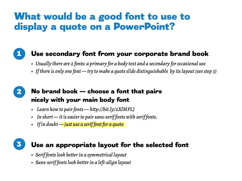
there are 2 fonts: a primary for a body text and a secondary for occasional use • If there is only one font — try to make a quote slide distinguishable by its layout (see step 3) No brand book — choose a font that pairs nicely with your main body font • Learn how to pair fonts — http://bit.ly/2XlMPLJ • In short — it is easier to pair sans-serif fonts with serif fonts. • If in doubt — just use a serif font for a quote Use an appropriate layout for the selected font • Serif fonts look better in a symmetrical layout • Sans-serif fonts look better in a left-align layout What would be a good font to use to display a quote on a PowerPoint? 1 2 3
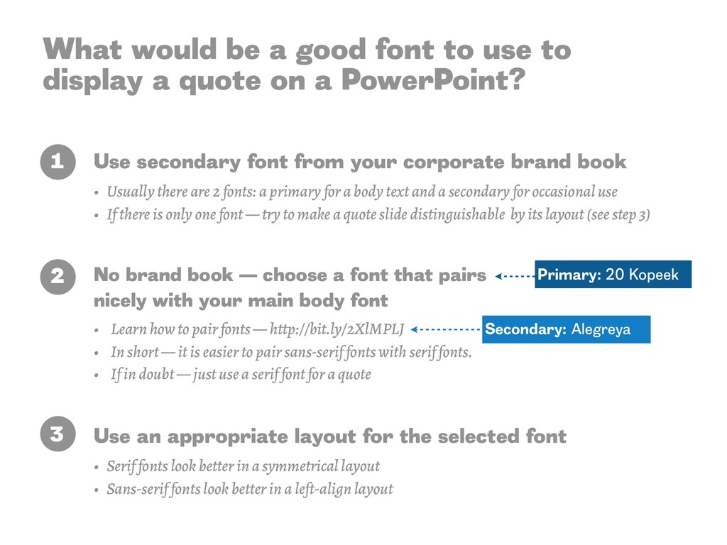
there are 2 fonts: a primary for a body text and a secondary for occasional use • If there is only one font — try to make a quote slide distinguishable by its layout (see step 3) No brand book — choose a font that pairs nicely with your main body font • Learn how to pair fonts — http://bit.ly/2XlMPLJ • In short — it is easier to pair sans-serif fonts with serif fonts. • If in doubt — just use a serif font for a quote Use an appropriate layout for the selected font • Serif fonts look better in a symmetrical layout • Sans-serif fonts look better in a left-align layout What would be a good font to use to display a quote on a PowerPoint? 2 3 1 Primary: 20 Kopeek Secondary: Alegreya
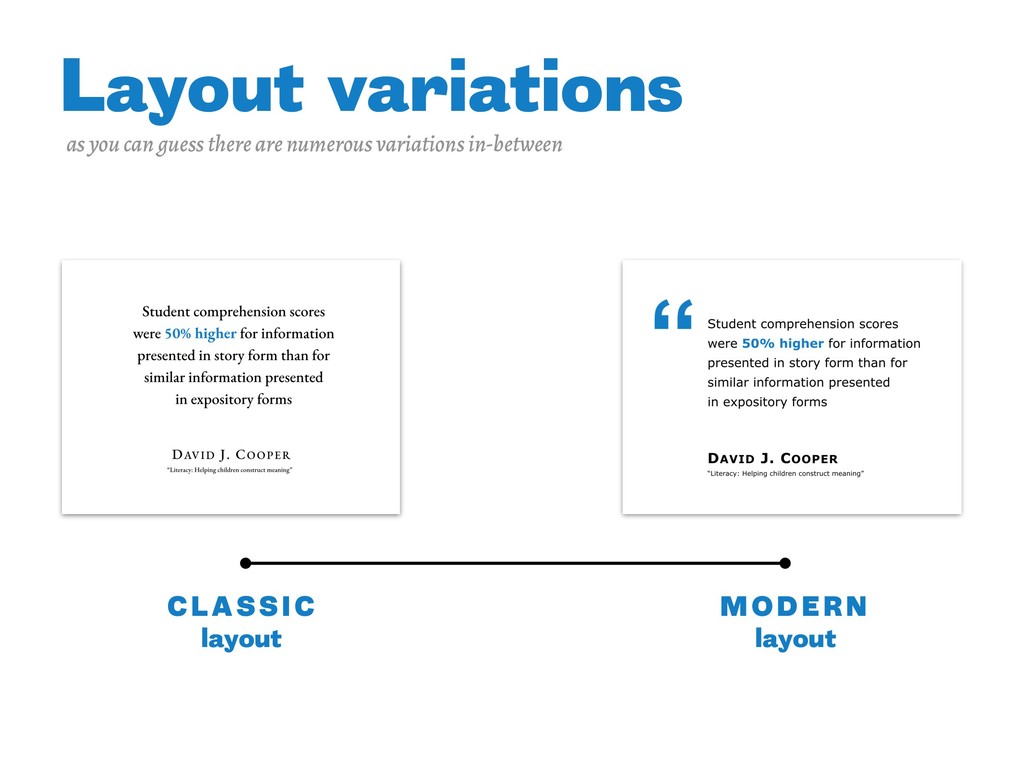
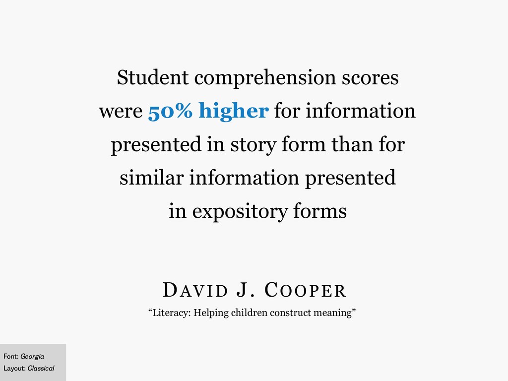
scores were 50% higher for information presented in story form than for similar information presented in expository forms Font: Georgia Layout: Classical
scores were 50% higher for information presented in story form than for similar information presented in expository forms Font: IBM Plex Serif Layout: Classical
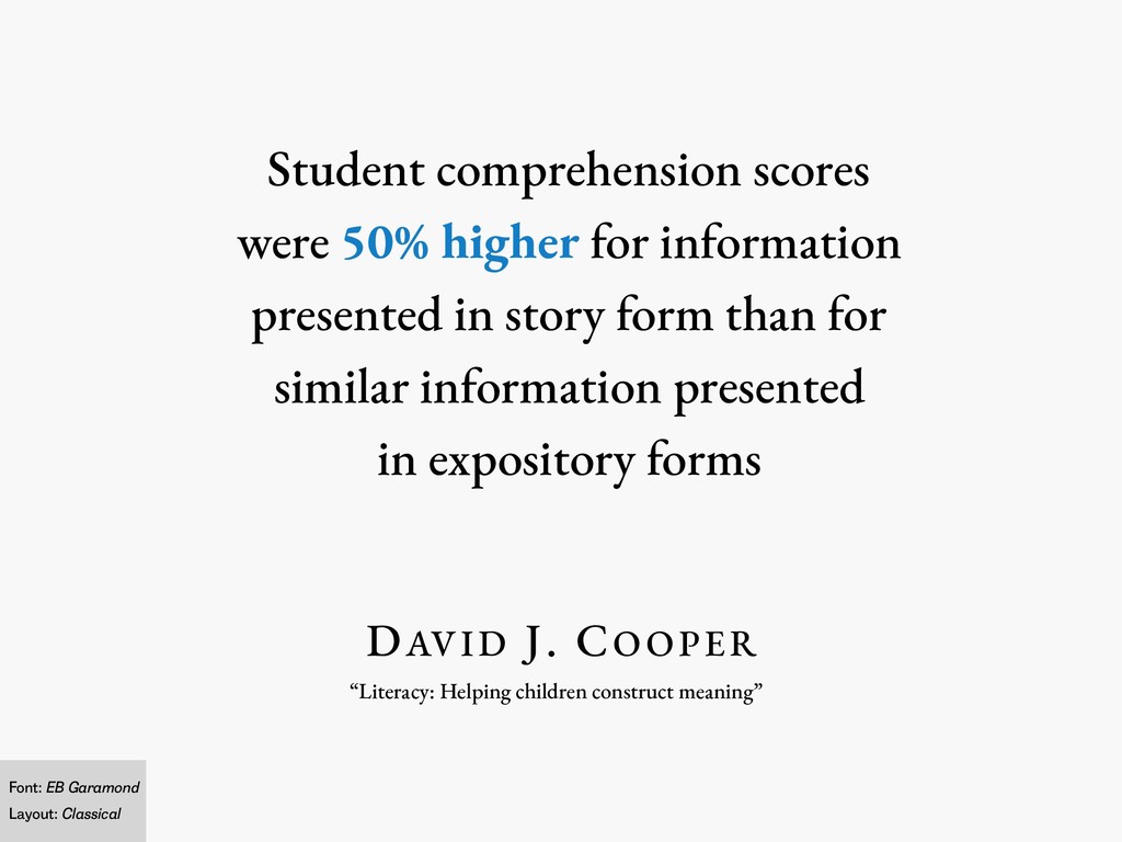
scores were 50% higher for information presented in story form than for similar information presented in expository forms Font: EB Garamond Layout: Classical
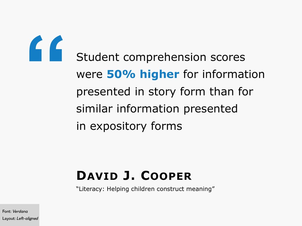
scores were 50% higher for information presented in story form than for similar information presented in expository forms Font: Verdana Layout: Left-aligned
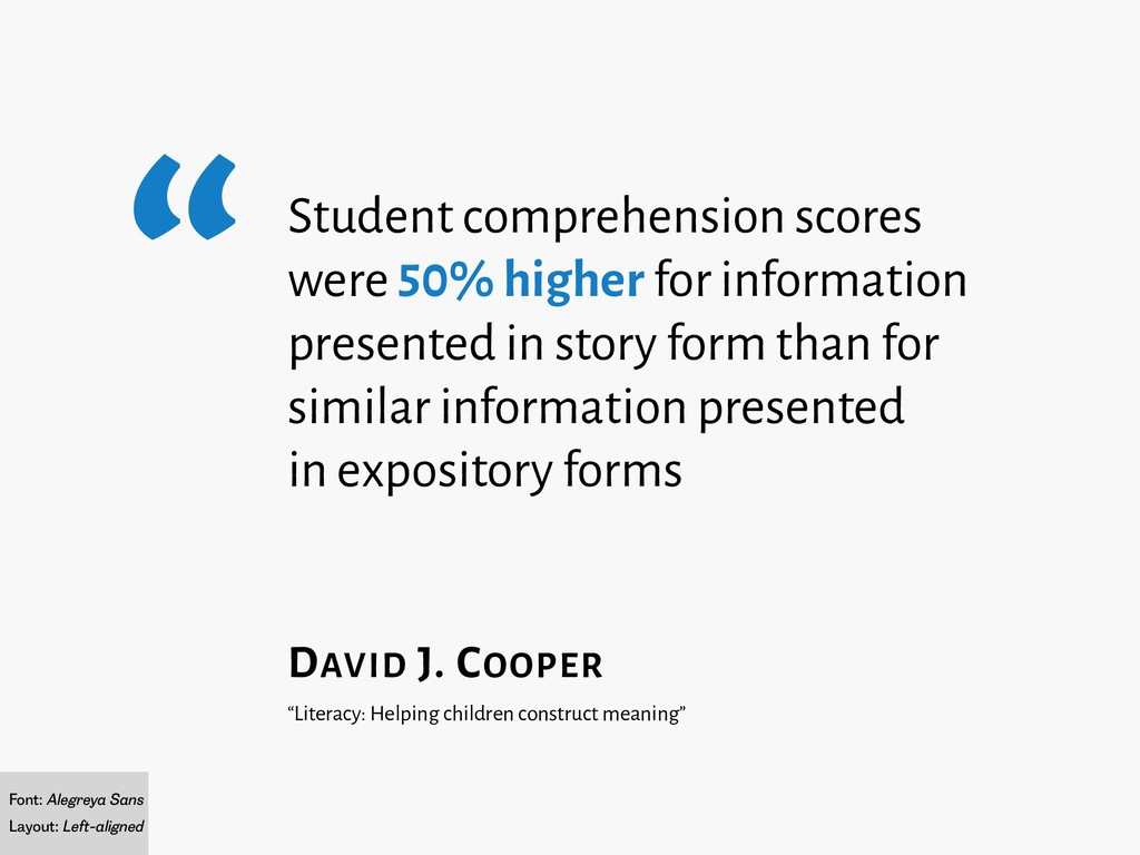
Alegreya Sans Layout: Left-aligned Student comprehension scores were 50% higher for information presented in story form than for similar information presented in expository forms
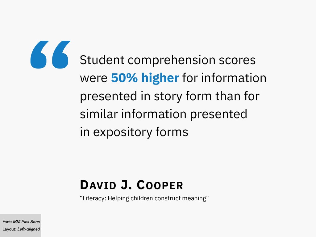
IBM Plex Sans Layout: Left-aligned Student comprehension scores were 50% higher for information presented in story form than for similar information presented in expository forms
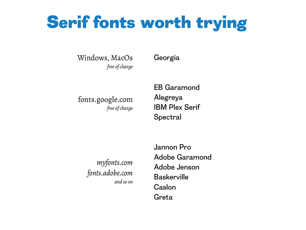
Adobe Garamond Adobe Jenson Baskerville Caslon Greta Serif fonts worth trying fonts.google.com free of charge Windows, MacOs free of charge myfonts.com fonts.adobe.com and so on
![Alexey Burba +7 916 106-45-65 [email protected] www.burba.pro telegram: @alexburba fb.com/alexey.burba](https://files.speakerdeck.com/presentations/41e2b4b0dcac48e9b587f2b9a631f291/slide_11.jpg)