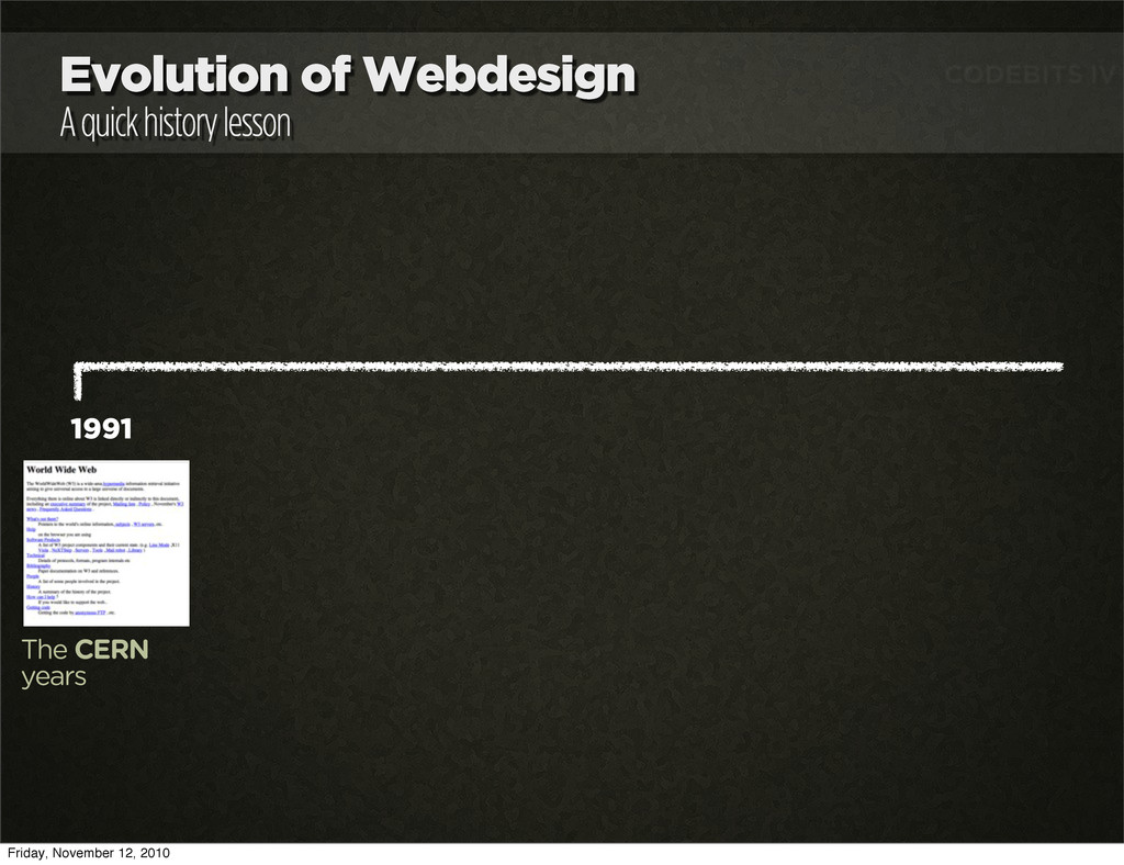
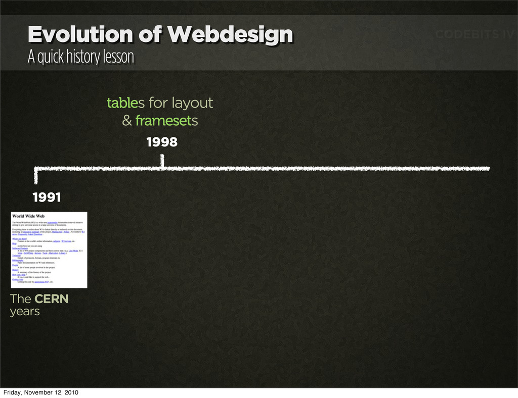
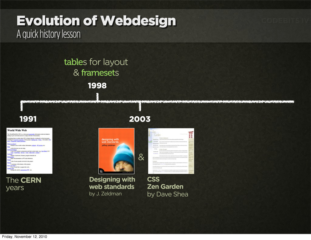
years 1998 tables for layout & framesets 2003 Designing with web standards by J. Zeldman CSS Zen Garden by Dave Shea & 2005 microformats Friday, November 12, 2010
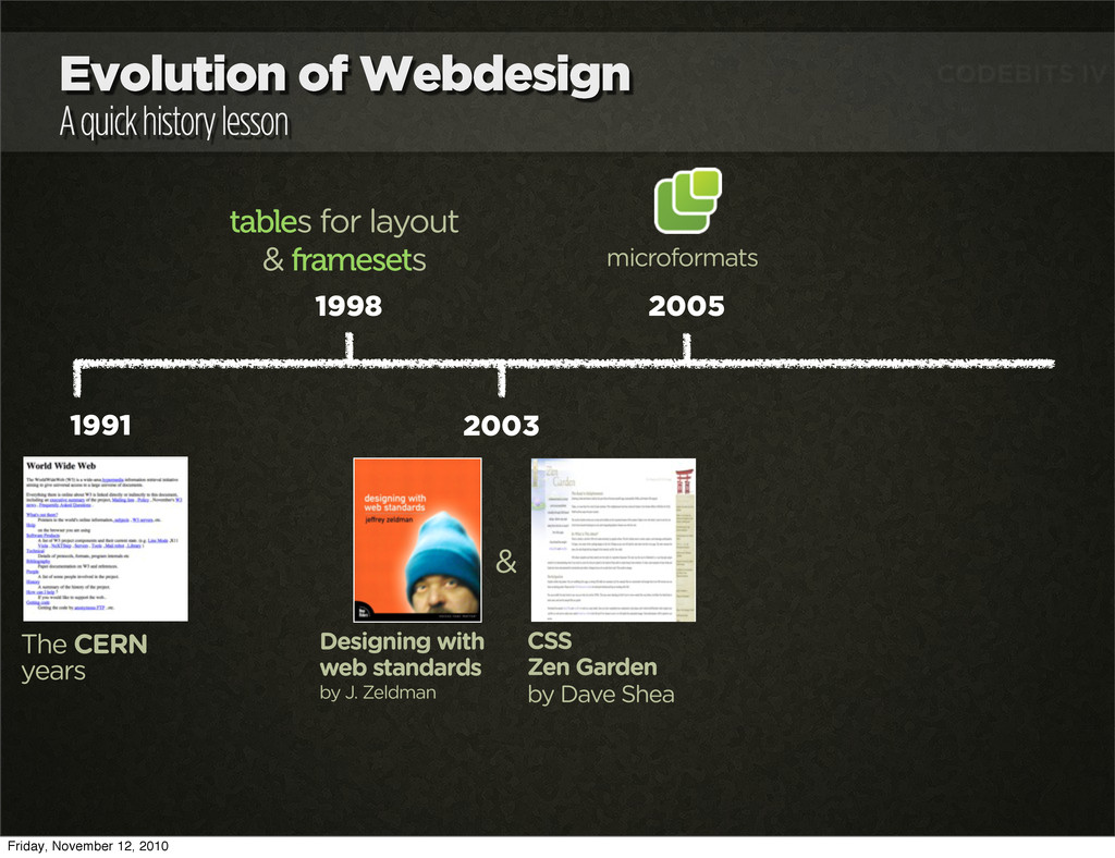
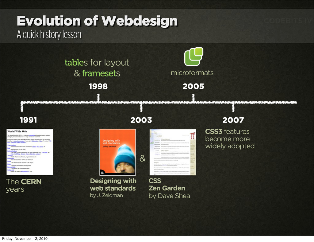
years 1998 tables for layout & framesets 2003 Designing with web standards by J. Zeldman CSS Zen Garden by Dave Shea & 2007 CSS3 features become more widely adopted 2005 microformats Friday, November 12, 2010
years 1998 tables for layout & framesets 2003 Designing with web standards by J. Zeldman CSS Zen Garden by Dave Shea & 2007 CSS3 features become more widely adopted 2005 microformats 2009 HTML5 features become more widely adopted Friday, November 12, 2010
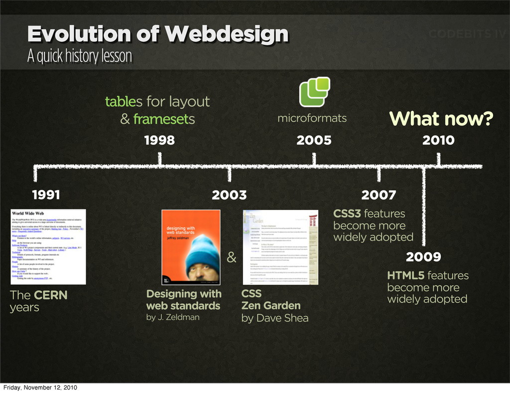
years 1998 tables for layout & framesets 2003 Designing with web standards by J. Zeldman CSS Zen Garden by Dave Shea & 2007 CSS3 features become more widely adopted 2010 What now? 2005 microformats 2009 HTML5 features become more widely adopted Friday, November 12, 2010
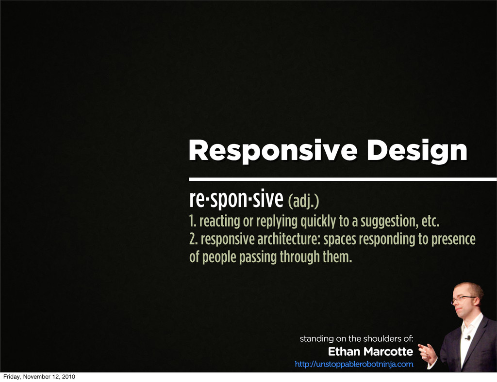
a suggestion, etc. 2. responsive architecture: spaces responding to presence of people passing through them. standing on the shoulders of: Ethan Marcotte http://unstoppablerobotninja.com Friday, November 12, 2010
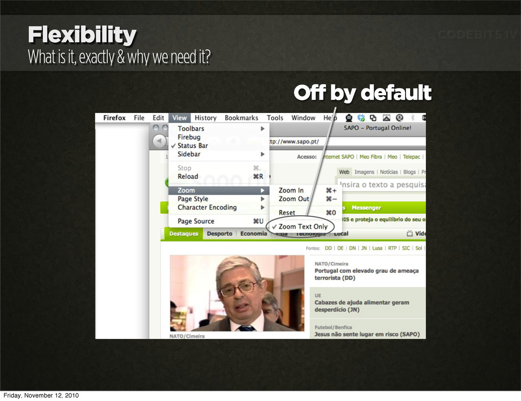
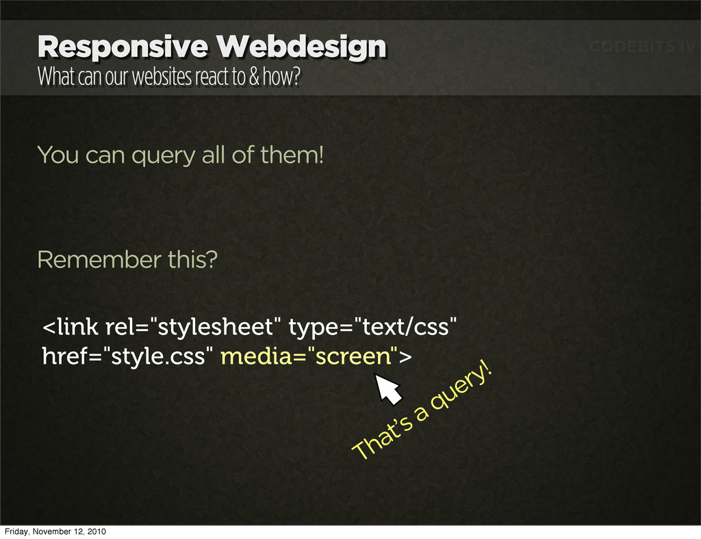
You can query all of them! Remember this? <link rel="stylesheet" type="text/css" href="style.css" media="screen"> That’s a query! Friday, November 12, 2010
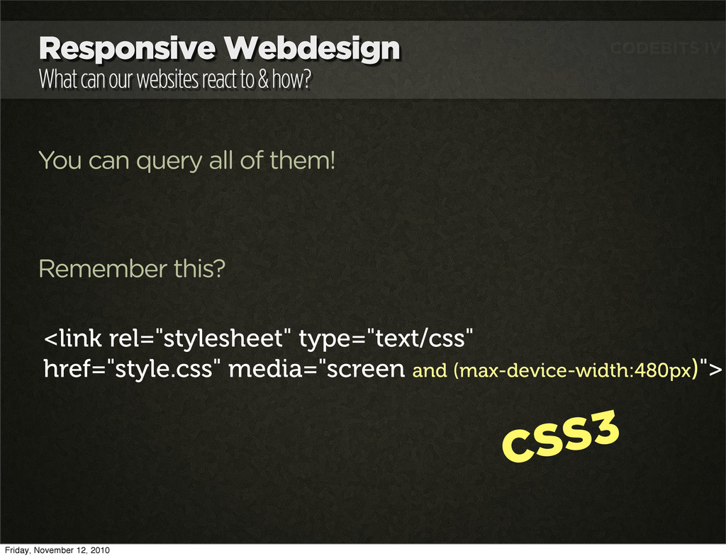
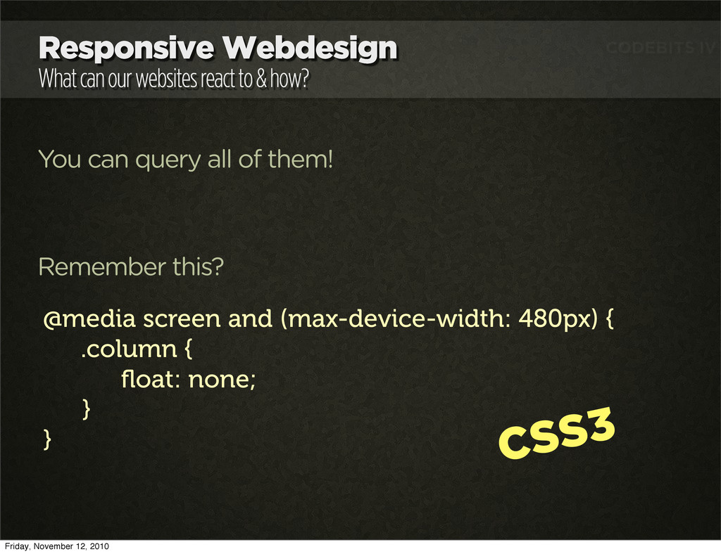
You can query all of them! Remember this? <link rel="stylesheet" type="text/css" href="style.css" media="screen and (max-device-width:480px)"> CSS3 Friday, November 12, 2010
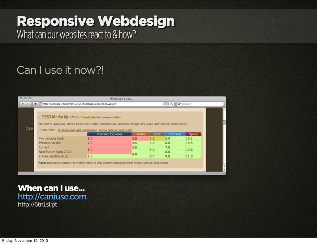
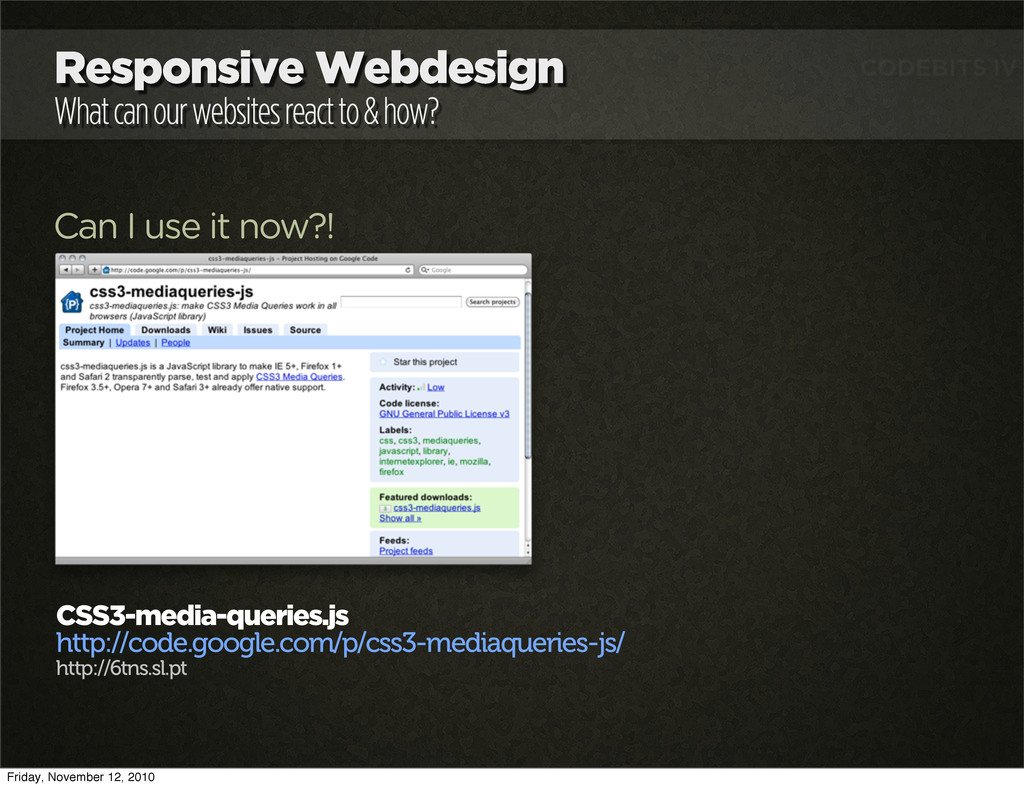
Can I use it now?! CSS3-media-queries.js http://code.google.com/p/css3-mediaqueries-js/ http://6tns.sl.pt Do you really need it? Friday, November 12, 2010
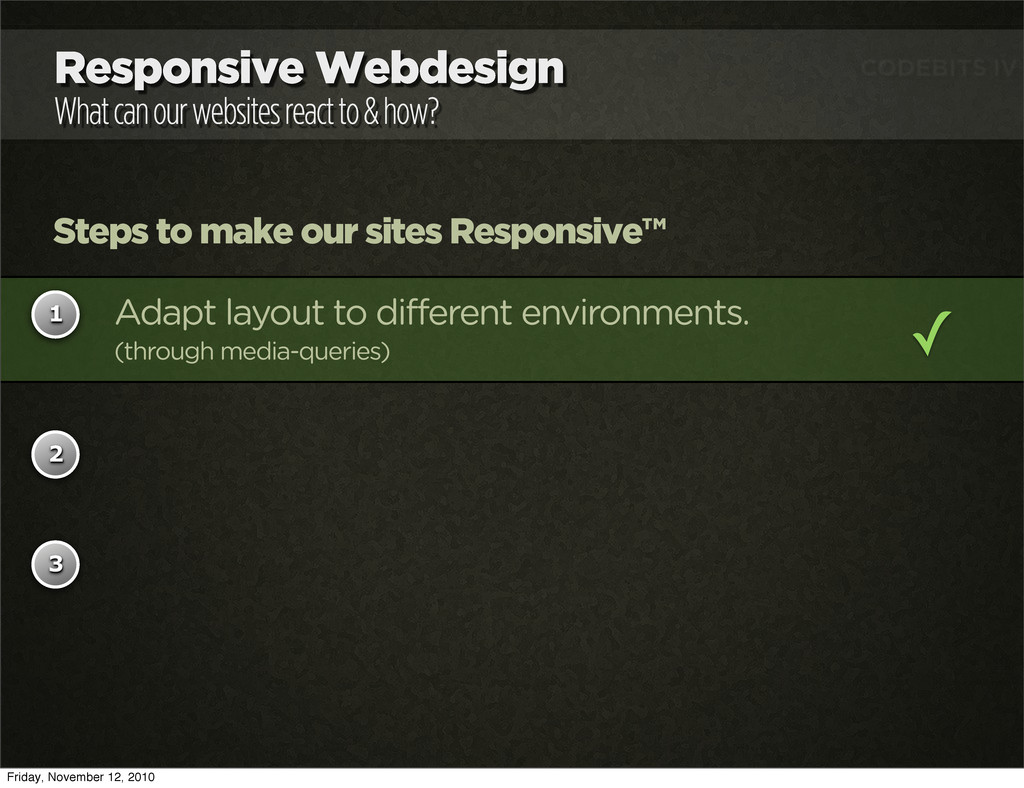
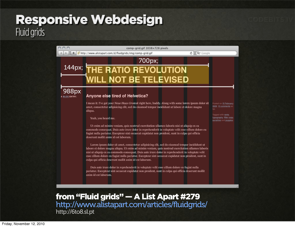
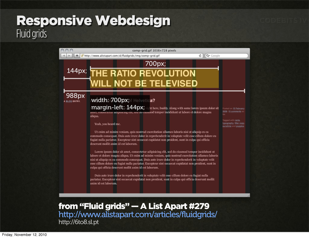
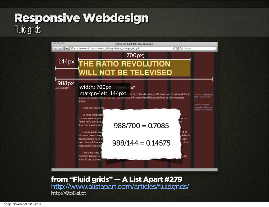
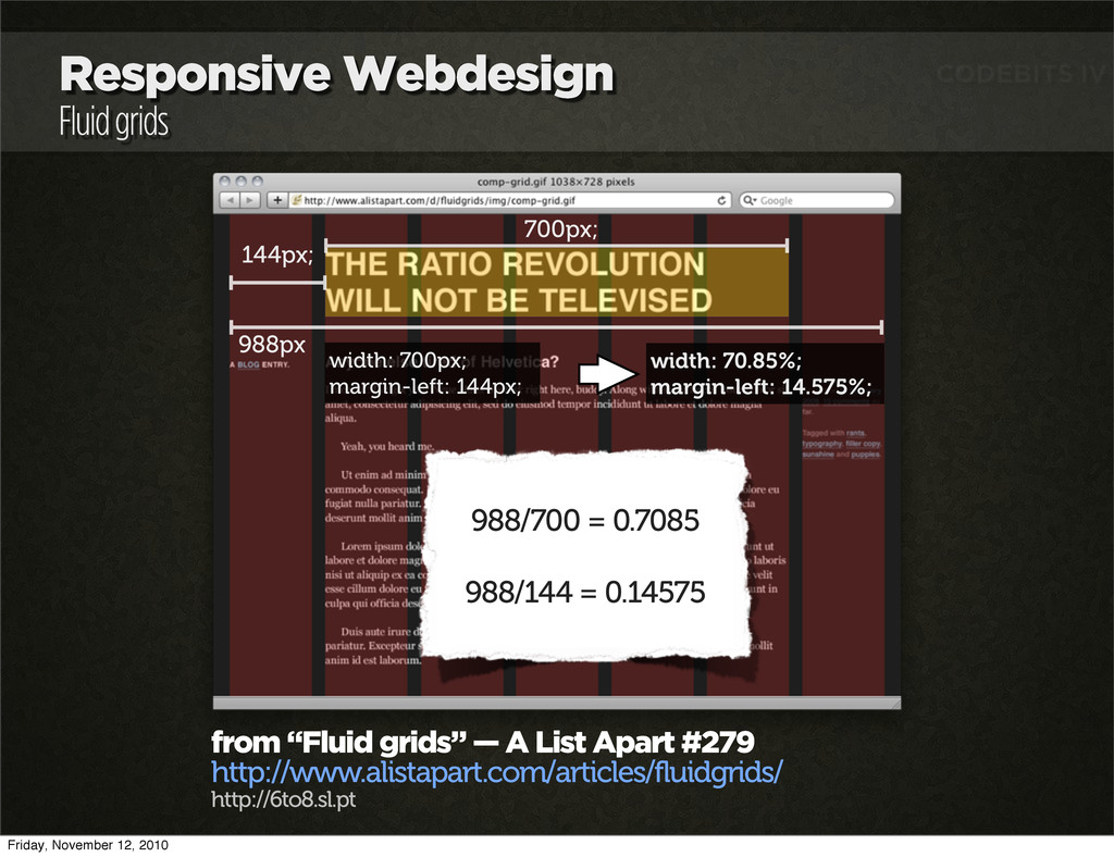
Steps to make our sites Responsive™ 1 2 3 Adapt layout to different environments. (through media-queries) ✓ Fluid Grids (if you’re using them) Friday, November 12, 2010
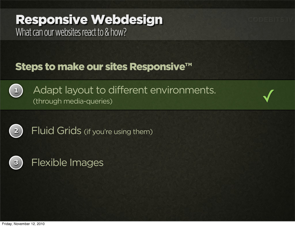
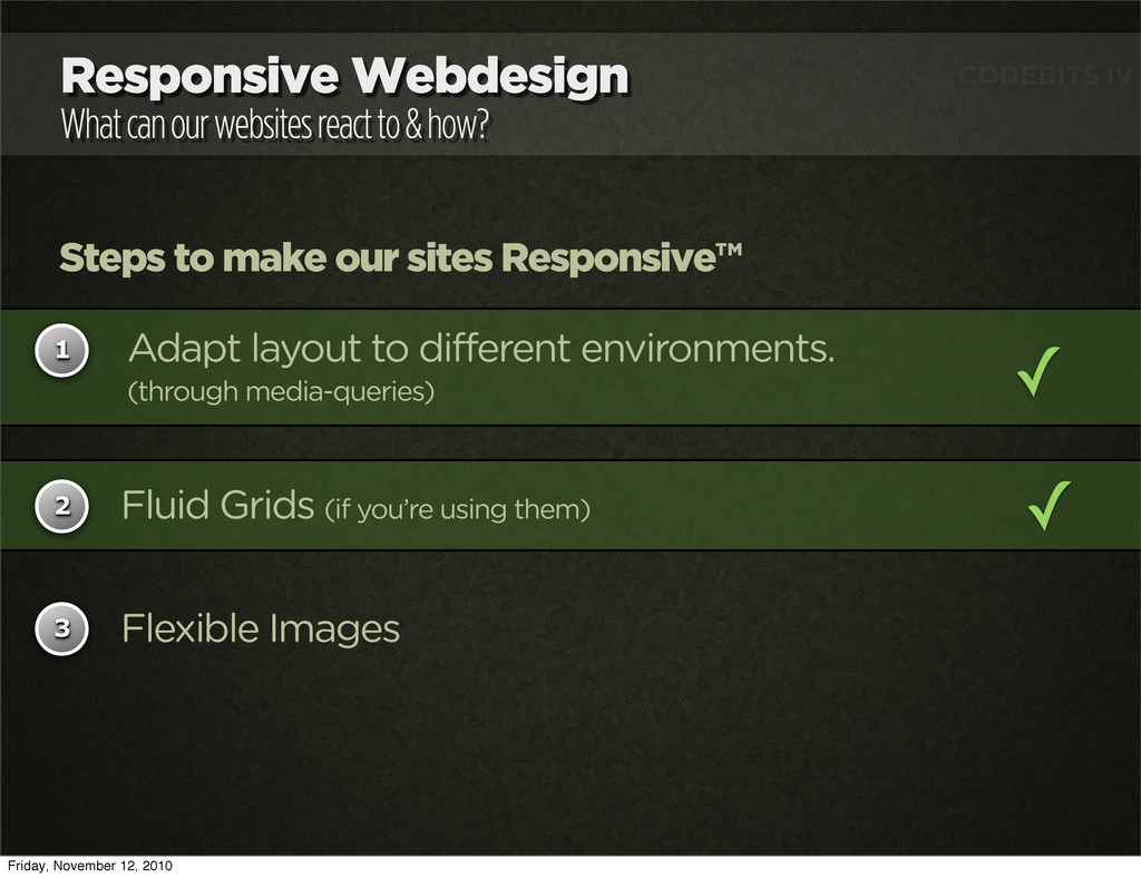
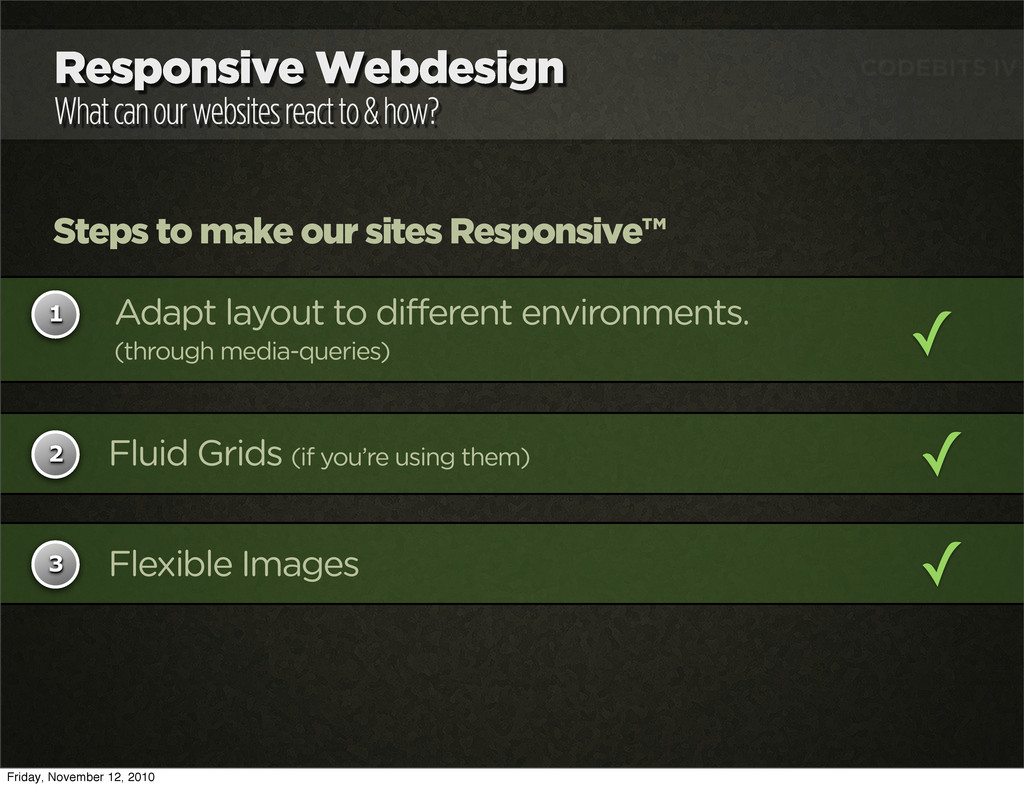
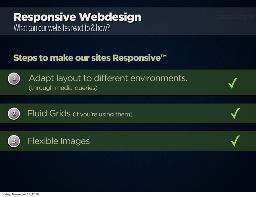
Steps to make our sites Responsive™ 1 2 3 Adapt layout to different environments. (through media-queries) ✓ Fluid Grids (if you’re using them) Flexible Images Friday, November 12, 2010
how? Steps to make our sites Responsive™ 1 2 3 Adapt layout to different environments. (through media-queries) ✓ Fluid Grids (if you’re using them) Flexible Images Friday, November 12, 2010
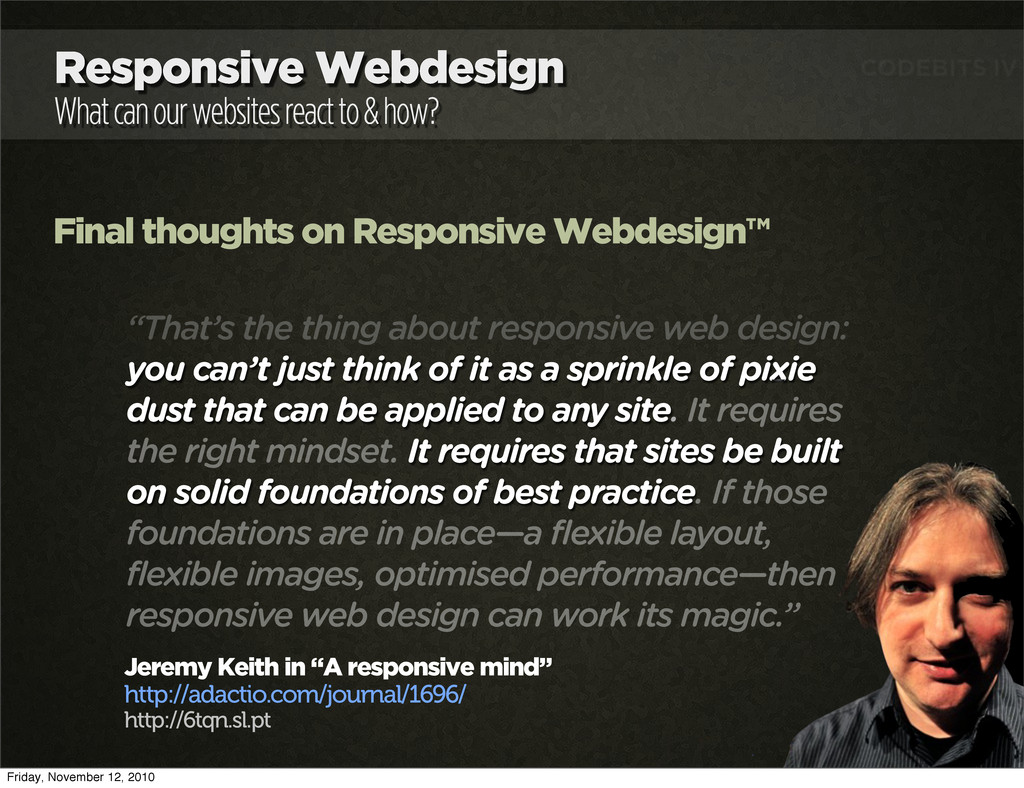
Final thoughts on Responsive Webdesign™ “That’s the thing about responsive web design: you can’t just think of it as a sprinkle of pixie dust that can be applied to any site. It requires the right mindset. It requires that sites be built on solid foundations of best practice. If those foundations are in place—a flexible layout, flexible images, optimised performance—then responsive web design can work its magic.” Jeremy Keith in “A responsive mind” http://adactio.com/journal/1696/ http://6tqn.sl.pt Friday, November 12, 2010
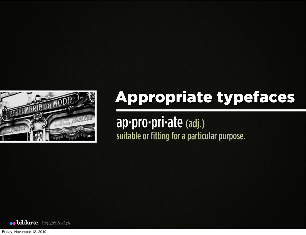
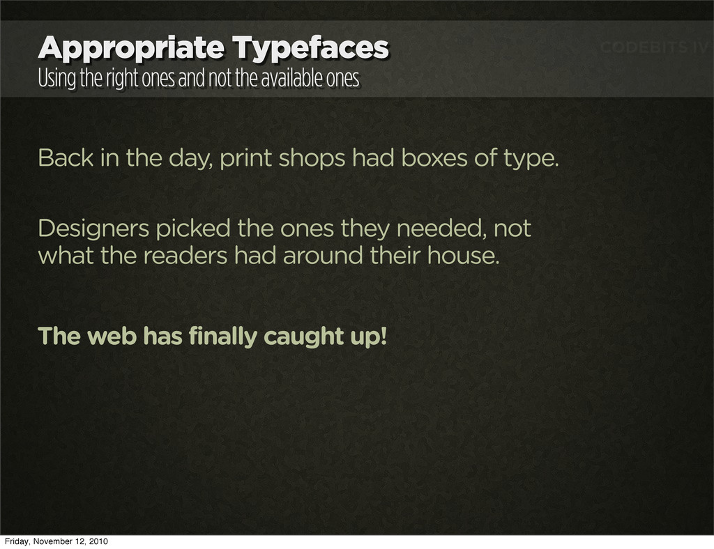
ones Back in the day, print shops had boxes of type. Designers picked the ones they needed, not what the readers had around their house. The web has finally caught up! Friday, November 12, 2010
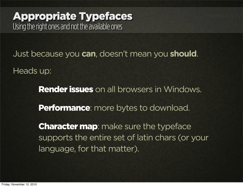
ones Just because you can, doesn’t mean you should. Heads up: Render issues on all browsers in Windows. Performance: more bytes to download. Character map: make sure the typeface supports the entire set of latin chars (or your language, for that matter). Friday, November 12, 2010
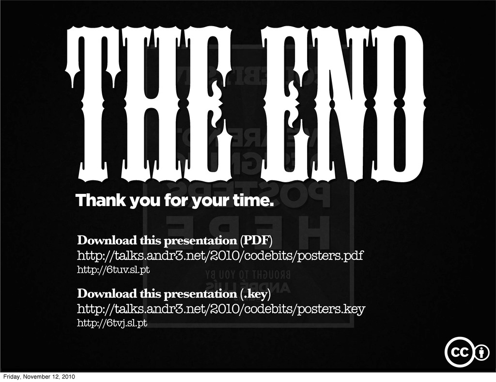
TO YOU BY ANDRÉ LUÍS cb n @andr3 CODEBITS IV THE END Thank you for your time. Download this presentation (PDF) http://talks.andr3.net/2010/codebits/posters.pdf http://6tuv.sl.pt cb Download this presentation (.key) http://talks.andr3.net/2010/codebits/posters.key http://6tvj.sl.pt Friday, November 12, 2010
 andr3
andr3
 kspace
 cyberagent_creators
 hilokifigma
 solmetts
 spacemarket
 daitasu
 madoka_portfolio
 connecre
 mixi_design
 mukai_takeru
 so_kotani
 poteboy
 codingconduct
 katarinadahlin
 aleyda
 addyosmani
 techseoconnect
 eileencodes
 frankvandijk
 helmedeiros
 smashingmag
 stephaniewalter
 schroneko