Upgrade to Pro — share decks privately, control downloads, hide ads and more …

What We Talk About When We Talk About Navigation

What We Talk About When We Talk About Navigation

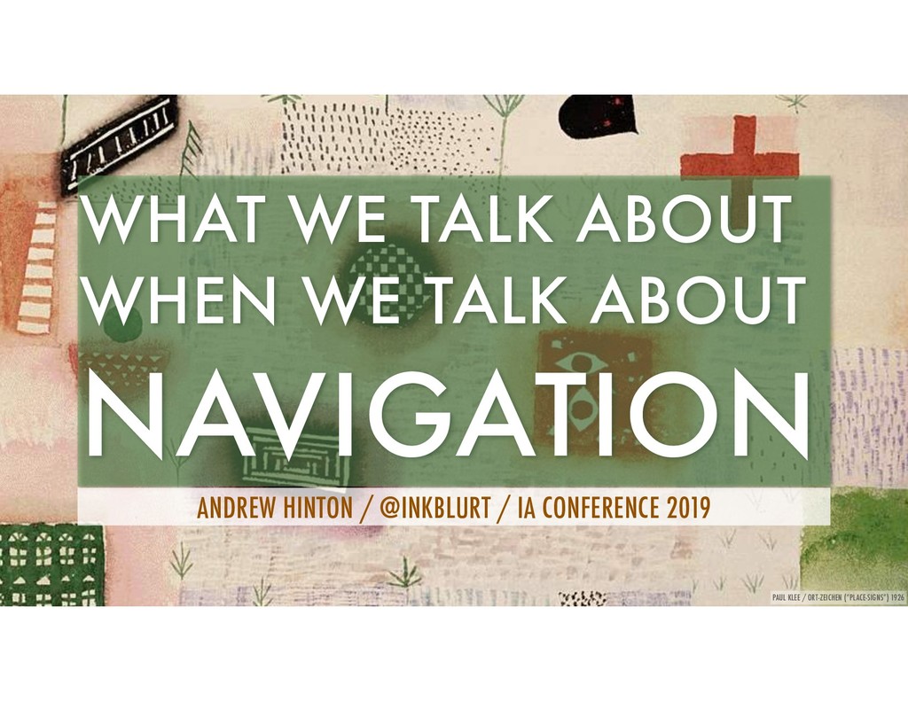
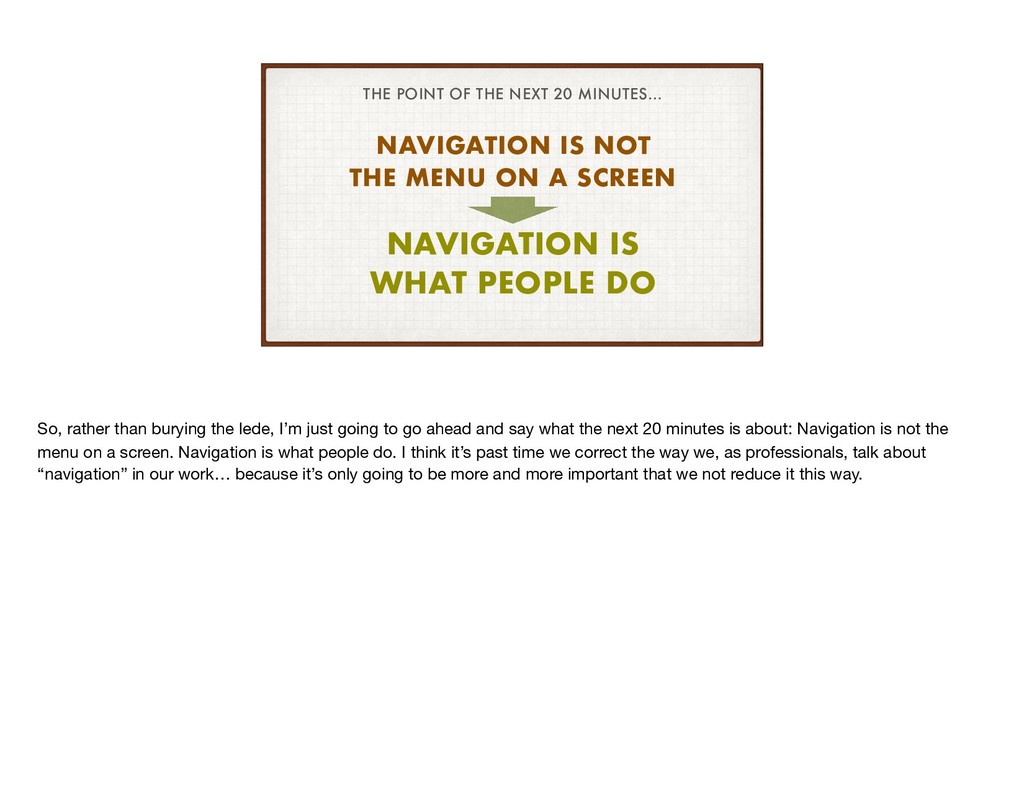
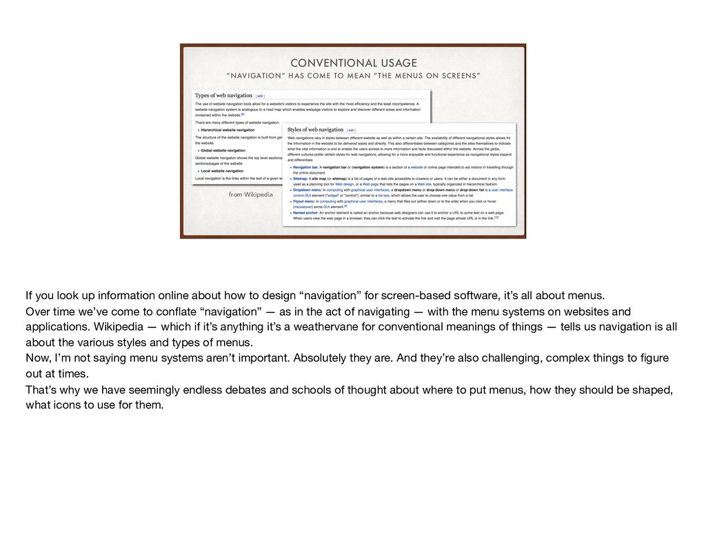
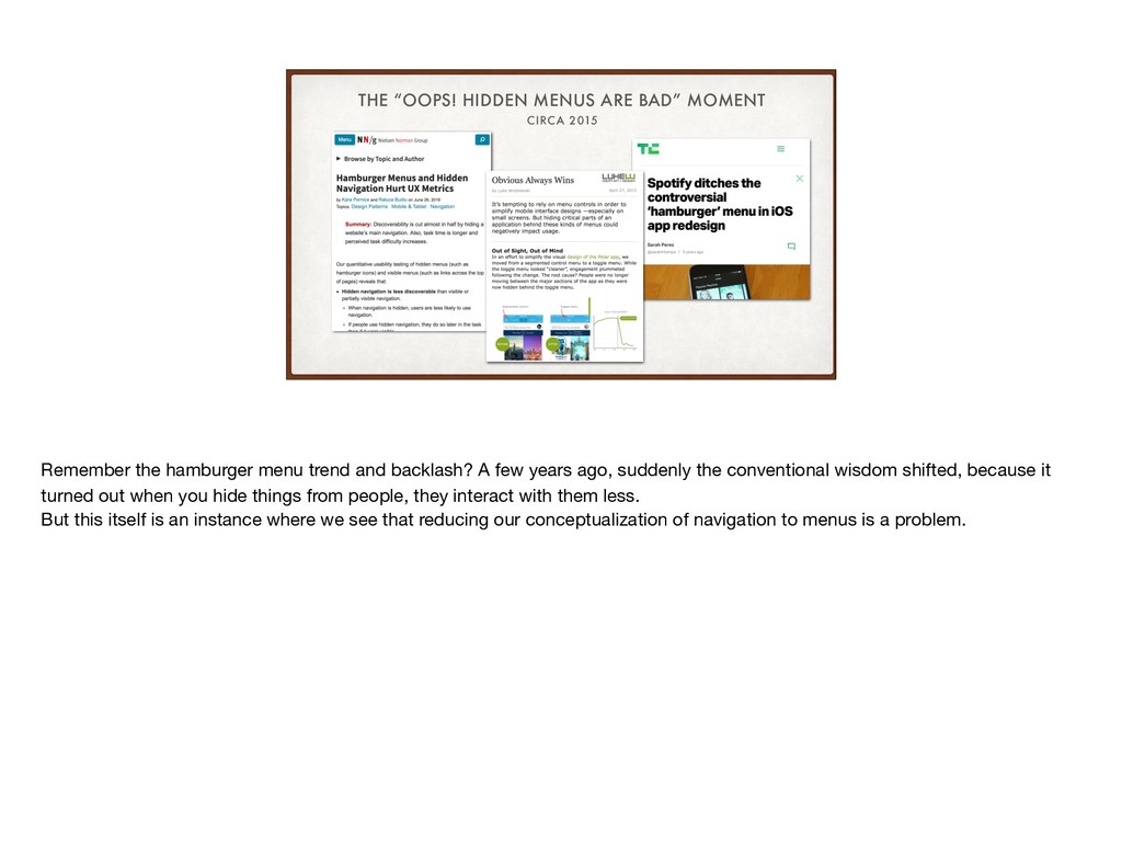
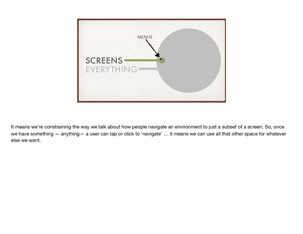
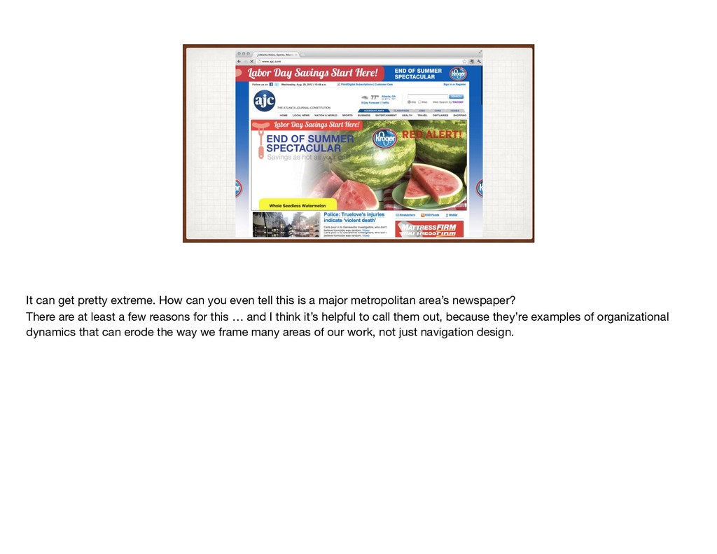
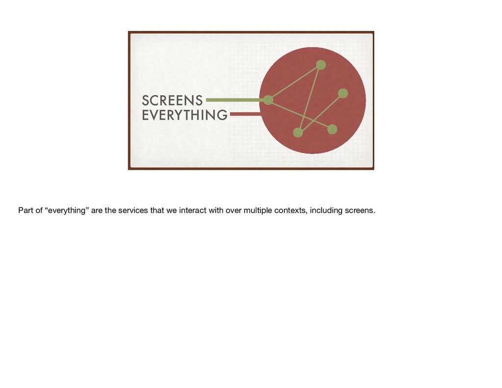
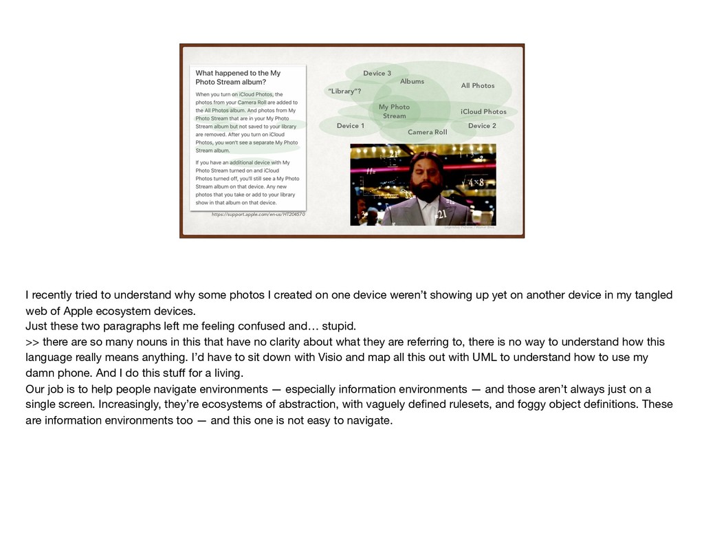
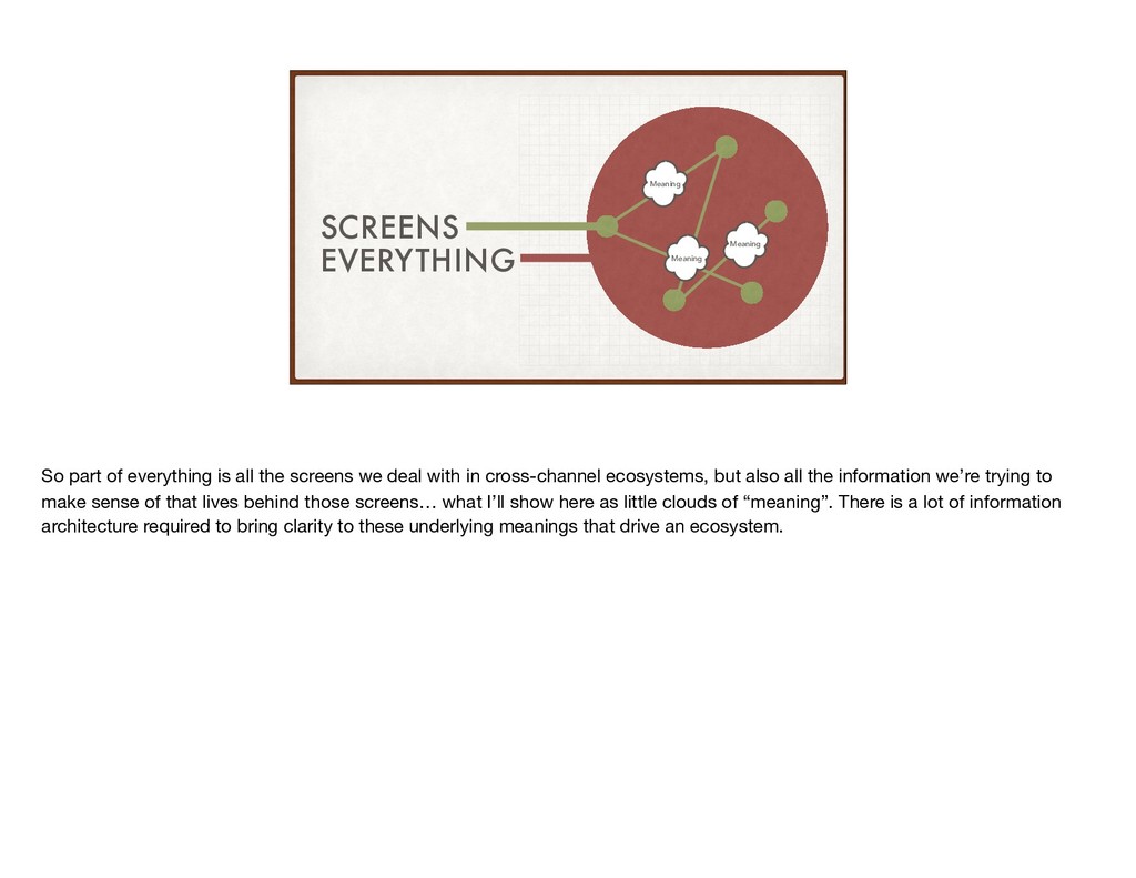
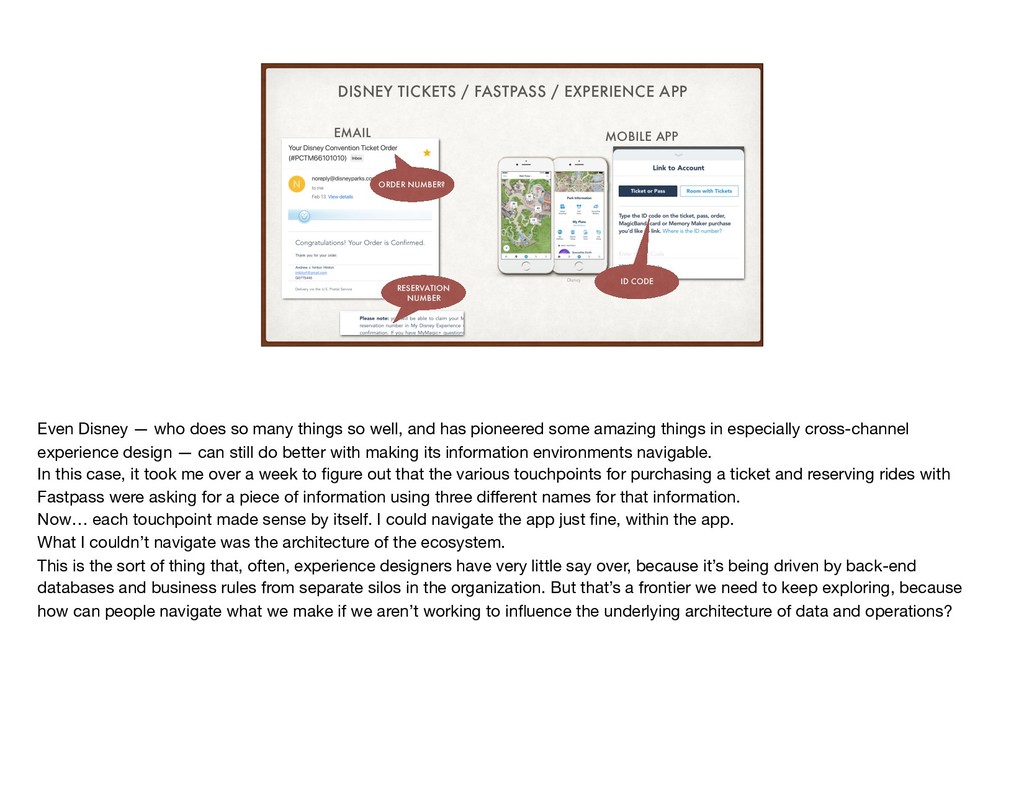
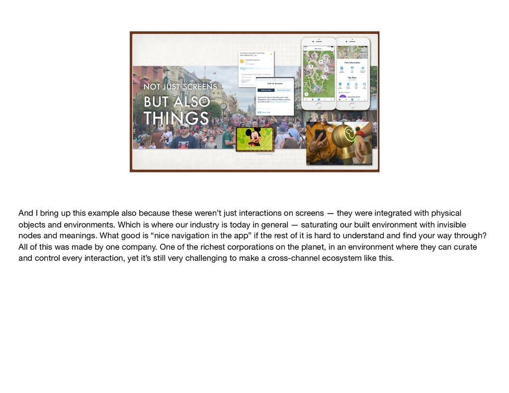
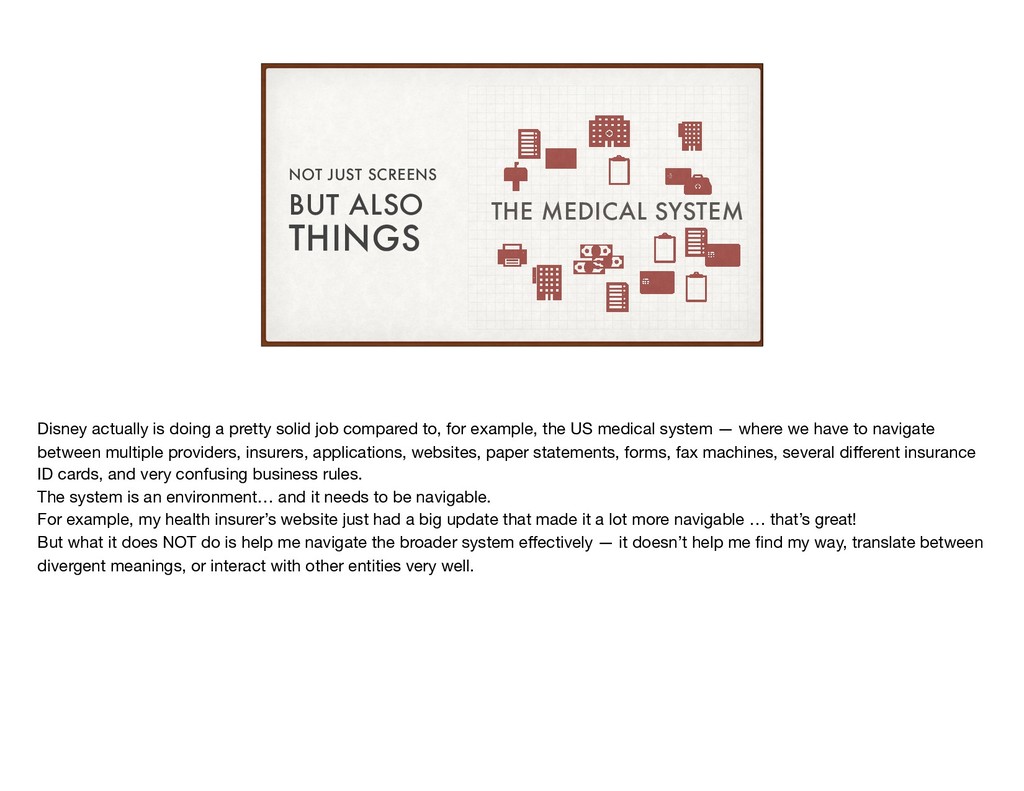
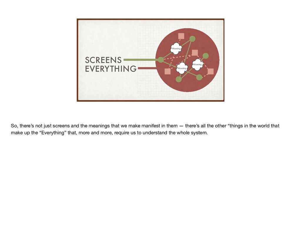
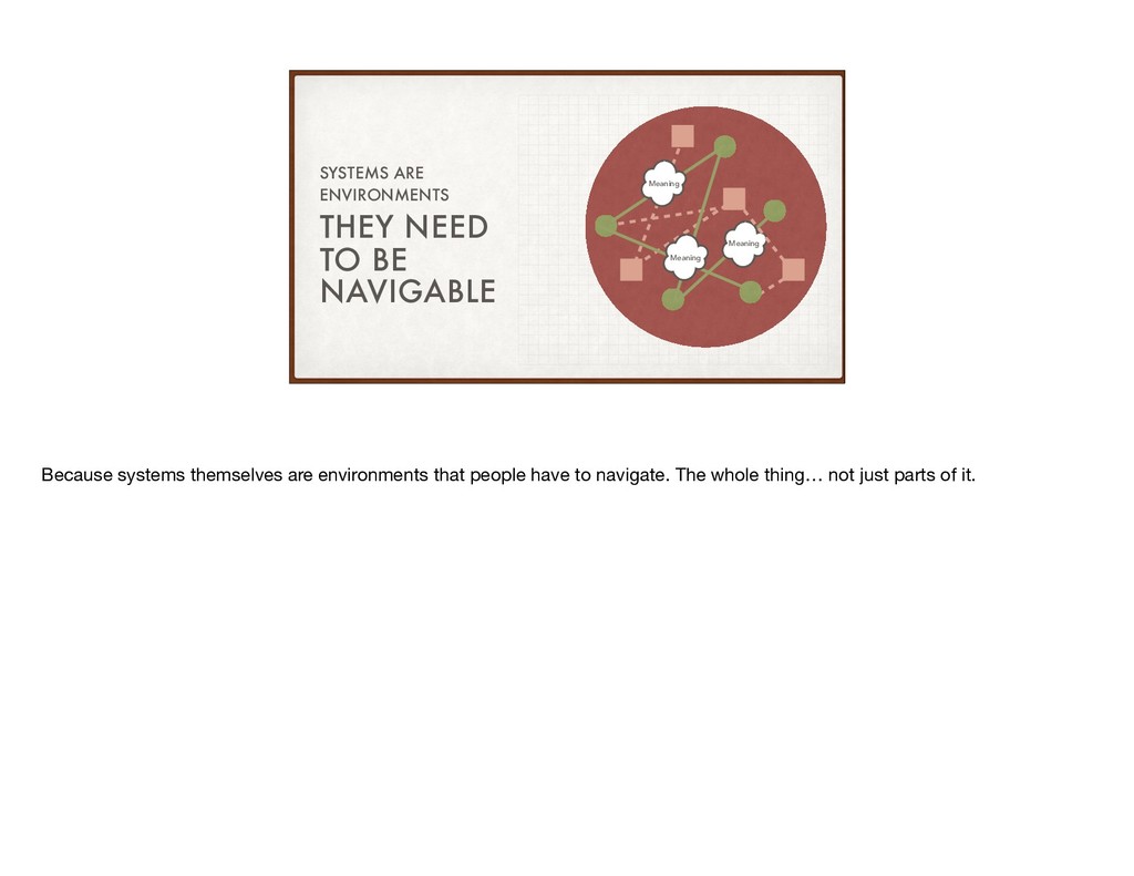
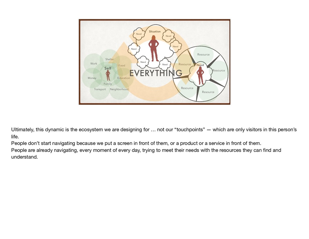
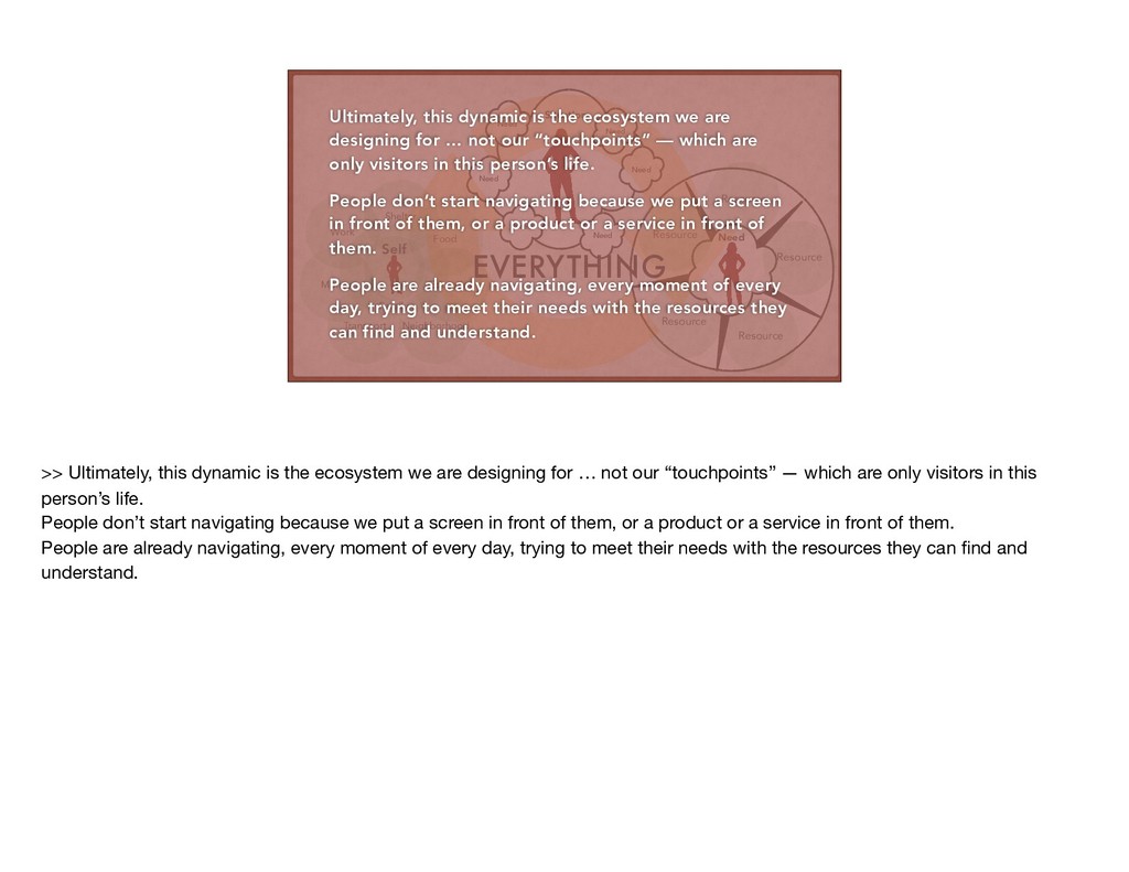
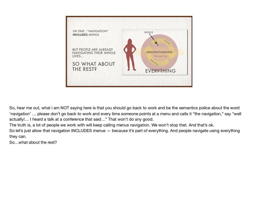
Much of what information architecture practice is expected to figure out is “the navigation.” But what if we’ve been oversimplifying the way we discuss, design, and deliver navigation — and what if that’s been the source of later pain for users and organizations for a really long time? This short talk makes the case that we’ve been conflating too many things into the rubric of “navigation”, explains how this bad habit has come to pass, and the challenges that have resulted. But fear not! We’ll also look at practical ways to overcome the problem in our own day to day work, as well as with stakeholders and team members.

Andrew Hinton

March 15, 2019
Tweet

More Decks by Andrew Hinton

Other Decks in Design

Transcript

  1. PAUL KLEE / ORT-ZEICHEN (“PLACE-SIGNS”) 1926 WHAT WE TALK ABOUT

    WHEN WE TALK ABOUT NAVIGATION ANDREW HINTON / @INKBLURT / IA CONFERENCE 2019
  2. NAVIGATION IS NOT THE MENU ON A SCREEN NAVIGATION IS

    WHAT PEOPLE DO THE POINT OF THE NEXT 20 MINUTES… So, rather than burying the lede, I’m just going to go ahead and say what the next 20 minutes is about: Navigation is not the menu on a screen. Navigation is what people do. I think it’s past time we correct the way we, as professionals, talk about “navigation” in our work… because it’s only going to be more and more important that we not reduce it this way.
  3. SCREENS EVERYTHING TWO PARTS I’ll break this down in two

    parts — first just navigation with screens, but then navigation with, well, everything else.
  4. SCREENS EVERYTHING PART ONE Ok, so … screens. Because that’s

    what most of us are being asked to work on in our jobs, right?
  5. “NAVIGATION” HAS COME TO MEAN “THE MENUS ON SCREENS” CONVENTIONAL

    USAGE from Wikipedia If you look up information online about how to design “navigation” for screen-based software, it’s all about menus. Over time we’ve come to conflate “navigation” — as in the act of navigating — with the menu systems on websites and applications. Wikipedia — which if it’s anything it’s a weathervane for conventional meanings of things — tells us navigation is all about the various styles and types of menus. Now, I’m not saying menu systems aren’t important. Absolutely they are. And they’re also challenging, complex things to figure out at times. That’s why we have seemingly endless debates and schools of thought about where to put menus, how they should be shaped, what icons to use for them.
  6. CIRCA 2015 THE “OOPS! HIDDEN MENUS ARE BAD” MOMENT Remember

    the hamburger menu trend and backlash? A few years ago, suddenly the conventional wisdom shifted, because it turned out when you hide things from people, they interact with them less. But this itself is an instance where we see that reducing our conceptualization of navigation to menus is a problem.
  7. SCREENS EVERYTHING MENUS It means we’re constraining the way we

    talk about how people navigate an environment to just a subset of a screen. So, once we have something — anything— a user can tap or click to ‘navigate’ … it means we can use all that other space for whatever else we want.
  8. It can get pretty extreme. How can you even tell

    this is a major metropolitan area’s newspaper? There are at least a few reasons for this … and I think it’s helpful to call them out, because they’re examples of organizational dynamics that can erode the way we frame many areas of our work, not just navigation design.
  9. ORGS TEND TO MAKE DECISIONS “INSIDE-OUT” REASON 1 We all

    know this — organizations tend to make their decisions from a pretty self-absorbed point of view. There’s a lot of misguided incentive to assume users only need some tiny menu controls to meet their needs.
  10. THE “ATOMISED” WAY WORK IS ASSIGNED & PRODUCED REASON 2

    https://commons.wikimedia.org/ Saying “navigation” is taken care of by the menus allows us to have a lot fewer stories to take care of “as a user I need to navigate the application.” Yes, we still have to break the work down somehow, but we also have to remember navigation is more like a theme that involves multiple features and stories. We wouldn’t do that to a user behavior like “shopping” or “communicating”.
  11. THE WAY LANGUAGE WORKS REASON 3 Synecdoche gone too far…

    Another reason is just the way language works. It’s similar to synecdoche where we refer to something by referring to a part of it. Like “give me a hand”… except we do this a lot with technology to the point where we may forget there’s a larger thing at all. Folks often say “my internet went down…” or “let me plug in my GPS”… well neither the internet nor the global positioning system is just in your house or car. And that’s ok for conversational use! But when we’re professionals talking about human behavior in information environments, we need to not fall for our own figures of speech.
  12. HUMANS NAVIGATE THEIR ENVIRONMENT BY USING THE WHOLE ENVIRONMENT As

    practitioners who pay attention to the architecture of the environments we make, we need to listen to the best research and guidance we have in our field on matters like this. There’s plenty of research and writing, going back decades, that tells us humans navigate their environment by using whatever they can in that environment to understand it and make use of it.
  13. How can we make the experience at a computer or

    mobile phone or whatever feel more like this world that we have lived in for most of the entire history of our species? Marcia J. Bates “Designing Information Systems for our Inner Hunter-Gatherer” — IA Summit 2018 A major contributor to the science of how people interact with information, Marcia Bates presented to us last year in Chicago about rethinking our frame for how we design interaction and architecture for screen-based environments to make use of the faculties we evolved with. She asks how can we make the experience of a device feel and behave more like the world that made our species’ bodies and brains?
  14. THAT’S WHY WE PUT WARNINGS & PROMOTIONS THERE! WE INTUITIVELY

    KNOW WHERE TO PUT THINGS WE WANT USERS* TO NOTICE *users who are visually unimpaired photo: andrew hinton The thing is, we know this intuitively — that’s why we put things we really want people to notice in the middle of their field of vision, in both physical and digital environments. The question is, are we doing it responsibly? Are we thinking “well the navigation is taken care of”…or are we making sure we’re providing plenty of information scent for the many facets of information users may actually need?
  15. NAVIGATION IS WHAT PEOPLE DO; MENUS ARE JUST ONE WAY

    THEY DO IT BUY NOW!!! “Menus” “Perception/Action in Environments” So, again… even with just screens… > Menus are fine and important, and we need to design them well. > But we also need to put that in context: the menu system is only part of how people are finding their way and understanding the whole screen-based environment. Navigating is what people do. Menus are just one way they do it.
  16. SCREENS EVERYTHING PART TWO But here’s the thing — just

    because most of what most of us are paid to work on is individual sites and applications, we shouldn’t frame navigation in those terms alone either. So let’s expand outward to what I’m calling ‘everything’ here.
  17. SCREENS EVERYTHING Part of “everything” are the services that we

    interact with over multiple contexts, including screens.
  18. https://support.apple.com/en-us/HT204570 All Photos Camera Roll “Library”? Albums My Photo Stream

    iCloud Photos Device 1 Device 2 Device 3 Legendary Pictures / Warner Bros. I recently tried to understand why some photos I created on one device weren’t showing up yet on another device in my tangled web of Apple ecosystem devices. Just these two paragraphs left me feeling confused and… stupid. >> there are so many nouns in this that have no clarity about what they are referring to, there is no way to understand how this language really means anything. I’d have to sit down with Visio and map all this out with UML to understand how to use my damn phone. And I do this stuff for a living. Our job is to help people navigate environments — especially information environments — and those aren’t always just on a single screen. Increasingly, they’re ecosystems of abstraction, with vaguely defined rulesets, and foggy object definitions. These are information environments too — and this one is not easy to navigate.
  19. SCREENS EVERYTHING Meaning Meaning Meaning So part of everything is

    all the screens we deal with in cross-channel ecosystems, but also all the information we’re trying to make sense of that lives behind those screens… what I’ll show here as little clouds of “meaning”. There is a lot of information architecture required to bring clarity to these underlying meanings that drive an ecosystem.
  20. DISNEY TICKETS / FASTPASS / EXPERIENCE APP ORDER NUMBER? EMAIL

    MOBILE APP RESERVATION NUMBER ID CODE Disney Even Disney — who does so many things so well, and has pioneered some amazing things in especially cross-channel experience design — can still do better with making its information environments navigable. In this case, it took me over a week to figure out that the various touchpoints for purchasing a ticket and reserving rides with Fastpass were asking for a piece of information using three different names for that information. Now… each touchpoint made sense by itself. I could navigate the app just fine, within the app. What I couldn’t navigate was the architecture of the ecosystem. This is the sort of thing that, often, experience designers have very little say over, because it’s being driven by back-end databases and business rules from separate silos in the organization. But that’s a frontier we need to keep exploring, because how can people navigate what we make if we aren’t working to influence the underlying architecture of data and operations?
  21. BUT ALSO THINGS NOT JUST SCREENS TheDisneyBlog And I bring

    up this example also because these weren’t just interactions on screens — they were integrated with physical objects and environments. Which is where our industry is today in general — saturating our built environment with invisible nodes and meanings. What good is “nice navigation in the app” if the rest of it is hard to understand and find your way through? All of this was made by one company. One of the richest corporations on the planet, in an environment where they can curate and control every interaction, yet it’s still very challenging to make a cross-channel ecosystem like this.
  22. BUT ALSO THINGS NOT JUST SCREENS THE MEDICAL SYSTEM Disney

    actually is doing a pretty solid job compared to, for example, the US medical system — where we have to navigate between multiple providers, insurers, applications, websites, paper statements, forms, fax machines, several different insurance ID cards, and very confusing business rules. The system is an environment… and it needs to be navigable. For example, my health insurer’s website just had a big update that made it a lot more navigable … that’s great! But what it does NOT do is help me navigate the broader system effectively — it doesn’t help me find my way, translate between divergent meanings, or interact with other entities very well.
  23. SCREENS EVERYTHING Meaning Meaning Meaning So, there’s not just screens

    and the meanings that we make manifest in them — there’s all the other “things in the world that make up the “Everything” that, more and more, require us to understand the whole system.
  24. THEY NEED TO BE NAVIGABLE SYSTEMS ARE ENVIRONMENTS Meaning Meaning

    Meaning Because systems themselves are environments that people have to navigate. The whole thing… not just parts of it.
  25. ” “ — Luca Rosati & Andrea Resmini, “Pervasive Information

    Architecture” 2011 “WE SAY NAVIGATE, BUT REALLY MEAN UNDERSTAND .” I come back to this quote a lot — from members of our own community, in the excellent book Pervasive Information Architecture: we say ‘navigate’ but really mean ‘understand’— navigation is a handy label for humans perceiving and acting in an environment so as to understand what it is, how it works, and where to acquire the resources each human needs.
  26. UNDERSTANDING Navigating PERCEPTIO N ACTIO N Understanding isn’t an abstract

    state of being — it’s work. It’s a human body figuring out what to do moment by moment in the entire world it’s living in. So when we put new things into that world, we’re asking people to navigate not just those things, but the world we changed with those things.
  27. MENUS EVERYTHING UNDERSTANDING Navigating PERCEPTIO N ACTIO N This is

    what I’m getting at when I say “everything” — it’s not the world, but the dynamic between people and the world they’re trying to understand. And there’s the tiny dot of “menus”… important, certainly. But just a small small part.
  28. Neighborhood Family Self Work Food Money Shelter Transport Education Situation

    Need Need Need Need Need Need Need Resource Resource Resource Resource Resource This is why one of my current obsessions is how we might model a person’s ‘everything’ — not their journey with a service, or just their mental model of a specific product. That can come later. Rather, how does a person figure out how to meet their needs in general, over time? First, what is the conceptual architecture of a person’s life is, as they see it? >> Then, when a new situation arises, how might we determine what category of situation gives rise to which categories of needs? >> And for any given category of need, what categories of resources do people tend to want or require to take care of those needs? And what parts of their life are they needing to make sense of in order to understand those resources, and whether those resources will meet their needs or not?
  29. Neighborhood Family Self Work Food Money Shelter Transport Education Situation

    Need Need Need Need Need Need Need Resource Resource Resource Resource Resource EVERYTHING Ultimately, this dynamic is the ecosystem we are designing for … not our “touchpoints” — which are only visitors in this person’s life. People don’t start navigating because we put a screen in front of them, or a product or a service in front of them. People are already navigating, every moment of every day, trying to meet their needs with the resources they can find and understand.
  30. Neighborhood Family Self Work Food Money Shelter Transport Education Situation

    Need Need Need Need Need Need Need Resource Resource Resource Resource Resource EVERYTHING Ultimately, this dynamic is the ecosystem we are designing for … not our “touchpoints” — which are only visitors in this person’s life. People don’t start navigating because we put a screen in front of them, or a product or a service in front of them. People are already navigating, every moment of every day, trying to meet their needs with the resources they can find and understand. >> Ultimately, this dynamic is the ecosystem we are designing for … not our “touchpoints” — which are only visitors in this person’s life. People don’t start navigating because we put a screen in front of them, or a product or a service in front of them. People are already navigating, every moment of every day, trying to meet their needs with the resources they can find and understand.
  31. BUT PEOPLE ARE ALREADY NAVIGATING THEIR WHOLE LIVES... SO WHAT

    ABOUT THE REST? OK FINE…“NAVIGATION” INCLUDES MENUS So, hear me out, what i am NOT saying here is that you should go back to work and be the semantics police about the word ‘navigation’ … please don’t go back to work and every time someone points at a menu and calls it “the navigation,” say “well actually!… I heard a talk at a conference that said…” That won’t do any good. The truth is, a lot of people we work with will keep calling menus navigation. We won’t stop that. And that’s ok. So let’s just allow that navigation INCLUDES menus — because it’s part of everything. And people navigate using everything they can. So…what about the rest?