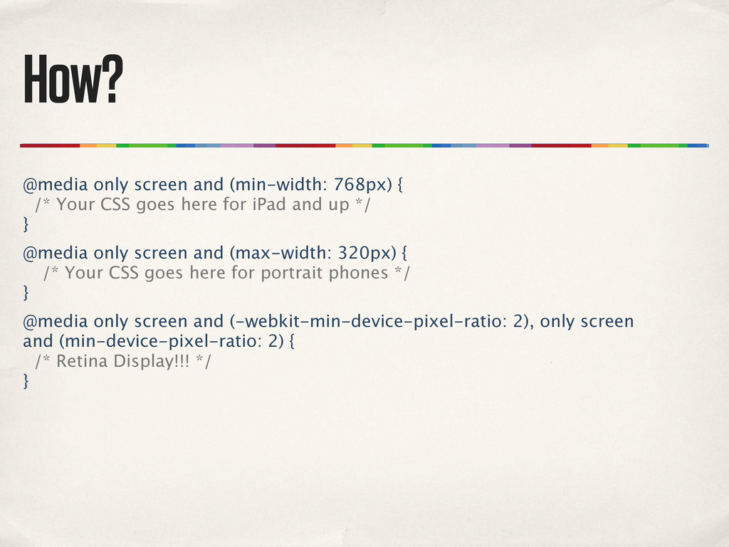
CSS goes here for iPad and up */ } @media only screen and (max-width: 320px) { /* Your CSS goes here for portrait phones */ } @media only screen and (-webkit-min-device-pixel-ratio: 2), only screen and (min-device-pixel-ratio: 2) { /* Retina Display!!! */ }
 andycroll
 prgckwb
 koheiyoshikawa
 ynisqa1988
 oracle4engineer
 taromatsui_cccmkhd
 yuksew
 takkuhiro
 moongift
 cyberagentdevelopers
 taka_aki
 makies
 tmiket
 sferik
 stephenakadiri
 charlesmeaden
 aleyda
 marcoroth
 maggiecrowley
 addyosmani
 khoart
 szymonslowik
 takai
takai
 jonoalderson