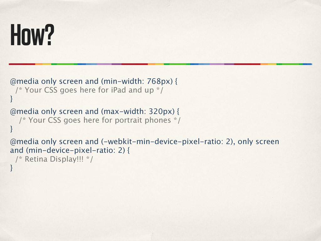
CSS goes here for iPad and up */ } @media only screen and (max-width: 320px) { /* Your CSS goes here for portrait phones */ } @media only screen and (-webkit-min-device-pixel-ratio: 2), only screen and (min-device-pixel-ratio: 2) { /* Retina Display!!! */ }
of work an adaptive or responsive approach is compared to complete re- engineering. Adaptive? Responsive? Flexible grids? What to do with images? Javascript? Performance?
 andycroll
 fossamagna
 eiei114
 i35_267
 alchemy1115
 k_adachi_01
 makies
 kzykmyzw
 torumakabe
 ks91
ks91
 yama3133
 genda
genda
 oracle4engineer
 axbom
axbom
 destraynor
 427marketing
 moore
moore
 kastner
 ryanjones
 dugsong
 cassininazir
 geshan
 tamaranovitovic
 inesmontani
 schlessera