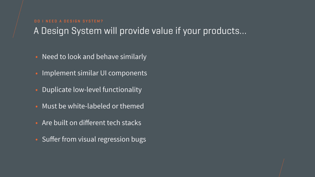
UI components • Duplicate low-level functionality • Must be white-labeled or themed • Are built on different tech stacks • Suffer from visual regression bugs A Design System will provide value if your products… D O I N E E D A D E S I G N S Y S T E M ?
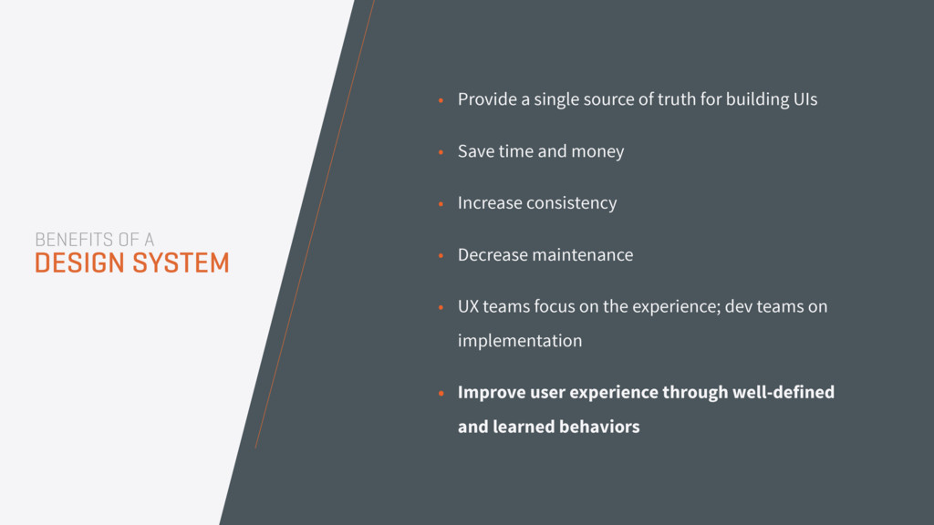
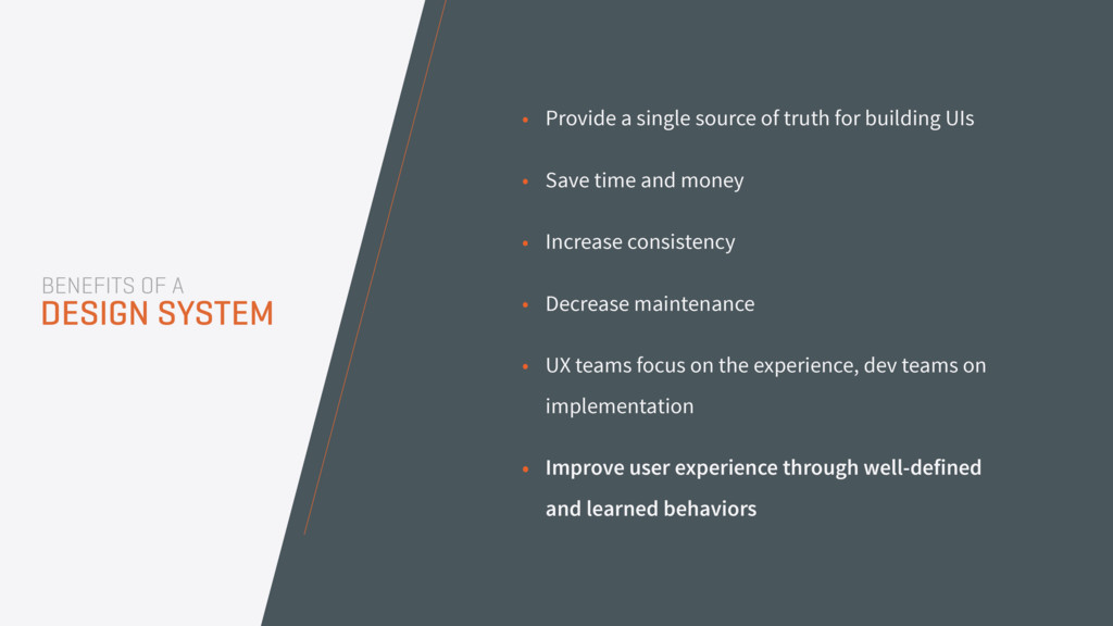
• Save time and money • Increase consistency • Decrease maintenance • UX teams focus on the experience; dev teams on implementation • Improve user experience through well-defined and learned behaviors BENEFITS OF A DESIGN SYSTEM
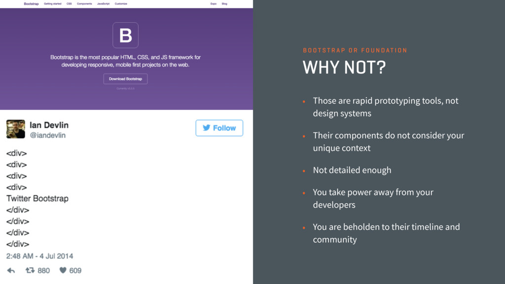
systems • Their components do not consider your unique context • Not detailed enough • You take power away from your developers • You are beholden to their timeline and community B O O T S T R A P O R F O U N D AT I O N
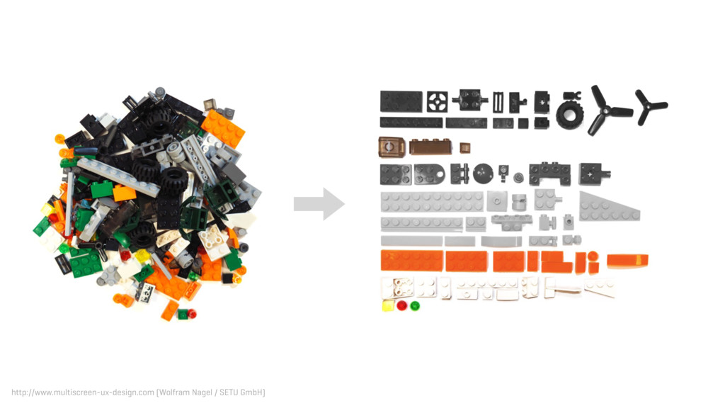
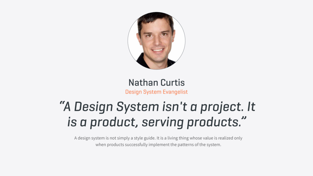
serving products.” A design system is not simply a style guide. It is a living thing whose value is realized only when products successfully implement the patterns of the system. Nathan Curtis Design System Evangelist
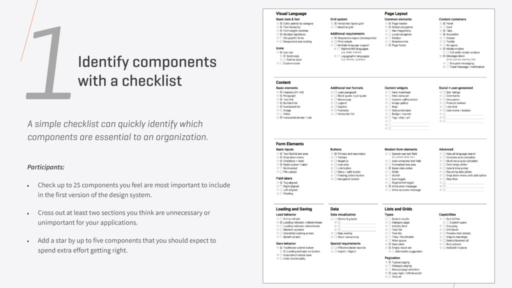
important to include in the first version of the design system. • Cross out at least two sections you think are unnecessary or unimportant for your applications. • Add a star by up to five components that you should expect to spend extra effort getting right. Participants: Identify components with a checklist 1 A simple checklist can quickly identify which components are essential to an organization.
today, and the level of complexity a component needs to accommodate. 2Cut-up components from various interfaces • Organize and print out screenshots from the existing site and/or applications • Create categorized sections (forms/buttons/navigation/etc.) based on the component checklist • Participants cut up each page into components, separating components into their assigned category • This exercise generates momentum, brings clarity, and trims fat
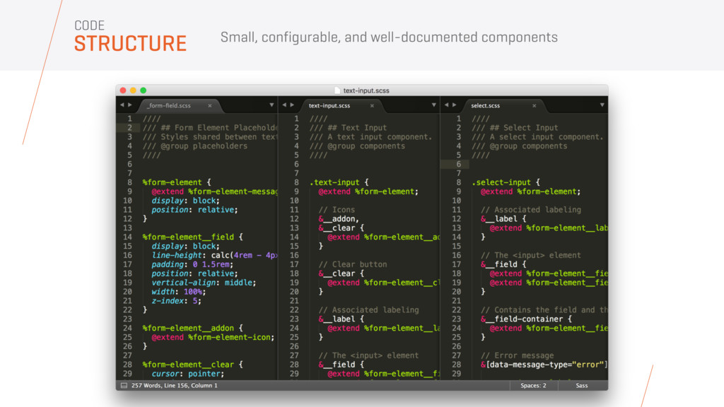
base. • Establish low-level design principles • Start with color, typography, iconography, units of measure, grids, spacing • Align on what you are going to name each component 3Lay a solid foundation for your components
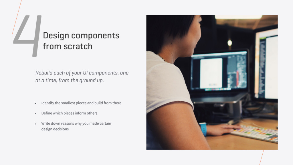
from the ground up. • Identify the smallest pieces and build from there • Define which pieces inform others • Write down reasons why you made certain design decisions 4Design components from scratch
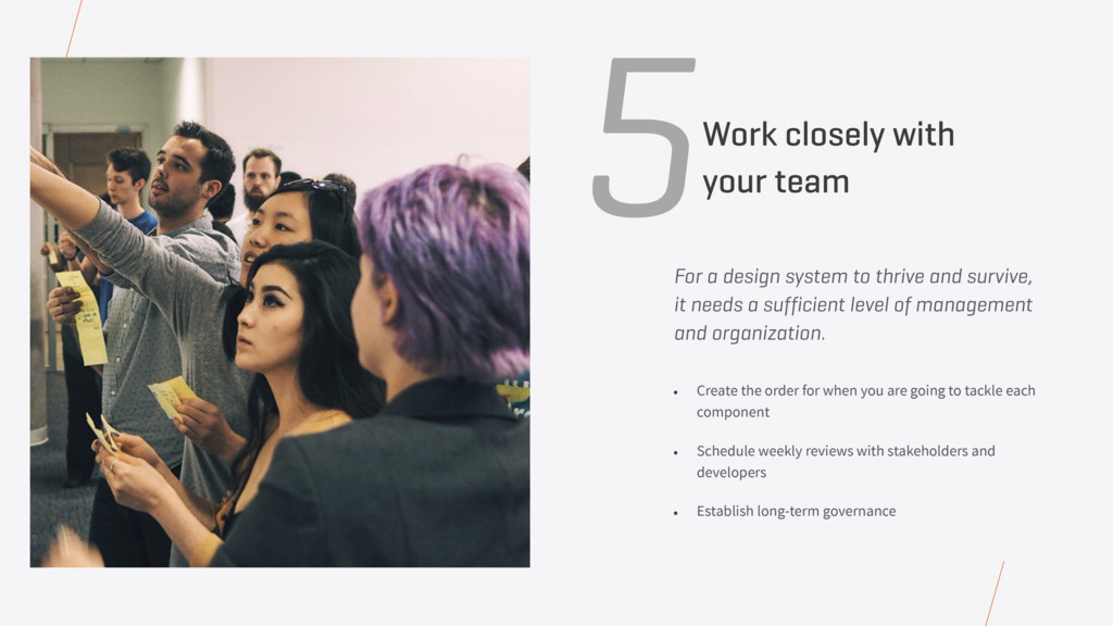
a sufficient level of management and organization. • Create the order for when you are going to tackle each component • Schedule weekly reviews with stakeholders and developers • Establish long-term governance 5Work closely with your team
Take into account all of the software you have today when designing, and frequently refer back to the results of the component cut up for reference. Your Users Who are you designing for? Are your users bank tellers, auto mechanics, grandparents? How are they accessing your software? For how many hours a day? Remember that designers and devs are also users of the design system.
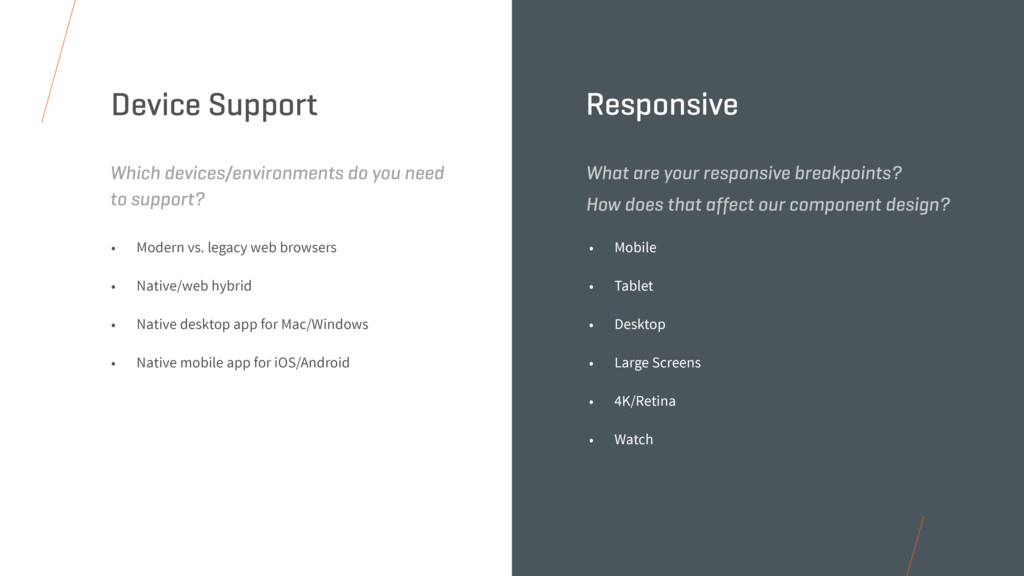
Native desktop app for Mac/Windows • Native mobile app for iOS/Android Which devices/environments do you need to support? Device Support • Mobile • Tablet • Desktop • Large Screens • 4K/Retina • Watch What are your responsive breakpoints? How does that affect our component design? Responsive
with disabilities from the start • Maintain reasonable contrast ratio between text and background colors • 4:5:1 for small text • 3:1 for large text • Use online tools • wave.webaim.org • colorsafe.co Do you need Section 508 and WCAG 2.0 compliance? Accessibility • Make your CSS highly configurable • Select smart defaults by making the contrast between colors as high as possible • Leverage color algorithms in your CSS preprocessor for dummy-proof color schemes • Consider providing a Light UI or Dark UI for different environments Does your experience need to be easily themed or rebranded? White-Label
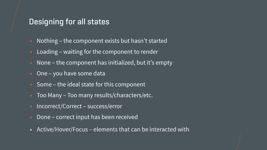
Loading – waiting for the component to render • None – the component has initialized, but it’s empty • One – you have some data • Some – the ideal state for this component • Too Many – Too many results/characters/etc. • Incorrect/Correct – success/error • Done – correct input has been received Designing for all states • Active/Hover/Focus – elements that can be interacted with
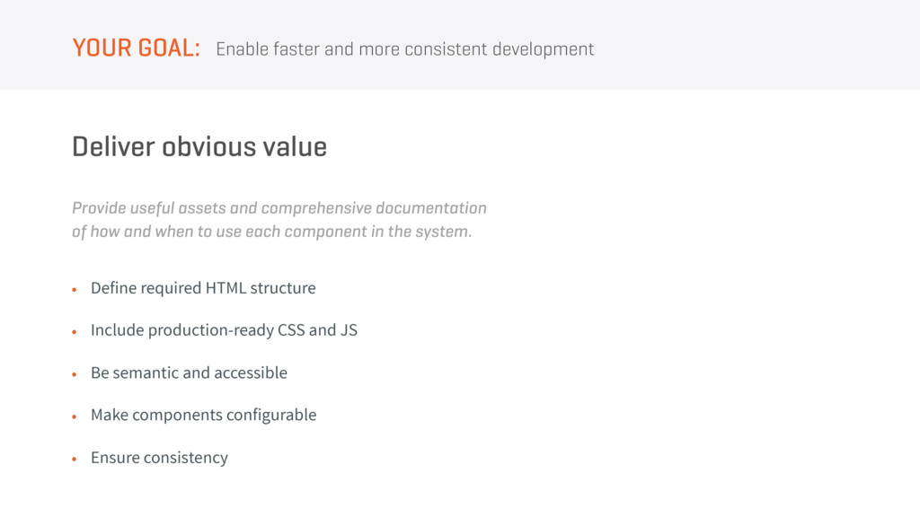
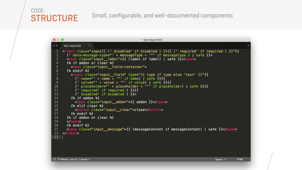
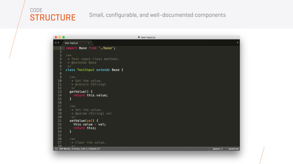
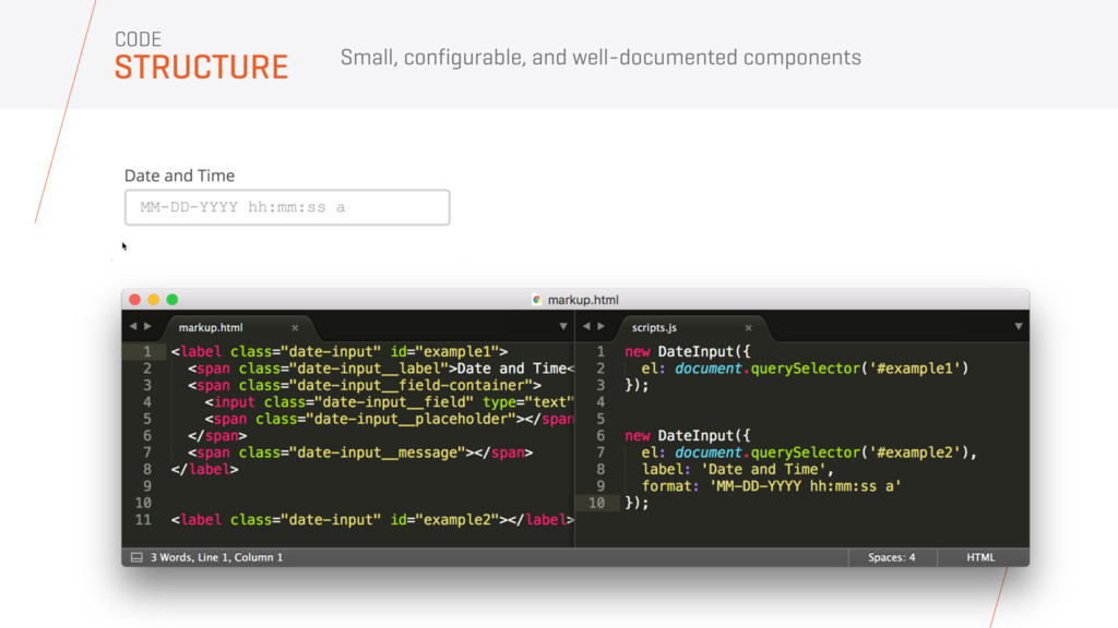
not be coupled to one. Build self-contained components • Create a prescriptive application template • Build on or for one particular framework DO NOT • Focus on building long-lasting vanilla HTML/CSS/JS • Keep your components “dumb” • Consider all your systems DO Enable faster and more consistent development YOUR GOAL:
to use each component in the system. Deliver obvious value Enable faster and more consistent development YOUR GOAL: • Define required HTML structure • Include production-ready CSS and JS • Be semantic and accessible • Make components configurable • Ensure consistency
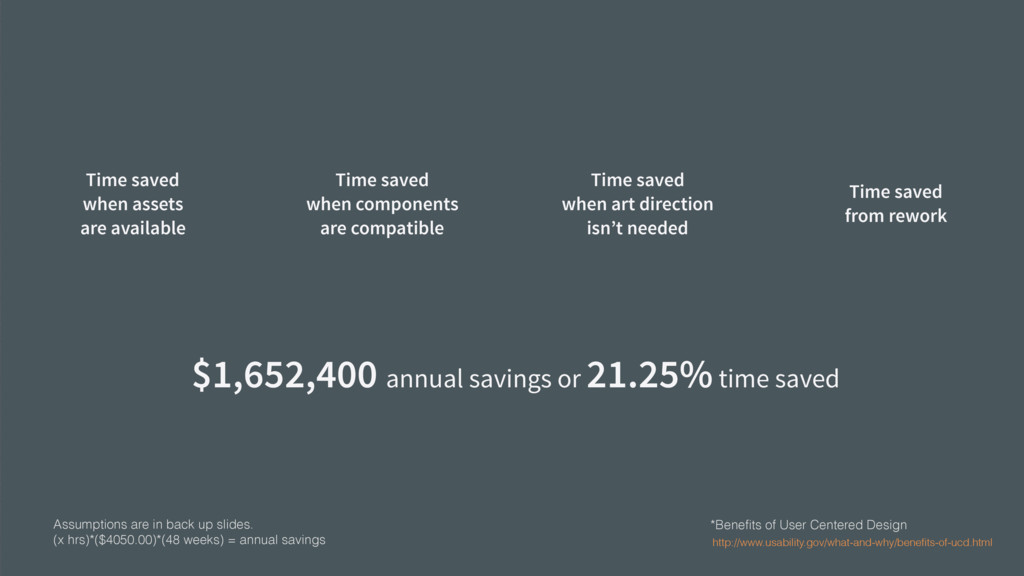
21.25% time saved Assumptions are in back up slides. (x hrs)*($4050.00)*(48 weeks) = annual savings 100 devs each save 2 hrs per week = $388,800 annual savings* 100 devs each save 30 min per week = $97,200 annual savings* 100 devs each save 5 hrs per week = $972,000 annual savings* 100 devs each save 1 hr per week = $194,400 annual savings* Time saved when art direction isn’t needed Time saved from rework Time saved when components are compatible Time saved when assets are available
• Save time and money • Increase consistency • Decrease maintenance • UX teams focus on the experience, dev teams on implementation • Improve user experience through well-defined and learned behaviors BENEFITS OF A DESIGN SYSTEM
 shift_evolve
 kentarofujii
 jnchito
 kakehashi
 takasehideki
 kozotaira
 yoshiki0705
 masayoshimaezawa
 bash0c7
 jukishiya
 sugupoko
 tammyeverts
 apolaine
 techseoconnect
 jonoalderson
 maltzj
 mfonobong
 kneath
 codingconduct
 jmmastey
 reverentgeek
 palkan