Upgrade to Pro — share decks privately, control downloads, hide ads and more …

CSS Animation to Tell a Story

CSS Animation to Tell a Story

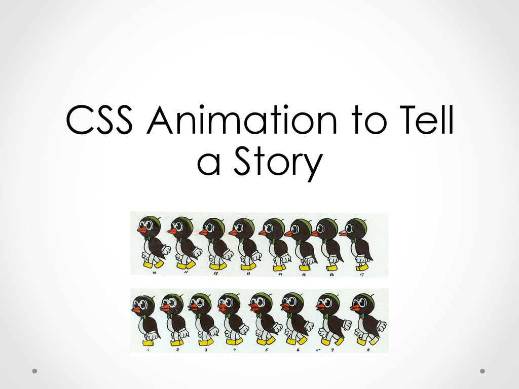
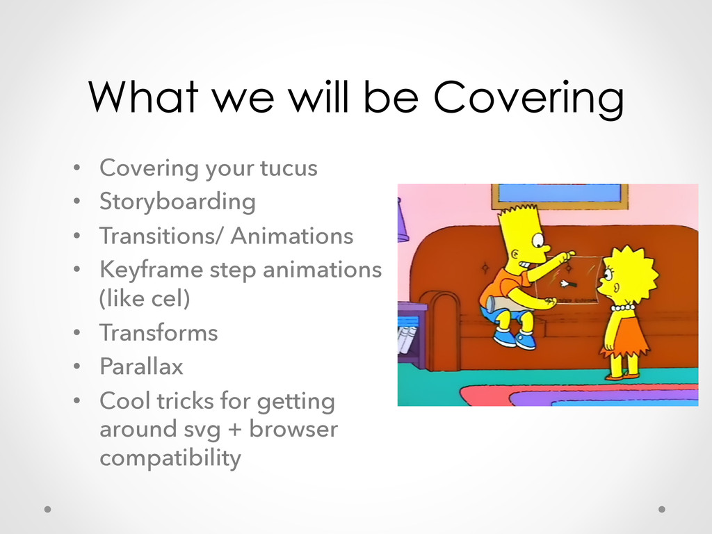
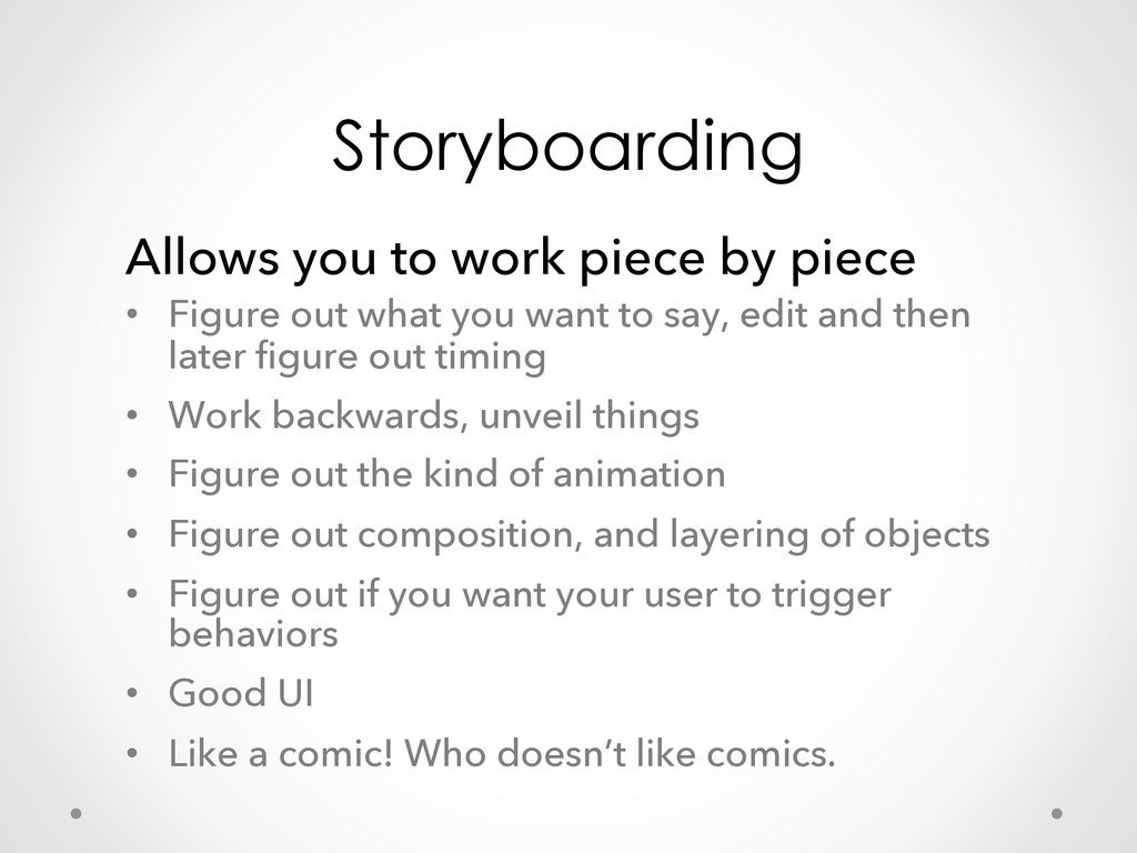
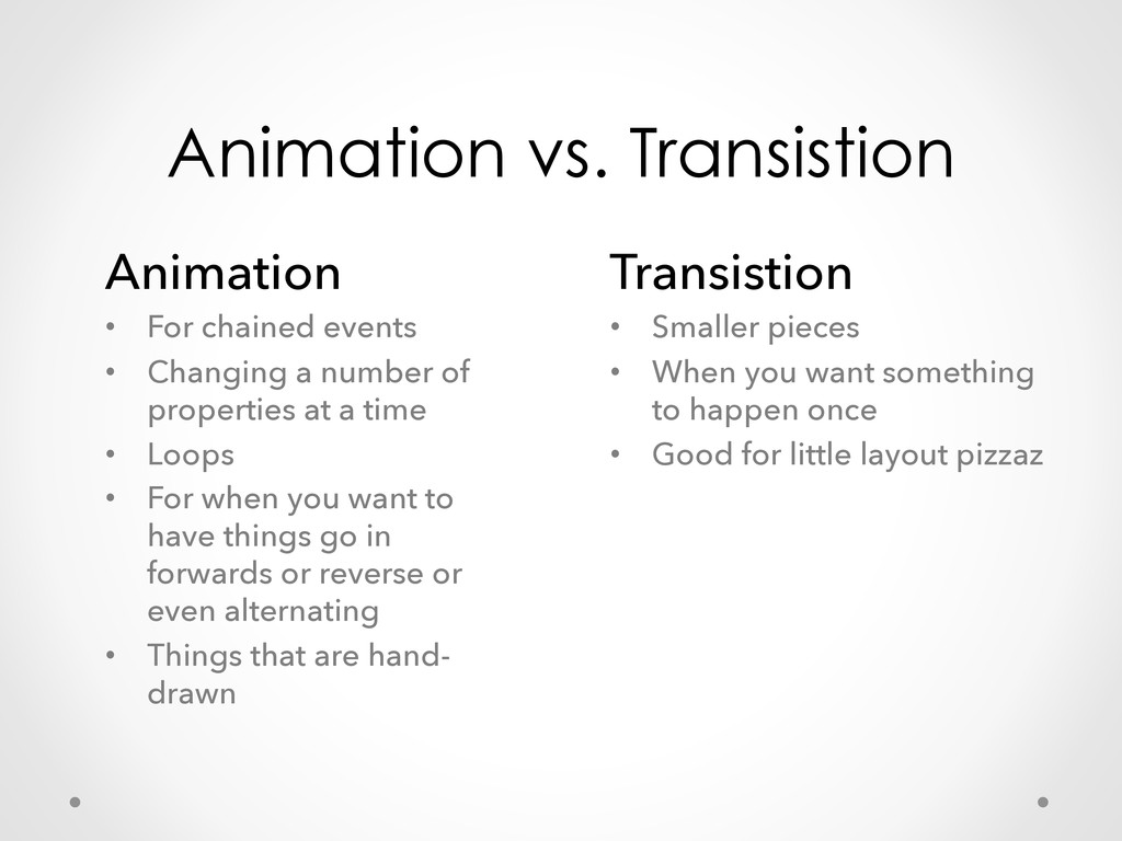
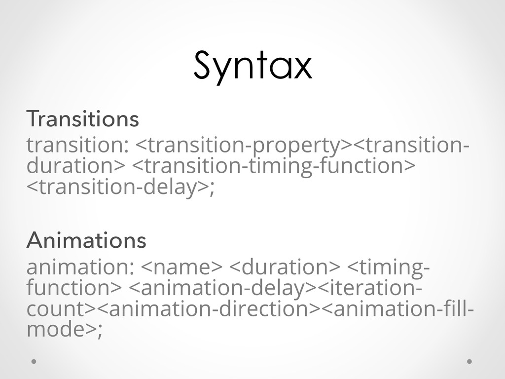
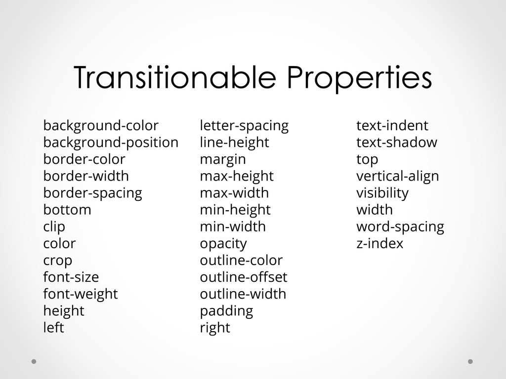
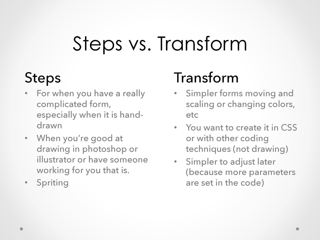
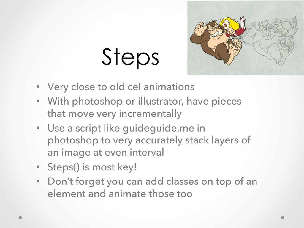
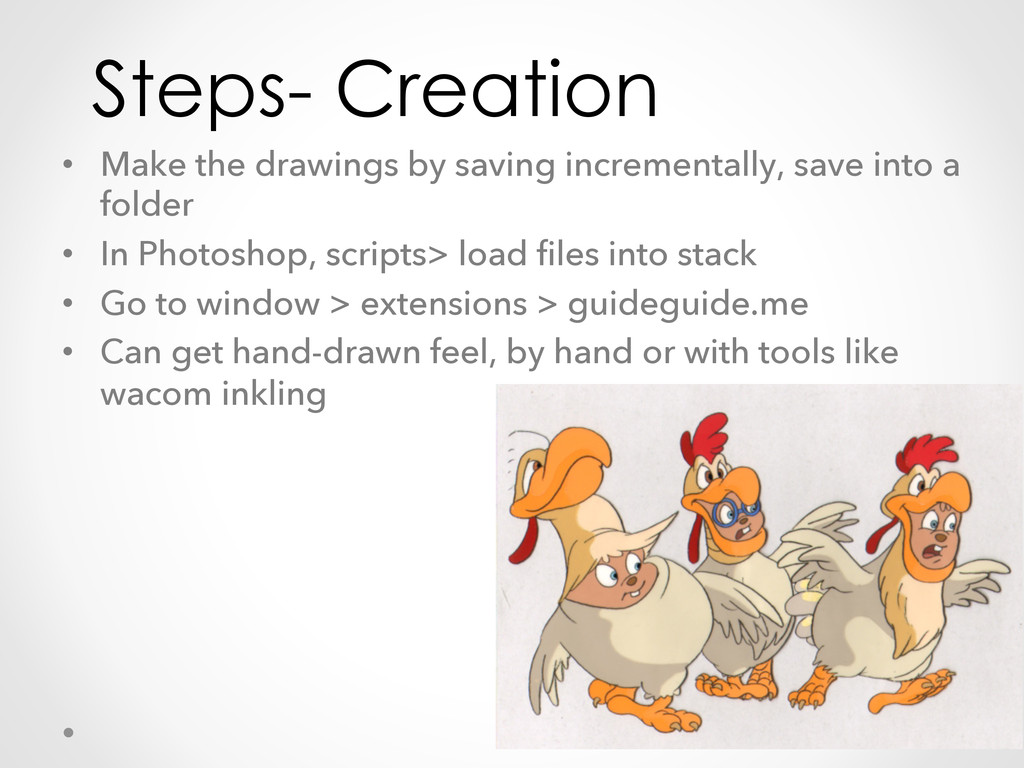
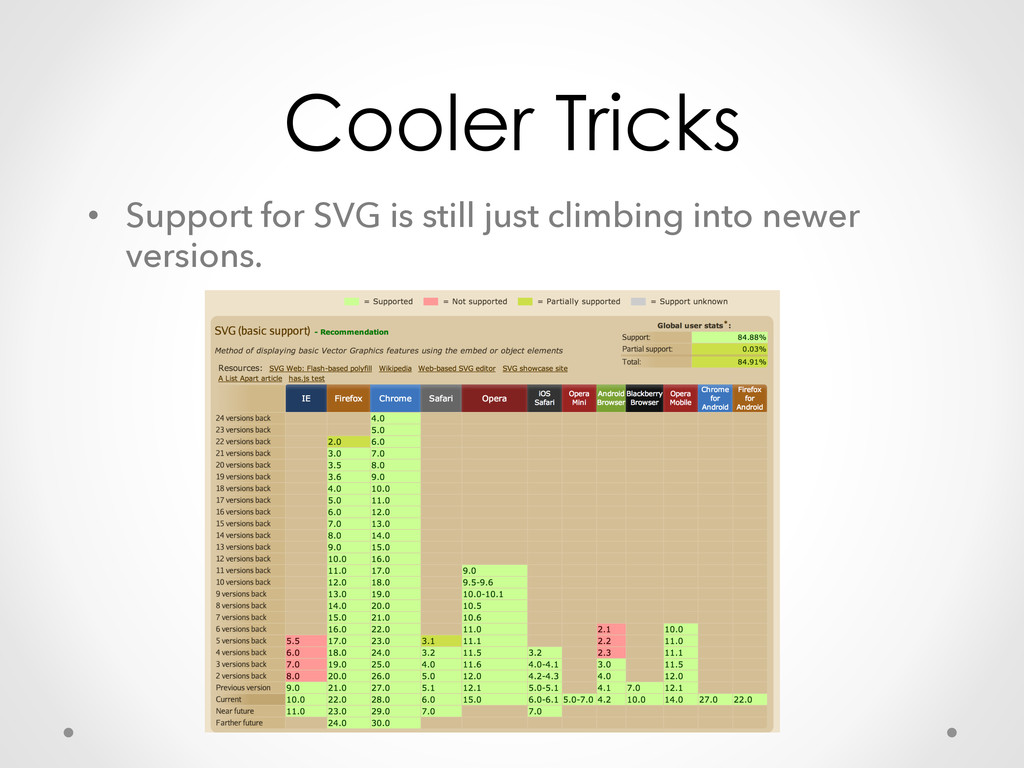
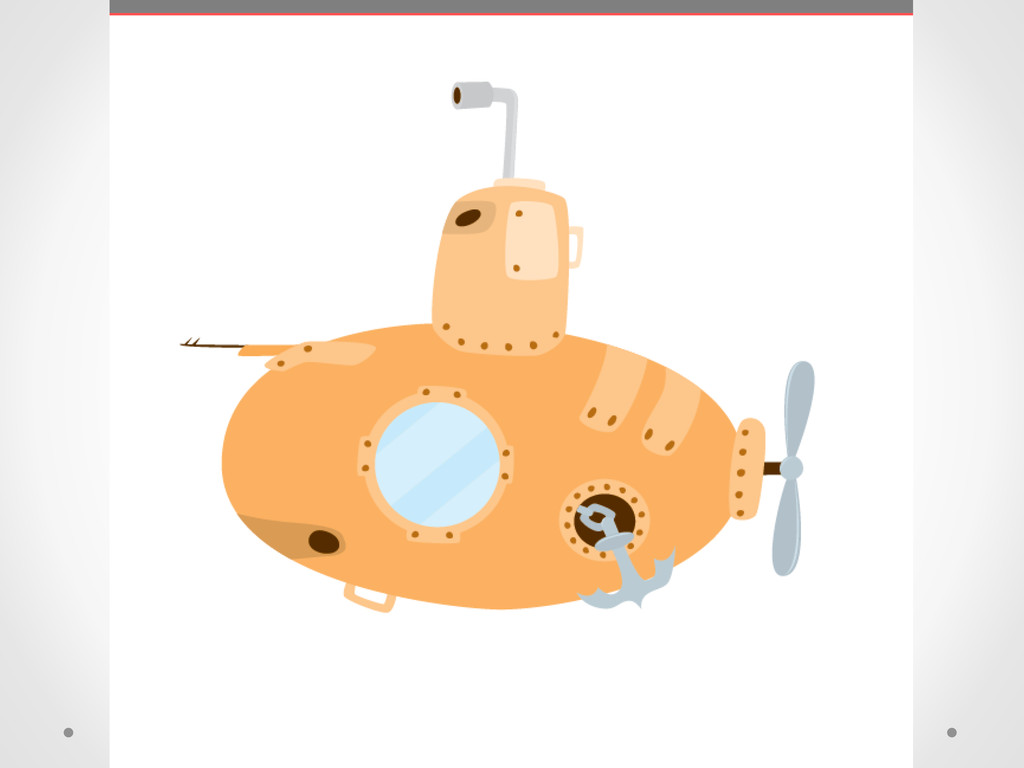
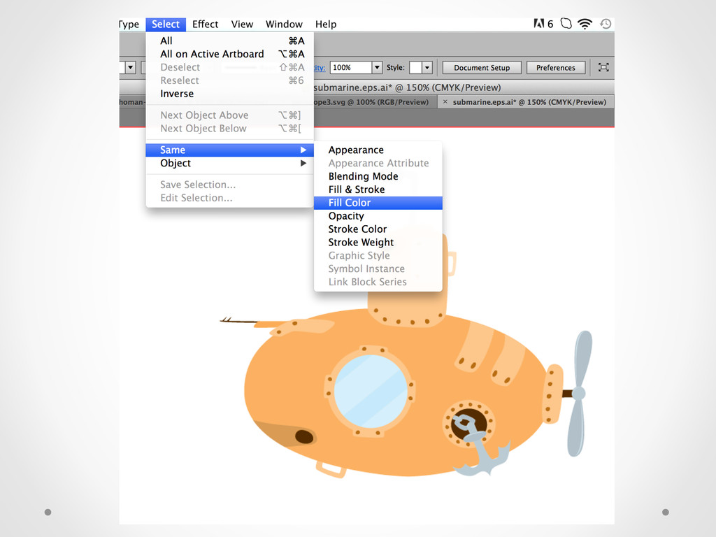
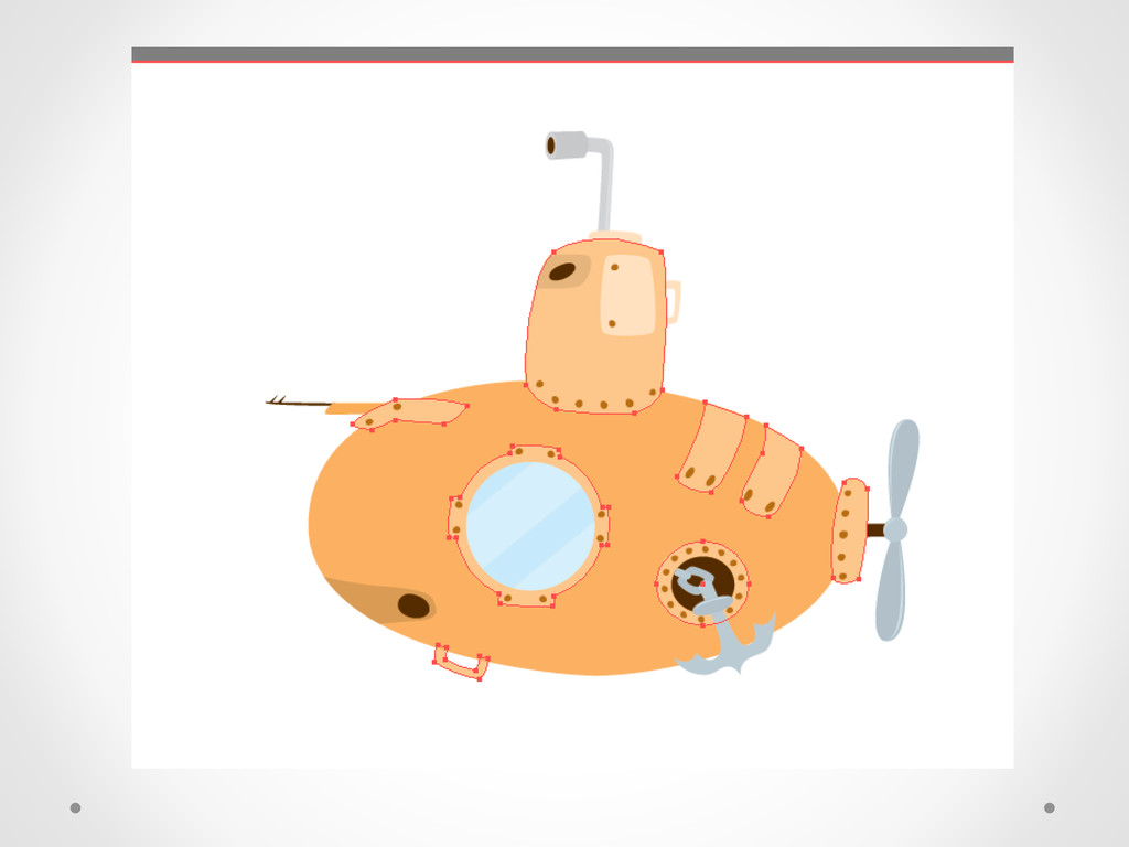
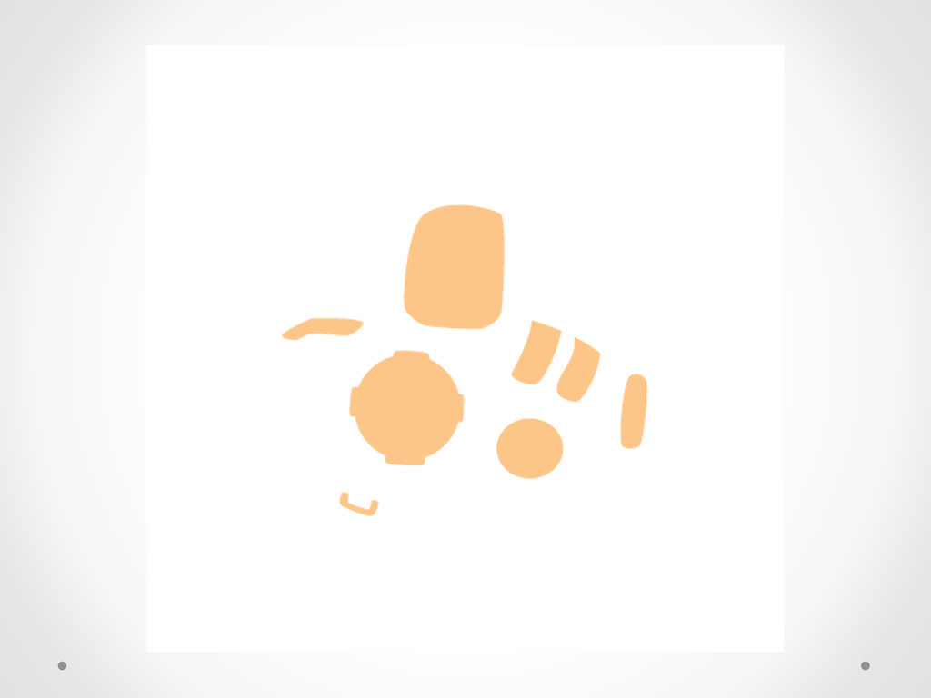
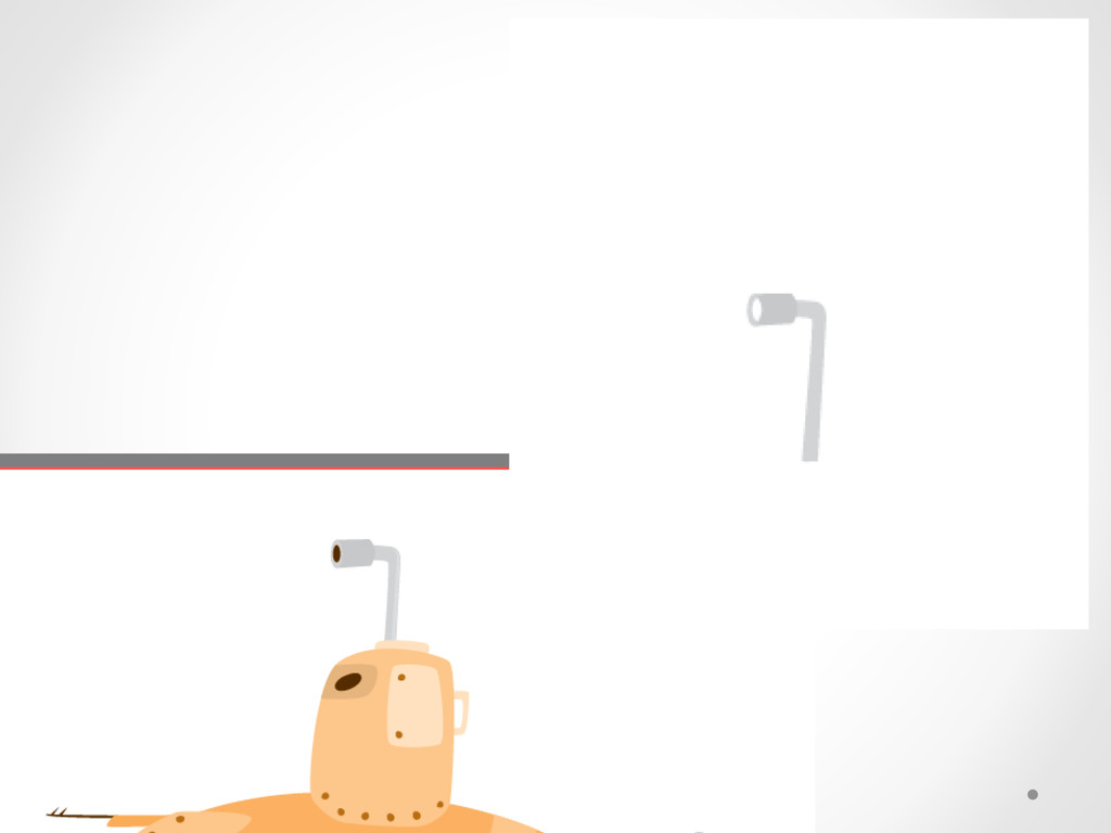
Using advanced techniques, we will be constructing engaging CSS animations with very little to no jQuery. Through the creation of scalable graphics we will emphasize using the smallest amount of code for maximum impact and show when it is appropriate to use transitions versus animations and even how to combine them. We will look at current support for techniques across browsers, and spacial depth with foreground, middleground, and background. We will also be discussing the use of storyboarding to work out ideas to cut down on editing time and the composition of a nuanced character, even if the character is a concept.

Avatar for Sarah Drasner

Sarah Drasner

July 25, 2013
Tweet

Other Decks in Technology

Transcript

  1. Sarah Drasner Basho Technologies Riak, an open source, distributed database

    @sarah_edo on twitter http://codepen.io/sdras artemist on github
  2. What we will be Covering •  Covering your tucus • 

    Storyboarding •  Transitions/ Animations •  Keyframe step animations (like cel) •  Transforms •  Parallax •  Cool tricks for getting around svg + browser compatibility
  3. What we are not Covering •  3-D animations •  Preprocessors

    and mixins (though totally rockin) •  Responsive •  Audio, though I will use just a little 
  4. Before we Begin Animating Prefix-free! Created by Lea Verou - 

    Minified it’s only 2KB (!!!) -  Remember @imported files not supported -  Not actually all that good for gradients because there are two different syntaxes for versions in Chrome -  Don’t even front, it’s awesome -  7 sec animation- from 1500, to 410 lines!
  5. Before we Begin Animating Warning for unsupported browsers •  Leverage

    modernizr, production tab •  Go to the page, make shivs for o  2-D animation o  3-D animation o  @fontface o  3-D transforms o  CSS transitions o  html5 shiv o  background-size o  hsla() •  <html class="no-js" lang="en"> •  Use a little jQuery magic, link to supported browsers
  6. Storyboarding Allows you to work piece by piece •  Figure

    out what you want to say, edit and then later figure out timing •  Work backwards, unveil things •  Figure out the kind of animation •  Figure out composition, and layering of objects •  Figure out if you want your user to trigger behaviors •  Good UI •  Like a comic! Who doesn’t like comics.
  7. Animation vs. Transistion Animation •  For chained events •  Changing

    a number of properties at a time •  Loops •  For when you want to have things go in forwards or reverse or even alternating •  Things that are hand- drawn Transistion •  Smaller pieces •  When you want something to happen once •  Good for little layout pizzaz
  8. Syntax Transitions transition: <transition-property><transition- duration> <transition-timing-function> <transition-delay>; Animations animation: <name>

    <duration> <timing- function> <animation-delay><iteration- count><animation-direction><animation-fill- mode>;
  9. Transitionable Properties background-color background-position border-color border-width border-spacing bottom clip color

    crop font-size font-weight height left letter-spacing line-height margin max-height max-width min-height min-width opacity outline-color outline-offset outline-width padding right text-indent text-shadow top vertical-align visibility width word-spacing z-index
  10. Transform So many properties! •  Skew (based on coordinates) o 

    Transform: skewX(0.5); or skewY(0.5); or skew(0.5, 1); •  Translate (based on coordinates) o  Transform: translateX(0.5); or translateY(0.5); or translate(0.5, 1); •  Matrix (based on coordinates) o  Transform: matrix(a, b, c, d, tx, ty); o  http://peterned.home.xs4all.nl/matrices/ •  Rotate (clockwise, counter-clockwise) o  Transform: rotate(10deg); •  Scale (solid numbers or decimal) o  Transform: scale(0.5); or scale(0.5, 1); *and don’t forget transform-origin (default is center)
  11. Other Things So many properties! •  Opacity- this is key.

    Don’t use display:none; •  For simple interactivity, use pseudo elements like :hover, :active, :target, etc •  Never use js when a transition will do •  Can use class and hover state for same transition/ animation with many different objects
  12. Animation So many properties! •  Animation-name o  You pick • 

    Animation-duration o  In seconds (s) or milliseconds (ms) •  Animation-timing-function o  Linear, ease, ease-in, ease-out, ease-in-out, cubic-bezier (#) o  See http://cubic-bezier.com •  Animation-delay o  Same with s and ms, really key for multiple animations •  Animation-iteration-count o  Number times it runs, or infinite for loop •  Animation-direction o  Normal, reverse, alternate (every other), reverse-alternate (same but starts in reverse) •  Animation-fill-mode o  forwards, backwards, none, both o  Val Head: http://www.valhead.com/2013/01/04/tutorial-css-animation-fill- mode/
  13. Syntax animation: <name> <duration> <timing-function> <animation-delay><iteration-count><animation- direction><animation-fill-mode>; *the order is

    not that important except for the time elements (duration, animation-delay, and iteration count). @keyframes { 0% { } 100% { /* things you want to have happen */ } } *actually you don’t need the 0% if its set at nothing.
  14. Syntax animation: <name> <duration> <timing- function> <animation-delay><iteration- count><animation-direction><animation- fill-mode>; There

    is also animation-play-state: paused/running; good for if you want to use jQuery to trigger events
  15. Steps vs. Transform Steps •  For when you have a

    really complicated form, especially when it is hand- drawn •  When you’re good at drawing in photoshop or illustrator or have someone working for you that is. •  Spriting Transform •  Simpler forms moving and scaling or changing colors, etc •  You want to create it in CSS or with other coding techniques (not drawing) •  Simpler to adjust later (because more parameters are set in the code)
  16. Steps •  Very close to old cel animations •  With

    photoshop or illustrator, have pieces that move very incrementally •  Use a script like guideguide.me in photoshop to very accurately stack layers of an image at even interval •  Steps() is most key! •  Don’t forget you can add classes on top of an element and animate those too
  17. Steps- Creation •  Make the drawings by saving incrementally, save

    into a folder •  In Photoshop, scripts> load files into stack •  Go to window > extensions > guideguide.me •  Can get hand-drawn feel, by hand or with tools like wacom inkling
  18. Steps- Tips •  Use imageoptim for superior image compression: http://imageoptim.com/

    •  Make a container for the animated image •  Absolutely position that element •  Test on localhost with MAMP while you are trying things out: http://www.mamp.info/en/index.html •  Don’t forget you can add classes on top of an element and animate those too!
  19. Parallax Powerful technique for creating the illustion of 3-Dimensional space

    This: https://github.com/404 (we’ve all seen it, it’s ok) Changing depending on the point of view of the viewer, and depth of field is key. But no js! Alexis Goldstein- Learning CSS3 Animations and Transitions
  20. Things you need! •  The background image must scroll seamlessly

    •  The background image should be 2x the size of the area where your animation is •  Absolutely position, z-index it back if needed and then move it off the canvas the length of the image •  In this animation, we will negatively apply the width and then infinite loop it in the animation properties
  21. Cool Tricks •  Have two background images and the higher

    z-index value is mostly transparent •  Have secondary elements or characters in middleground •  Make sure you cut your images well and have a small 2px feather on the border of the topmost image if it’s got dimension •  Think foreground, middleground, background and make sure the things that are farther away are smaller and lower contrast •  Use device orientation! Good documentation here: https://developer.mozilla.org/en-US/docs/Web/Guide/DOM/ Events/Using_device_orientation_with_3D_transforms
  22. Yet another example! Let’s just watch coding cartoons all day.

    This, all drawn with CSS (I didn’t make this one) http://codepen.io/m-kafiyan/pen/yhvgF This is awesome, but there’s a better way.
  23. Cooler Tricks •  Support for SVG is still just climbing

    into newer versions and the syntax for coding can be complex •  You already know fonts. And fonts are just svgs. •  Fontagrapher5 or icomoon.io app
  24. Chained events •  Combo of prefix-free and font-icons means such

    a small amount of code that you can add keyframes galore without bloating up your load time •  Create chained events with timing delays •  Trigger new events with user interactivity to the next parts of the animation (use js to fire it off)