Let's learn about emails! This presentation has three parts:
1) Brief history of email (or, how did we get here?)
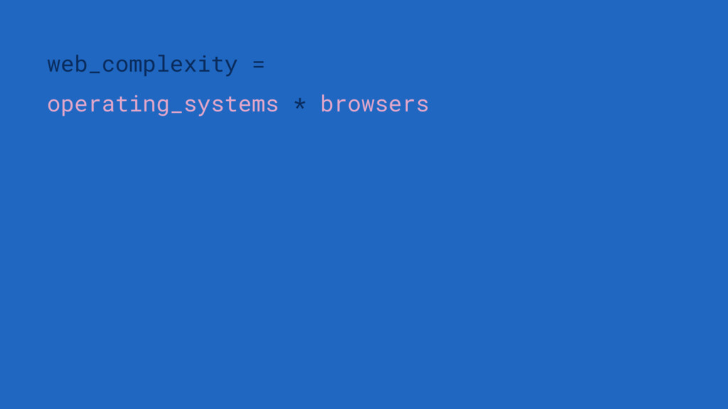
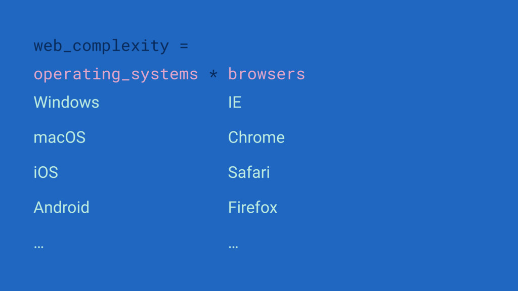
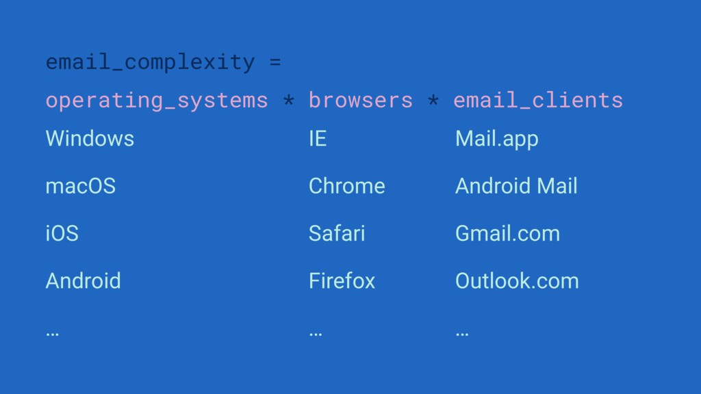
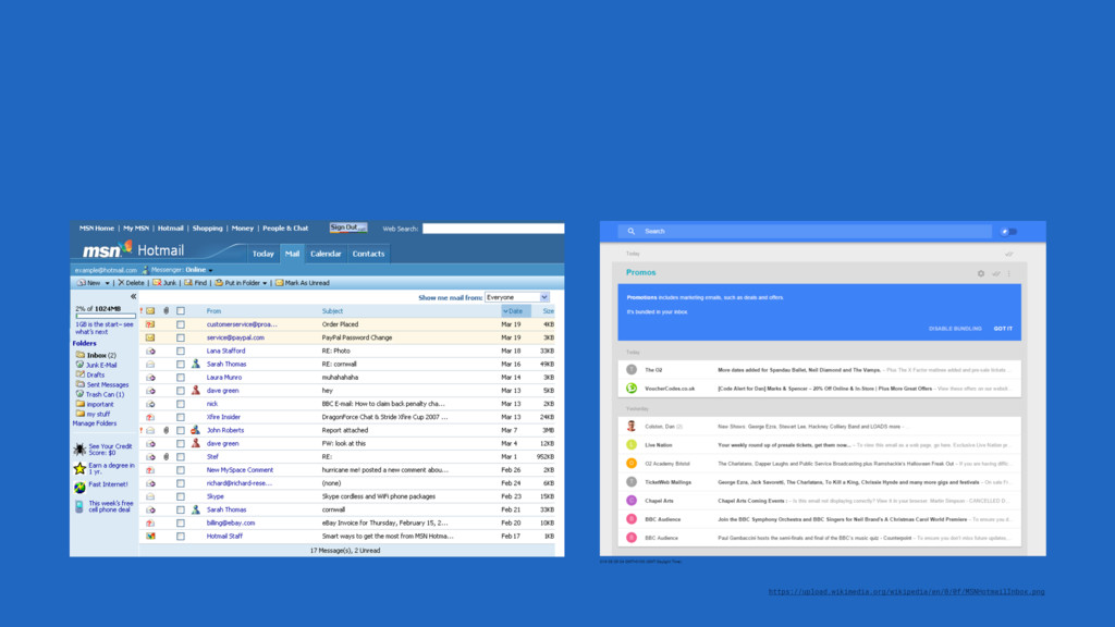
2) State of email in 2016 (or, why is email so complicated?)
3) Building good emails (or, how do we get around these complexities?)
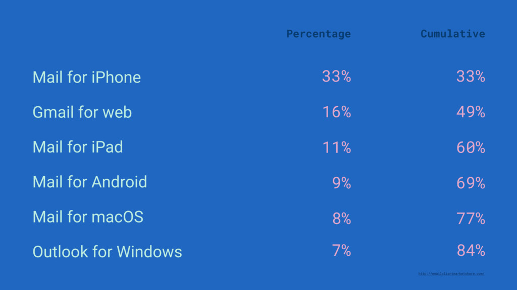
for web Mail for iPad Mail for Android Mail for macOS Outlook for Windows http://emailclientmarketshare.com/ Percentage Cumulative 33% 49% 60% 69% 77% 84%
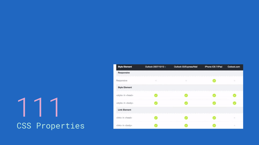
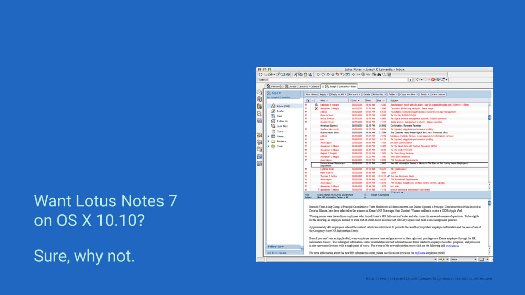
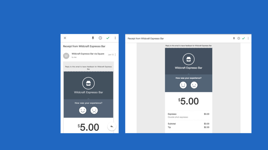
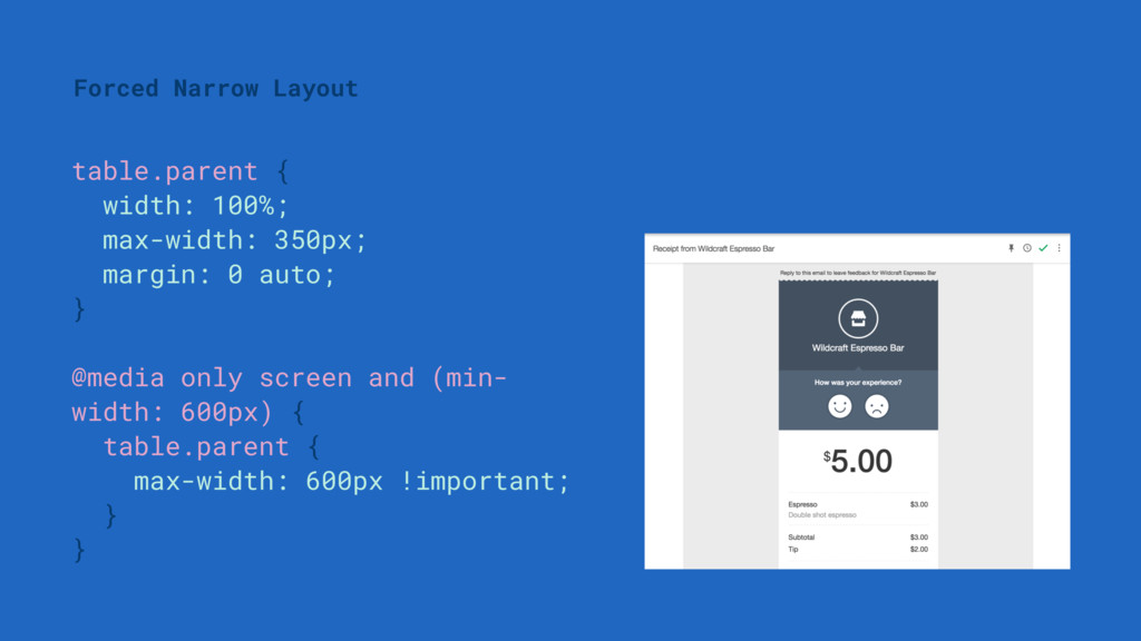
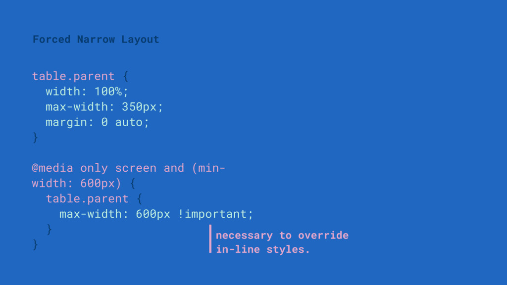
I can just link to a CSS file on my server. Sorry, Gmail doesn’t support that. And Gmail accounts for 16% of emails. Okay, how about I declare my CSS in a <style> tag at the top?
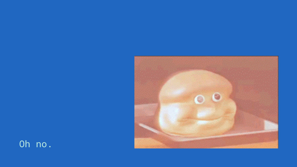
I can just link to a CSS file on my server. Sorry, Gmail doesn’t support that. And Gmail accounts for 16% of emails. Okay, how about I declare my CSS in a <style> tag at the top? Oh no.
 billyroh
 yud0uhu
 wxyzzz
 prgckwb
 watany
 nari_ex
 hr01
hr01
 ks91
ks91
 nrinetcom
 yuksew
 k_adachi_01
 yoshimi0227
 chmikata
 katarinadahlin
 tomoyanonymous
 lauravandoore
 varn
varn
 cassininazir
 sonatard
 aleyda
 asonas
 destraynor
 sabderemane
 sarafernandez
 lindahogenes
![<body> <!--[if gte mso 9]> <style> // Styling goes here](https://files.speakerdeck.com/presentations/e1e9960b1d6b4caf8e2f53d60555512d/slide_82.jpg)
![<body> <!--[if gte mso 9]> <style> // Styling goes here](https://files.speakerdeck.com/presentations/e1e9960b1d6b4caf8e2f53d60555512d/slide_83.jpg)