every medium " Desktop, tablet, phone, tv, refrigerator ! Don’t/Chase/A/Plaeorm/ " Today’s iPhone may be tomorrow’s Blackberry " Platform changes effect your app " iPhone 4 vs iPhone 5 " Retina vs non-retina ! S@ll/App/Ready/ " Step 1: Wrap it in PhoneGap " Step 2: Publish it to the app store " Step 3: Get interviewed by TechCrunch / /
" Defining baseline functionality for resolutions ! Tes@ng/ " Build " Check on iPad (Looks great!) " Rotate iPad to landscape (Looks like crap) " Rinse and repeat " The Scotch is open by 9:30 AM ! Media/Queries/Not/Supported/On/IE/8/And/Lower/ " Not too many mobile devices running IE 8 " RespondJS /
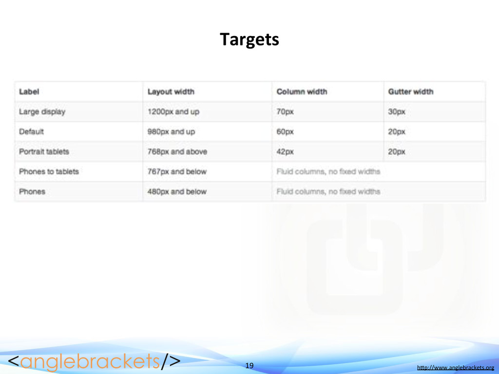
the width of the grid " Stack elements when necessary " Resize text when necessary ! Not/Included/In/Bootstrap.css/ " You must actively include bootstrap-responsive.css
media queries responsibly and only as a start to your mobile audiences. For larger projects, do consider dedicated code bases and not layers of media queries.” ! If/you/are/going/to/do/RWD,/get/a/browser/that/you/LOVE/ ! Your/site/is/either/responsive/or/unresponsive/ " Having an unresponsive site is the same as telling users on mobile devices to just go away ! Double]tapping/to/read/text/is/so/2000/and/late/ " Honestly. This sort of UX makes me physically ill.
 burkeholland
 sh_fk2
 zozotech
 sansantech
 cmusudakeisuke
 wyamazak_devrel
 yamaguchitk333
 hiranabe
 miichan
 nikkei_engineer_recruiting
 line_developers_tw
 jhashimoto
 icck
icck
 akihiro_kokubo
 jakevdp
 soudai
 427marketing
 gurzu
gurzu
 katiecoart
 aleyda
 honnibal
 bcantrill
 kneath
 eitanlees
 carmenintech
![11" " h$p://www.anglebrackets.org " " Sample/Media/Queries/ body/{/ ////background]color:/lime;/ }/ /](https://files.speakerdeck.com/presentations/0fff30608382013085ff123138098c12/slide_10.jpg)
![16" " h$p://www.anglebrackets.org " " TwiBer/Bootstrap/ ! “Sleek,/intui@ve/and/powerful/front]end/framework/for/faster/and/easier/ web/development”/ !](https://files.speakerdeck.com/presentations/0fff30608382013085ff123138098c12/slide_15.jpg)