Upgrade to Pro
— share decks privately, control downloads, hide ads and more …
Speaker Deck
Features
Speaker Deck
PRO
Sign in
Sign up for free
Search
Search
Mobile and Responsive Design with Sass
Search
Sponsored
·
Your Podcast. Everywhere. Effortlessly.
Share. Educate. Inspire. Entertain. You do you. We'll handle the rest.
→
canarymason
July 27, 2012
Design
260
3
Share
Embed
Copy iframe code
Copy JS code
Copy link
Start on current slide
Mobile and Responsive Design with Sass
What is a Sass, and how will I know if I'm shaking it?
canarymason
July 27, 2012
More Decks by canarymason
See All by canarymason
Living Style Guides In Sass
canarymason
3
420
The Coding Designer's Survival Kit
canarymason
8
540
Other Decks in Design
See All in Design
Connpass-Xperia_Camera_App_by_HCD.pdf
sony
1
690
開発・制作におけるUI・UXデザインの重要性について~UI・UXデザインってなんだろう~
yamasaku
0
130
「見せる」登壇資料デザインの極意
takanorip
4
1.1k
decksh object reference
ajstarks
2
1.7k
広い関与の可能性に どう向き合うのか? 私たちは。|Timee MarketingDesign 2026-06-18
bebe
0
250
工房としてのAI ── デザイナー、作家、ビルダー
hiranotomoki
0
330
30分でわかるインサイトマネジメント(2025年12月バージョン)
centou
1
690
ClaudeCodeでマーケターの課題を解決する
kenichiota0711
11
14k
再設計される業務 - AIにより再設計される "デザインワークフロー" / AI Ops Lab #2 Redesigned orkflows
kgsi
0
760
20260309_3月ICTデザイン勉強会_地域創生2.0
a2k
0
140
AIスライド生成を進化させるMDファイル
kenichiota0711
1
1.4k
CULTURE DECK/Marketing Director
mhand01
0
1.4k
Featured
See All Featured
From Legacy to Launchpad: Building Startup-Ready Communities
dugsong
0
260
A Modern Web Designer's Workflow
chriscoyier
698
190k
技術選定の審美眼(2025年版) / Understanding the Spiral of Technologies 2025 edition
twada
PRO
118
120k
Visualization
eitanlees
152
17k
Understanding Cognitive Biases in Performance Measurement
bluesmoon
32
3k
Evolving SEO for Evolving Search Engines
ryanjones
0
240
How to make the Groovebox
asonas
2
2.3k
AI Search: Where Are We & What Can We Do About It?
aleyda
0
7.7k
Building a Modern Day E-commerce SEO Strategy
aleyda
45
9.1k
Organizational Design Perspectives: An Ontology of Organizational Design Elements
kimpetersen
PRO
1
760
GraphQLとの向き合い方2022年版
quramy
50
15k
エンジニアに許された特別な時間の終わり
watany
107
250k
Transcript
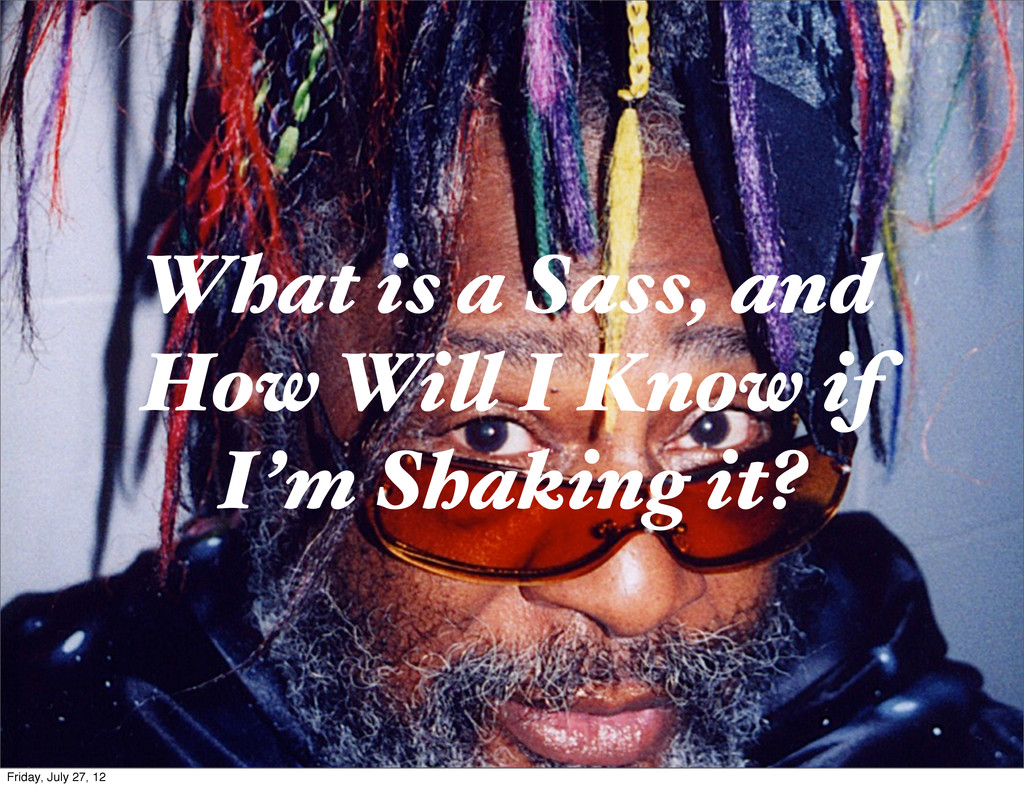
What is a Sass, and How Will I Know if
I’m Shaking it? Friday, July 27, 12
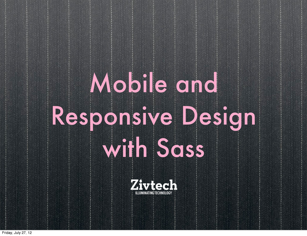
Mobile and Responsive Design with Sass Friday, July 27, 12
I Friday, July 27, 12
Mobile First Friday, July 27, 12
The Mobile Web? Friday, July 27, 12
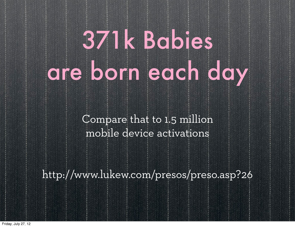
371k Babies are born each day Compare that to 1.5
million mobile device activations http://www.lukew.com/presos/preso.asp?26 Friday, July 27, 12
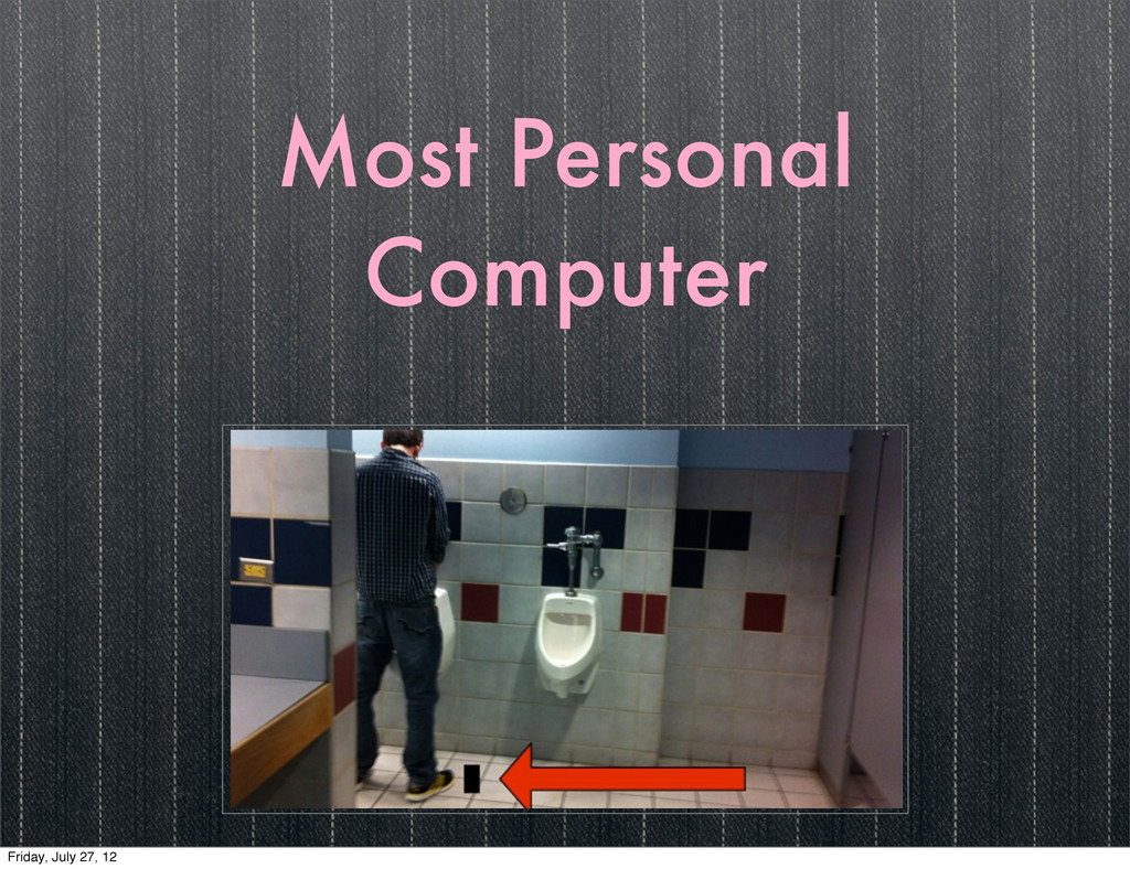
Most Personal Computer Friday, July 27, 12
Most Personal Computer Friday, July 27, 12
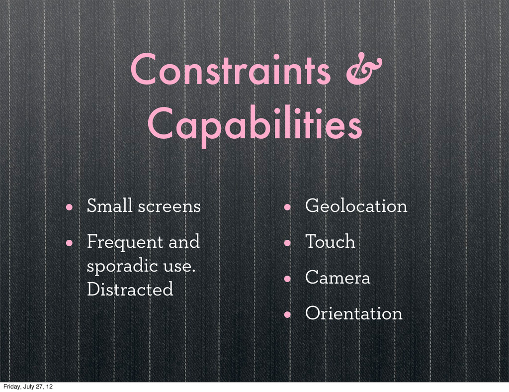
Constraints & Capabilities • Small screens • Frequent and sporadic
use. Distracted • Geolocation • Touch • Camera • Orientation Friday, July 27, 12
II Friday, July 27, 12
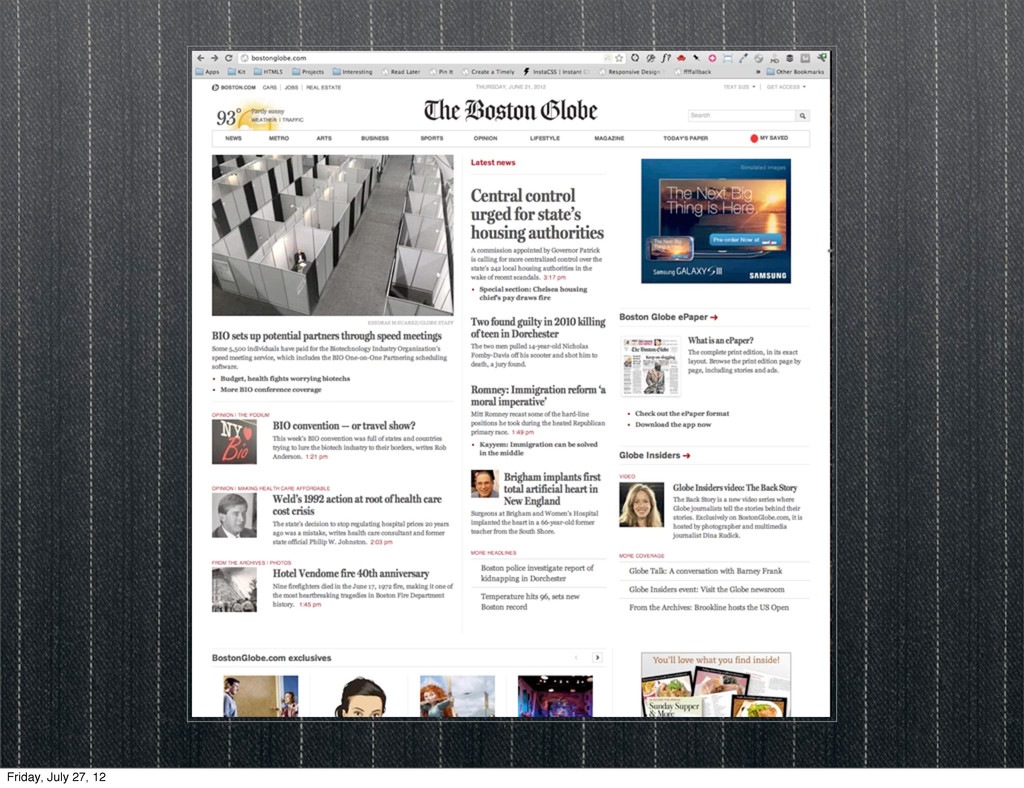
Responsive Web Design Friday, July 27, 12
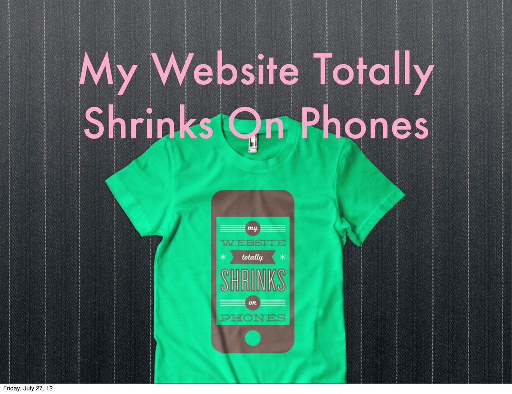
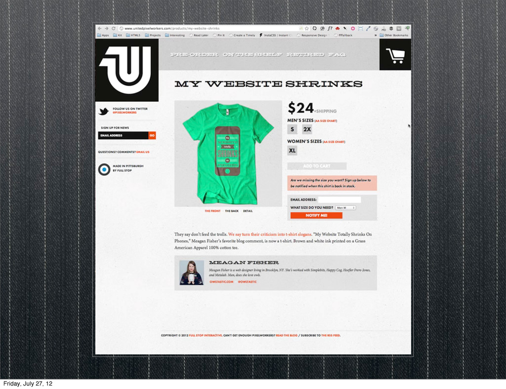
My Website Totally Shrinks On Phones Friday, July 27, 12
Friday, July 27, 12
Friday, July 27, 12
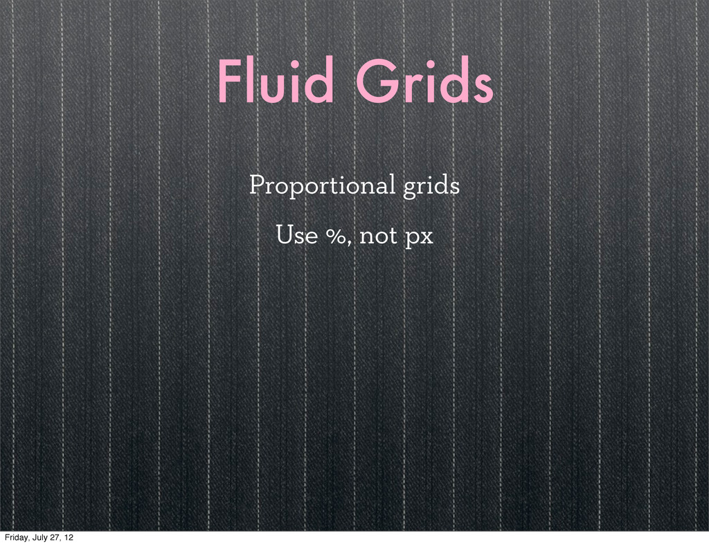
Fluid Grids Proportional grids Use %, not px Friday, July
27, 12
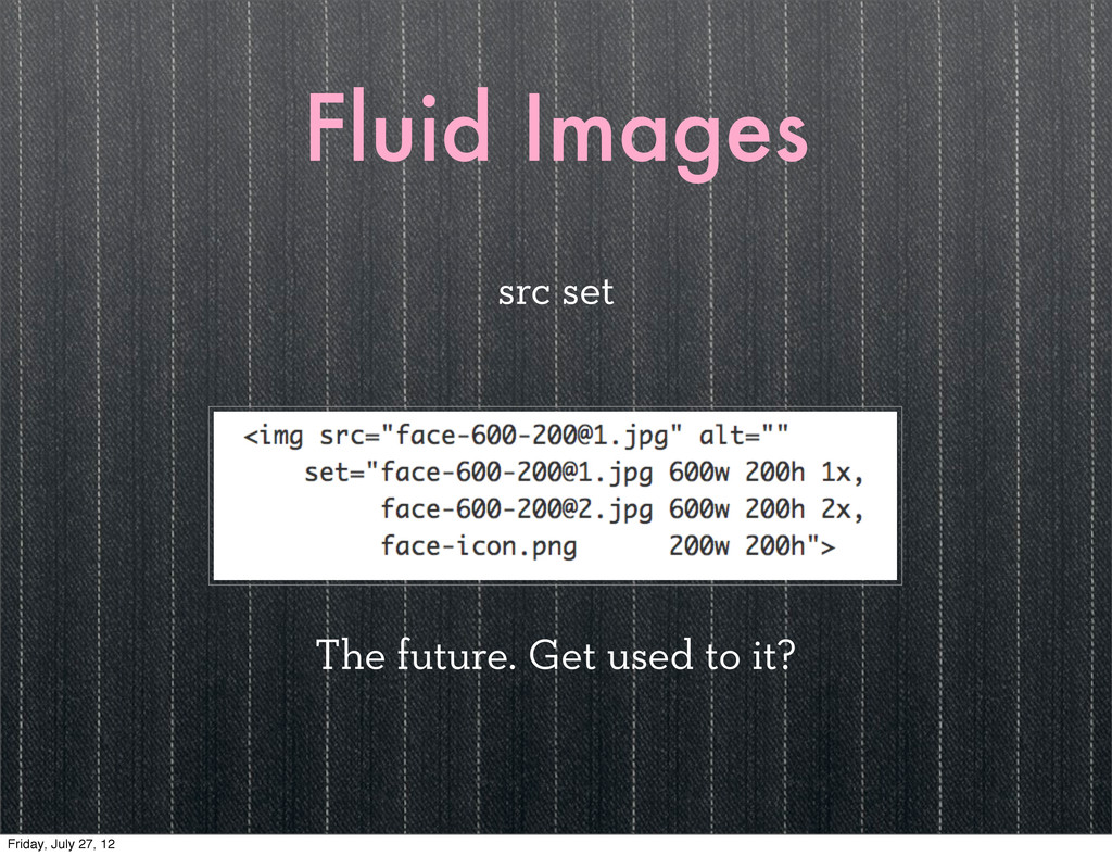
Fluid Images src set The future. Get used to it?
Friday, July 27, 12
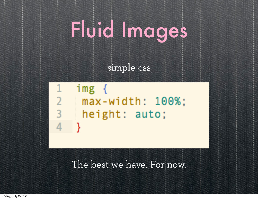
Fluid Images simple css The best we have. For now.
Friday, July 27, 12
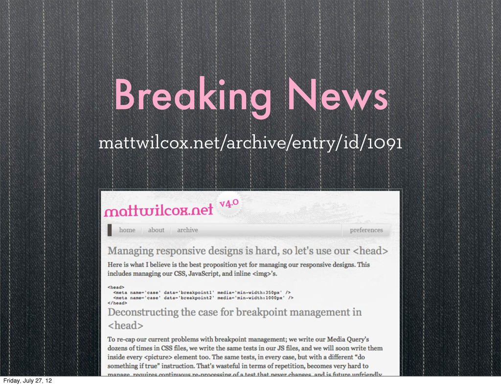
Breaking News mattwilcox.net/archive/entry/id/1091 Friday, July 27, 12
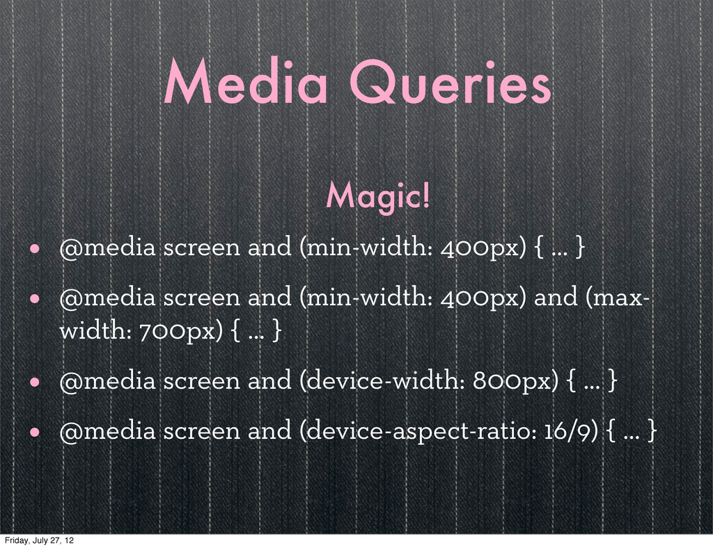
Media Queries Magic! • @media screen and (min-width: 400px) {
… } • @media screen and (min-width: 400px) and (max- width: 700px) { … } • @media screen and (device-width: 800px) { … } • @media screen and (device-aspect-ratio: 16/9) { … } Friday, July 27, 12
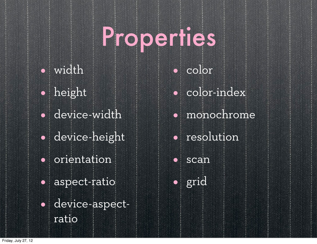
Properties • width • height • device-width • device-height •
orientation • aspect-ratio • device-aspect- ratio • color • color-index • monochrome • resolution • scan • grid Friday, July 27, 12
Feature Detection Friday, July 27, 12
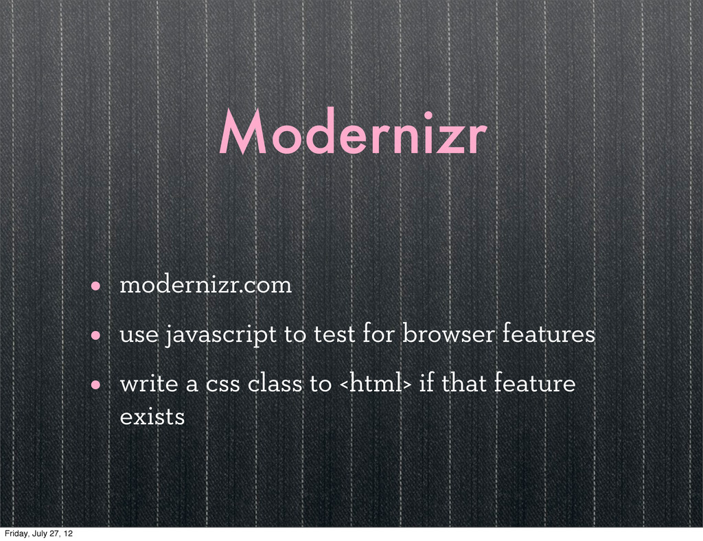
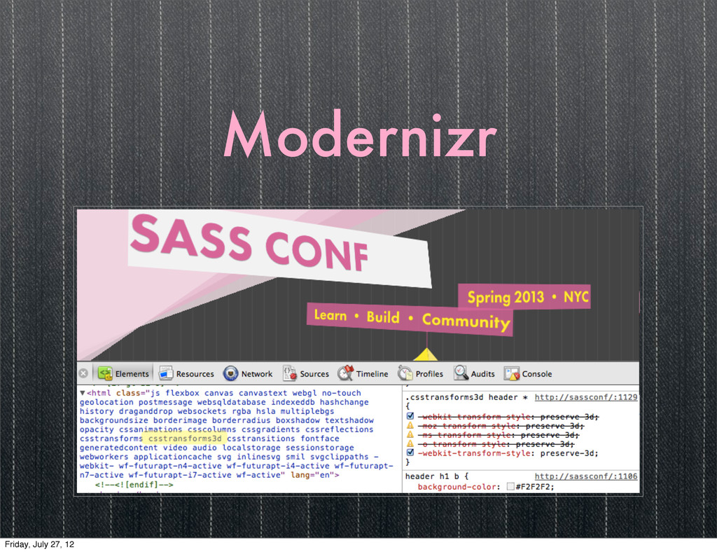
Modernizr • modernizr.com • use javascript to test for browser
features • write a css class to <html> if that feature exists Friday, July 27, 12
Modernizr Friday, July 27, 12
III Friday, July 27, 12
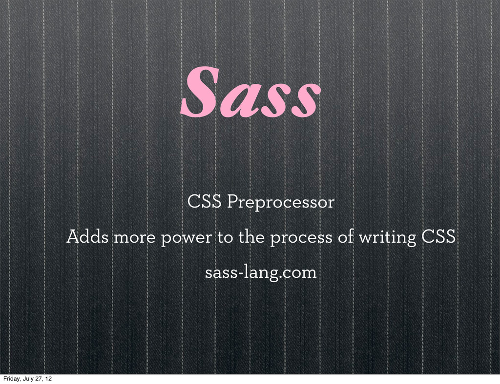
Sass CSS Preprocessor Adds more power to the process of
writing CSS sass-lang.com Friday, July 27, 12
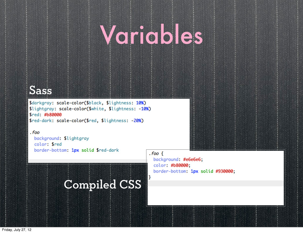
Variables Sass Compiled CSS Friday, July 27, 12
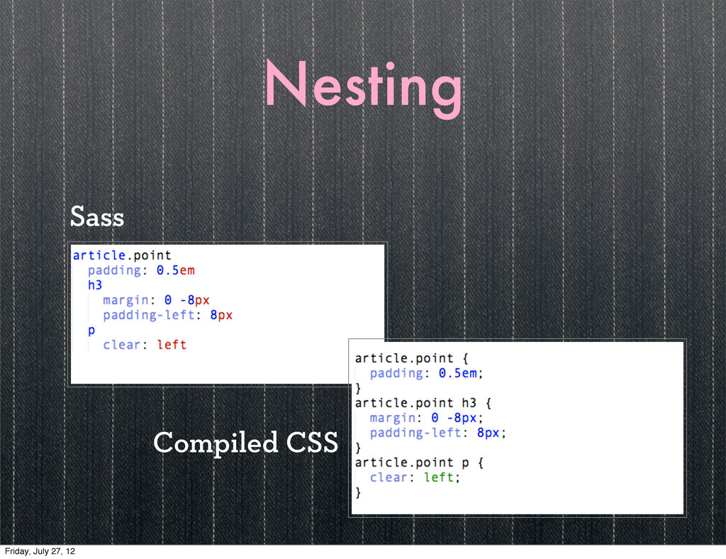
Nesting Sass Compiled CSS Friday, July 27, 12
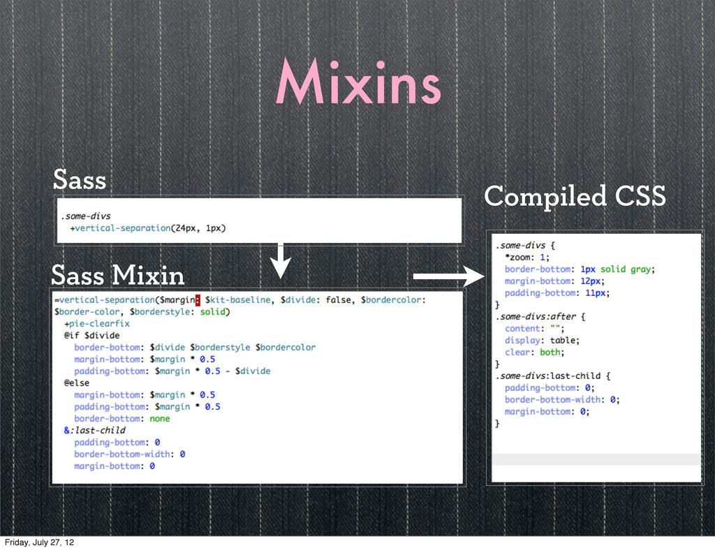
Mixins Sass Mixin Compiled CSS Sass Friday, July 27, 12
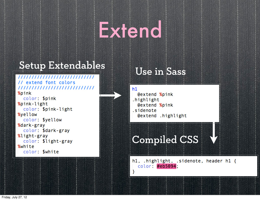
Extend Use in Sass Compiled CSS Setup Extendables Friday, July
27, 12
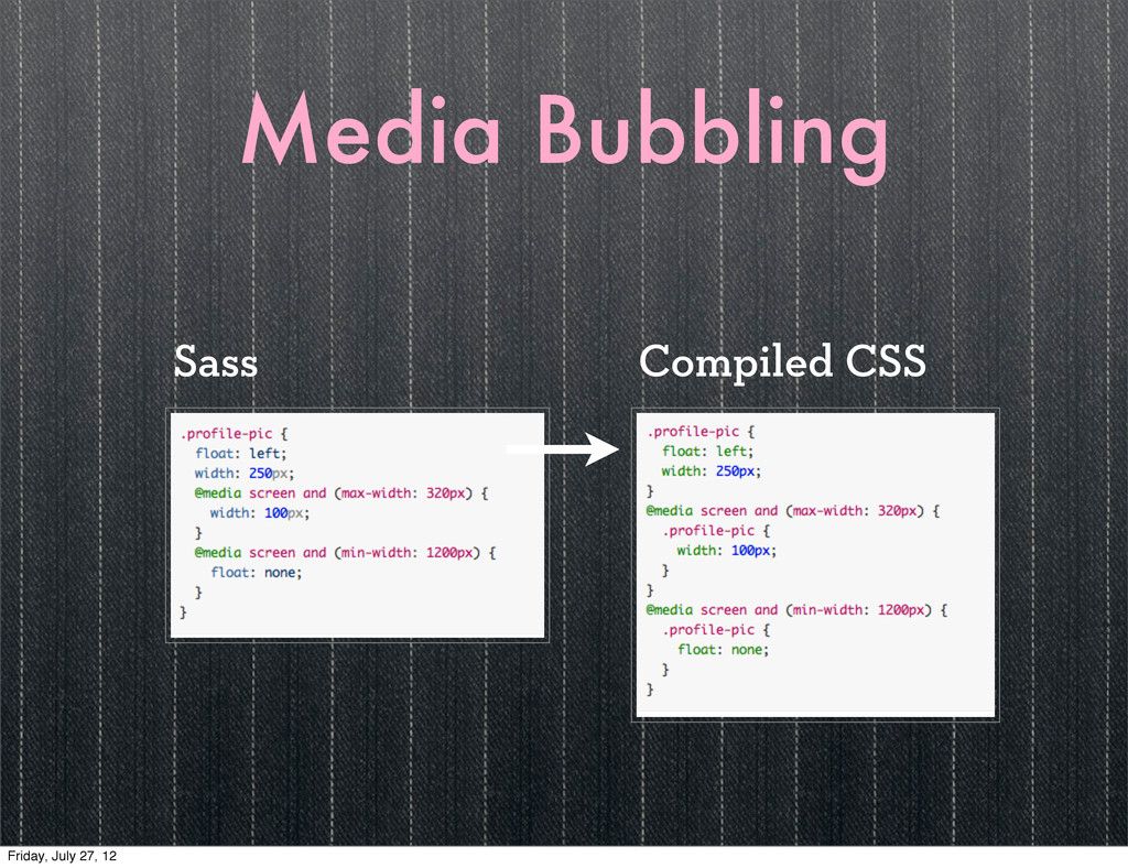
Media Bubbling Compiled CSS Sass Friday, July 27, 12
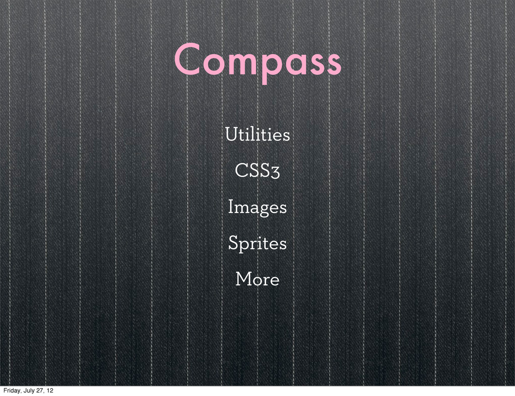
Compass Utilities CSS3 Images Sprites More Friday, July 27, 12
Compass Extensions Friday, July 27, 12
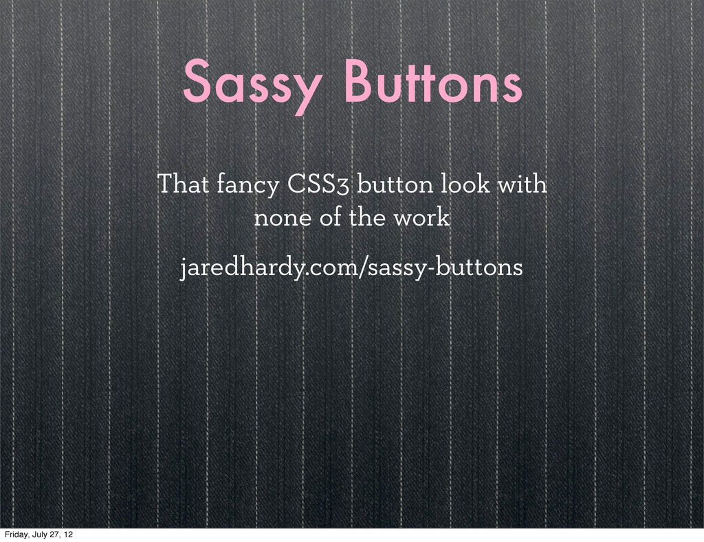
Sassy Buttons That fancy CSS3 button look with none of
the work jaredhardy.com/sassy-buttons Friday, July 27, 12
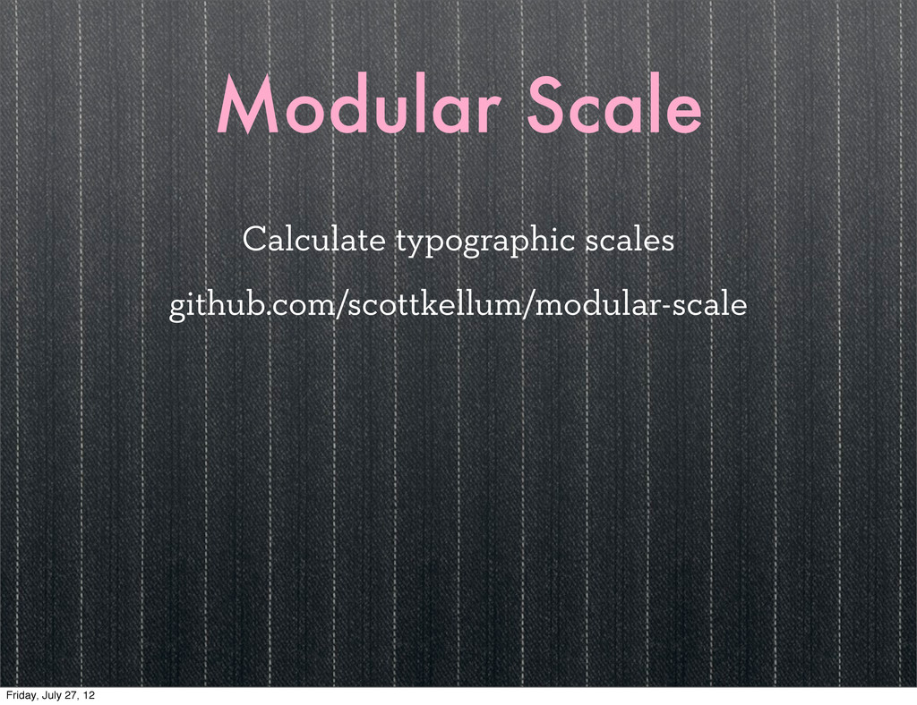
Modular Scale Calculate typographic scales github.com/scottkellum/modular-scale Friday, July 27, 12
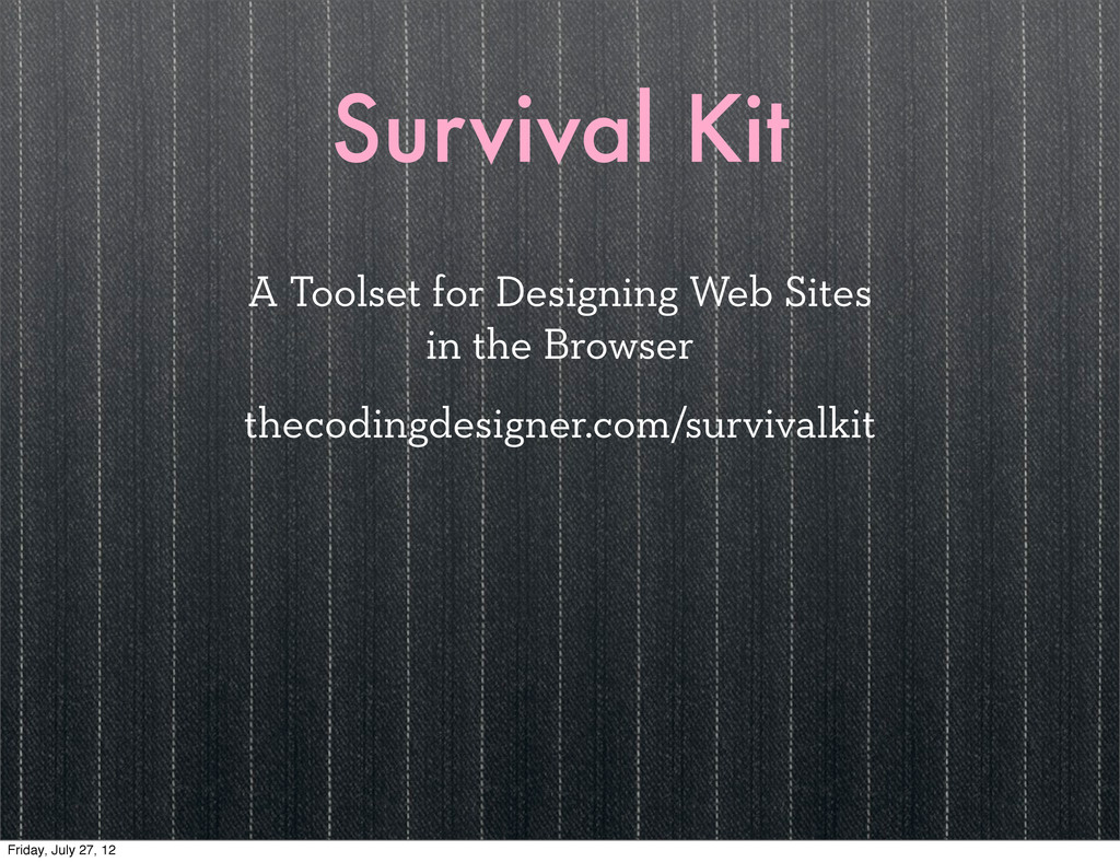
Survival Kit A Toolset for Designing Web Sites in the
Browser thecodingdesigner.com/survivalkit Friday, July 27, 12
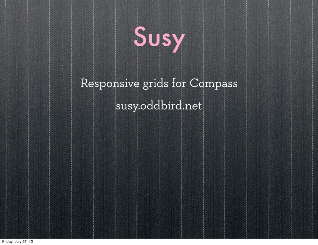
Susy Responsive grids for Compass susy.oddbird.net Friday, July 27, 12
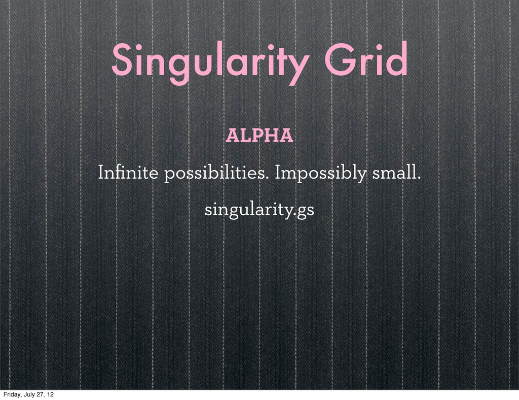
Singularity Grid ALPHA Infinite possibilities. Impossibly small. singularity.gs Friday, July
27, 12
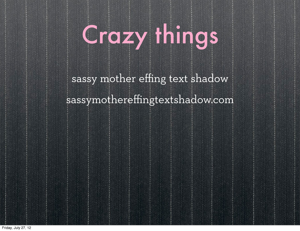
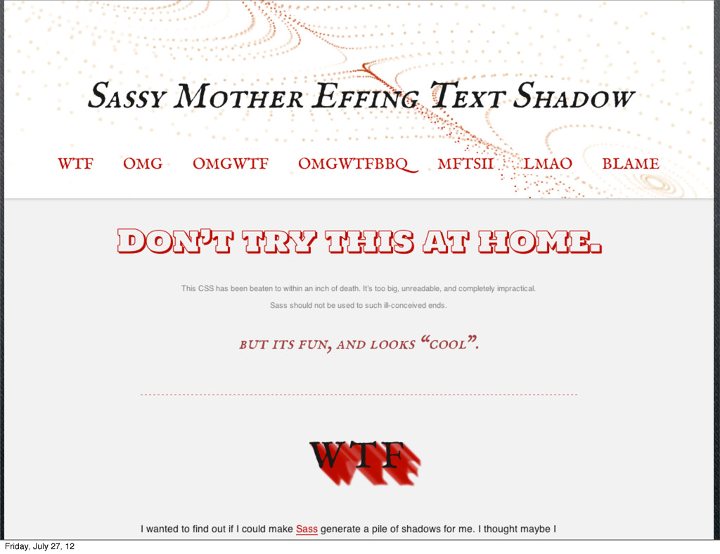
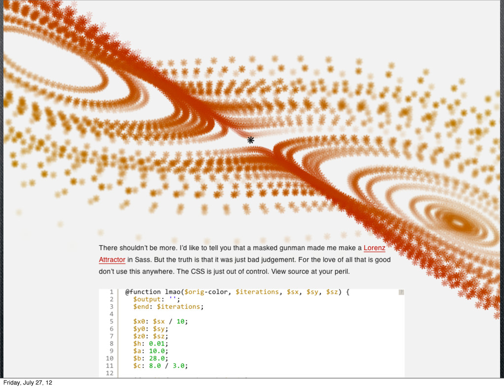
Crazy things sassy mother effing text shadow sassymothereffingtextshadow.com Friday, July
27, 12
Friday, July 27, 12
Friday, July 27, 12
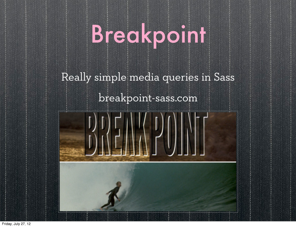
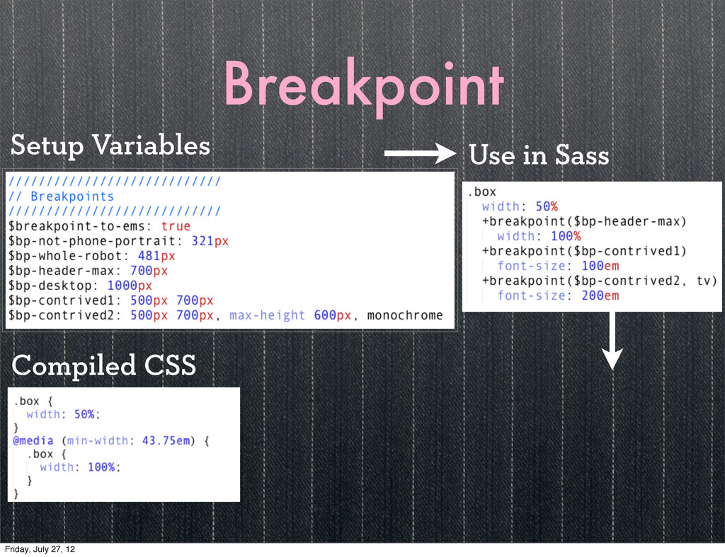
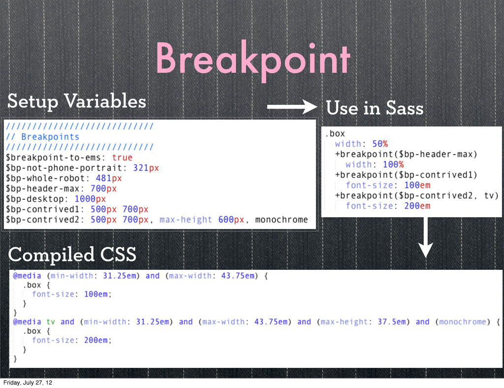
Breakpoint Really simple media queries in Sass breakpoint-sass.com Friday, July
27, 12
Breakpoint Use in Sass Compiled CSS Setup Variables Friday, July
27, 12
Breakpoint Use in Sass Compiled CSS Setup Variables Friday, July
27, 12
IV Friday, July 27, 12
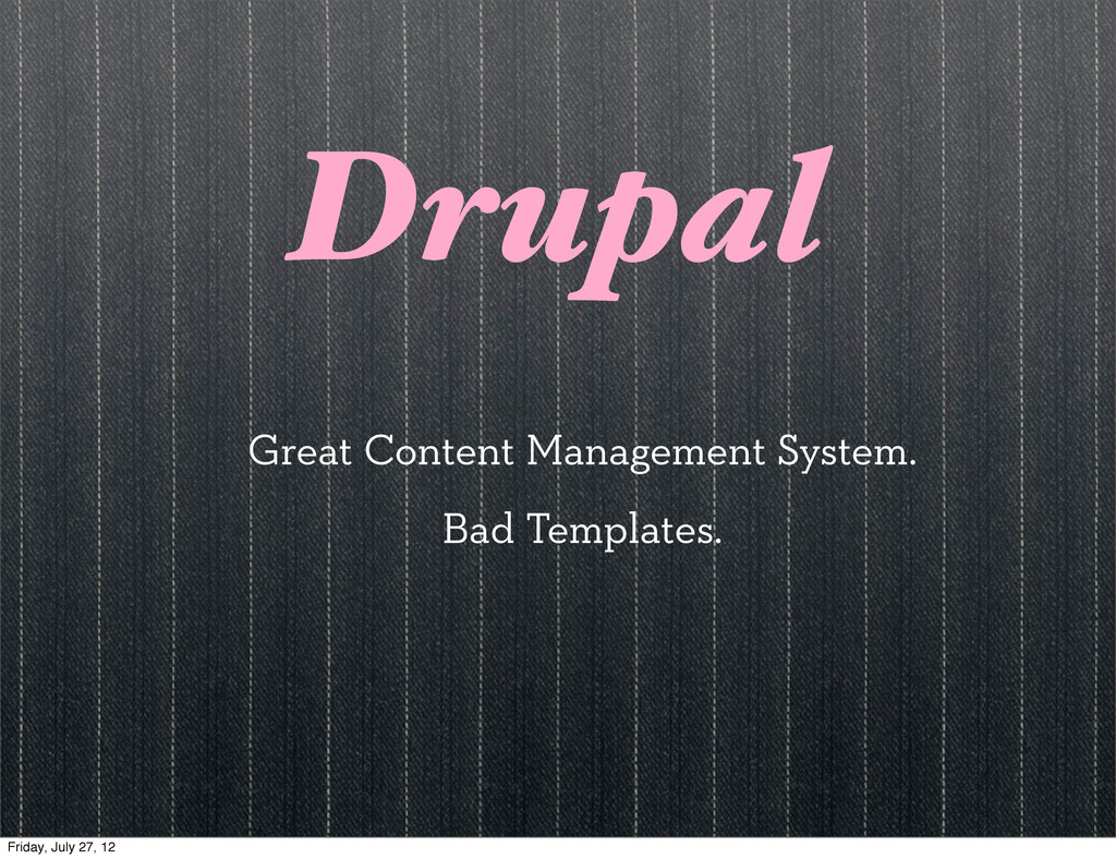
Drupal Great Content Management System. Bad Templates. Friday, July 27,
12
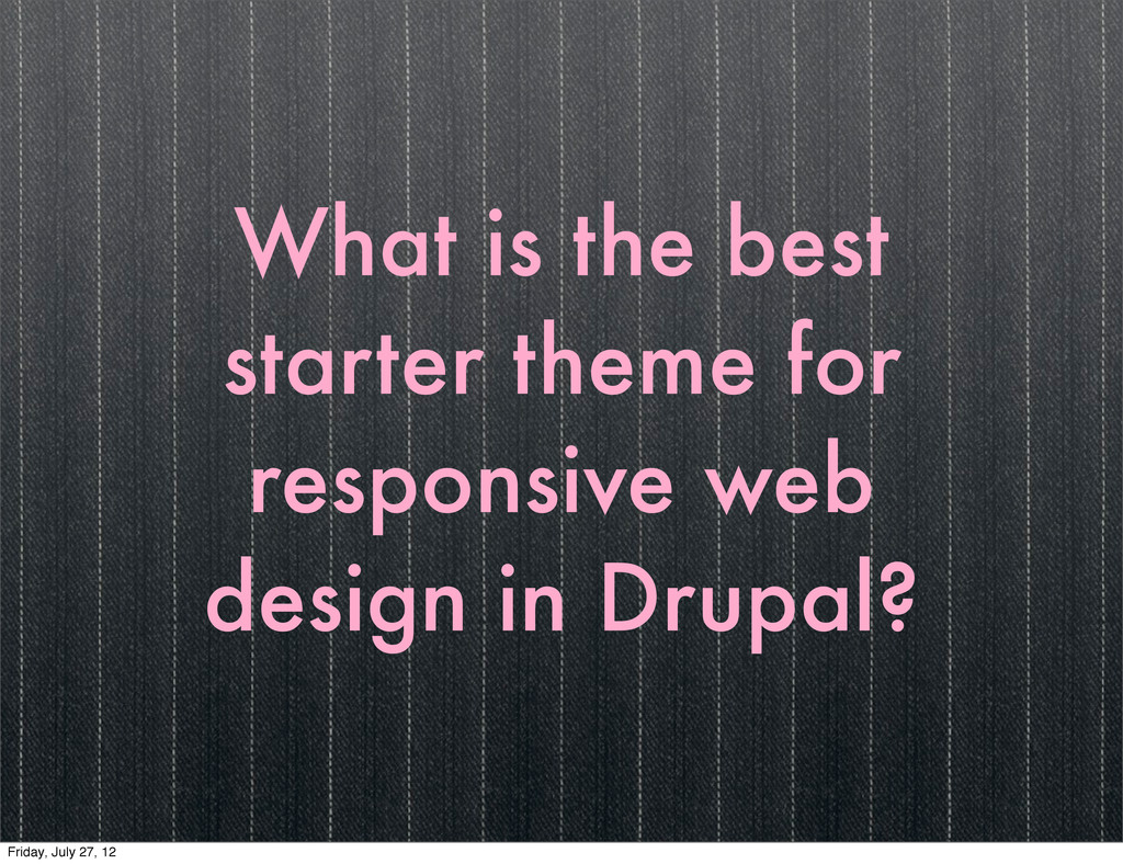
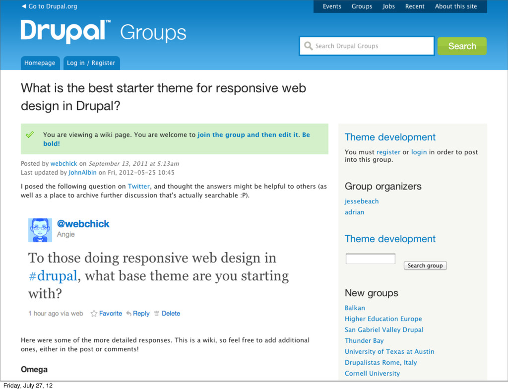
What is the best starter theme for responsive web design
in Drupal? Friday, July 27, 12
Friday, July 27, 12
Friday, July 27, 12
Avoid Cookie Cutters & Assertive Frameworks Friday, July 27, 12
V Friday, July 27, 12
Putting It Together Friday, July 27, 12
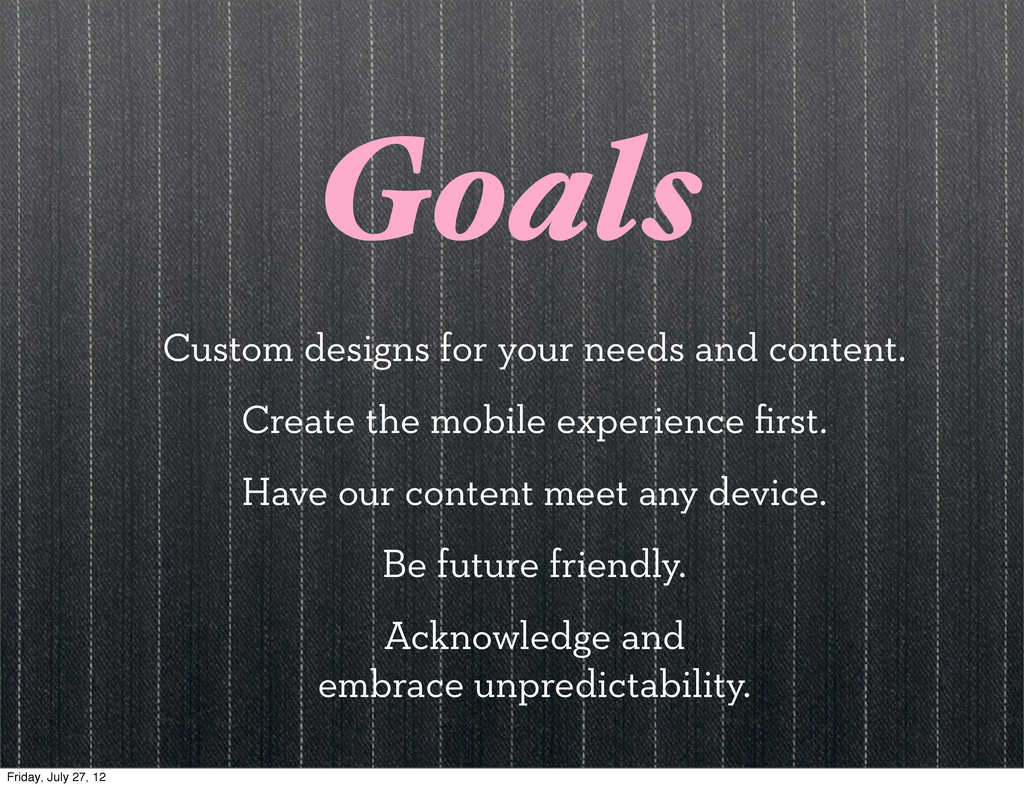
Goals Custom designs for your needs and content. Create the
mobile experience first. Have our content meet any device. Be future friendly. Acknowledge and embrace unpredictability. Friday, July 27, 12
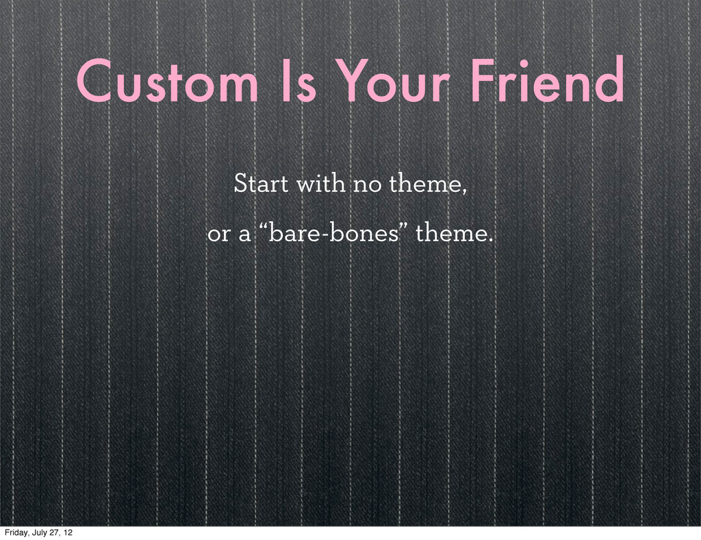
Custom Is Your Friend Start with no theme, or a
“bare-bones” theme. Friday, July 27, 12
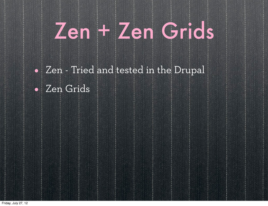
Zen + Zen Grids • Zen - Tried and tested
in the Drupal • Zen Grids Friday, July 27, 12
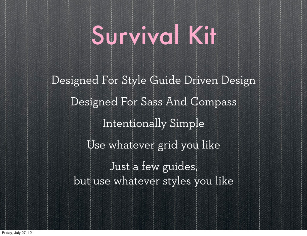
Survival Kit Designed For Style Guide Driven Design Designed For
Sass And Compass Intentionally Simple Use whatever grid you like Just a few guides, but use whatever styles you like Friday, July 27, 12
Demo Friday, July 27, 12
The Future Friday, July 27, 12
Survival Kit Module Will show the style guide pages from
the standard Survival Kit Friday, July 27, 12
Sass Conf Spring 2013 sassconf.com Friday, July 27, 12
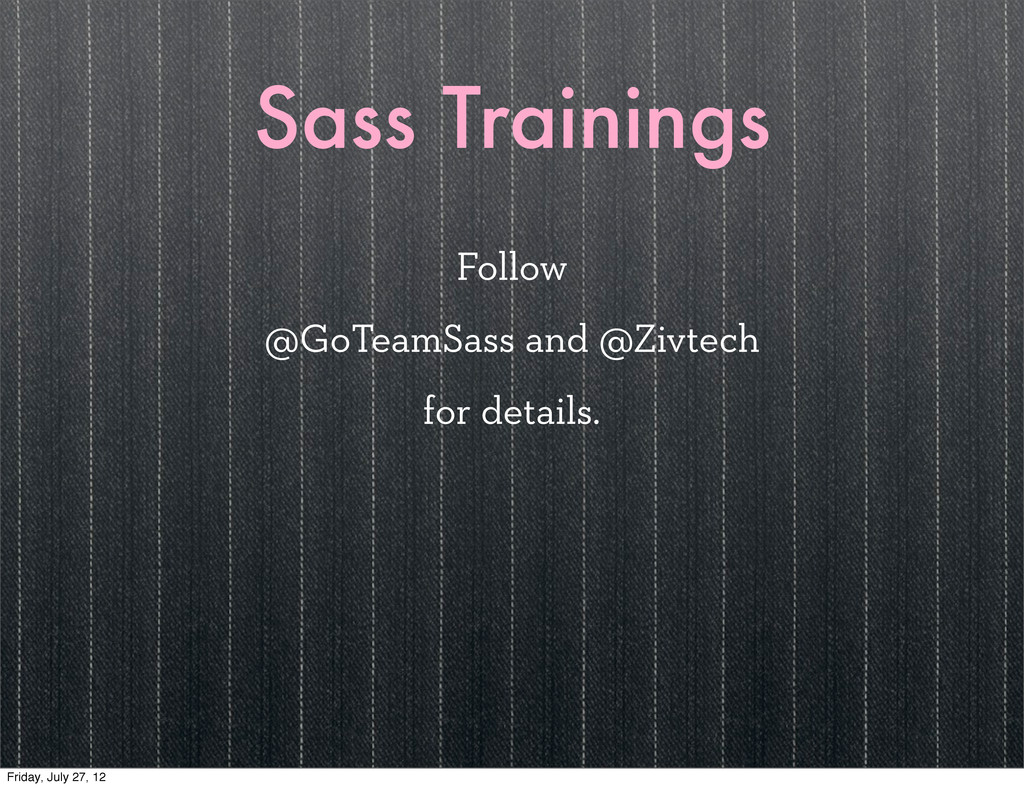
Sass Trainings Follow @GoTeamSass and @Zivtech for details. Friday, July
27, 12
Questions & Contact Zivtech zivtech.com Mason Wendell - Creative Director
Twitter, Dribbble & Drupal: codingdesigner github: canarymason Friday, July 27, 12
 canarymason
 sony
sony
 yamasaku
 takanorip
 ajstarks
 bebe
bebe
 hiranotomoki
 centou
 kenichiota0711
 kgsi
kgsi
 a2k
a2k
 mhand01
 dugsong
 chriscoyier
 twada
twada
 eitanlees
 bluesmoon
 ryanjones
 asonas
 aleyda
 kimpetersen
 quramy
 watany