often desire in the web medium, is simply a function of the limitation of the printed page. We should embrace the fact that the web doesn’t have the same constraints, and design for this flexibility. But first, we must 'accept the ebb and flow of things.” John Allsopp, “A Dao of Web Design”
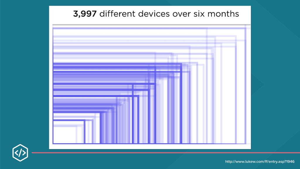
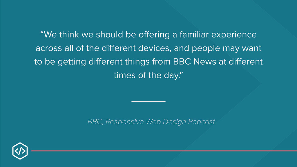
all of the different devices, and people may want to be getting different things from BBC News at different times of the day.” BBC, Responsive Web Design Podcast
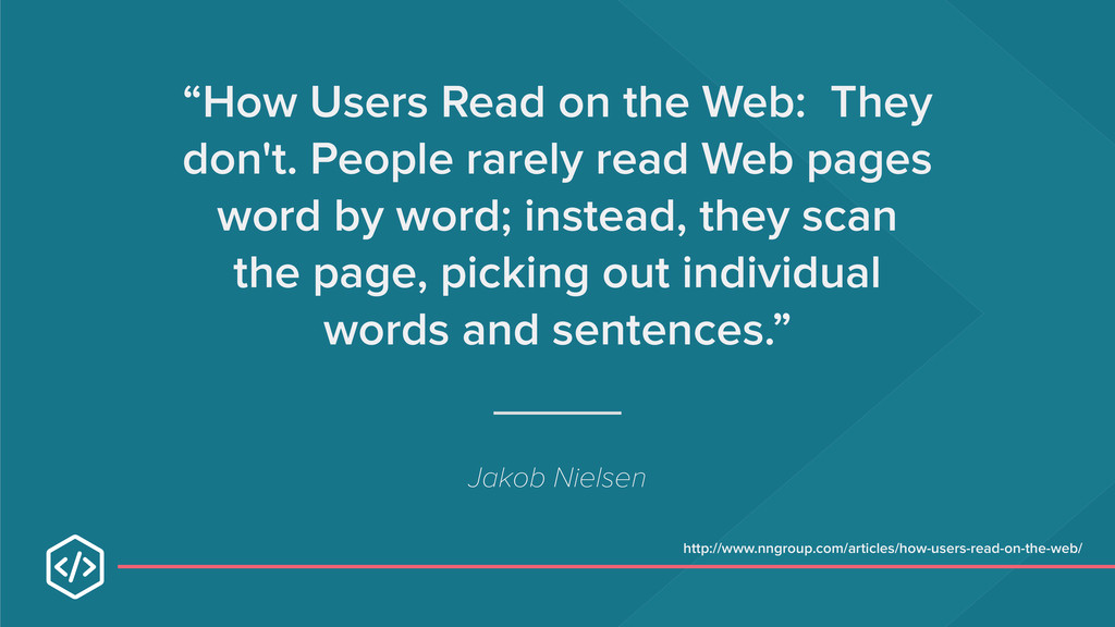
read Web pages word by word; instead, they scan the page, picking out individual words and sentences.” Jakob Nielsen http://www.nngroup.com/articles/how-users-read-on-the-web/
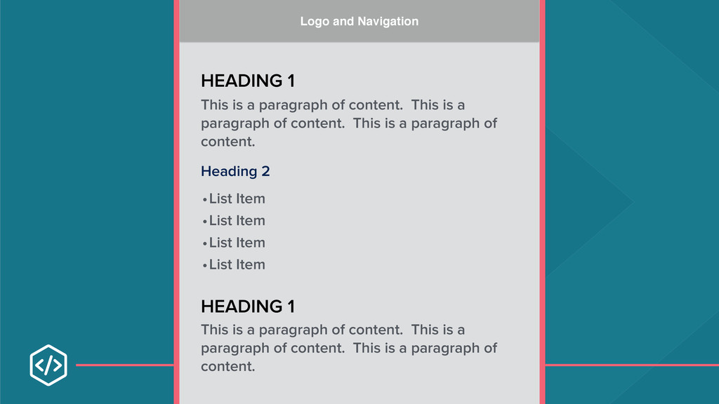
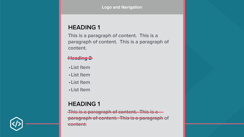
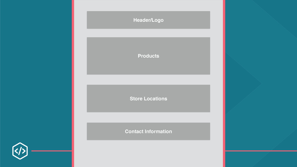
of content. This is a paragraph of content. This is a paragraph of content. •List Item •List Item •List Item •List Item This is a paragraph of content. This is a paragraph of content. This is a paragraph of content. Logo and Navigation
of content. This is a paragraph of content. This is a paragraph of content. •List Item •List Item •List Item •List Item This is a paragraph of content. This is a paragraph of content. This is a paragraph of content. Logo and Navigation
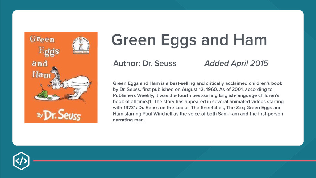
2015 Green Eggs and Ham is a best-selling and critically acclaimed children's book by Dr. Seuss, first published on August 12, 1960. As of 2001, according to Publishers Weekly, it was the fourth best-selling English-language children's book of all time.[1] The story has appeared in several animated videos starting with 1973's Dr. Seuss on the Loose: The Sneetches, The Zax; Green Eggs and Ham starring Paul Winchell as the voice of both Sam-I-am and the first-person narrating man.
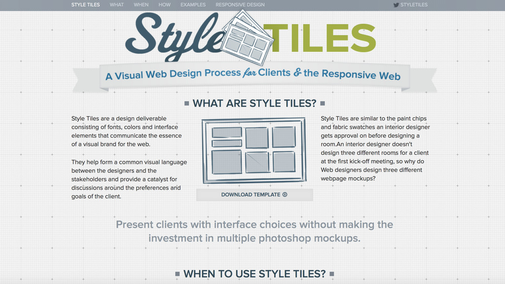
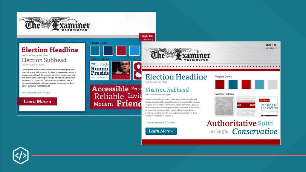
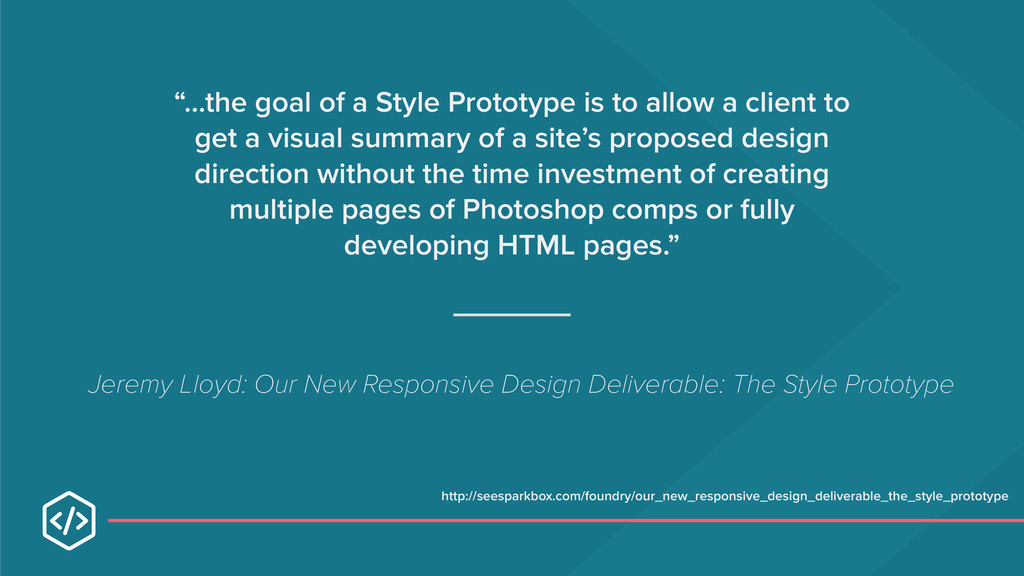
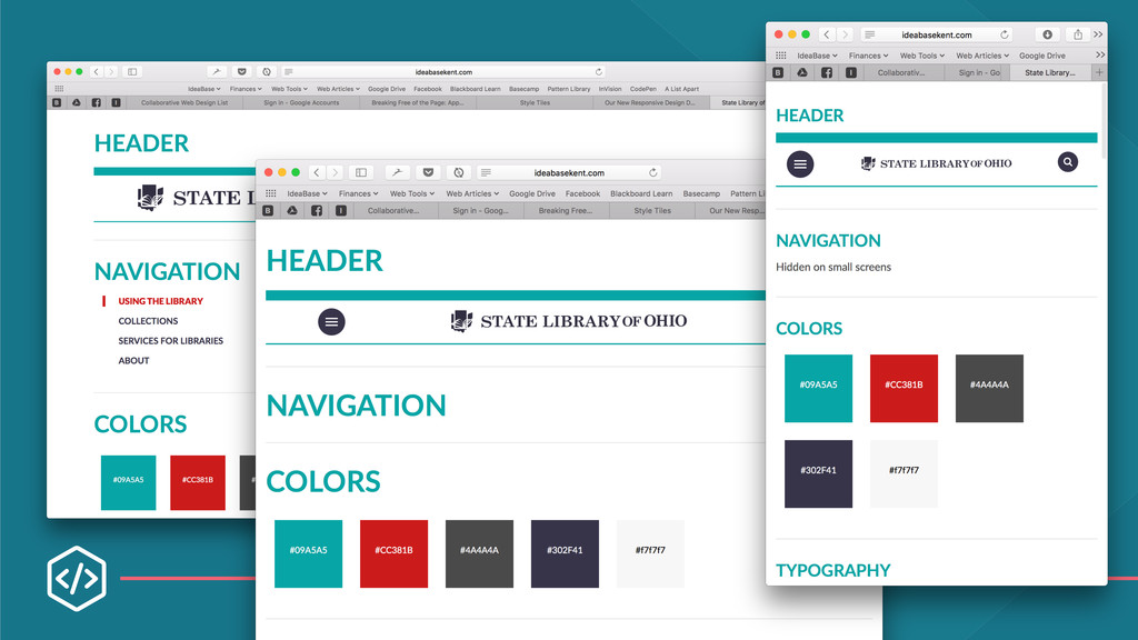
client to get a visual summary of a site’s proposed design direction without the time investment of creating multiple pages of Photoshop comps or fully developing HTML pages.” Jeremy Lloyd: Our New Responsive Design Deliverable: The Style Prototype http://seesparkbox.com/foundry/our_new_responsive_design_deliverable_the_style_prototype
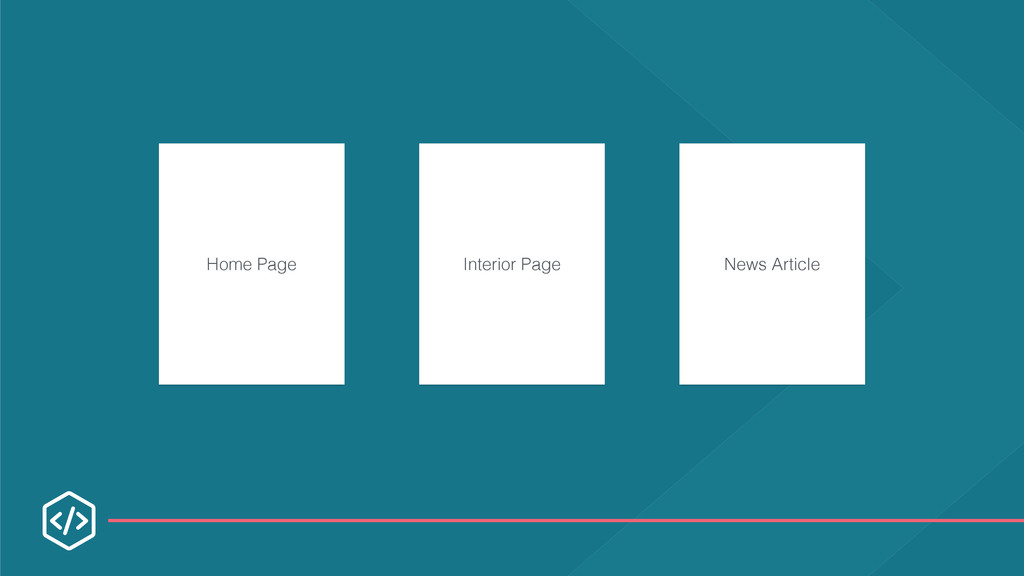
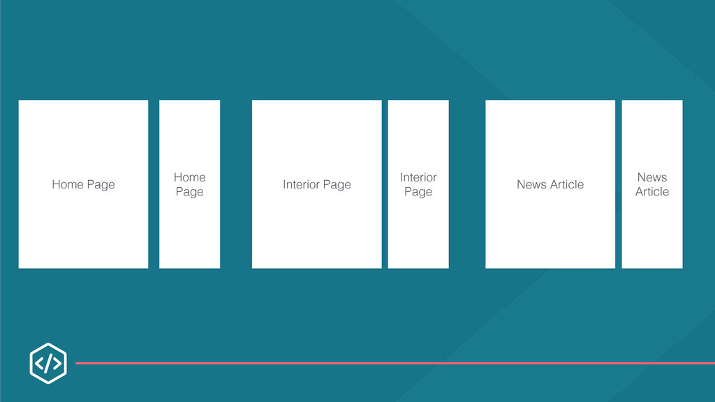
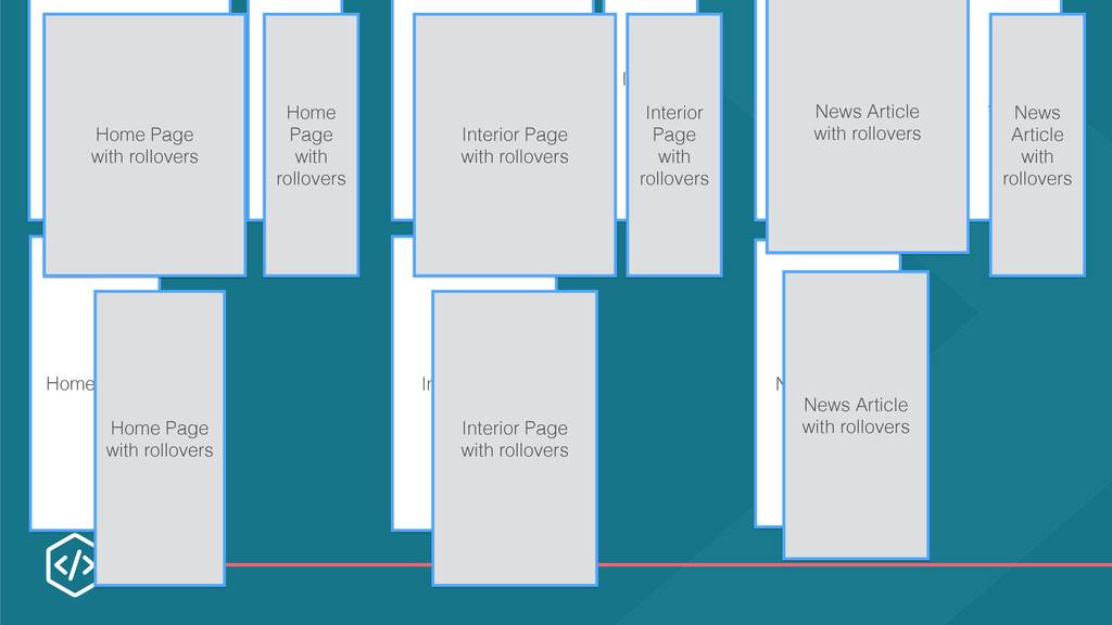
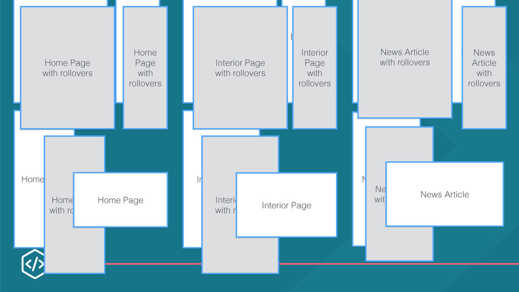
News Article Home Page Interior Page News Article Home Page Home Page with rollovers Home Page with rollovers Home Page with rollovers Interior Page with rollovers Interior Page with rollovers Interior Page with rollovers News Article with rollovers News Article with rollovers News Article with rollovers
News Article Home Page Interior Page News Article Home Page Home Page with rollovers Home Page with rollovers Home Page with rollovers Interior Page with rollovers Interior Page with rollovers Interior Page with rollovers News Article with rollovers News Article with rollovers News Article with rollovers
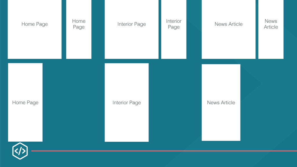
News Article Home Page Interior Page News Article Home Page Home Page with rollovers Home Page with rollovers Home Page with rollovers Interior Page with rollovers Interior Page with rollovers Interior Page with rollovers News Article with rollovers News Article with rollovers News Article with rollovers Home Page Interior Page News Article
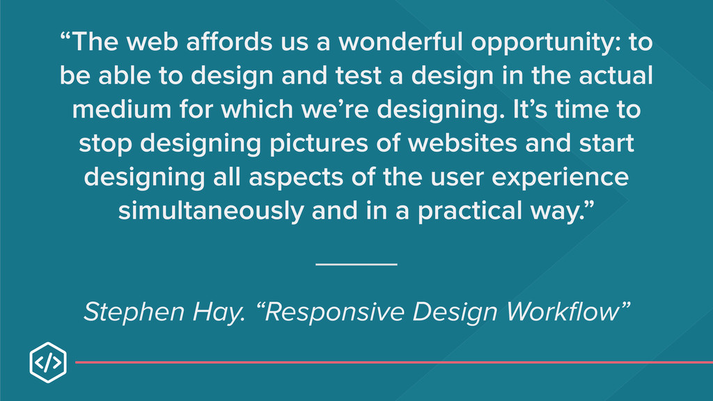
to design and test a design in the actual medium for which we’re designing. It’s time to stop designing pictures of websites and start designing all aspects of the user experience simultaneously and in a practical way.” Stephen Hay. “Responsive Design Workflow”
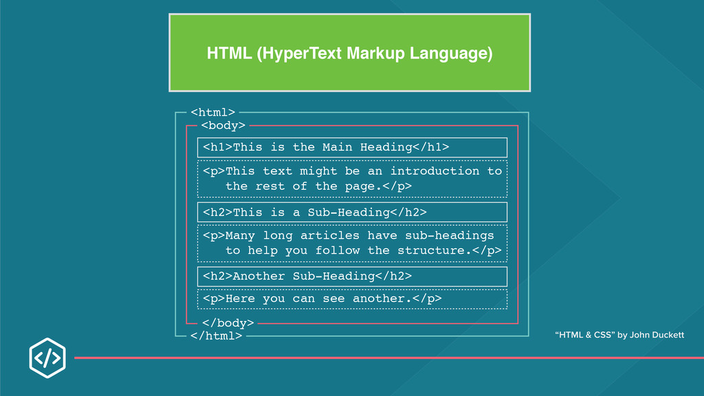
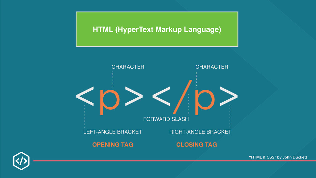
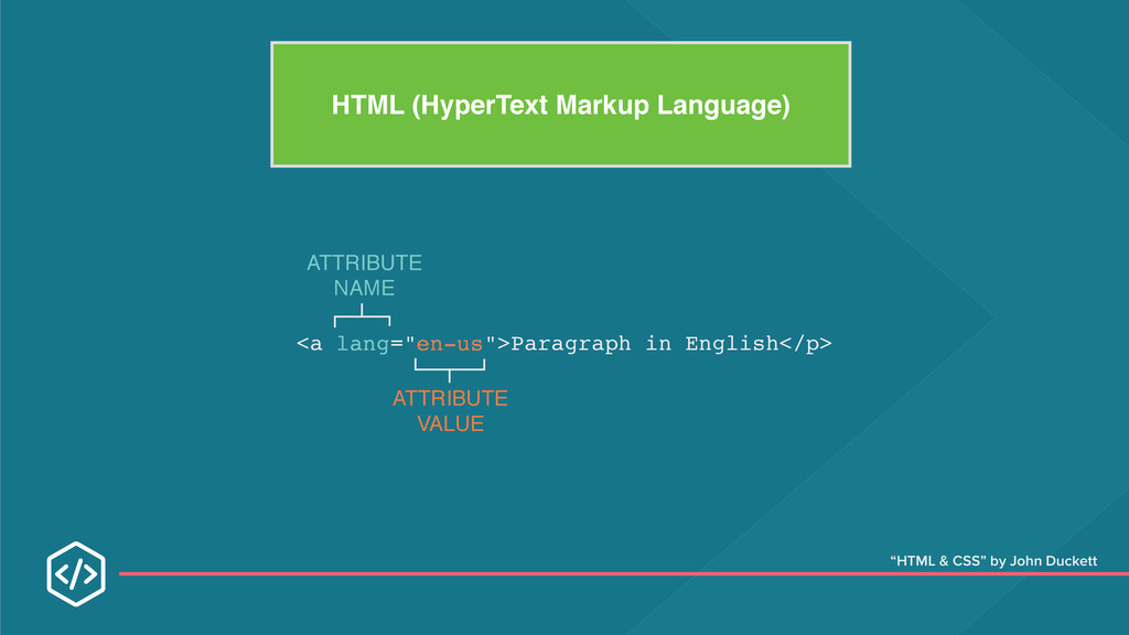
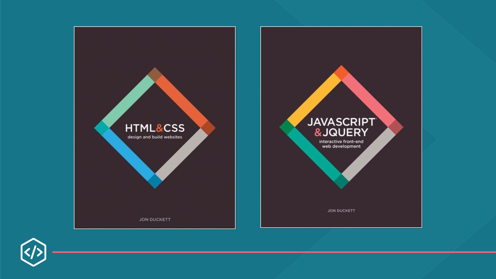
the Main Heading</h1> <h2>This is a Sub-Heading</h2> <h2>Another Sub-Heading</h2> <p>This text might be an introduction to the rest of the page.</p> <p>Here you can see another.</p> <p>Many long articles have sub-headings to help you follow the structure.</p> “HTML & CSS” by John Duckett
refunds. Allow residents to easily look up Ohio agency contact information. Allow residents to search for jobs in Ohio Provide a list of things to do in Ohio for visitors Allow Ohio new businesses to easily get started. Provide access to vehicle registration services. Provide access to vehicle registration services. Guide voters to registration services and polling locations.
want to check on the status of your refund. How would you do this on ohio.gov? 2. You’ve just gotten a letter in the mail telling you that you need to renew your motorcycle’s license plates. Start the renewal process. 3. You’re voting with an absentee ballot in the upcoming election and need to know the latest date it can be returned by mail in order to be counted.
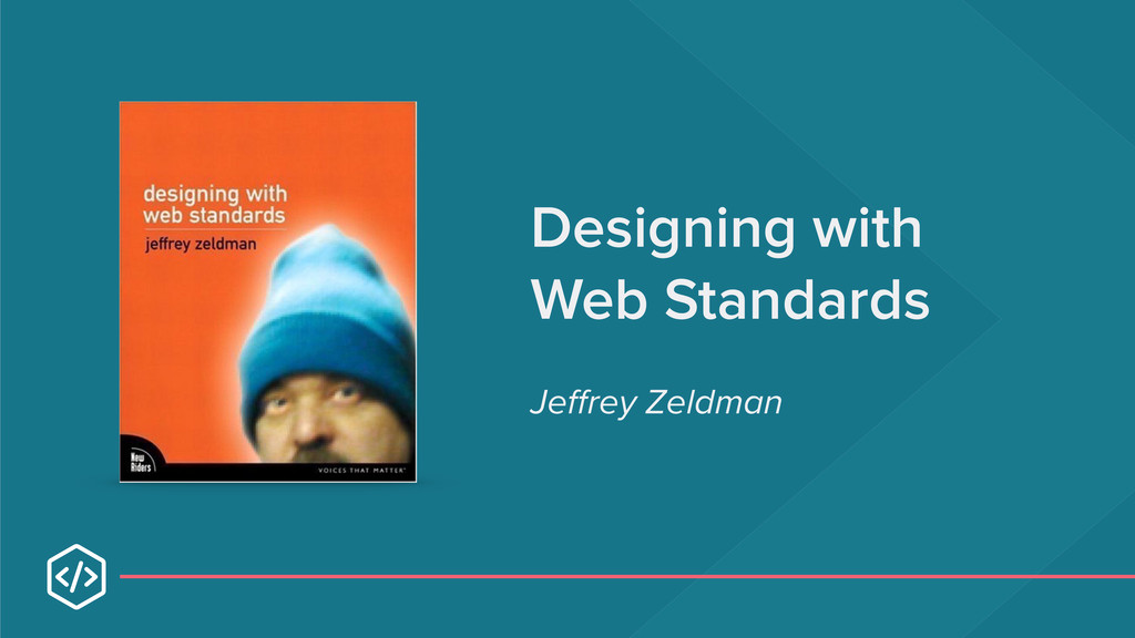
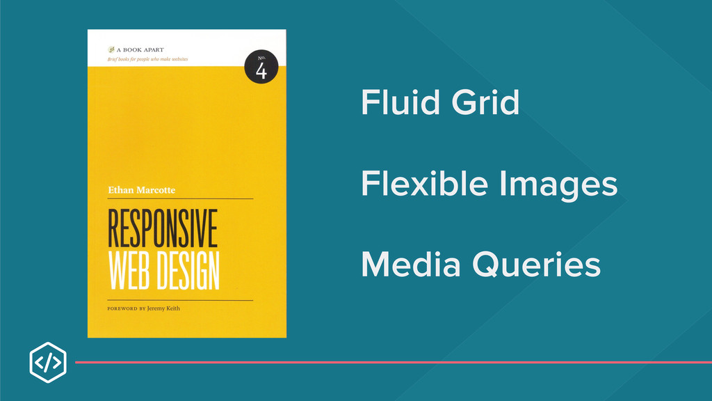
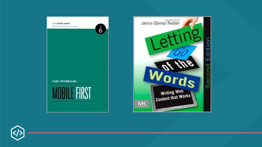
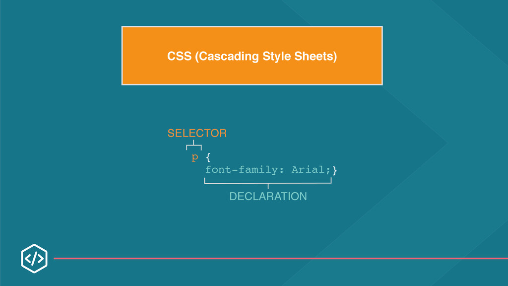
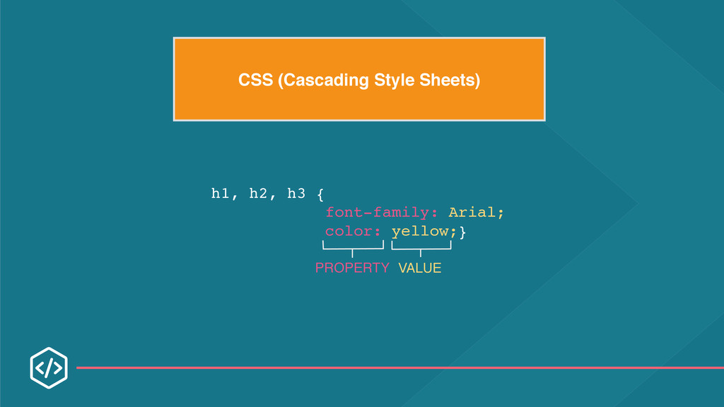
Content Strategy for Mobile and Mobile Content Mandate by Karen McGrane HTML & CSS by John Duckett Atomic Design by Brad Frost Style Tiles by Samantha Warren Style Prototypes & Responsive Design Process by Sparkbox Responsive Design Workflow by Stephen Hay Implementing Responsive Design by Tim Kadlec Mobile First by Luke Wroblewski Don’t Make Me Think by Steve Krug Designing with Web Standards by Jeffrey Zeldman CREDITS
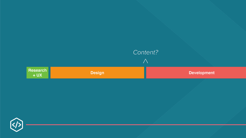
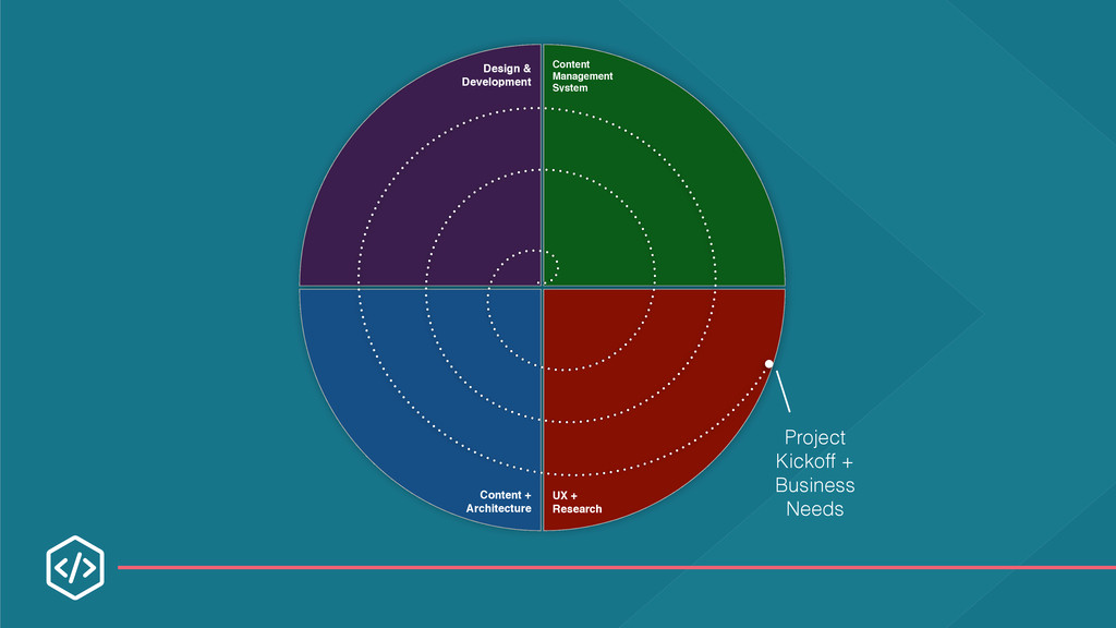
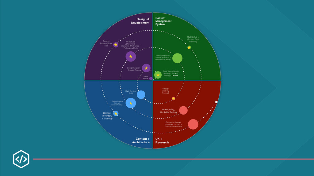
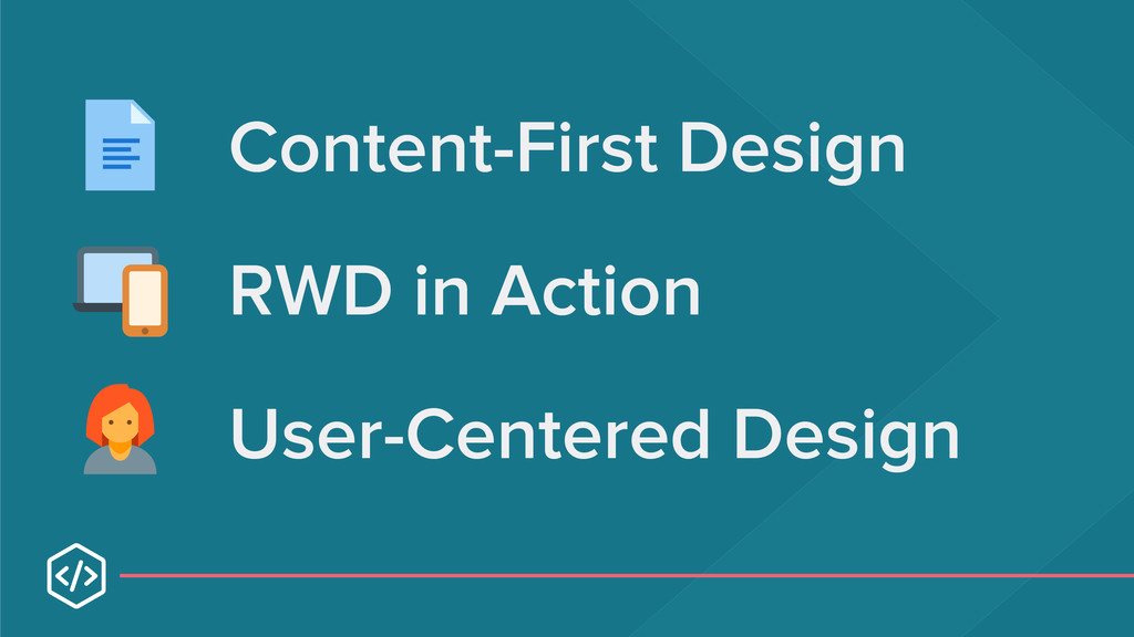
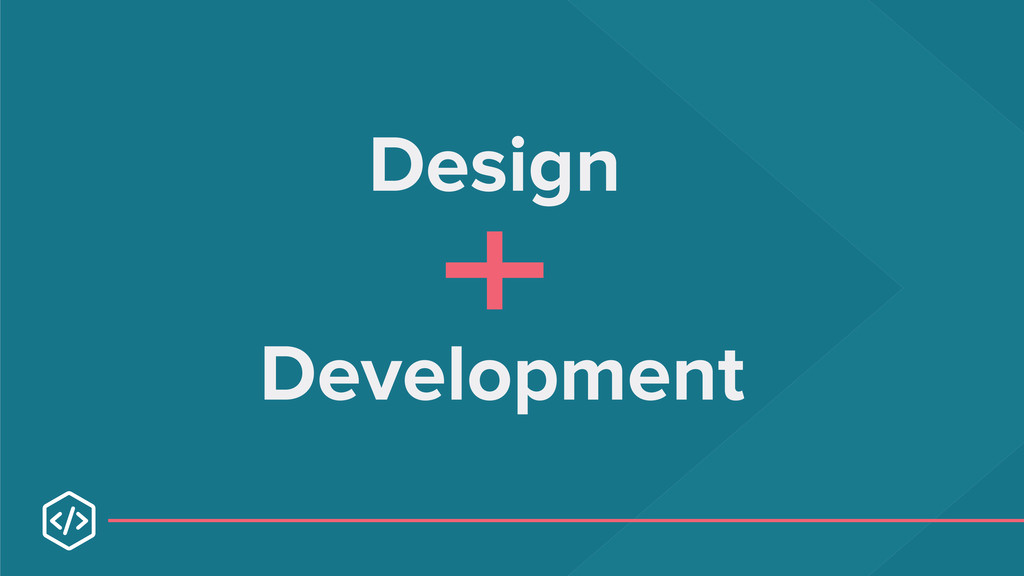
and may not be reused without permission. 1 Responsive Web Design is now much more than just a technical solution. It brings together content strategy, user experience design and web design/development to create truly flexible design systems that scale to multiple devices and screen sizes. The following activities will allow you to gain hands-on experience with some of these techniques, so that you can more easily apply them to your own websites and applications.
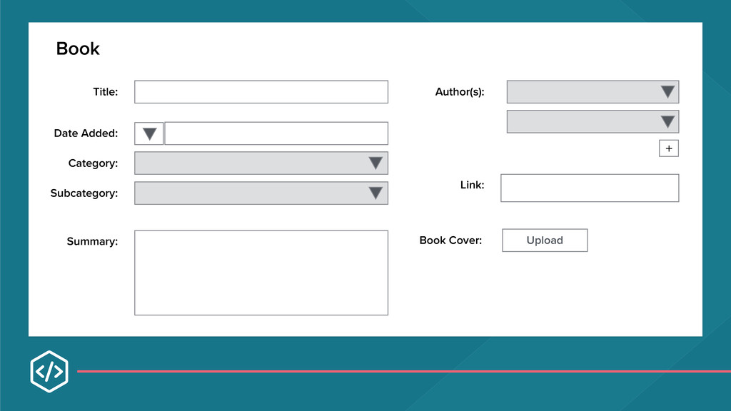
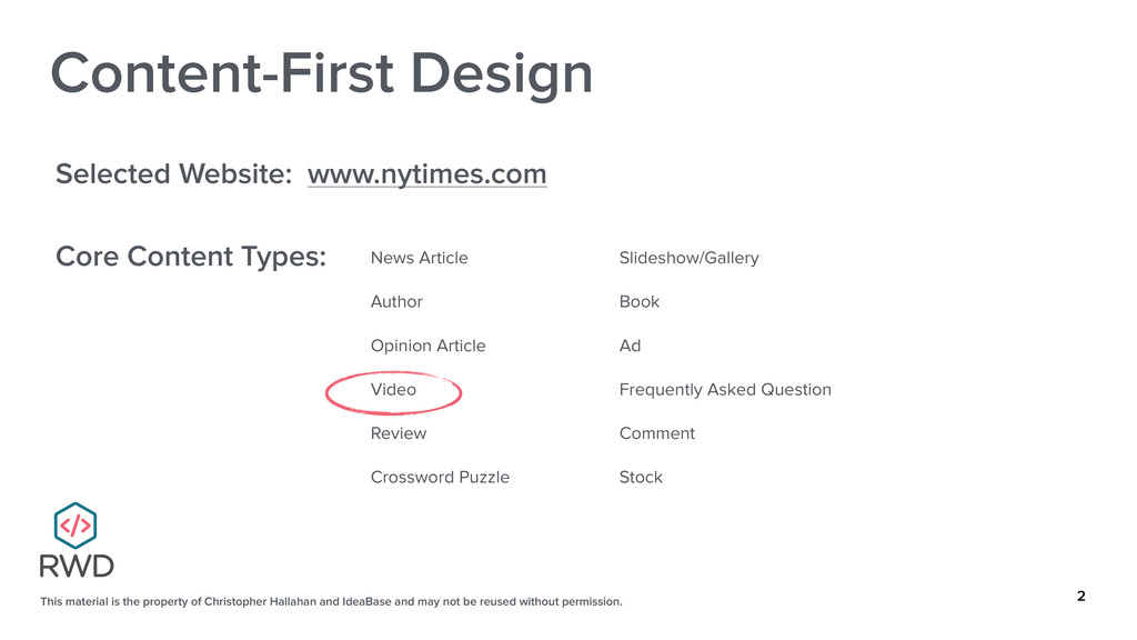
and may not be reused without permission. 2 Content-First Design Selected Website: www.nytimes.com Core Content Types: News Article Author Opinion Article Video Review Crossword Puzzle Slideshow/Gallery Book Ad Frequently Asked Question Comment Stock
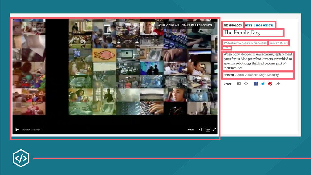
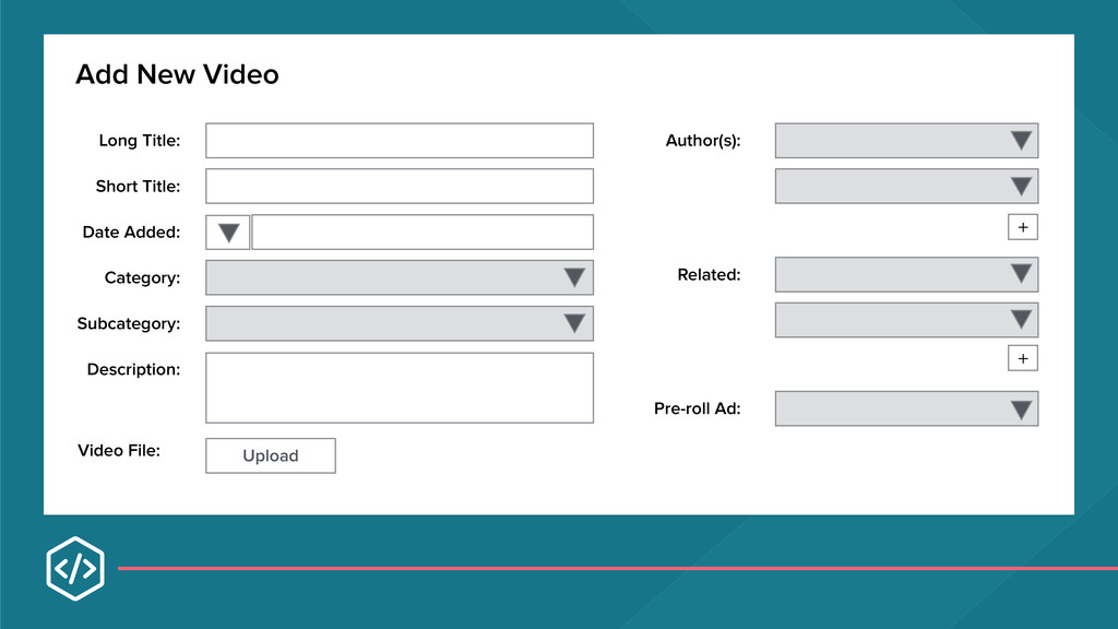
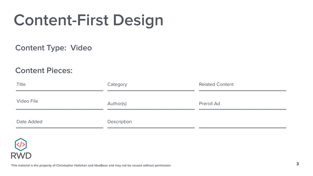
and may not be reused without permission. 3 Content-First Design Content Type: Video Content Pieces: ___________________ ___________________ ___________________ ___________________ ___________________ ___________________ ___________________ ___________________ ___________________ Title Video File Date Added Category Author(s) Description Related Content Preroll Ad
and may not be reused without permission. 4 Content-First Design Selected Website: ___________________________________________ Core Content Types: ___________________ ___________________ ___________________ ___________________ ___________________ ___________________ ___________________ ___________________ ___________________
and may not be reused without permission. 5 Content-First Design Content Type: ____________________________________________ Content Pieces: ___________________ ___________________ ___________________ ___________________ ___________________ ___________________ ___________________ ___________________ ___________________
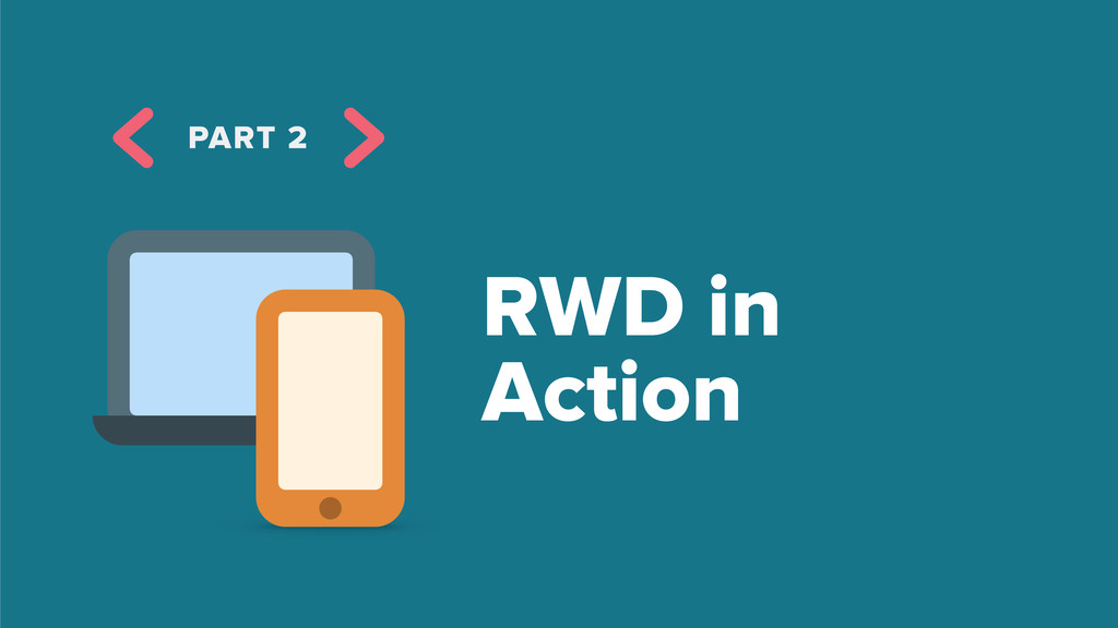
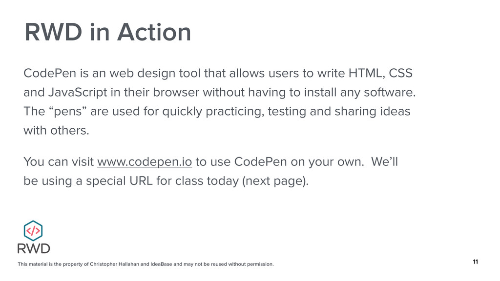
and may not be reused without permission. 11 RWD in Action CodePen is an web design tool that allows users to write HTML, CSS and JavaScript in their browser without having to install any software. The “pens” are used for quickly practicing, testing and sharing ideas with others. You can visit www.codepen.io to use CodePen on your own. We’ll be using a special URL for class today (next page).
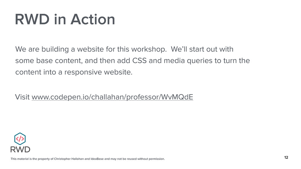
and may not be reused without permission. 12 RWD in Action Visit www.codepen.io/challahan/professor/WvMQdE We are building a website for this workshop. We’ll start out with some base content, and then add CSS and media queries to turn the content into a responsive website.
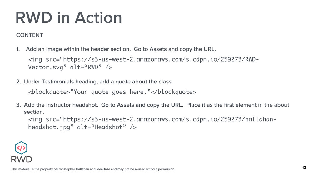
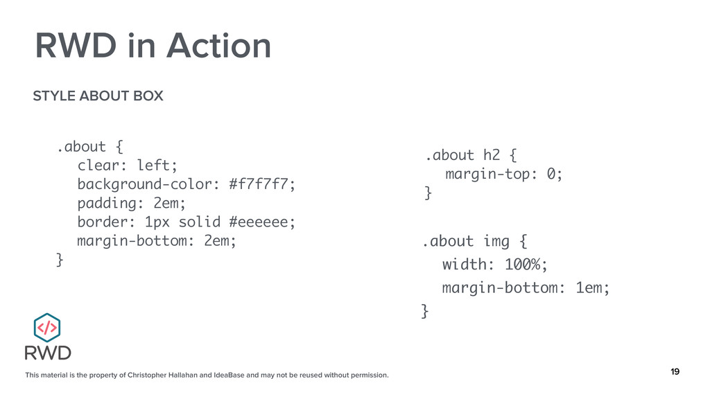
and may not be reused without permission. 13 RWD in Action CONTENT 1. Add an image within the header section. Go to Assets and copy the URL. <img src=“https://s3-us-west-2.amazonaws.com/s.cdpn.io/259273/RWD- Vector.svg” alt=“RWD” /> 2. Under Testimonials heading, add a quote about the class. <blockquote>”Your quote goes here.”</blockquote> 3. Add the instructor headshot. Go to Assets and copy the URL. Place it as the first element in the about section. <img src=“https://s3-us-west-2.amazonaws.com/s.cdpn.io/259273/hallahan- headshot.jpg” alt=“Headshot” />
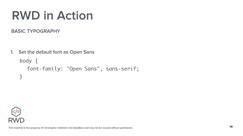
and may not be reused without permission. 14 RWD in Action BASIC TYPOGRAPHY 1. Set the default font as Open Sans body { font-family: "Open Sans", sans-serif; }
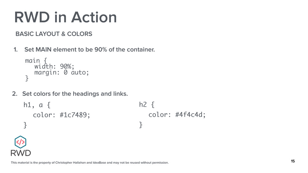
and may not be reused without permission. 15 RWD in Action BASIC LAYOUT & COLORS 1. Set MAIN element to be 90% of the container. main { width: 90%; margin: 0 auto; } 2. Set colors for the headings and links. h1, a { color: #1c7489; } h2 { color: #4f4c4d; }
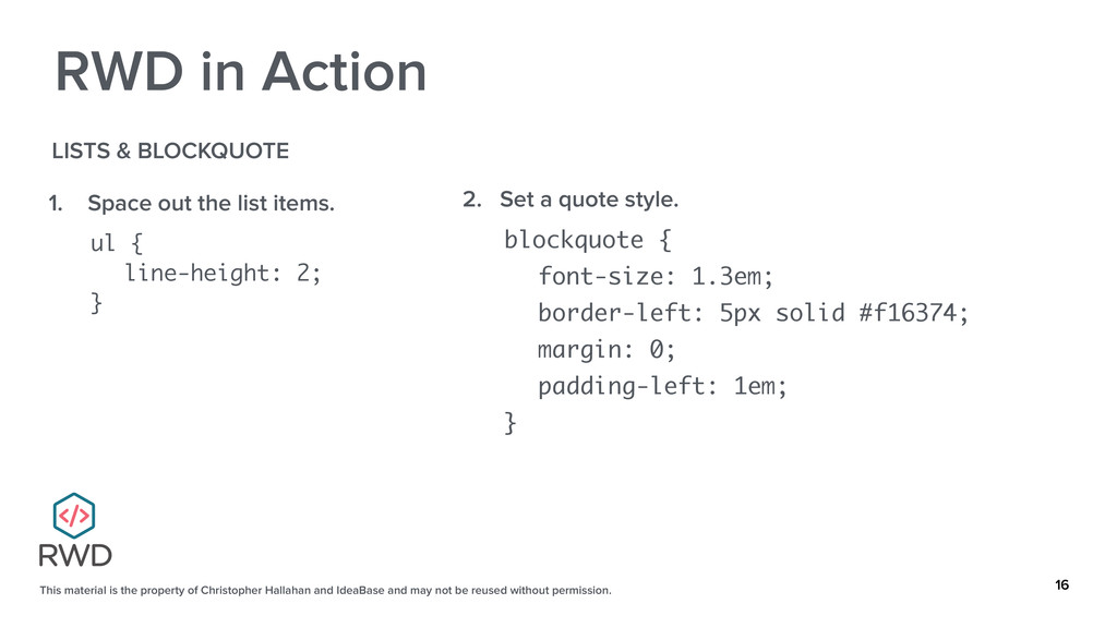
and may not be reused without permission. 16 RWD in Action LISTS & BLOCKQUOTE 1. Space out the list items. ul { line-height: 2; } 2. Set a quote style. blockquote { font-size: 1.3em; border-left: 5px solid #f16374; margin: 0; padding-left: 1em; }
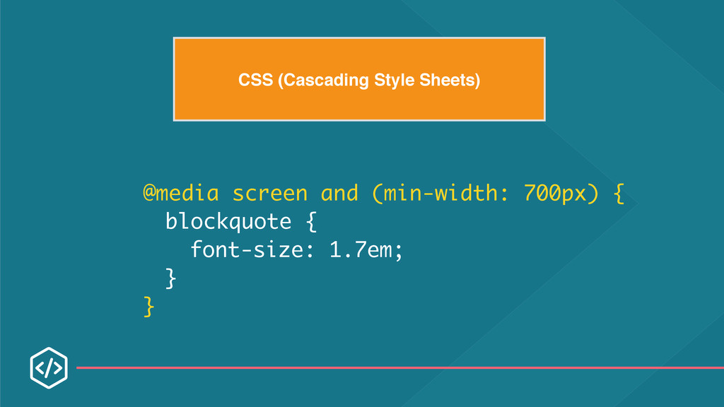
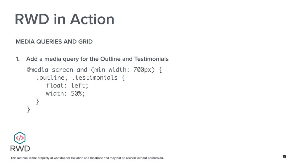
and may not be reused without permission. 18 RWD in Action MEDIA QUERIES AND GRID 1. Add a media query for the Outline and Testimonials @media screen and (min-width: 700px) { .outline, .testimonials { float: left; width: 50%; } }
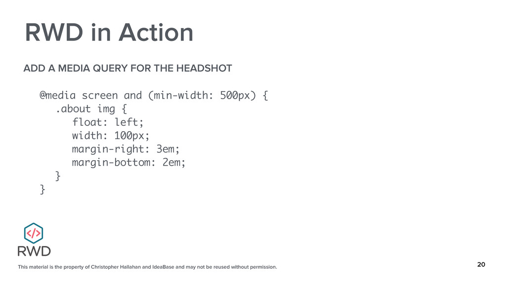
and may not be reused without permission. 20 RWD in Action ADD A MEDIA QUERY FOR THE HEADSHOT @media screen and (min-width: 500px) { .about img { float: left; width: 100px; margin-right: 3em; margin-bottom: 2em; } }
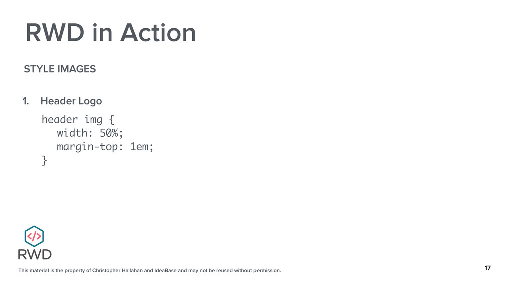
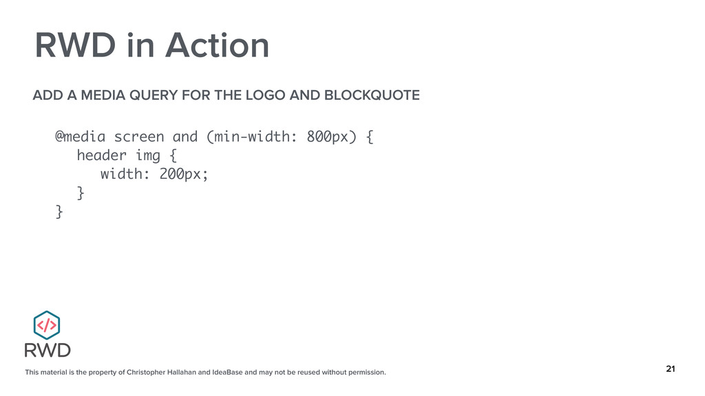
and may not be reused without permission. 21 RWD in Action ADD A MEDIA QUERY FOR THE LOGO AND BLOCKQUOTE @media screen and (min-width: 800px) { header img { width: 200px; } }
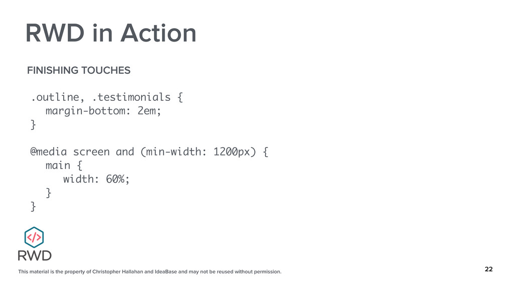
and may not be reused without permission. 22 RWD in Action FINISHING TOUCHES .outline, .testimonials { margin-bottom: 2em; } @media screen and (min-width: 1200px) { main { width: 60%; } }
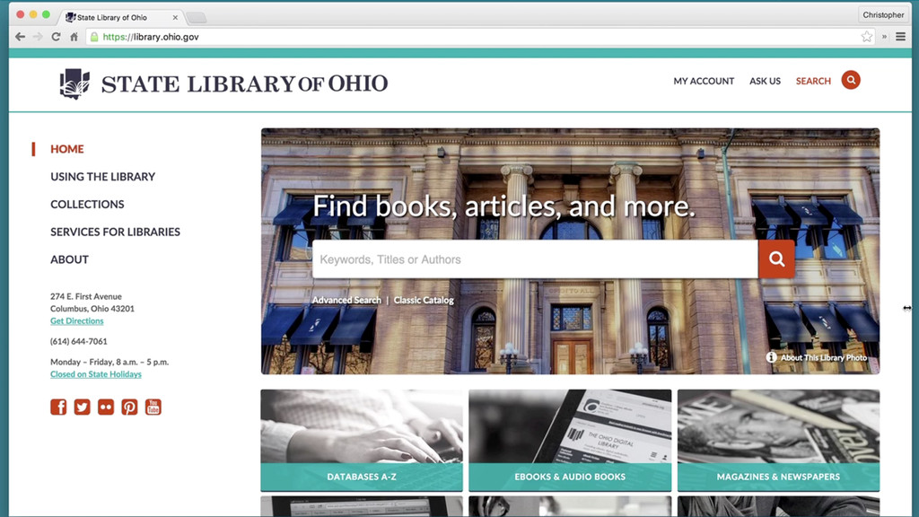
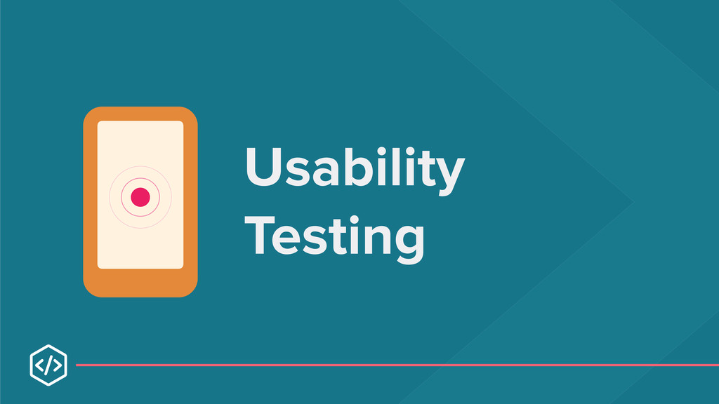
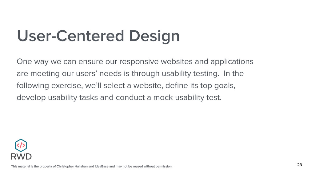
and may not be reused without permission. 23 User-Centered Design One way we can ensure our responsive websites and applications are meeting our users’ needs is through usability testing. In the following exercise, we’ll select a website, define its top goals, develop usability tasks and conduct a mock usability test.
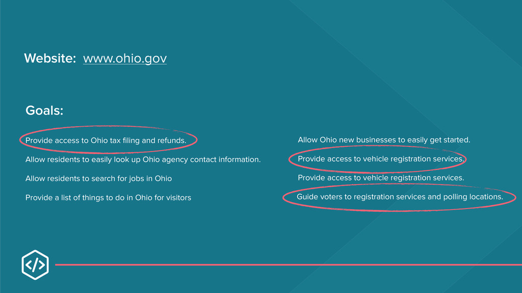
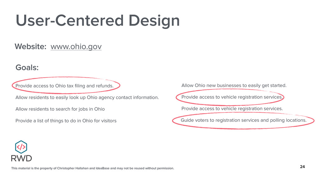
and may not be reused without permission. 24 User-Centered Design Website: www.ohio.gov Goals: Provide access to Ohio tax filing and refunds. Allow residents to easily look up Ohio agency contact information. Allow residents to search for jobs in Ohio Provide a list of things to do in Ohio for visitors Allow Ohio new businesses to easily get started. Provide access to vehicle registration services. Provide access to vehicle registration services. Guide voters to registration services and polling locations.
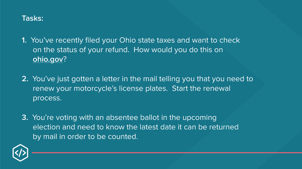
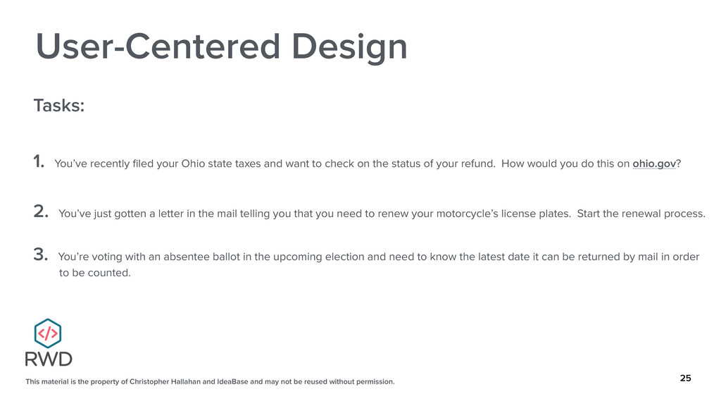
and may not be reused without permission. 25 User-Centered Design Tasks: 1. You’ve recently filed your Ohio state taxes and want to check on the status of your refund. How would you do this on ohio.gov? 2. You’ve just gotten a letter in the mail telling you that you need to renew your motorcycle’s license plates. Start the renewal process. 3. You’re voting with an absentee ballot in the upcoming election and need to know the latest date it can be returned by mail in order to be counted.
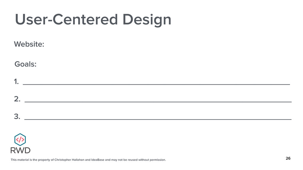
and may not be reused without permission. 26 User-Centered Design Website: Goals: 1. ____________________________________________________________ 2. ____________________________________________________________ 3. ____________________________________________________________
and may not be reused without permission. 28 User-Centered Design Tasks: 1. ____________________________________________________________ 2. ____________________________________________________________ 3. ____________________________________________________________
 challahan
 cyberagentdevelopers
 twada
twada
 koukihosaka
 watany
 ks91
ks91
 fossamagna
 news_it_enj
 hacobu
 alchemy1115
 shukob
 beli68
 ynisqa1988
 bluesmoon
 mraible
 aemeredith
 tapps
tapps
 notwaldorf
 mfonobong
 techseoconnect
 inesmontani
 addyosmani
 philnash
 yeseniaperezcruz
 coloredviolet