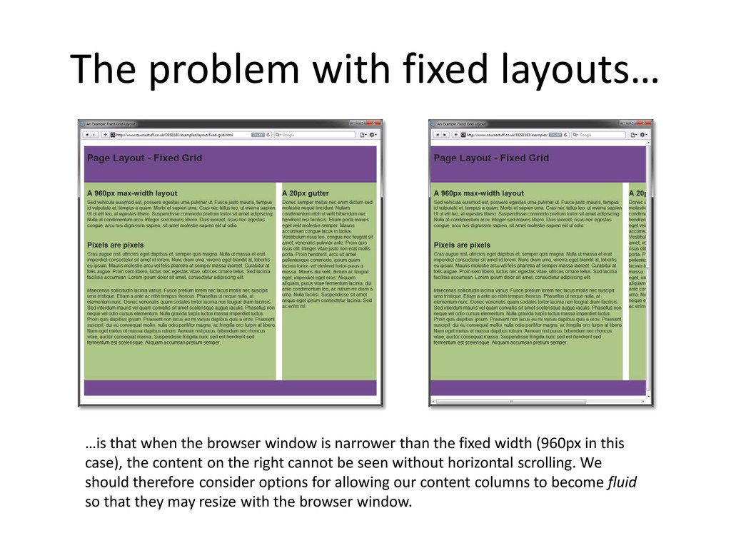
window is narrower than the fixed width (960px in this case), the content on the right cannot be seen without horizontal scrolling. We should therefore consider options for allowing our content columns to become fluid so that they may resize with the browser window.
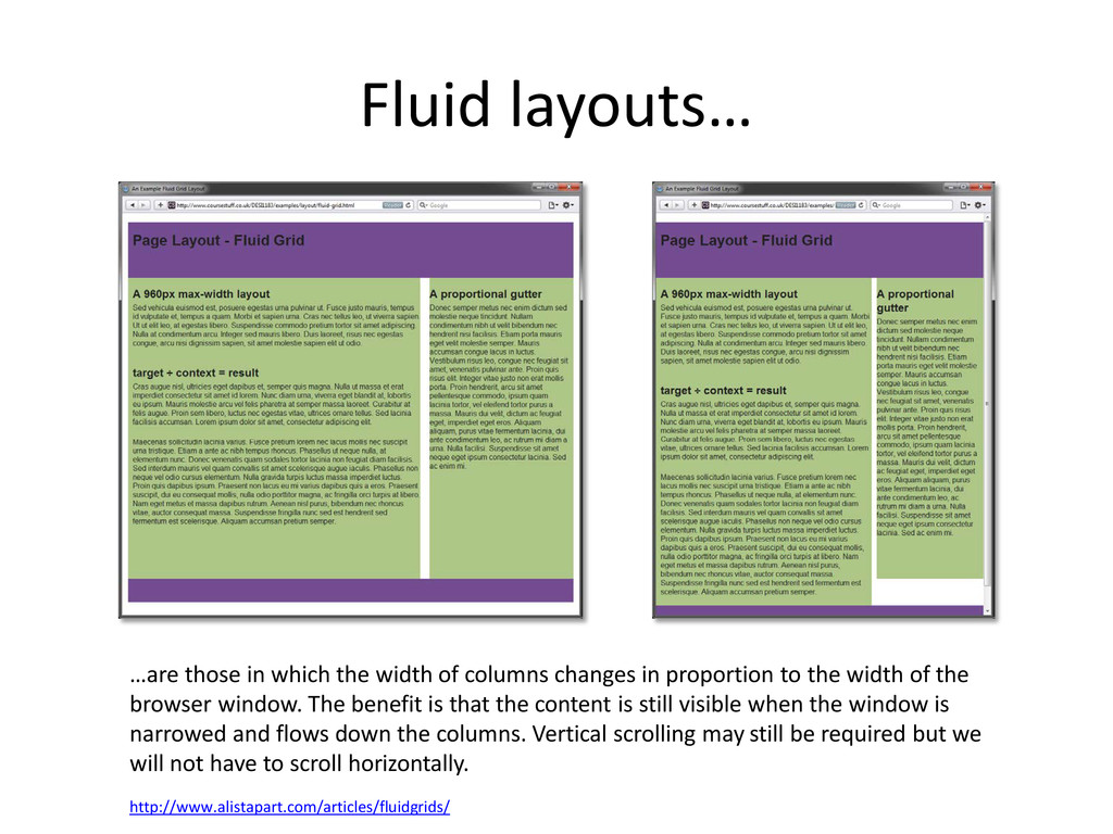
changes in proportion to the width of the browser window. The benefit is that the content is still visible when the window is narrowed and flows down the columns. Vertical scrolling may still be required but we will not have to scroll horizontally. http://www.alistapart.com/articles/fluidgrids/
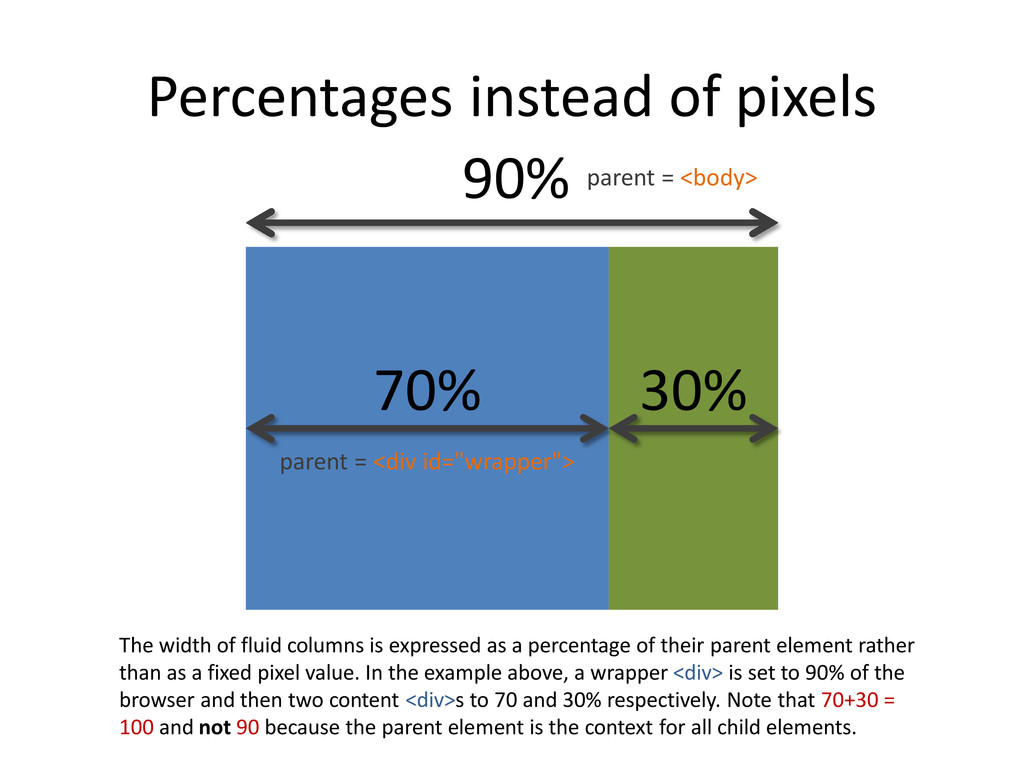
expressed as a percentage of their parent element rather than as a fixed pixel value. In the example above, a wrapper <div> is set to 90% of the browser and then two content <div>s to 70 and 30% respectively. Note that 70+30 = 100 and not 90 because the parent element is the context for all child elements. 70% 30% 90% parent = <body> parent = <div id="wrapper">
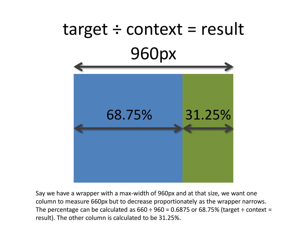
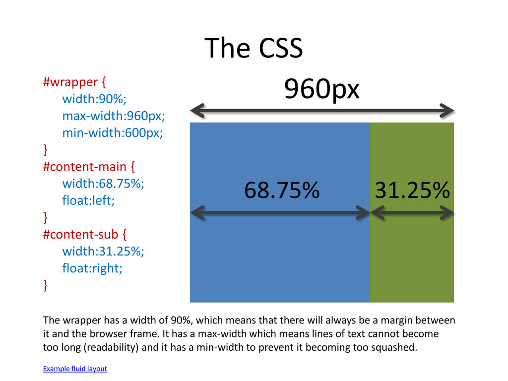
with a max-width of 960px and at that size, we want one column to measure 660px but to decrease proportionately as the wrapper narrows. The percentage can be calculated as 660 ÷ 960 = 0.6875 or 68.75% (target ÷ context = result). The other column is calculated to be 31.25%. 68.75% 31.25% 960px
width:68.75%; float:left; } #content-sub { width:31.25%; float:right; } 68.75% 31.25% 960px The wrapper has a width of 90%, which means that there will always be a margin between it and the browser frame. It has a max-width which means lines of text cannot become too long (readability) and it has a min-width to prevent it becoming too squashed. Example fluid layout
 chivonne
 xtone
xtone
 ajstarks
 mukai_takeru
 klemens
 rezaline
 lynteo
 r5ni4
r5ni4
 tajima_kaho
 baasie
 toshihidemurata
 ranyfardiany
 garyuten
 leimatthew05
 tenderlove
 tammyeverts
 inesmontani
 cassininazir
 axbom
axbom
 chriscoyier
 retrage
 bkeepers
 ryanjones
 malarkey