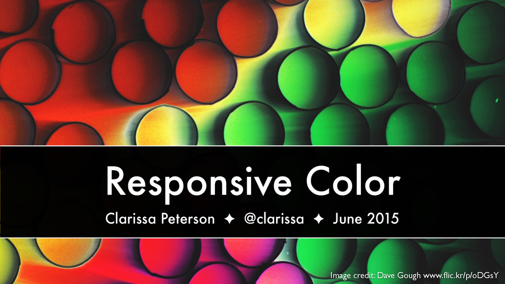
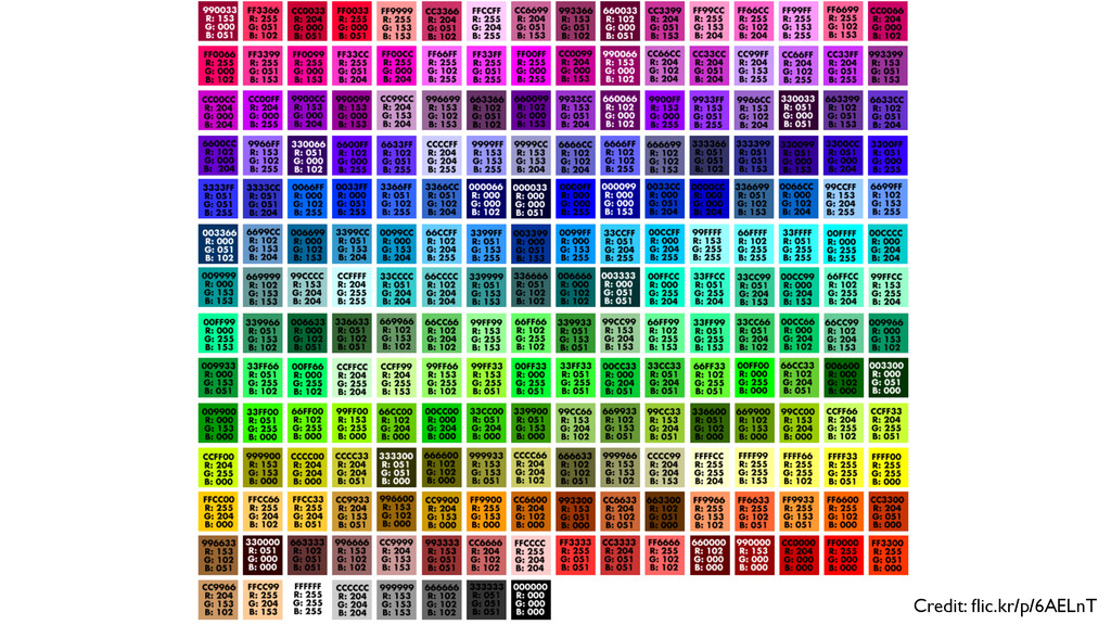
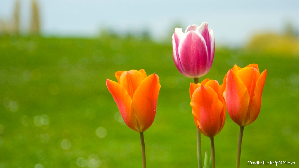
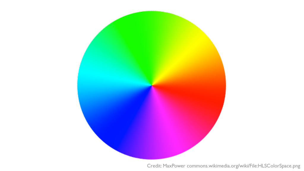
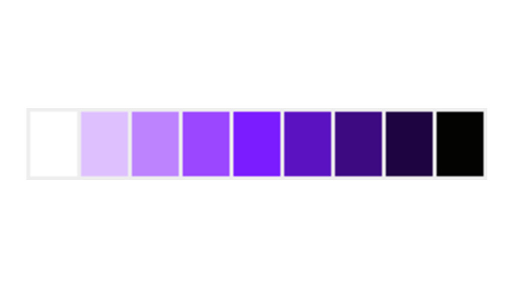
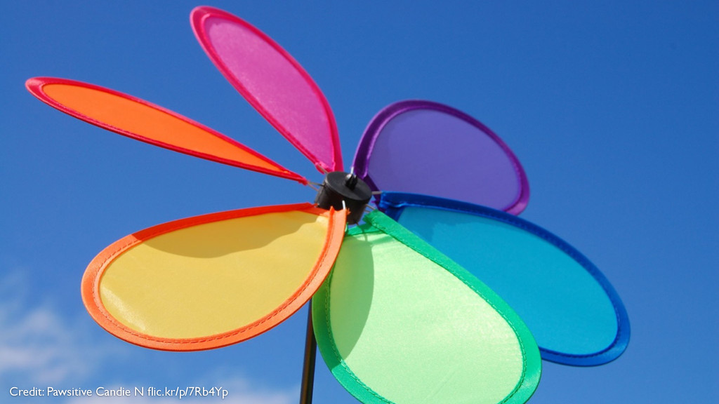
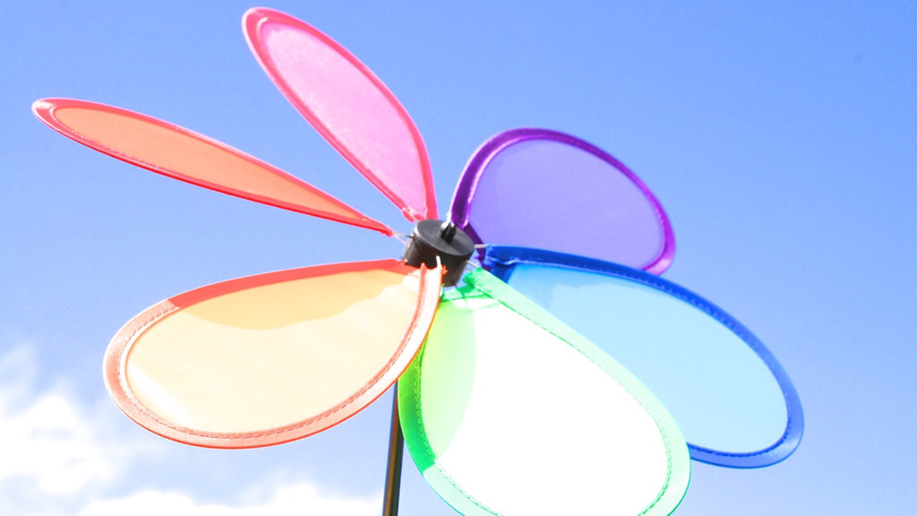
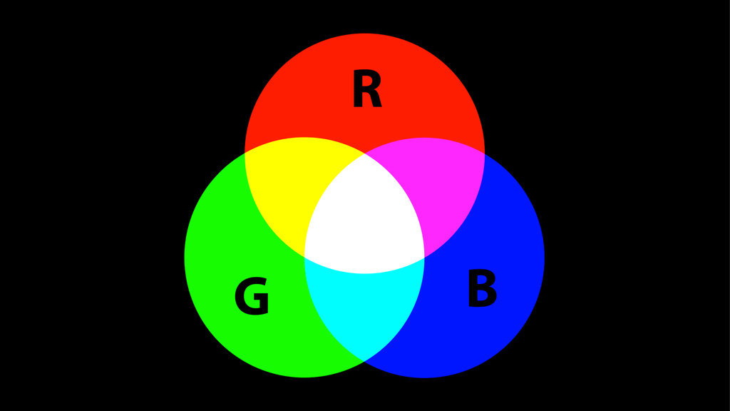
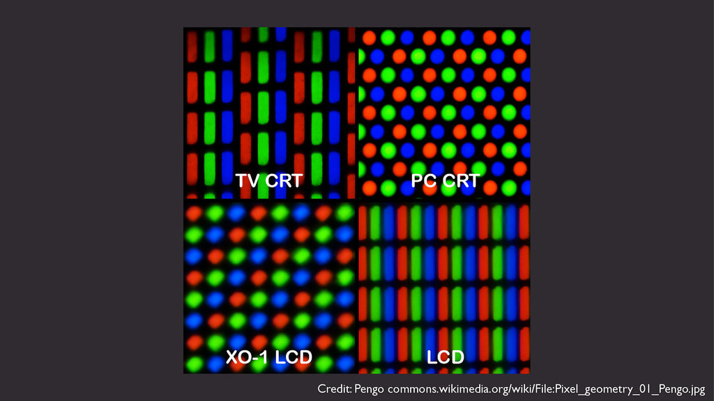
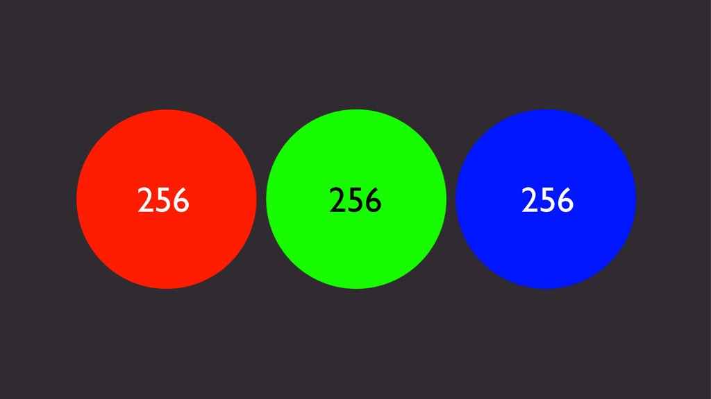
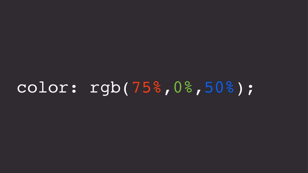
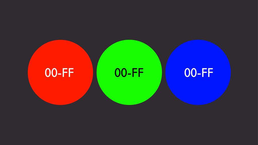
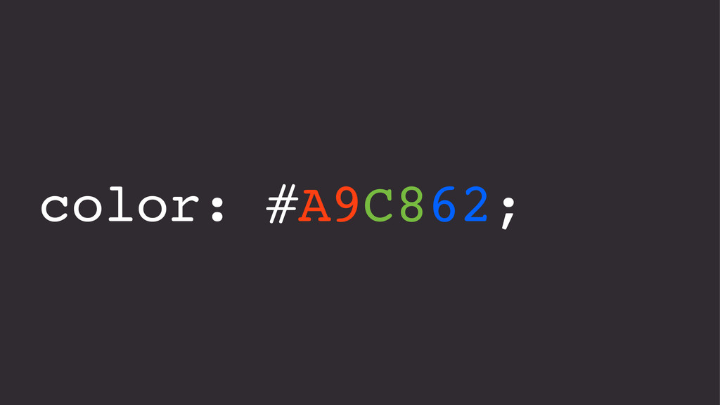
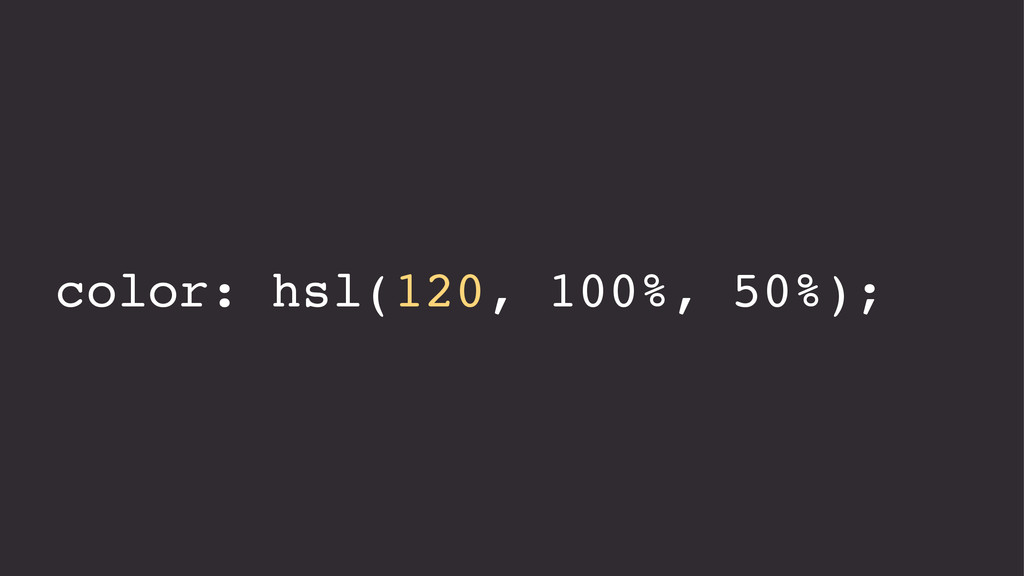
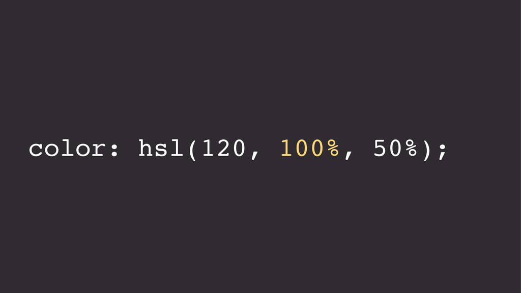
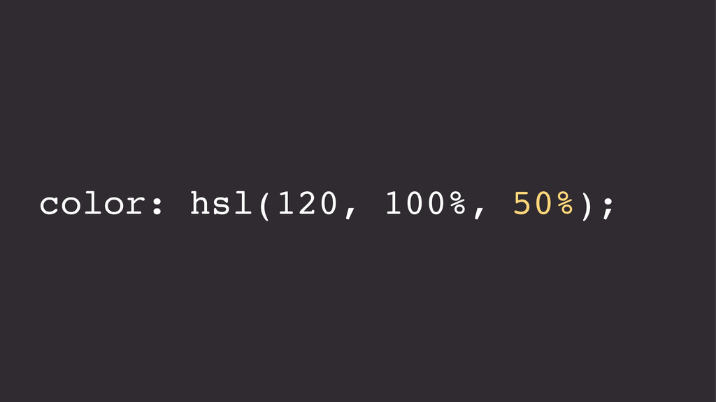
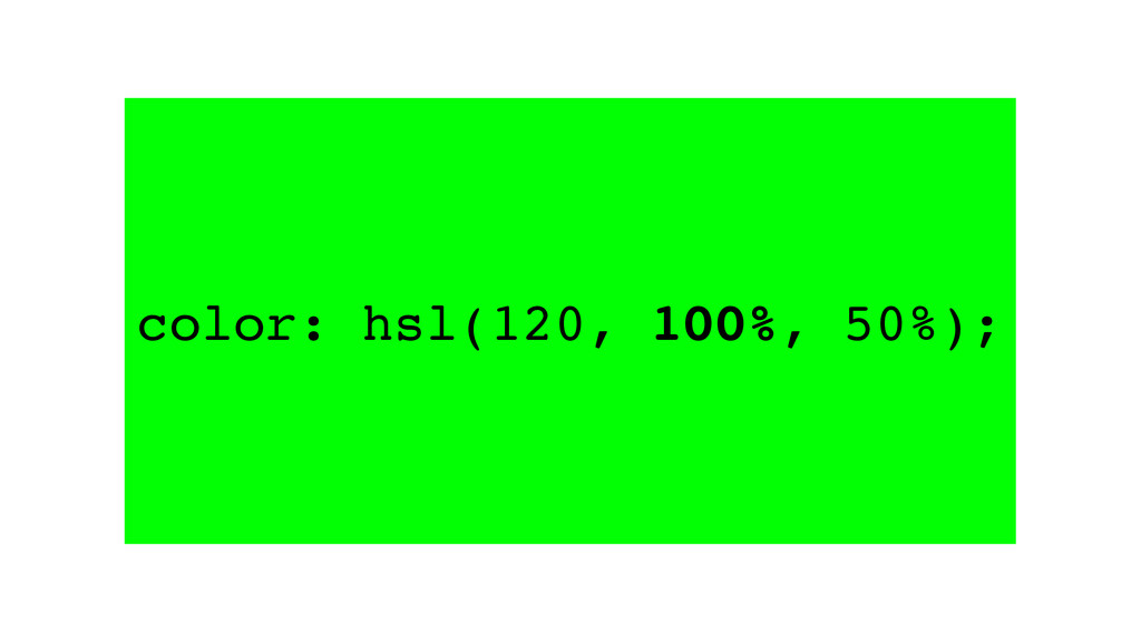
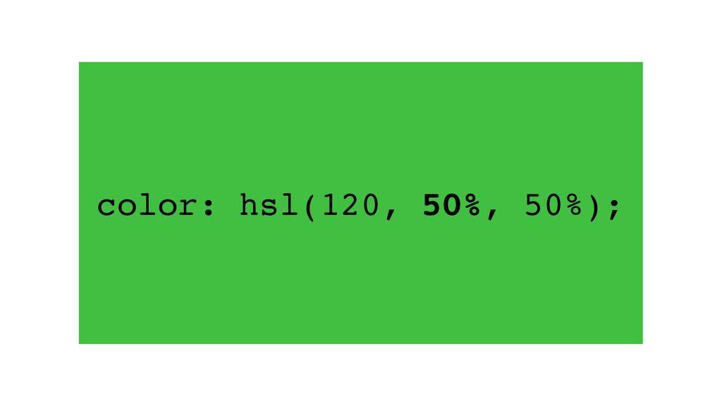
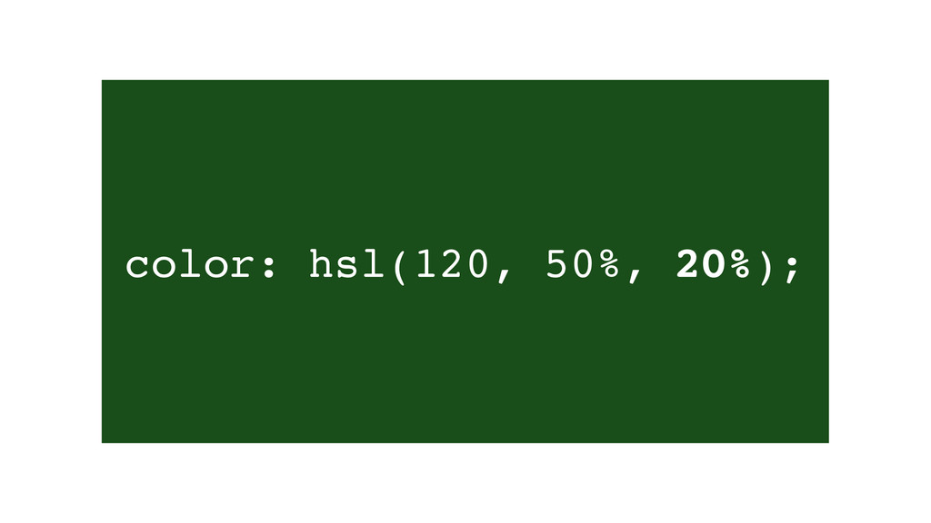
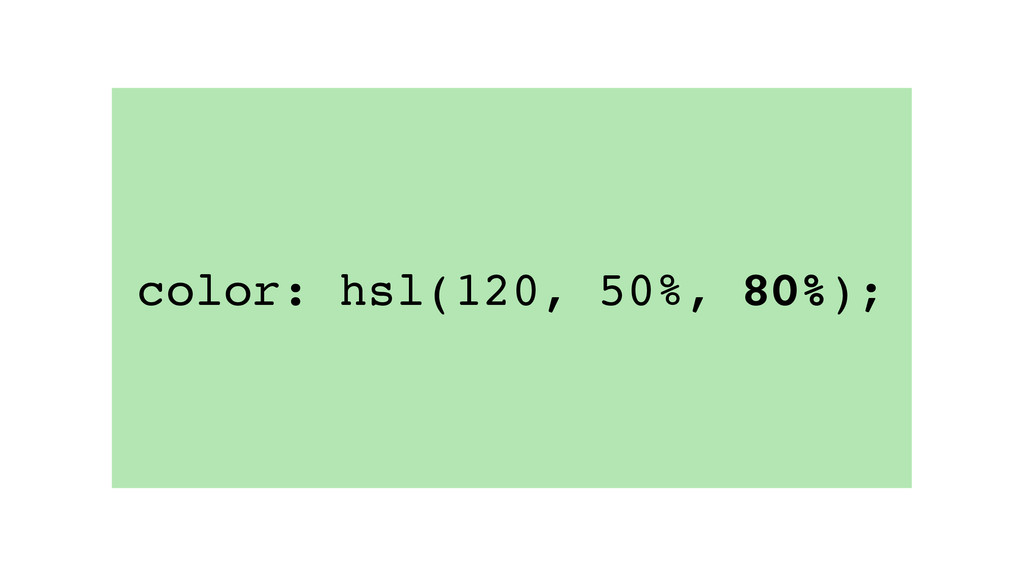
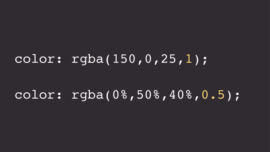
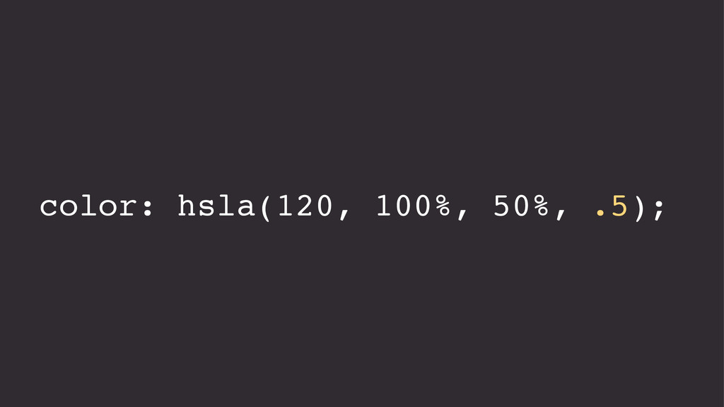
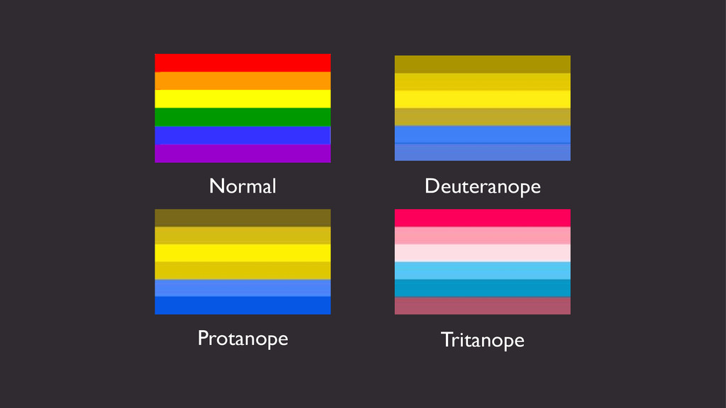
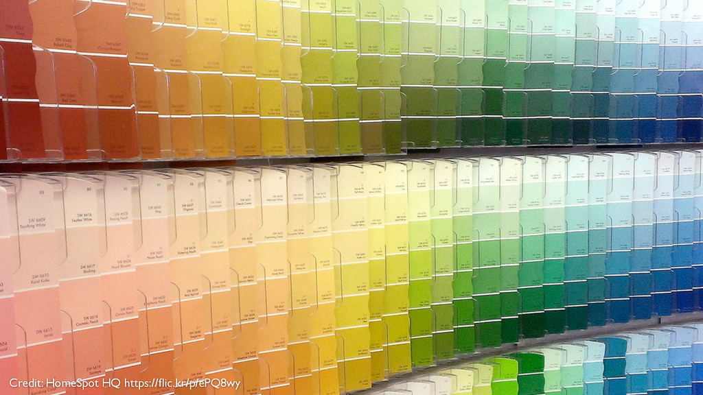
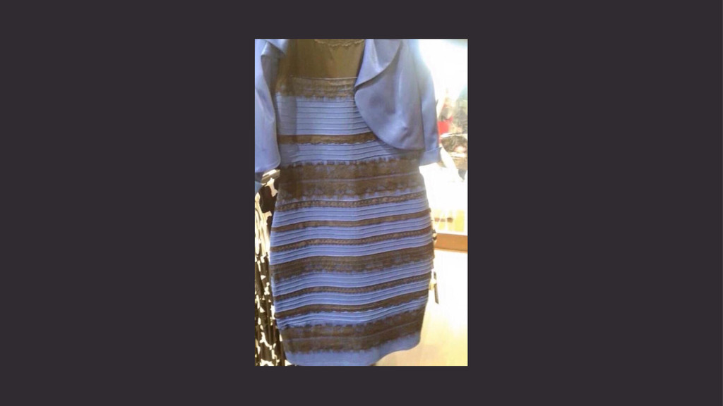
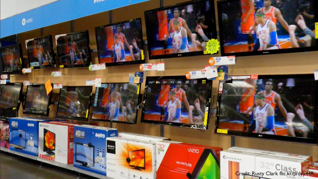
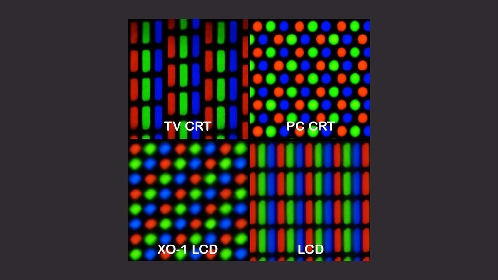
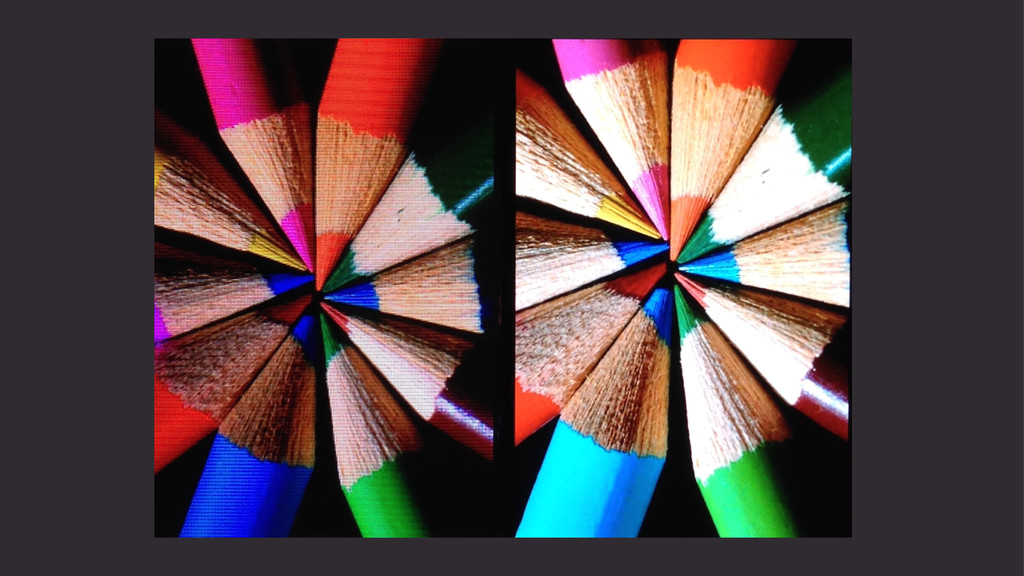
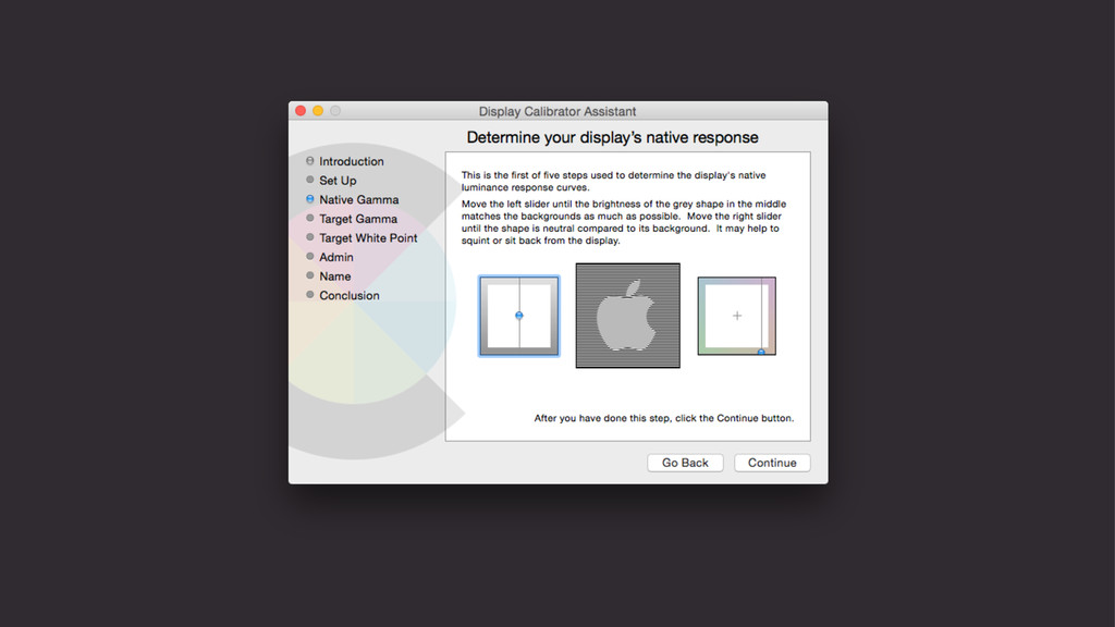
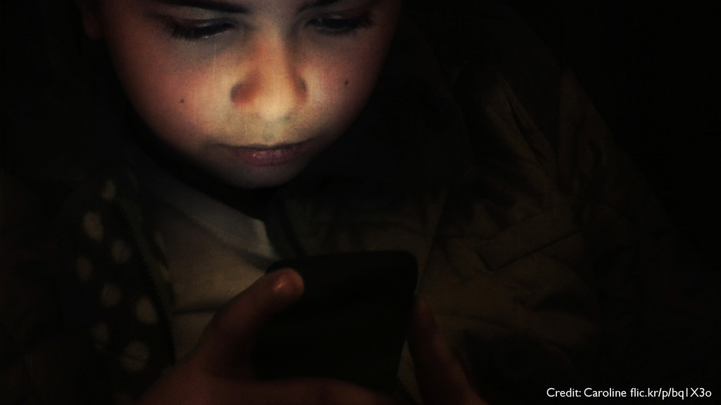
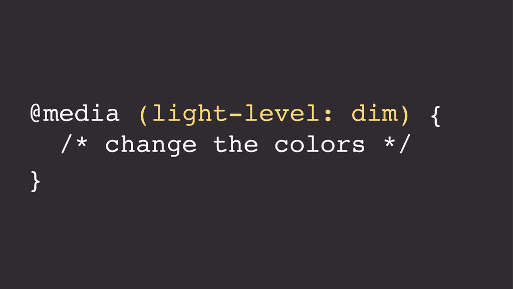
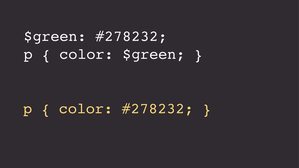
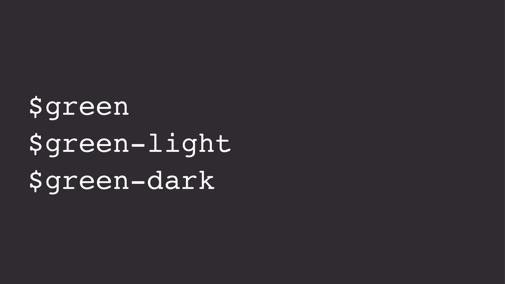
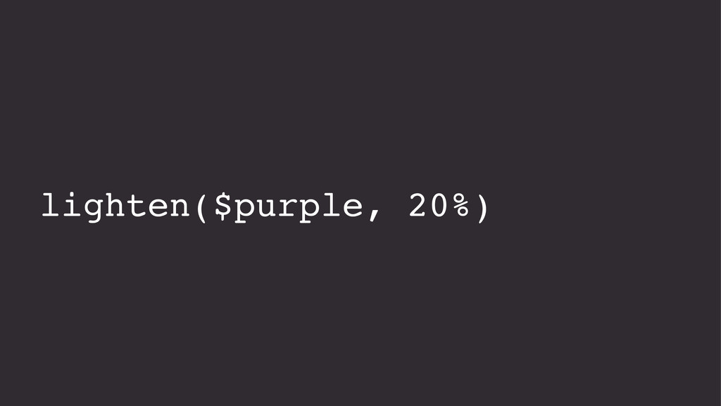
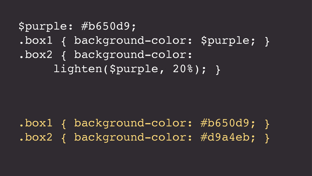
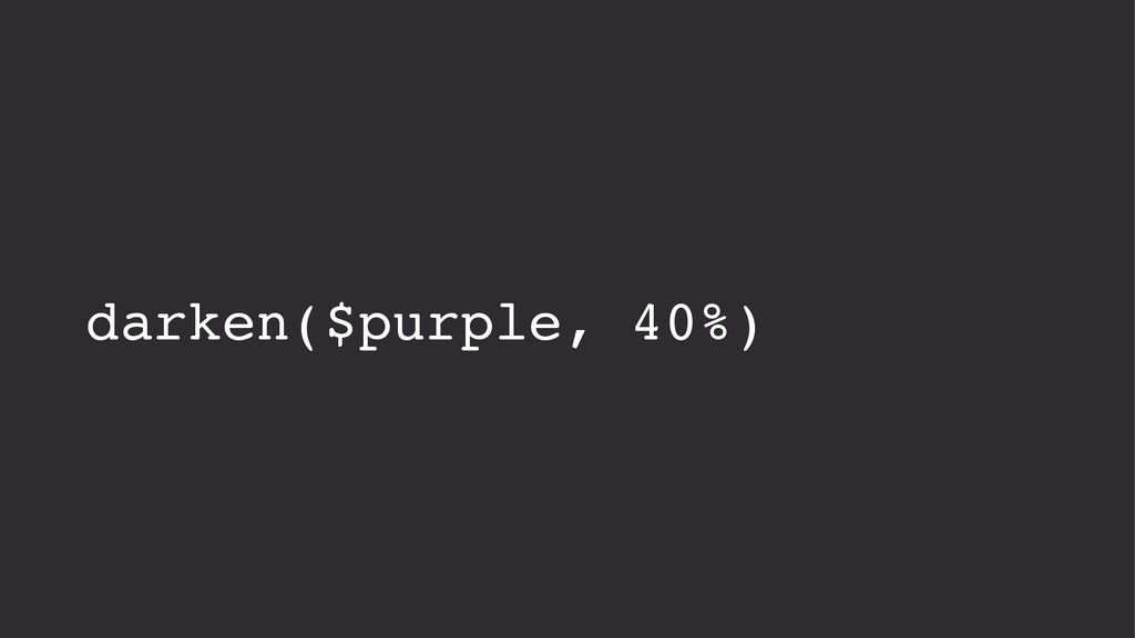
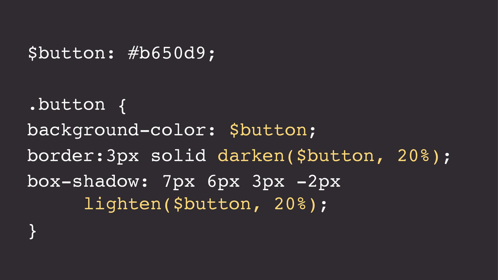
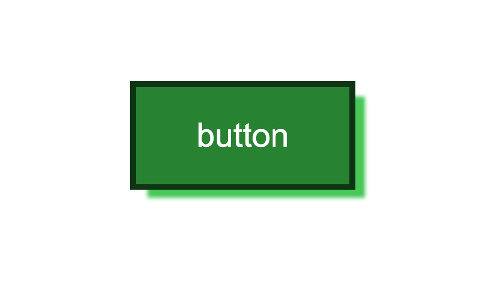
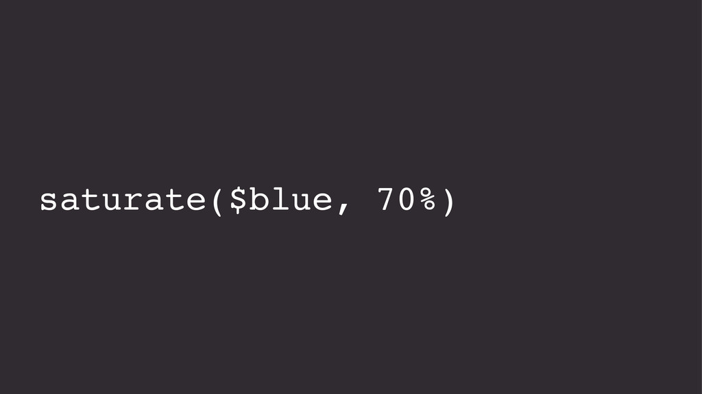
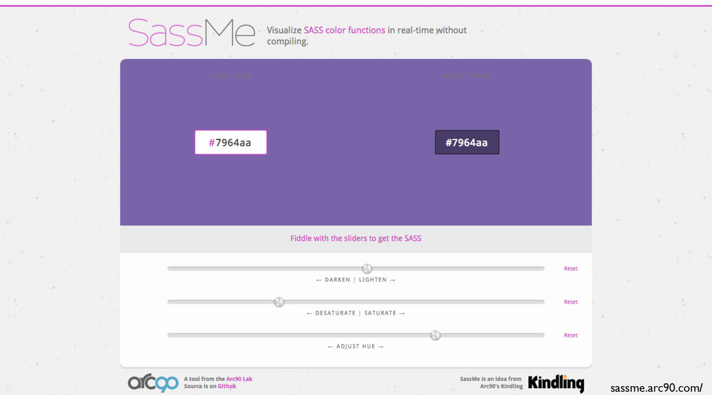
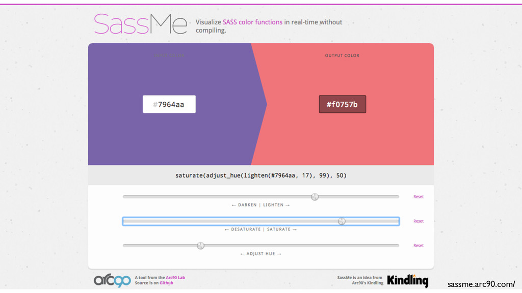
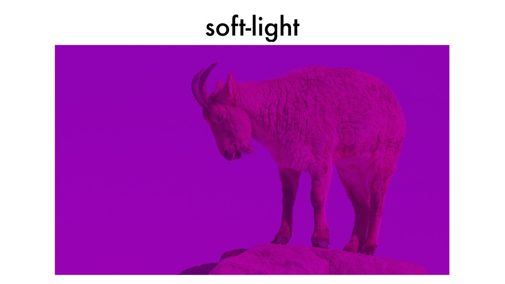
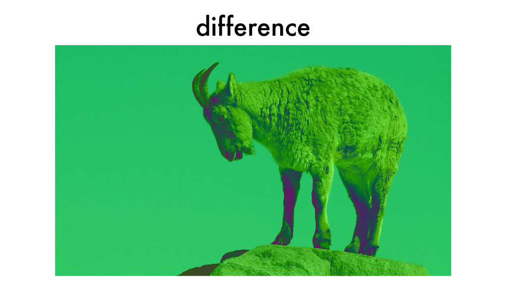
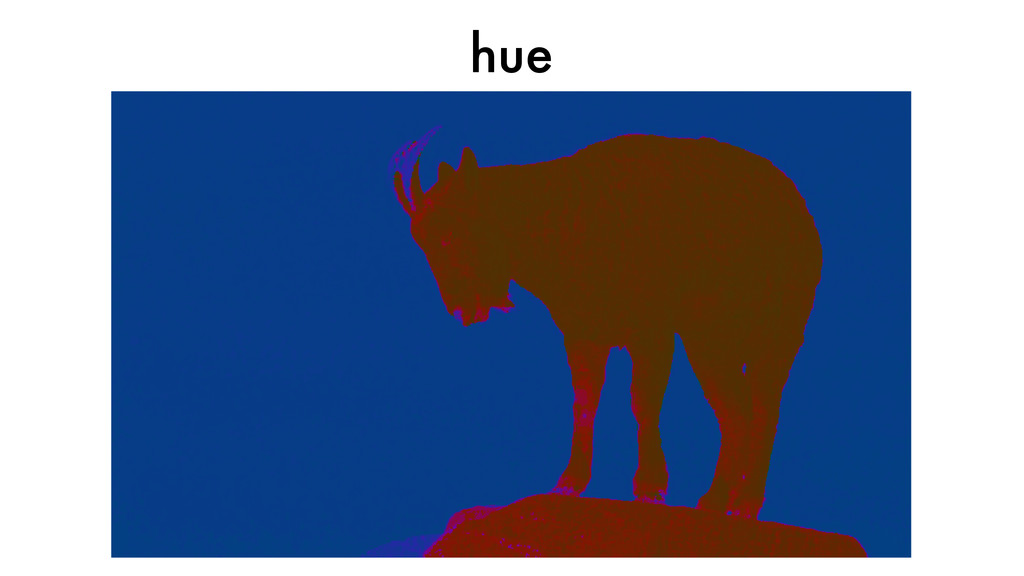
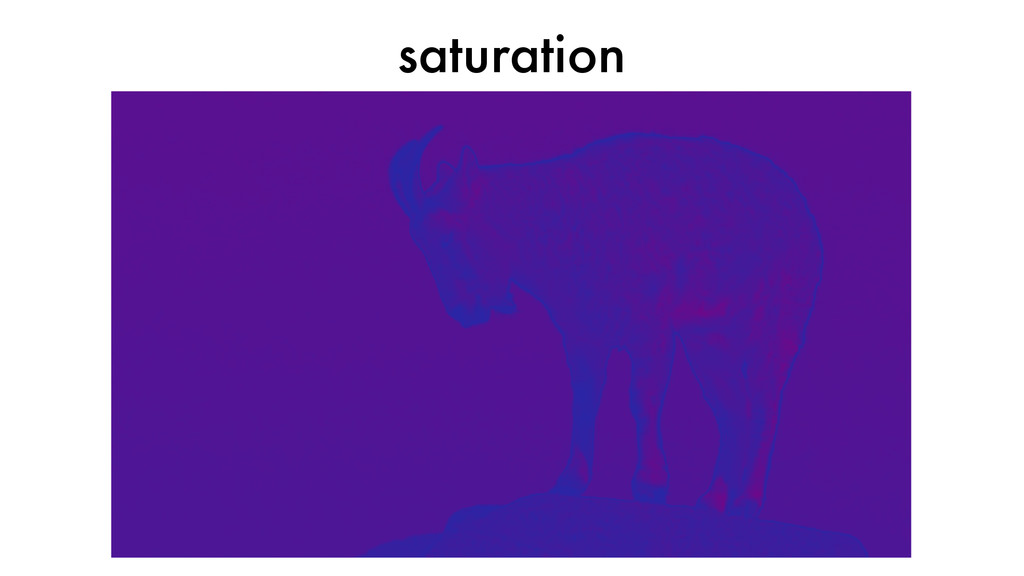
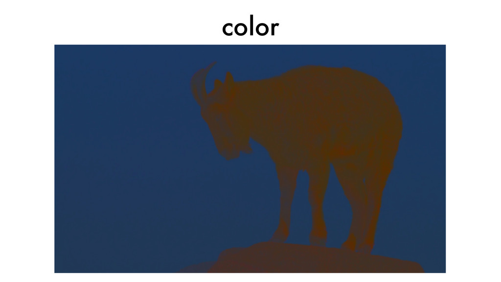
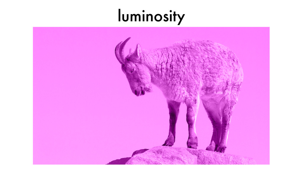
Color is one of the first things we learn how to do in CSS — and yet many of us don't ever go further than typing hex numbers handed to us by a designer. But getting colors to appear on a screen is just the beginning. Find out why colors look different on different devices, and what you can do about it. Learn how to adjust colors with media queries to make sure your colors look their best on any screen size. Find out how user context may affect the appropriate colors for a website. And finally, learn how you can make this whole color thing a lot less complicated by using a CSS preprocessor like Sass to manage your color choices and create color variations automatically.
Presented in 2015 & 2016 at ConFoo, Breaking Development, Mobile+Web Dev Conference, Code Fellows Seattle, CascadiaFest, CSS Summit, CSS Brigade Vancouver, CSS Day Amsterdam, Future Insights Live, WebVisions NYC, and Albany UX.
 clarissa
 ajstarks
 mhand01
 kgsi
kgsi
 godlingkogami
 tararira
 usagimaru
 bebe
bebe
 garyuten
 lynteo
 sevendex
 karad
karad
 kitanosirokuma
 lauravandoore
 aleyda
 schlessera
 addyosmani
 thekraken
 jonyablonski
 stephenakadiri
 szymonslowik
 nmsamuel
 holman
 axbom
axbom
 mfonobong