Upgrade to Pro — share decks privately, control downloads, hide ads and more …

Responsive Typography

Clarissa Peterson
October 21, 2013

Responsive Typography

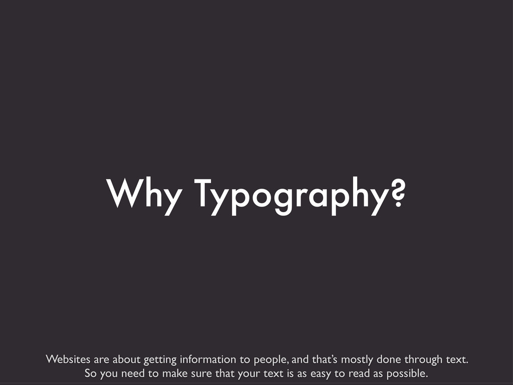
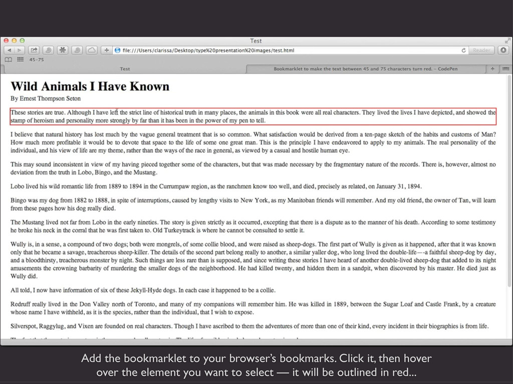
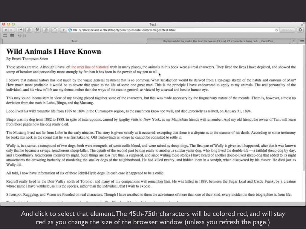
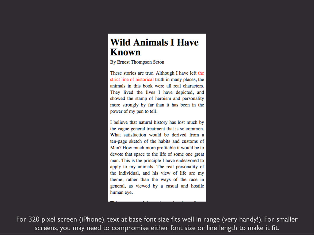
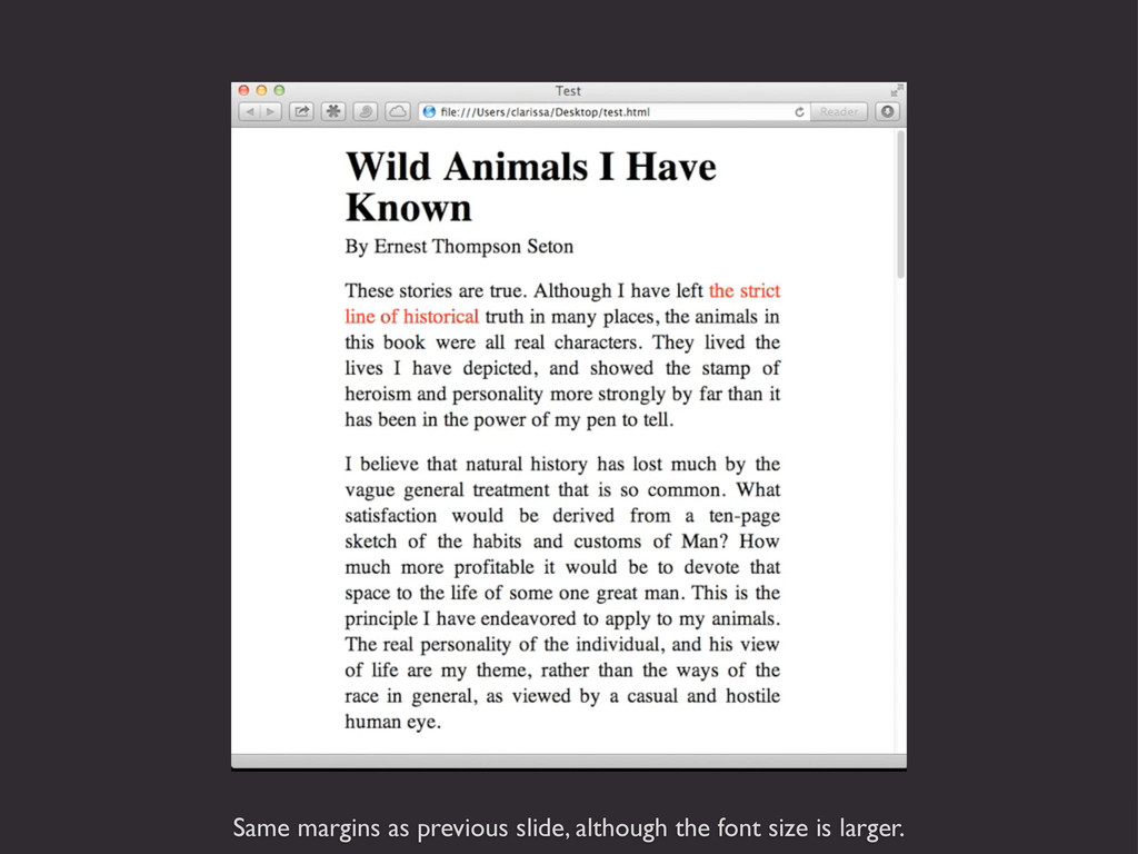
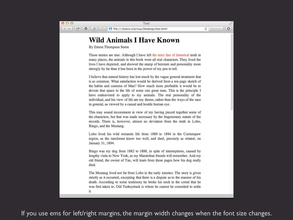
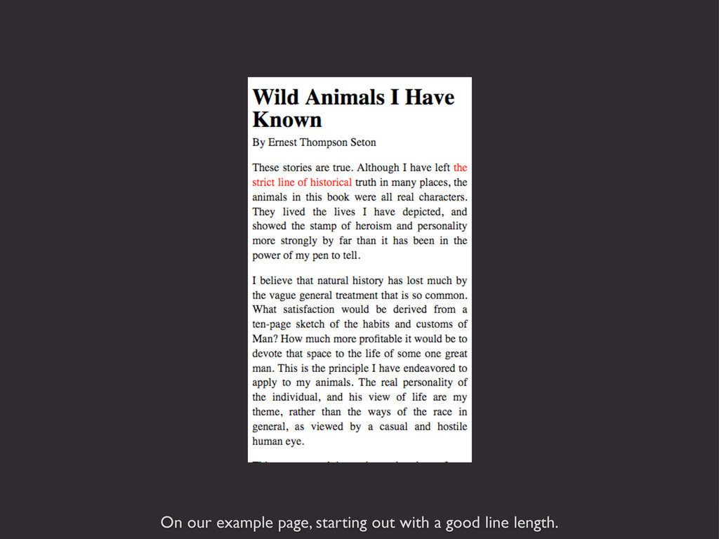
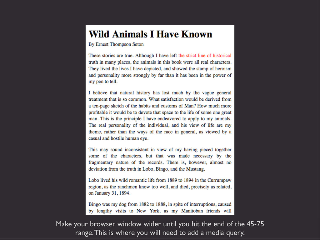
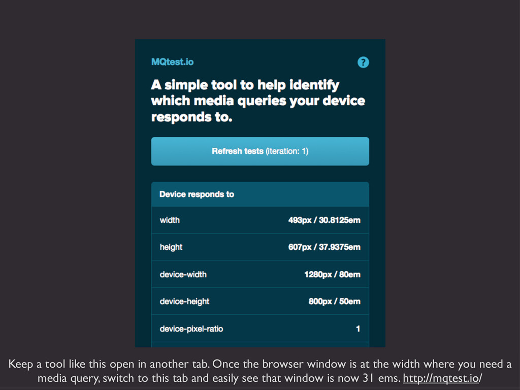
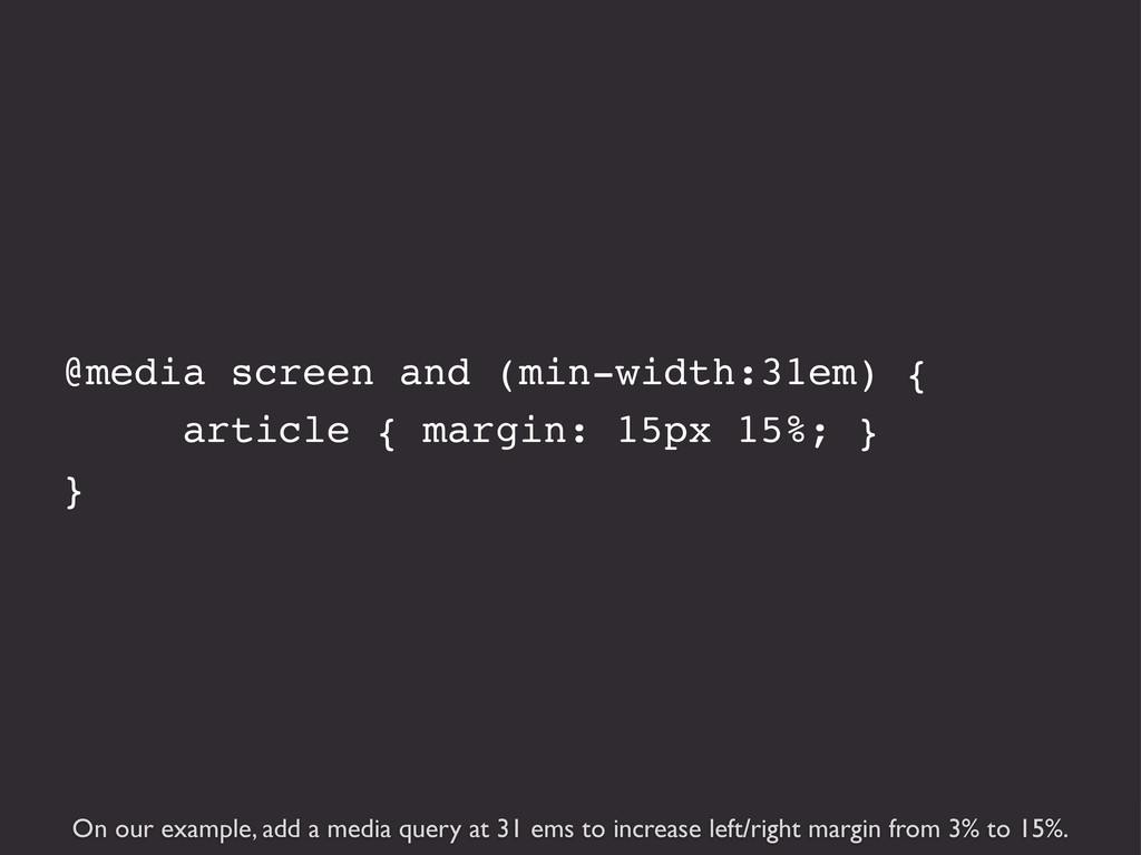
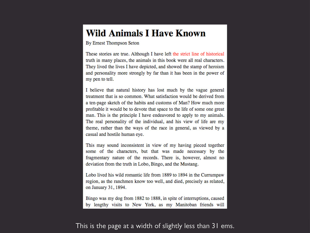
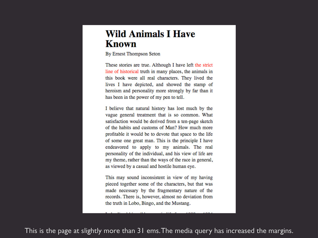
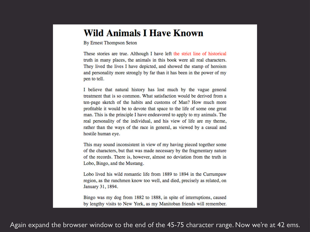
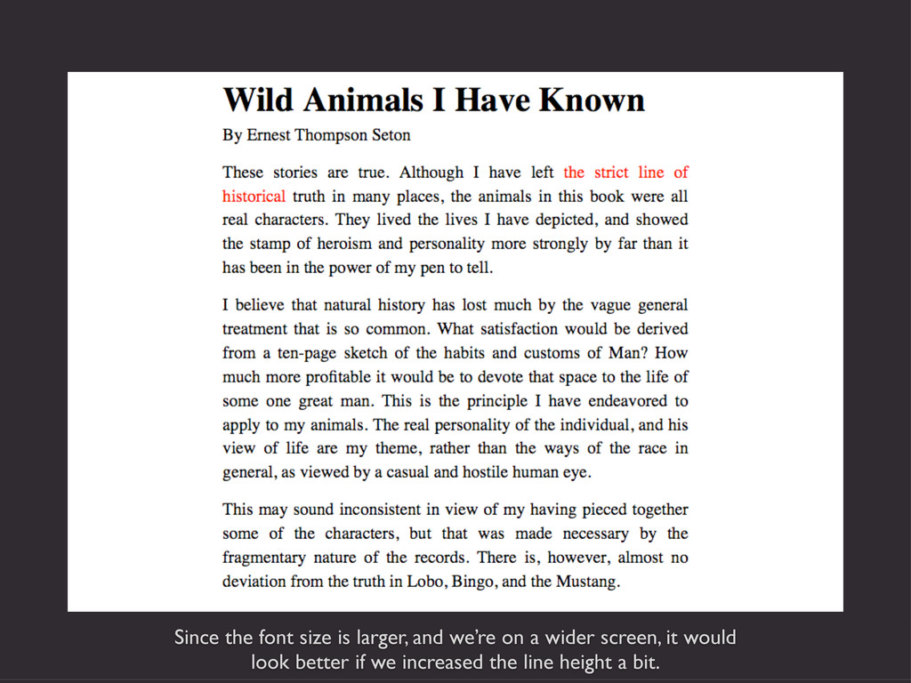
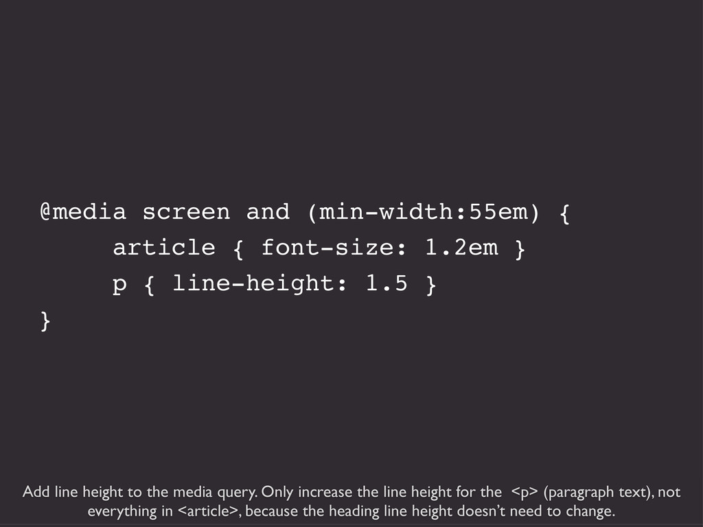
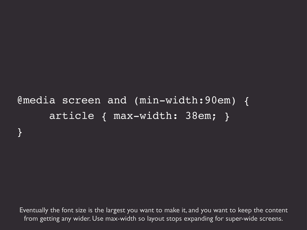
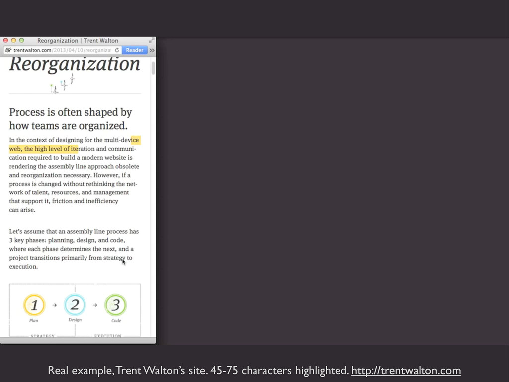
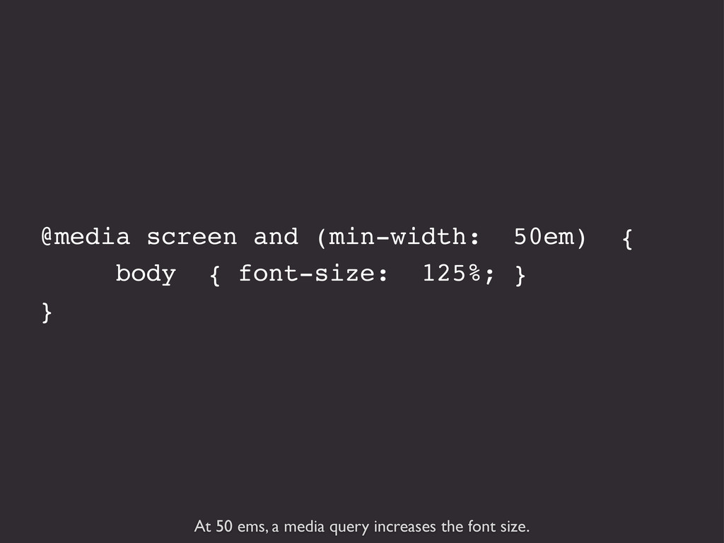
Your content is probably the most important feature of your website, so it's important to make sure that the text looks good and is easy to read no matter what device type or screen size it's being viewed on. One size does not fit all when it comes to typography, but you can use media queries to adjust type qualities such as size, line height, column width, margins, hyphenation, and even typeface depending on the viewport size. Learn how you can use CSS to apply design rules that will make your typography look better and perform better across devices.

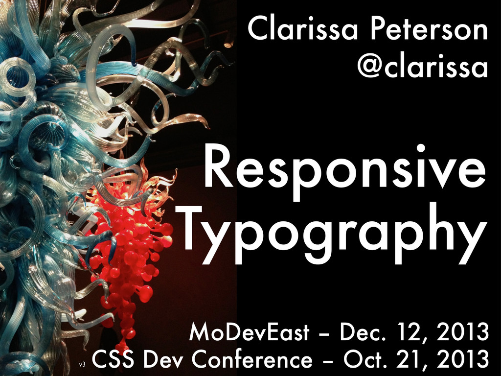
Presented at CSS Dev Conference, in Estes Park, Colorado, on October 21, 2013, and again the following day during the "Best Of" track.

Presented at MoDevEast in McLean, Virginia, on December 12, 2013.

Clarissa Peterson

October 21, 2013
Tweet

More Decks by Clarissa Peterson

Other Decks in Design

Transcript

  1. Covered in these slides: 1. Font Size 2. Line Height

    (Leading) 3. Line Length (Measure) (those three things work together to make text look good and easy to read) 4. Hyphenation 5. column-count
  2. Websites are about getting information to people, and that’s mostly

    done through text. So you need to make sure that your text is as easy to read as possible. Why Typography?
  3. A website can have as many media queries as you

    want. Add a media query where something needs to change - even if it’s a small thing. Don’t think of responsive websites as being made up of a few separate designs (one-column, two-column, etc.). Think of responsive websites as a range of changes across all viewport widths. Typography media queries don’t need to happen at the same breakpoints as layout changes. Media Queries
  4. It’s important to use the correct elements. For very old

    browsers/devices that don’t support CSS, they’ll still be able to display text using browser defaults. This is also important for accessibility. <h1>Heading</h1> <h2>Subheading</h2> <p>This is a paragraph</p>
  5. Because typefaces in the same font-size aren’t actually the same

    size. These are different fonts in the same size (in pixels). Changing the typeface later will affect your layout.
  6. Reference pixels aren’t even the same size on every device.

    This is 320 pixels viewed on an iPhone and on a laptop screen, held next to each other. http://m.ew.com
  7. Two alternatives for font size: ems and rems. You probably

    know these in the context of converting from pixels. But it’s also possible (and more responsive) to start with responsive units and not use pixels at all. Setting Font Size
  8. Base font size for the page - 100% is the

    browser’s default font size for body text - what the browser thinks is a good reading size for that device. It’s not the same for every browser, but currently most computers/devices use 16 pixels. In the future, that may not be the case. By using responsive units now, you’re making your site more likely to look good on future devices. html { font-size: 100%; }
  9. Starting with the browser default base size makes the site

    more readable for everybody, even if the text may seem too large to some users (or to the designer). http://alistapart.com
  10. Ems are linked to the size of type. Originally derived

    from width of letter M in lead typesetting. Ems
  11. Ems are relative to the font size of the containing

    element. 1 em = 100% (full size) 1.1 em = 110% (10% larger) 2 em = 200% (twice as big)
  12. p is the base font size - h1 is twice

    as big p { font-size: 1em; } h3 { font-size: 1.3em; } h2 { font-size: 1.5em; } h1 { font-size: 2em; }
  13. Nested elements make ems a little bit tricky. p {

    font-size: 1em; } li { font-size: 1.5em; }
  14. Rems (root ems) are an alternative to ems. Relative to

    the document’s root element (the html element), not the parent element. Rems
  15. But not all browsers support it; you need fallback in

    pixels for IE8 and older. h1 { font-size: 32px; font-size: 2rem; }
  16. Converting pixels to ems gets you weird numbers, which are

    difficult to use, They can also cause problems with rounding by the browser. p { font-size: .45833333333em; }
  17. If lines are too close together/far apart, text is more

    difficult to read. It’s called leading because in lead typesetting, they would put pieces of lead between lines to add space. Line Height (leading)
  18. For line-height, use unitless numbers, which are relative to the

    font size of the element. 1 is default. p { line-height: 1 }
  19. line-height: 2 - the lines are too far apart, so

    it’s difficult and tiring to read
  20. line-height: 1.4 - good default to start with, but adjust

    based on typeface, line width, screen size
  21. Small screens need less line height (1.4 on left, 1.3

    on right), plus you can fit a little more on screen.
  22. Media queries to increase line height as viewport gets wider.

    p { line-height: 1.3 } @media screen and (min-width: 30em) { p { line-height: 1.4 } } @media screen and (min-width: 60em) { p { line-height: 1.5 } }
  23. Characters per line is one of the most important qualities

    that makes type readable. Line Length (Measure)
  24. Obvious that super-long lines are hard to read. Difficult for

    eyes to move from one line to the next.
  25. Lines that are too short interrupt the flow of reading.

    This makes it tiring to read because your eyes move back and forth more.
  26. Optimum characters per line for body text such as paragraphs

    (doesn’t apply to headings, etc.) 45 - 75 characters
  27. Remember: to design around line length, it’s important to select

    the typeface first, because they’re different sizes.
  28. Characters per line vary due to letter size, word length.

    Try to average 45-75. 65 58 65 73 68 67 66 74 72 69 69
  29. You should test line length as you’re designing a layout,

    to stay within the optimal range. Testing Line Length
  30. One easy way to test: count from 45th to 75th

    character on the first line, and use a span to color it. 45 75
  31. You can easily turn this on an off in your

    CSS during designing/testing. <p>These stories are true. Although I have left <span class=”testing”>the strict line of historical</span> truth in many places, the animals in this book were all real characters.</p> .testing { color: #f00; }
  32. But this is even easier: after my talk at CSS

    Dev Conference, Chris Coyier made this bookmarklet that does the same thing — colors the text red between the 45th-75th characters in any text element. No need to change your HTML or CSS. http://codepen.io/chriscoyier/pen/atebf
  33. Add the bookmarklet to your browser’s bookmarks. Click it, then

    hover over the element you want to select — it will be outlined in red...
  34. And click to select that element. The 45th-75th characters will

    be colored red, and will stay red as you change the size of the browser window (unless you refresh the page.)
  35. The main methods to adjust line length are changing the

    margins and changing the font size. Margins & Font Size
  36. For 320 pixel screen (iPhone), text at base font size

    fits well in range (very handy!). For smaller screens, you may need to compromise either font size or line length to make it fit.
  37. Use narrow margins on small screens to not waste space,

    but don’t have margins of zero. The example on the previous slide is 3% margin on each side. article { margin: 15px 3%; }
  38. If you use % for left/right margins, the margin width

    stays the same if the font size changes.
  39. If you use ems for left/right margins, the margin width

    changes when the font size changes.
  40. Same margin in ems as previous slide, but the margins

    get wider because the font size is larger.
  41. Make your browser window wider until you hit the end

    of the 45-75 range. This is where you will need to add a media query.
  42. Keep a tool like this open in another tab. Once

    the browser window is at the width where you need a media query, switch to this tab and easily see that window is now 31 ems. http://mqtest.io/
  43. On our example, add a media query at 31 ems

    to increase left/right margin from 3% to 15%. @media screen and (min-width:31em) { article { margin: 15px 15%; } }
  44. This is the page at slightly more than 31 ems.

    The media query has increased the margins.
  45. Again expand the browser window to the end of the

    45-75 character range. Now we’re at 42 ems.
  46. Media query to increase font size, from 1 em up

    to 1.1 em. Larger fonts will look okay on larger screens. It’s better to include more media queries with small changes in each one than to use only a few media queries and make dramatic jumps in font size. @media screen and (min-width:42em) { article { font-size: 1.1em } }
  47. This is the page at slightly more than 42 ems,

    with a bigger font size. We changed the font size on the <article> element, so everything inside it is bigger (both paragraph text and heading). Alternatively, you could just change the <p> font size and leave the heading the same.
  48. Since the font size is larger, and we’re on a

    wider screen, it would look better if we increased the line height a bit.
  49. Add line height to the media query. Only increase the

    line height for the <p> (paragraph text), not everything in <article>, because the heading line height doesn’t need to change. @media screen and (min-width:55em) { article { font-size: 1.2em } p { line-height: 1.5 } }
  50. @media screen and (min-width:90em) { article { max-width: 38em; }

    } Eventually the font size is the largest you want to make it, and you want to keep the content from getting any wider. Use max-width so layout stops expanding for super-wide screens.
  51. You can use max-width on individual columns, or on an

    element that contains all your content. #content { max-width: 120em; }
  52. Starting at the most narrow width, the container is 88%

    (6% margin on each side). The font-isze starts at 100% (base font size for the browser). body { font-size: 100%; } .container { width: 88%; margin-left: auto; margin-right: auto; max-width: 1260px; }
  53. There’s a media query at 37.5 em, where the content

    width changes to 68% (85% × 80%) and the font size increases. @media screen and (min-width: 37.5em) { .container { width: 85%; } .article .centered p { width: 80%; } body { font-size: 112.5%; } }
  54. At 50 ems, a media query increases the font size.

    @media screen and (min-width: 50em) { body { font-size: 125%; } }
  55. At 65 ems, a media query increases the font size

    again, to 137.5%. @media screen and (min-width: 64.375em) { body {font-size: 137.5%;} }
  56. At 75 ems, a media query increases the font size,

    but only if screen is tall enough (so not for wide laptop screens where the vertical space is taken up with lots of browser toolbars) @media screen and (min-width: 75em) and (min-height: 31.25em) { body {font-size: 150%;} }
  57. Using max-width to keep the layout from getting wider. @media

    screen and (min-width: 106.875em) and (min-height: 50em) { body {font-size: 162.5%;} .container {max-width:1360px;} }
  58. This site uses max-width instead of min-width for media queries,

    so I’ll show you starting from widest screen instead of narrowest screen. http://wearyoubelong.com/
  59. Start with 100% font size, then a media query takes

    it down to 90% at 800 pixels or narrower, and 80% at 680 or narrower. (Yes, media queries should be in ems.) body { font-size: 100%; } @media screen and (max-width:800px) { body { font-size:90%; } } @media screen and (max-width:680px) { body { font-size:80%; } }
  60. As the window gets narrower, we’re down to 90%. The

    media query changes the font size on the body element, so all of the text gets smaller.
  61. At a narrower screen width, even though the font-size is

    80%, the heading/intro text takes up whole screen.
  62. On iPhone it’s even worse. It wouldn’t be a good

    idea to make this particular typeface smaller (it would be hard to read), but you could use a media query to change the typeface on narrow screens. Also, don’t use all caps for long sections of text like this.
  63. Further down the page, the text is 80% of the

    browser default. It’s pretty small. I had trouble reading it, and wanted to zoom in on my phone’s screen...
  64. But they used maximum-scale=1.0, which takes away the ability to

    zoom. Don’t ever do this. <meta name="viewport" content="width=device-width; initial- scale=1.0; maximum-scale=1.0;">
  65. Also, there’s a lot of wasted space on the right

    at the end of lines. Hyphenation would help with this.
  66. You can even out the length of lines by letting

    long words wrap onto next line. Hyphenation
  67. The left example has no hyphenation, the right has hyphenation.

    On left, look at second-to-last line, the words look too spaced out. Hyphenation is most important on small screens, to maximize use of space.
  68. The hyphen property is new, so you need prefixes. Opera

    and Chrome don’t support hyphenation at all, but that’s okay. This is an example of progressive enhancement. Hyphens make the design better for browsers that can support it, but the design is still perfectly okay for users with browsers that don’t support hyphenation. p { -webkit-hyphens: auto; -moz-hyphens: auto; -ms-hyphens: auto; hyphens: auto; }
  69. Hyphens are especially important for narrow screens, but you can

    use a media query to remove hyphens for wider viewports. @media screen and (min-width:30em) { p { -webkit-hyphens: none; -moz-hyphens: none; -ms-hyphens: none; hyphens: none; } }
  70. You have to specify a language (i.e., English). If you

    leave it out, the browser won’t hyphenate. If you specify the wrong language, the browser will still add hyphens, but weird things may happen. Note: you can specify language on elements other than the <html> element, if you have more than one language on a particular page. <html lang=”en-US”>
  71. ... And a media query divides it into two columns

    when the viewport is wide enough. People are used to reading down on web pages, not across, so use this sparingly. Don’t use multiple columns for regular body text, but it would be okay on something like an About page, if you want to be a bit artistic.
  72. @media screen and (min-width: 48em) { #content { width: 90%;

    -moz-column-count: 2; -webkit-column-count: 2; column-count: 2; -moz-column-gap: 4em; -webkit-column-gap: 4em; column-gap: 4em; } } column-count tells the browser how many columns there should be; column-gap is the space between columns. There are other CSS properties for adding a line between columns, etc.
  73. Prefixes for moz/webkit. Column count is supported in IE 10

    and Opera without prefixes. It’s not supported in IE9 or earlier, so content will stay in one column — if it doesn't’ look okay, use conditional comments to add CSS that’s specific to old IE. @media screen and (min-width: 48em) { #content { width: 90%; -moz-column-count: 2; -webkit-column-count: 2; column-count: 2; -moz-column-gap: 4em; -webkit-column-gap: 4em; column-gap: 4em; } }
  74. CSS for 3 columns @media screen and (min-width: 70em) {

    #content { -moz-column-count: 3; -webkit-column-count: 3; column-count: 3; -moz-column-gap: 2em; -webkit-column-gap: 2em; column-gap: 2em; } }
  75. You need to make sure there’s enough vertical space so

    users won’t need to scroll up and down to read. You can use a media query to check for vertical space.
  76. Add a min-height media query to change to one column

    if the viewport isn’t tall enough.
  77. With this media query, only use multiple columns if the

    viewport is a minimum height of 450 pixels. @media screen and (min-width: 70em) and (min-height: 450px) { /* columns */ }
  78. Responsive Typography Resources The Elements of Typographic Style Applied to

    the Web – Richard Rutter http://webtypography.net/toc/ Fluid Type – Trent Walton http://trentwalton.com/2012/06/19/fluid-type/ Responsive Web Typography – Jason Cranford Teague http://www.jasonspeaking.com/rwt/#/ Web Typography You Should Do Now – Richard Rutter http://webtypography.net/talks/sxsw2013/ Prototyping Responsive Typography – Viljami Salminen http://viljamis.com/blog/2013/prototyping-responsive-typography/ Responsive Web Design and Typography – Danny Calderst http://www.slideshare.net/dannycalders/typography-responsive-web-design