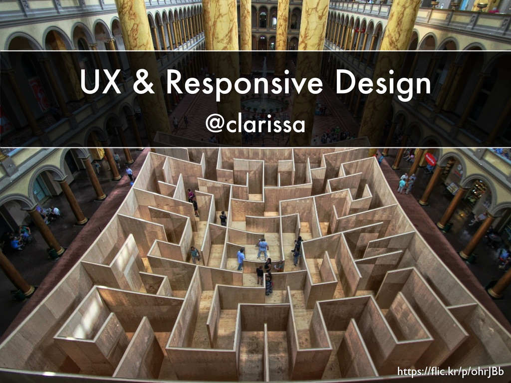
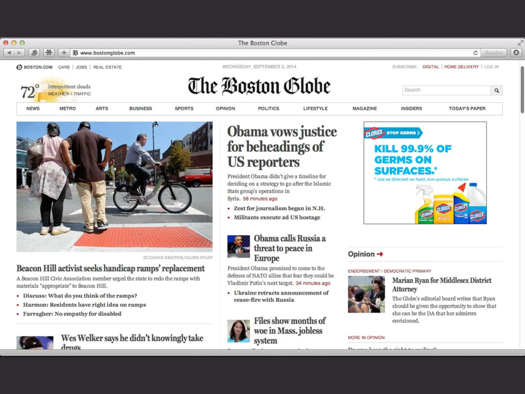
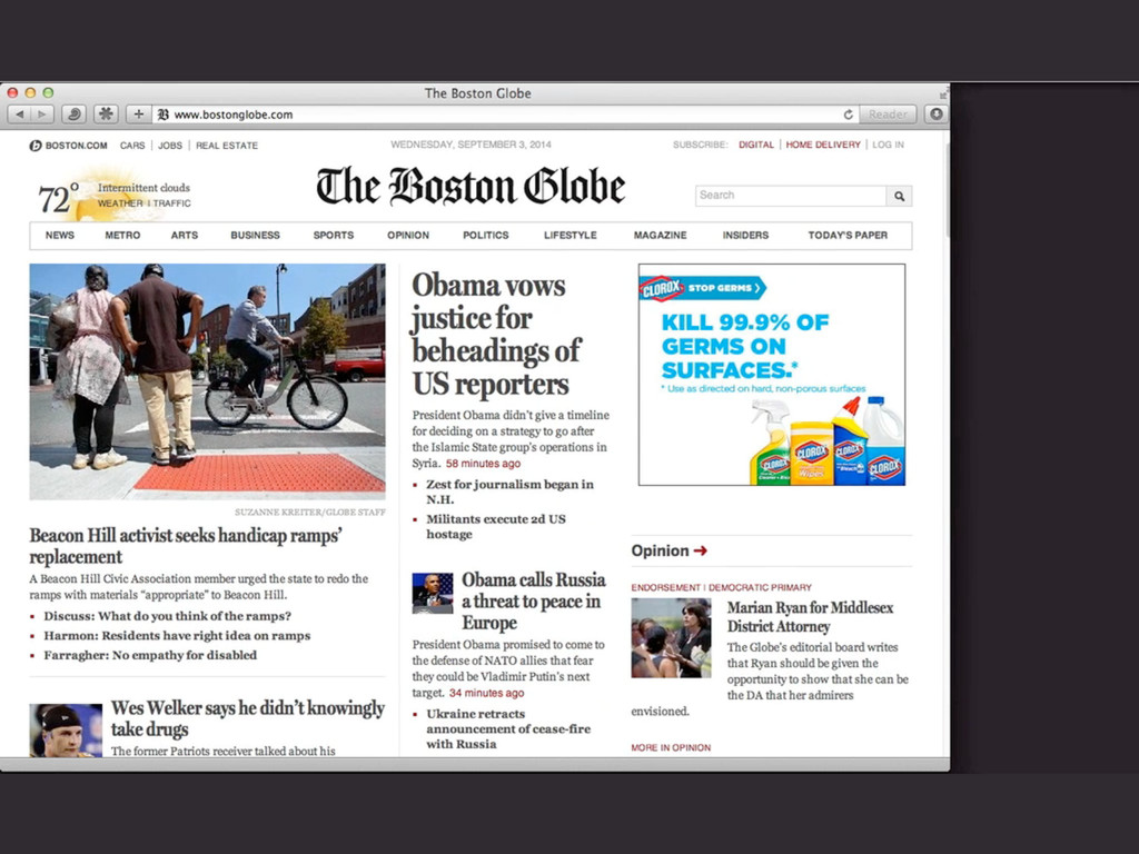
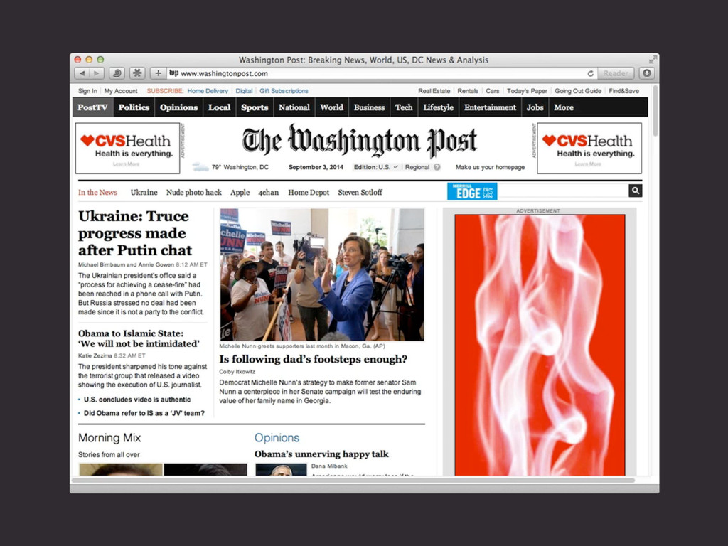
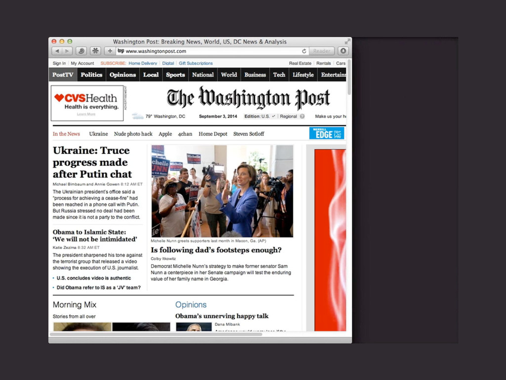
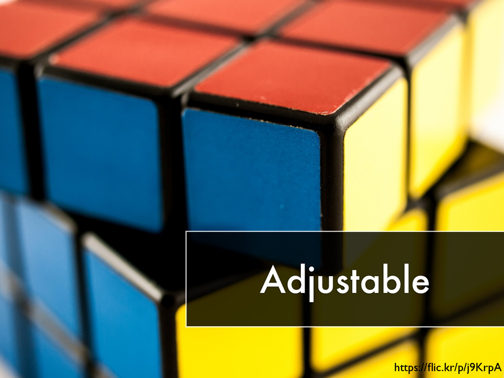
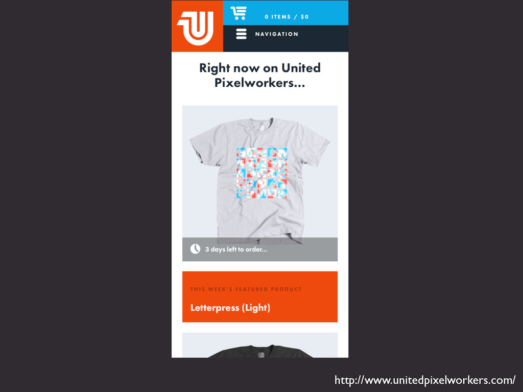
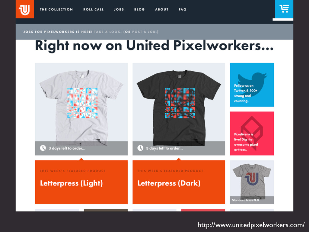
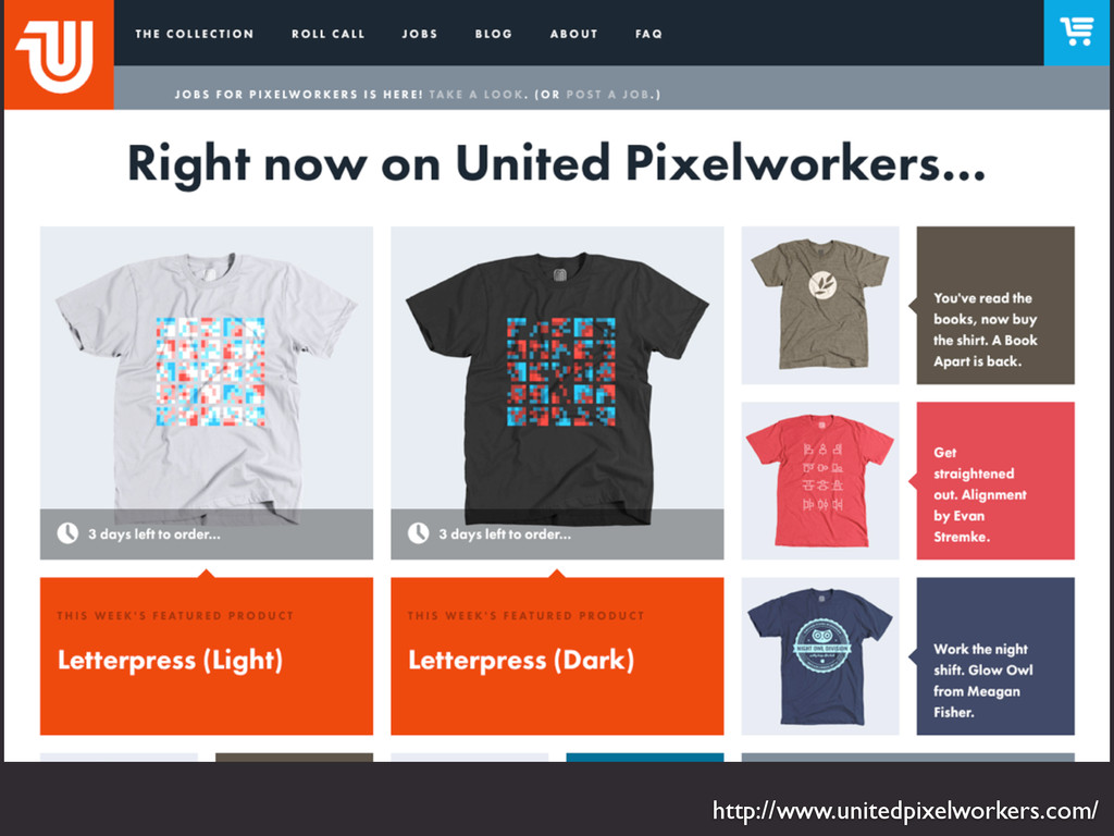
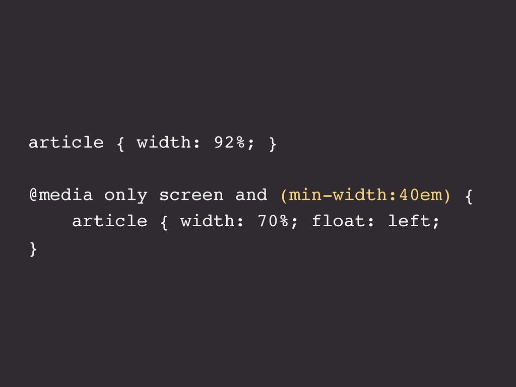
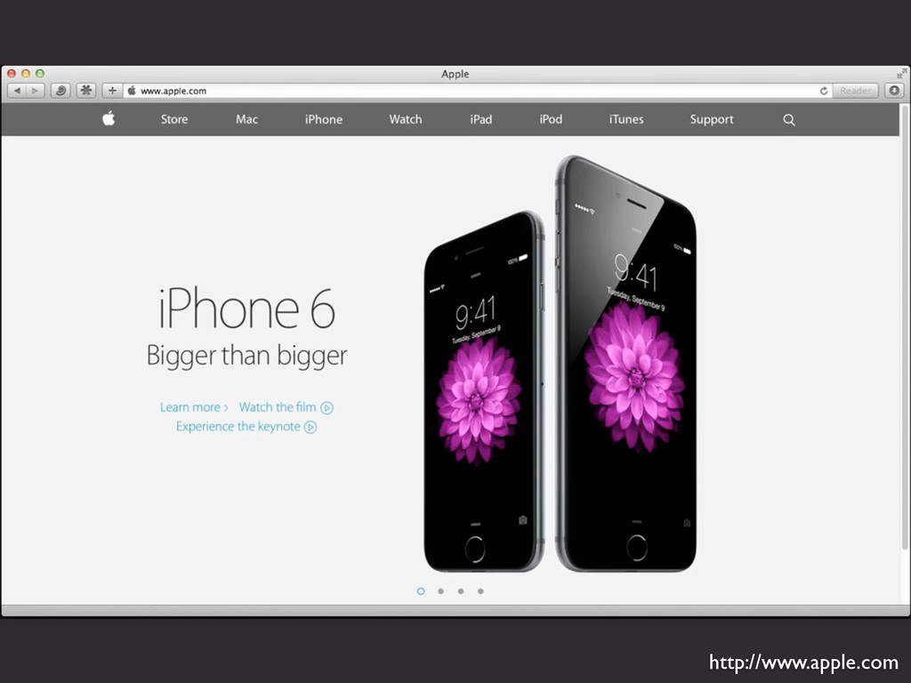
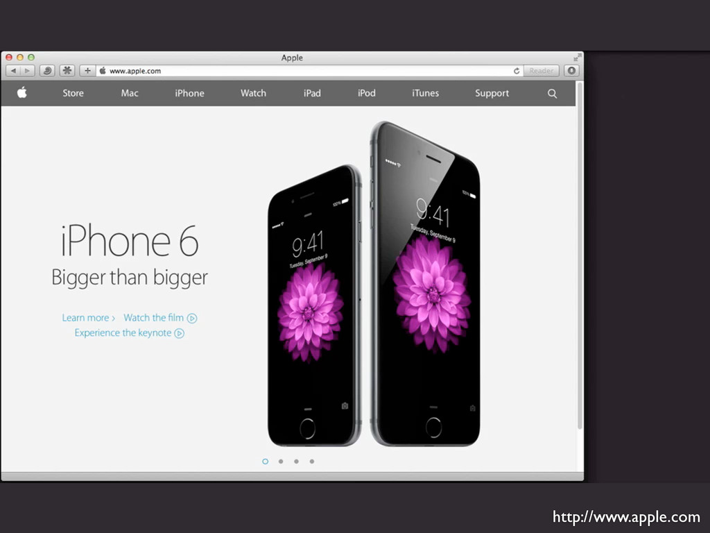
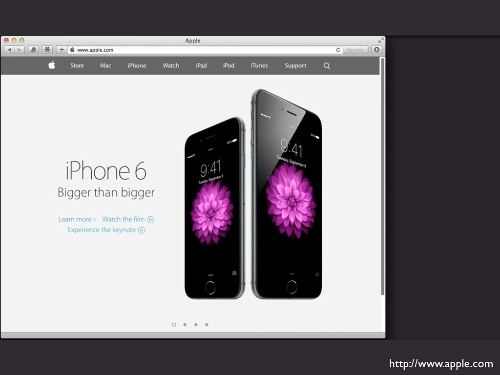
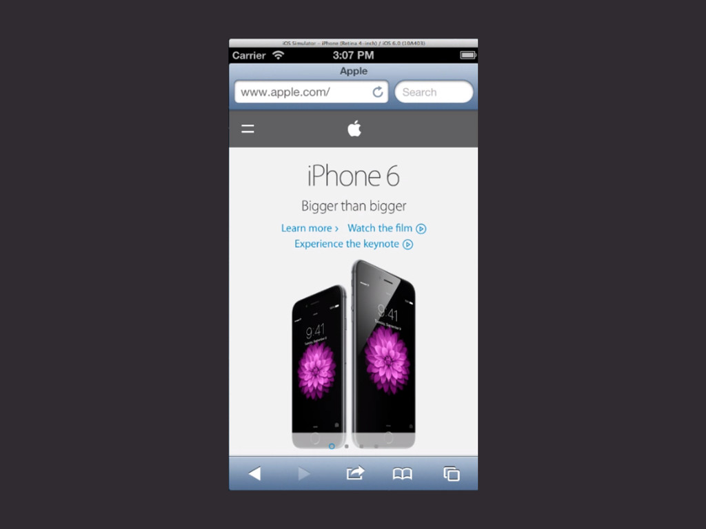
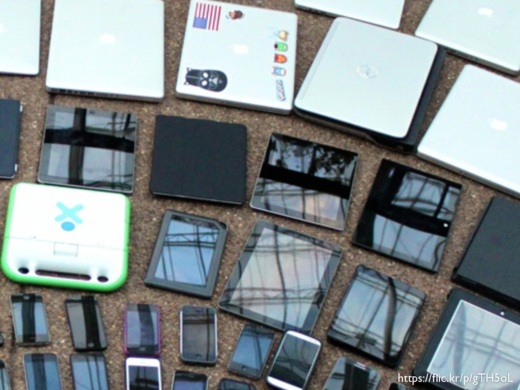
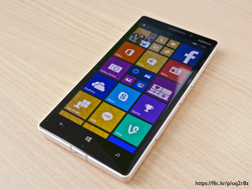
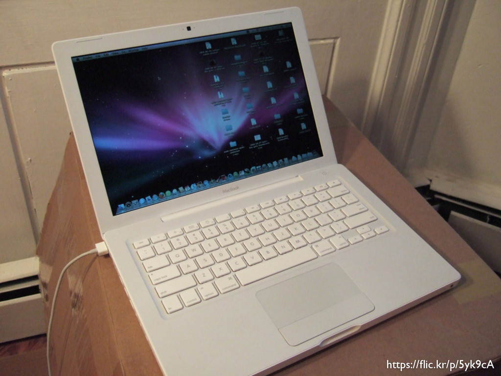
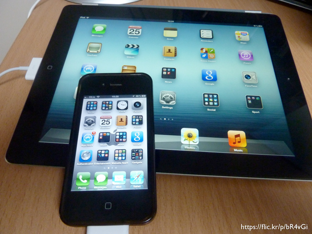
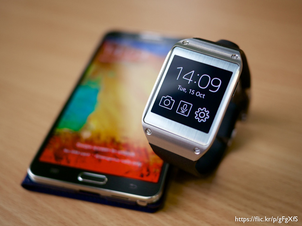
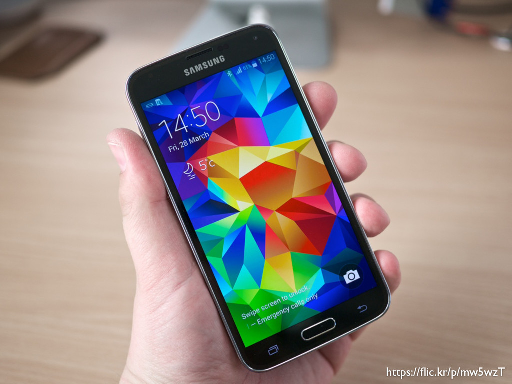
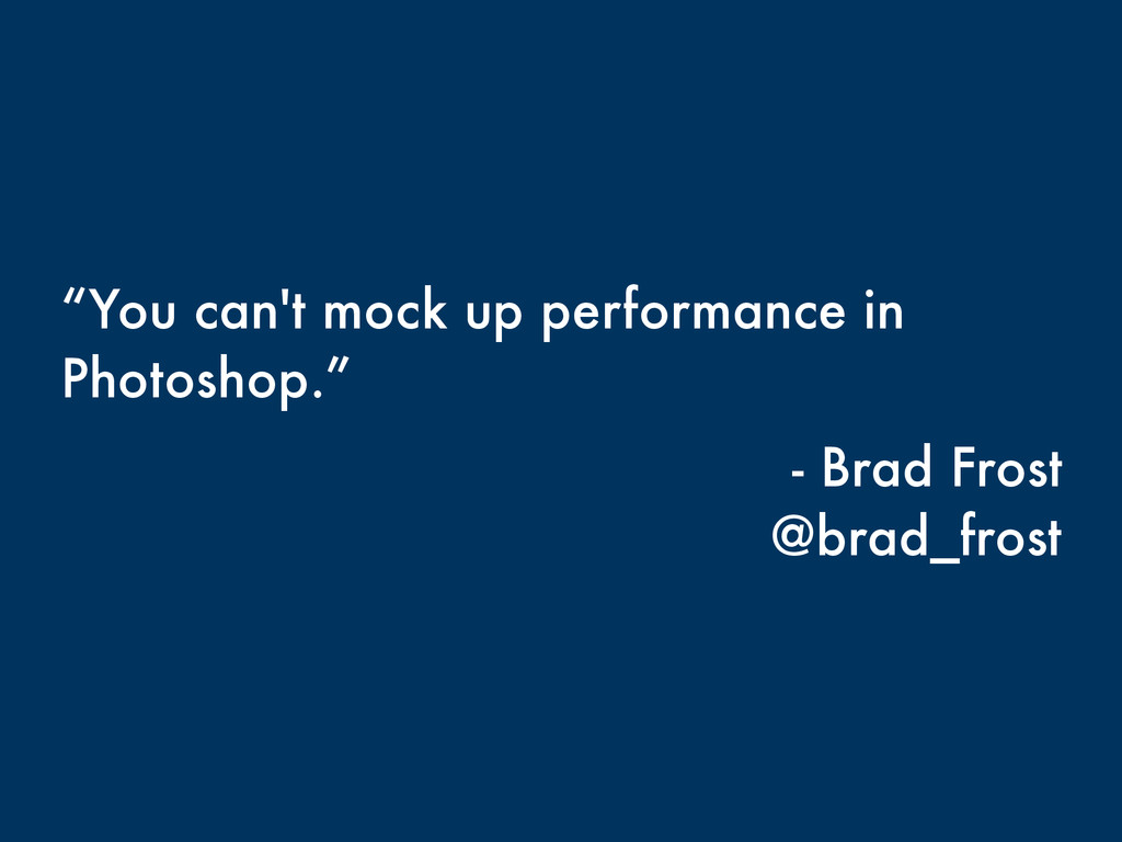
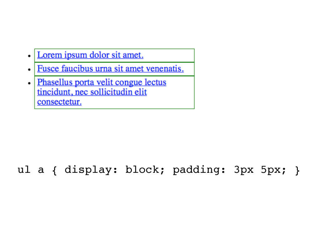
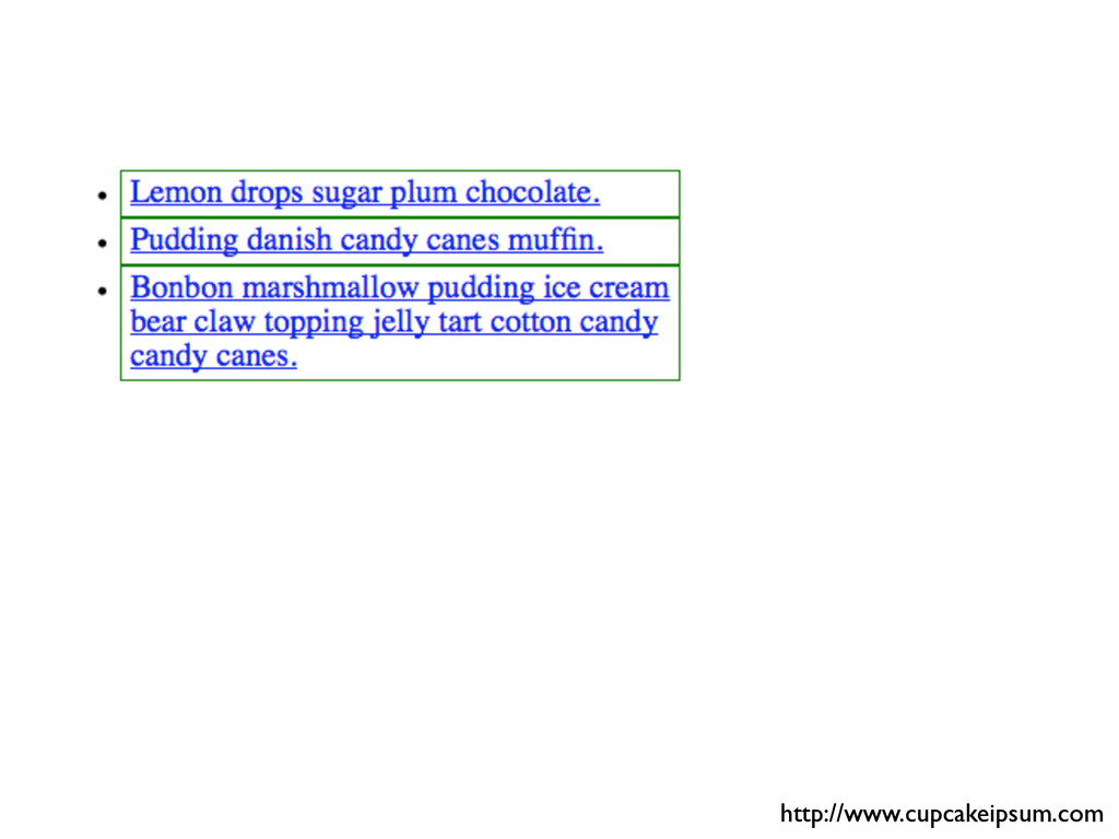
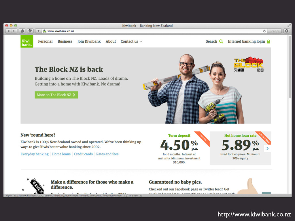
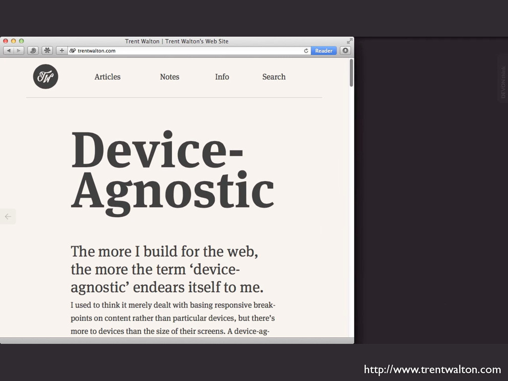
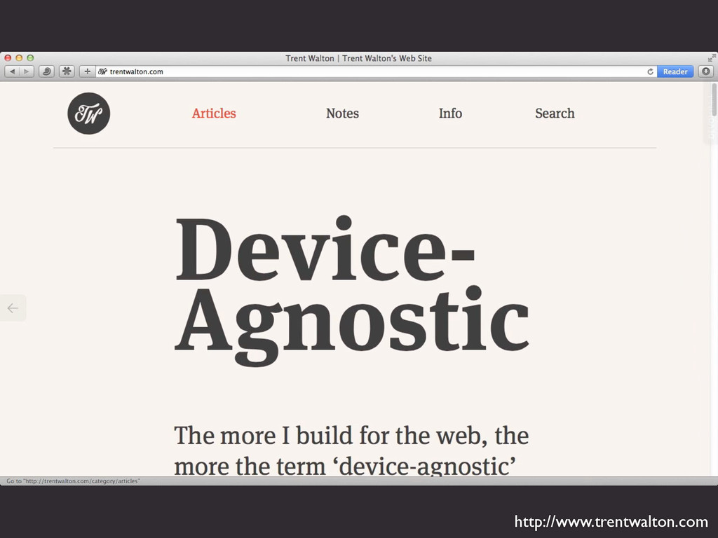
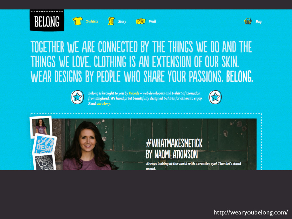
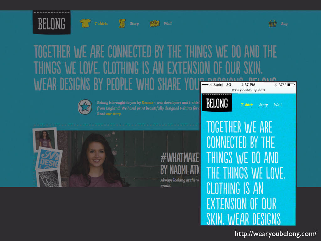
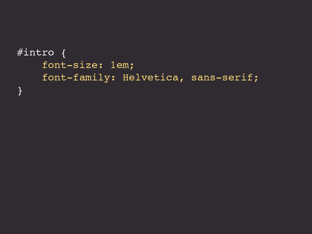
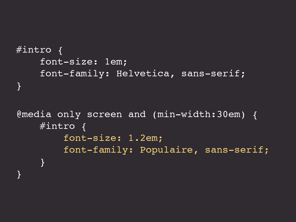
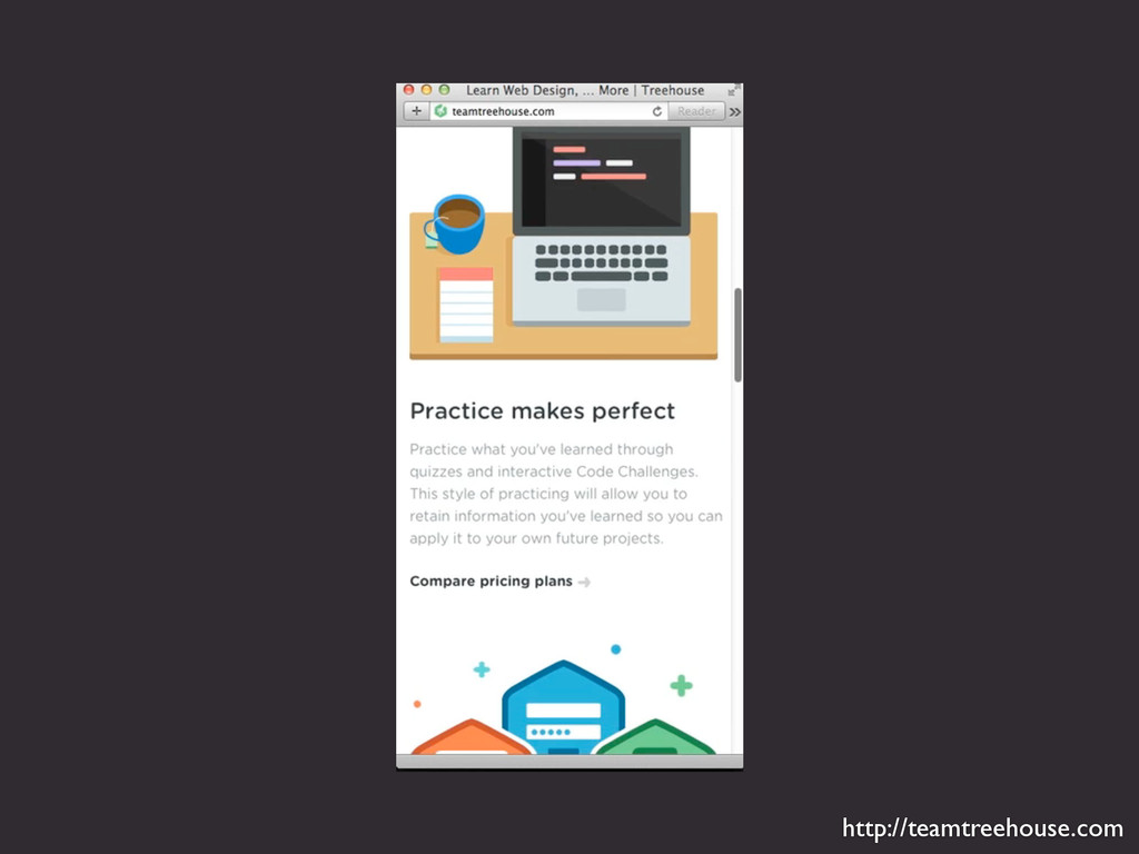
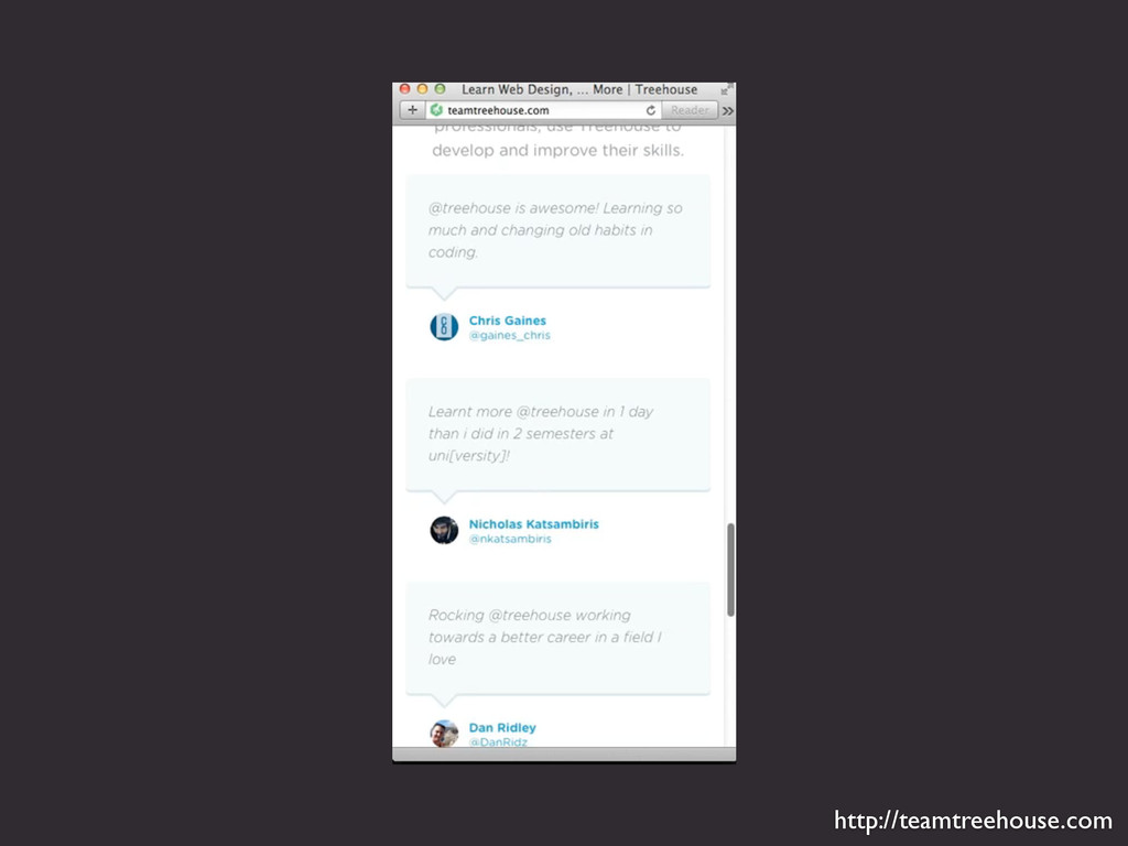
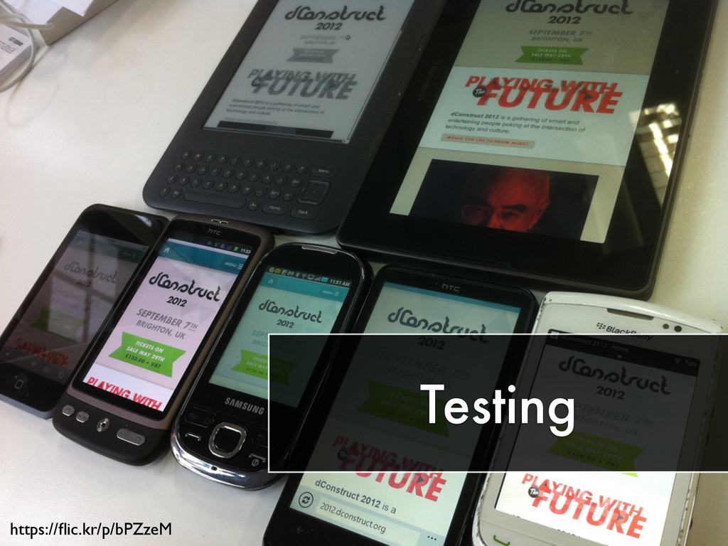
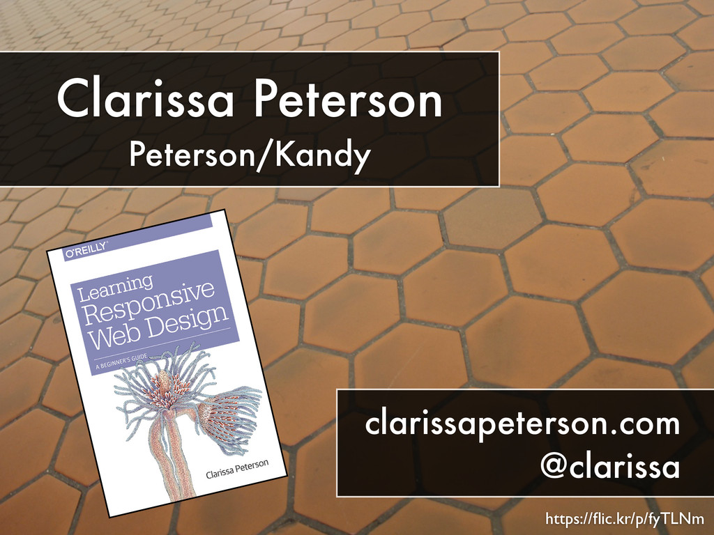
Although responsive web design has only been around for a few years, it's grown up a lot since first we started talking about fluid grids and media queries. Now, we look to responsive design with the goal of providing a good experience for every user on every device. From the DC Web Women Code(Her) Conference, 9/13/14.
 clarissa
 chiemitaki
 satosio
 saki822
 a2k
a2k
 calpin
 csswizardry
 mhand01
 hicard
 nttcom
 uxman
uxman
 kenichiota0711
 rezaline
 inesmontani
 thekraken
 bryan
bryan
 codingconduct
 tonyrice
 mongodb
 addyosmani
 axbom
axbom
 bkeepers
 philnash
 andyhume
 auna
auna