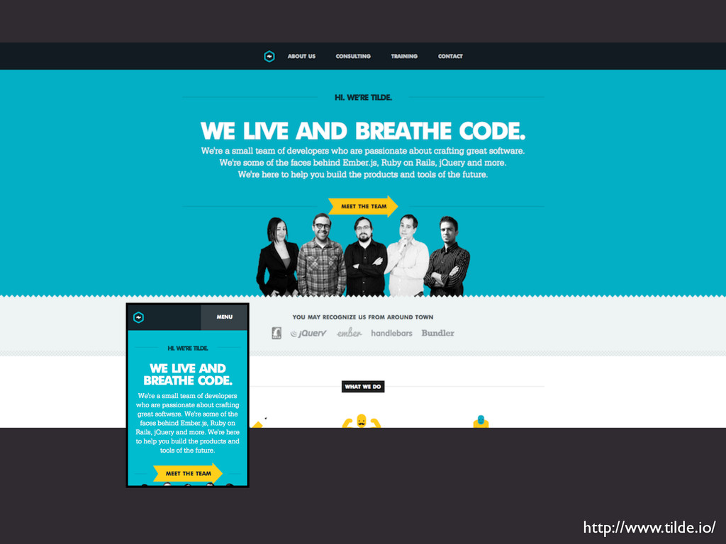
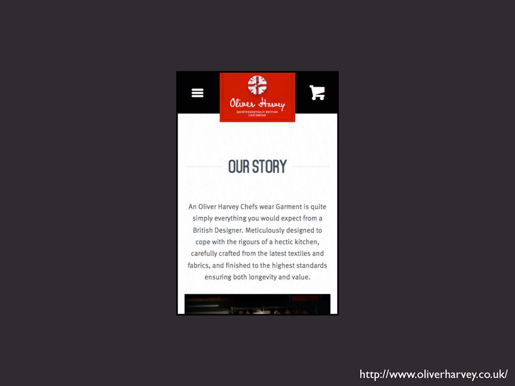
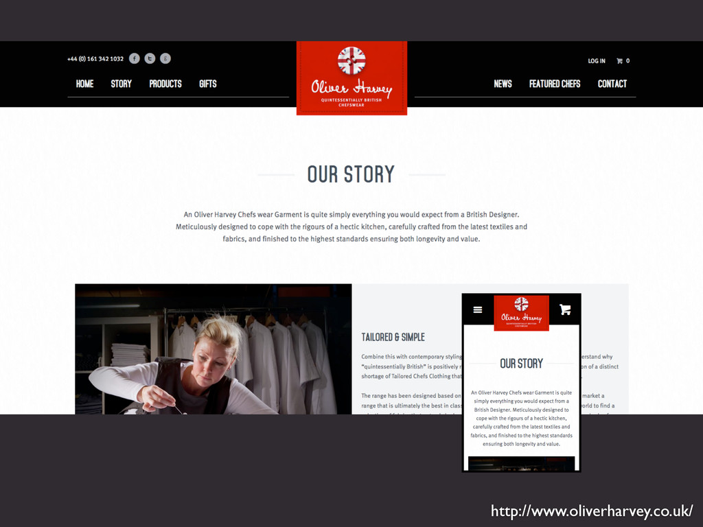
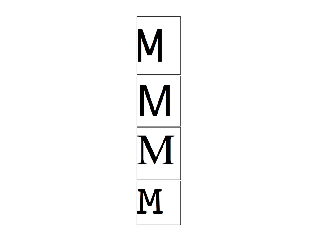
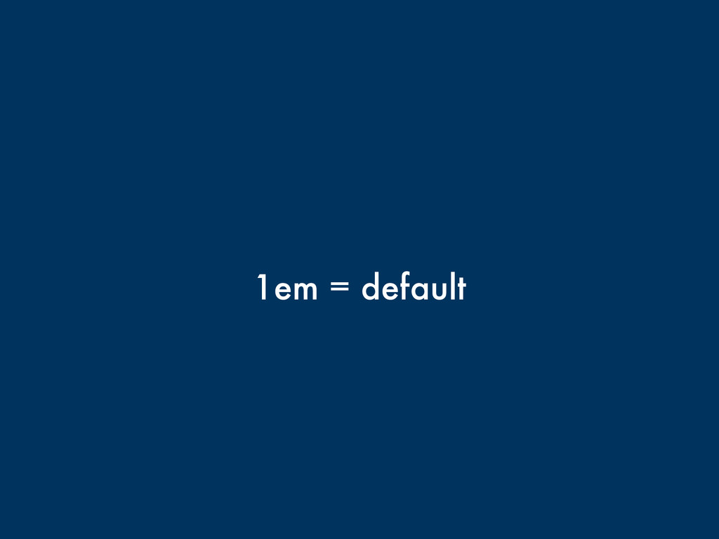
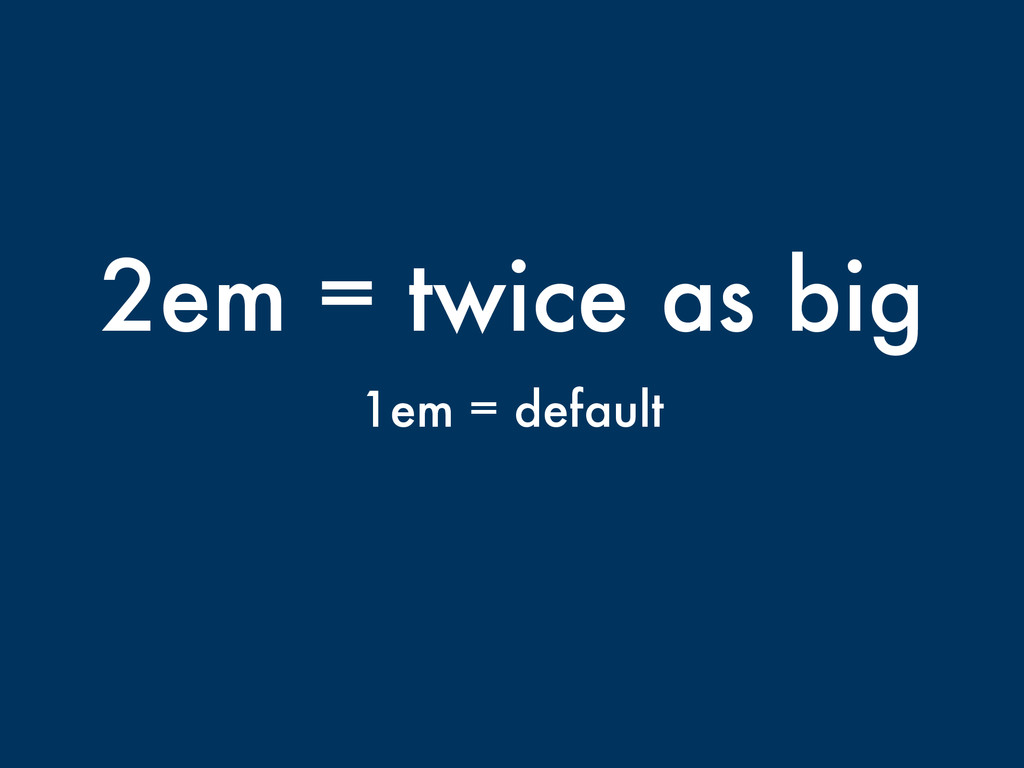
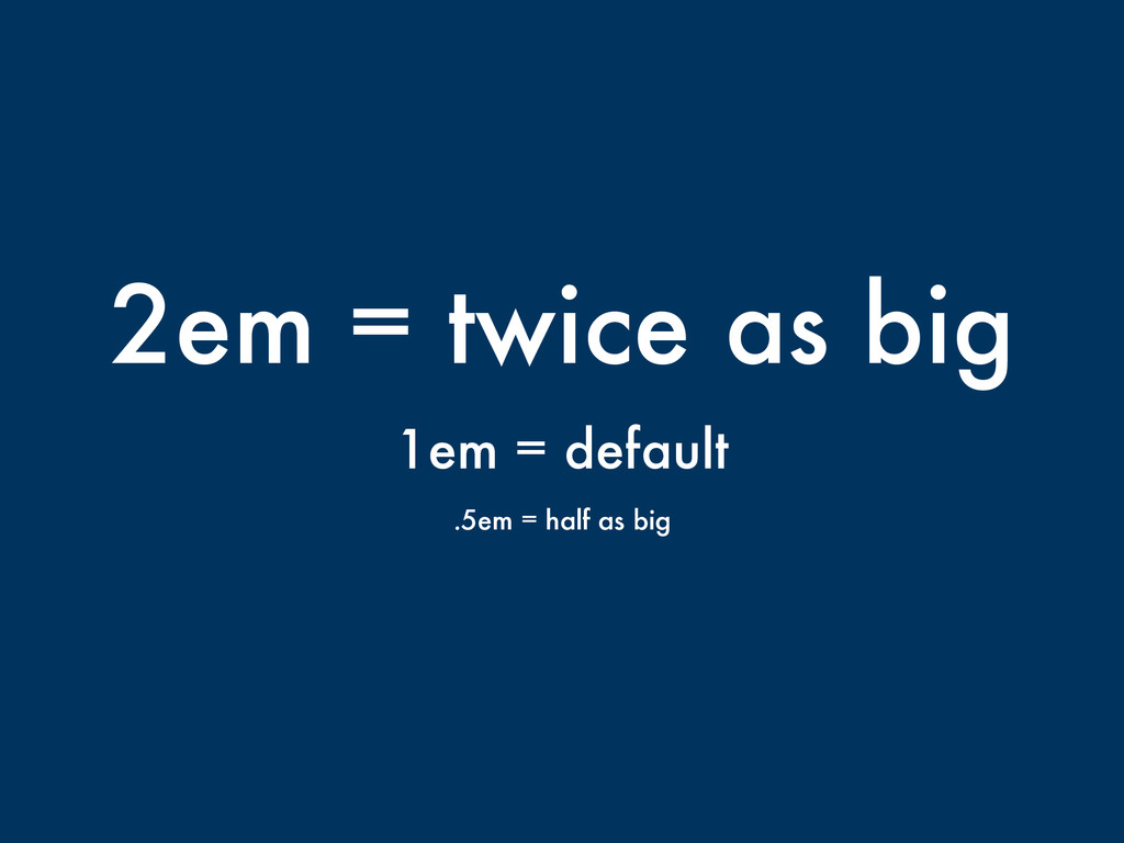
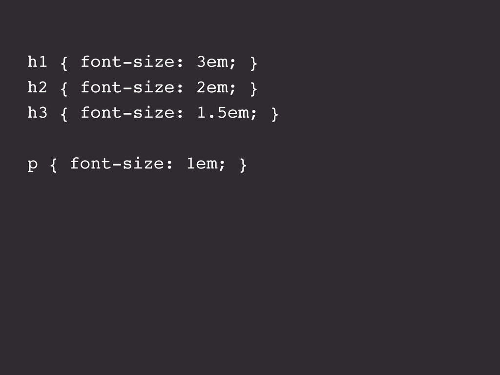
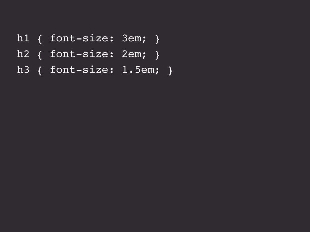
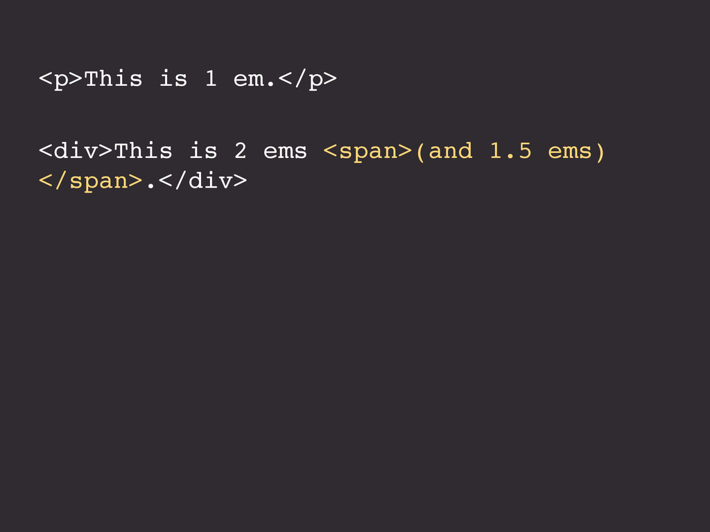
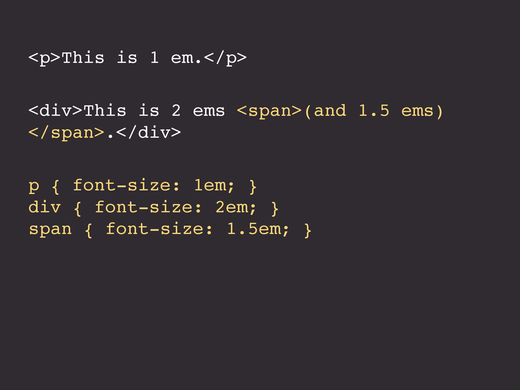
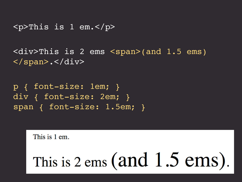
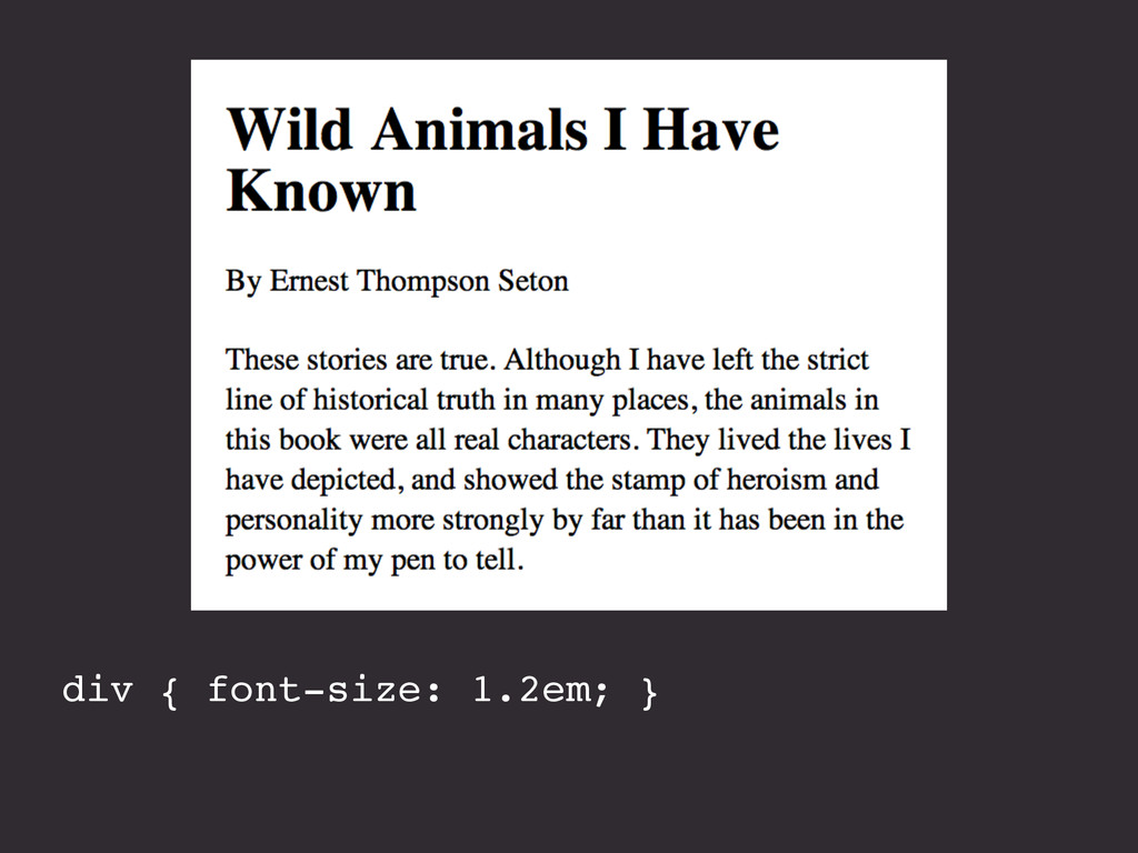
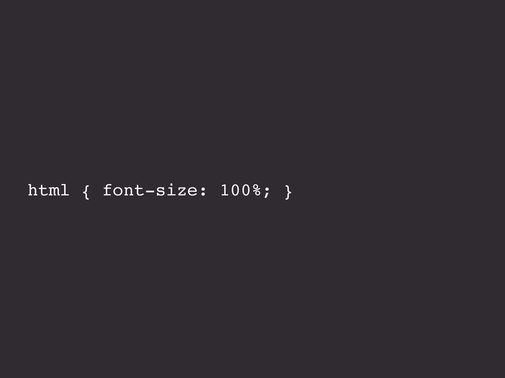
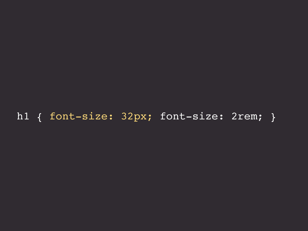
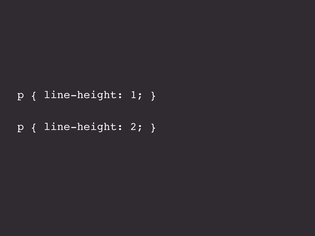
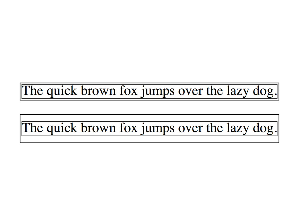
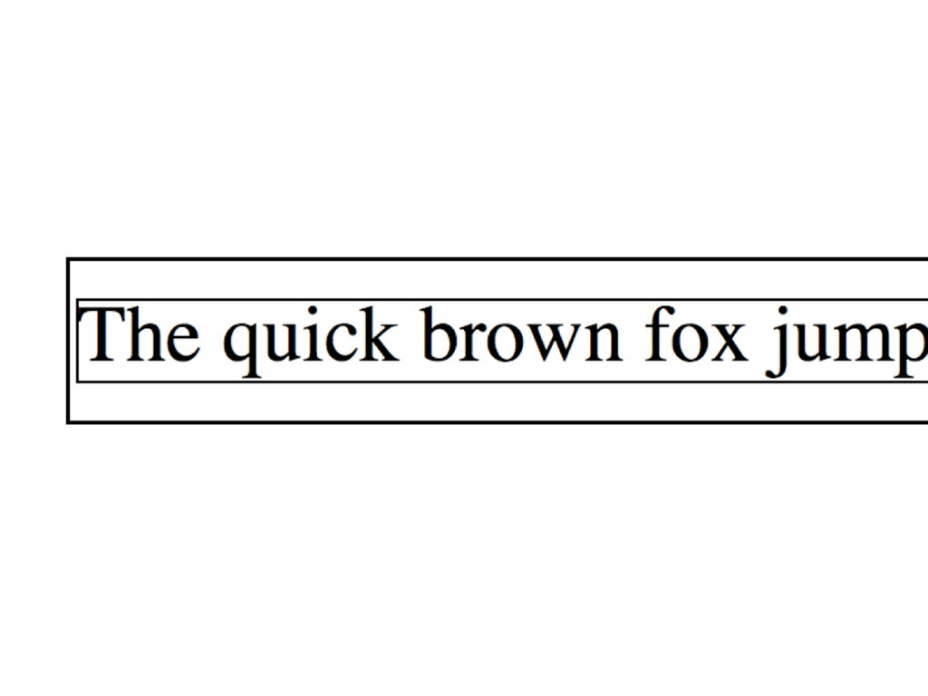
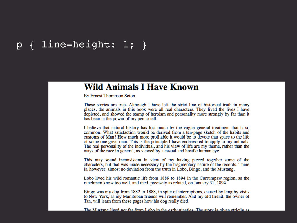
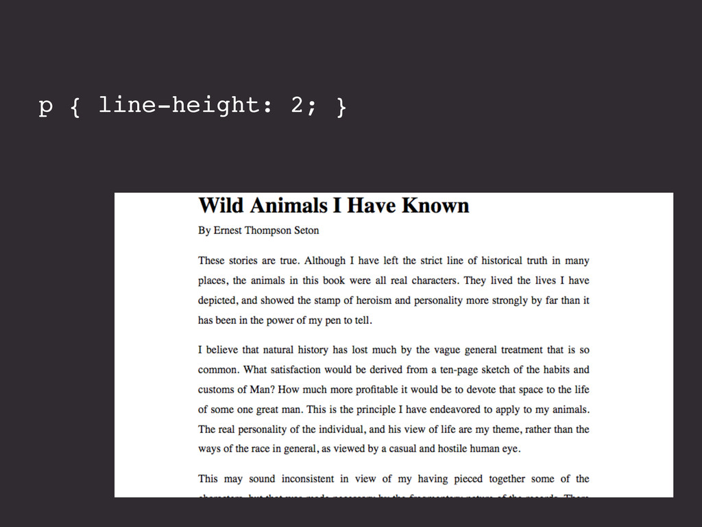
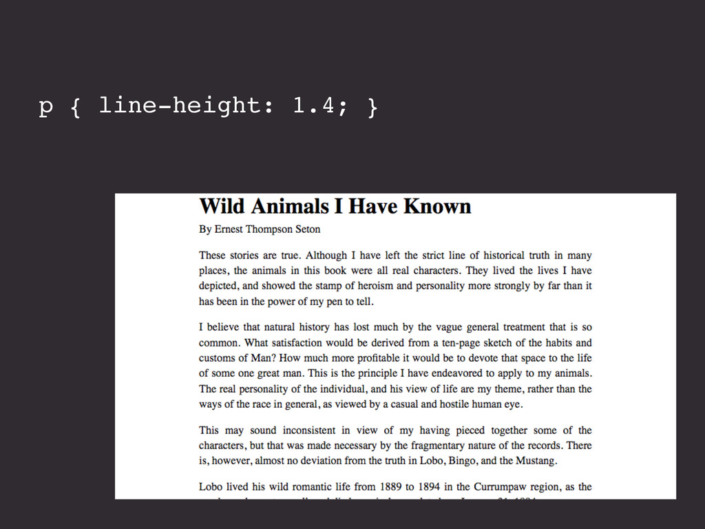
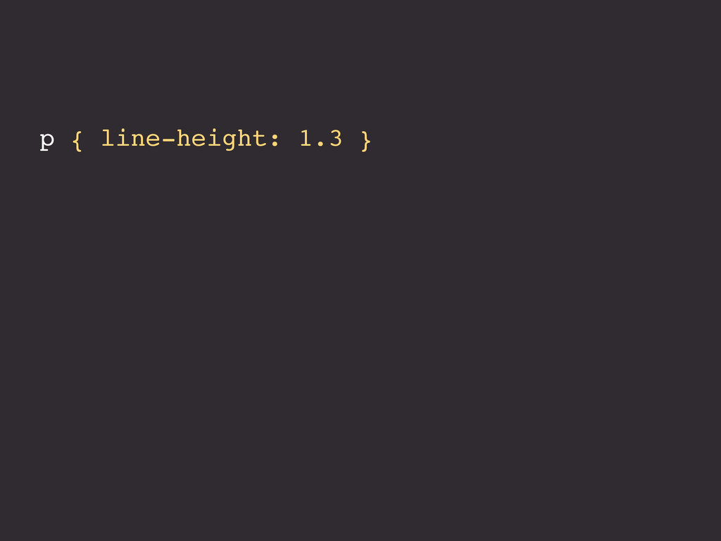
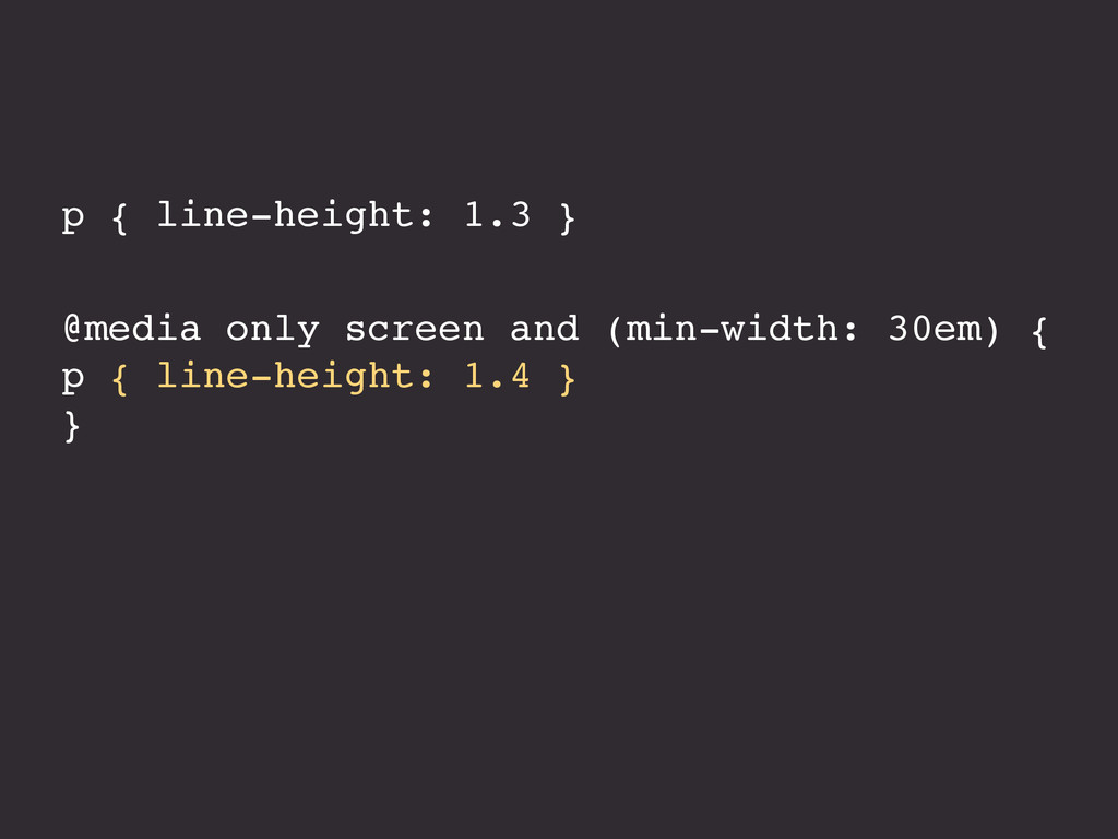
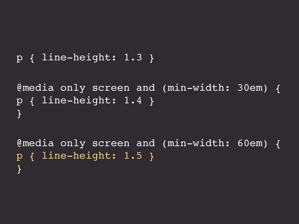
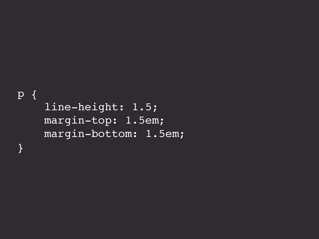
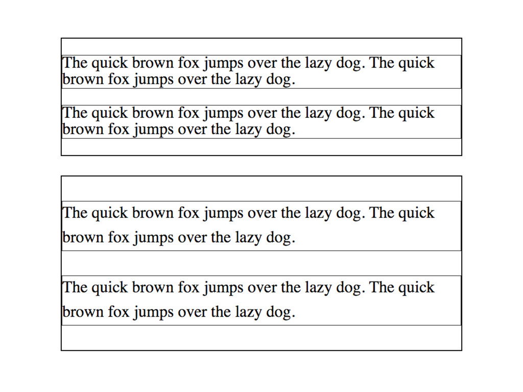
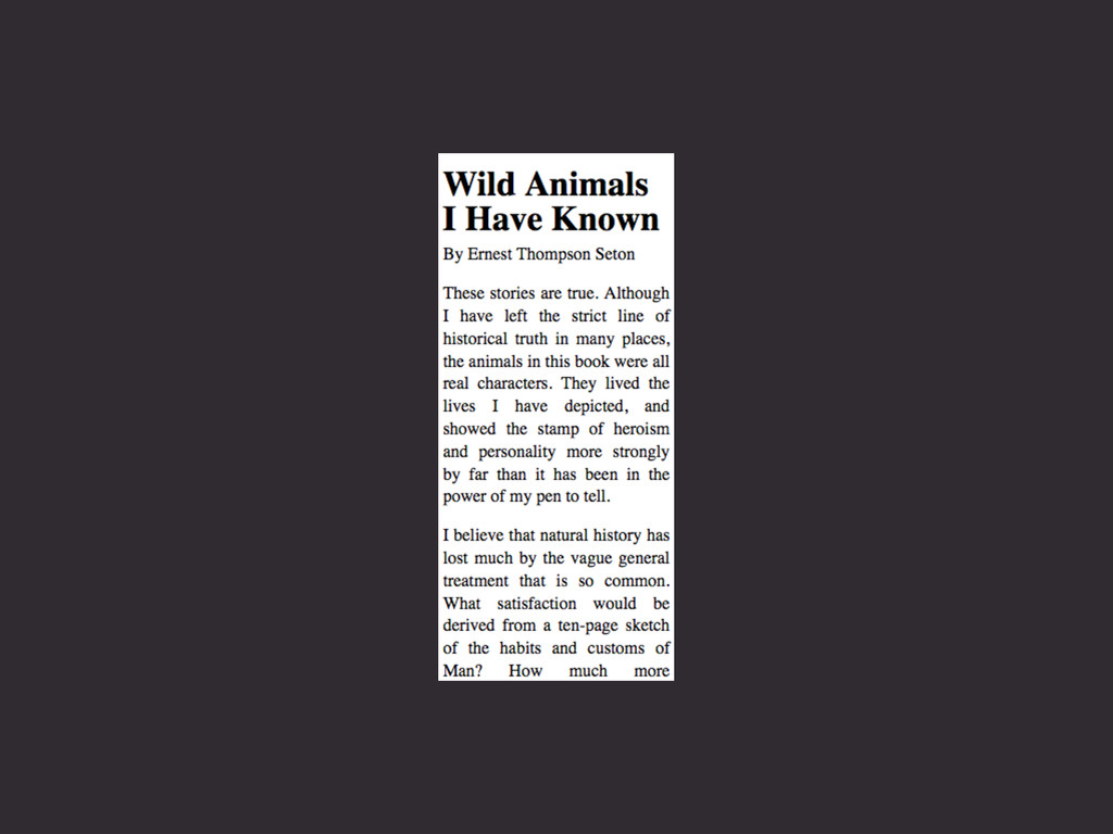
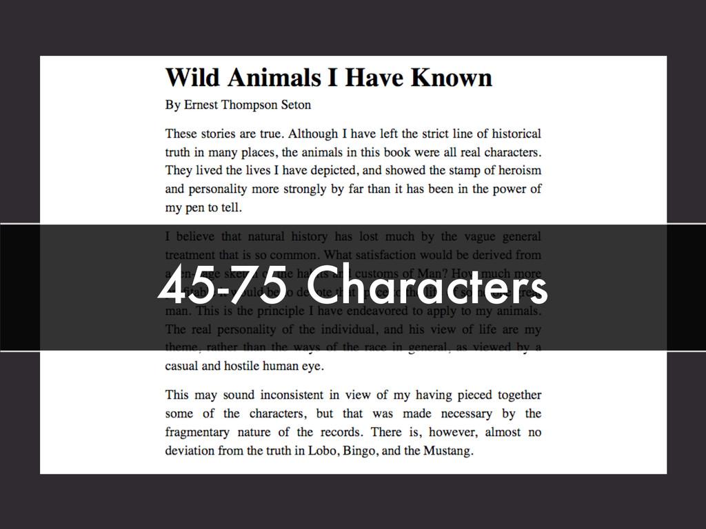
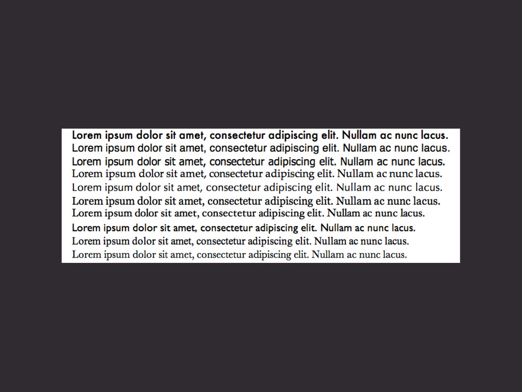
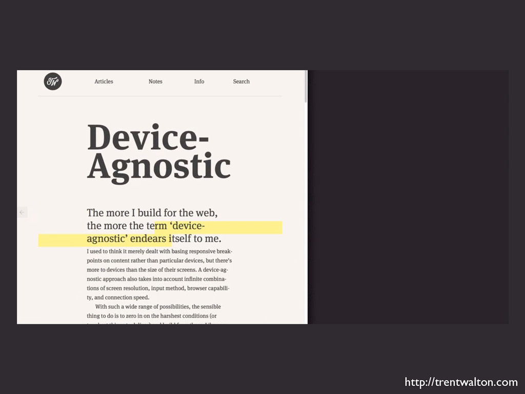
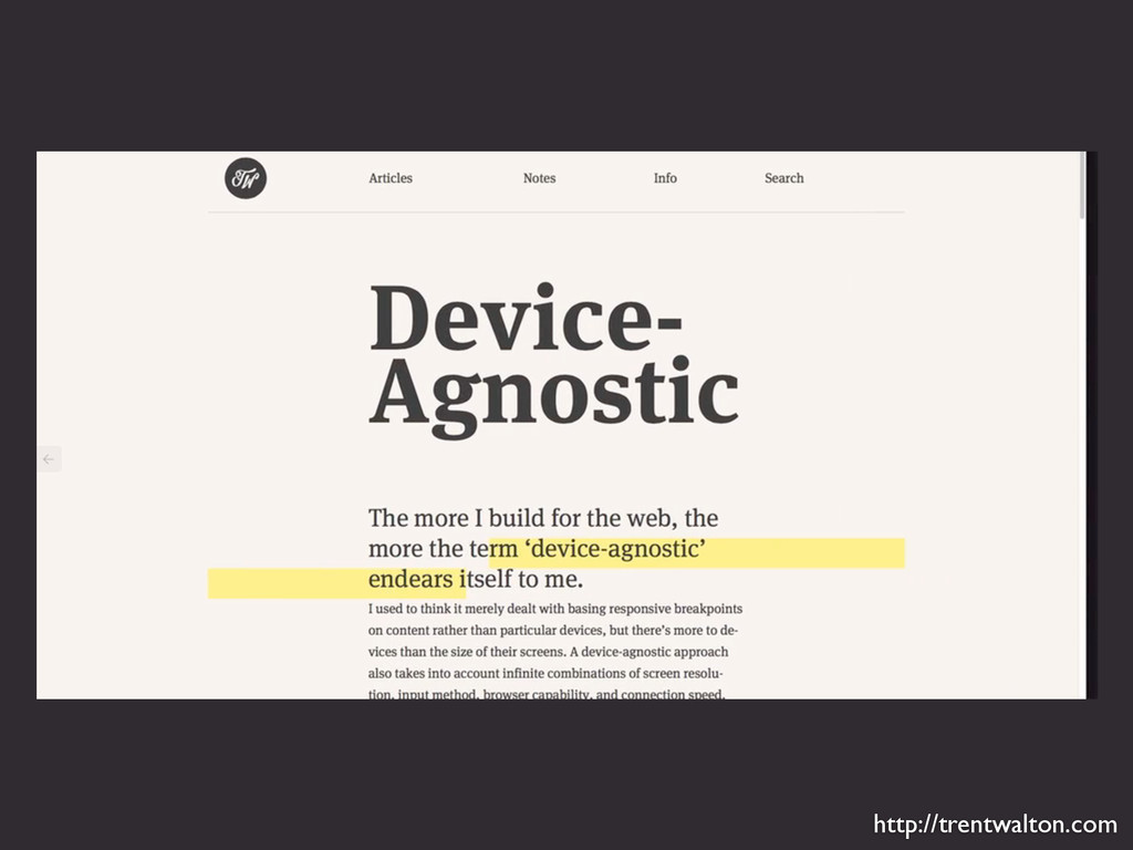
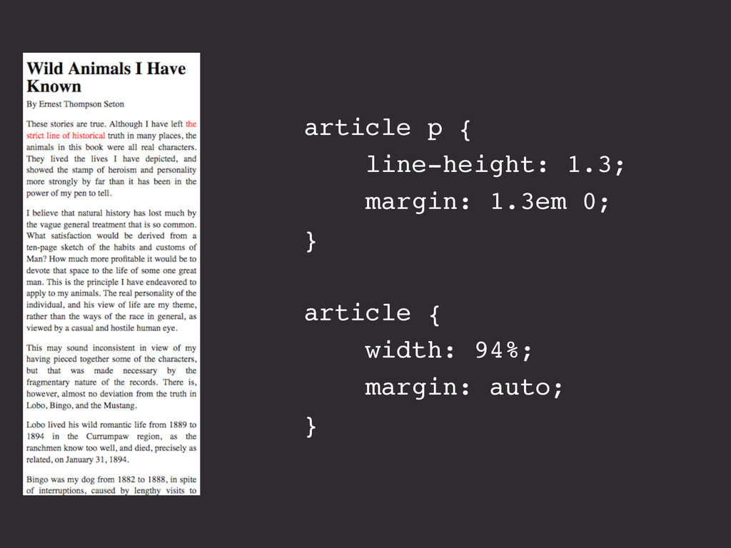
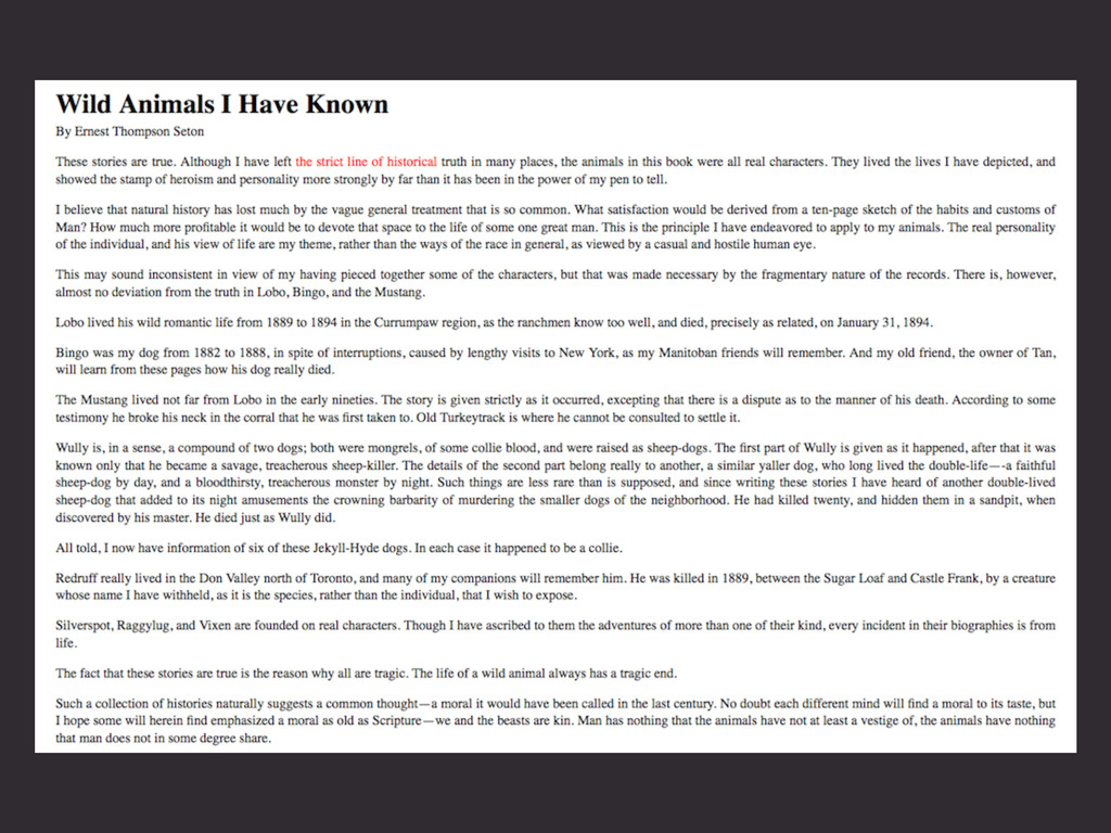
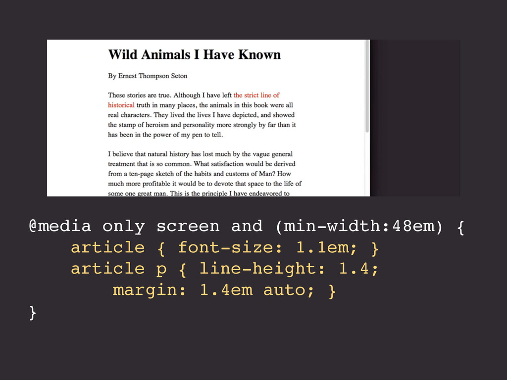
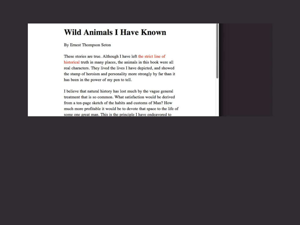
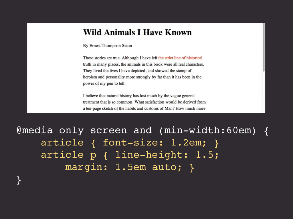
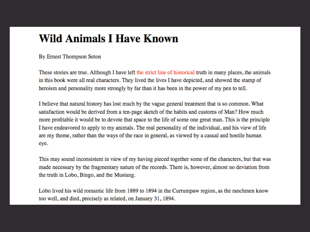
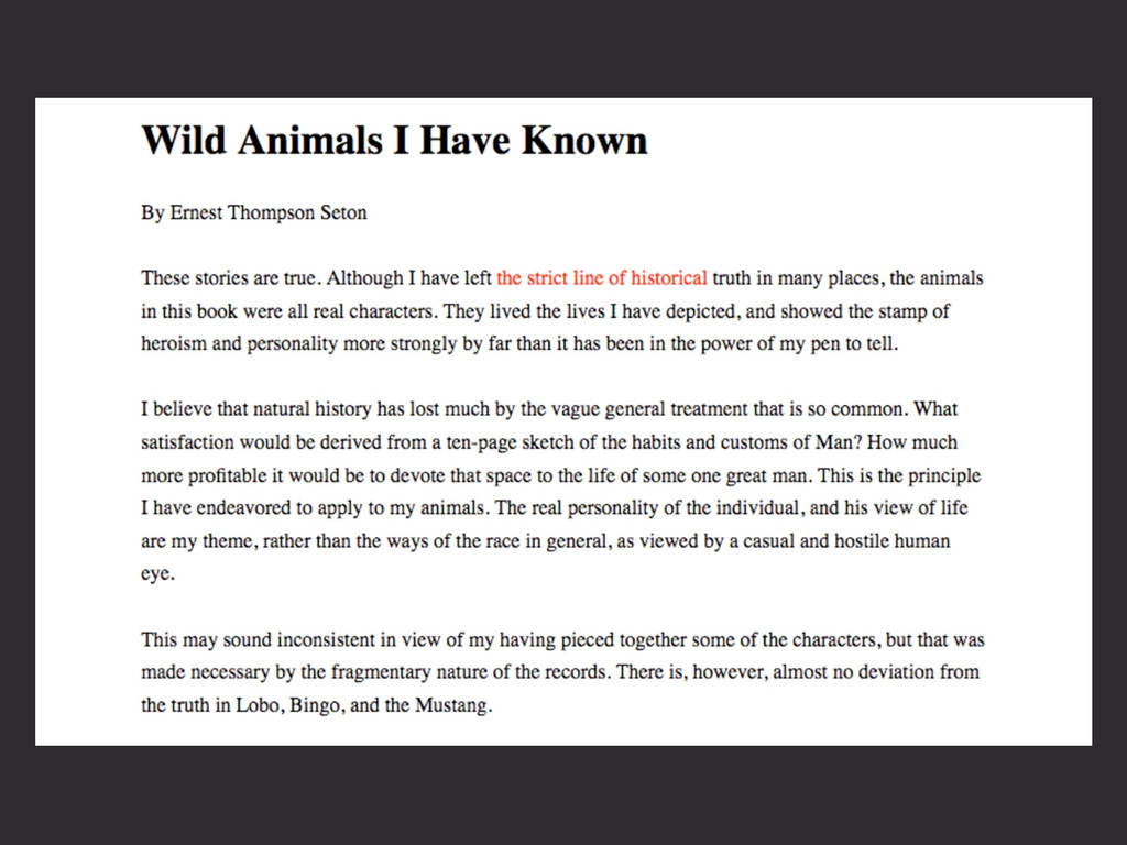
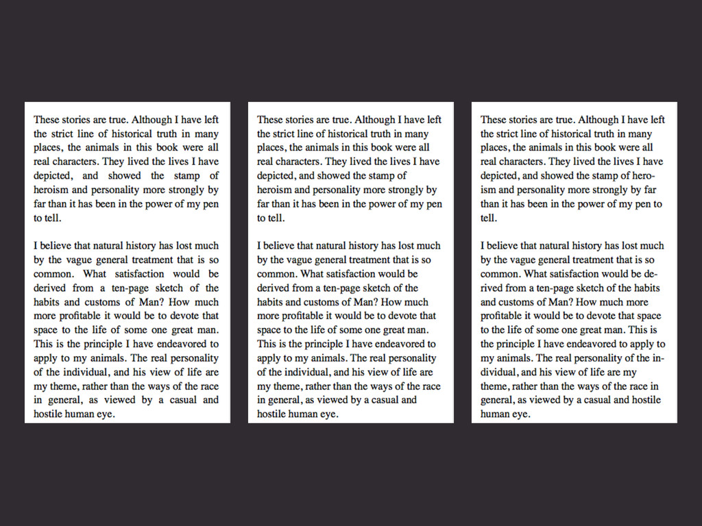
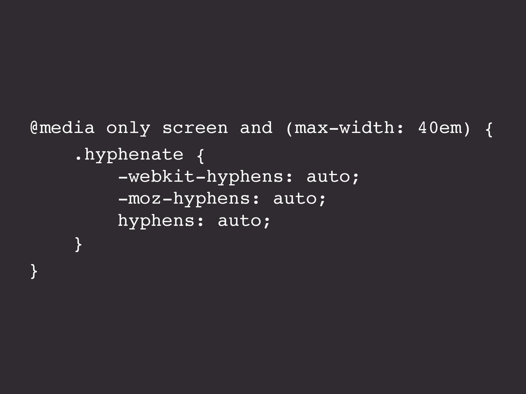
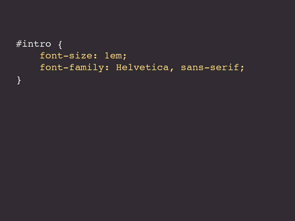
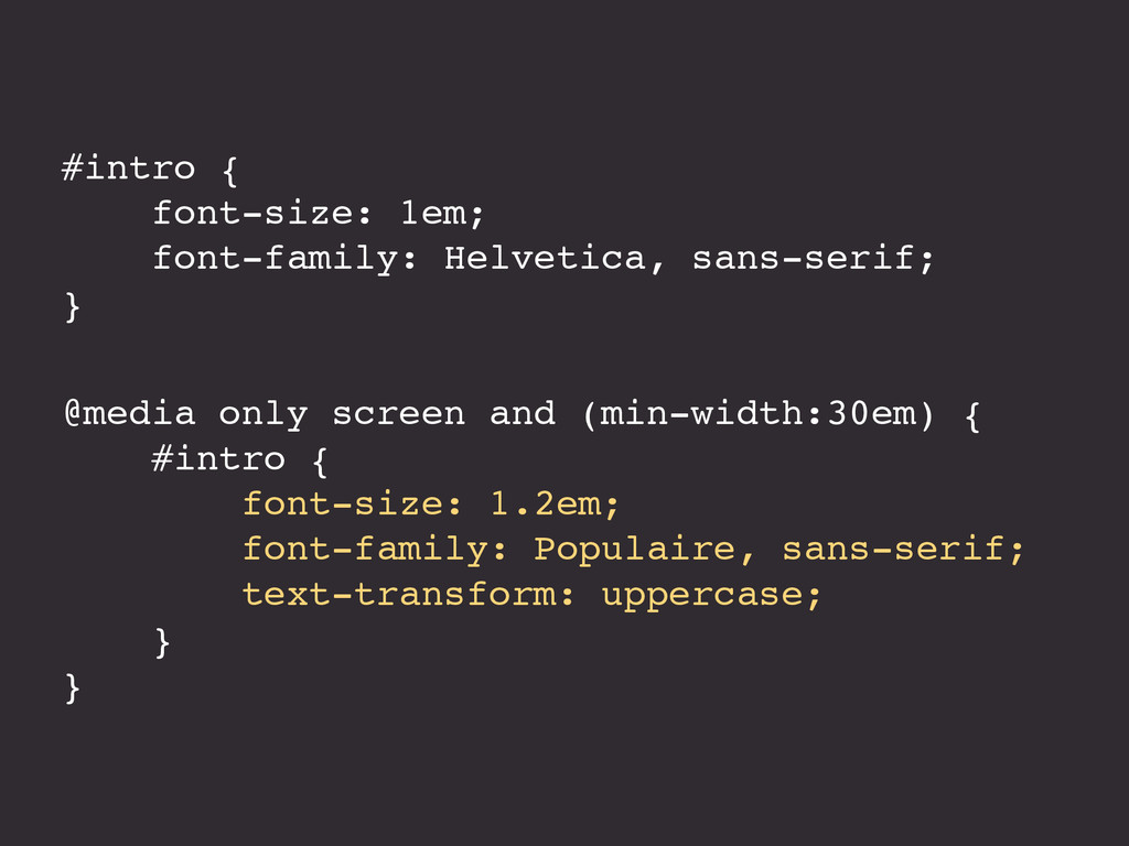
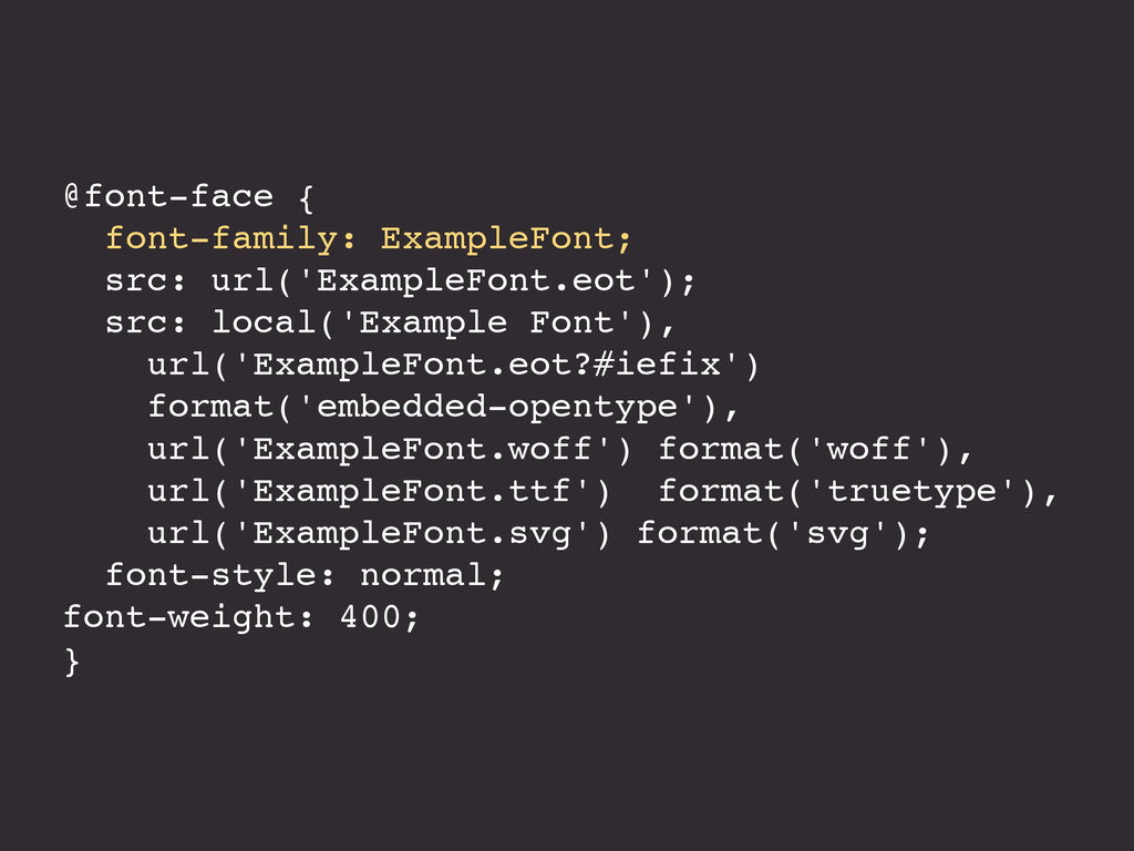
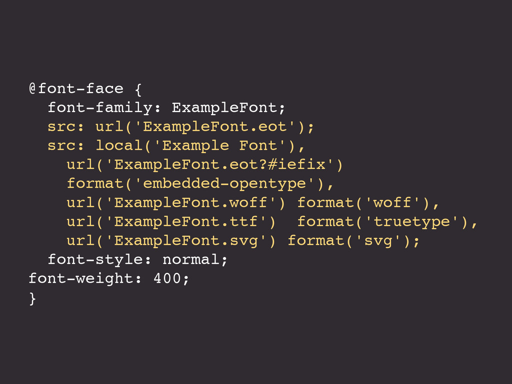
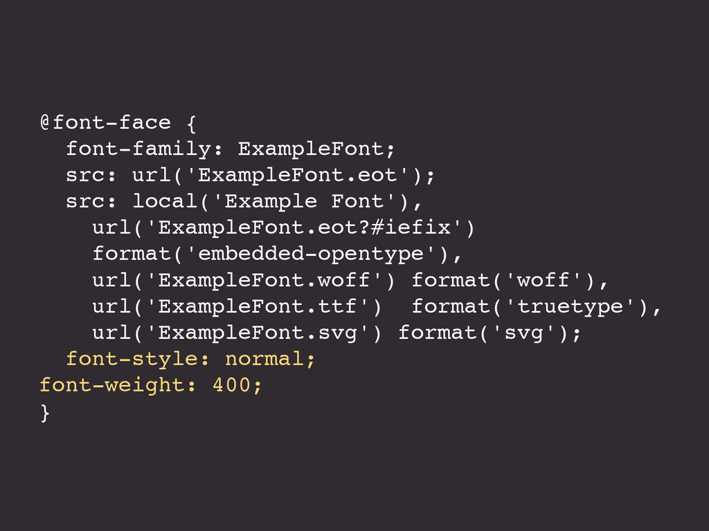
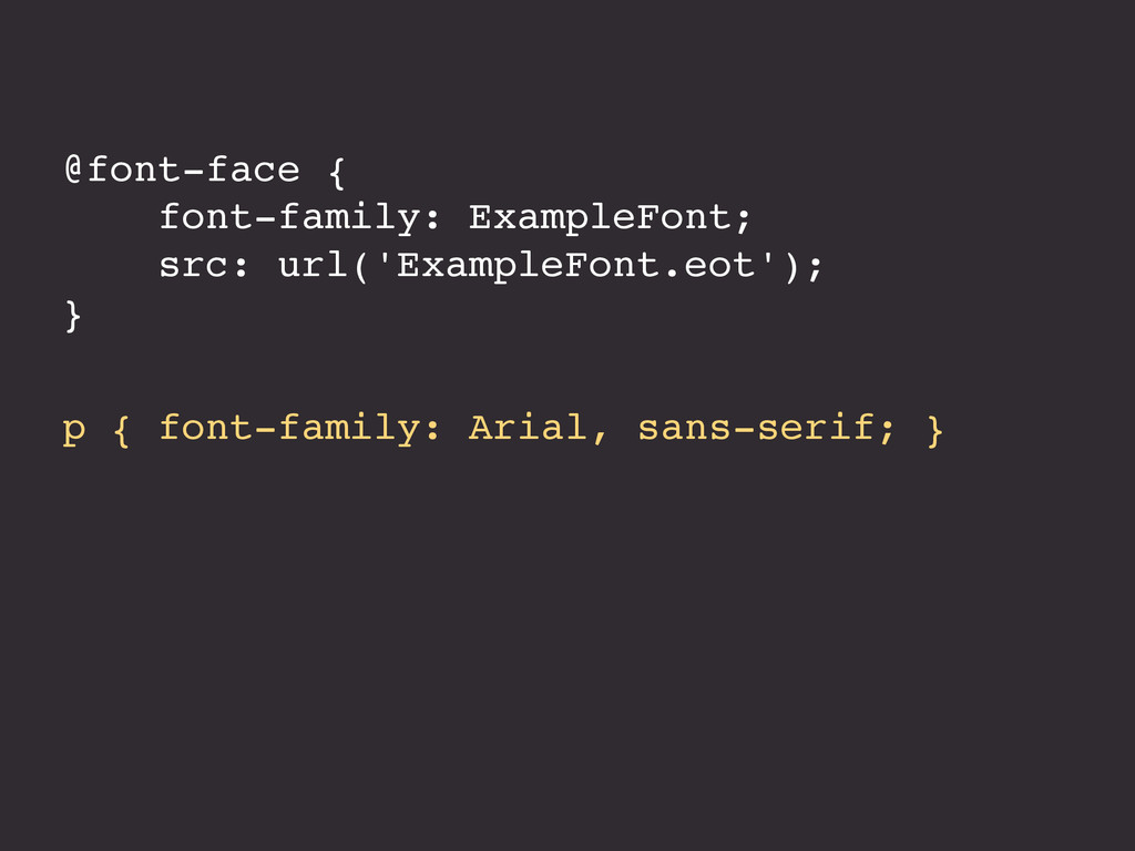
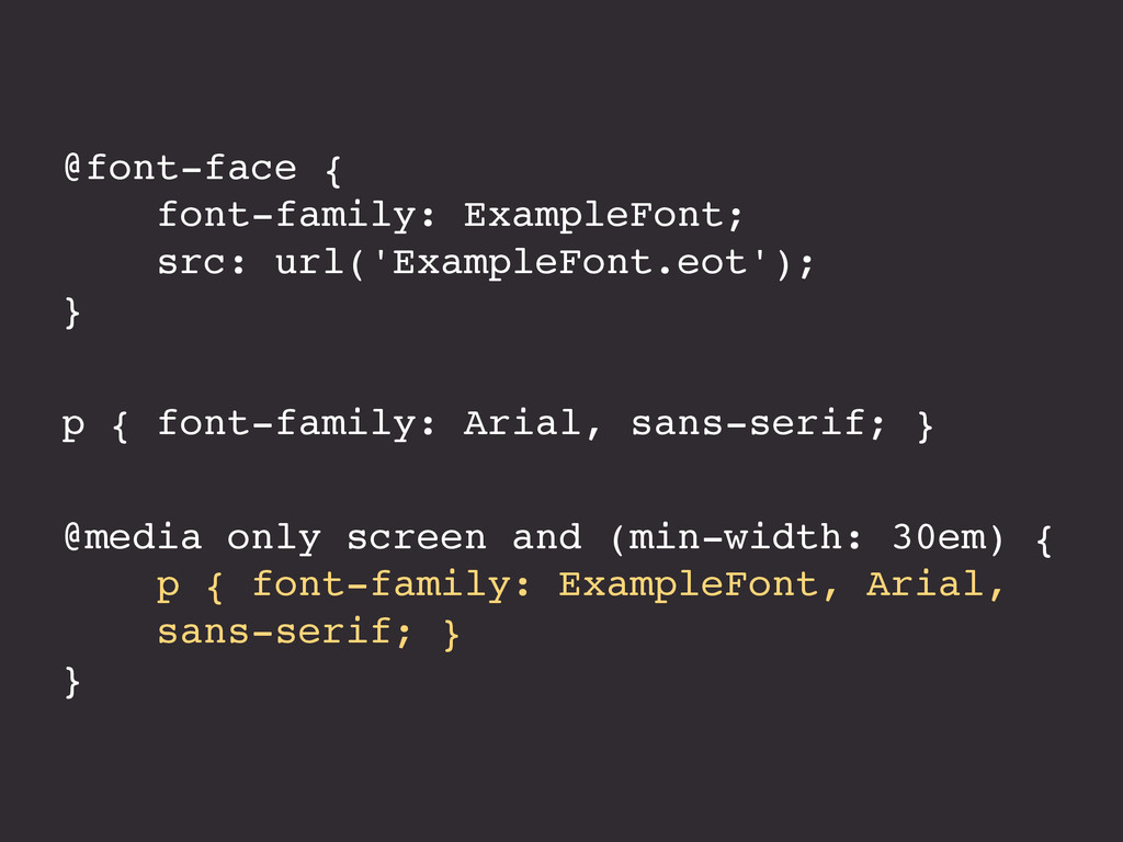
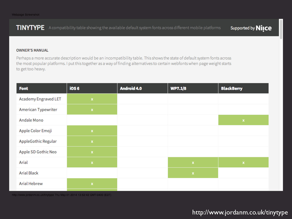
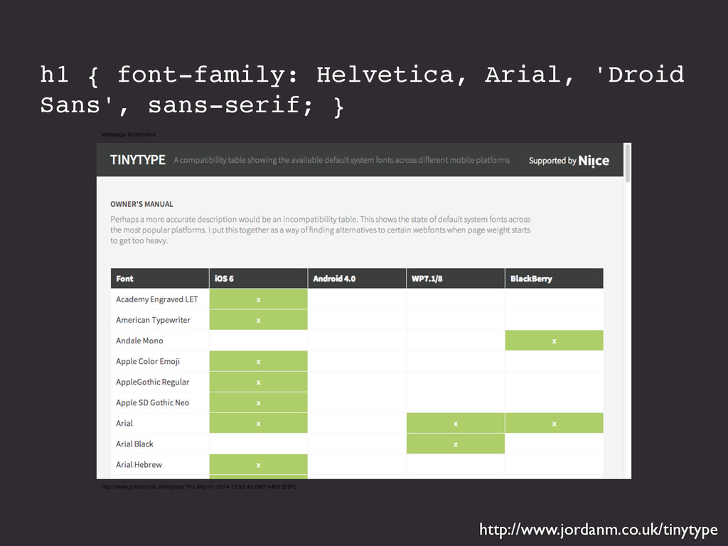
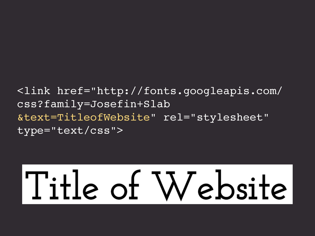
Your content is the most important feature of your website, so it's important to make sure that the text looks good and is easy to read no matter what device type or screen size it's being viewed on. One size does not fit all when it comes to typography, but you can use media queries to adjust type qualities such as size, line height, column width, margins, hyphenation, and even typeface depending on the viewport size. Learn how you can use CSS to apply design rules that will make your typography look better and perform better across devices. You'll also find out how typography affects the loading time of your website, and what you can do to improve performance.
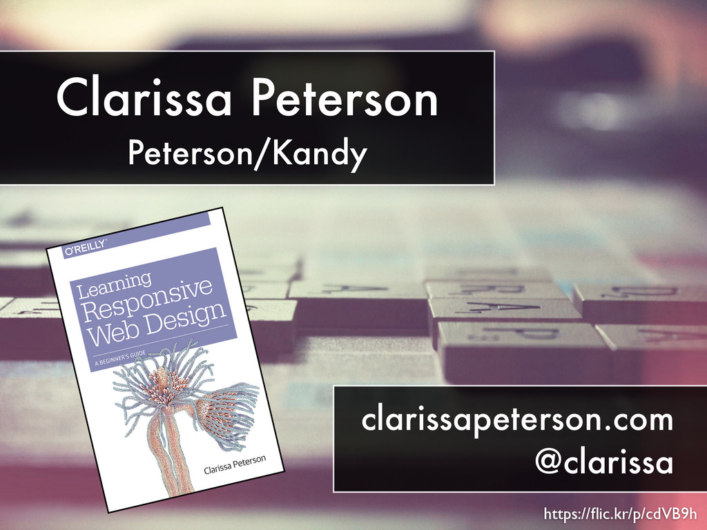
Presented in 2015 at ConFoo. Presented in 2014 at WebVisions Chicago, Blend Conference, Frontend Conference Zurich, Refresh Ottawa, Mobile+Web Dev Conference, STC Summit, Bmoresponsive, ConvergeSE, and Girl Geeks Montreal.
 clarissa
 hjmkth
.jpg) rwang05
rwang05
 securecat
 webnaut
 hiro93n
 csswizardry
 klemens
 mhand01
 takaikanako
 kgsi
kgsi
 yamasaku
 dougneiner
 katarinadahlin
 tammyeverts
 afnizarnur
 inesmontani
 sergeychernyshev
 maggiecrowley
 eileencodes
 samtorres
 palkan
 jacobtomlinson
 apolaine