Upgrade to Pro — share decks privately, control downloads, hide ads and more …

User Experience in the real world

clarklab
June 24, 2014

User Experience in the real world

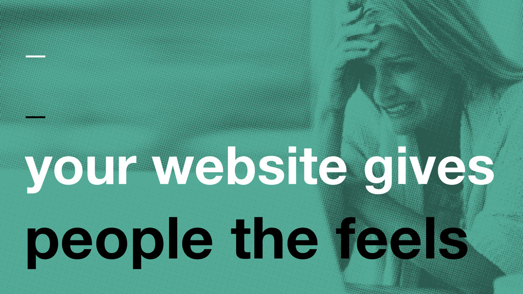
User Experience...It's not just for apps anymore- websites and blogs everywhere make our users *feel* things, good and bad. Staying on top of the experience requires a keen eye and the ability to get yourself into a user's frame of mind.

We'll use this session to walk through some common areas that can make a user feel annoyed, confused, and (hopefully) at ease. Making your site (and your interactions outside your site) easy to digest can go a long way in building a reliable network/community.

If "user experience" is a foreign concept for you, think of it as a talk on "best practices", and come join us anyway! We'll start with a "big picture" discussion of UX and move into specific examples, finishing with a round of Q&A (so make sure to bring your questions!).

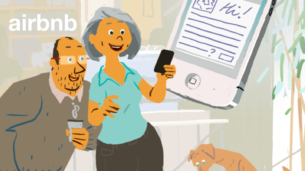
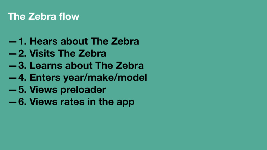
Clark Wimberly will lead this month's WordPress Intermediate session. Clark is the UX Lead at The Zebra (http://thezebra.com), an online insurance comparison platform (think "Priceline for insurance"). He's been building things with WordPress for the better part of a decade now.

clarklab

June 24, 2014
Tweet

More Decks by clarklab

Other Decks in Design

Transcript

  1. How this works —Pros/Cons of common UX blunders —Watch for

    links ∞ Listed at clarklab.com/talks/user-experience —Long reads —Worthy reads
  2. What is UX? —what a user experiences (duh) —the study

    of hurdles —guiding the resulting emotions —easy, fair, complexity —worth their time
  3. UI vs UX ∞ User interface what the user interacts

    with User experience how those interactions make the user feel Married, but not the same like all good couples
  4. Pros (for the site) —registered user —who we can spam

    Cons (for me) —another registration —they can spam me
  5. I ended up in a conference room with about half

    a dozen people from the Surface team. More rotated in and out as I worked. I drew and talked for two and half hours while they watched and took notes. Within the first thirty seconds they realized how frustrating the home button placement was. I was trying to draw for them but kept brushing that home button and getting kicked out to the desktop. I could see some of them shaking their heads and looking at each other. They were very obviously bothered that they had not seen this before.∞
  6. Pros —Pageviews! Cons —No one likes clicking —Users won't see

    all the content —your puns! —harder to author
  7. Solutions ∞ —Don't do it —Give a one-page option —If

    you want pageviews, force reload! —(then repent)
  8. Solutions —Generate value with social —Interact with followers —hit a

    good ratio —dark activity —treat it like a subscription service —share with @mentions and #hashtags and +names
  9. Newsletters Idea: get a bunch of emails and get inside

    their inbox each time we want to tell them something
  10. Pros: —No one is left out —Impaired visitors = 14%

    —Pageviews/sales/conversions! Cons —Development time
  11. Pros —Get in the user's head —Optimize the flow —Concrete

    goals for planning, arguments Cons —Hard truths —Time
  12. The Zebra flow —1. Hears about The Zebra —2. Visits

    The Zebra —3. Learns about The Zebra —4. Enters year/make/model —5. Views preloader —6. Views rates in the app
  13. The Zebra flow (cont'd) —7. Interacts with form —8. Selects

    coverage —9. Reviews results —10. Clicks Buy Now —11. Gets a call from LIPs —12. Buy a policy
  14. My built-in personas —Mom - kindergarten teacher, no tech —Dad

    - computer sales/service, old tech —Brother - my age, as nerdy, mega tech
  15. Guerrilla testing ∞ —Over the shoulder testing —Sentiment testing —Drunk

    user testing —usertesting.com —peek.usertesting.com —verifyapp.com