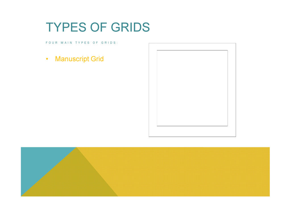
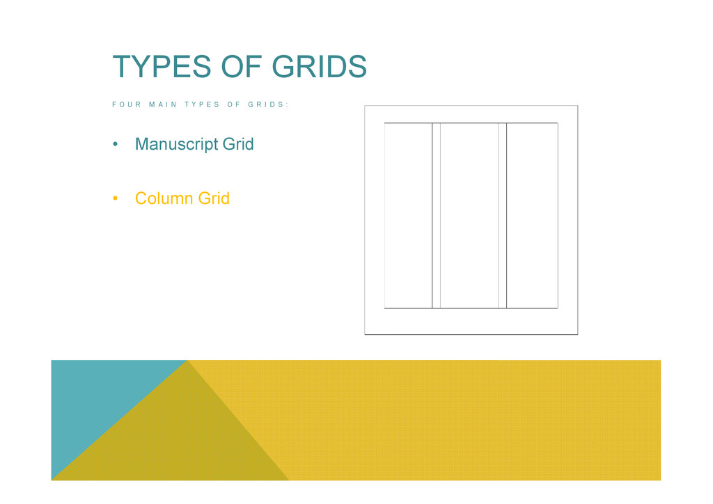
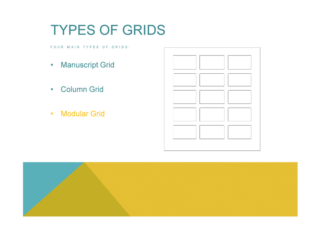
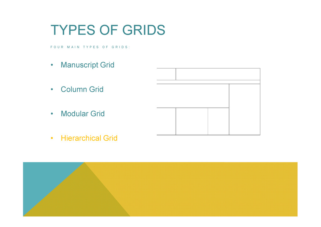
E X P E R T S : • “In the context of Graphic Design a Grid is an instrument for ordering graphical elements of text and images” – Mark Boulton – • “A Grid is a system of Vertical and Horizontal Divisions that organizes and creates relationships between elements – Kimberly Elam –
E X P E R T S : • “In the context of Graphic Design a Grid is an instrument for ordering graphical elements of text and images” – Mark Boulton – • “A Grid is a system of Vertical and Horizontal Divisions that organizes and creates relationships between elements – Kimberly Elam – • “The Typographic Grid is the most vivid manifestation of that will to order in the practice of Graphic Design” – Khoi Vinh –
E X P E R T S : • “In the context of Graphic Design a Grid is an instrument for ordering graphical elements of text and images” – Mark Boulton – • “A Grid is a system of Vertical and Horizontal Divisions that organizes and creates relationships between elements – Kimberly Elam – • “The Typographic Grid is the most vivid manifestation of that will to order in the practice of Graphic Design” – Khoi Vinh – Philosophic View • “The use of the Grid as an Ordering System is the expression of a certain mental attitude inasmuch as it shows that the designer conceives his work in terms that are constructive and oriented to the future” – Josef Muller Brockmann -
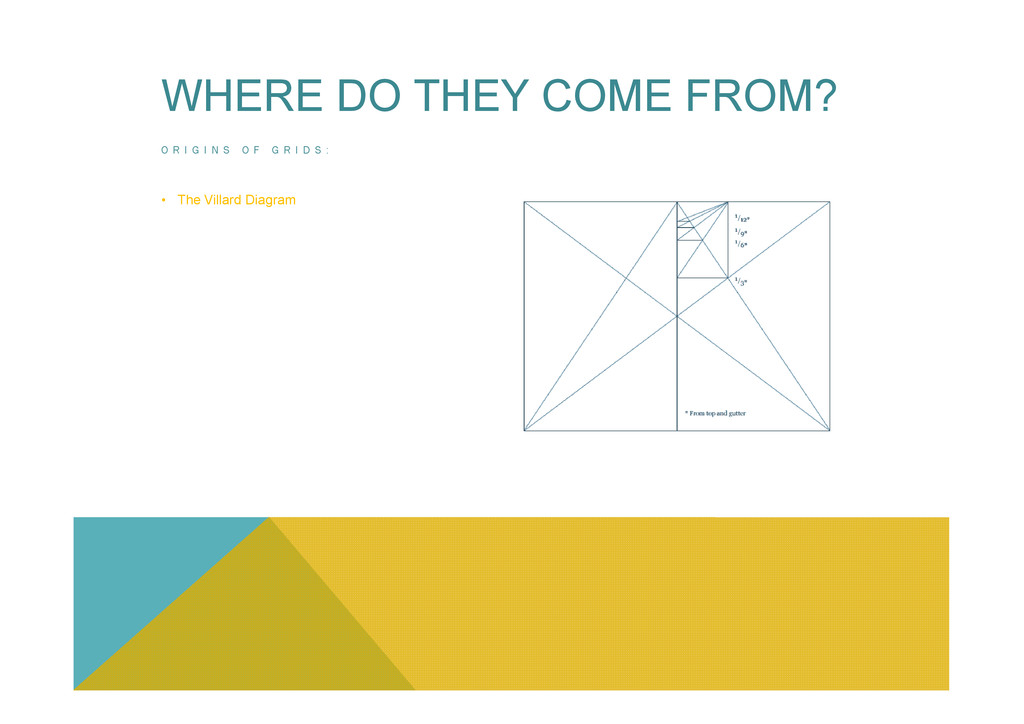
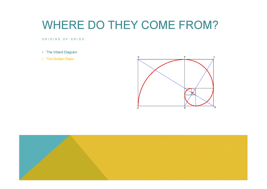
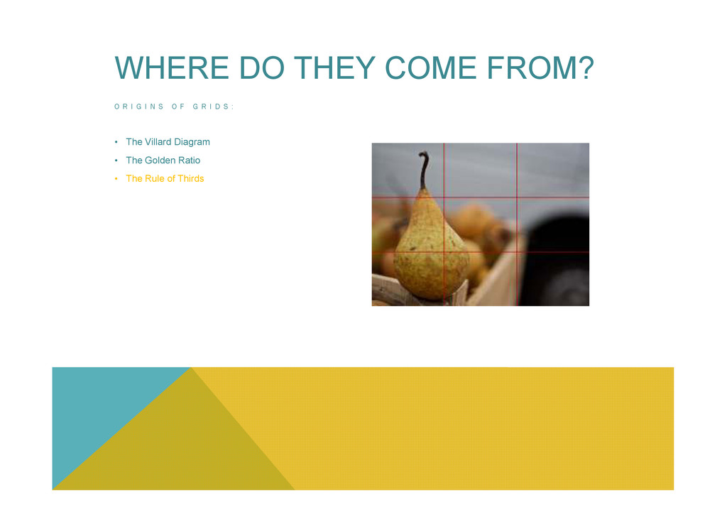
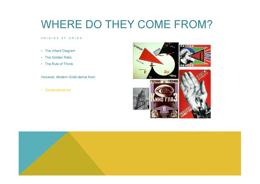
R I D S : • The Villard Diagram • The Golden Ratio • The Rule of Thirds However, Modern Grids derive from: • Constructivist Art WHERE DO THEY COME FROM? • Constructivist Art
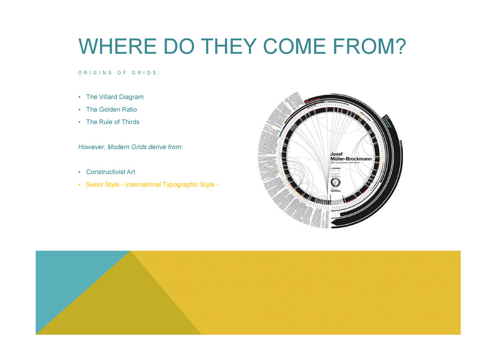
R I D S : • The Villard Diagram • The Golden Ratio • The Rule of Thirds However, Modern Grids derive from: • Constructivist Art WHERE DO THEY COME FROM? • Constructivist Art • Swiss Style - International Typographic Style -
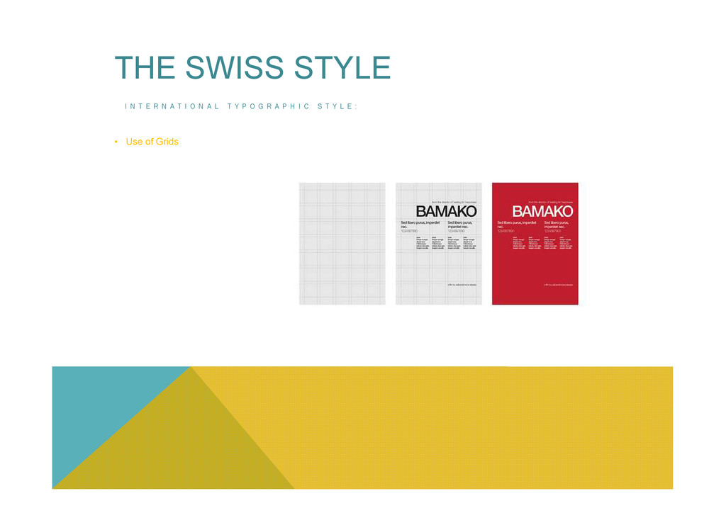
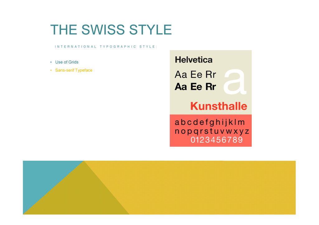
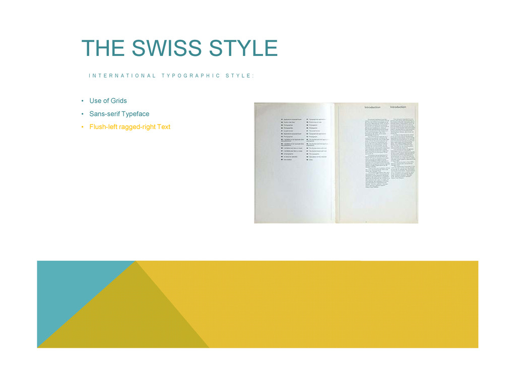
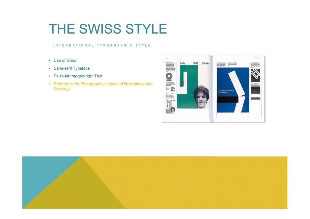
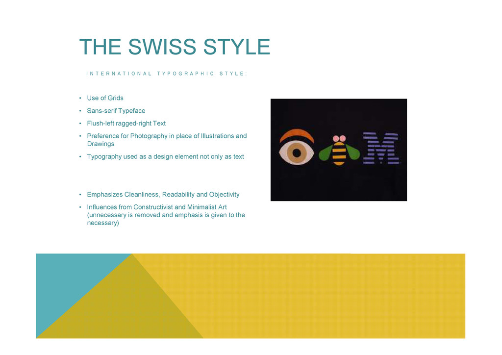
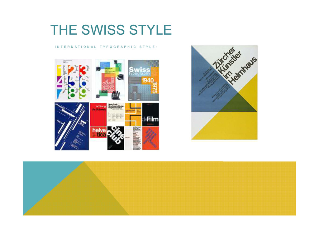
N A L T Y P O G R A P H I C S T Y L E : • Use of Grids • Sans-serif Typeface • Flush-left ragged-right Text • Preference for Photography in place of Illustrations and Drawings THE SWISS STYLE
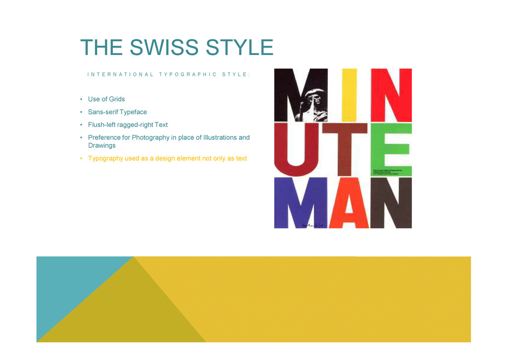
N A L T Y P O G R A P H I C S T Y L E : • Use of Grids • Sans-serif Typeface • Flush-left ragged-right Text • Preference for Photography in place of Illustrations and Drawings • Typography used as a design element not only as text THE SWISS STYLE
N A L T Y P O G R A P H I C S T Y L E : • Use of Grids • Sans-serif Typeface • Flush-left ragged-right Text • Preference for Photography in place of Illustrations and Drawings • Typography used as a design element not only as text THE SWISS STYLE • Emphasizes Cleanliness, Readability and Objectivity • Influences from Constructivist and Minimalist Art (unnecessary is removed and emphasis is given to the necessary)
N A L T Y P O G R A P H I C S T Y L E : • After World War II - Max Bill, Emil Ruder, and Josef Müller-Brockmann devised a system to help designers achieve coherency in organizing the page. The result was the Modern Typographic Grid. THE SWISS STYLE
N A L T Y P O G R A P H I C S T Y L E : • After World War II - Max Bill, Emil Ruder, and Josef Müller-Brockmann devised a system to help designers achieve coherency in organizing the page. The result was the Modern Typographic Grid. • Became adopted worldwide by 1970s. THE SWISS STYLE
N A L T Y P O G R A P H I C S T Y L E : • After World War II - Max Bill, Emil Ruder, and Josef Müller-Brockmann devised a system to help designers achieve coherency in organizing the page. The result was the Modern Typographic Grid. • Became adopted worldwide by 1970s. • However, it was rejected by some designers in 1980s for its constructive nature and association with corporate culture in favour of a more organic structure and creative freedom. THE SWISS STYLE culture in favour of a more organic structure and creative freedom.
R P O S E O F G R I D S : • To create well structured balanced designs and harmonious compositions. • To determine the dimension of space and its proportions.
R P O S E O F G R I D S : • To create well structured balanced designs and harmonious compositions. • To determine the dimension of space and its proportions. • To distribute content more efficiently in a way that it is logical and beautiful.
R P O S E O F G R I D S : • To create well structured balanced designs and harmonious compositions. • To determine the dimension of space and its proportions. • To distribute content more efficiently in a way that it is logical and beautiful. • To solve visual problems but also usability and accessibility issues.
R P O S E O F G R I D S : • To create well structured balanced designs and harmonious compositions. • To determine the dimension of space and its proportions. • To distribute content more efficiently in a way that it is logical and beautiful. • To solve visual problems but also usability and accessibility issues. • To crate order and organization on the page and enhance user experience.
T A G E S : • online content assimilation and retention increases when these are used, enhancing the user experience • compositions and designs are more linear and aesthetically pleasing
T A G E S : • online content assimilation and retention increases when these are used, enhancing the user experience • compositions and designs are more linear and aesthetically pleasing • makes the design process quicker by creating compartments for the content to be directly placed in.
T A G E S : • online content assimilation and retention increases when these are used, enhancing the user experience • compositions and designs are more linear and aesthetically pleasing • makes the design process quicker by creating compartments for the content to be directly placed in. • creates vertical rhythm and fosters analytical thinking.
T A G E S : • online content assimilation and retention increases when these are used, enhancing the user experience • compositions and designs are more linear and aesthetically pleasing • makes the design process quicker by creating compartments for the content to be directly placed in. • creates vertical rhythm and fosters analytical thinking. D I S A D V A N T A G E S : • In web design often the content is dynamic, hence there is no much to do about vertical proportions but approximate. The focus is therefore on horizontal layout which usually means columns.
T A G E S : • online content assimilation and retention increases when these are used, enhancing the user experience • compositions and designs are more linear and aesthetically pleasing • makes the design process quicker by creating compartments for the content to be directly placed in. • creates vertical rhythm and fosters analytical thinking. D I S A D V A N T A G E S : • In web design often the content is dynamic, hence there is no much to do about vertical proportions but approximate. The focus is therefore on horizontal layout which usually means columns. • Some says that it limits creative freedom.
I C A L R H Y T H M ? The spacing and arrangement of text as the reader descend the page. This is contributed by: • Font-size • Line-height VERTICAL RHYTHM
I C A L R H Y T H M ? The spacing and arrangement of text as the reader descend the page. This is contributed by: • Font-size • Line-height • Margins or Padding VERTICAL RHYTHM
I C A L R H Y T H M ? The spacing and arrangement of text as the reader descend the page. This is contributed by: • Font-size • Line-height • Margins or Padding • White Space VERTICAL RHYTHM
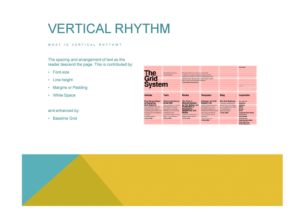
I C A L R H Y T H M ? The spacing and arrangement of text as the reader descend the page. This is contributed by: • Font-size • Line-height • Margins or Padding • White Space VERTICAL RHYTHM and enhanced by: • Baseline Grid
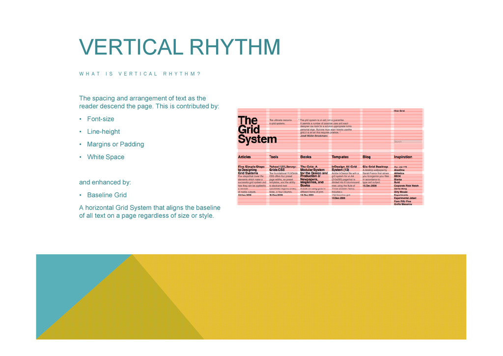
I C A L R H Y T H M ? The spacing and arrangement of text as the reader descend the page. This is contributed by: • Font-size • Line-height • Margins or Padding • White Space VERTICAL RHYTHM and enhanced by: • Baseline Grid A horizontal Grid System that aligns the baseline of all text on a page regardless of size or style.
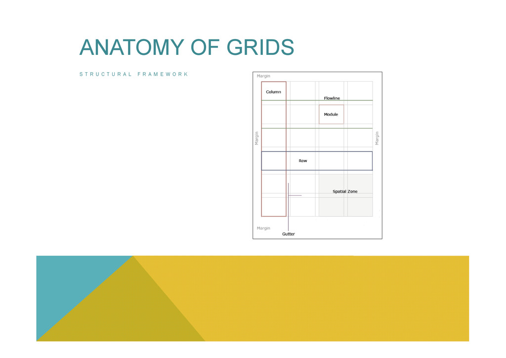
F R A M E W O R K • Units • Basic building blocks of a Grid. • Used to create Columns • Derived from constraints such as content elements going in the design (Images, Adverts, Font-Sizes) or by subdividing the maximum screen resolution. A relationship is created between the layout an ANATOMY OF GRIDS the element from which the unit is derived.
F R A M E W O R K • Units • Columns • Are the grouping of Units • Create the visual structure of the page • Equal or vary across the page ANATOMY OF GRIDS
F R A M E W O R K • Units • Columns • Rows • The horizontal equivalent of columns Online it is hard to plan for rows as the height of the format is often inconsistent ANATOMY OF GRIDS
F R A M E W O R K • Units • Columns • Rows • Gutters • Flowlines/Hanglines • horizontal lines that break the space into horizontal bands • used to help guide the eye across the page and above all to align elements ANATOMY OF GRIDS • Flowlines/Hanglines
F R A M E W O R K • Units • Columns • Rows • Gutters • Flowlines/Hanglines • Groups of adjacent modules • Used to place large images or long blocks of text. ANATOMY OF GRIDS • Flowlines/Hanglines • Fields
F R A M E W O R K • Units • Columns • Rows • Gutters • Flowlines/Hanglines • Spaces between the edge of the page and the outer edge of the content. • Help establish the overall tension in a composition. • The smaller the margin the more tension is created. ANATOMY OF GRIDS • Flowlines/Hanglines • Fields • Margins
R A L F R A M E W O R K • Ratios are at the heart of a well-designed Grid System. Either the Rule of Third or the Golden Ratio can be adopted to create a Grid System.
R A L F R A M E W O R K • Ratios are at the heart of a well-designed Grid System. Either the Rule of Third or the Golden Ratio can be adopted to create a Grid System. • On the web Grids need to be flexible to accommodate varying monitor widths and resolutions.
R A L F R A M E W O R K • Ratios are at the heart of a well-designed Grid System. Either the Rule of Third or the Golden Ratio can be adopted to create a Grid System. • On the web Grids need to be flexible to accommodate varying monitor widths and resolutions. • When using a fixed-width grid for the Web if the browser window expands, the layout within the Grid is not altered.
R A L F R A M E W O R K • Ratios are at the heart of a well-designed Grid System. Either the Rule of Third or the Golden Ratio can be adopted to create a Grid System. • On the web Grids need to be flexible to accommodate varying monitor widths and resolutions. • When using a fixed-width grid for the Web if the browser window expands, the layout within the Grid is not altered. • When using a variable-width Grid columns expand in proportion with the width of the browser frame. The layout within the Grid changes depending on the user’s monitor.
R A L F R A M E W O R K • Ratios are at the heart of a well-designed Grid System. Either the Rule of Third or the Golden Ratio can be adopted to create a Grid System. • On the web Grids need to be flexible to accommodate varying monitor widths and resolutions. • When using a fixed-width grid for the Web if the browser window expands, the layout within the Grid is not altered. • When using a variable-width Grid columns expand in proportion with the width of the browser frame. The layout within the Grid changes depending on the user’s monitor. • A combination of variable-width columns and fixed width columns would bring the variable-width columns to expand and shift the fixed width columns if there is not enough space.


 claudio1
 ipullrank
 watany
 oripsolob
 andyhume
 morganepeng
 axbom
 katarinadahlin
 panda_program
 sabderemane
 destraynor
 varn
 palkan