Upgrade to Pro
— share decks privately, control downloads, hide ads and more …
Speaker Deck
Features
Speaker Deck
PRO
Sign in
Sign up for free
Search
Search
マテリアルデザイン、フラットデザインガイドラインを読む
Search
kkeeth
March 03, 2018
Technology
910
1
Share
Embed
Copy iframe code
Copy JS code
Copy link
Start on current slide
マテリアルデザイン、フラットデザインガイドラインを読む
kkeeth
March 03, 2018
More Decks by kkeeth
See All by kkeeth
Programming to play with p5.js
clown0082
0
100
とある EM の初めての育休からの学び
clown0082
1
5.7k
The history of Javascript frameworks: changes in front-end design philosophy
clown0082
2
240
Visually experience the beauty of mathematics with p5.js
clown0082
1
3.3k
Rediscover the joy of coding with Creative Coding
clown0082
0
1.9k
全員が意思決定する会社で開発者体験や生産性を見る大変さについて
clown0082
0
670
JavaScript × Mathematics go to Digital Art
clown0082
1
460
In-house study group at YUMEMI
clown0082
0
240
Playing Ionic Logo by p5.js
clown0082
0
350
Other Decks in Technology
See All in Technology
Amplify Gen2でbackend.tsにCDKを定義する/しない事によるCDKの挙動の違いとユースケース
smt7174
1
420
AIレビューはどこまで任せられるのか?自動化と人が背負うレビューの境界
sansantech
PRO
3
1.1k
インフラと開発の垣根を超えていき!〜元AWSインフラエンジニアがAWS開発で奮闘している話〜
hatahata021
3
300
ファミコンでPHPを動かす / PHP on the Famicom
tomzoh
2
450
関数型の考えを TypeScript に持ち込んで、テストしやすい純粋関数を増やす / Pure at the Core, Effects at the Edge: Bringing Functional Thinking into TypeScript
kaminashi
2
130
生成AI×AWS CDK×AWS FISで"振り返れる"ミニGameDayをつくろう
yoshimi0227
1
410
OpenTelemetryにおけるGoのゼロコード・コンパイル時計装について #fukuokago
quiver
0
120
誤解だらけの開発生産性 / Myths and Misconceptions about Developer Productivity
i35_267
2
810
Genie Ontologyは銀の弾丸かを考える / Is Genie Ontology a Silver Bullet?
nttcom
0
410
LLMやAIエージェントをソフトウェアに組み込むプラクティス
shibuiwilliam
2
420
kaonavi Tech Night#1
kaonavi
0
110
最適な自走を最小限の支援で — M&Aで拡大する組織で少人数SREが挑んだ1年 / SRE NEXT 2026
genda
0
1.5k
Featured
See All Featured
Building Adaptive Systems
keathley
44
3.1k
Producing Creativity
orderedlist
PRO
348
40k
[RailsConf 2023 Opening Keynote] The Magic of Rails
eileencodes
31
10k
Un-Boring Meetings
codingconduct
0
350
30 Presentation Tips
portentint
PRO
1
350
A Guide to Academic Writing Using Generative AI - A Workshop
ks91
PRO
1
350
Why You Should Never Use an ORM
jnunemaker
PRO
61
9.9k
What the history of the web can teach us about the future of AI
inesmontani
PRO
1
630
Discover your Explorer Soul
emna__ayadi
2
1.2k
Measuring & Analyzing Core Web Vitals
bluesmoon
9
880
Reality Check: Gamification 10 Years Later
codingconduct
0
2.2k
Performance Is Good for Brains [We Love Speed 2024]
tammyeverts
12
1.7k
Transcript
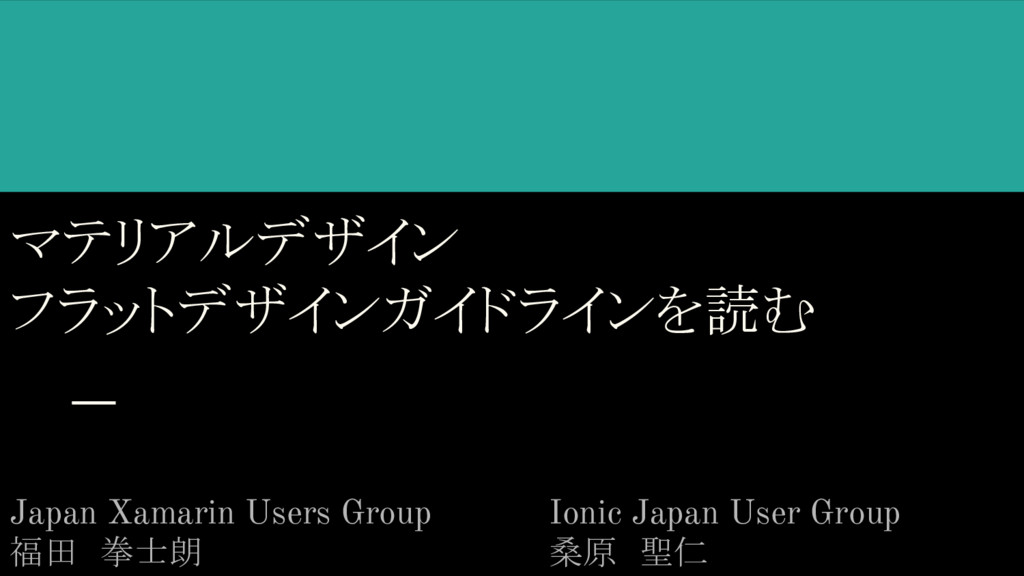
マテリアルデザイン フラットデザインガイドラインを読む Japan Xamarin Users Group 福田 拳士朗 Ionic Japan User
Group 桑原 聖仁
マテリアルデザインガイドラインを読む
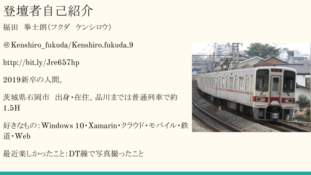
登壇者自己紹介 福田 拳士朗(フクダ ケンシロウ) @Kenshiro_fukuda/Kenshiro.fukuda.9 http://bit.ly/Jre657hp 2019新卒の人間。 茨城県石岡市 出身・在住。品川までは普通列車で約 1.5H 好きなもの:Windows 10・Xamarin・クラウド・モバイル・鉄 道・Web
最近楽しかったこと:DT線で写真撮ったこと
マテリアルデザインとは 「A unified system that combines theory, resources, and tools
for crafting digital experiences.」 Googleによって提唱したユーザーエクスペリエンスデザインの体系、およびそれを実現する開 発技術や手法、デザイン、試みなどの包括的呼称 とされている。 2014年6月のGoogle I/Oにて発表され、主にAndroidネイティブアプリで持ち入れられている。 原本元ソース:https://material.io/
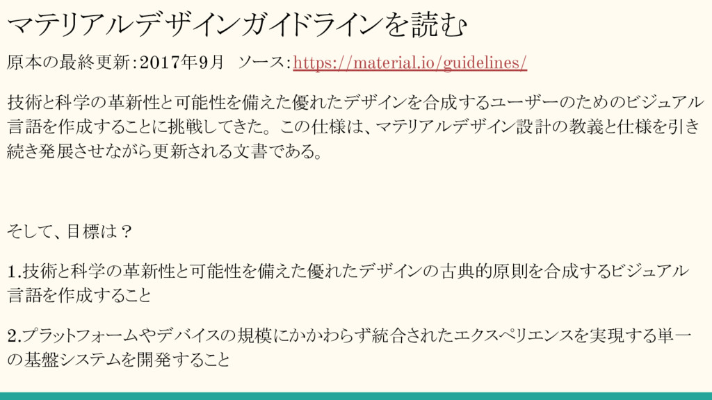
マテリアルデザインガイドラインを読む 原本の最終更新:2017年9月 ソース:https://material.io/guidelines/ 技術と科学の革新性と可能性を備えた優れたデザインを合成するユーザーのためのビジュアル 言語を作成することに挑戦してきた。 この仕様は、マテリアルデザイン設計の教義と仕様を引き 続き発展させながら更新される文書である。 そして、目標は? 1.技術と科学の革新性と可能性を備えた優れたデザインの古典的原則を合成するビジュアル 言語を作成すること 2.プラットフォームやデバイスの規模にかかわらず統合されたエクスペリエンスを実現する単一
の基盤システムを開発すること
マテリアルデザインの大原則 主に3つの原則に基づく。 1.比喩であること 2.意図的なものであること 3.モーション=意味
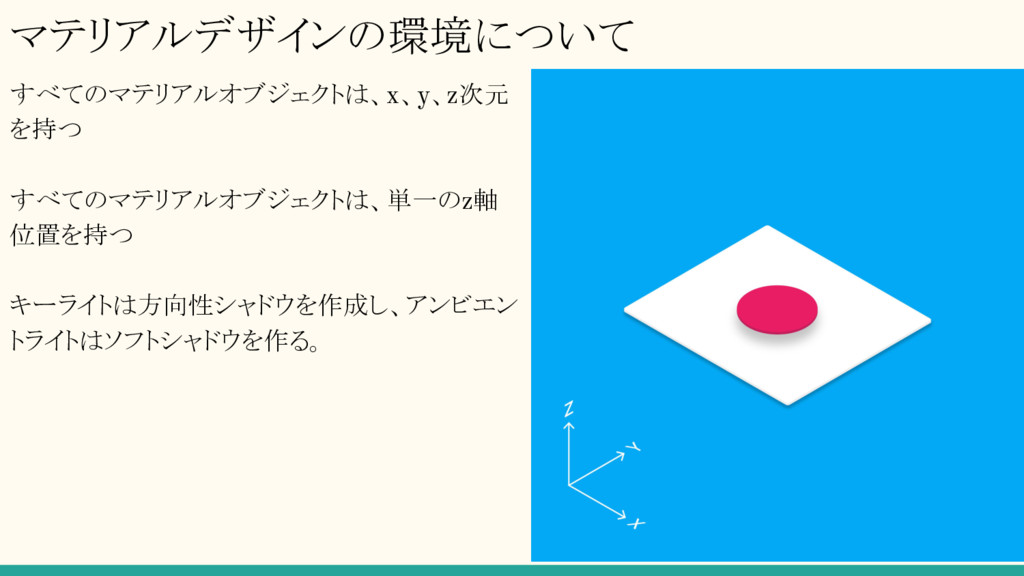
マテリアルデザインの環境について すべてのマテリアルオブジェクトは、x、y、z次元 を持つ すべてのマテリアルオブジェクトは、単一のz軸 位置を持つ キーライトは方向性シャドウを作成し、アンビエン トライトはソフトシャドウを作る。
マテリアルデザインの最新情報 2017年9月 オフライン上でのアクセス機能の拡張系をAndroid 8.0向けに行った Updated guidance on categorizing notifications into
channels and a new messaging template Android 8向けのアイコン作成方法についても解説。 Simplified guidance on how settings are grouped, titled, and styled
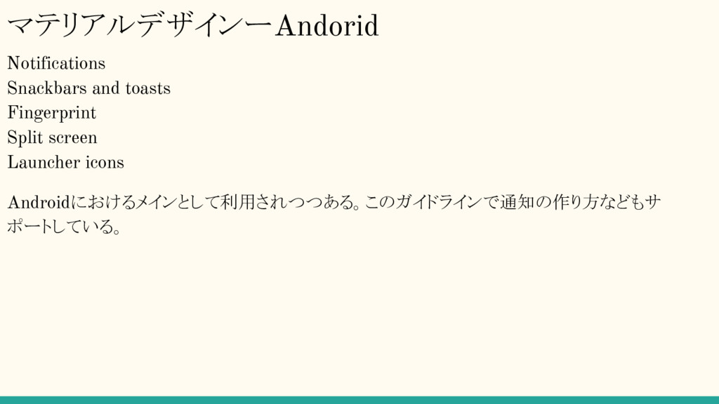
マテリアルデザインーAndorid Notifications Snackbars and toasts Fingerprint Split screen Launcher icons
Androidにおけるメインとして利用されつつある。このガイドラインで通知の作り方などもサ ポートしている。
マテリアルデザインが使われているアプリ Google+ Airbnb Evernote ※ 原則的にGoogleアプリはマテリアルデザインが採用されている。 参考:https://sugar.amebaownd.com/posts/357364
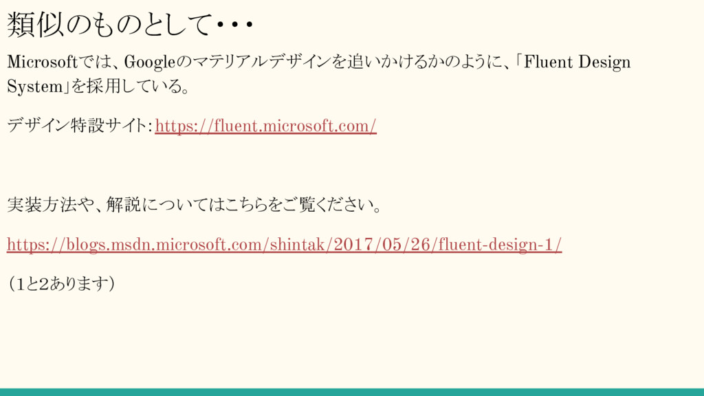
類似のものとして・・・ Microsoftでは、Googleのマテリアルデザインを追いかけるかのように、「Fluent Design System」を採用している。 デザイン特設サイト:https://fluent.microsoft.com/ 実装方法や、解説についてはこちらをご覧ください。 https://blogs.msdn.microsoft.com/shintak/2017/05/26/fluent-design-1/ (1と2あります)
フラットデザイン
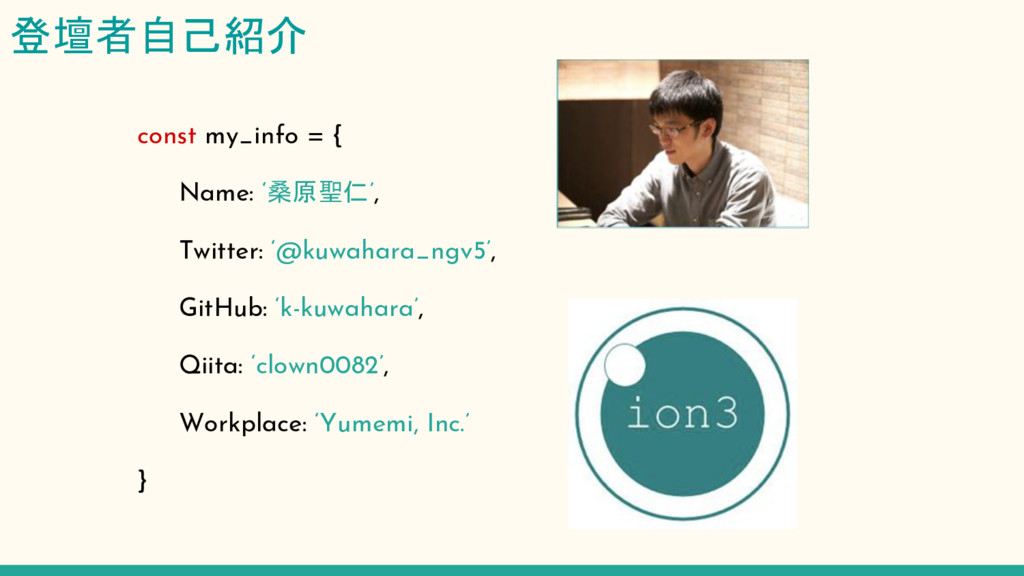
登壇者自己紹介 const my_info = { Name: ‘桑原聖仁’, Twitter:
‘@kuwahara_ngv5’, GitHub: ‘k-kuwahara’, Qiita: ‘clown0082’, Workplace: ‘Yumemi, Inc.’ }
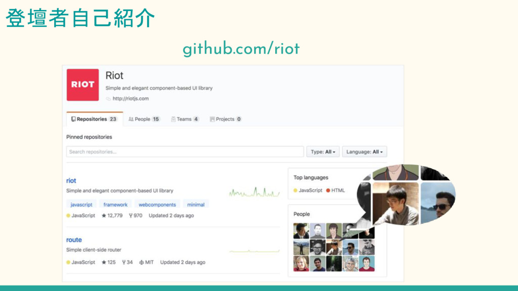
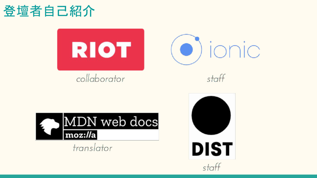
登壇者自己紹介 github.com/riot
登壇者自己紹介
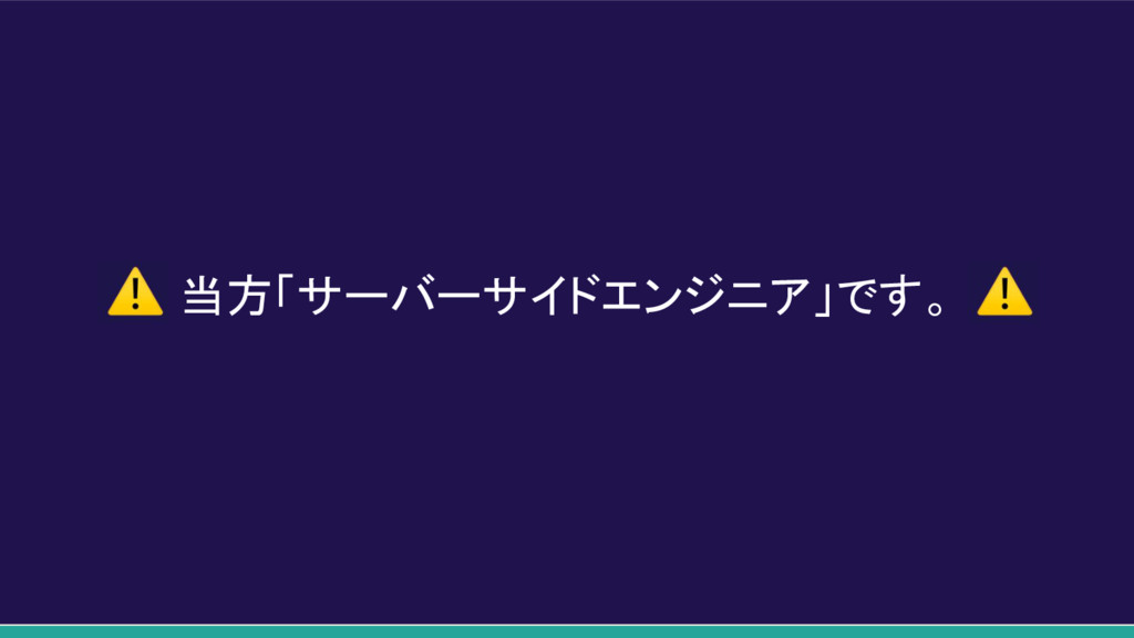
当方「サーバーサイドエンジニア」です。
フラットデザインとは
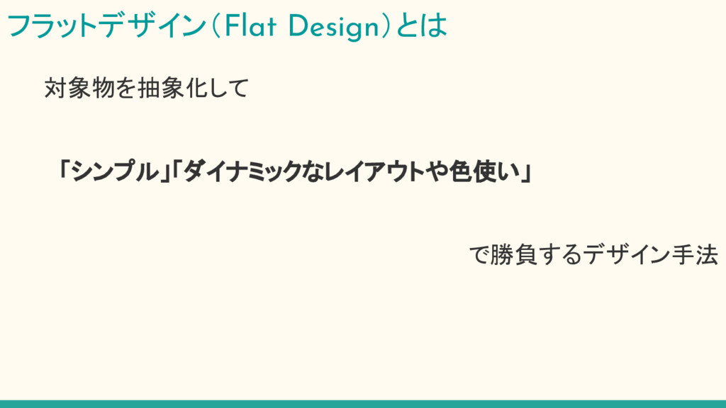
フラットデザイン(Flat Design)とは 対象物を抽象化して 「シンプル」「ダイナミックなレイアウトや色使い」 で勝負するデザイン手法
フラットデザイン(Flat Design)とは 対象物を抽象化して 「シンプル」「ダイナミックなレイアウトや色使い」 で勝負するデザイン手法
フラットデザインの起源 厳格な定義はなく、AppleもMicrosoftも 「フラットデザイン」とは 提唱していない。 ※もちろんガイドラインもない。 (Microsoft社が提唱した「モダンUI」が後に大きな影響を及ぼす)
なんでこんなに流行ったの?
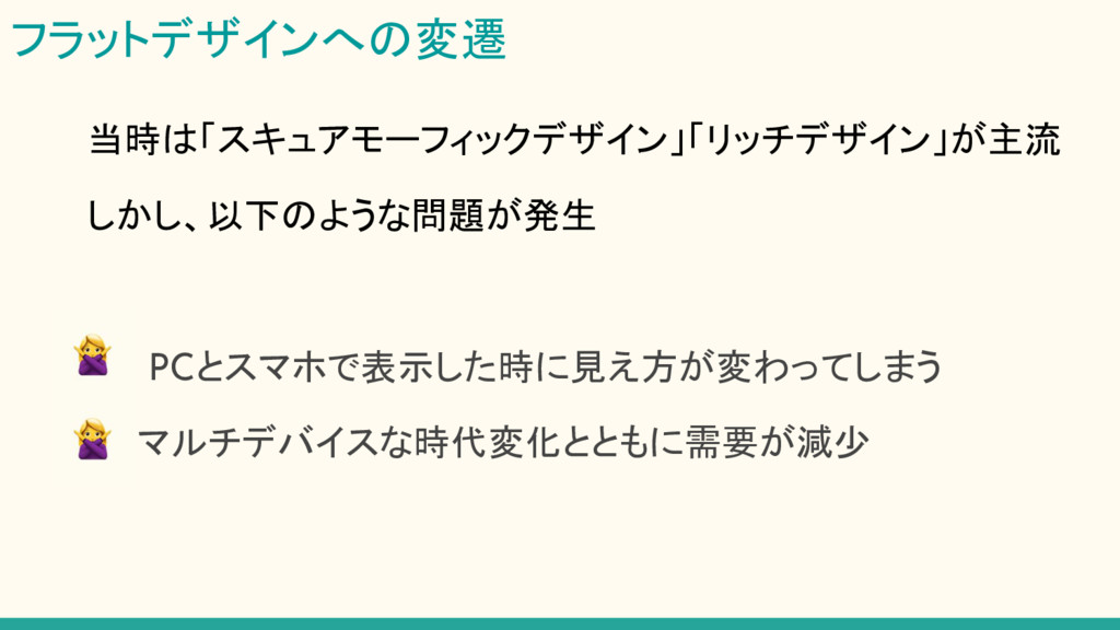
フラットデザインへの変遷 当時は「スキュアモーフィックデザイン」「リッチデザイン」が主流 しかし、以下のような問題が発生 PCとスマホで表示した時に見え方が変わってしまう マルチデバイスな時代変化とともに需要が減少
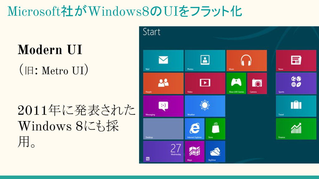
Modern UI (旧: Metro UI) 2011年に発表された Windows 8にも採 用。 Microsoft社がWindows8のUIをフラット化
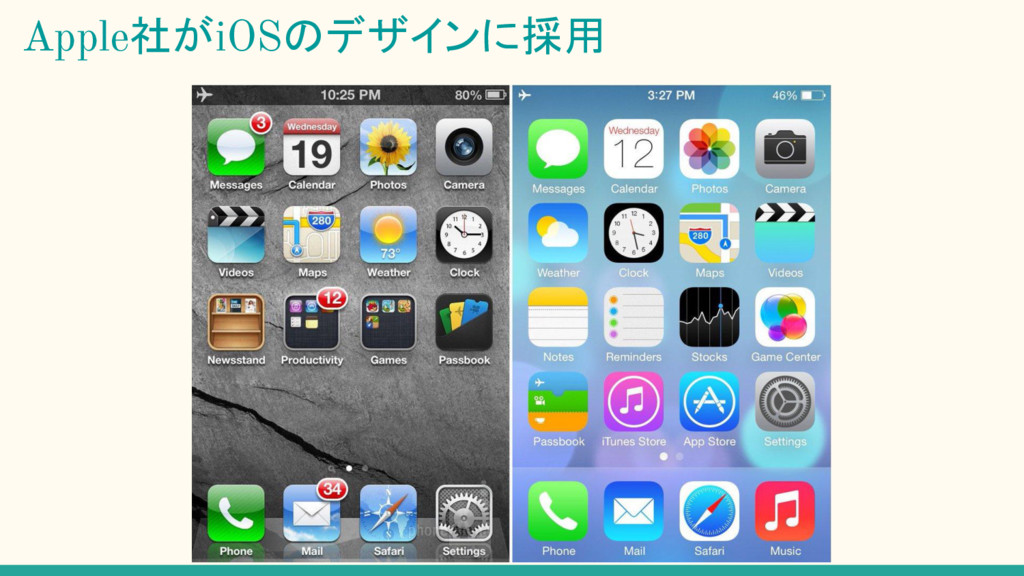
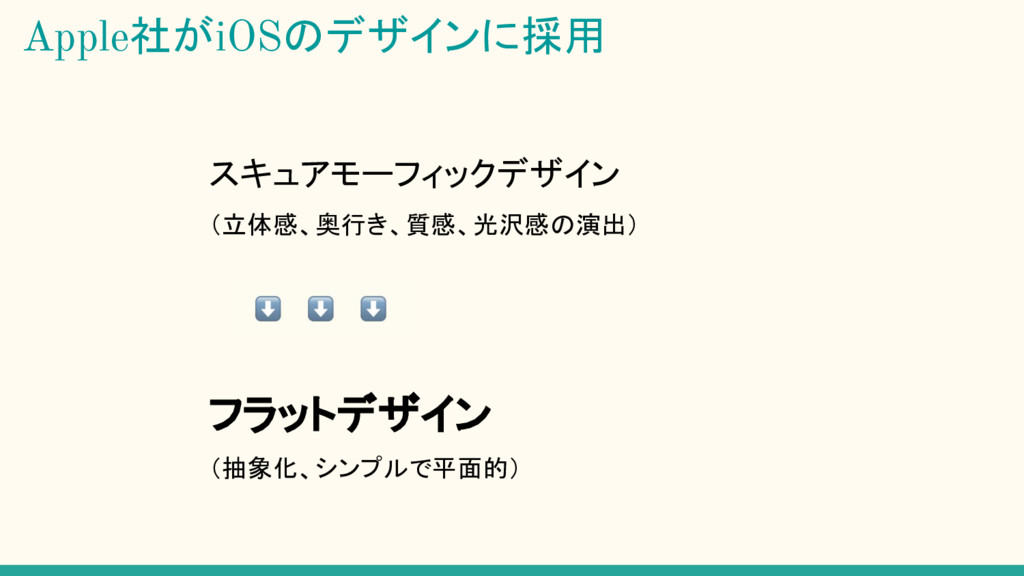
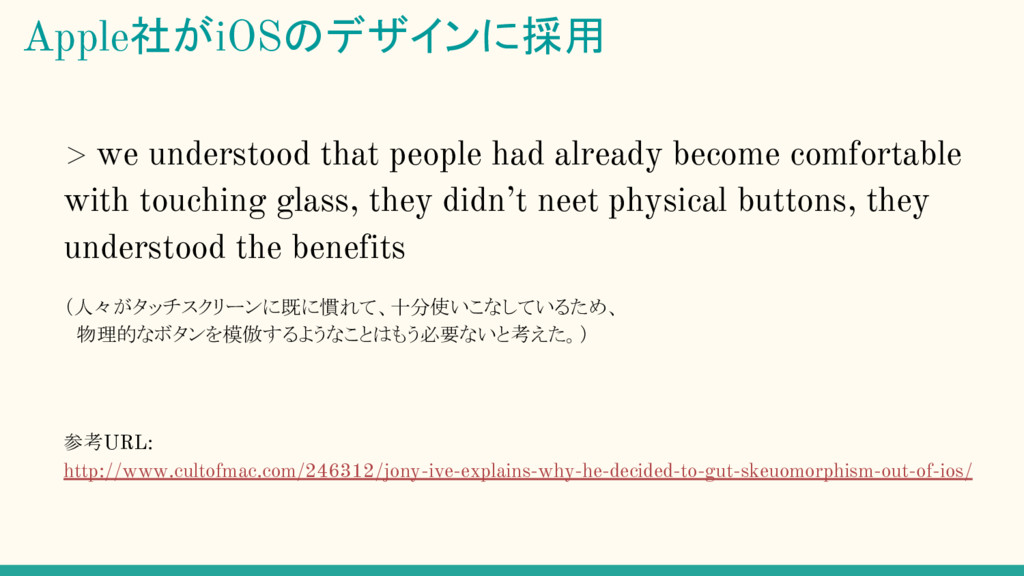
Apple社がiOSのデザインに採用
スキュアモーフィックデザイン (立体感、奥行き、質感、光沢感の演出) ⬇ ⬇ ⬇ フラットデザイン (抽象化、シンプルで平面的) Apple社がiOSのデザインに採用
> we understood that people had already become comfortable with
touching glass, they didn’t neet physical buttons, they understood the benefits (人々がタッチスクリーンに既に慣れて、十分使いこなしているため、 物理的なボタンを模倣するようなことはもう必要ないと考えた。) 参考URL: http://www.cultofmac.com/246312/jony-ive-explains-why-he-decided-to-gut-skeuomorphism-out-of-ios/ Apple社がiOSのデザインに採用
その他の採用事例
フラットデザインのメリット・デメリット
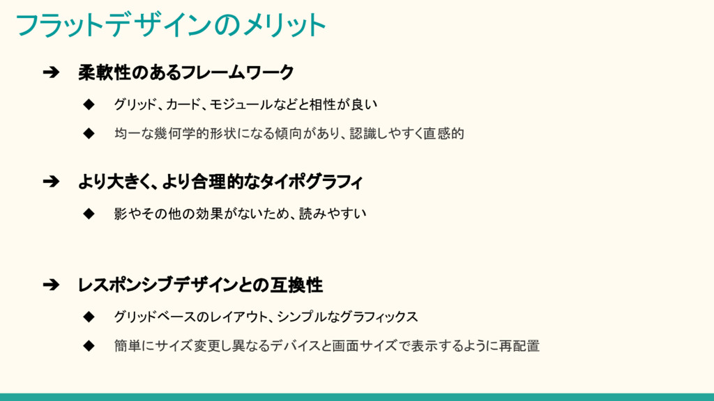
フラットデザインのメリット ➔ 柔軟性のあるフレームワーク ◆ グリッド、カード、モジュールなどと相性が良い ◆ 均一な幾何学的形状になる傾向があり、認識しやすく直感的 ➔ より大きく、より合理的なタイポグラフィ ◆
影やその他の効果がないため、読みやすい ➔ レスポンシブデザインとの互換性 ◆ グリッドベースのレイアウト、シンプルなグラフィックス ◆ 簡単にサイズ変更し異なるデバイスと画面サイズで表示するように再配置
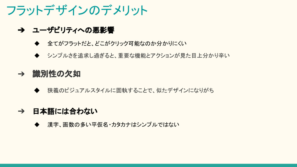
➔ ユーザビリティへの悪影響 ◆ 全てがフラットだと、どこがクリック可能なのか分かりにくい ◆ シンプルさを追求し過ぎると、重要な機能とアクションが見た目上分かり辛い フラットデザインのデメリット ➔ 識別性の欠如 ◆
狭義のビジュアルスタイルに固執することで、似たデザインになりがち ➔ 日本語には合わない ◆ 漢字、画数の多い平仮名・カタカナはシンプルではない
フラットデザインの今後は?
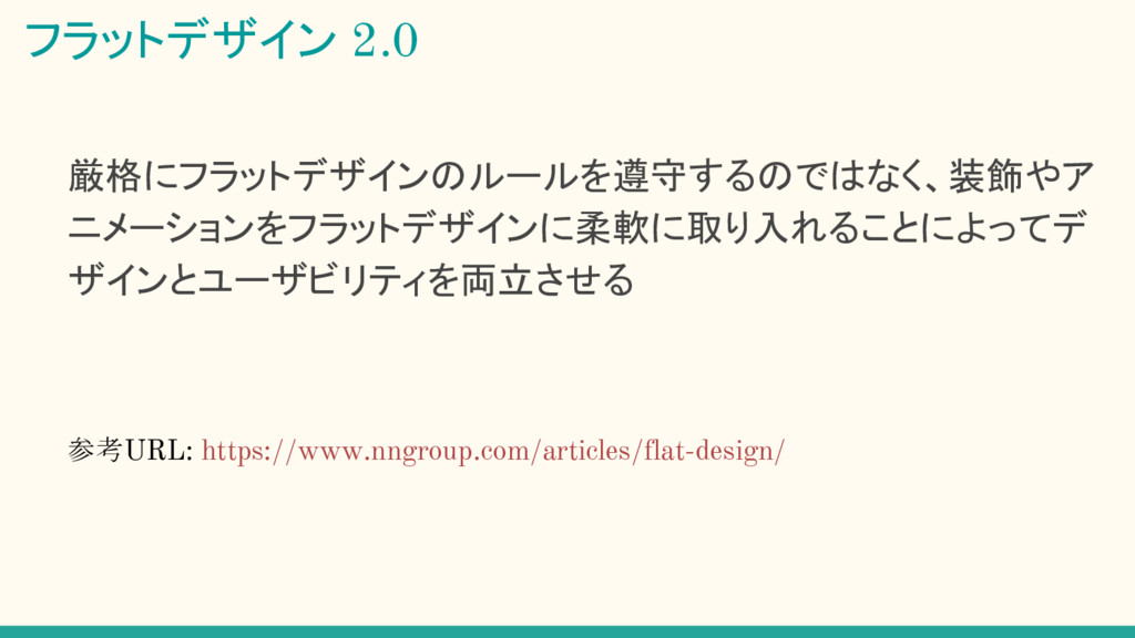
厳格にフラットデザインのルールを遵守するのではなく、装飾やア ニメーションをフラットデザインに柔軟に取り入れることによってデ ザインとユーザビリティを両立させる 参考URL: https://www.nngroup.com/articles/flat-design/ フラットデザイン 2.0
マテリアルデザインとの比較
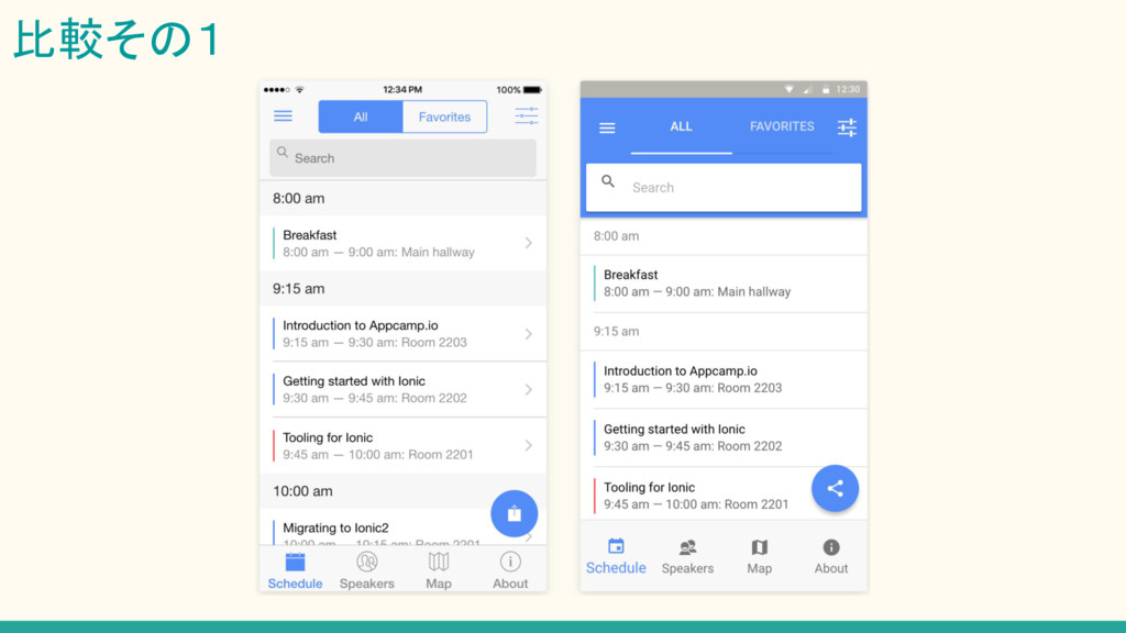
比較その1
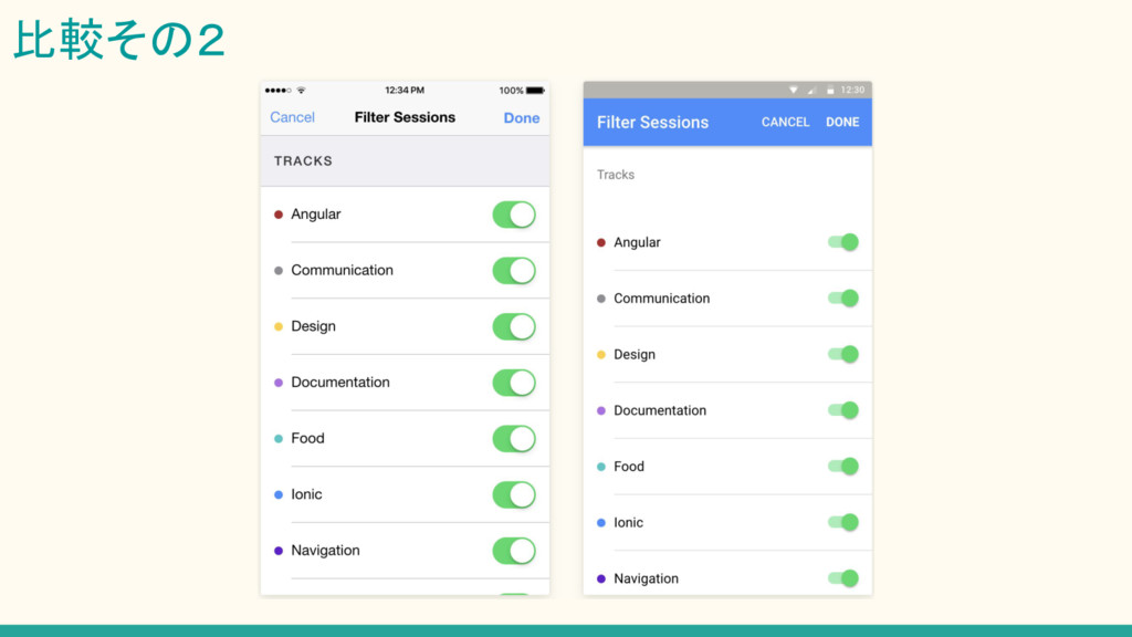
比較その2
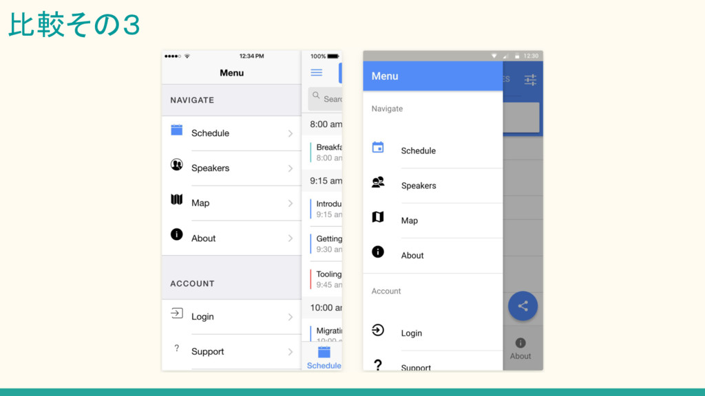
比較その3
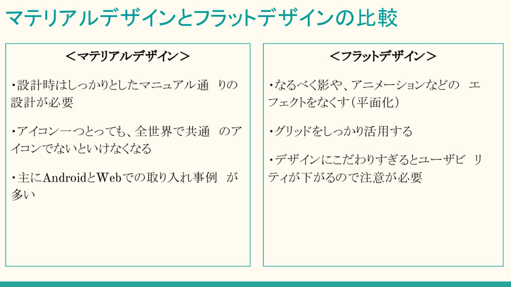
<フラットデザイン> ・なるべく影や、アニメーションなどの エ フェクトをなくす(平面化) ・グリッドをしっかり活用する ・デザインにこだわりすぎるとユーザビ リ ティが下がるので注意が必要 マテリアルデザインとフラットデザインの比較 <マテリアルデザイン> ・設計時はしっかりとしたマニュアル通 りの 設計が必要
・アイコン一つとっても、全世界で共通 のア イコンでないといけなくなる ・主にAndroidとWebでの取り入れ事例 が 多い
双方メリット・デメリットを理解し、どちらが何に適し ているのかを、的確に判断しながらデザインを考え ていくことが大事だと思います。
最後に…
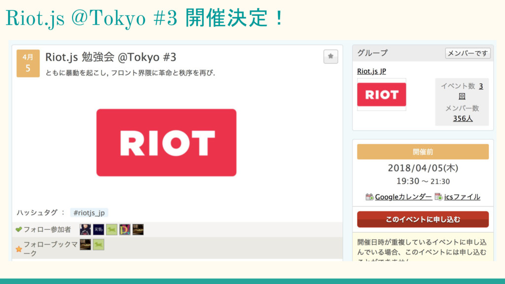
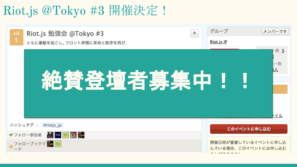
Riot.js @Tokyo #3 開催決定!
Riot.js @Tokyo #3 開催決定! 絶賛登壇者募集中!!
ご清聴ありがとうございました!