Share
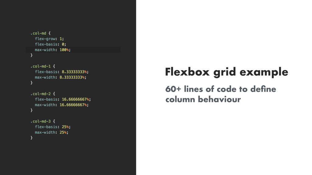
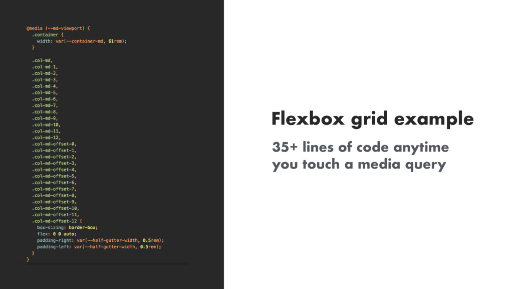
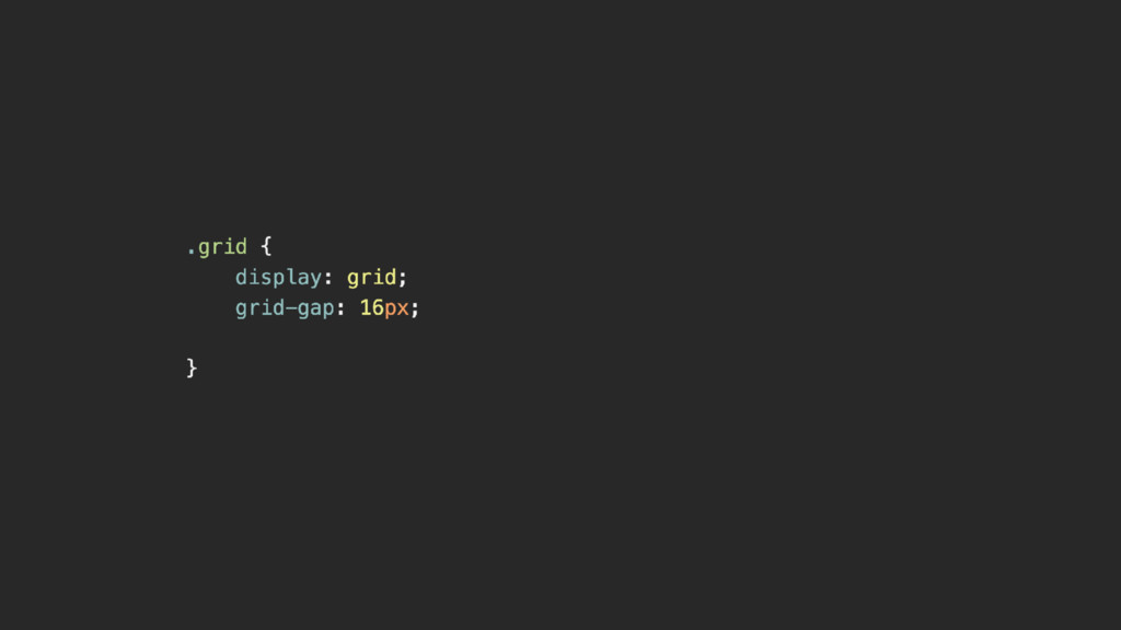
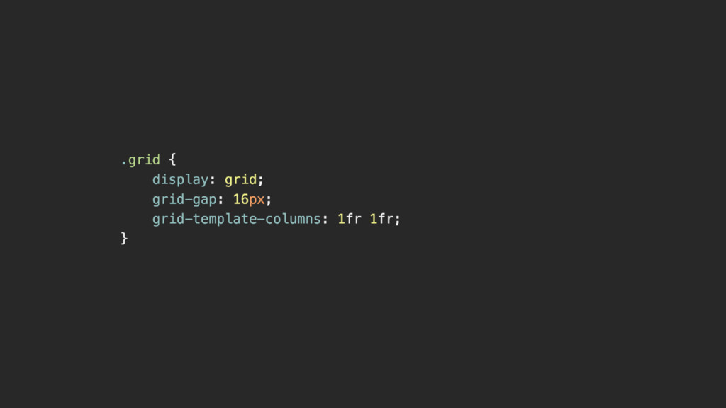
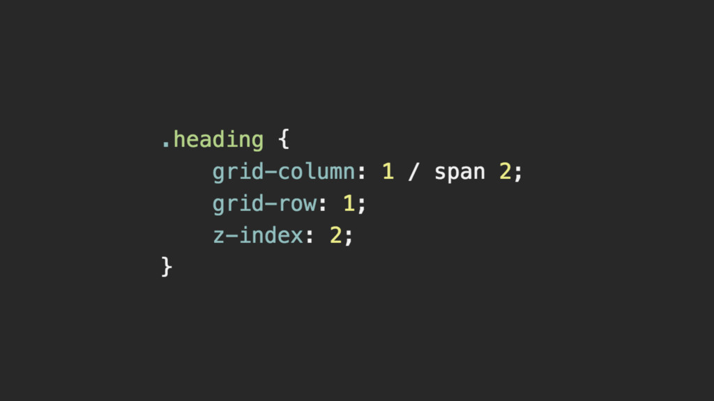
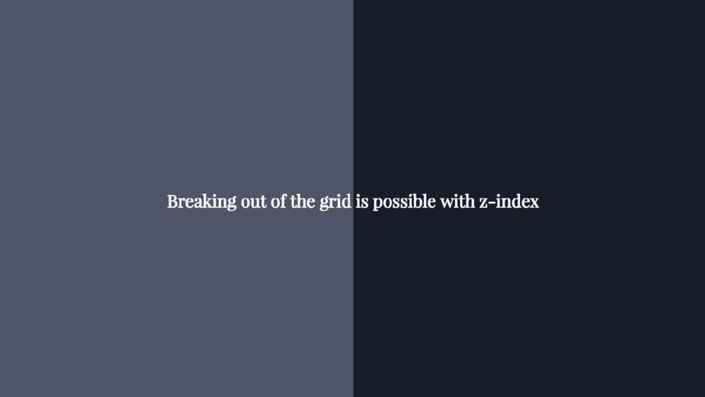
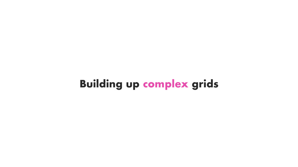
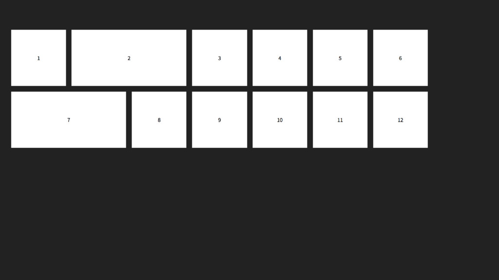
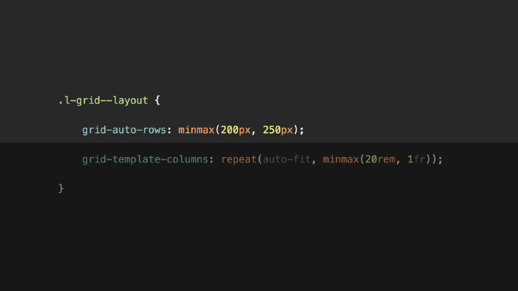
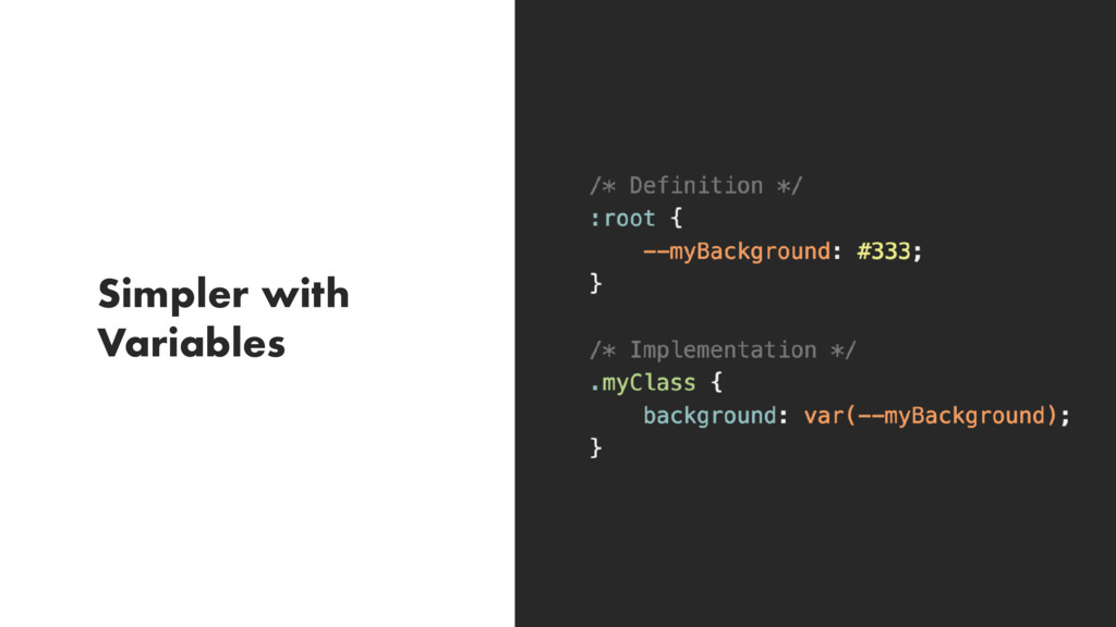
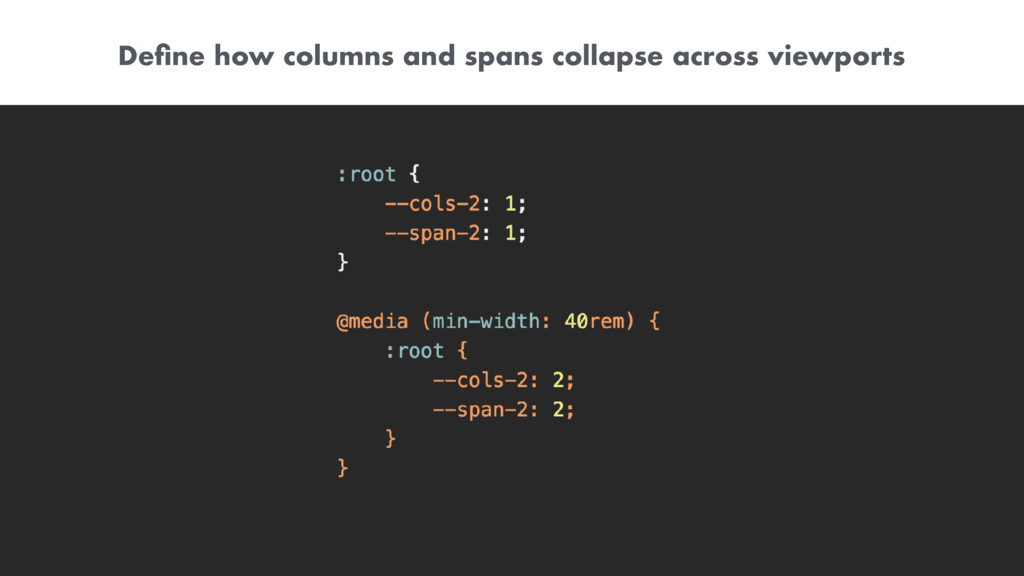
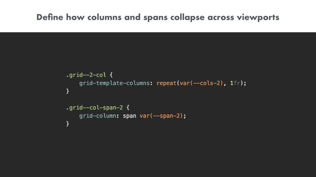
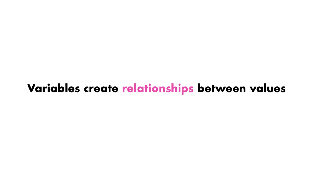
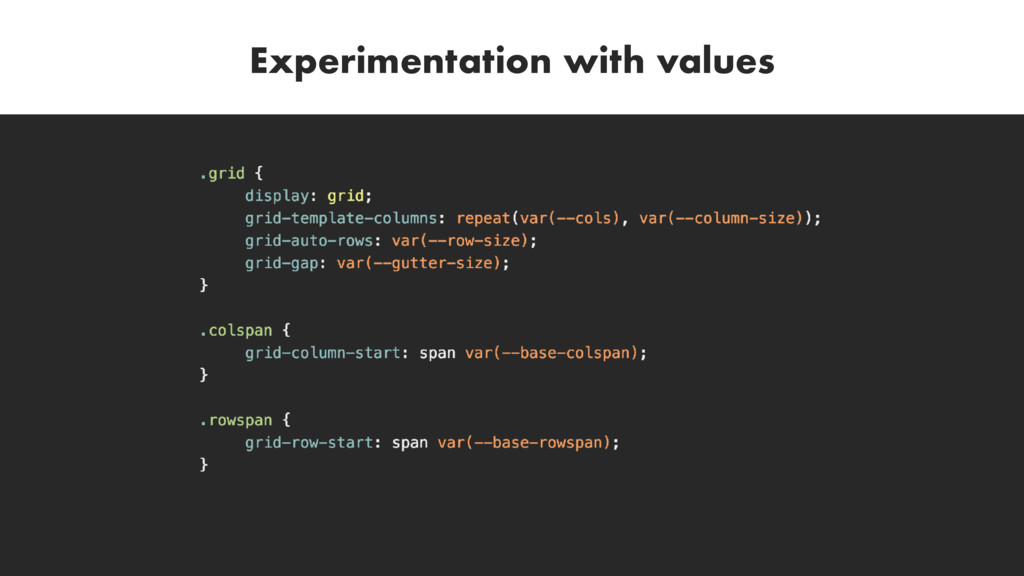
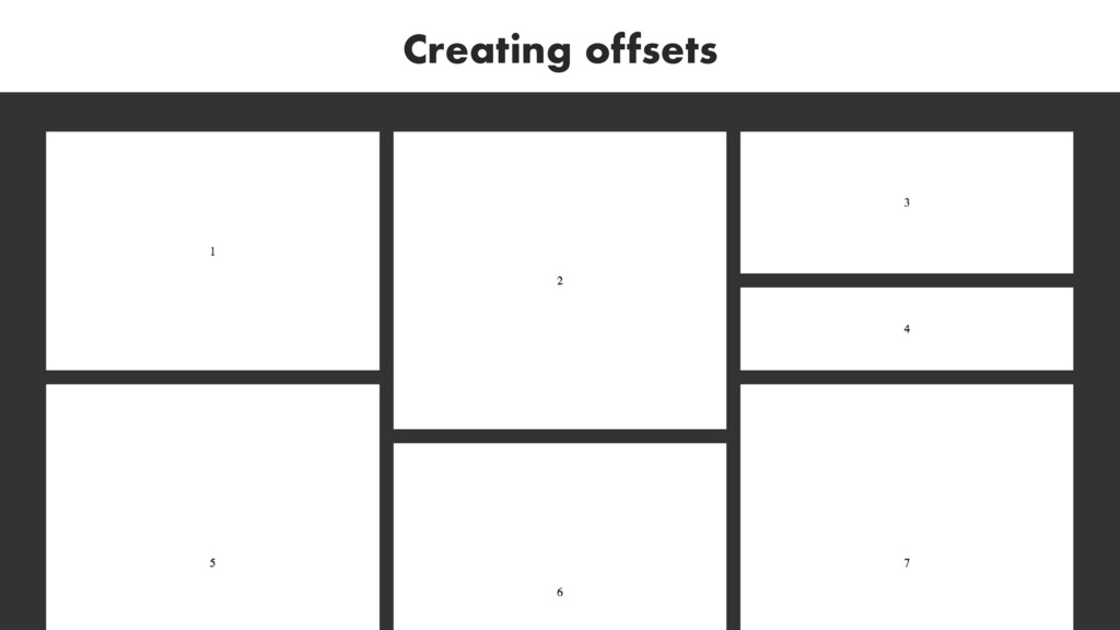
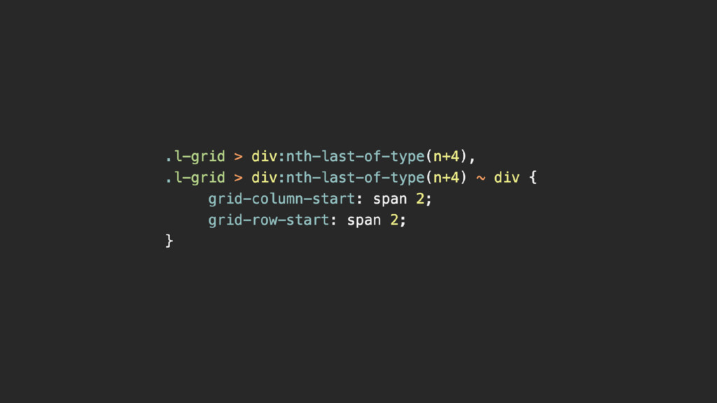
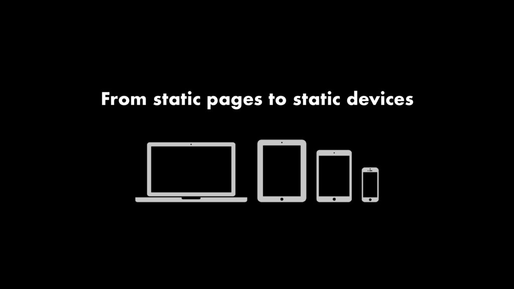
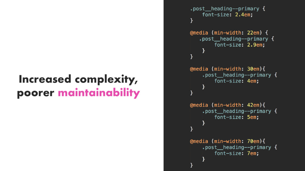
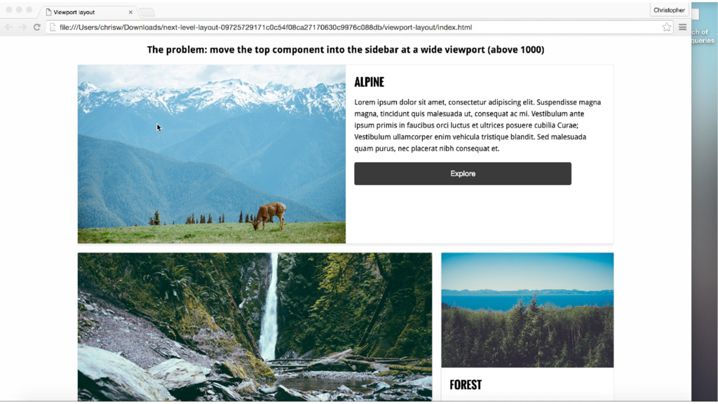
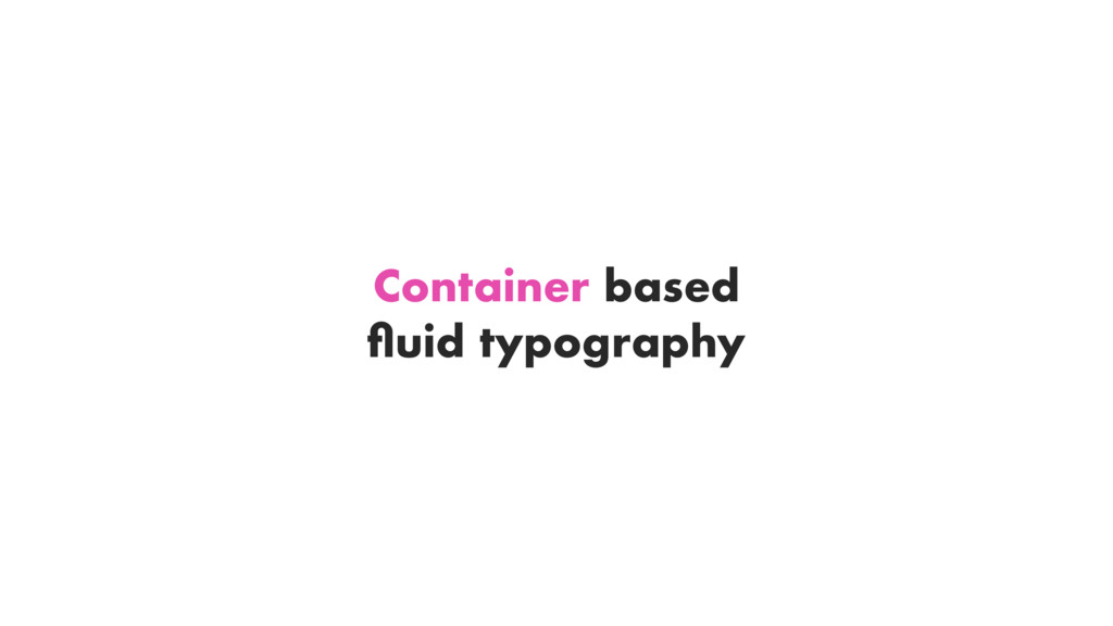
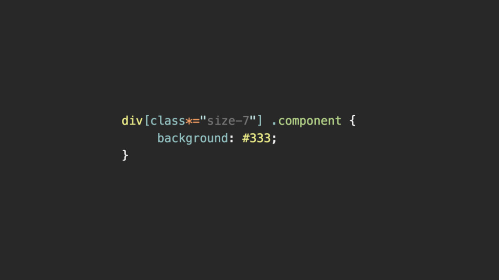
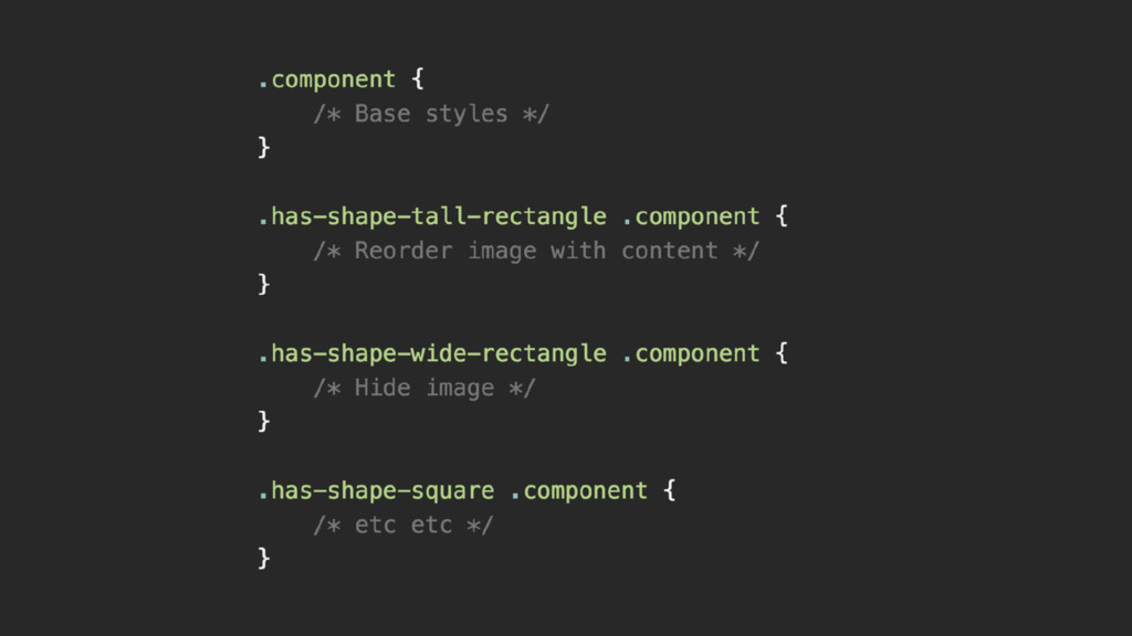
A talk about creating the layout features we want - by hacking together the features we have and experimenting to create change.
 cwrightdesign
 akihisaikeda
 kuranuki
 y0hgi
y0hgi
 naoya
naoya
 geekplus_tech
 mizchi
 broadleaf
 tk3fftk
 manfredsteyer
 tomoyanonymous
 wanko_it
 pizzacat83
 bluesmoon
 eileencodes
 shlominoach
 speakerdeck
 soudai
 katarinadahlin
 kevinliebholz
 jacobtomlinson
 jonoalderson
 addyosmani
 marcelosomers
 wayneb77