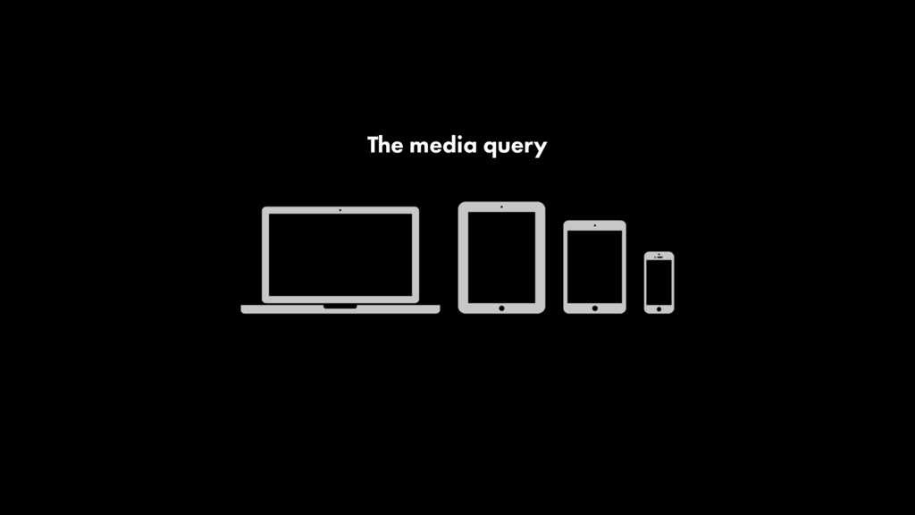
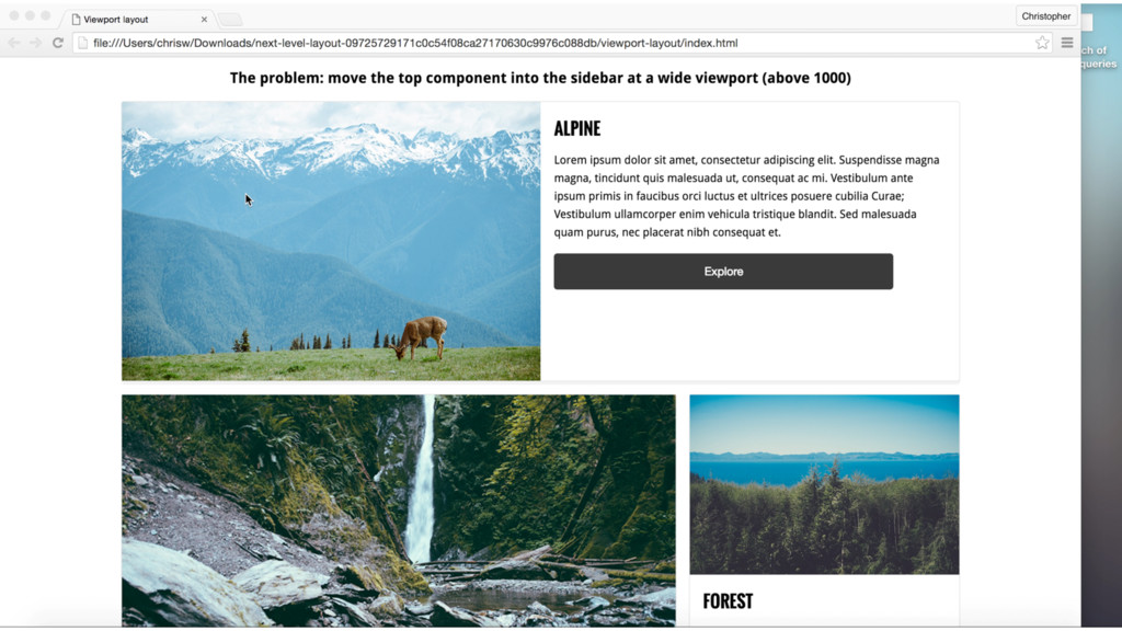
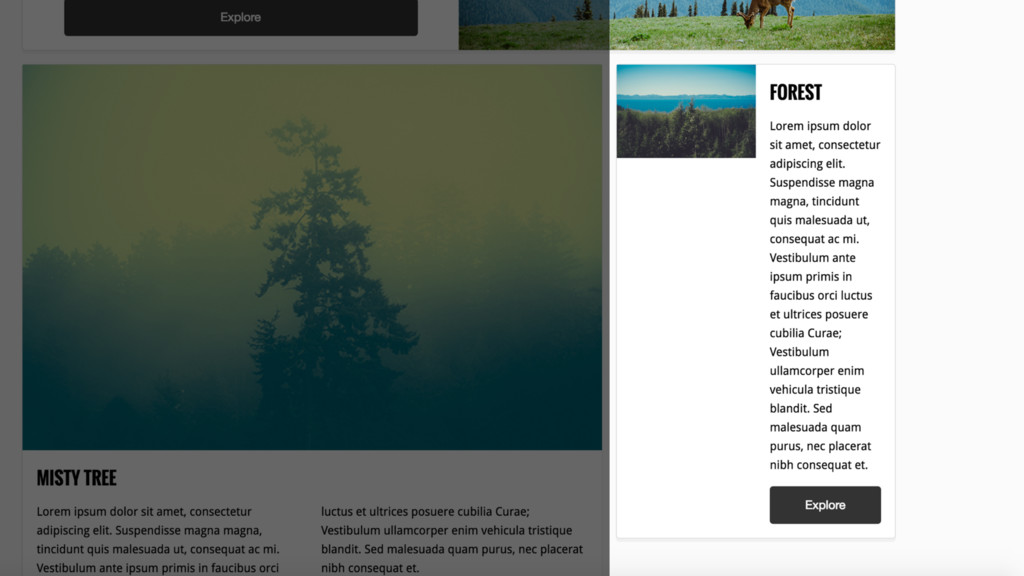
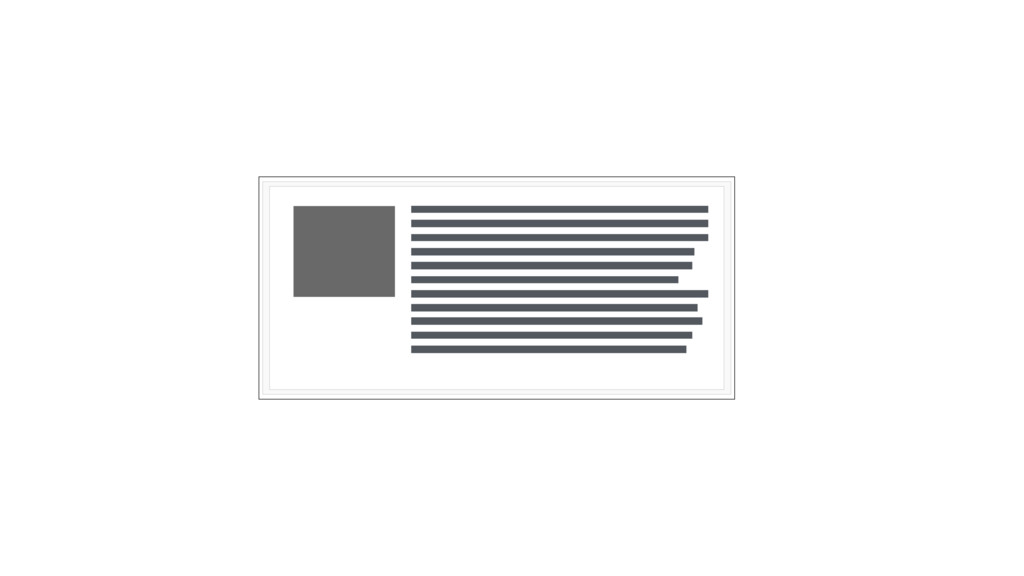
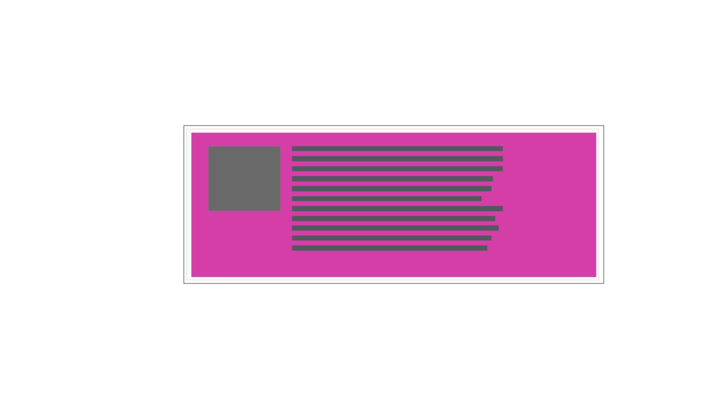
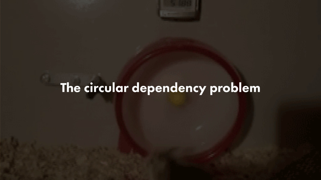
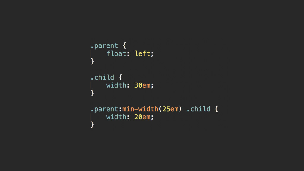
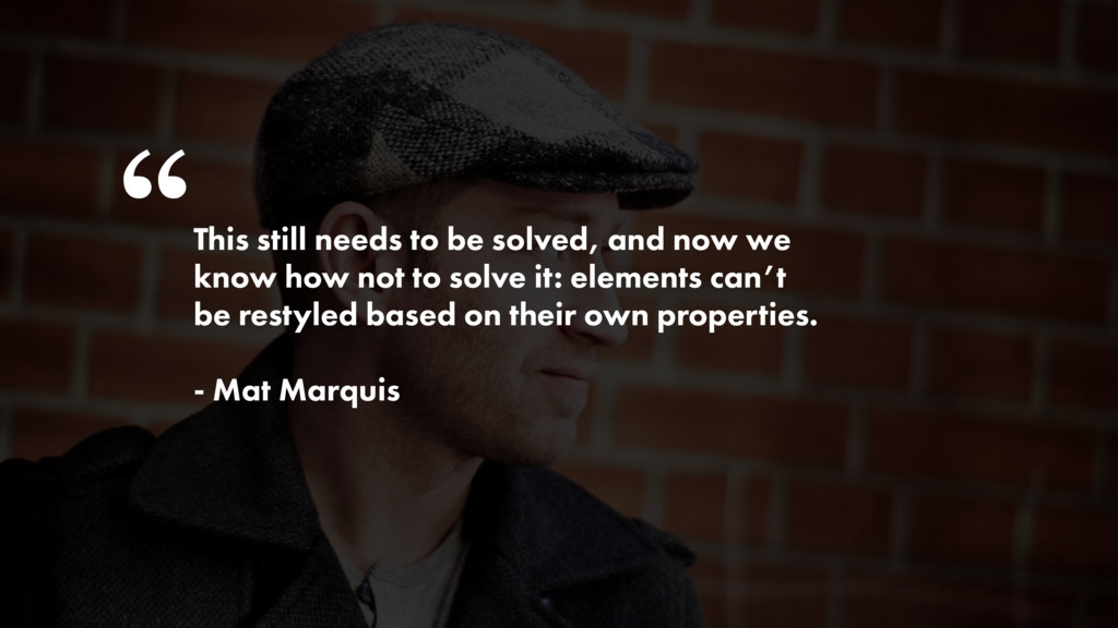
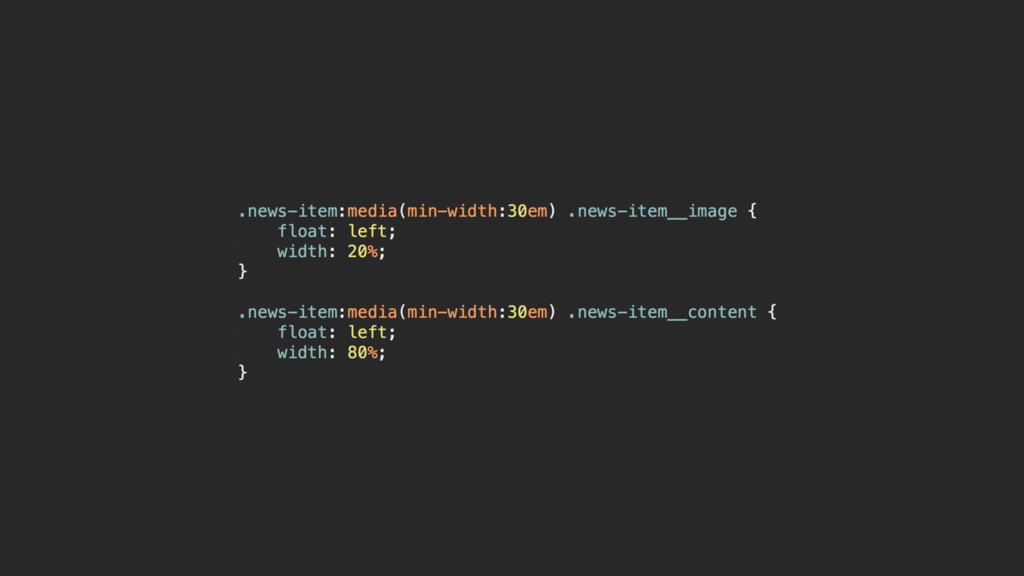
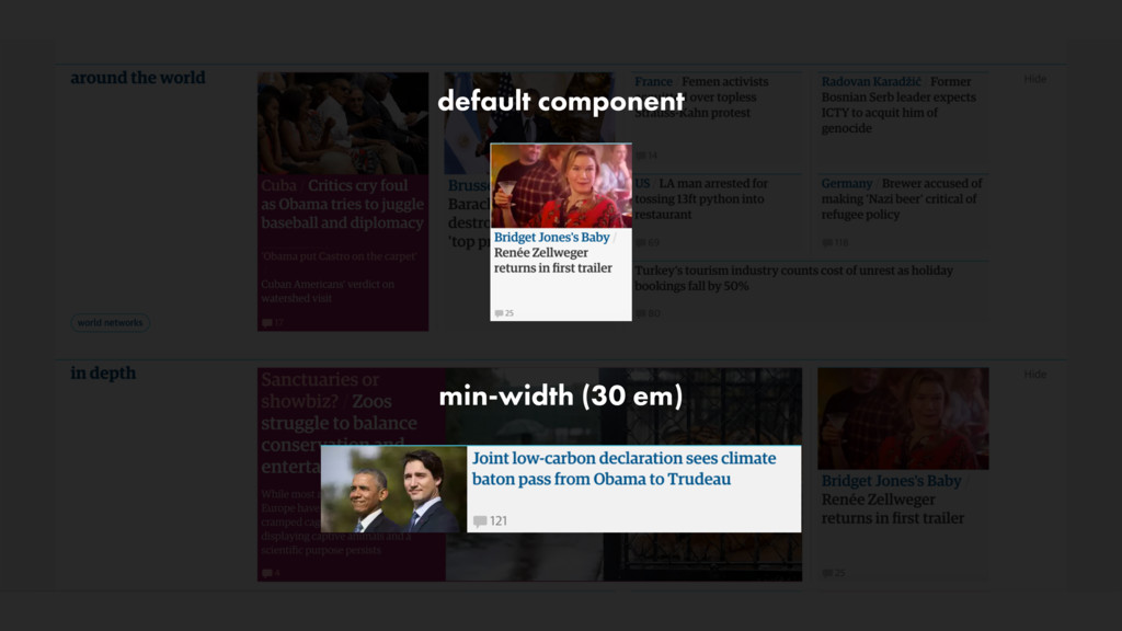
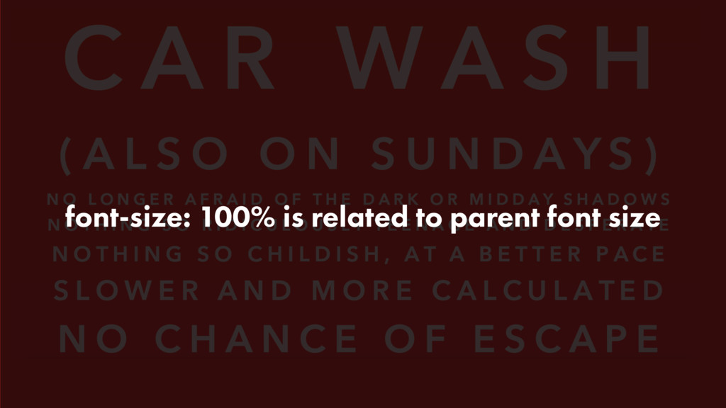
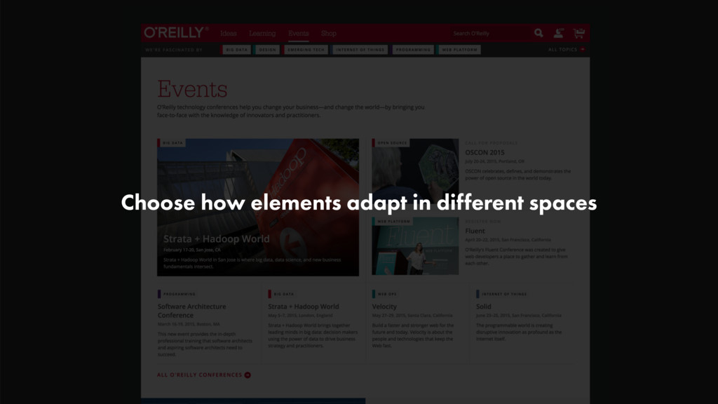
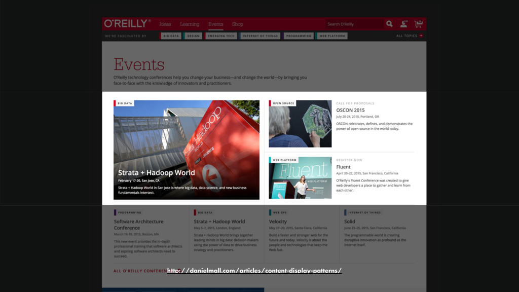
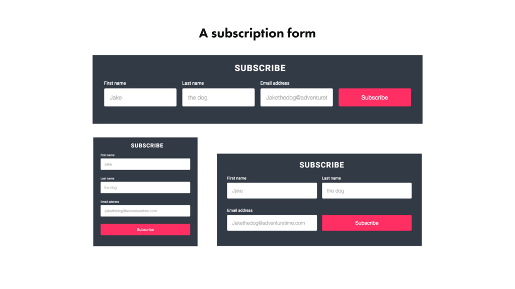
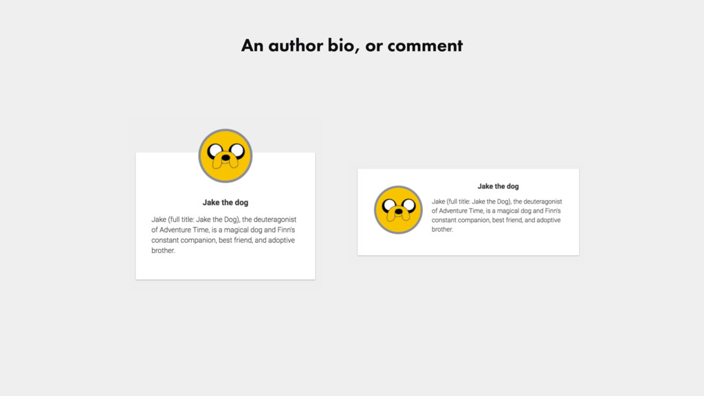
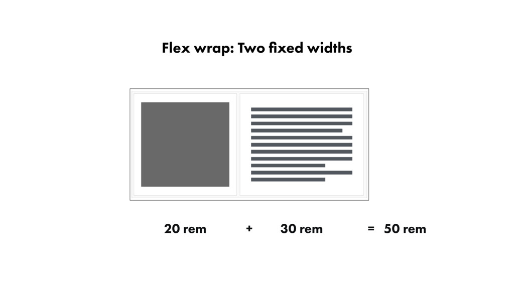
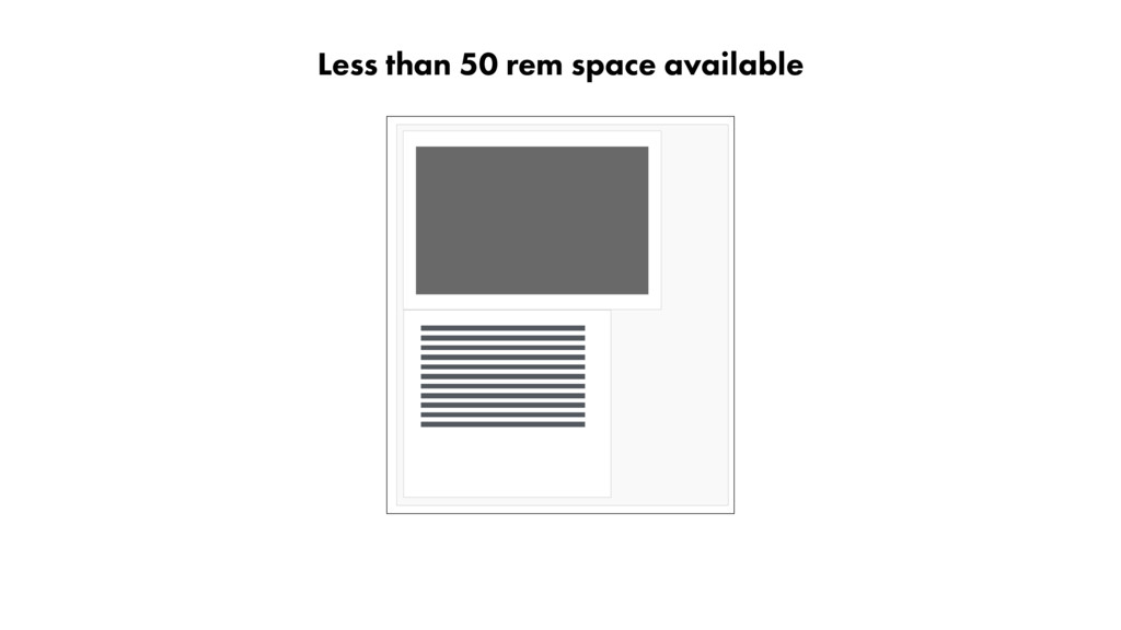
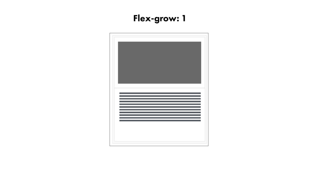
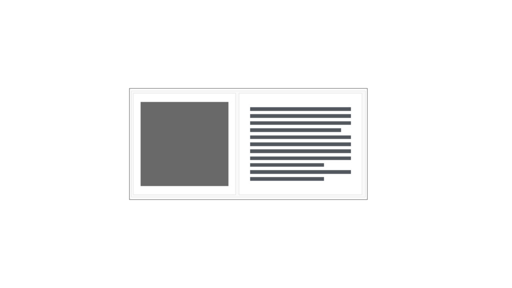
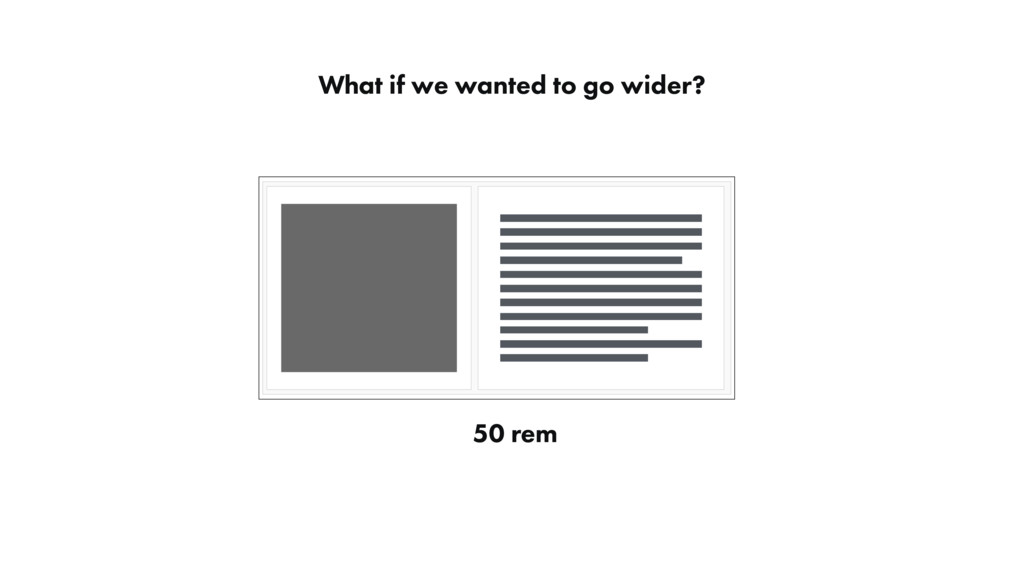
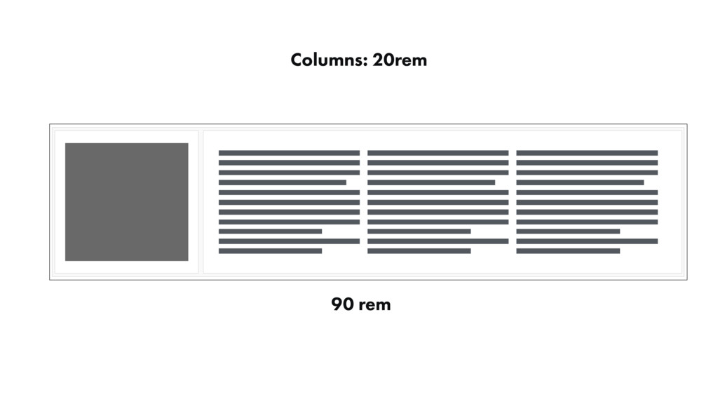
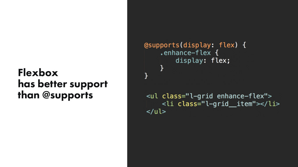
Components need to be able to adapt to their available space, not the size of the viewport. Unfortunately, the closest tool we’ve had for addressing this need has been the Media Query, which was not designed for this purpose. As a result, we micromanage our components at different screen sizes - increasing the complexity and brittleness of the component design and lose modularity when a component has a new implementation.
This is a talk exploring element based queries - container queries and our need to go beyond the media query.
 cwrightdesign
 saka2jp
 ukaoli
 visional_engineering_and_design
 saki822
 takaikanako
 shotamatsuo
 vivion
 yamasaku
 nttcom
 ncdc
ncdc
 hicard
 koyaman
 pedronauck
 soysaucechin
 stephenakadiri
 lara
lara
 mojombo
 katarinadahlin
 jnunemaker
 soudai
 codingconduct
 bermonpainter