Share
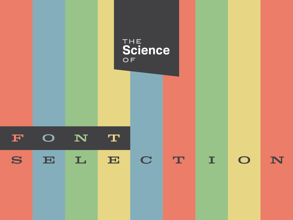
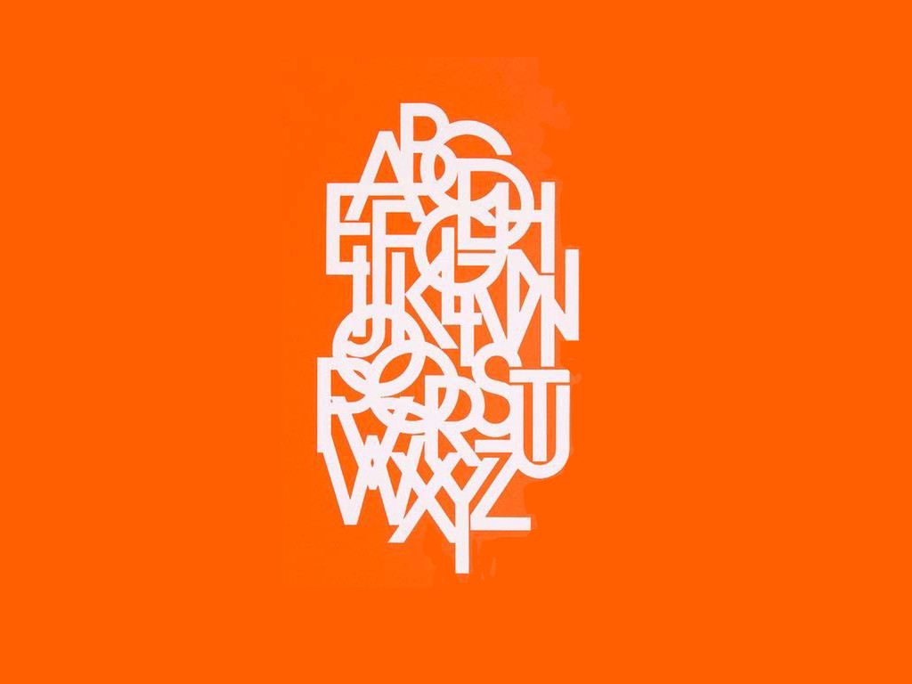
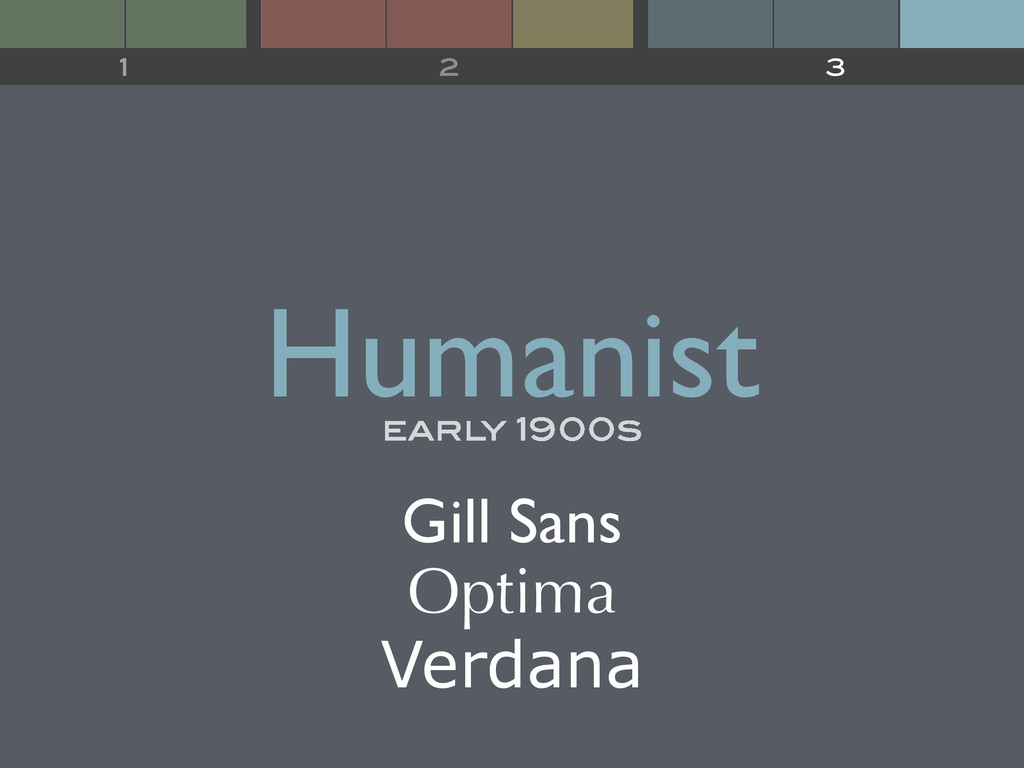
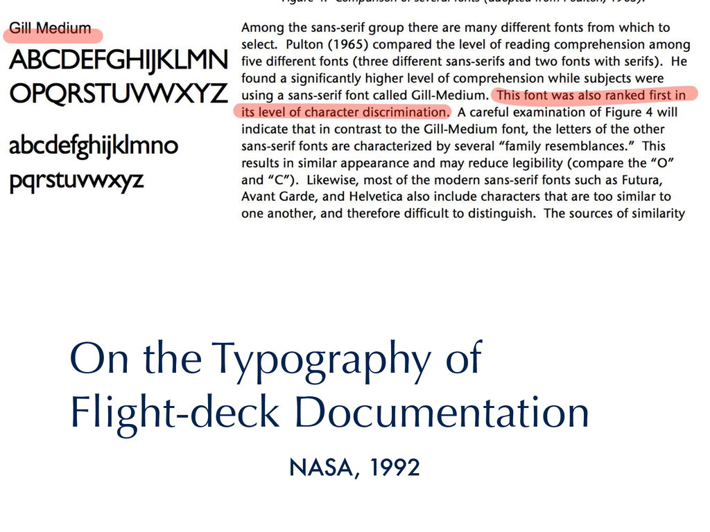
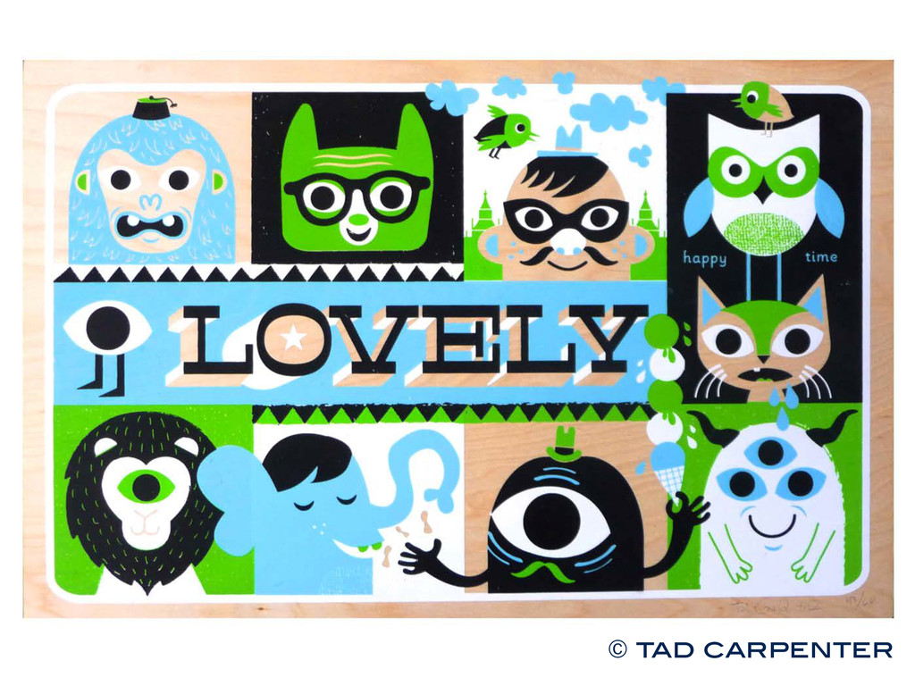
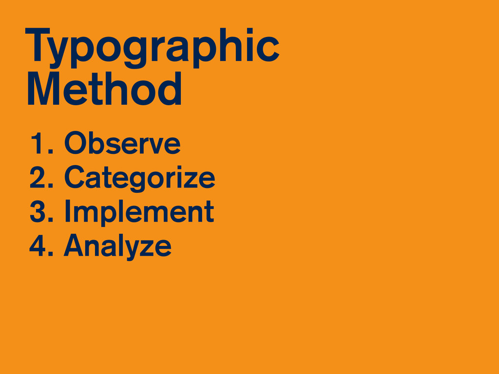
Design Orlando #31: The Science of Font Selection
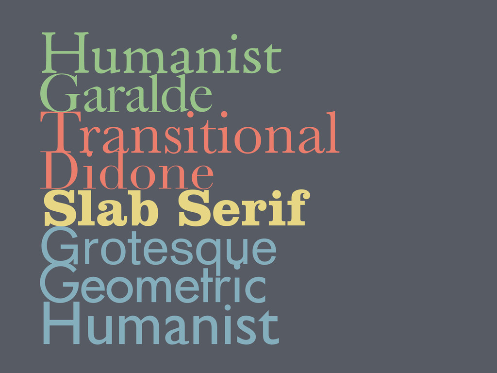
See also: http://madewithenvy.com/ecosystem/articles/2015/how-to-systematically-pick-fonts/