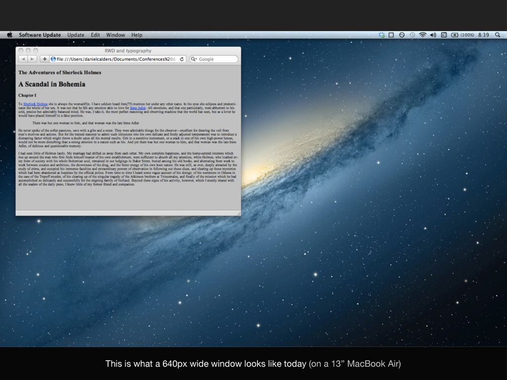
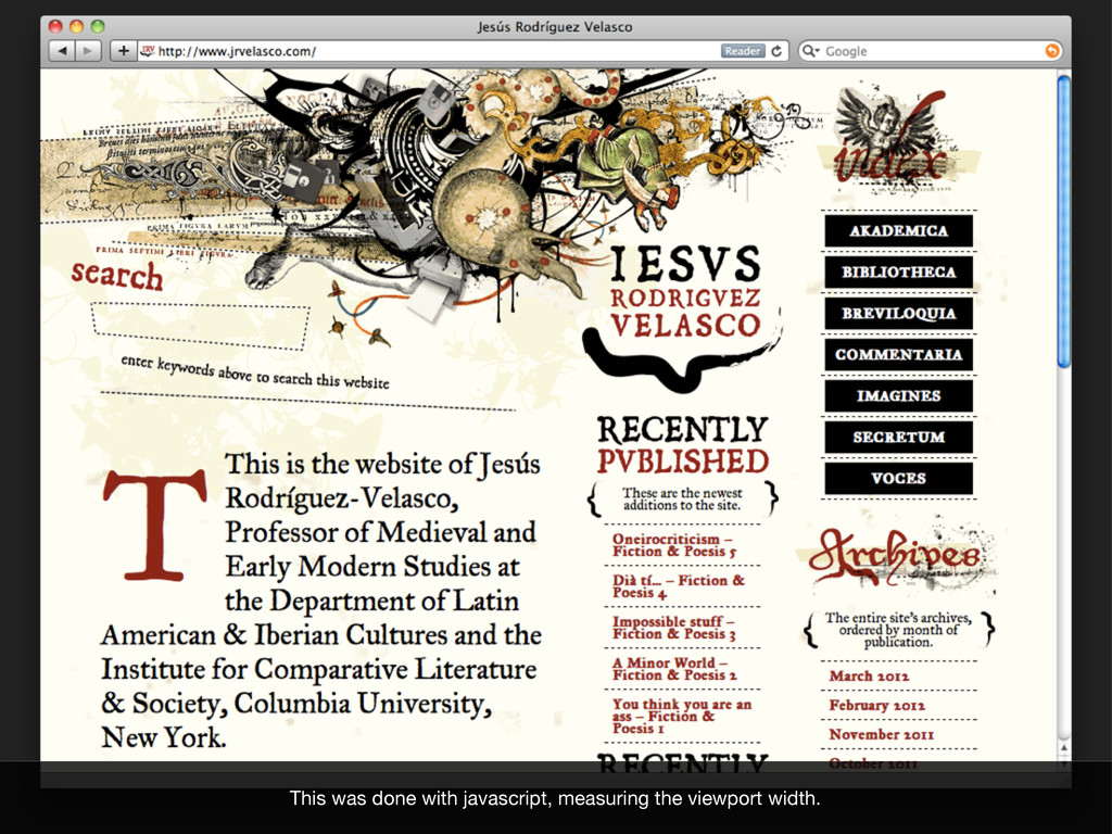
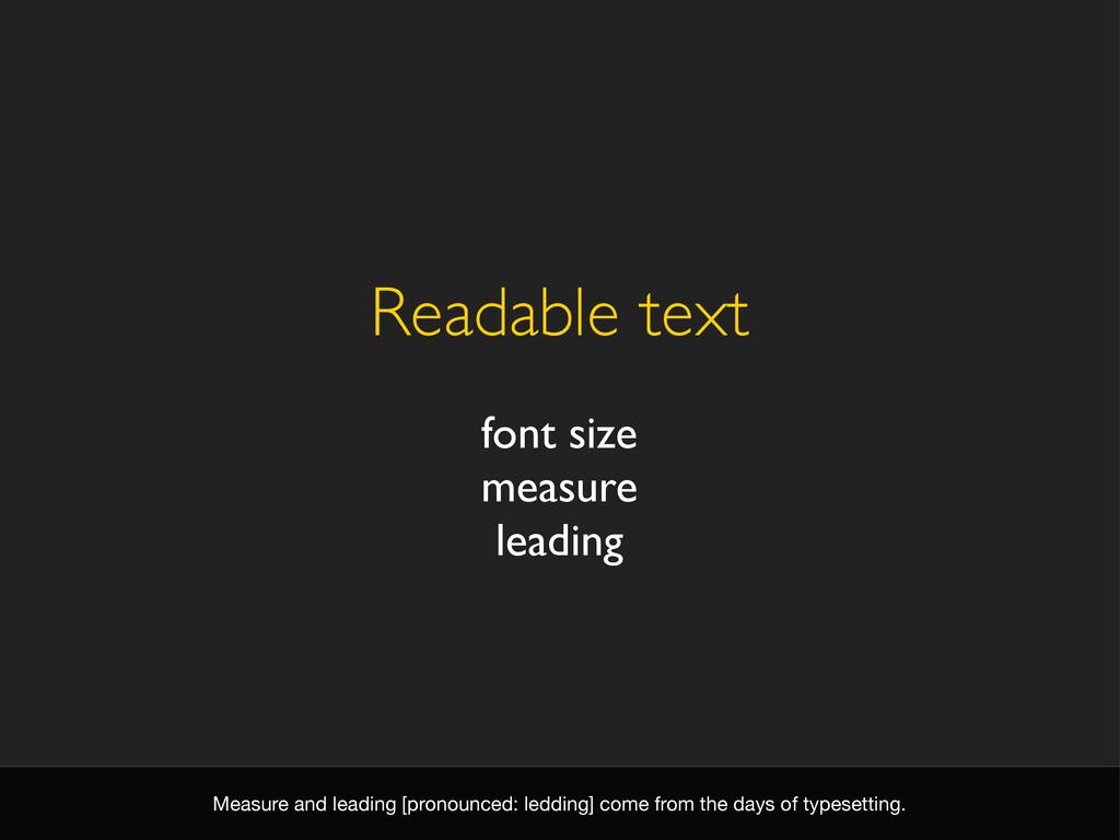
How do we ensure our text stays readable within the flexible nature of responsive web design. Presentation given at the Fronteers meeting at Inventis, April 10, 2012
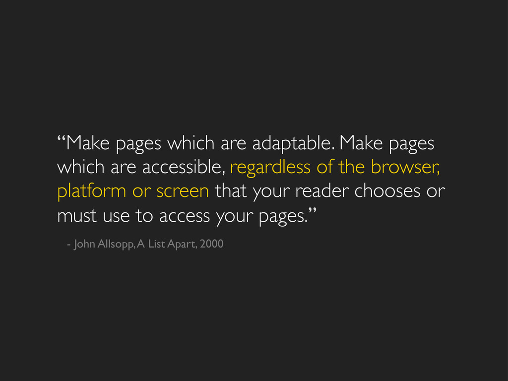
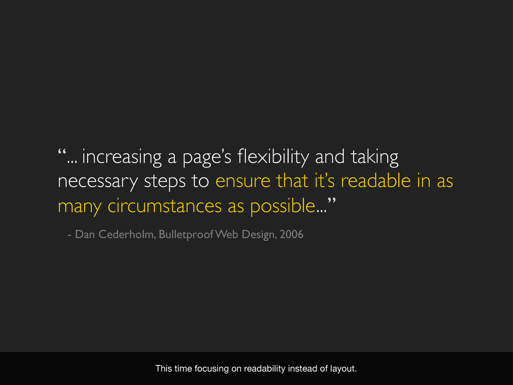
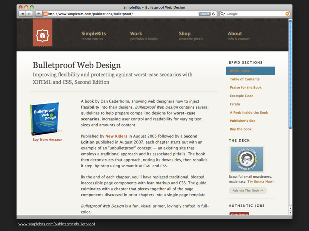
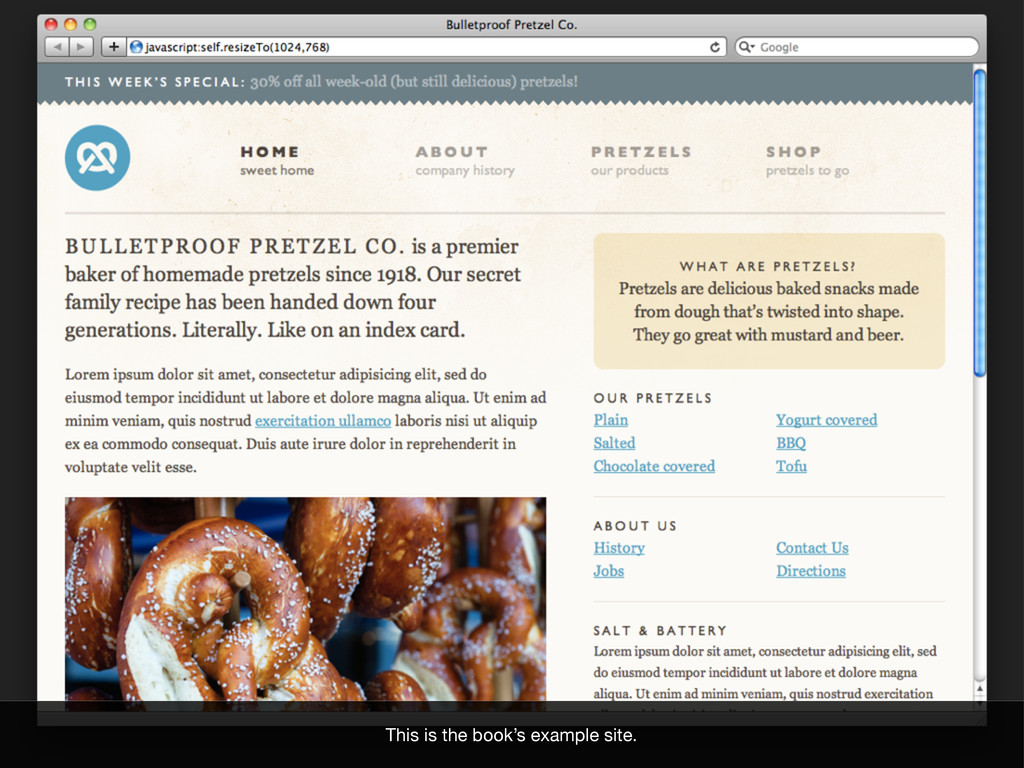
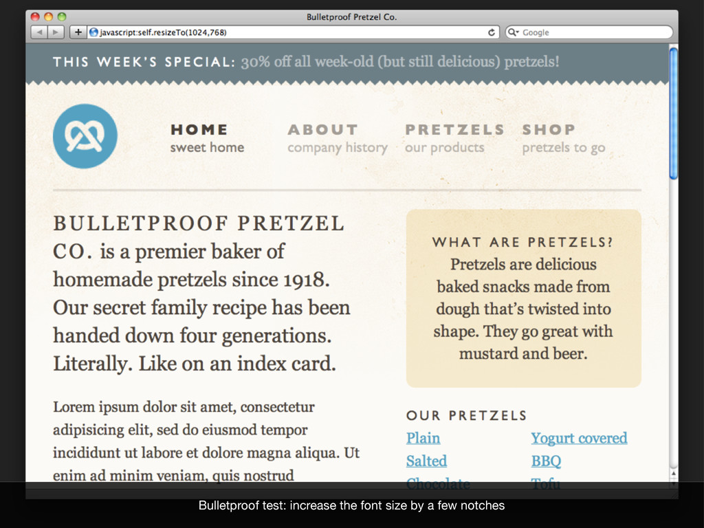
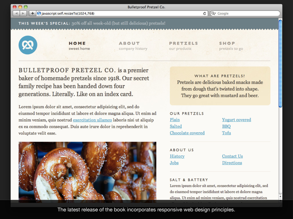
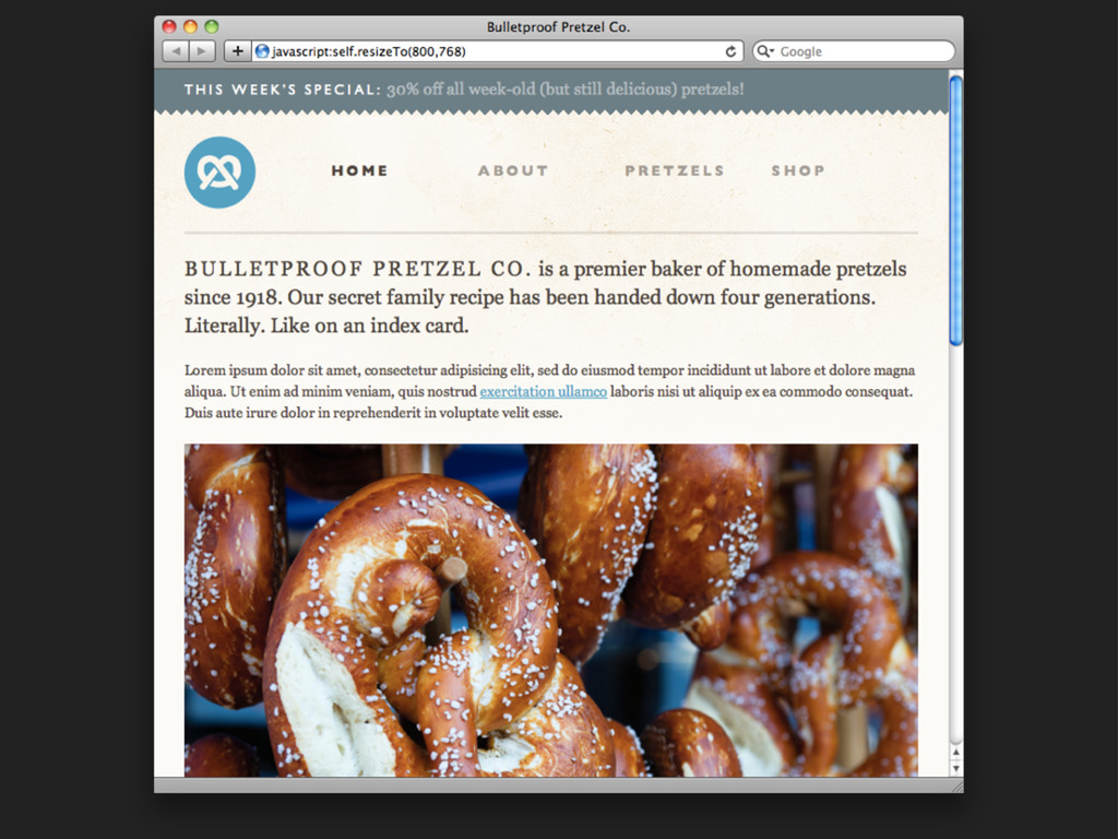
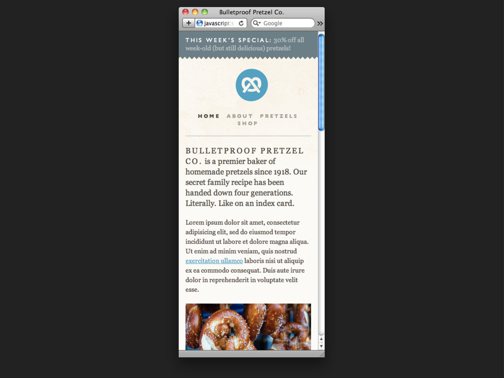
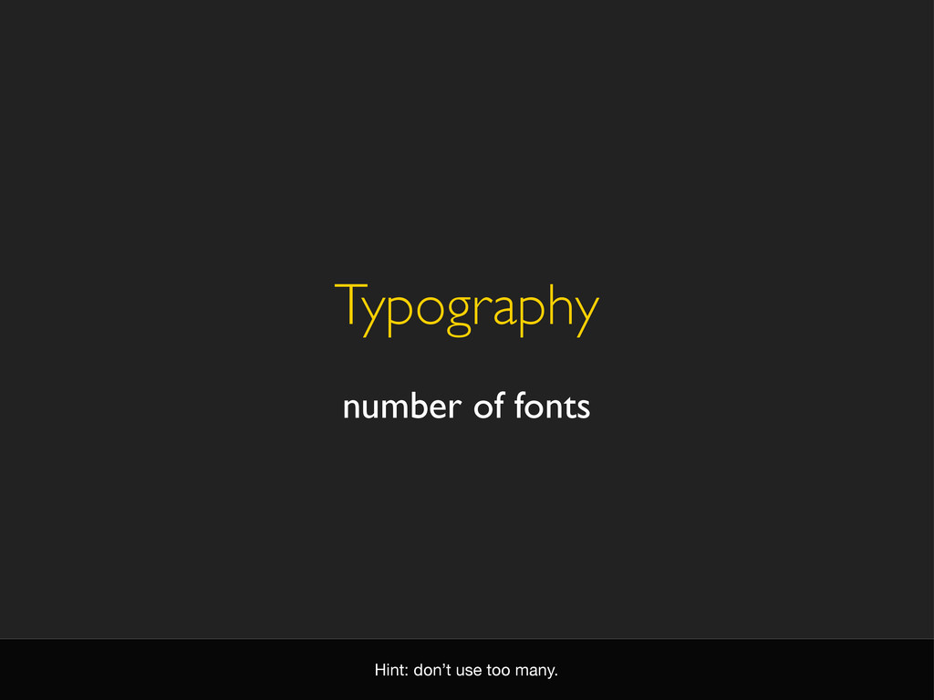
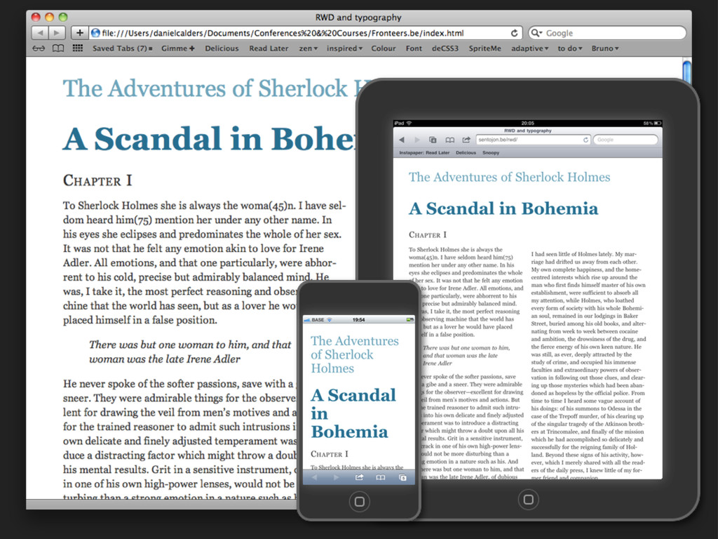
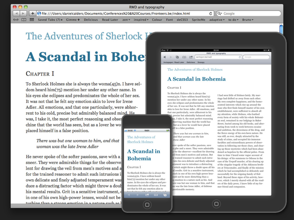
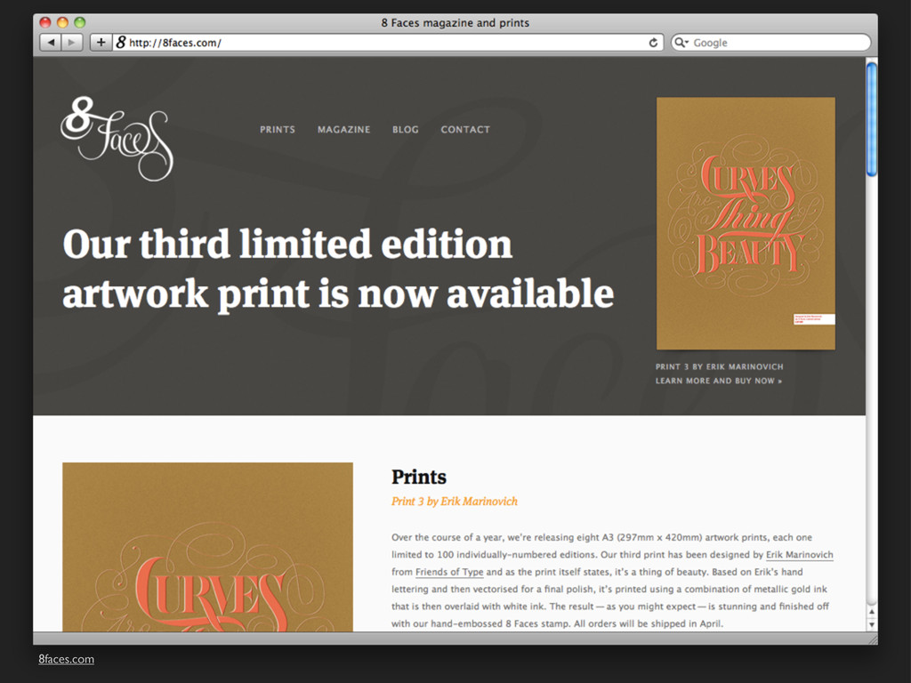
ensure that it’s readable in as many circumstances as possible...” - Dan Cederholm, Bulletproof Web Design, 2006 This time focusing on readability instead of layout.
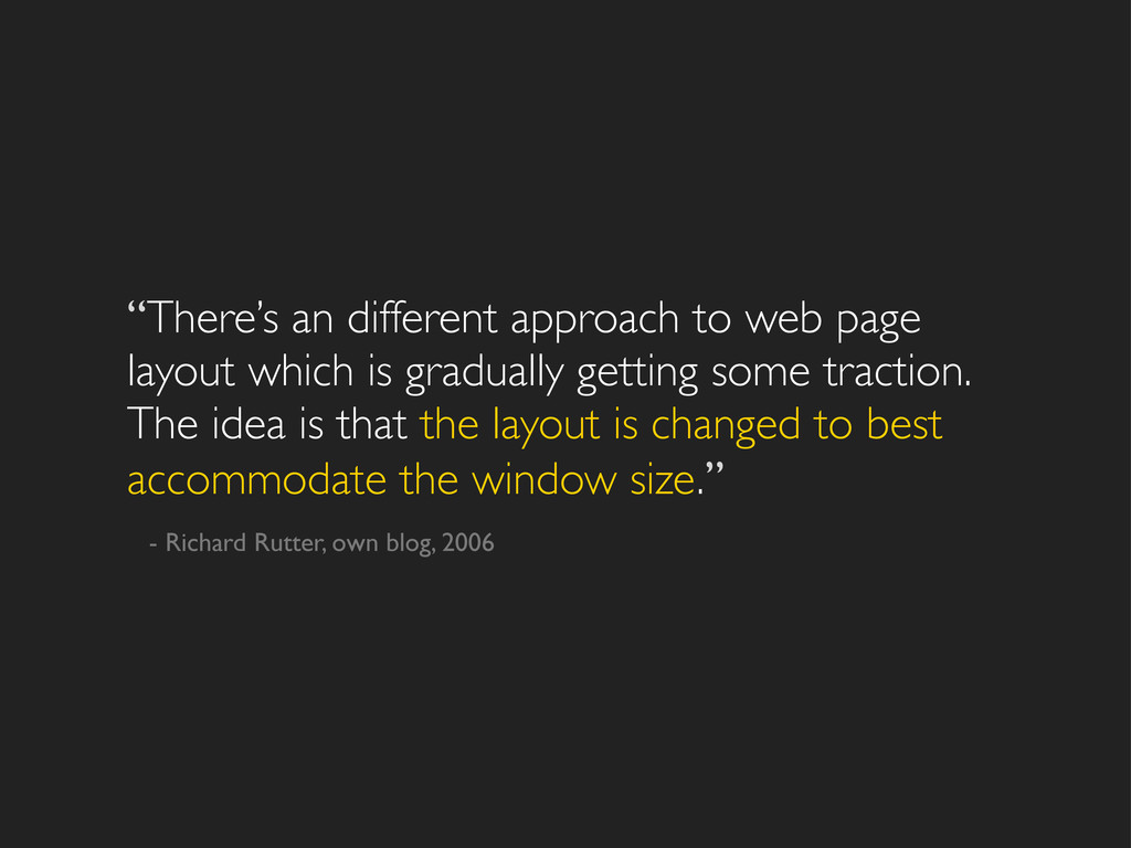
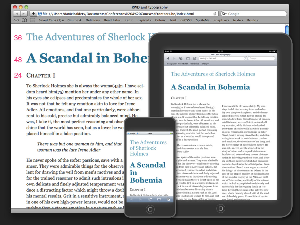
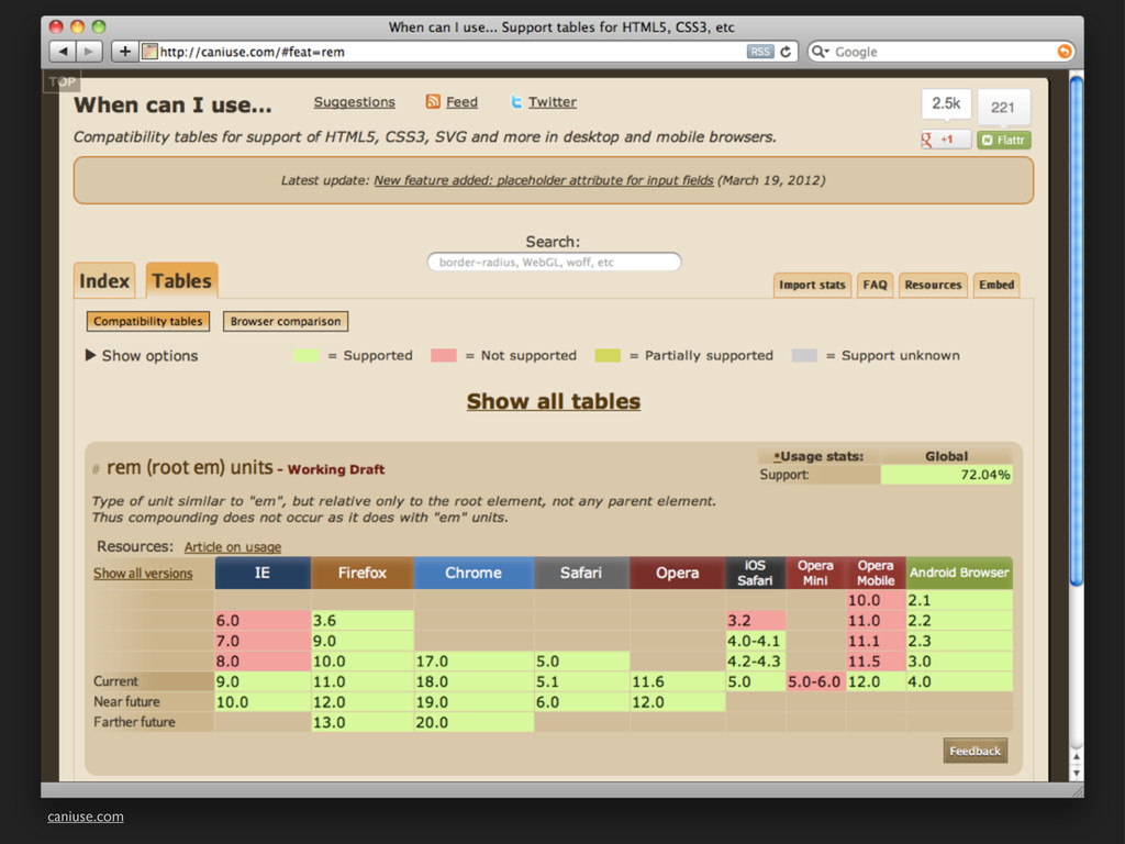
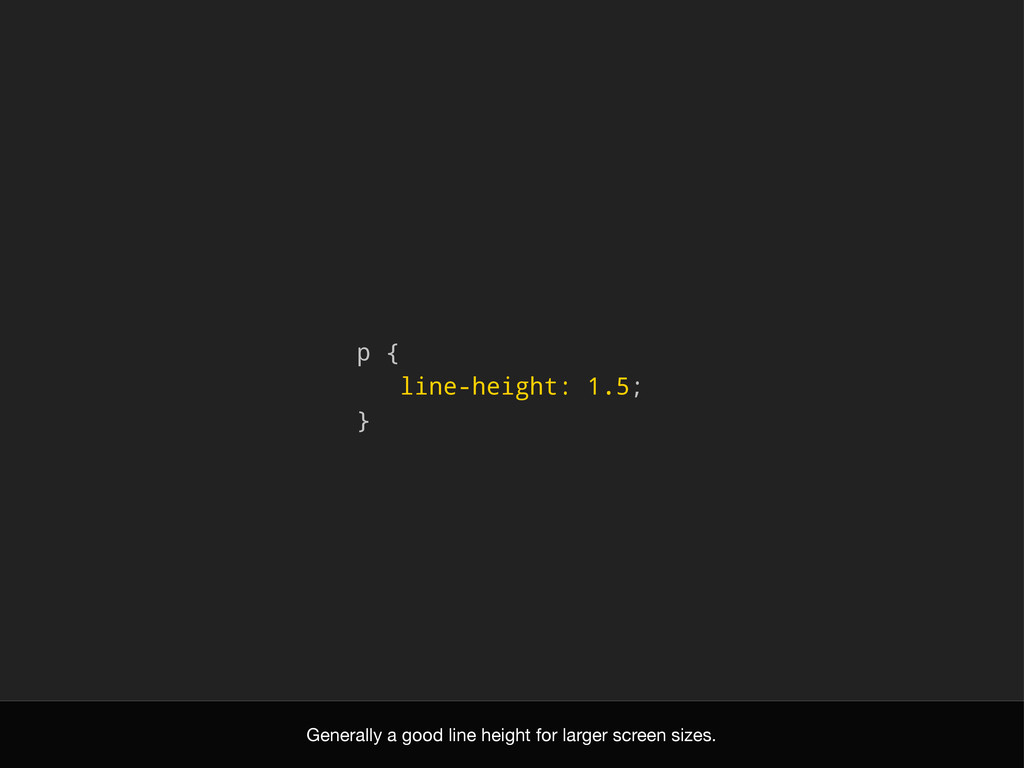
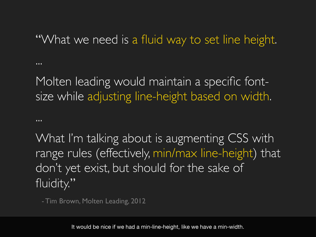
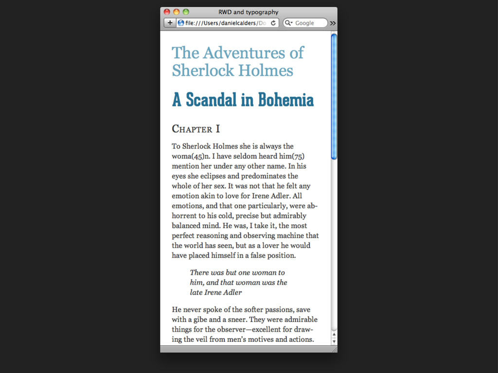
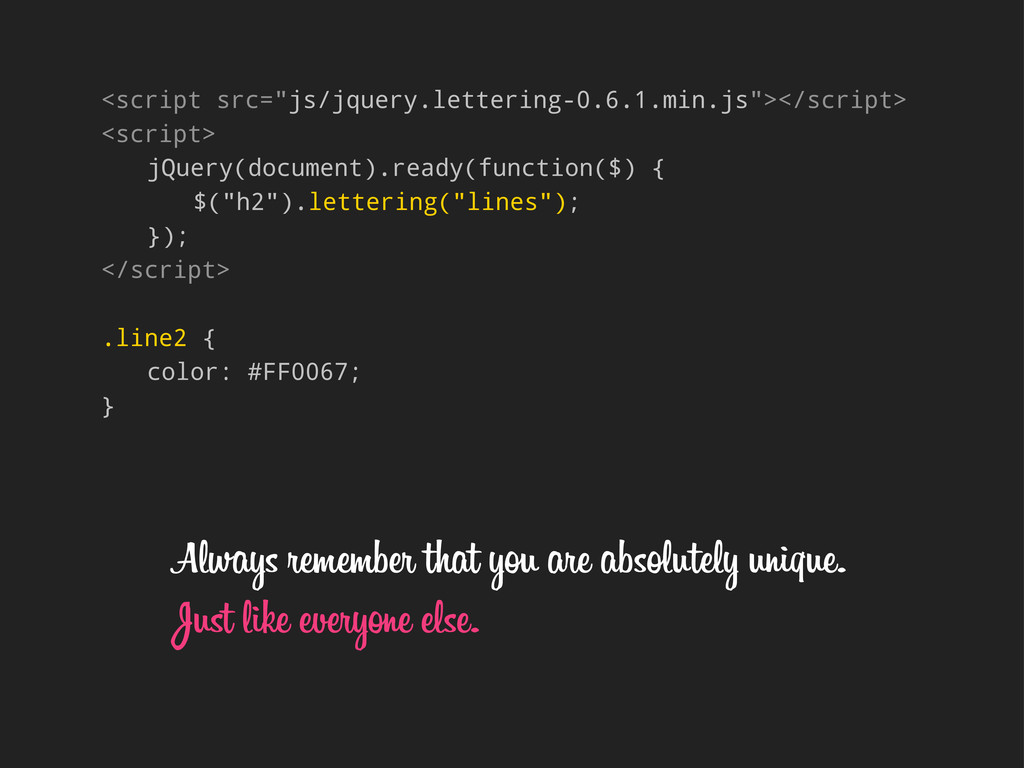
height. ... Molten leading would maintain a specific font- size while adjusting line-height based on width. ... What I’m talking about is augmenting CSS with range rules (effectively, min/max line-height) that don’t yet exist, but should for the sake of fluidity.” - Tim Brown, Molten Leading, 2012 It would be nice if we had a min-line-height, like we have a min-width.
 usagimaru
 signull
 baasie
 bebe
bebe
 ashapiro
 dmattsun
 marzstarz
 pkshadeck
 hikarutakase
 terencebasart
 hjmkth
 aonomasahiro
 addyosmani
 chriscoyier
 tamaranovitovic
 inesmontani
 chikuwait
 mkilby
 csswizardry
 morganepeng
 gurzu
gurzu
 bcantrill
 stephenakadiri
 marktimemedia