 SiteGround - Reliable hosting with speed, security, and support you can count on.
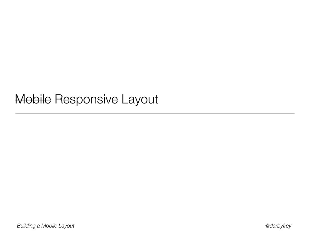
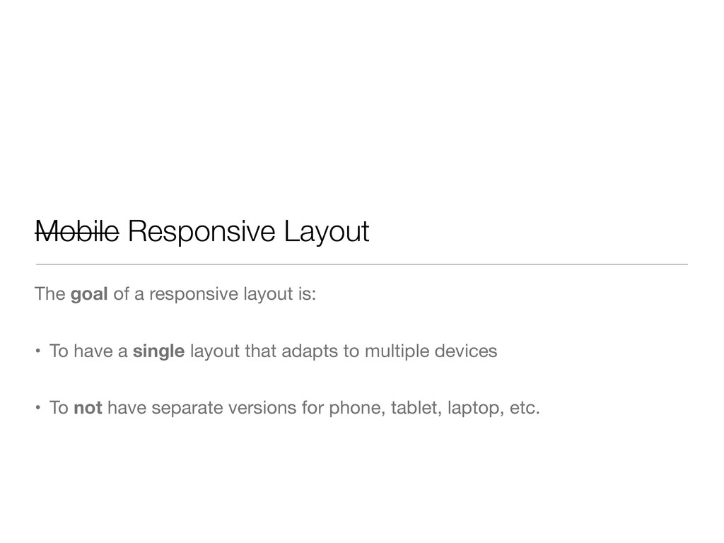
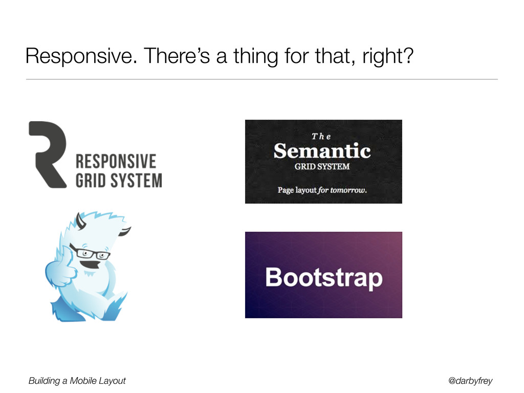
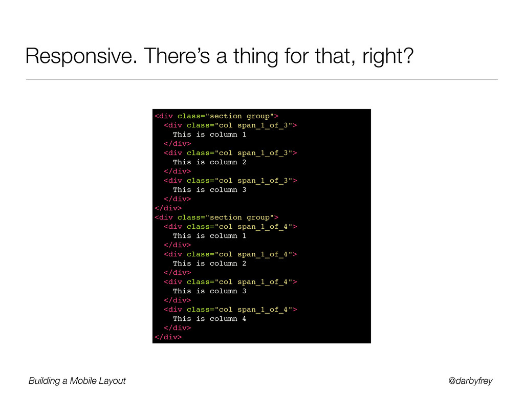
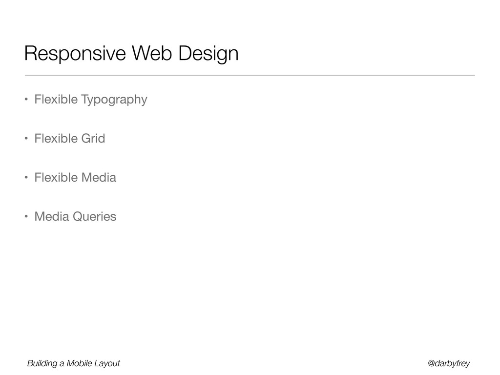
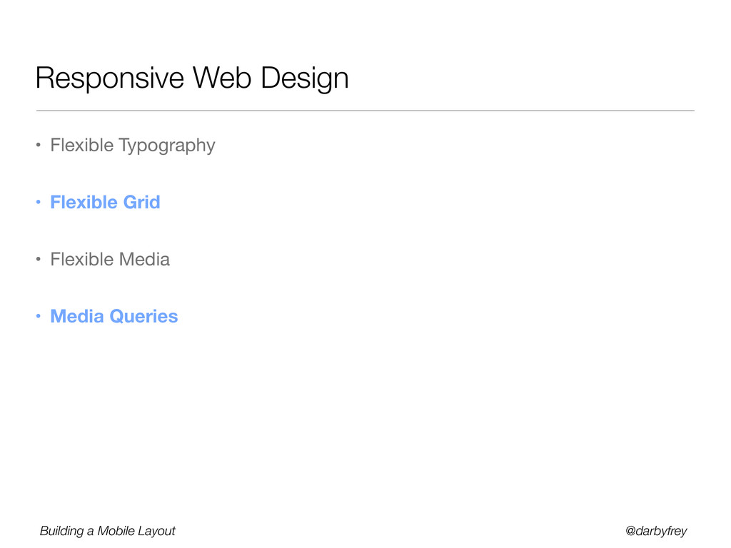
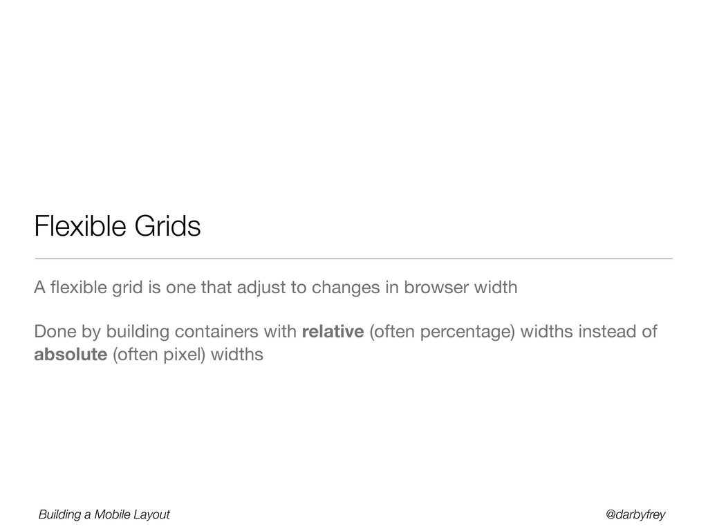
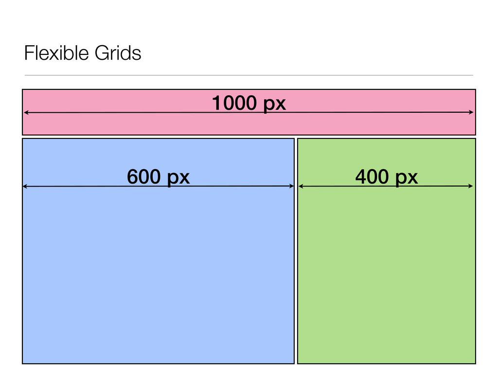
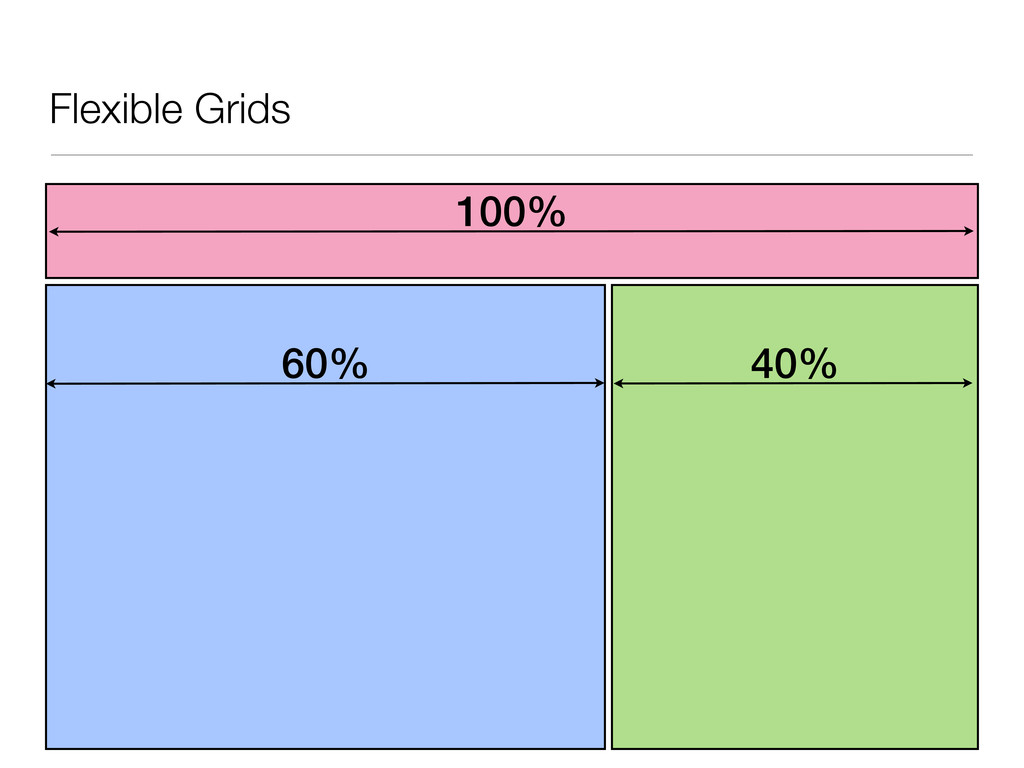
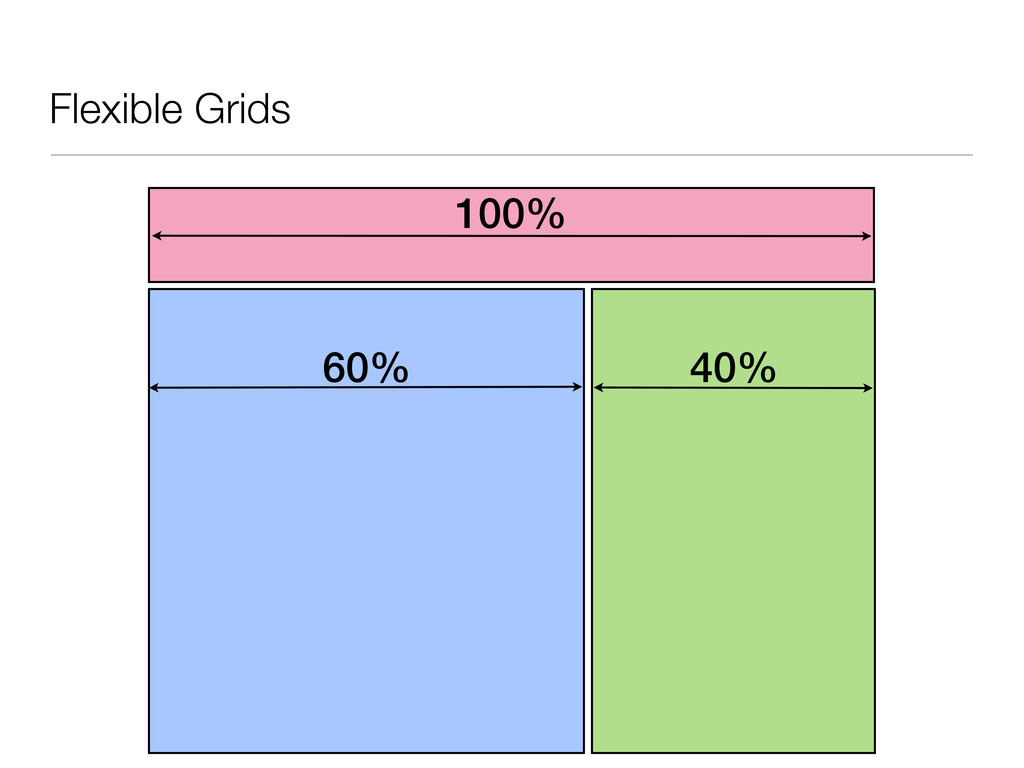
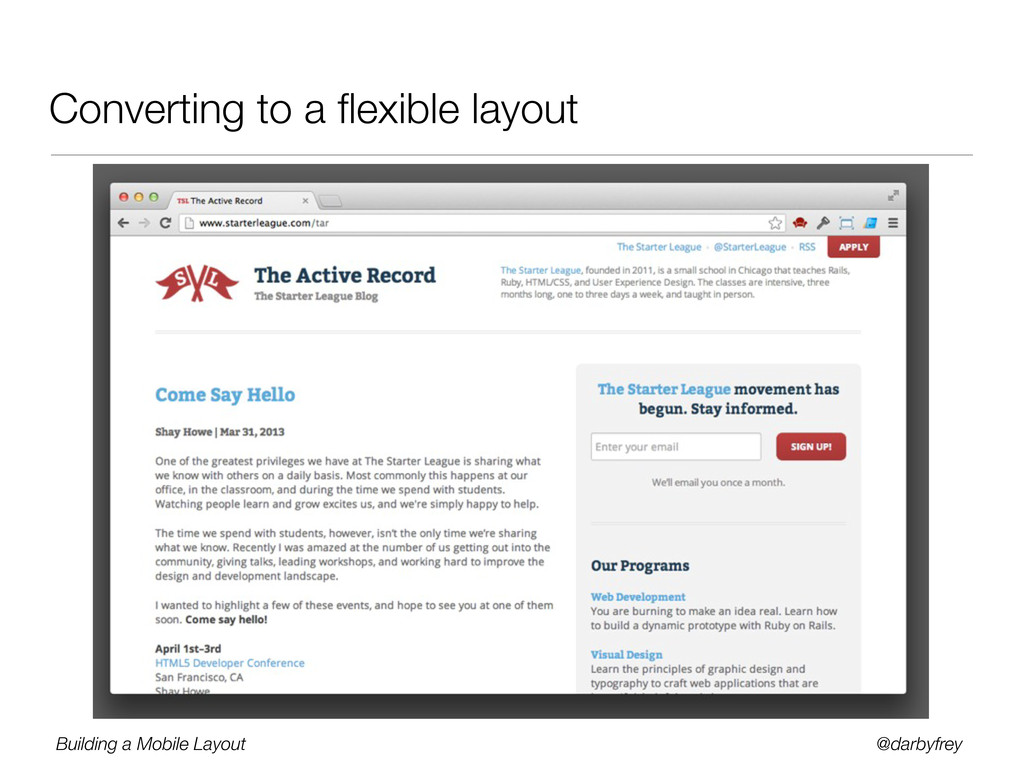
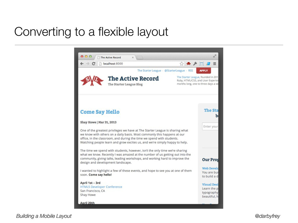
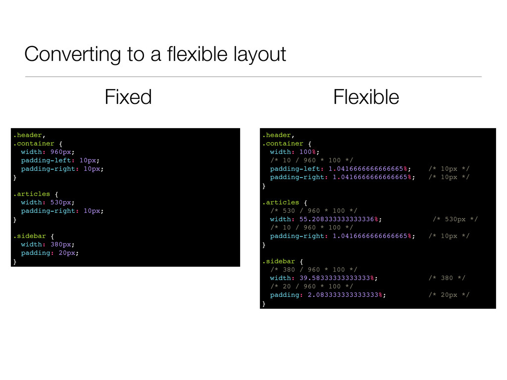
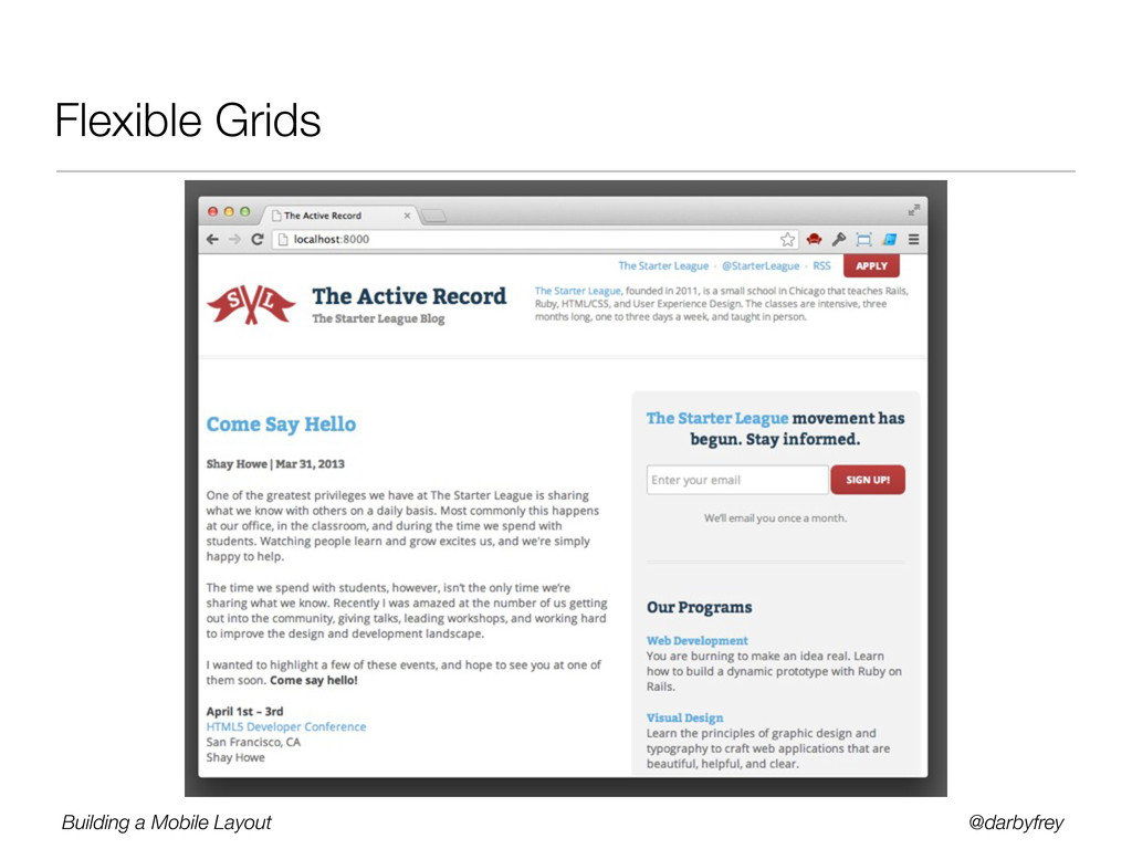
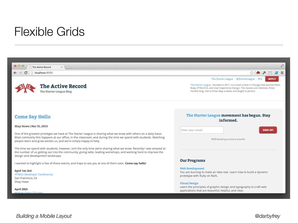
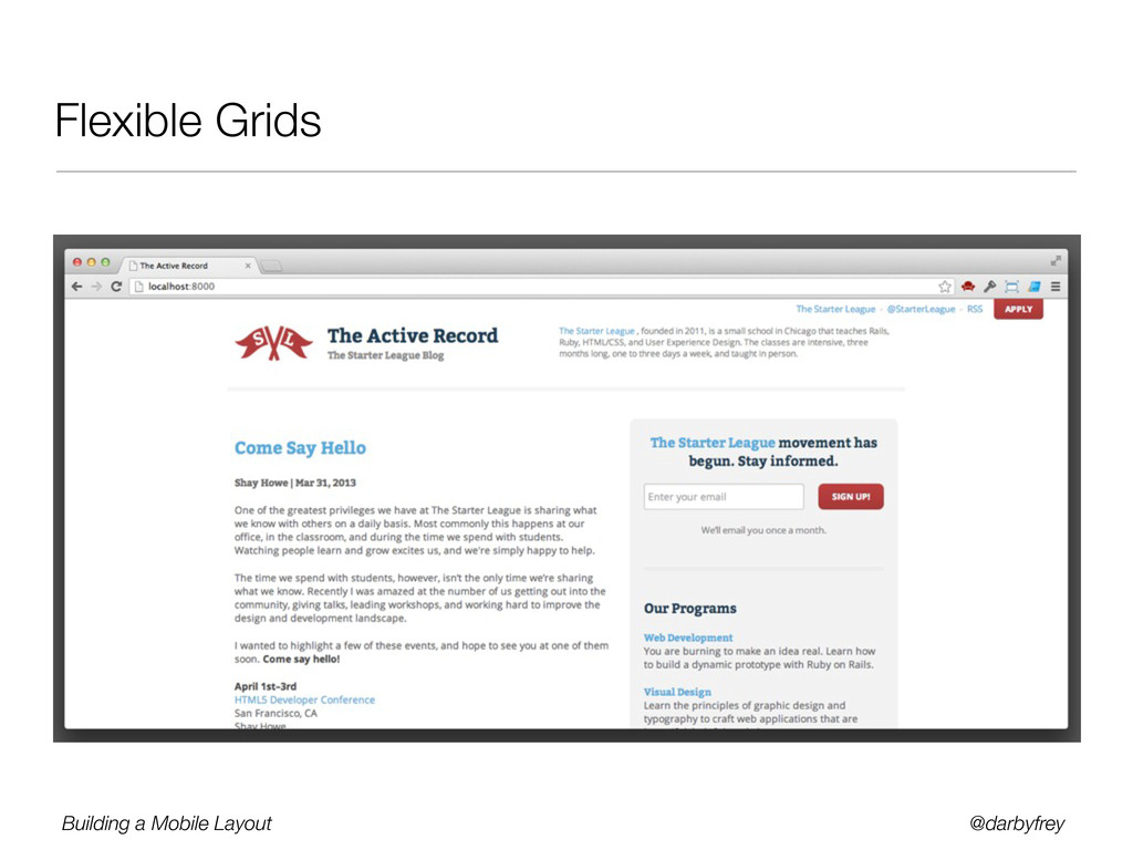
Designing for mobile is challenging. With the ever changing landscape of devices and screen sizes, there is no way to predict every possible canvas we’ll be desiging for. Luckily, there are few tools at our disposal that we can use to be confident in our designs.
In this session we will introduce some of these tools, including flexible grids and media queries. We will also dive into some code and see how these components can be created and how we can avoid some common pitfalls along the way.
 darbyfrey
 seike460
 freshdaz
 shihochan
 fullkaiten
 isaoshimizu
 z63d
z63d
 a_ono
a_ono
 taddy_919
 techtekt
 elmodev09
 tamaiyutaro
 hiroramos4
 keathley
 nmsamuel
 mfonobong
 nonsquared
 tammielis
 aleyda
 addyosmani
 reverentgeek
 szymonslowik
 keithpitt
 danielanewman