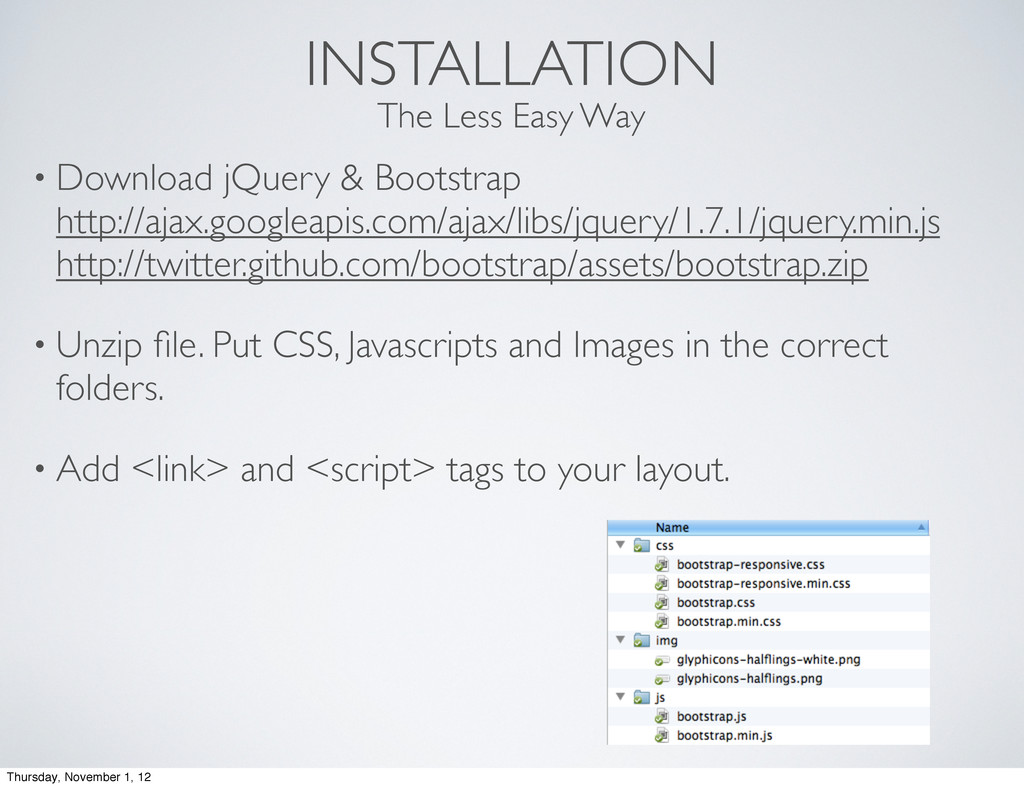
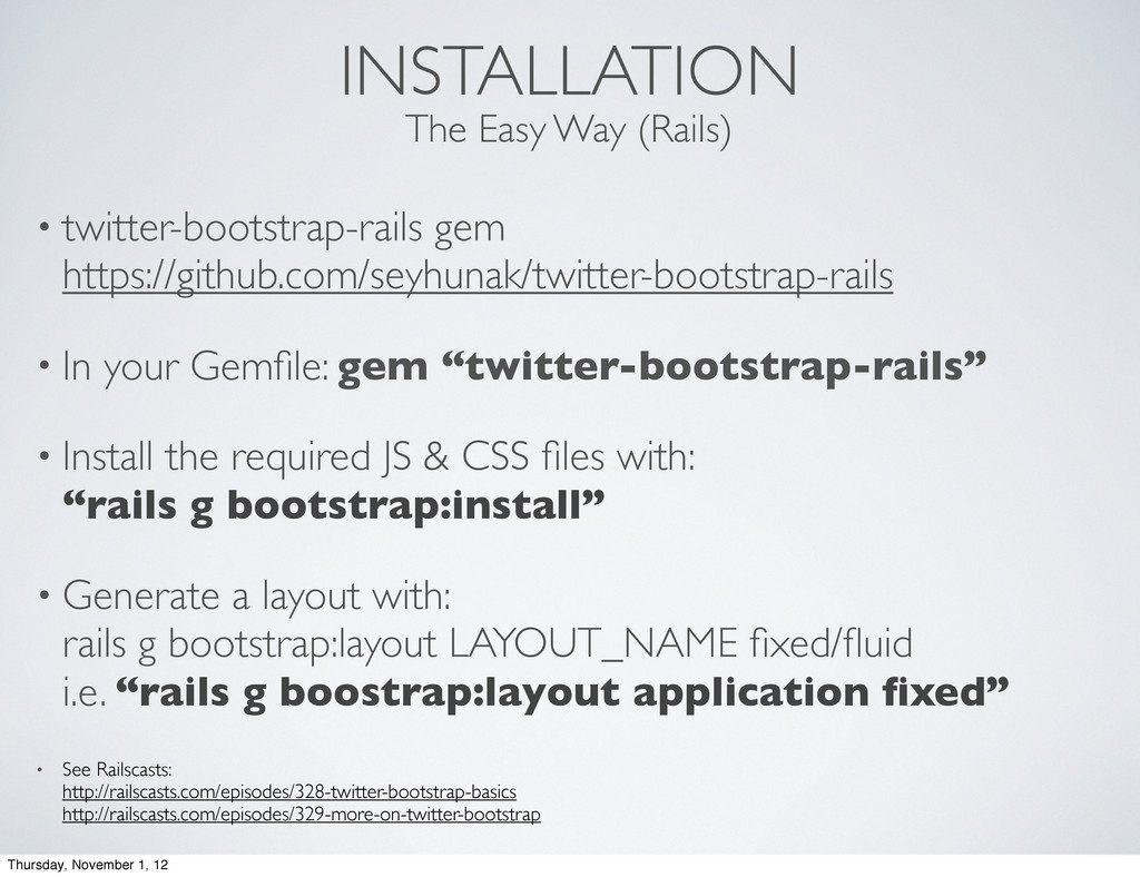
“twitter-bootstrap-rails” • Install the required JS & CSS files with: “rails g bootstrap:install” • Generate a layout with: rails g bootstrap:layout LAYOUT_NAME fixed/fluid i.e. “rails g boostrap:layout application fixed” • See Railscasts: http://railscasts.com/episodes/328-twitter-bootstrap-basics http://railscasts.com/episodes/329-more-on-twitter-bootstrap The Easy Way (Rails) Thursday, November 1, 12
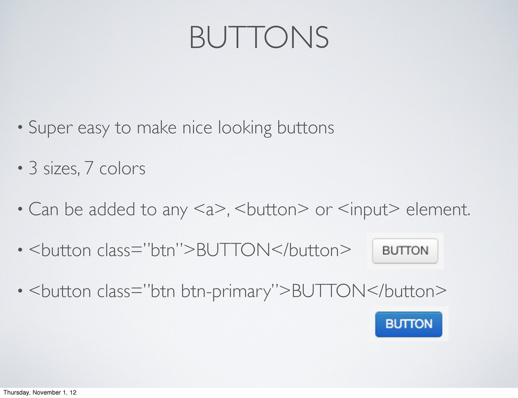
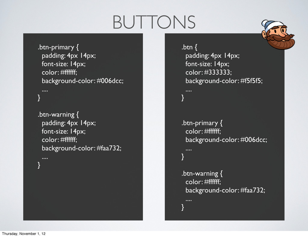
3 sizes, 7 colors • Can be added to any <a>, <button> or <input> element. • <button class=”btn”>BUTTON</button> • <button class=”btn btn-primary”>BUTTON</button> Thursday, November 1, 12
 darbyfrey
 ymty
ymty
 stefafafan
 nagatsu
 vtryo
vtryo
 a_ono
a_ono
 knih
knih
 tanimuyk
 jukishiya
 sucitw
 k_adachi_01
 iotengineer22
 izumii19
 bermonpainter
 tonyrice
 minecr
 bkeepers
 afnizarnur
 addyosmani
 eileencodes
 greggifford
 sachag
 jct
jct
 rakko
rakko
 rkaga
rkaga
![TWITTER BOOTSTRAP Darby Frey [email protected] @darbyfrey Thursday, November 1, 12](https://files.speakerdeck.com/presentations/509272b0289bba000204cb5f/slide_0.jpg)
![Darby Frey [email protected] @darbyfrey QUESTIONS? Thursday, November 1, 12](https://files.speakerdeck.com/presentations/509272b0289bba000204cb5f/slide_26.jpg)