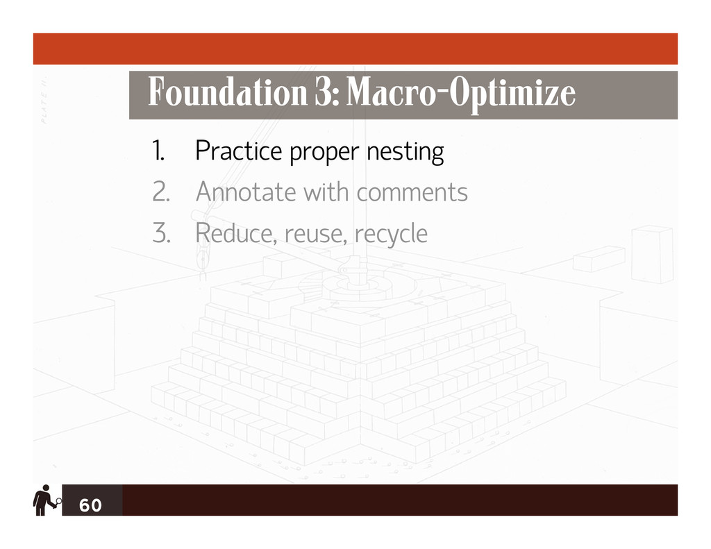
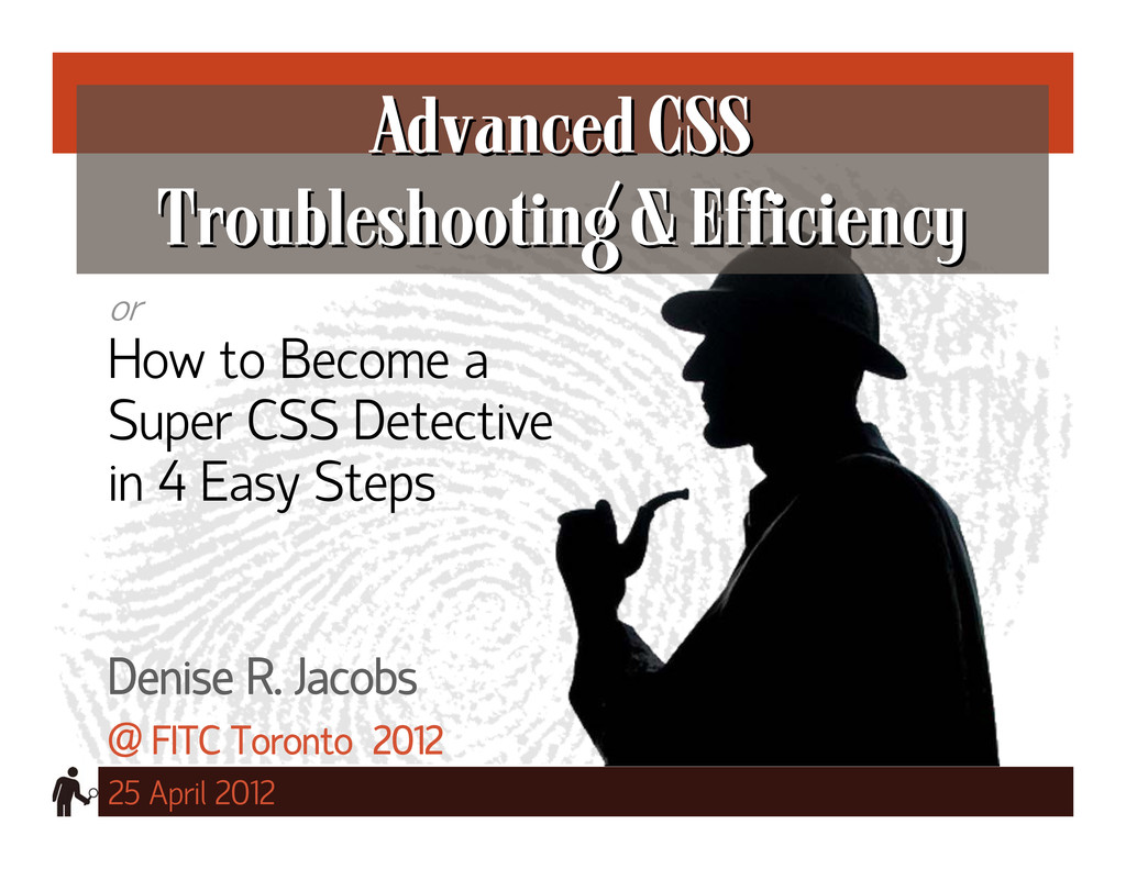
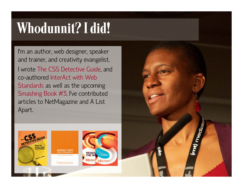
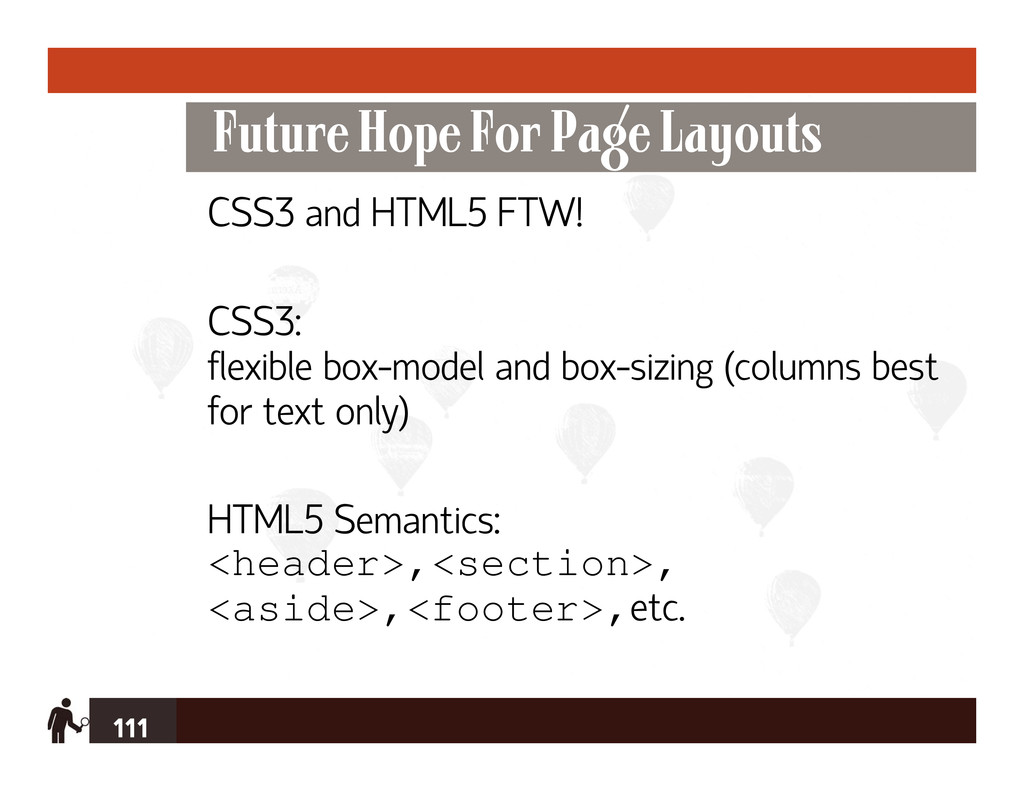
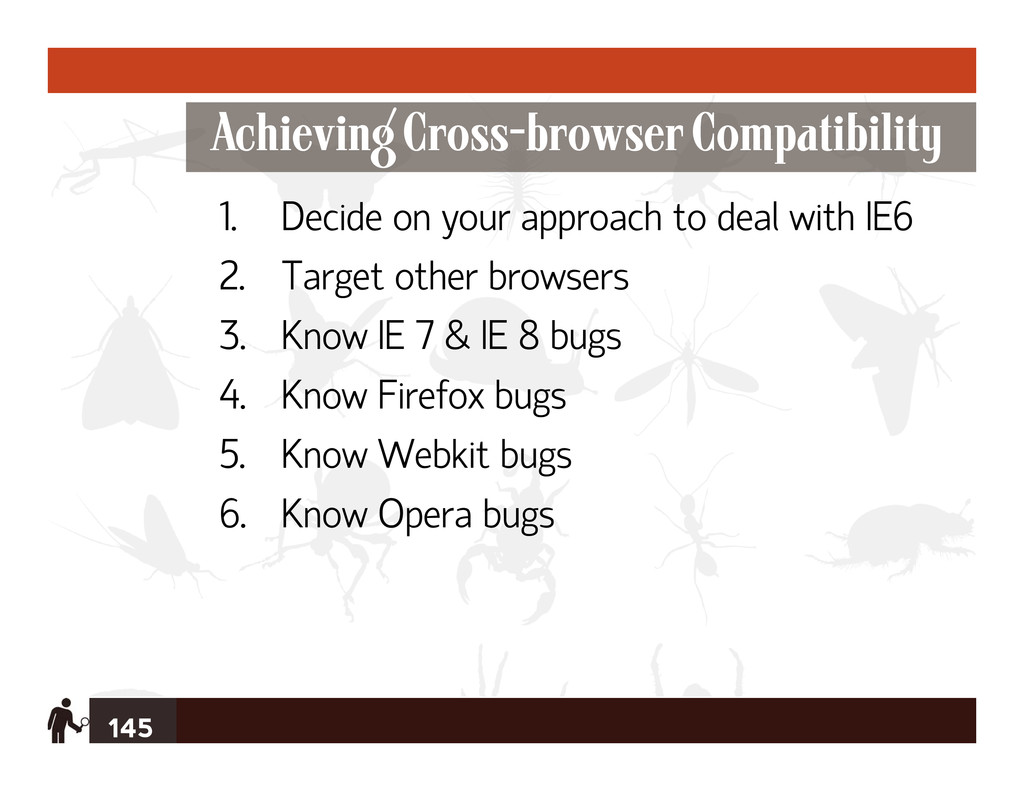
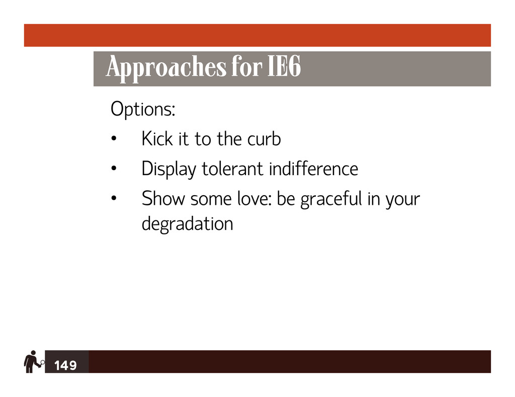
A look at some advanced CSS investigative and problem-solving techniques, including tiny tidbits to lay the foundation for clean, informative markup; ways of dealing definitively with IE6/7, proactive coding practices for the “other” browsers’ bugs, new alternatives to using floats for layout, and creating and using the more esoteric css2 selectors and newer css3 selectors for true style targeting power. Presented at FITC Toronto, April 2012.
 iwashi86
 kairim0
 demaecan
 cdataj
.jpeg) rikukobayashi
rikukobayashi
 ebiken
 sgwrmctk
 hironobuiga
 muehara
 hamukazu
 yanzm
yanzm
 oasis1994liveforever
 aarron
 pwiseman
 reverentgeek
 portentint
 morganepeng
 honzajavorek
 szymonslowik
 katiecoart
 tammyeverts
 akihiro_kokubo
 dugsong
 cromwellryan
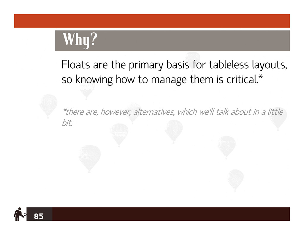
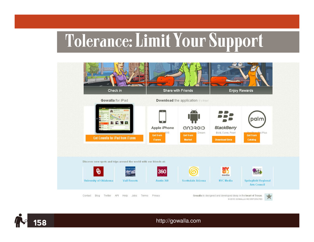
![214 Thank You! DeniseJacobs.com [email protected] twitter.com/denisejacobs slideshare.net/denisejacobs http://www.flickr.com/photos/aarronwalter/4629076165/](https://files.speakerdeck.com/presentations/4f983427eb6cd200ef0033aa/slide_213.jpg)