to create layouts. The naming came up with the CSS 1.0 and 2.1 to replace the tables. Today the term is also used by W3C for the creation of new specifications.
HTML 3.0 ‣ Gained strength (+attributes) with the approved HTML 3.2 ‣ Contrary to the common thinking, the <table> burn for tabular data and also to create layouts TABLE HISTORY http://www.w3.org/TR/REC-html32#table
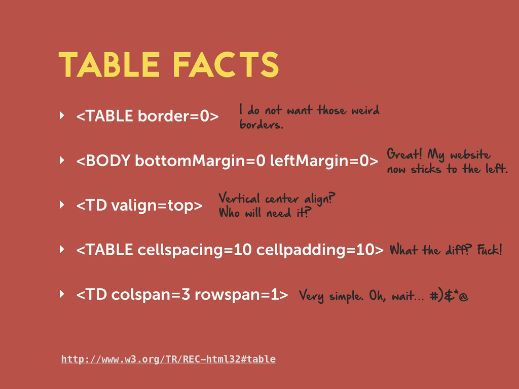
‣ <TABLE cellspacing=10 cellpadding=10> ‣ <TD colspan=3 rowspan=1> TABLE FACTS http://www.w3.org/TR/REC-html32#table I do not want those weird borders. Great! My website now sticks to the left. Vertical center align? Who will need it? What the diff? F uck! Very simple. Oh, wait… #)&*@
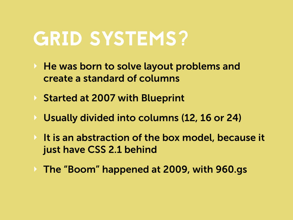
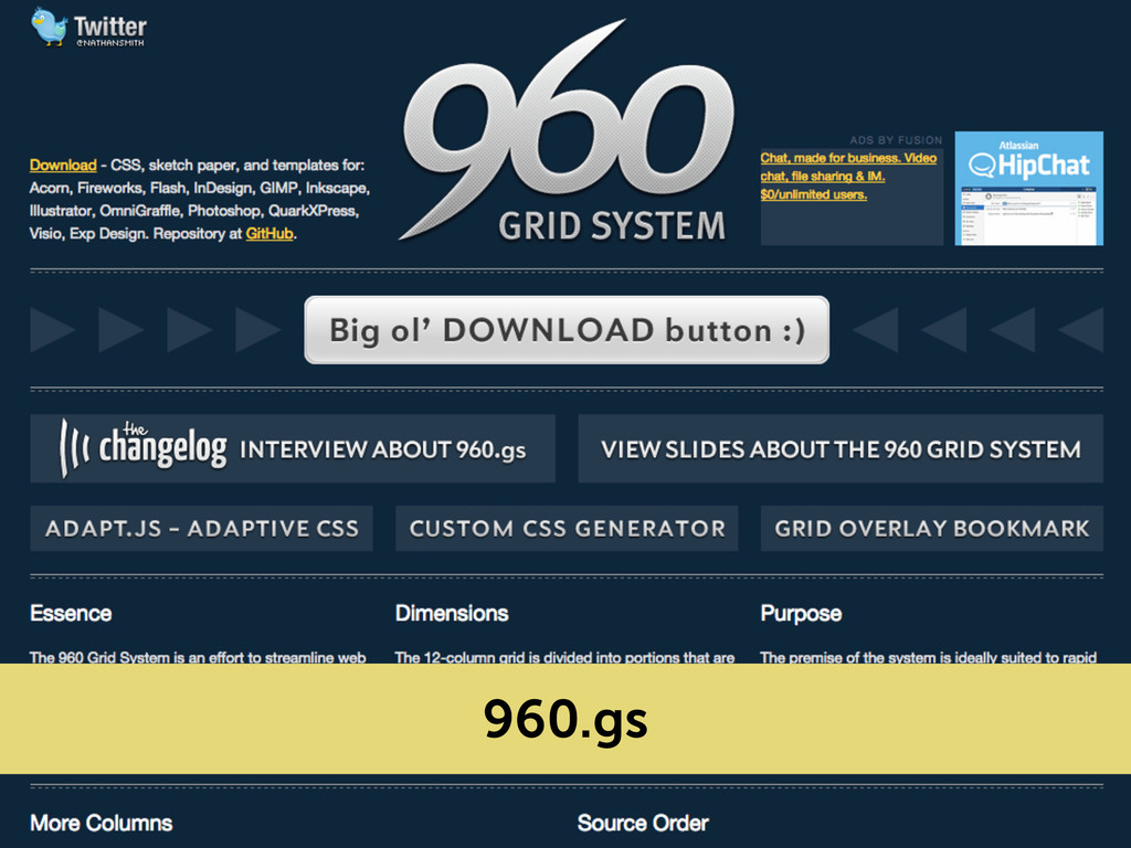
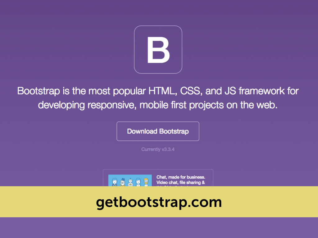
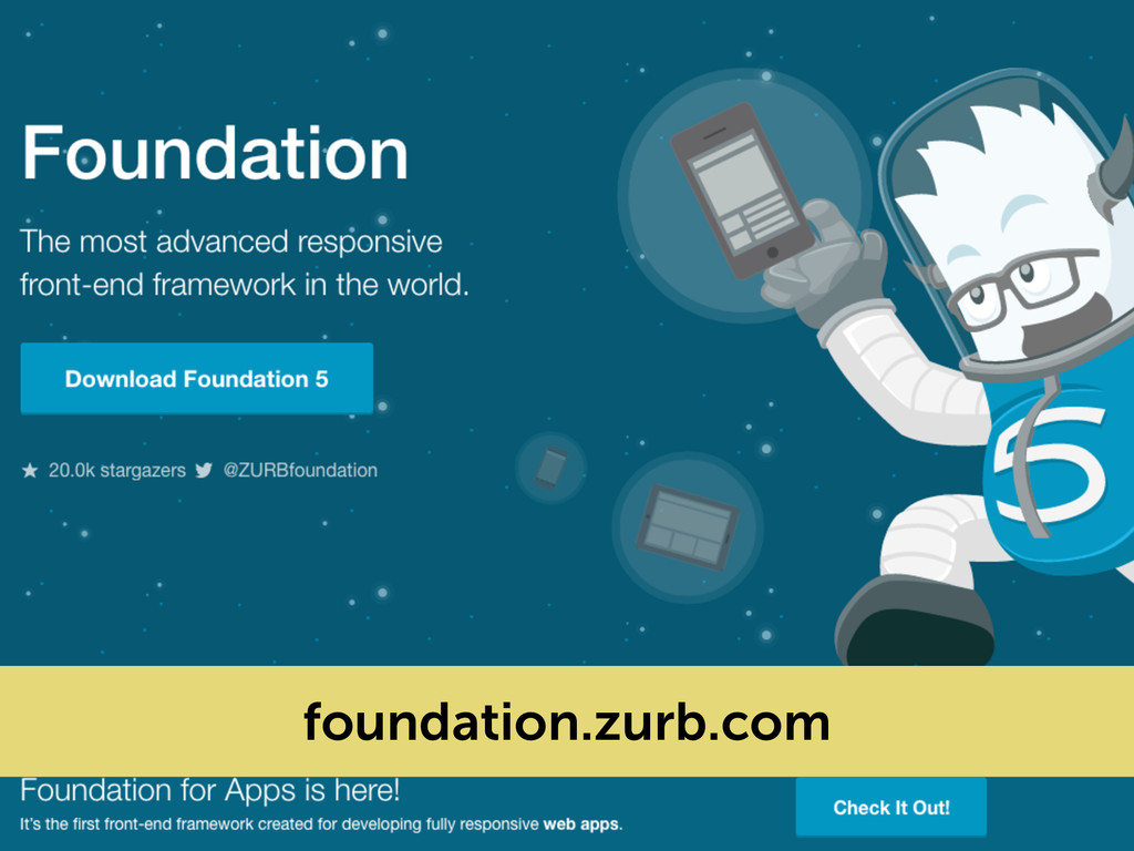
a standard of columns ‣ Started at 2007 with Blueprint ‣ Usually divided into columns (12, 16 or 24) ‣ It is an abstraction of the box model, because it just have CSS 2.1 behind ‣ The “Boom” happened at 2009, with 960.gs GRID SYSTEMS?
 diogomoretti
 sansantech
 miyamu
 news_it_enj
 sakajunquality
 sugitak
 tonkotsuboy_com
 subroh0508
 nek0128
 k8yasuma
 mhrtech
 i35_267
 kenichinakamura
 keithpitt
 axbom
axbom
 gurzu
gurzu
 inesmontani
 sferik
 sachag
 sonatard
 danielanewman
 kimpetersen
 tmiket
 kneath
 ks91
ks91
![MANY OPTIONS, BUT… I made mine =]](https://files.speakerdeck.com/presentations/c3f0fe642a784b87982369f47be688a6/slide_35.jpg)