Upgrade to Pro — share decks privately, control downloads, hide ads and more …

Re-usable and Scalable CSS

Re-usable and Scalable CSS

A small talk I gave at a development clinic for my colleagues at Zicht Online.

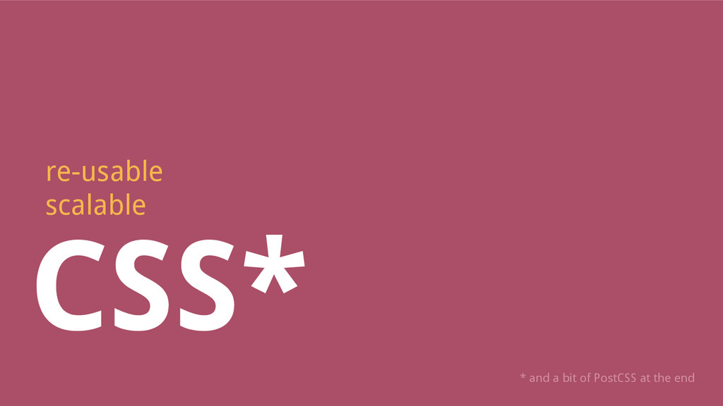
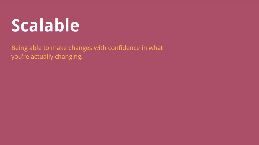
It explains constructs that help with creating CSS that's re-usable, scalable, and a pleasure to work with.

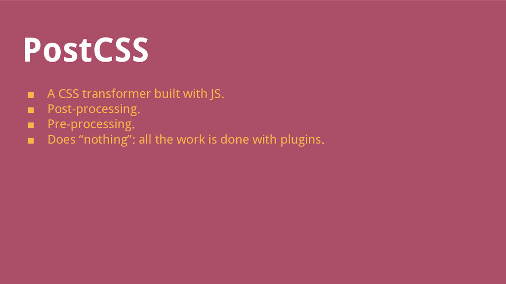
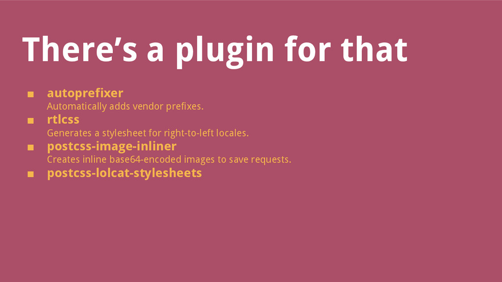
And there's a bit about PostCSS at the end.

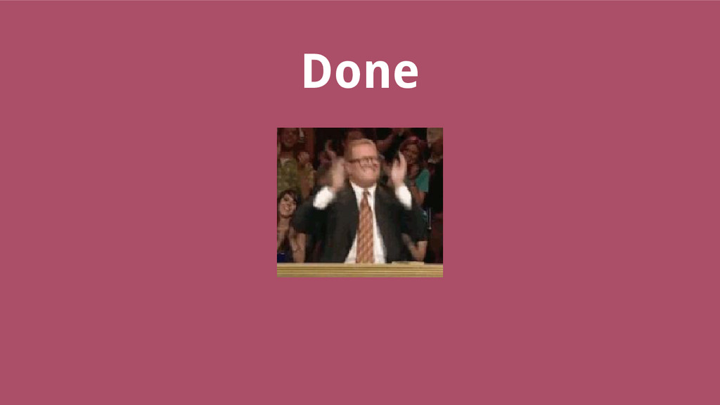
* The still image at the end is actually an animated GIF. No talk should go without animated GIFs.

Robert van Kempen

October 21, 2015
Tweet

More Decks by Robert van Kempen

Other Decks in Programming

Transcript

  1. CSS*
    re-usable
    scalable
    * and a bit of PostCSS at the end

    View Slide

  2. Re-usable
    Being able to apply styles across components and
    views without changing a single line of CSS.

    View Slide

  3. Scalable
    Being able to make changes with confidence in what
    you’re actually changing.

    View Slide

  4. CSS is Lego
    ■ Classes are building blocks.
    ■ Stack them together to build components.
    ■ More classes, more fun.
    ■ Seriously: there’s no harm in adding classes to
    an element.

    View Slide

  5. Benefits
    ■ Faster design.
    Just apply classes.
    ■ File size.
    Prevents repetition of properties.
    ■ Developer comprehension.
    Smaller classes are easier to understand.
    Not really a benefit, but still:
    ■ You were doing it all along.
    Bootstrap.

    View Slide

  6. Before


    .product {
    float: left;
    width: 33%;
    background-color: #000;
    }


    .news {
    float: left;
    width: 33%;
    background-color: #fff;
    }

    View Slide

  7. View Slide

  8. After


    .column--4 {
    float: left;
    width: 33%;
    }
    .product {
    background-color: #000;
    }


    .news {
    background-color: #fff;
    }

    View Slide

  9. View Slide

  10. Namespacing
    ■ Indicates the scope of a class.
    Element, local, global?
    ■ Helps bridge the gap between CSS source and where
    it’s used.
    ■ Groups like-minded classes.
    ■ Especially helpful when viewed in HTML.
    Source: http://csswizardry.com/2015/03/more-transparent-ui-code-with-namespaces/

    View Slide

  11. Suggestions
    Implementation via prefixes.
    Object -o
    High-level abstract classes. Very basic in implementation, but leads
    to DRY code.
    Example: .o-ui-list for resetting style of unordered lists.
    Component -c
    Implementation of a specific piece of UI. Changes to code have no
    side effects.
    Example: .c-button.

    View Slide

  12. Suggestions, part 2
    Utility -u
    Does one thing only and is not tied to a specific UI.
    Example: .u-absolute for applying position: absolute to an
    element.
    Scope -s
    Creates a new styling scope for styling elements inside it.
    Example: .s-cms-content for styling WYSIWYG content.
    JavaScript -js
    Indicates the element is bound by JavaScript and should be treated
    with caution.
    Example: .js-open-navigation.

    View Slide

  13. Suggestions, part 3
    State -is or -has
    Indicates the element has a temporary state.
    Example: .is-open.
    Theming -t
    Indicates the element looks a certain way because a theme is
    applied.
    Example: .t-corporate.
    Hack _
    The style inside this class is a temporary hack that should ideally be
    refactored.
    Example: ._fix-chrome-bug-3431

    View Slide

  14. Utility classes
    Example:
    .u-margin--b2 {
    margin-bottom: 2rem;
    }
    ■ Use with moderation.
    ■ Use when a component is overkill.
    E.g. applying a margin to some title on a page.
    ■ Feels like inline styles
    Scary, but keeps control in CSS or SASS.

    View Slide

  15. Prevent overriding styles
    Instinct tells you to provide a default.
    .c-button {
    padding: 1rem;
    background-color: blue;
    color: white;
    }
    .c-button--red {
    background-color: red;
    color: black;
    }
    Becomes a problem when you have to override multiple styles.

    View Slide

  16. Separate style & structure
    .c-button {
    padding: 1rem;
    }
    .c-button--red {
    background-color: red;
    color: black;
    }
    .c-button--blue {
    background-color: blue;
    color: white;
    }

    View Slide

  17. Usable typography
    Styling elements directly causes problems.
    h2 {
    color: red;
    }

    Hodor

    Now c-news__title unwillingly inherits all styles from h2.

    View Slide

  18. Usable typography
    Solution: create typographic classes you can use everywhere, and
    only use element selectors to reset.
    h2 {
    margin: 0;
    }
    .c-copy--h2 {
    color: red;
    }
    .c-news__title {
    // Styles specific to news
    }

    View Slide

  19. Re-usable typography
    Share typography between components and WYSIWYG content.
    %title--h2 {
    color: red;
    }
    .c-copy--h2 {
    @extend %title--h2;
    }
    .s-cms-content {
    h2 {
    @extend %title--h2;
    }
    }

    View Slide

  20. Semantic classes
    /giphy no!

    View Slide

  21. Don’t use semantic classes
    ■ Google doesn’t care.
    ■ A browser doesn’t care.
    ■ No-one cares.

    View Slide

  22. Actually, ...
    Developers care.
    Name the thing after what it looks like.
    ■ Easier mental model
    “Was the button for the call to action blue or red?”
    ■ Easier to transfer
    A class .product might not make sense on a news component.
    ■ Easier to talk about
    Design is visual. Let your class names reflect that.

    View Slide

  23. Comments, please
    CSS is a language that doesn’t lend itself to write self-documenting
    code.
    ■ Never enough comments.
    Add a comment for each class.
    ■ Explain your thought process.
    ■ Document anything weird.
    Browser bugs, classes made while drunk et cetera.

    View Slide

  24. Zum beispiel
    /**
    * Introduction element.
    *
    * 1. The background image is a bit high, so make some room at the bottom in case the content is not high enough.
    */
    .c-introduction {
    background-image: image: url('../images/stain--regular--white.png');
    @media (min-width: $screen-md) {
    padding-bottom: 20px; /* [1] */
    }
    }

    View Slide

  25. PostCSS
    ■ A CSS transformer built with JS.
    ■ Post-processing.
    ■ Pre-processing.
    ■ Does “nothing”: all the work is done with plugins.

    View Slide

  26. There’s a plugin for that
    ■ autoprefixer
    Automatically adds vendor prefixes.
    ■ rtlcss
    Generates a stylesheet for right-to-left locales.
    ■ postcss-image-inliner
    Creates inline base64-encoded images to save requests.
    ■ postcss-lolcat-stylesheets

    View Slide

  27. ...
    .ohai {
    posishun: relativ;
    bakground-color: chawklit;
    bakground-image: none;
    font-pplz: Helvetica, Arial;
    color: silvr;
    lettr-spacin: 2px;
    paddin-rite: 30px;
    }

    View Slide

  28. Sass replacement?
    No.
    ■ No defined syntax means no editor support.
    ■ Configuring plugins = a bitch.
    ■ Anyone can make a plugin: lacking documentation and
    support.
    ■ Plugin running order can break things.

    View Slide

  29. Use it for what it’s good at
    Great at automating laborious tasks.

    View Slide

  30. Done

    View Slide