Upgrade to Pro — share decks privately, control downloads, hide ads and more …

Progressively enhanced markup: using web components to build PWAs

Progressively enhanced markup: using web components to build PWAs

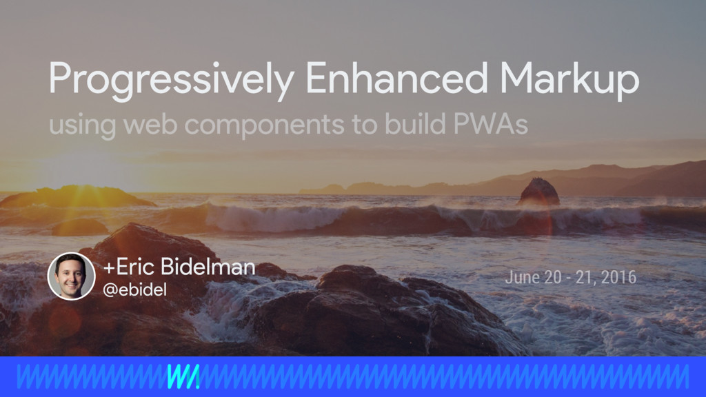
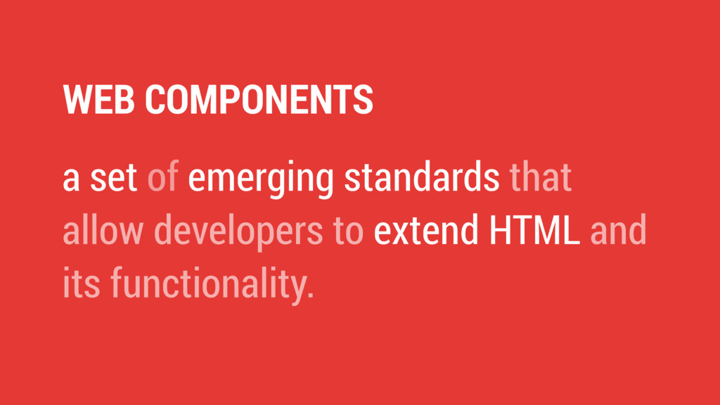
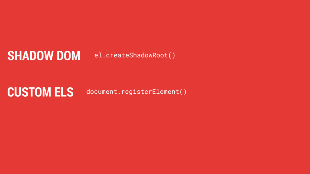
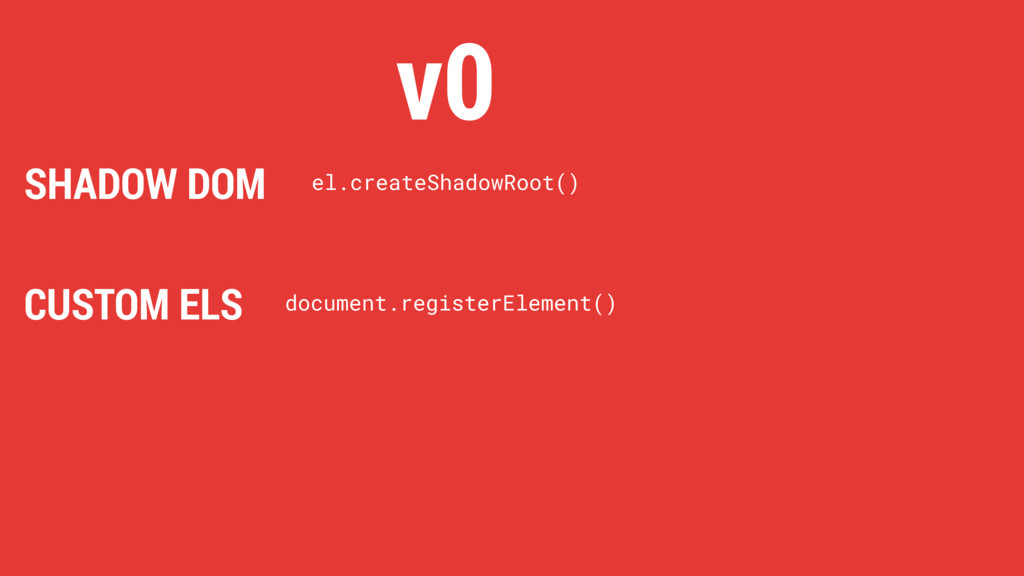
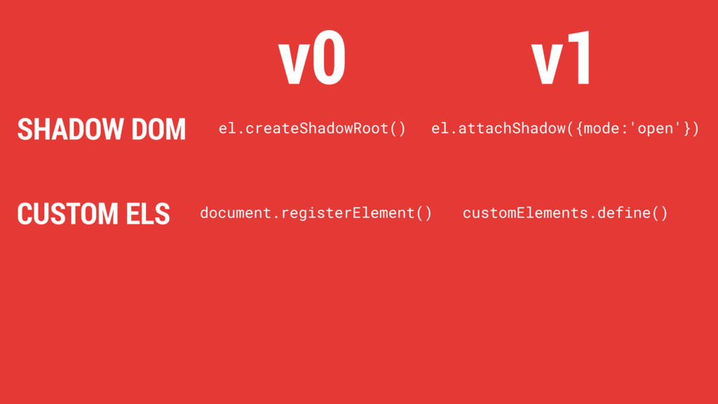
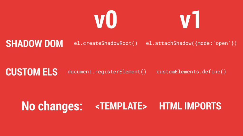
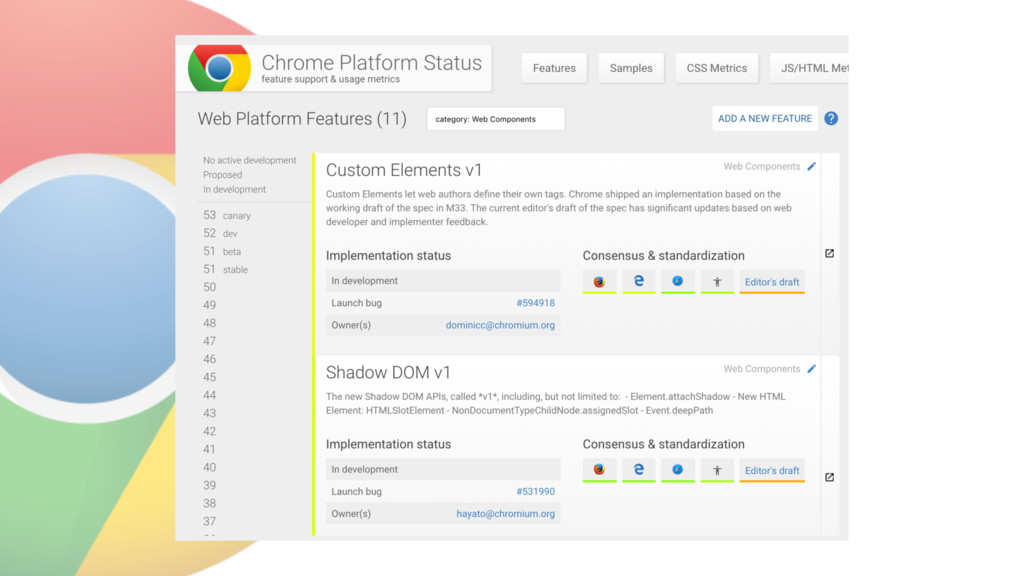
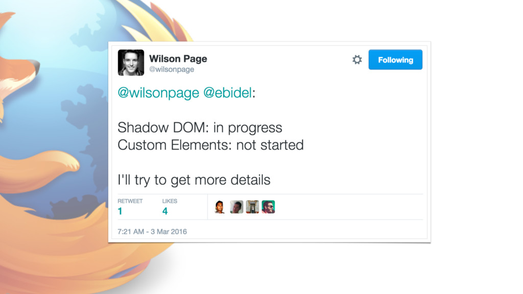
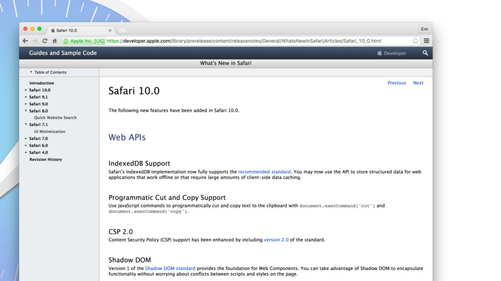
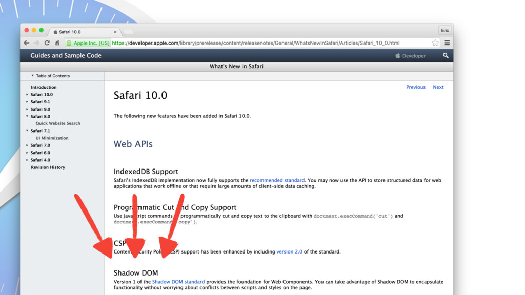
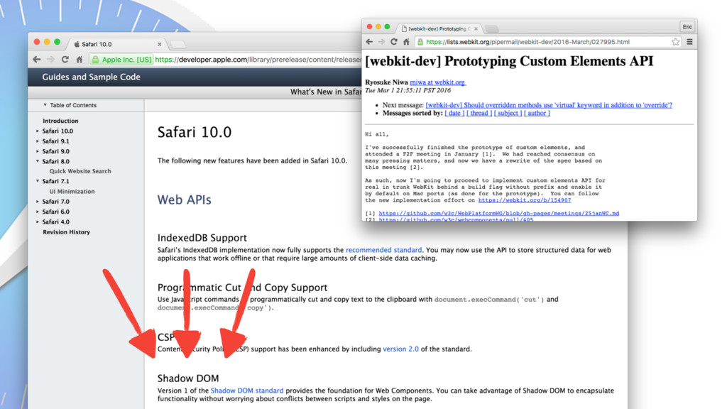
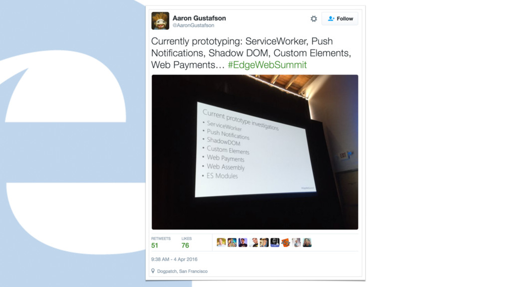
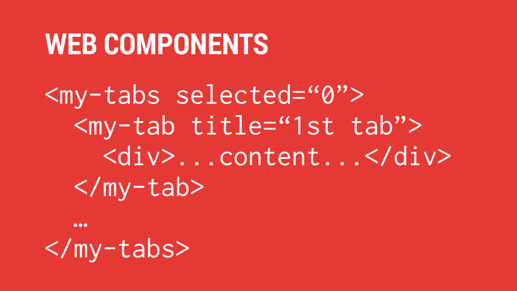
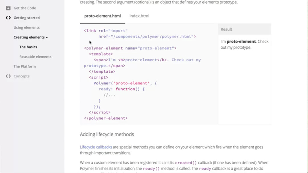
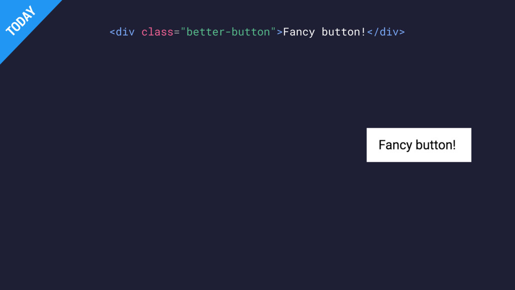
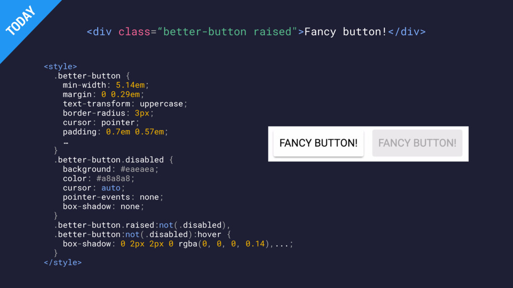
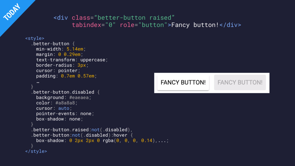
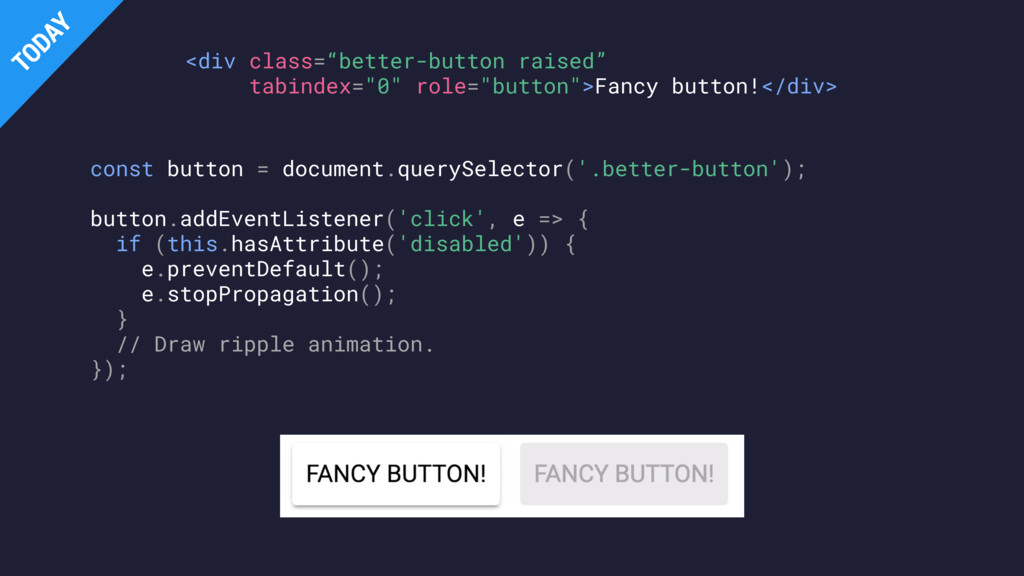
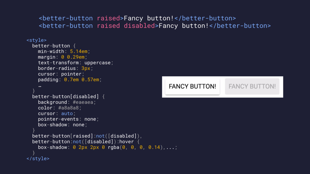
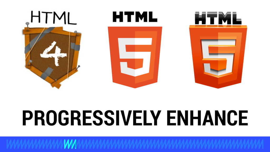
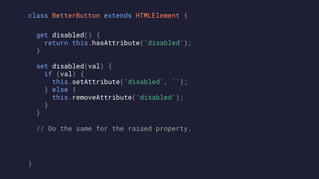
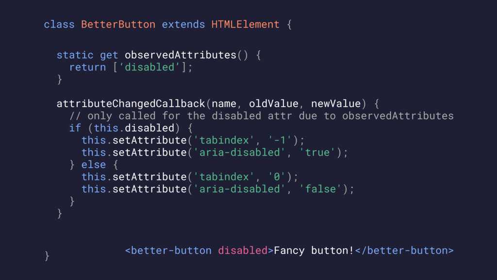
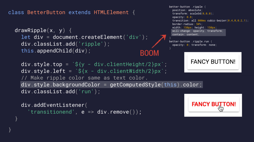
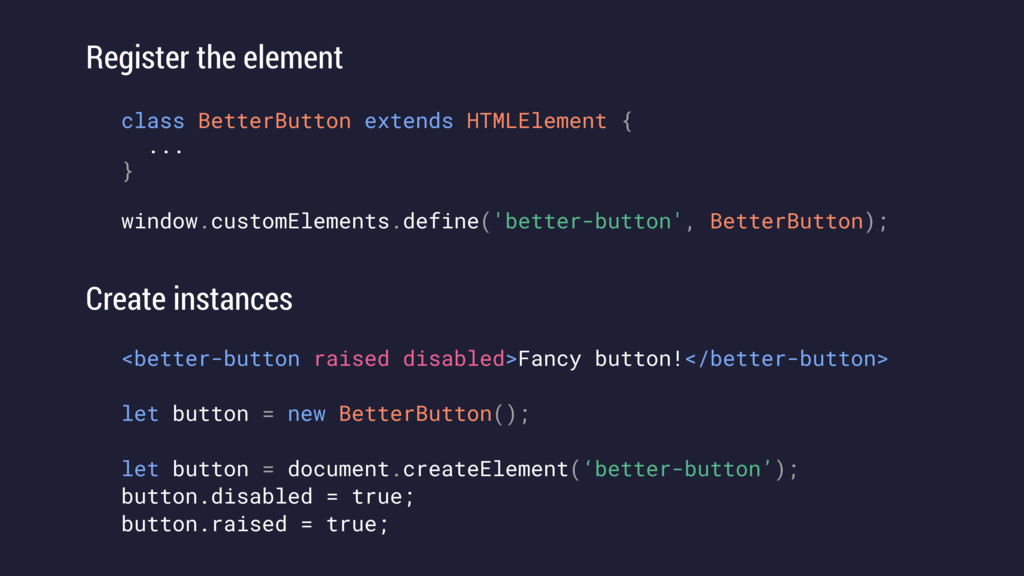
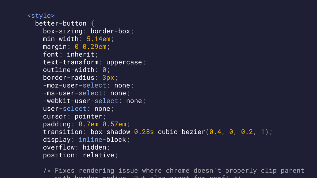
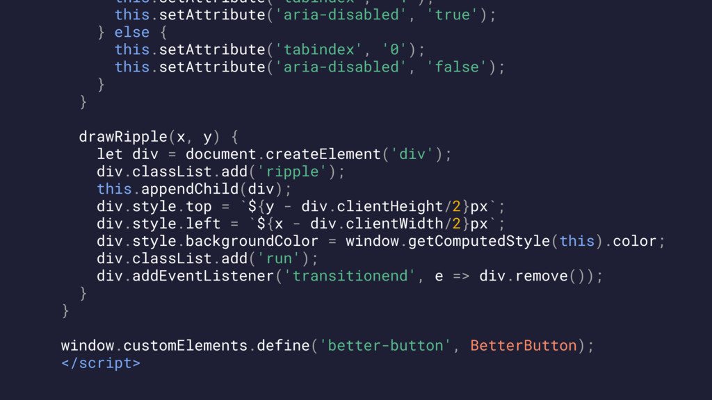
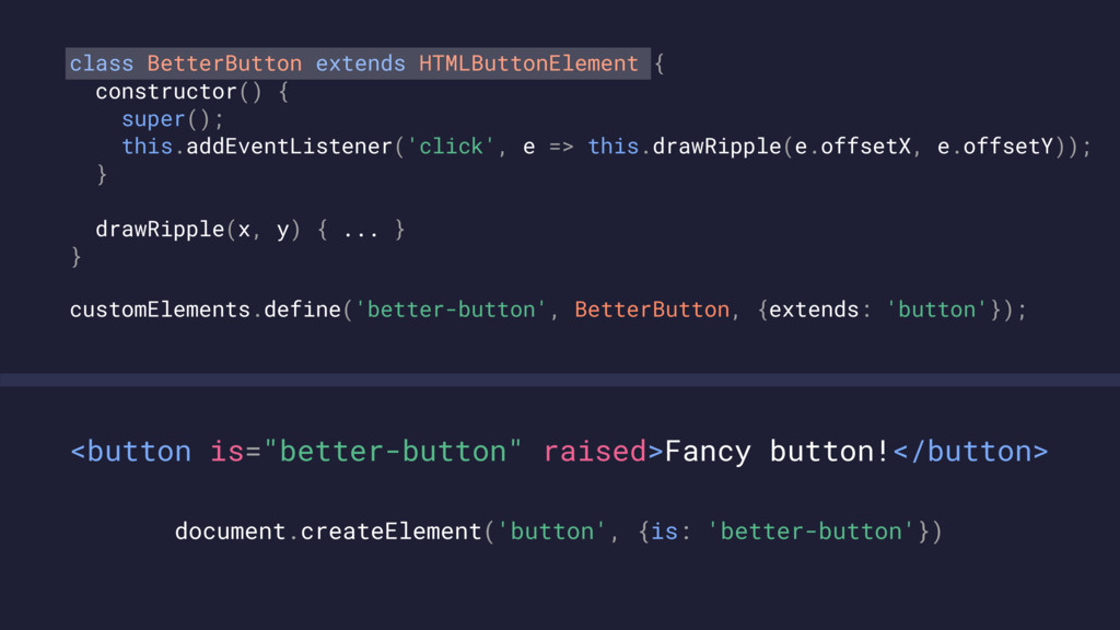
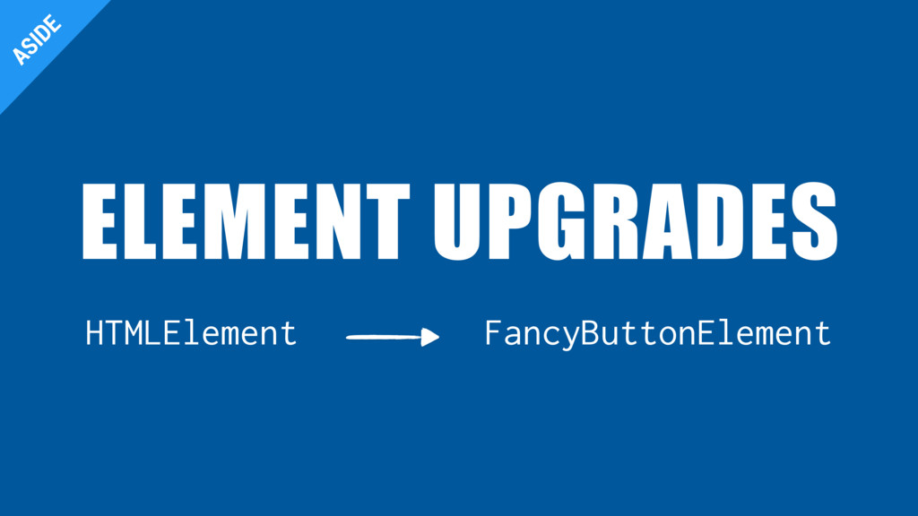
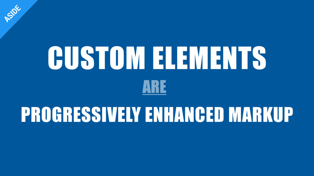
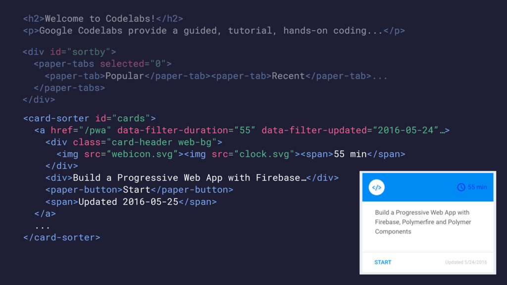
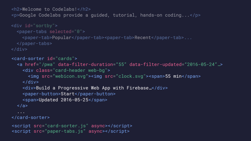
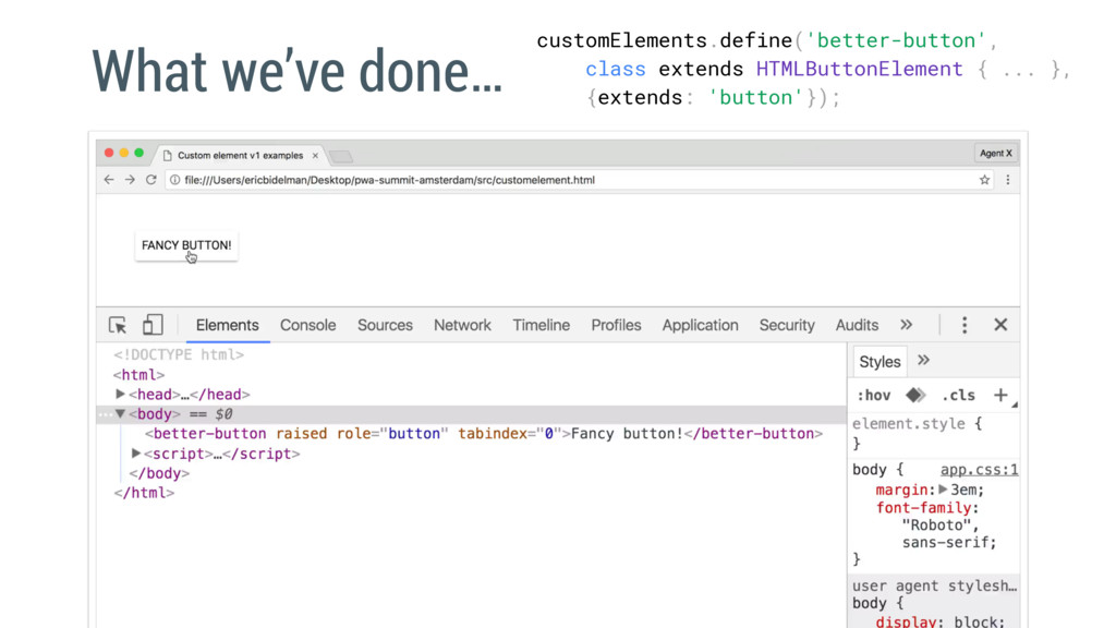
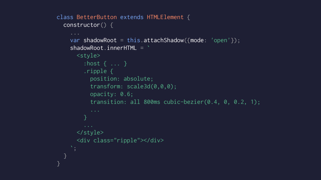
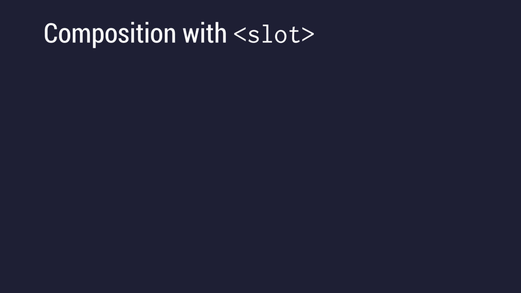
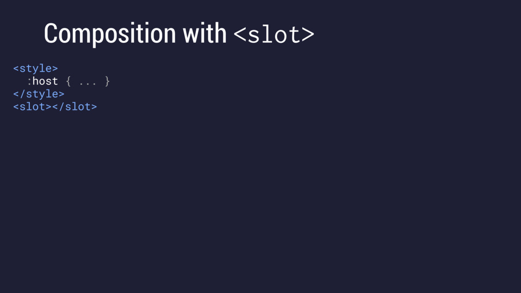
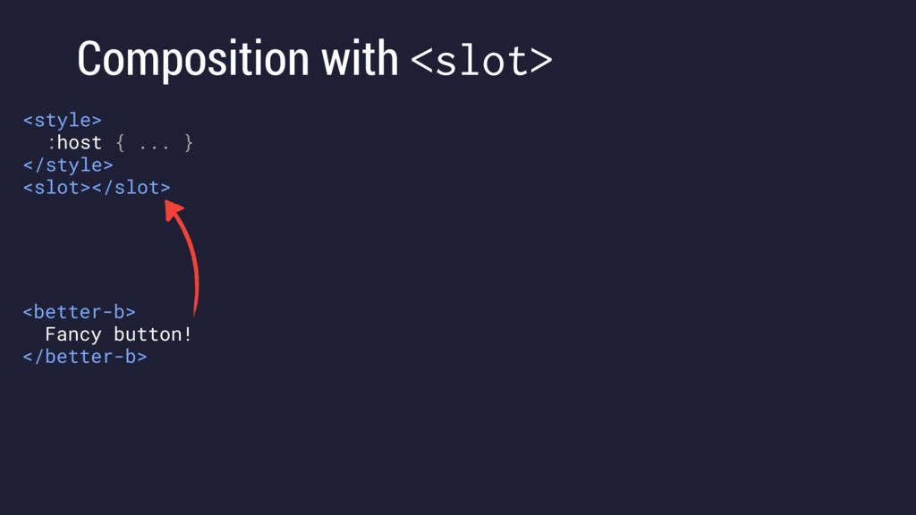
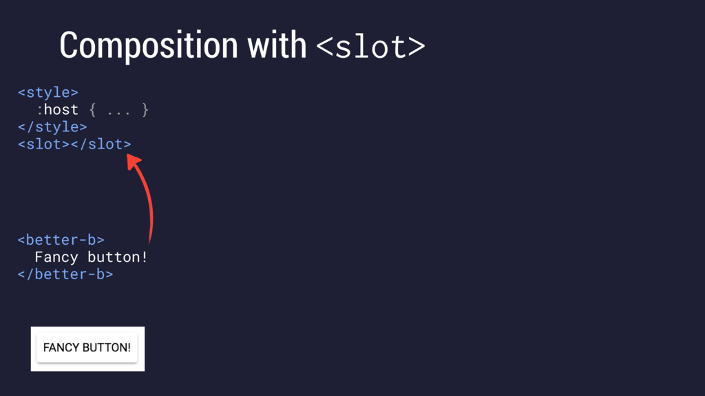
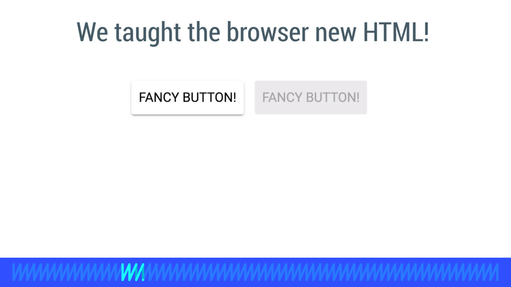
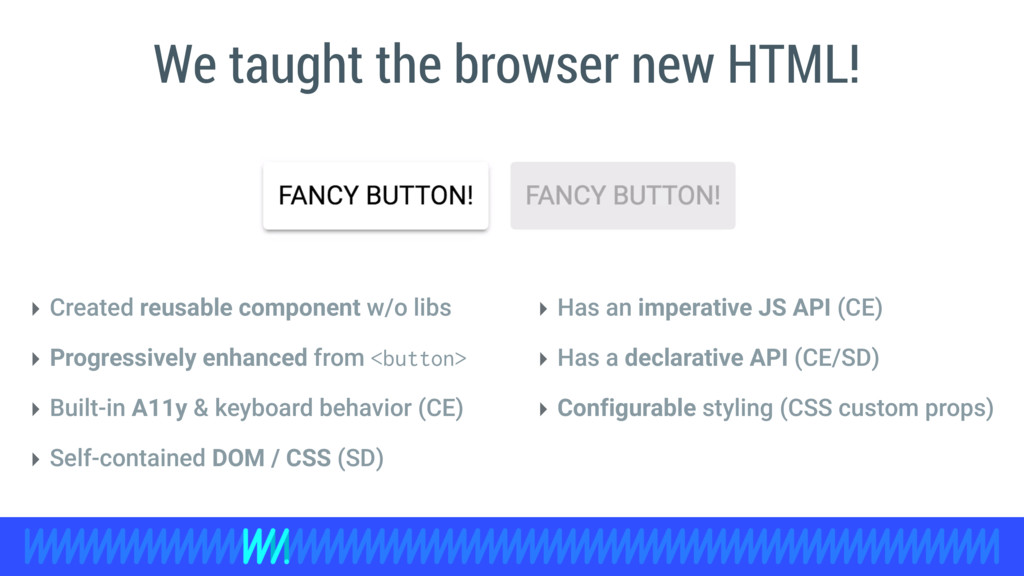
Web components provide a standard way to create reusable components on the web. In this talk, we'll discuss how to leverage these new features to build PWA, introduce the idea of "progressively enhanced markup", and cover all the changes happening in Custom Elements and Shadow DOM API v1. Both landing in browsers later this year.

Eric Bidelman

June 20, 2016
Tweet

More Decks by Eric Bidelman

Other Decks in Programming

Transcript

  1. +Eric Bidelman @ebidel June 20 - 21, 2016 Progressively Enhanced

    Markup using web components to build PWAs
  2. a set of emerging standards that allow developers to extend

    HTML and its functionality. WEB COMPONENTS
  3. <div class=“better-button raised">Fancy button!</div> TODAY <style> .better-button { min-width: 5.14em;

    margin: 0 0.29em; text-transform: uppercase; border-radius: 3px; cursor: pointer; padding: 0.7em 0.57em; … } .better-button.disabled { background: #eaeaea; color: #a8a8a8; cursor: auto; pointer-events: none; box-shadow: none; } .better-button.raised:not(.disabled), .better-button:not(.disabled):hover { box-shadow: 0 2px 2px 0 rgba(0, 0, 0, 0.14),...; } </style>
  4. <div class=“better-button raised” tabindex="0" role="button">Fancy button!</div> <style> .better-button { min-width:

    5.14em; margin: 0 0.29em; text-transform: uppercase; border-radius: 3px; cursor: pointer; padding: 0.7em 0.57em; … } .better-button.disabled { background: #eaeaea; color: #a8a8a8; cursor: auto; pointer-events: none; box-shadow: none; } .better-button.raised:not(.disabled), .better-button:not(.disabled):hover { box-shadow: 0 2px 2px 0 rgba(0, 0, 0, 0.14),...; } </style> TODAY
  5. const button = document.querySelector('.better-button'); button.addEventListener('click', e => { if (this.hasAttribute('disabled'))

    { e.preventDefault(); e.stopPropagation(); } // Draw ripple animation. }); <div class=“better-button raised” tabindex="0" role="button">Fancy button!</div> TODAY
  6. const button = document.querySelector('.better-button'); button.addEventListener('click', e => { if (this.hasAttribute('disabled'))

    { e.preventDefault(); e.stopPropagation(); } // Draw ripple animation. }); <div class=“better-button raised” tabindex="0" role="button">Fancy button!</div> TODAY
  7. <style> better-button { min-width: 5.14em; margin: 0 0.29em; text-transform: uppercase;

    border-radius: 3px; cursor: pointer; padding: 0.7em 0.57em; … } better-button[disabled] { background: #eaeaea; color: #a8a8a8; cursor: auto; pointer-events: none; box-shadow: none; } better-button[raised]:not([disabled]), better-button:not([disabled]):hover { box-shadow: 0 2px 2px 0 rgba(0, 0, 0, 0.14),...; } </style> <better-button raised>Fancy button!</better-button> <better-button raised disabled>Fancy button!</better-button>
  8. class BetterButton extends HTMLElement { } get disabled() { return

    this.hasAttribute('disabled'); } set disabled(val) { if (val) { this.setAttribute('disabled', ''); } else { this.removeAttribute('disabled'); } } // Do the same for the raised property.
  9. class BetterButton extends HTMLElement { } static get observedAttributes() {

    return [‘disabled’]; } attributeChangedCallback(name, oldValue, newValue) { // only called for the disabled attr due to observedAttributes if (this.disabled) { this.setAttribute('tabindex', '-1'); this.setAttribute('aria-disabled', 'true'); } else { this.setAttribute('tabindex', '0'); this.setAttribute('aria-disabled', 'false'); } } <better-button disabled>Fancy button!</better-button>
  10. class BetterButton extends HTMLElement { } constructor() { super(); this.addEventListener('keydown',

    e => { if (e.keyCode === 32 || e.keyCode === 13) { this.dispatchEvent( new MouseEvent('click', {bubbles: true, cancelable: true})); } }); this.addEventListener('click', e => { if (this.disabled) { e.preventDefault(); e.stopPropagation(); } this.drawRipple(e.offsetX, e.offsetY); }); }
  11. class BetterButton extends HTMLElement { } connectedCallback() { this.setAttribute('role', 'button');

    this.setAttribute('tabindex', '0'); } disconnectedCallback() { ... }
  12. class BetterButton extends HTMLElement { } drawRipple(x, y) { let

    div = document.createElement('div'); div.classList.add('ripple'); this.appendChild(div); div.style.top = `${y - div.clientHeight/2}px`; div.style.left = `${x - div.clientWidth/2}px`; // Make ripple color same as text color. div.style.backgroundColor = getComputedStyle(this).color; div.classList.add(‘run'); div.addEventListener( 'transitionend', e => div.remove()); } better-button .ripple { position: absolute; transform: scale3d(0,0,0); opacity: 0.8; transition: all 800ms cubic-bezier(0.4,0,0.2,1); border-radius: 50%; width: 150px; height: 150px; will-change: opacity, transform; contain: content; } better-button .ripple.run { opacity: 0; transform: none; }
  13. class BetterButton extends HTMLElement { } drawRipple(x, y) { let

    div = document.createElement('div'); div.classList.add('ripple'); this.appendChild(div); div.style.top = `${y - div.clientHeight/2}px`; div.style.left = `${x - div.clientWidth/2}px`; // Make ripple color same as text color. div.style.backgroundColor = getComputedStyle(this).color; div.classList.add(‘run'); div.addEventListener( 'transitionend', e => div.remove()); } better-button .ripple { position: absolute; transform: scale3d(0,0,0); opacity: 0.8; transition: all 800ms cubic-bezier(0.4,0,0.2,1); border-radius: 50%; width: 150px; height: 150px; will-change: opacity, transform; contain: content; } better-button .ripple.run { opacity: 0; transform: none; }
  14. class BetterButton extends HTMLElement { } drawRipple(x, y) { let

    div = document.createElement('div'); div.classList.add('ripple'); this.appendChild(div); div.style.top = `${y - div.clientHeight/2}px`; div.style.left = `${x - div.clientWidth/2}px`; // Make ripple color same as text color. div.style.backgroundColor = getComputedStyle(this).color; div.classList.add(‘run'); div.addEventListener( 'transitionend', e => div.remove()); } better-button .ripple { position: absolute; transform: scale3d(0,0,0); opacity: 0.8; transition: all 800ms cubic-bezier(0.4,0,0.2,1); border-radius: 50%; width: 150px; height: 150px; will-change: opacity, transform; contain: content; } better-button .ripple.run { opacity: 0; transform: none; } BOOM
  15. class BetterButton extends HTMLElement { } drawRipple(x, y) { let

    div = document.createElement('div'); div.classList.add('ripple'); this.appendChild(div); div.style.top = `${y - div.clientHeight/2}px`; div.style.left = `${x - div.clientWidth/2}px`; // Make ripple color same as text color. div.style.backgroundColor = getComputedStyle(this).color; div.classList.add(‘run'); div.addEventListener( 'transitionend', e => div.remove()); } better-button .ripple { position: absolute; transform: scale3d(0,0,0); opacity: 0.8; transition: all 800ms cubic-bezier(0.4,0,0.2,1); border-radius: 50%; width: 150px; height: 150px; will-change: opacity, transform; contain: content; } better-button .ripple.run { opacity: 0; transform: none; } BOOM
  16. class BetterButton extends HTMLElement { ... } window.customElements.define('better-button', BetterButton); Register

    the element <better-button raised disabled>Fancy button!</better-button> let button = new BetterButton(); let button = document.createElement(‘better-button’); button.disabled = true; button.raised = true; Create instances
  17. <style> better-button { box-sizing: border-box; min-width: 5.14em; margin: 0 0.29em;

    font: inherit; text-transform: uppercase; outline-width: 0; border-radius: 3px; -moz-user-select: none; -ms-user-select: none; -webkit-user-select: none; user-select: none; cursor: pointer; padding: 0.7em 0.57em; transition: box-shadow 0.28s cubic-bezier(0.4, 0, 0.2, 1); display: inline-block; overflow: hidden; position: relative; /* Fixes rendering issue where chrome doesn't properly clip parent
  18. this.setAttribute('tabindex', '-1'); this.setAttribute('aria-disabled', 'true'); } else { this.setAttribute('tabindex', '0'); this.setAttribute('aria-disabled',

    'false'); } } drawRipple(x, y) { let div = document.createElement('div'); div.classList.add('ripple'); this.appendChild(div); div.style.top = `${y - div.clientHeight/2}px`; div.style.left = `${x - div.clientWidth/2}px`; div.style.backgroundColor = window.getComputedStyle(this).color; div.classList.add('run'); div.addEventListener('transitionend', e => div.remove()); } } window.customElements.define('better-button', BetterButton); </script>
  19. class BetterButton extends HTMLButtonElement { constructor() { super(); this.addEventListener('click', e

    => this.drawRipple(e.offsetX, e.offsetY)); } drawRipple(x, y) { ... } } customElements.define('better-button', BetterButton, {extends: 'button'}); <button is="better-button" raised>Fancy button!</button> document.createElement('button', {is: 'better-button'})
  20. class BetterButton extends HTMLButtonElement { constructor() { super(); this.addEventListener('click', e

    => this.drawRipple(e.offsetX, e.offsetY)); } drawRipple(x, y) { ... } } customElements.define('better-button', BetterButton, {extends: 'button'}); <button is="better-button" raised>Fancy button!</button> document.createElement('button', {is: 'better-button'})
  21. ( WPT: Nexus 5 - Chrome - 3G ) 2.2s

    first paint CODELABS SITE
  22. ( WPT: Nexus 5 - Chrome - 3G ) 2.2s

    first paint CODELABS SITE
  23. <style> paper-tabs:not(:defined) { /* Pre-style, give layout,replicate internal styles of

    paper-tabs */ display: block; height: 48px; opacity: 0; transition: opacity 0.3s ease-in-out; } </style> :defined - pre-style components
  24. <style> paper-tabs:not(:defined) { /* Pre-style, give layout,replicate internal styles of

    paper-tabs */ display: block; height: 48px; opacity: 0; transition: opacity 0.3s ease-in-out; } </style> :defined - pre-style components
  25. <h2>Welcome to Codelabs!</h2> <p>Google Codelabs provide a guided, tutorial, hands-on

    coding...</p> <div id="sortby"> <paper-tabs selected="0"> <paper-tab>Popular</paper-tab><paper-tab>Recent</paper-tab>... </paper-tabs> </div>
  26. <h2>Welcome to Codelabs!</h2> <p>Google Codelabs provide a guided, tutorial, hands-on

    coding...</p> <div id="sortby"> <paper-tabs selected="0"> <paper-tab>Popular</paper-tab><paper-tab>Recent</paper-tab>... </paper-tabs> </div> <card-sorter id="cards"> <a href="/pwa" data-filter-duration=“55” data-filter-updated=“2016-05-24”…> <div class="card-header web-bg"> <img src=“webicon.svg”><img src=“clock.svg"><span>55 min</span> </div> <div>Build a Progressive Web App with Firebase…</div> <paper-button>Start</paper-button> <span>Updated 2016-05-25</span> </a> ... </card-sorter>
  27. <h2>Welcome to Codelabs!</h2> <p>Google Codelabs provide a guided, tutorial, hands-on

    coding...</p> <script src="card-sorter.js" async></script> <script src=“paper-tabs.js” async></script> <div id="sortby"> <paper-tabs selected="0"> <paper-tab>Popular</paper-tab><paper-tab>Recent</paper-tab>... </paper-tabs> </div> <card-sorter id="cards"> <a href="/pwa" data-filter-duration=“55” data-filter-updated=“2016-05-24”…> <div class="card-header web-bg"> <img src=“webicon.svg”><img src=“clock.svg"><span>55 min</span> </div> <div>Build a Progressive Web App with Firebase…</div> <paper-button>Start</paper-button> <span>Updated 2016-05-25</span> </a> ... </card-sorter>
  28. class BetterButton extends HTMLElement { constructor() { ... var shadowRoot

    = this.attachShadow({mode: 'open'}); shadowRoot.innerHTML = ` <style> :host { ... } .ripple { position: absolute; transform: scale3d(0,0,0); opacity: 0.6; transition: all 800ms cubic-bezier(0.4, 0, 0.2, 1); ... } ... </style> <div class="ripple"></div> `; } }
  29. class BetterButton extends HTMLElement { constructor() { ... var shadowRoot

    = this.attachShadow({mode: 'open'}); shadowRoot.innerHTML = ` <style> :host { ... } .ripple { position: absolute; transform: scale3d(0,0,0); opacity: 0.6; transition: all 800ms cubic-bezier(0.4, 0, 0.2, 1); ... } ... </style> <div class="ripple"></div> `; } }
  30. class BetterButton extends HTMLElement { constructor() { ... var shadowRoot

    = this.attachShadow({mode: 'open'}); shadowRoot.innerHTML = ` <style> :host { ... } .ripple { position: absolute; transform: scale3d(0,0,0); opacity: 0.6; transition: all 800ms cubic-bezier(0.4, 0, 0.2, 1); ... } ... </style> <div class="ripple"></div> `; } } Styles are scoped to a shadow root. Selectors don’t leak out or collide with outside rules.
  31. class BetterButton extends HTMLElement { constructor() { ... var shadowRoot

    = this.attachShadow({mode: 'open'}); shadowRoot.innerHTML = ` <style> :host { ... } .ripple { position: absolute; transform: scale3d(0,0,0); opacity: 0.6; transition: all 800ms cubic-bezier(0.4, 0, 0.2, 1); ... } ... </style> <div class="ripple"></div> `; } } Styles are scoped to a shadow root. Selectors don’t leak out or collide with outside rules.
  32. Composition with <slot> <style> :host { ... } </style> <slot></slot>

    <style> :host { ... } </style> <slot>Button</slot> <better-b> Fancy button! </better-b>
  33. Composition with <slot> <style> :host { ... } </style> <slot></slot>

    <style> :host { ... } </style> <slot>Button</slot> <better-b> Fancy button! </better-b> <better-b></better-b>
  34. Composition with <slot> <style> :host { ... } </style> <slot></slot>

    <style> :host { ... } </style> <slot>Button</slot> <better-b> Fancy button! </better-b> <better-b></better-b>
  35. Composition with <slot> <style> :host { ... } </style> <slot></slot>

    <style> :host { ... } ::slotted(img) {height: 24px;} </style> <slot name="icon"></slot> <slot></slot> <style> :host { ... } </style> <slot>Button</slot> <better-b> Fancy button! </better-b> <better-b></better-b>
  36. Composition with <slot> <style> :host { ... } </style> <slot></slot>

    <style> :host { ... } ::slotted(img) {height: 24px;} </style> <slot name="icon"></slot> <slot></slot> <style> :host { ... } </style> <slot>Button</slot> <better-b> Fancy button! </better-b> <better-b></better-b> <better-b> <img src="gear.svg" slot=“icon"> Settings </better-b>
  37. Composition with <slot> <style> :host { ... } </style> <slot></slot>

    <style> :host { ... } ::slotted(img) {height: 24px;} </style> <slot name="icon"></slot> <slot></slot> <style> :host { ... } </style> <slot>Button</slot> <better-b> Fancy button! </better-b> <better-b></better-b> <better-b> <img src="gear.svg" slot=“icon"> Settings </better-b>
  38. Style hooks using CSS Custom properties Placeholders in Shadow DOM:

    :host { padding: var(--button-padding, 0.7em); } .ripple { --default-size: 150px; width: var(--ripple-size, var(--default-size)); height: var(--ripple-size, var(--default-size)); }
  39. Style hooks using CSS Custom properties Placeholders in Shadow DOM:

    <style> better-button { background-color: #E91E63; font-size: 40px; --button-padding: 2em; --ripple-size: 300px; } </style> <better-button raised> Ginormous button! </better-button> User provides styles: :host { padding: var(--button-padding, 0.7em); } .ripple { --default-size: 150px; width: var(--ripple-size, var(--default-size)); height: var(--ripple-size, var(--default-size)); }
  40. ‣ Created reusable component w/o libs ‣ Progressively enhanced from

    <button> ‣ Built-in A11y & keyboard behavior (CE) ‣ Self-contained DOM / CSS (SD) ‣ Has an imperative JS API (CE) ‣ Has a declarative API (CE/SD) ‣ Configurable styling (CSS custom props) We taught the browser new HTML!