$30 off During Our Annual Pro Sale. View Details »

Mobile Application Design

Emi Maj
October 07, 2014

Mobile Application Design

Emi Maj

October 07, 2014
Tweet

More Decks by Emi Maj

Other Decks in Design

Transcript

  1. @emiliamaj
    Mobile Application Design

    View Slide

  2. „User Experience encompasses all
    aspects of the end-user interaction with
    the company, its services and products.”
    Nielsen Norman Group, „User Experience - Our Definition”

    View Slide

  3. View Slide

  4. How to build a
    user-friendly app?

    View Slide

  5. 1. Analysis 2. Mockups
    3. Graphic Design 4. Implementation

    View Slide

  6. Analysis
    1

    View Slide

  7. • What kind of app we want to build?
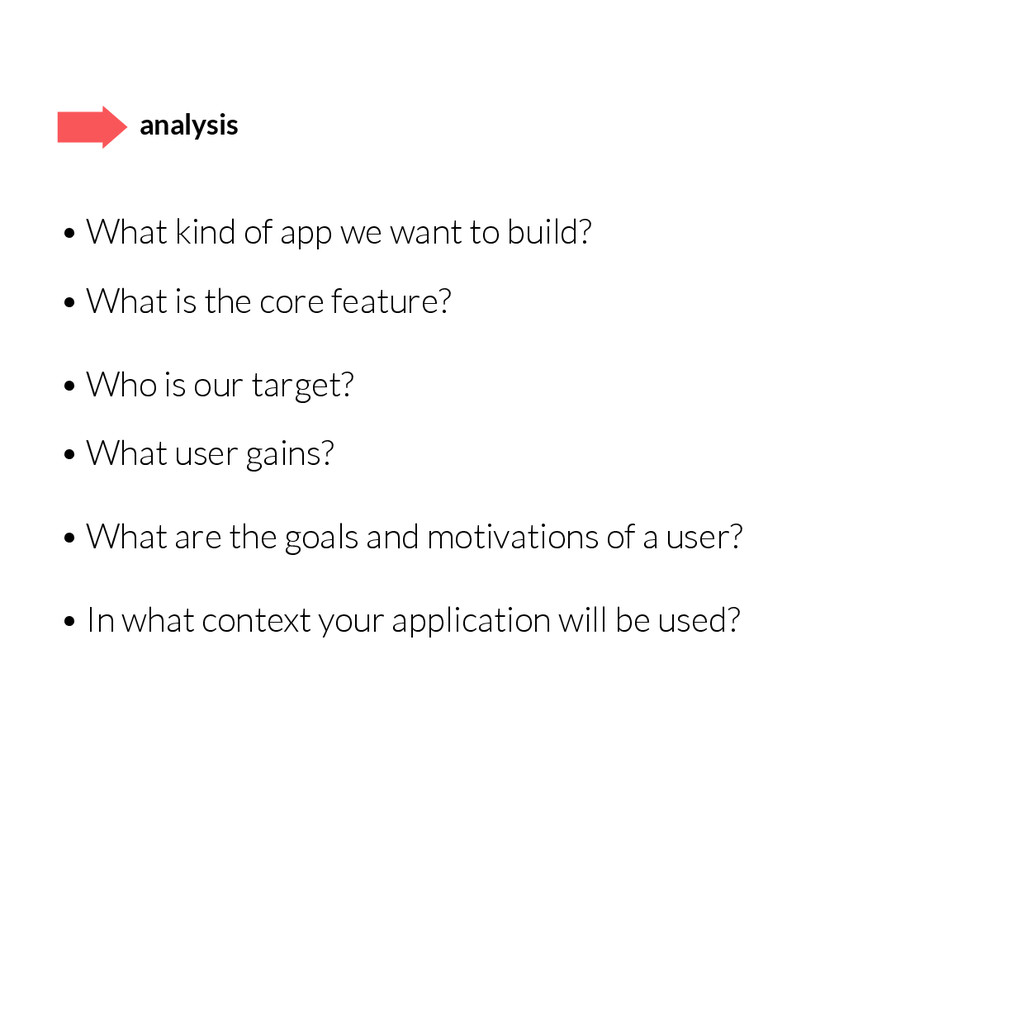
    • What is the core feature?
    • Who is our target?
    • What user gains?
    • What are the goals and motivations of a user?
    • In what context your application will be used?
    analysis

    View Slide

  8. write down and group: requirements, needs, ideas,
    inspirations

    View Slide

  9. Needs Features
    big amount of data
    recommendations
    places suggestions
    engaging
    user account
    users rating
    geolocation
    shares
    requirements analysis

    View Slide

  10. Must be
    Should have
    Nice to have
    requirements analysis

    View Slide

  11. feedback – share your ideas with a team and everyone
    who gives a constructive opinion

    View Slide

  12. Workshop.
    15 min
    1. E-commerc?
    2. Social app?
    3. Tool?
    4. Info Service?
    5. Gallery?

    View Slide

  13. Mockups
    2

    View Slide

  14. mockups – rough and not very accurate idea
    of the project

    View Slide

  15. mockups
    • draw quickly: paper + marker
    • show only the most important features
    • search for different approaches, do not stop at one,
    even if you like it
    • investigate a variety of solutions
    everyone draws 4, 2 i 1 version; after: one final together
    • if you don’t know what to do, then draw whatever
    the most important is to think aloud and draw it
    • if you get confused, start from the beginning

    View Slide

  16. • Organization
    • Labeling
    • Navigation
    • Research
    Information Architecture – the art and science of
    organizing and labeling information to support usability

    View Slide

  17. • don’t think about solutions but about needs
    • think 
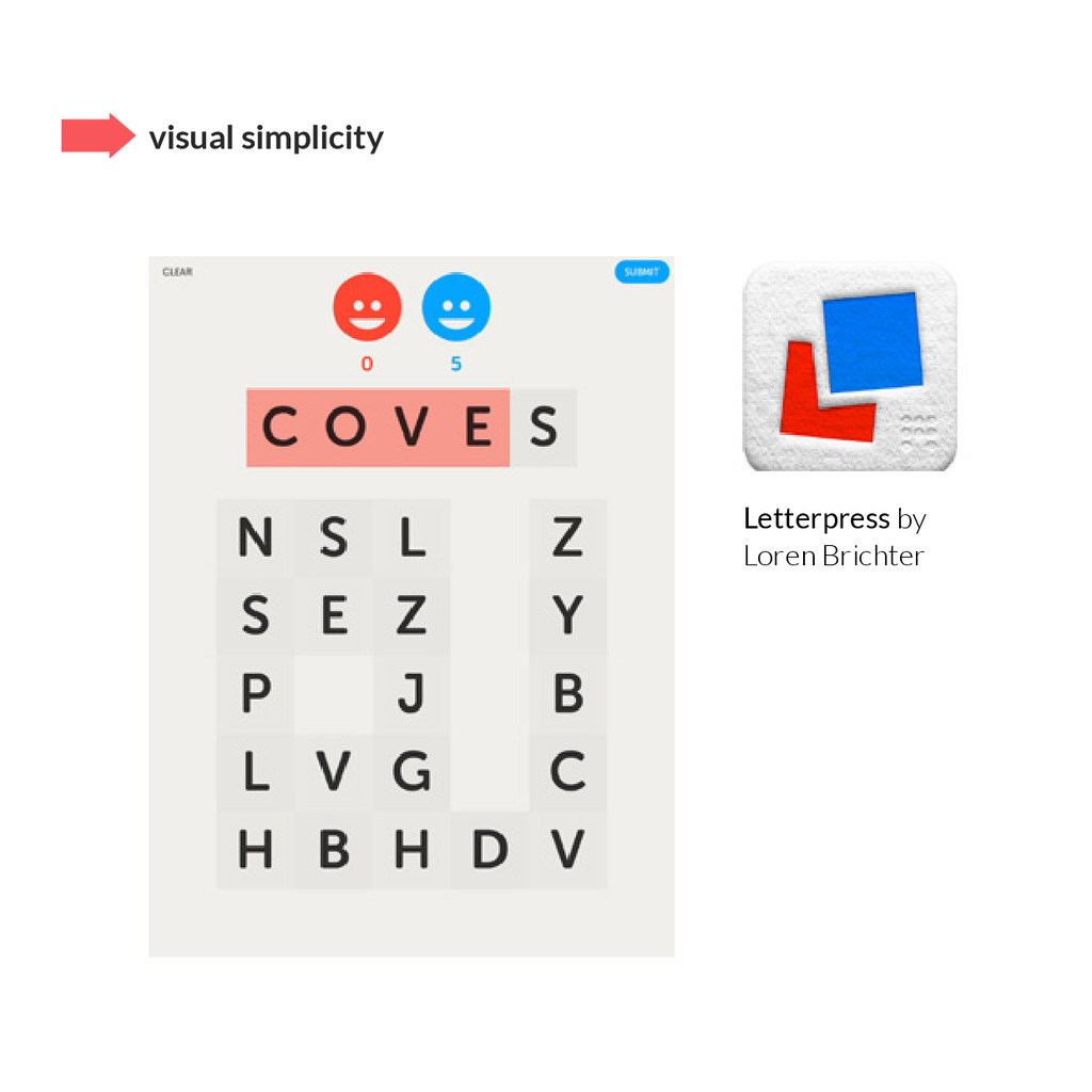
about user as a busy and “mobile” man
    • simplify as much as you can
    • one main feature per screen
    • the fewer steps in navigation, the better
    • don’t duplicate the functionality (but group logically)
    • use global applications (mental model)
    good advice

    View Slide

  18. Workshop.
    15 min
    Mockups for app:
    – first screen
    – subpages

    View Slide

  19. usability – is the ease of use and learnability of
    a human-made object
    Definition by Jakoba Nielsen:
    Learnability: How easy is it for users to accomplish basic
    tasks the first time they encounter the design?
    Efficiency: Once users have learned the design, how
    quickly can they perform tasks?
    Memorability: When users return to the design after
    a period of not using it, how easily can they reestablish
    proficiency?
    Errors: How many errors do users make, how severe are
    these errors, and how easily can they recover from the
    errors?
    Satisfaction: How pleasant is it to use the design?

    View Slide

  20. • each step of the product development takes place
    with 
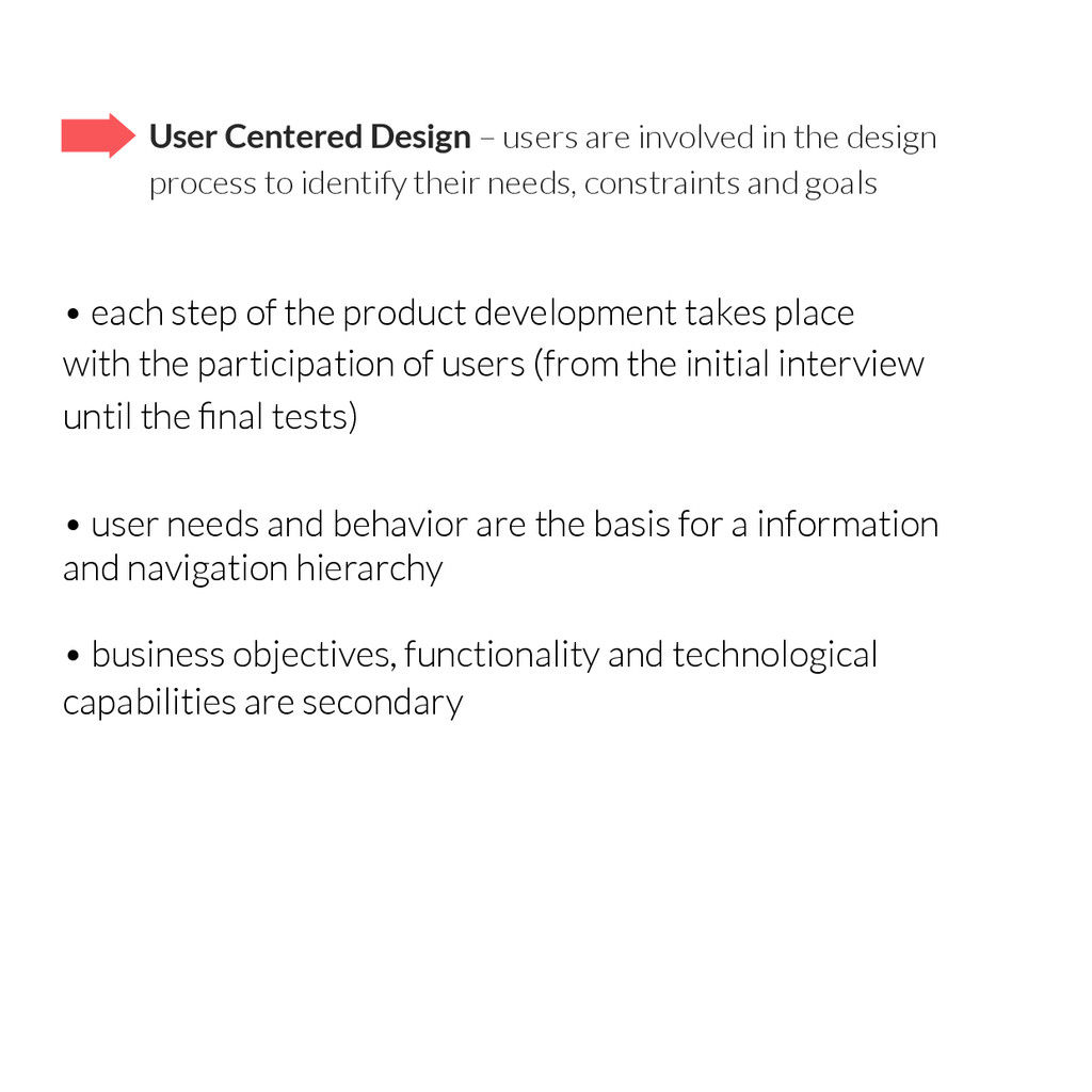
the participation of users (from the initial interview
    until the final tests)
    • user needs and behavior are the basis for a information
    and navigation hierarchy
    • business objectives, functionality and technological
    capabilities are secondary
    User Centered Design – users are involved in the design
    process to identify their needs, constraints and goals

    View Slide

  21. Heuristics by Donald Norman:
    Visibility – I see what is 
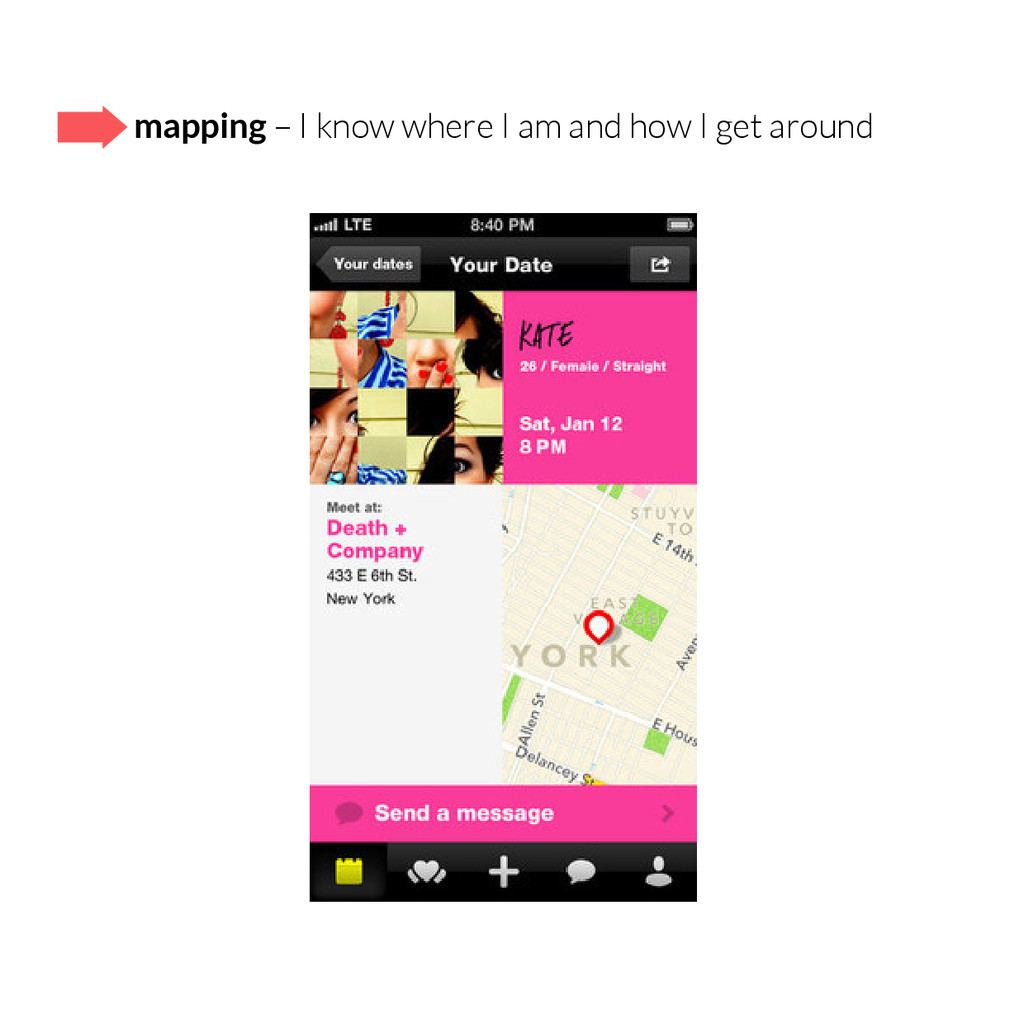
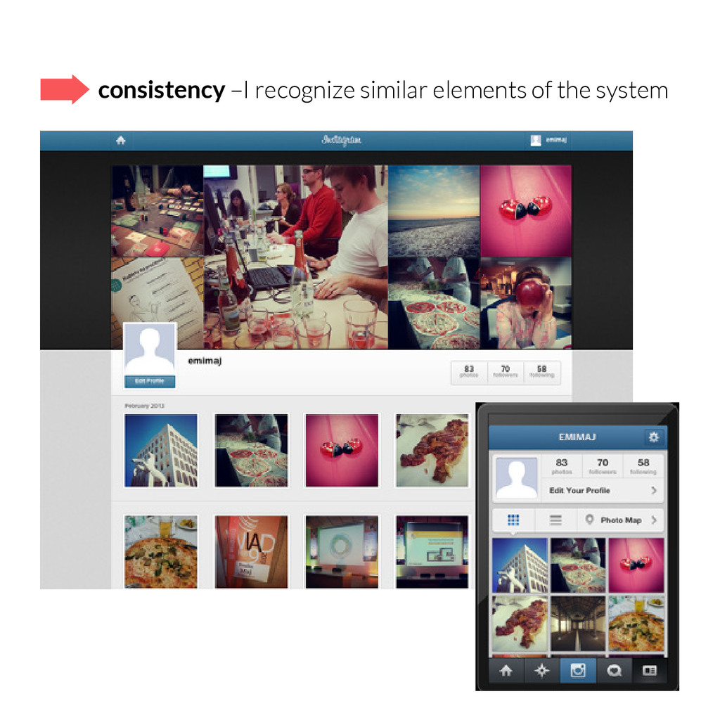
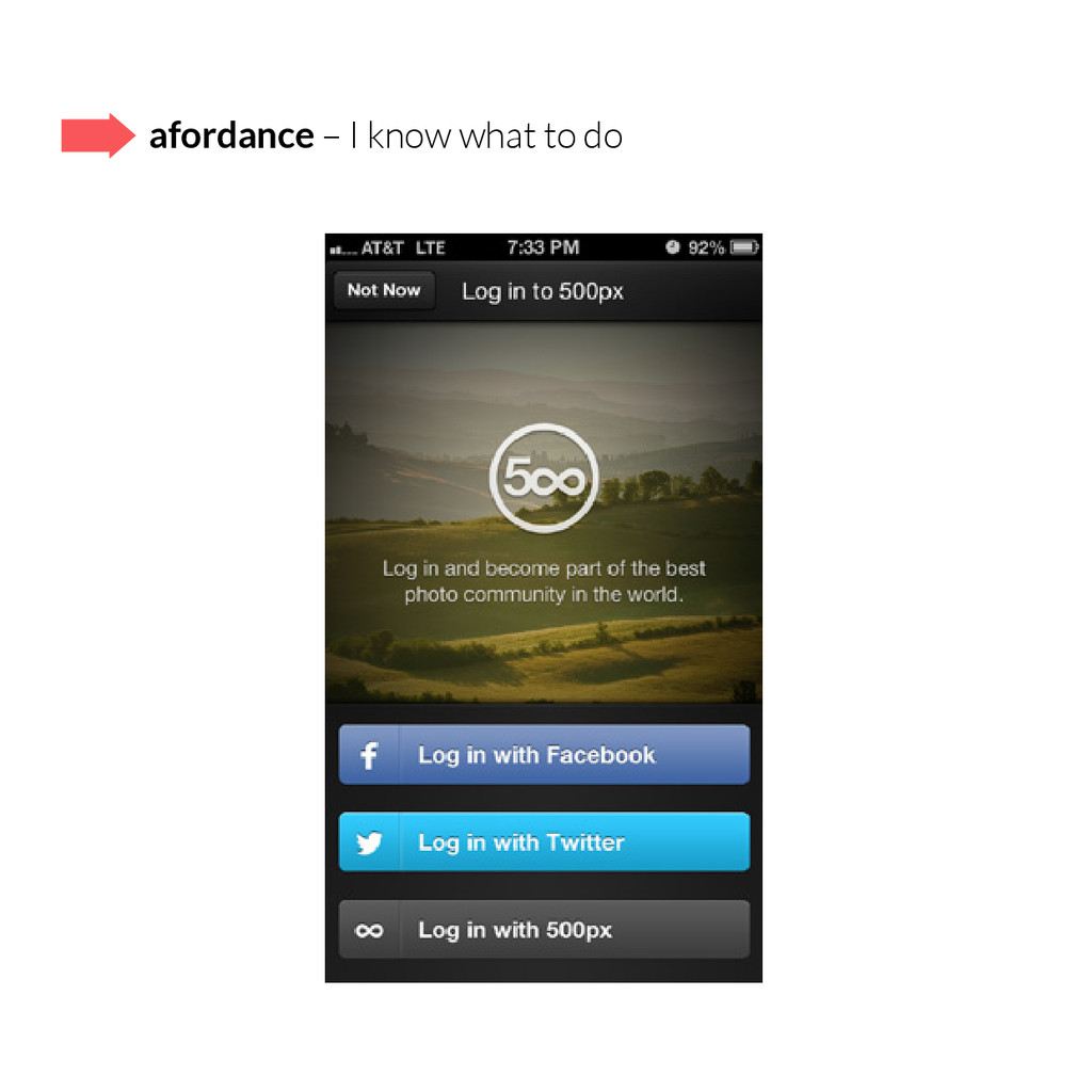
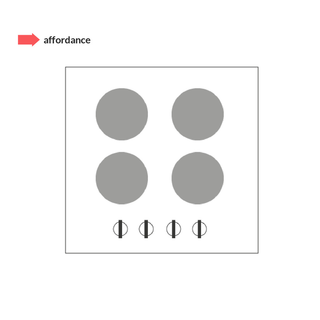
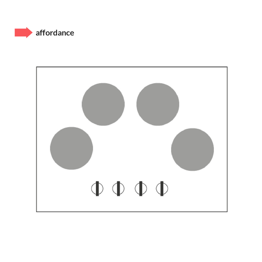
going on
    Feedback – I see the effects of my actions
    Constraints – I know why I’m not able to act
    Mapping – I know where I am and how I get around
    Consistency –I recognize similar elements of the system
    Afordance – I know what to do
    heuristics

    View Slide

  22. visibility – I see what is going on

    View Slide

  23. feedback – I see the effects of my actions

    View Slide

  24. constraints – I know why I’m not able to act

    View Slide

  25. mapping – I know where I am and how I get around

    View Slide

  26. consistency –I recognize similar elements of the system

    View Slide

  27. afordance – I know what to do

    View Slide

  28. affordance

    View Slide

  29. affordance

    View Slide

  30. affordance

    View Slide

  31. Workshop.
    15 min
    Makes your mockups better!

    View Slide

  32. • We tend to contain information in 3-4 groups
    (e.g. 
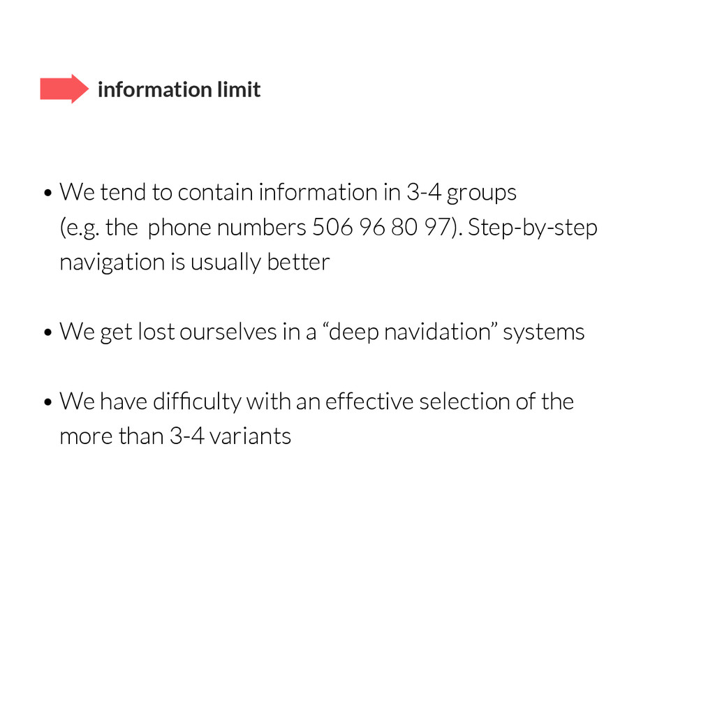
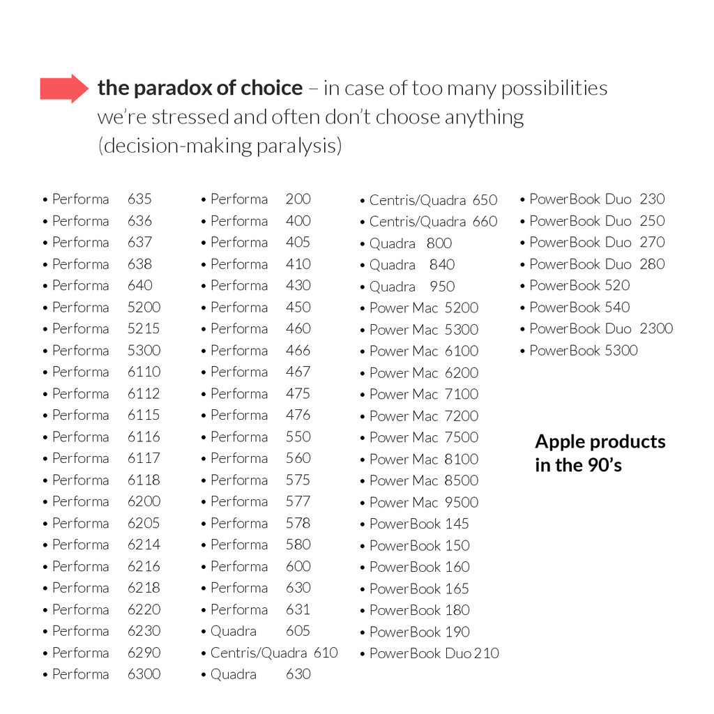
the phone numbers 506 96 80 97). Step-by-step
    navigation is usually better
    • We get lost ourselves in a “deep navidation” systems
    • We have difficulty with an effective selection of the
    more than 3-4 variants
    information limit

    View Slide

  33. the paradox of choice – in case of too many possibilities
    we’re stressed and often don’t choose anything
    (decision-making paralysis)
    • Performa 635
    • Performa 636
    • Performa 637
    • Performa 638
    • Performa 640
    • Performa 5200
    • Performa 5215
    • Performa 5300
    • Performa 6110
    • Performa 6112
    • Performa 6115
    • Performa 6116
    • Performa 6117
    • Performa 6118
    • Performa 6200
    • Performa 6205
    • Performa 6214
    • Performa 6216
    • Performa 6218
    • Performa 6220
    • Performa 6230
    • Performa 6290
    • Performa 6300
    • Performa 200
    • Performa 400
    • Performa 405
    • Performa 410
    • Performa 430
    • Performa 450
    • Performa 460
    • Performa 466
    • Performa 467
    • Performa 475
    • Performa 476
    • Performa 550
    • Performa 560
    • Performa 575
    • Performa 577
    • Performa 578
    • Performa 580
    • Performa 600
    • Performa 630
    • Performa 631
    • Quadra 605
    • Centris/Quadra 610
    • Quadra 630
    • Centris/Quadra 650
    • Centris/Quadra 660
    • Quadra 800
    • Quadra 840
    • Quadra 950
    • Power Mac 5200
    • Power Mac 5300
    • Power Mac 6100
    • Power Mac 6200
    • Power Mac 7100
    • Power Mac 7200
    • Power Mac 7500
    • Power Mac 8100
    • Power Mac 8500
    • Power Mac 9500
    • PowerBook 145
    • PowerBook 150
    • PowerBook 160
    • PowerBook 165
    • PowerBook 180
    • PowerBook 190
    • PowerBook Duo 210
    • PowerBook Duo 230
    • PowerBook Duo 250
    • PowerBook Duo 270
    • PowerBook Duo 280
    • PowerBook 520
    • PowerBook 540
    • PowerBook Duo 2300
    • PowerBook 5300
    Apple products
    in the 90’s

    View Slide

  34. the paradox of choice
    Apple products around 2000, after reduction by S. Jobs

    View Slide

  35. range of sharp vision –it’s about ok. 2,5 cm ; reduce the number
    of elements and take care of their proper distinction

    View Slide

  36. Letterpress by
    Loren Brichter
    visual simplicity

    View Slide

  37. first screen – is the most important!
    User should do and see exactly what he’s expecting.

    View Slide

  38. FUX (First User Experience) – when interface can be
    complicated, learn how to use it

    View Slide

  39. suggestions

    View Slide

  40. max. use of mobile screen

    View Slide

  41. direct interaction

    View Slide

  42. gestures
    Flat Pomodoro

    View Slide

  43. minimalism
    Eve Nap Timer

    View Slide

  44. flat design&typography
    Timelet

    View Slide

  45. like Tinder

    View Slide

  46. Workshop.
    15 min
    Build a killer feature!

    View Slide

  47. Emilia Maj
    UX & Graphic Designer
    Thank you.
    www.emimaj.com
    [email protected]
    @emiliamaj

    View Slide