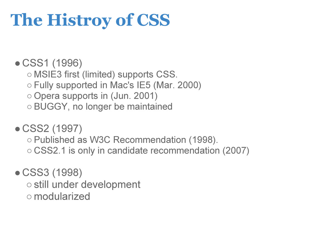
supports CSS. ◦ Fully supported in Mac's IE5 (Mar. 2000) ◦ Opera supports in (Jun. 2001) ◦ BUGGY, no longer be maintained •CSS2 (1997) ◦ Published as W3C Recommendation (1998). ◦ CSS2.1 is only in candidate recommendation (2007) •CSS3 (1998) ◦still under development ◦modularized
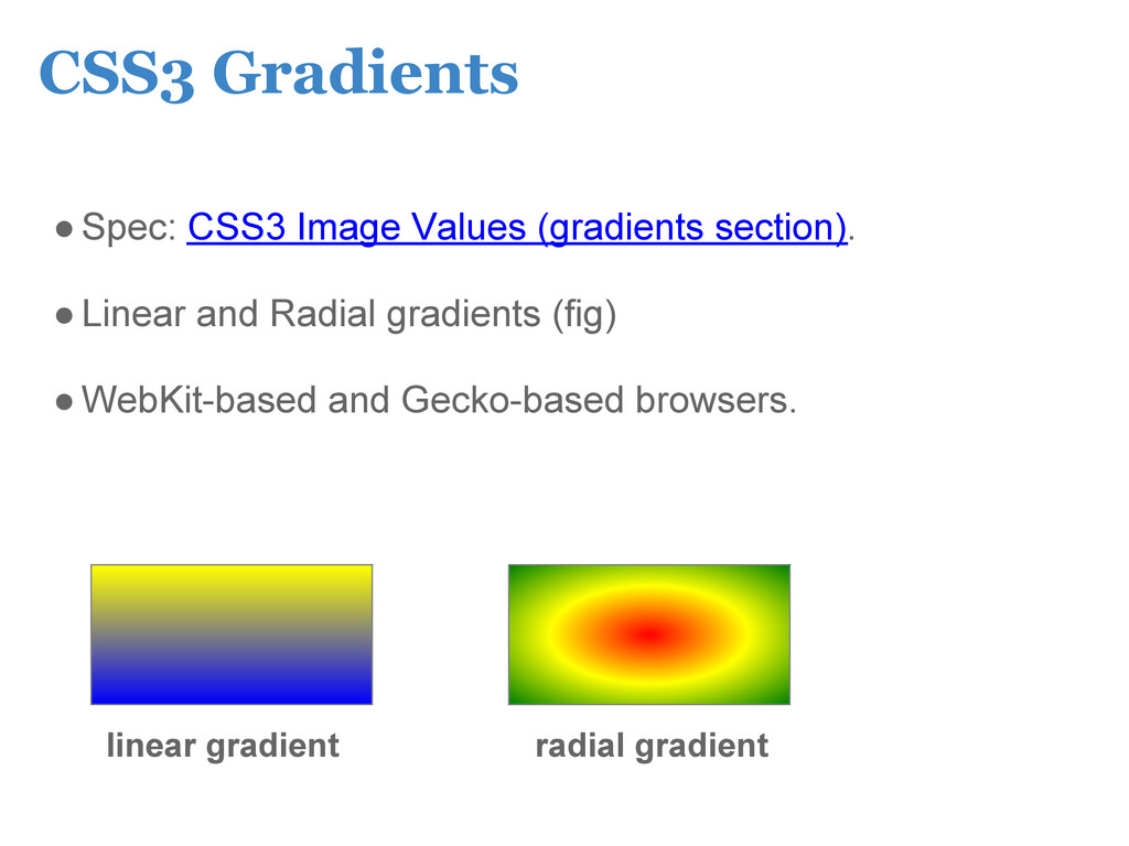
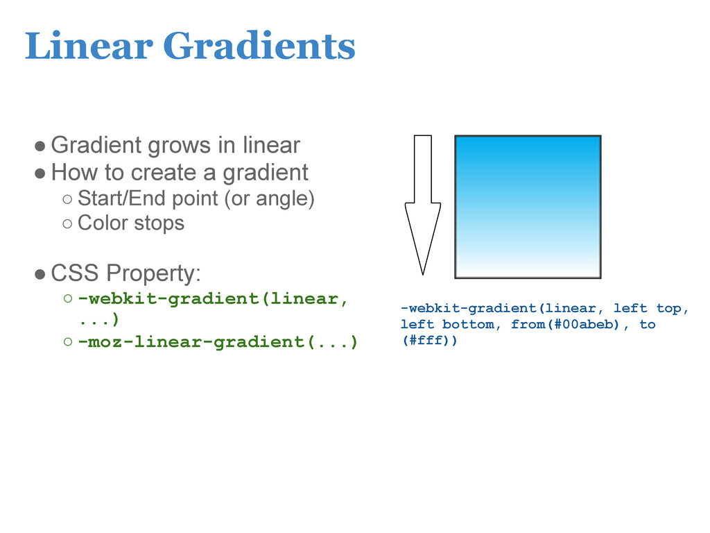
gradient ◦ Start/End point (or angle) ◦ Color stops •CSS Property: ◦ -webkit-gradient(linear, ...) ◦ -moz-linear-gradient(...) -webkit-gradient(linear, left top, left bottom, from(#00abeb), to (#fff))
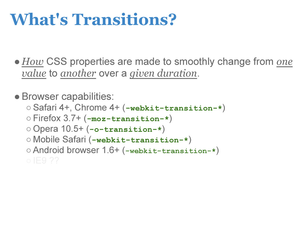
from one value to another over a given duration. •Browser capabilities: ◦ Safari 4+, Chrome 4+ (-webkit-transition-*) ◦ Firefox 3.7+ (-moz-transition-*) ◦ Opera 10.5+ (-o-transition-*) ◦ Mobile Safari (-webkit-transition-*) ◦ Android browser 1.6+ (-webkit-transition-*) ◦ IE9 ??
from one value to another over a given duration. •Browser capabilities: ◦ Safari 4+, Chrome 4+ (-webkit-transition-*) ◦ Firefox 3.7+ (-moz-transition-*) ◦ Opera 10.5+ (-o-transition-*) ◦ Mobile Safari (-webkit-transition-*) ◦ Android browser 1.6+ (-webkit-transition-*) ◦ IE9 ??
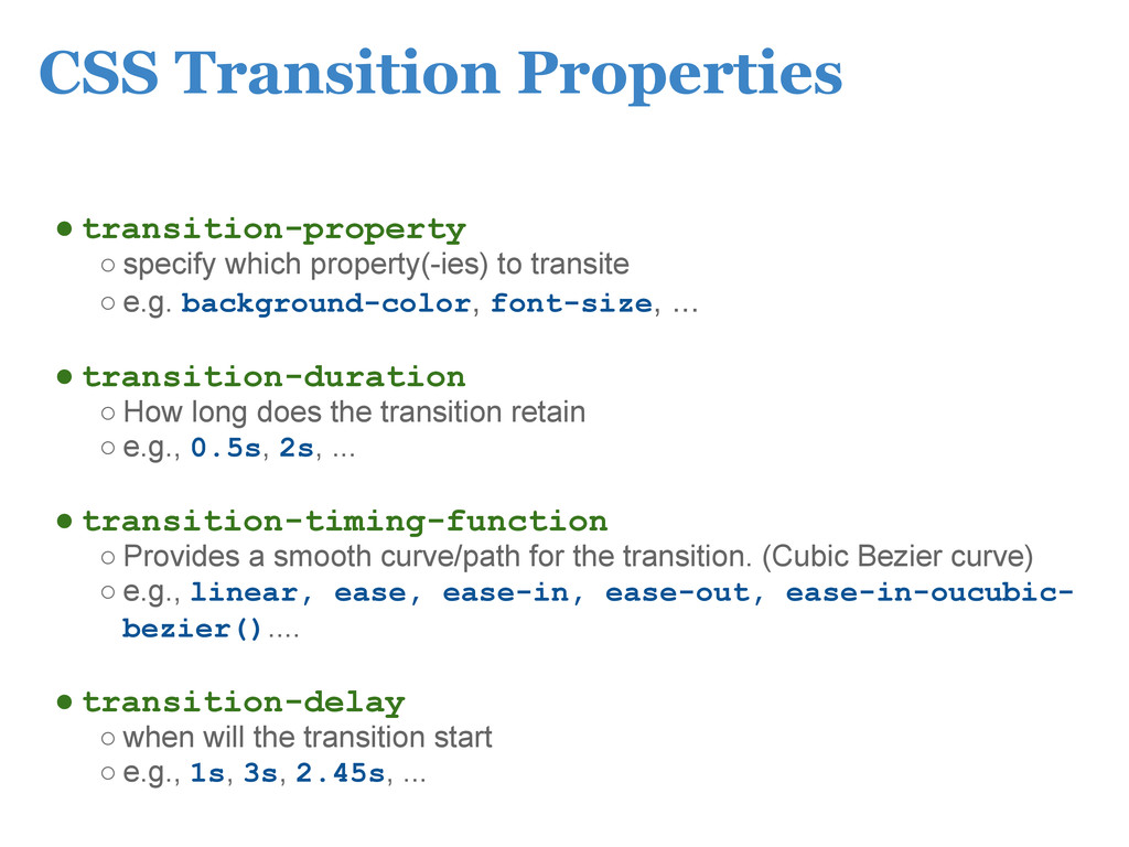
transite ◦ e.g. background-color, font-size, ... • transition-duration ◦ How long does the transition retain ◦ e.g., 0.5s, 2s, ... • transition-timing-function ◦ Provides a smooth curve/path for the transition. (Cubic Bezier curve) ◦ e.g., linear, ease, ease-in, ease-out, ease-in-oucubic- bezier().... • transition-delay ◦ when will the transition start ◦ e.g., 1s, 3s, 2.45s, ...
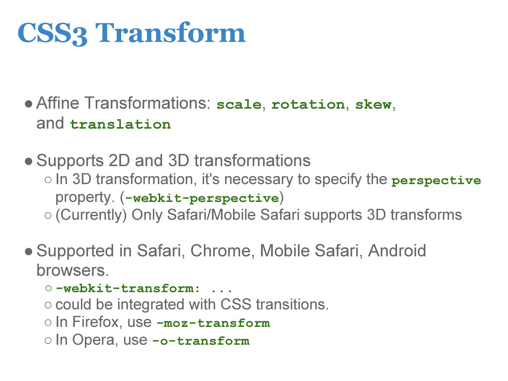
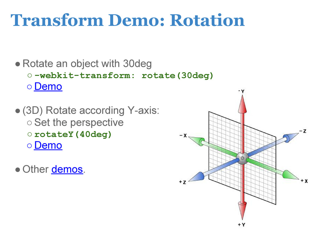
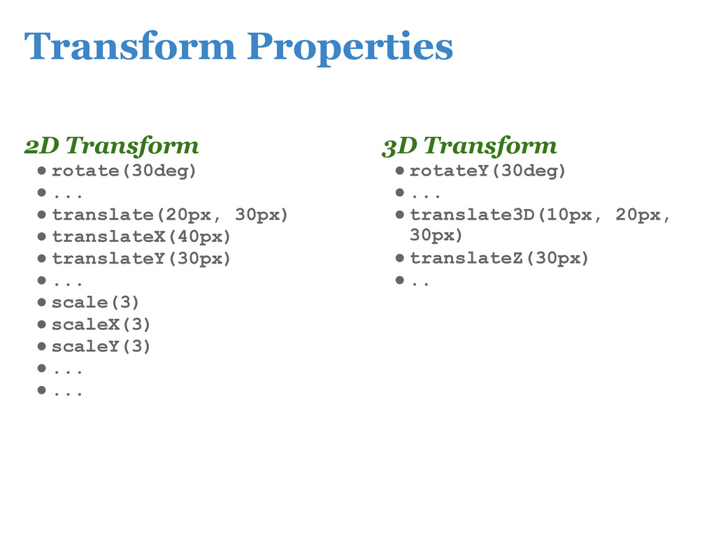
2D and 3D transformations ◦ In 3D transformation, it's necessary to specify the perspective property. (-webkit-perspective) ◦ (Currently) Only Safari/Mobile Safari supports 3D transforms •Supported in Safari, Chrome, Mobile Safari, Android browsers. ◦ -webkit-transform: ... ◦ could be integrated with CSS transitions. ◦ In Firefox, use -moz-transform ◦ In Opera, use -o-transform
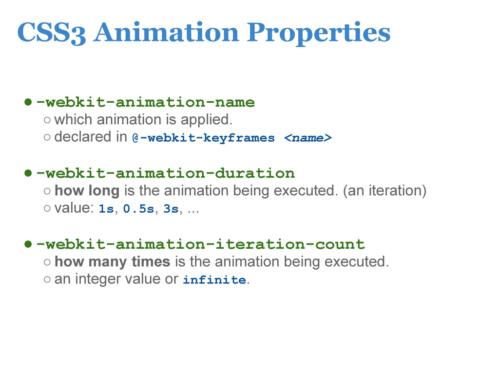
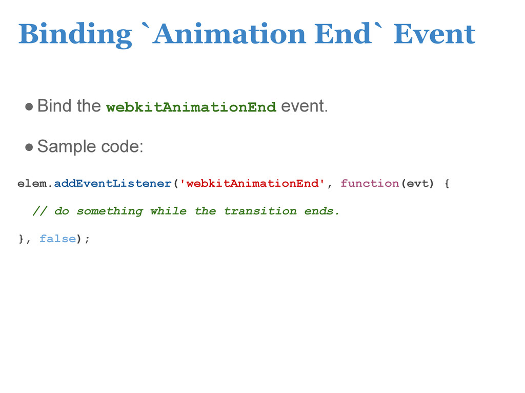
declared in @-webkit-keyframes <name> •-webkit-animation-duration ◦ how long is the animation being executed. (an iteration) ◦ value: 1s, 0.5s, 3s, ... •-webkit-animation-iteration-count ◦ how many times is the animation being executed. ◦ an integer value or infinite.
 ericsk
 kentaroutakeda
 koukimiura
 luccafort
 iidatakuma
 suikabar
 maroon1st
 16bitidol
 yukikurage
 ochtum
 jsoizo
 hananouchi
 findyinc
 bkeepers
 akashhashmi
 sachag
 greggifford
 katarinadahlin
 codingconduct
 sergeychernyshev
 cassininazir
 tammyeverts
 addyosmani
 jonoalderson
 shlominoach
![CSS3 Visual Effects Eric Shangkuan (ericsk) [email protected]](https://files.speakerdeck.com/presentations/0a712f00414401302c0112313d2a366c/slide_0.jpg)