Meeting the needs of your small-screen visitors. A mobile and responsive overview presented to the Campus Communicators group at the University of Notre Dame.
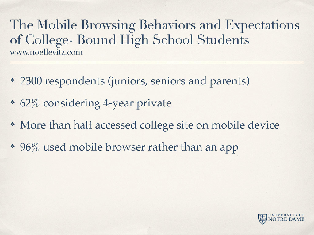
School Students www.noellevitz.com ✤ 2300 respondents (juniors, seniors and parents) ✤ 62% considering 4-year private ✤ More than half accessed college site on mobile device ✤ 96% used mobile browser rather than an app
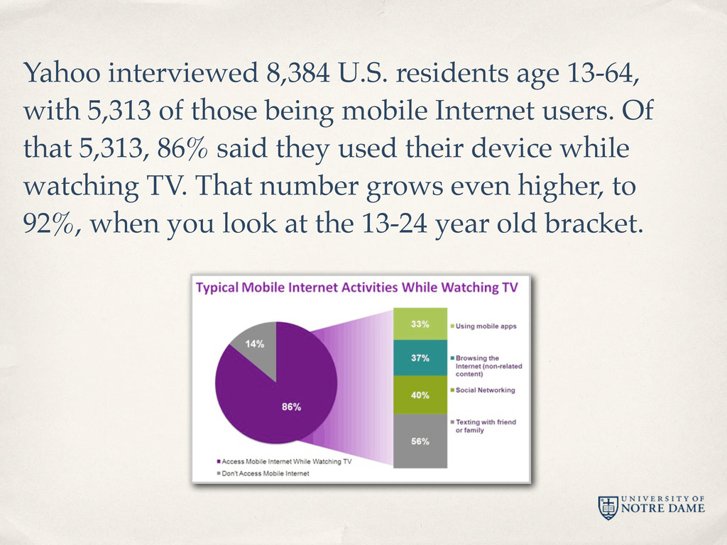
those being mobile Internet users. Of that 5,313, 86% said they used their device while watching TV. That number grows even higher, to 92%, when you look at the 13-24 year old bracket.
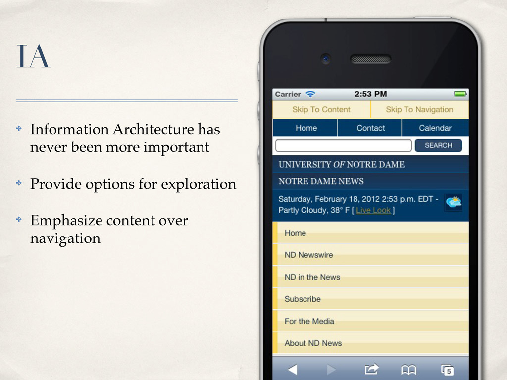
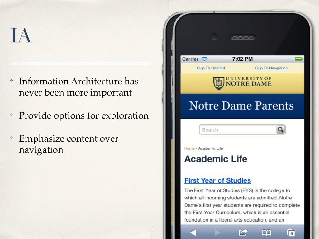
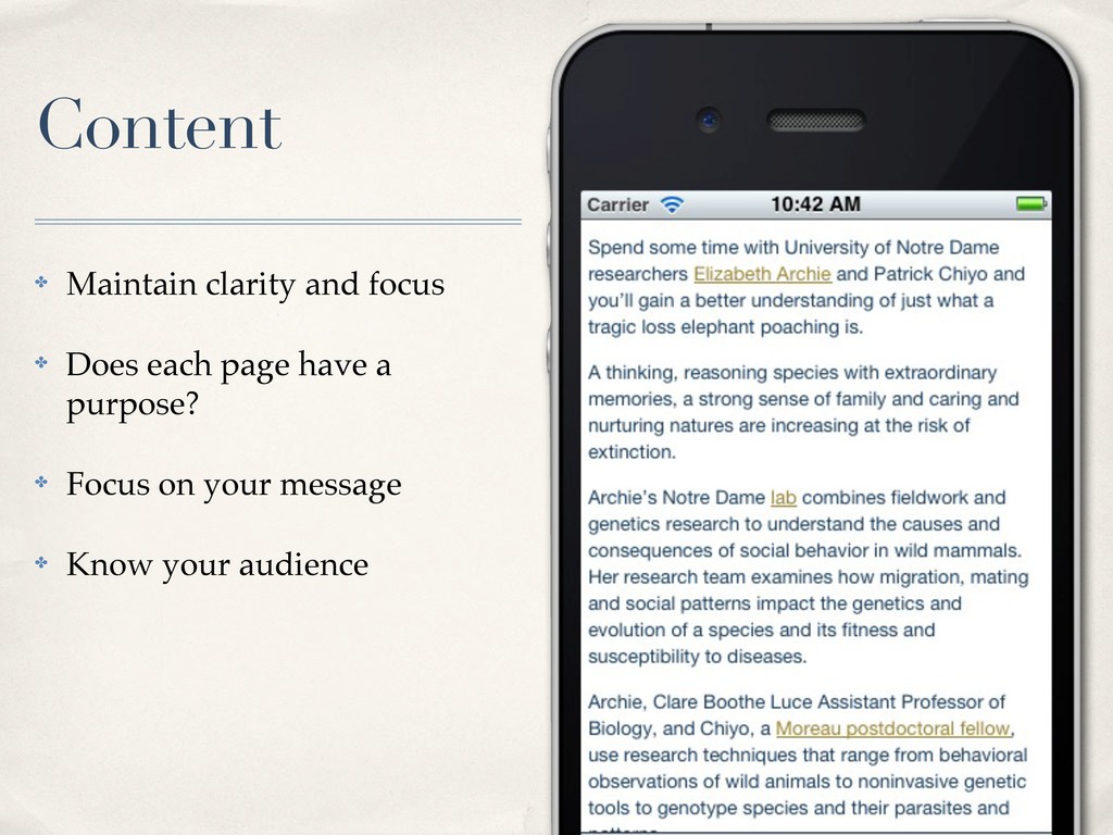
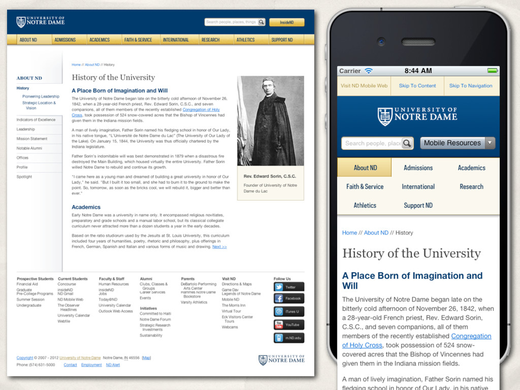
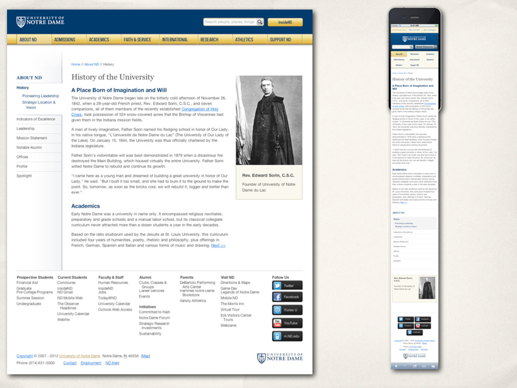
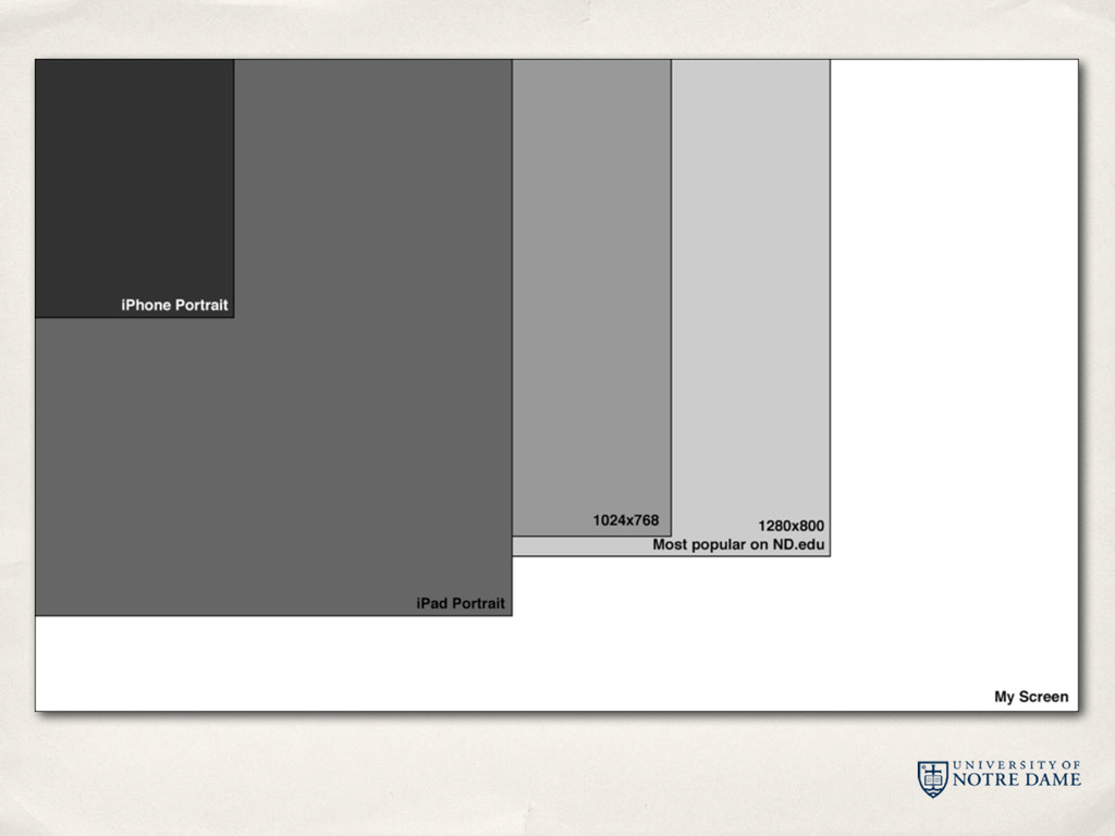
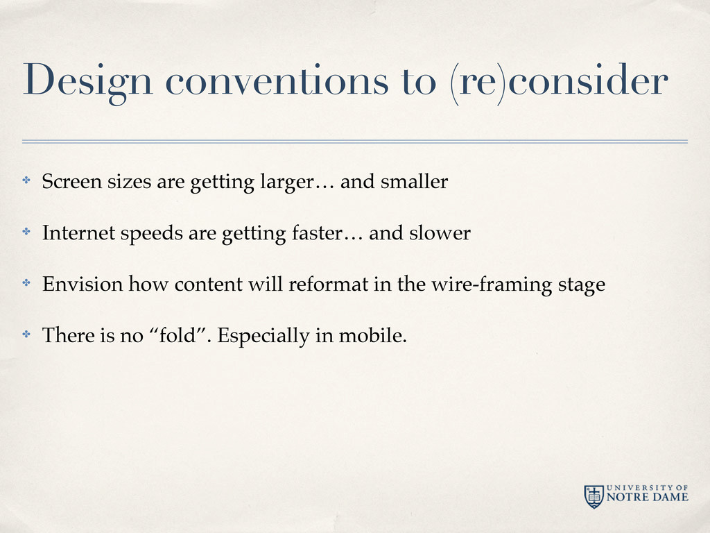
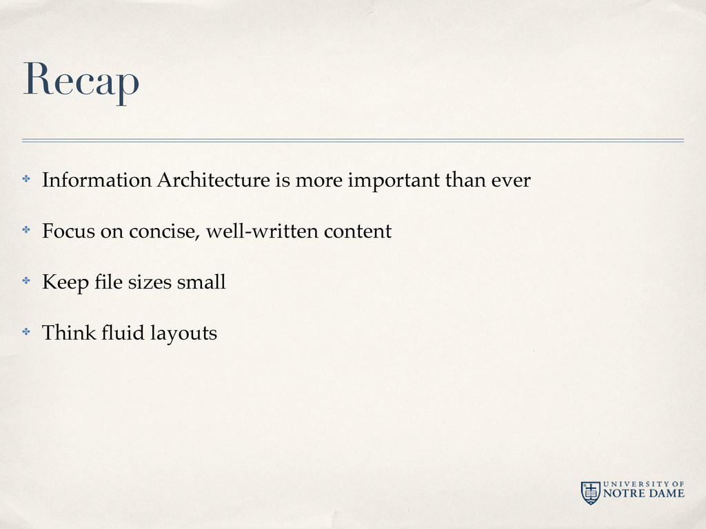
and smaller ✤ Internet speeds are getting faster… and slower ✤ Envision how content will reformat in the wire-framing stage ✤ There is no “fold”. Especially in mobile.
 erunyon
 hageyahhoo
 iwatatomoya
 kamoshika
 shinyasaita
 dmmsre
 hinac0
 tatsuya1970
 prgckwb
 nek0128
 sugimomoto
 mhrtech
 happysamurai294
 szymonslowik
 csswizardry
 pwiseman
 mclloyd
 mlcsv
mlcsv
 tammyeverts
 brad_frost
 aleyda
 mojombo
 ivargrimstad
 sabderemane
![Erik Runyon AgencyND University Communications [email protected] weedygarden.net blogs.nd.edu/nddotedu @erunyon](https://files.speakerdeck.com/presentations/4f4d4e6af120e9001f0020f0/slide_31.jpg)