Upgrade to Pro — share decks privately, control downloads, hide ads and more …

CSS from the future

FEVR
February 23, 2017

CSS from the future

FEVR

February 23, 2017
Tweet

More Decks by FEVR

Other Decks in Technology

Transcript

  1. How to define a property :root { --button-color: blue; --align:

    left; } header { --header-height: 300px; }
  2. <body> <a>Link 1</a> <footer> <a>Link 2</a> </footer> </body> Inheritance :root

    { --link: red } footer { --link: blue } a { color: var(--link) } <body> <a>Link 1</a> <footer> <a>Link 2</a> </footer> </body> $link: red footer { $link: blue } a { color: $link }
  3. <body> <a>Link 1</a> <footer> <a>Link 2</a> </footer> </body> Inheritance compiled

    :root { --link: red } footer { --link: blue } a { color: var(--link) } <body> <a>Link 1</a> <footer> <a>Link 2</a> </footer> </body> $link: red footer { $link: blue } a { color: $link red }
  4. <body> <a>Link 1</a> <footer> <a>Link 2</a> </footer> </body> Inheritance :root

    { --link: red } footer { --link: blue } a { color: var(--link) } <body> <a>Link 1</a> <footer> <a>Link 2</a> </footer> </body> $link: red footer { $link: blue } a { color: $link } Preprocessors: Nope
  5. :root { --gutter: 10px; } @media (min-width: 768px) { :root

    { --gutter: 15px; } } article { padding: var(--gutter); } Media queries $gutter: 10px; @media (min-width: 768px) { $gutter: 15px; } article { padding: $gutter; }
  6. :root { --gutter: 10px; } @media (min-width: 768px) { :root

    { --gutter: 15px; } } article { padding: var(--gutter); } Media queries compiled $gutter: 10px; @media (min-width: 768px) { $gutter: 15px; } article { padding: $gutter 10px; }
  7. :root { --gutter: 10px; } @media (min-width: 768px) { :root

    { --gutter: 15px; } } article { padding: var(--gutter); } Media queries $gutter: 10px; @media (min-width: 768px) { $gutter: 15px; } article { padding: $gutter; } Preprocessors: Nope
  8. :root { --gutter: 10px; } @media (min-width: 768px) { :root

    { --gutter: 15px; } } article { padding: var(--gutter); } Preprocessors solution $gutter: 10px; $gutter-large: 15px; @media (min-width: 768px) { article { padding: $gutter-large; } } article { padding: $gutter; }
  9. But… :root { --gutter: 10px; } @media (min-width: 768px) {

    :root { --gutter: 15px; } } article.class { padding: var(--gutter); } $gutter: 10px; $gutter-large: 15px; @media (min-width: 768px) { article { padding: $gutter-large; } } article.class { padding: $gutter; }
  10. <body> <a>Link 1</a> <footer> <a>Link 2</a> <section> <a>Link 3</a> </section>

    </footer> </body> Base rule a { background: var(--link, red) }
  11. <body> <a>Link 1</a> <footer> <a>Link 2</a> <section> <a>Link 3</a> </section>

    </footer> </body> Override variables, not properties section { --link: green } a { background: var(--link, red) }
  12. <body> <a>Link 1</a> <footer> <a>Link 2</a> <section> <a>Link 3</a> </section>

    </footer> </body> Make Cascade Love, not Specificity War section { --link: green } footer { --link: blue } a { background: var(--link, red) }
  13. Old school... section { --link: green } footer { --link:

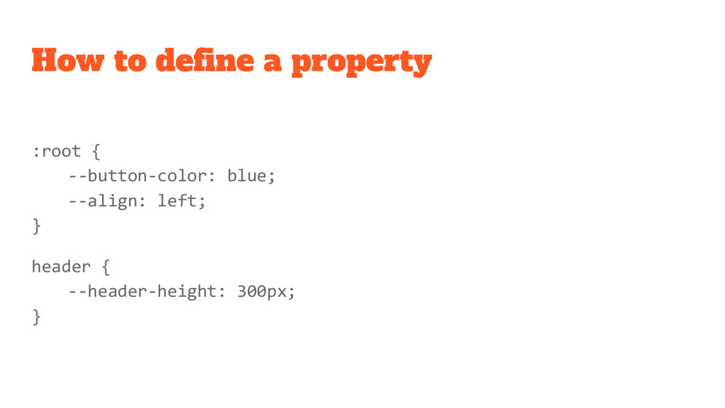
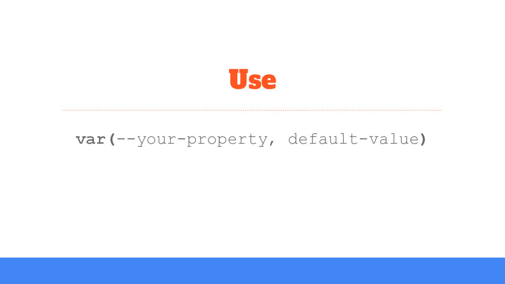
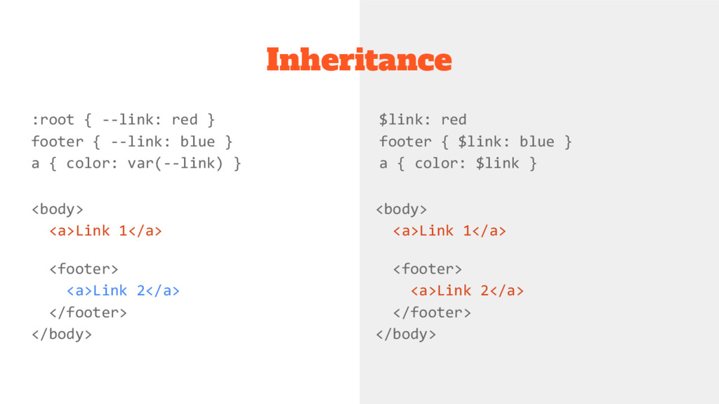
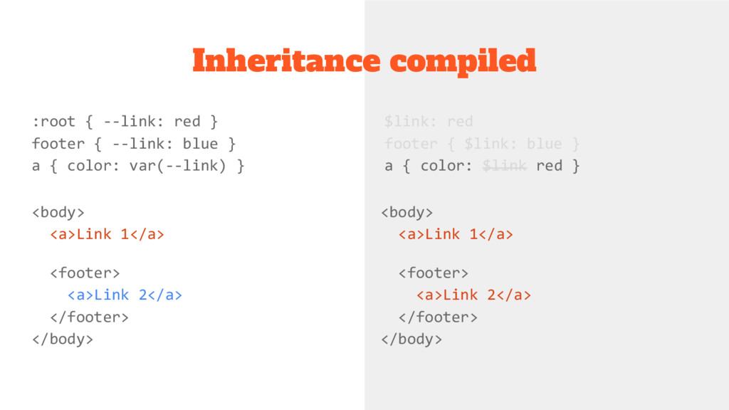
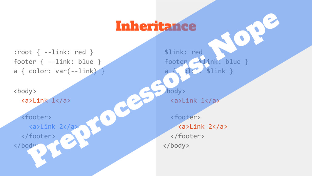
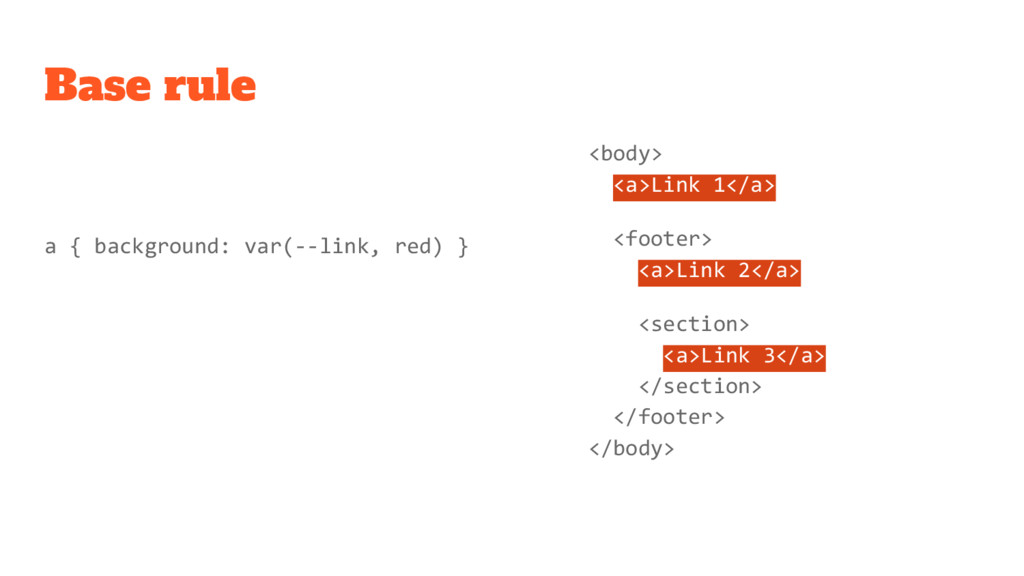
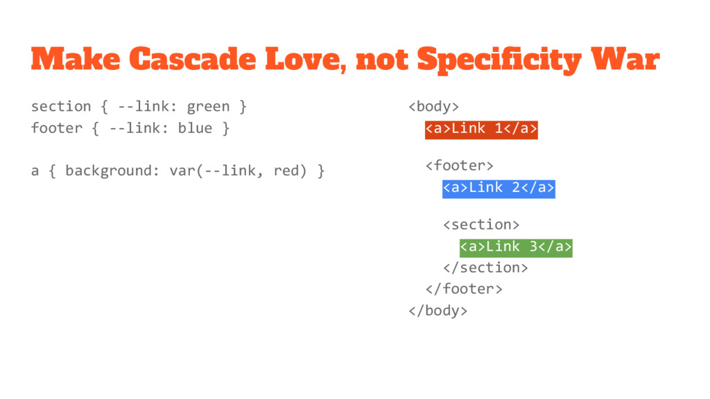
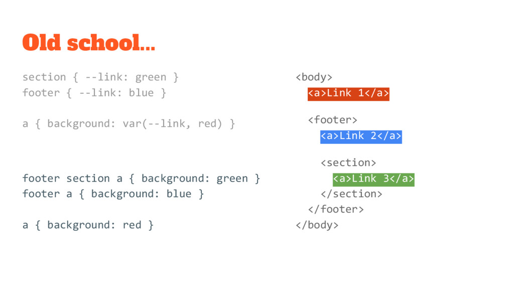
    blue } a { background: var(--link, red) } footer section a { background: green } footer a { background: blue } a { background: red } <body> <a>Link 1</a> <footer> <a>Link 2</a> <section> <a>Link 3</a> </section> </footer> </body>
  14. Old school... section { --link: green } footer { --link:

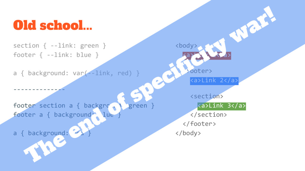
    blue } a { background: var(--link, red) } -------------- footer section a { background: green } footer a { background: blue } a { background: red } <body> <a>Link 1</a> <footer> <a>Link 2</a> <section> <a>Link 3</a> </section> </footer> </body> The end of specificity war!
  15. Fallback property @supports (--foo: green) { body { color: var(--my-color);

    } } Feature query color: red; color: var(--my-color, red);
  16. <body> <a>Link 1</a> <footer> <a>Link 2</a> <section> <a>Link 3</a> </section>

    </footer> </body> We already use CSS variables body { font-size: 18px } footer { font-size: 16px } section { font-size: 14px } a { border-width: 0.2em; padding-right: 2em; }
  17. <body> <a>Link 1</a> <footer> <a>Link 2</a> <section> <a>Link 3</a> </section>

    </footer> </body> The superhero: currentColor body { color: red } footer { color: blue } section { color: green } a { border-color: currentColor; }
  18. .theme(@bg: gray, @col: red, @var: blue) { .box { background:

    @bg } .button { color: @col } .box .button { color: @var } } .theme(); .dark { .theme(black, orange, lightgreen); } Theming with LESS
  19. .box { background: gray } .button { color: red }

    .box .button { color: blue } .dark .box { background: black } .dark .button { color: orange } .dark .box .button { color: lightgreen } Theming with CSS
  20. .box { --col: var(--alt, blue); background: var(--bg, lightgray); } .button

    { color: var(--col, red); } .dark { --bg: black; --col: orange; --alt: lightgreen; } Theming with CSS Variables