Upgrade to Pro
— share decks privately, control downloads, hide ads and more …
Speaker Deck
Features
Speaker Deck
PRO
Sign in
Sign up for free
Search
Search
Getting Sassy with CSS: An Introduction to Writ...
Search
Erin Smith
November 15, 2019
Programming
170
0
Share
Embed
Copy iframe code
Copy JS code
Copy link
Start on current slide
Getting Sassy with CSS: An Introduction to Writing CSS with Sass
Erin Smith
November 15, 2019
More Decks by Erin Smith
See All by Erin Smith
Website Maintenance: What You Need To Know to Keep Your Site in Peak Condition
girlybrackets
0
140
Other Decks in Programming
See All in Programming
【やさしく解説 設計編 #1】「ドメイン駆動」と「実装駆動」ってなに? 〜設計の考え方を、たとえ話で学ぼう〜
panda728
PRO
1
120
これからAgentCoreを触る方へ トレンドはGatewayです
har1101
6
500
Embedded SREと共に達成した会員管理システムのAWS移行 - SRE NEXT 2026 ランチスポンサーセッション
niftycorp
PRO
1
2.9k
鹿野さんに聞く!『TypeScriptコードレシピ集』で磨く実践力
tonkotsuboy_com
4
1.1k
琵琶湖の水は止められてもNet--HTTPのリトライは止められない / You might be able to stop the water flow of Lake Biwa but you can't stop Net::HTTP retries
luccafort
PRO
0
430
act2-costs.pdf
sumedhbala
0
120
AWS CDK を「作」ってみた 〜フルスクラッチで見えた CDK の裏側〜 / aws-cdk-from-scratch
gotok365
3
500
Built Our Own Background Agent at LayerX #aidevex_findy
layerx
PRO
8
3.1k
分散システム、なんですぐ死んでしまうん?耐障害性を高めたいあなたのためのレジリエンスパターン入門
mshibuya
7
6.7k
Prismを使った型安全な暗号化_関数型まつり2026
_fhhmm
0
150
PHPだって関数型したい 〜できること、できないこと〜 / fp-in-php
jsoizo
1
240
ルールを書いて終わらせないハーネスエンジニアリング
yug1224
4
1.7k
Featured
See All Featured
Applied NLP in the Age of Generative AI
inesmontani
PRO
4
2.4k
Color Theory Basics | Prateek | Gurzu
gurzu
0
400
Amusing Abliteration
ianozsvald
1
240
SEOcharity - Dark patterns in SEO and UX: How to avoid them and build a more ethical web
sarafernandez
0
220
Introduction to Domain-Driven Design and Collaborative software design
baasie
1
910
Imperfection Machines: The Place of Print at Facebook
scottboms
270
14k
How to optimise 3,500 product descriptions for ecommerce in one day using ChatGPT
katarinadahlin
PRO
1
3.7k
Put a Button on it: Removing Barriers to Going Fast.
kastner
60
4.4k
Stewardship and Sustainability of Urban and Community Forests
pwiseman
0
380
Design in an AI World
tapps
1
270
Winning Ecommerce Organic Search in an AI Era - #searchnstuff2025
aleyda
1
2.1k
Let's Do A Bunch of Simple Stuff to Make Websites Faster
chriscoyier
508
140k
Transcript
Getting Sassy with CSS Erin Smith
What we are covering: What are CSS preprocessors What advantages
do they have How to get set up to use them yourself
None
None
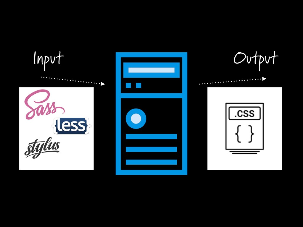
Input Output
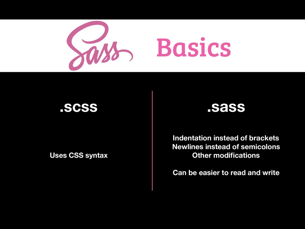
Basics .scss .sass Uses CSS syntax Indentation instead of brackets
Newlines instead of semicolons Other modifications Can be easier to read and write
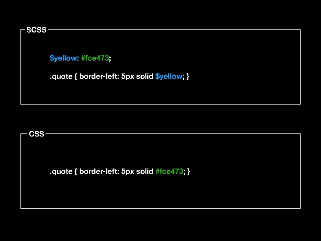
$variables
SCSS CSS $yellow: #fce473; .quote { border-left: 5px solid $yellow;
} .quote { border-left: 5px solid #fce473; }
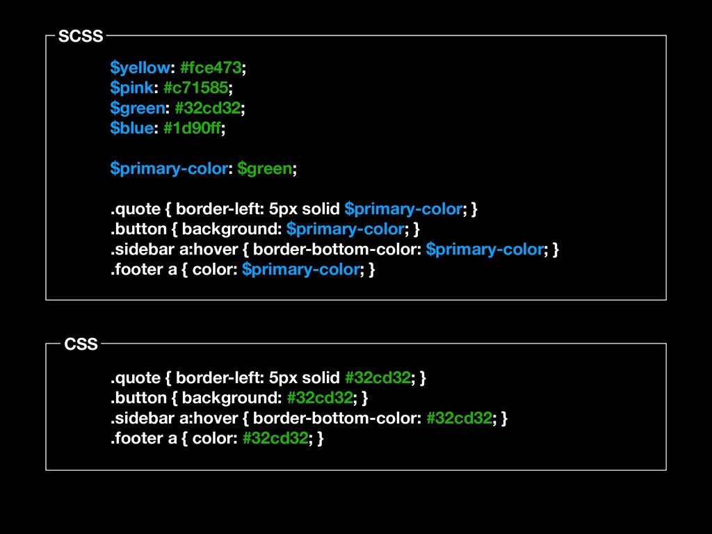
SCSS CSS $yellow: #fce473; $pink: #c71585; $green: #32cd32; $blue: #1d90ff;
$primary-color: $green; .quote { border-left: 5px solid $primary-color; } .button { background: $primary-color; } .sidebar a:hover { border-bottom-color: $primary-color; } .footer a { color: $primary-color; } .quote { border-left: 5px solid #32cd32; } .button { background: #32cd32; } .sidebar a:hover { border-bottom-color: #32cd32; } .footer a { color: #32cd32; }
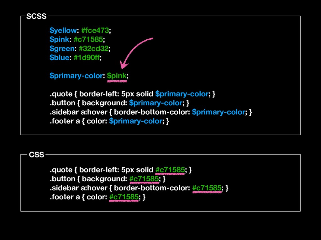
SCSS CSS $yellow: #fce473; $pink: #c71585; $green: #32cd32; $blue: #1d90ff;
$primary-color: $pink; .quote { border-left: 5px solid $primary-color; } .button { background: $primary-color; } .sidebar a:hover { border-bottom-color: $primary-color; } .footer a { color: $primary-color; } .quote { border-left: 5px solid #c71585; } .button { background: #c71585; } .sidebar a:hover { border-bottom-color: #c71585; } .footer a { color: #c71585; }
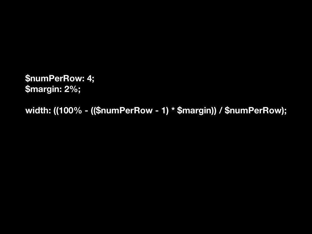
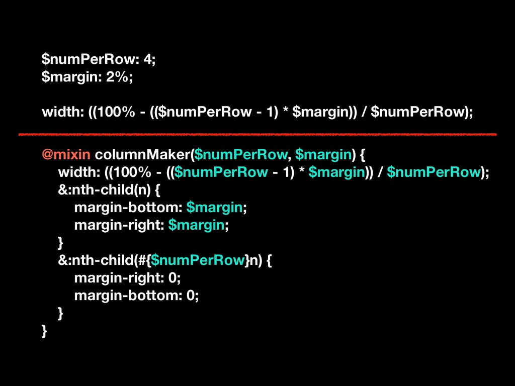
Math
$numPerRow: 4; $margin: 2%; width: ((100% - (($numPerRow - 1)
* $margin)) / $numPerRow);
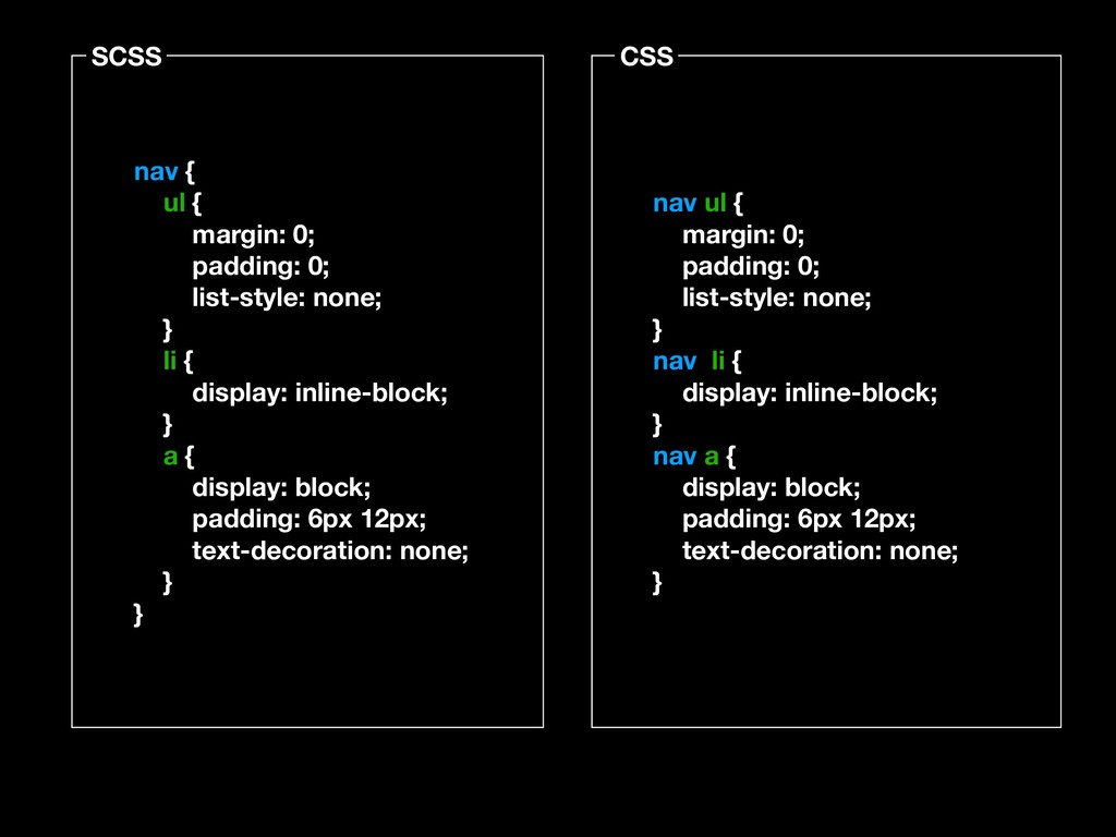
Nesting
SCSS CSS nav { ul { margin: 0; padding: 0;
list-style: none; } li { display: inline-block; } a { display: block; padding: 6px 12px; text-decoration: none; } } nav ul { margin: 0; padding: 0; list-style: none; } nav li { display: inline-block; } nav a { display: block; padding: 6px 12px; text-decoration: none; }
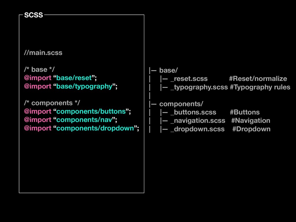
@imports
None
SCSS //main.scss /* base */ @import “base/reset”; @import “base/typography”; /*
components */ @import “components/buttons”; @import “components/nav”; @import “components/dropdown”; |— base/ | |— _reset.scss #Reset/normalize | |— _typography.scss #Typography rules | |— components/ | |— _buttons.scss #Buttons | |— _navigation.scss #Navigation | |— _dropdown.scss #Dropdown
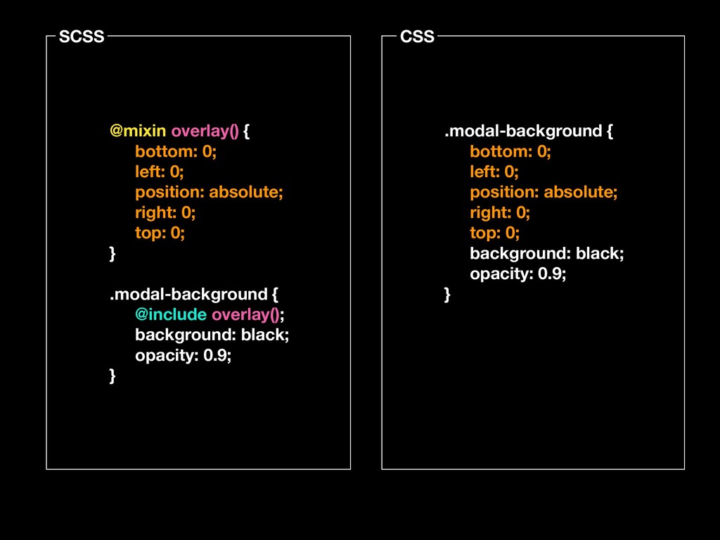
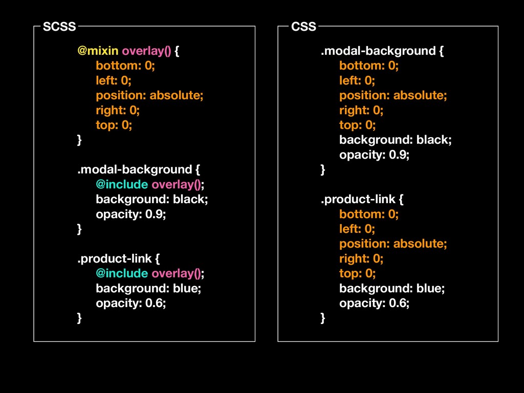
@mixins
SCSS CSS @mixin overlay() { bottom: 0; left: 0; position:
absolute; right: 0; top: 0; } .modal-background { @include overlay(); background: black; opacity: 0.9; } .modal-background { bottom: 0; left: 0; position: absolute; right: 0; top: 0; background: black; opacity: 0.9; }
SCSS CSS @mixin overlay() { bottom: 0; left: 0; position:
absolute; right: 0; top: 0; } .modal-background { @include overlay(); background: black; opacity: 0.9; } .product-link { @include overlay(); background: blue; opacity: 0.6; } .modal-background { bottom: 0; left: 0; position: absolute; right: 0; top: 0; background: black; opacity: 0.9; } .product-link { bottom: 0; left: 0; position: absolute; right: 0; top: 0; background: blue; opacity: 0.6; }
SCSS CSS @mixin border-radius($radius) { -webkit-border-radius: $radius; -moz-border-radius: $radius; -ms-border-radius:
$radius; border-radius: $radius; } .box { @include border-radius(3px); } .box { -webkit-border-radius: 3px; -moz-border-radius: 3px; -ms-border-radius: 3px; border-radius: 3px; }
$numPerRow: 4; $margin: 2%; width: ((100% - (($numPerRow - 1)
* $margin)) / $numPerRow); @mixin columnMaker($numPerRow, $margin) { width: ((100% - (($numPerRow - 1) * $margin)) / $numPerRow); &:nth-child(n) { margin-bottom: $margin; margin-right: $margin; } &:nth-child(#{$numPerRow}n) { margin-right: 0; margin-bottom: 0; } }
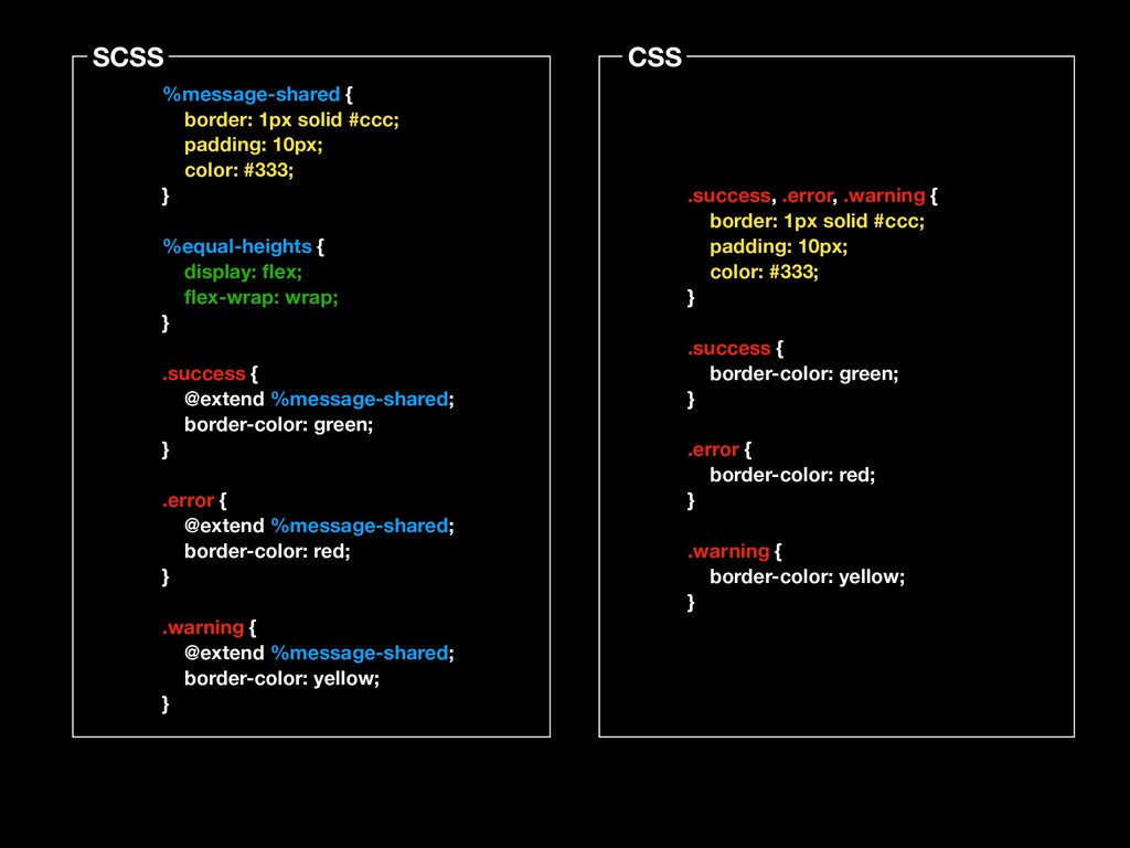
@extend
SCSS CSS %message-shared { border: 1px solid #ccc; padding: 10px;
color: #333; } %equal-heights { display: flex; flex-wrap: wrap; } .success { @extend %message-shared; border-color: green; } .error { @extend %message-shared; border-color: red; } .warning { @extend %message-shared; border-color: yellow; } .success, .error, .warning { border: 1px solid #ccc; padding: 10px; color: #333; } .success { border-color: green; } .error { border-color: red; } .warning { border-color: yellow; }
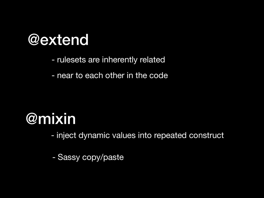
@extend - rulesets are inherently related - near to each
other in the code @mixin - inject dynamic values into repeated construct - Sassy copy/paste
Loops
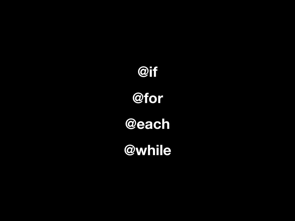
@if @for @each @while
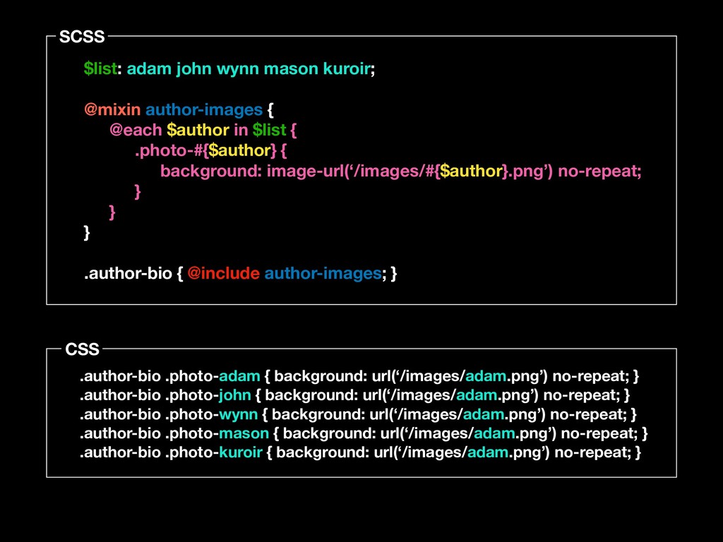
SCSS CSS $list: adam john wynn mason kuroir; @mixin author-images
{ @each $author in $list { .photo-#{$author} { background: image-url(‘/images/#{$author}.png’) no-repeat; } } } .author-bio { @include author-images; } .author-bio .photo-adam { background: url(‘/images/adam.png’) no-repeat; } .author-bio .photo-john { background: url(‘/images/adam.png’) no-repeat; } .author-bio .photo-wynn { background: url(‘/images/adam.png’) no-repeat; } .author-bio .photo-mason { background: url(‘/images/adam.png’) no-repeat; } .author-bio .photo-kuroir { background: url(‘/images/adam.png’) no-repeat; }
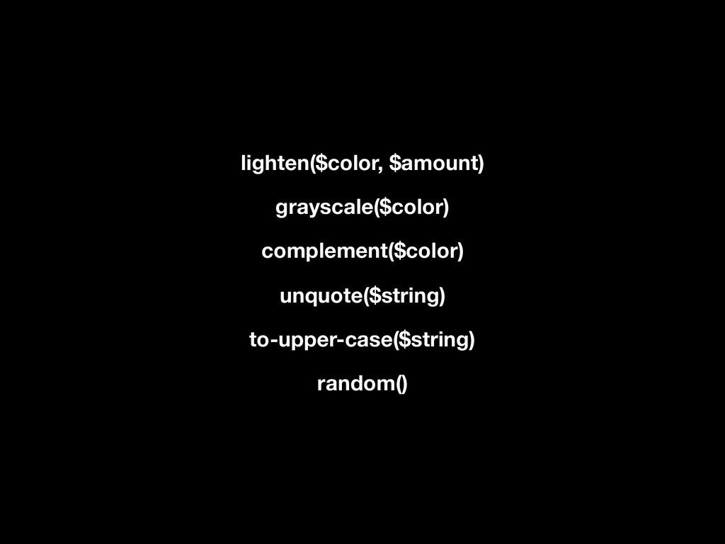
Pre-built Functions
lighten($color, $amount) grayscale($color) complement($color) unquote($string) to-upper-case($string) random()
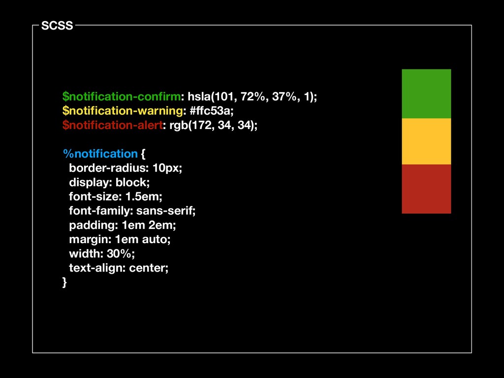
$notification-confirm: hsla(101, 72%, 37%, 1); $notification-warning: #ffc53a; $notification-alert: rgb(172, 34,
34); %notification { border-radius: 10px; display: block; font-size: 1.5em; font-family: sans-serif; padding: 1em 2em; margin: 1em auto; width: 30%; text-align: center; } SCSS
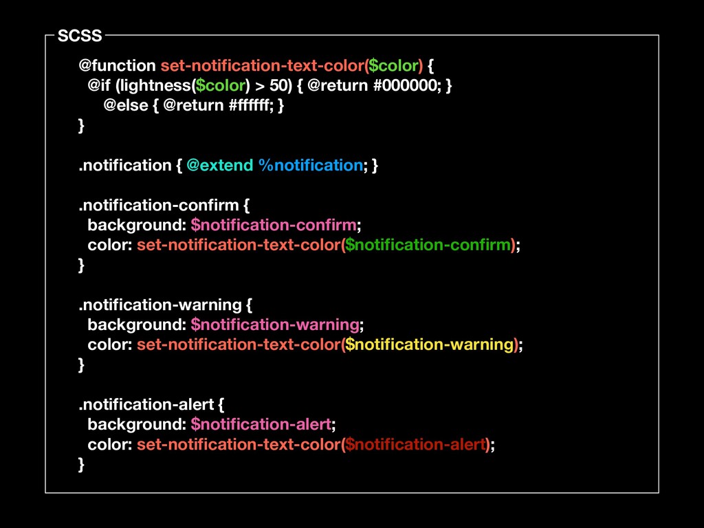
@function set-notification-text-color($color) { @if (lightness($color) > 50) { @return #000000;
} @else { @return #ffffff; } } .notification { @extend %notification; } .notification-confirm { background: $notification-confirm; color: set-notification-text-color($notification-confirm); } .notification-warning { background: $notification-warning; color: set-notification-text-color($notification-warning); } .notification-alert { background: $notification-alert; color: set-notification-text-color($notification-alert); } SCSS
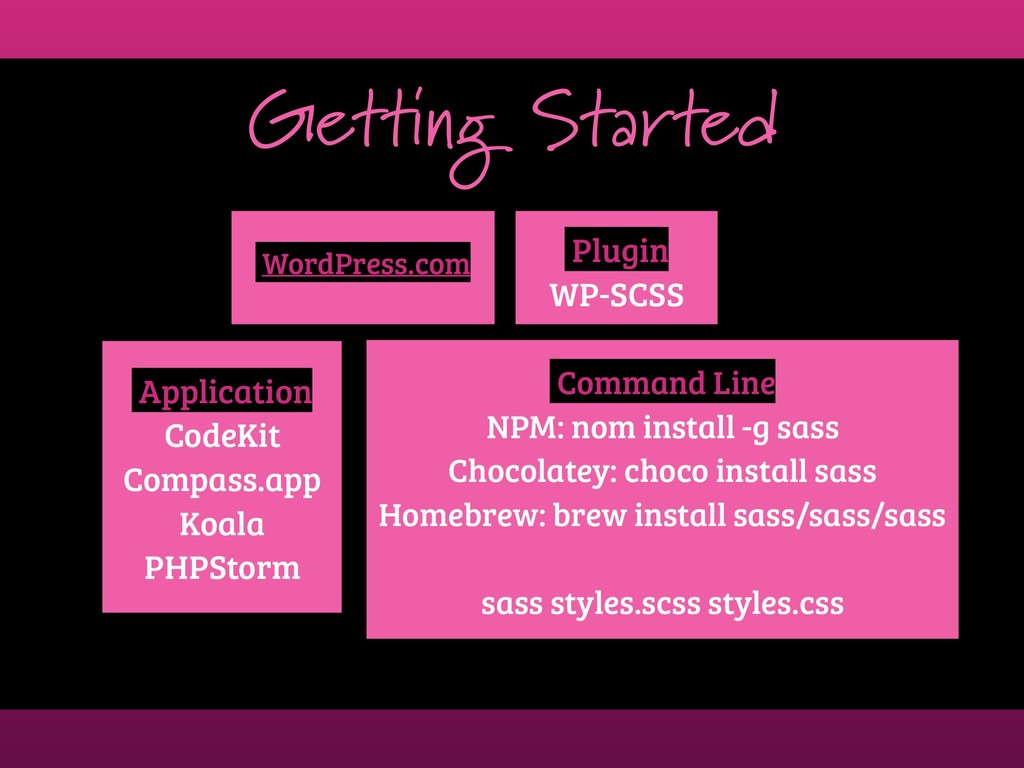
Getting Started WordPress.com Plugin WP-SCSS Command Line NPM: nom install
-g sass Chocolatey: choco install sass Homebrew: brew install sass/sass/sass sass styles.scss styles.css Application CodeKit Compass.app Koala PHPStorm
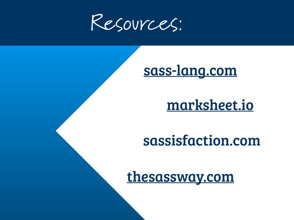
Resources: sass-lang.com marksheet.io thesassway.com sassisfaction.com
 girlybrackets
 panda728
 har1101
 niftycorp
 tonkotsuboy_com
 luccafort
 sumedhbala
 gotok365
 layerx
 mshibuya
 _fhhmm
 jsoizo
 yug1224
 inesmontani
 gurzu
gurzu
 ianozsvald
 sarafernandez
 baasie
 scottboms
 katarinadahlin
 kastner
 pwiseman
 tapps
tapps
 aleyda
 chriscoyier