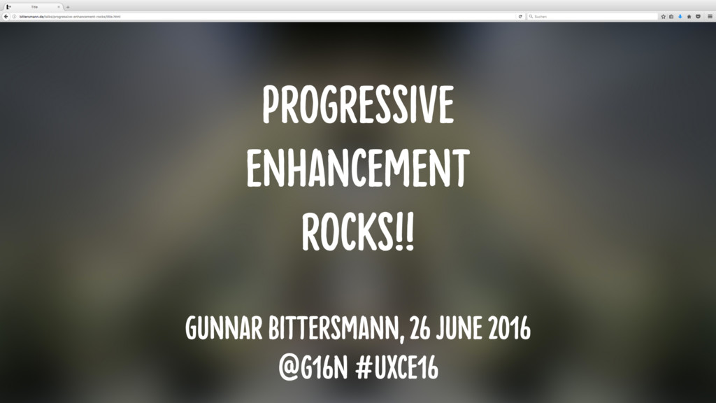
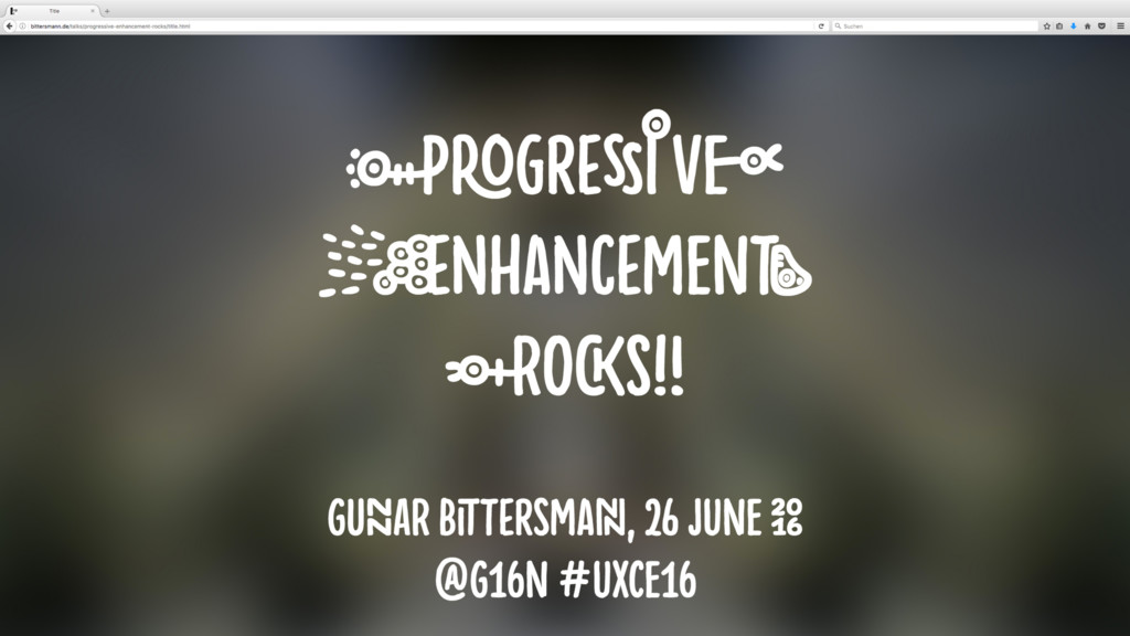
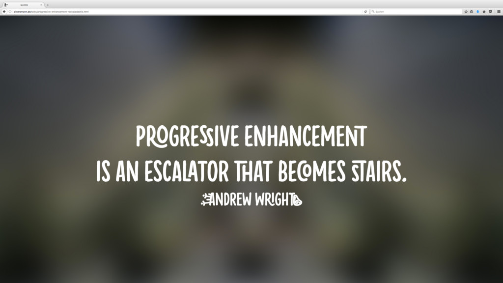
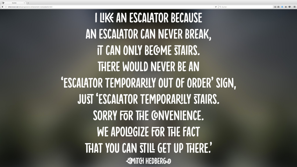
Progressive enhancement introduced visually with OpenType font features: basic at first, then ligatures, alternate glyph variants, swashes, …
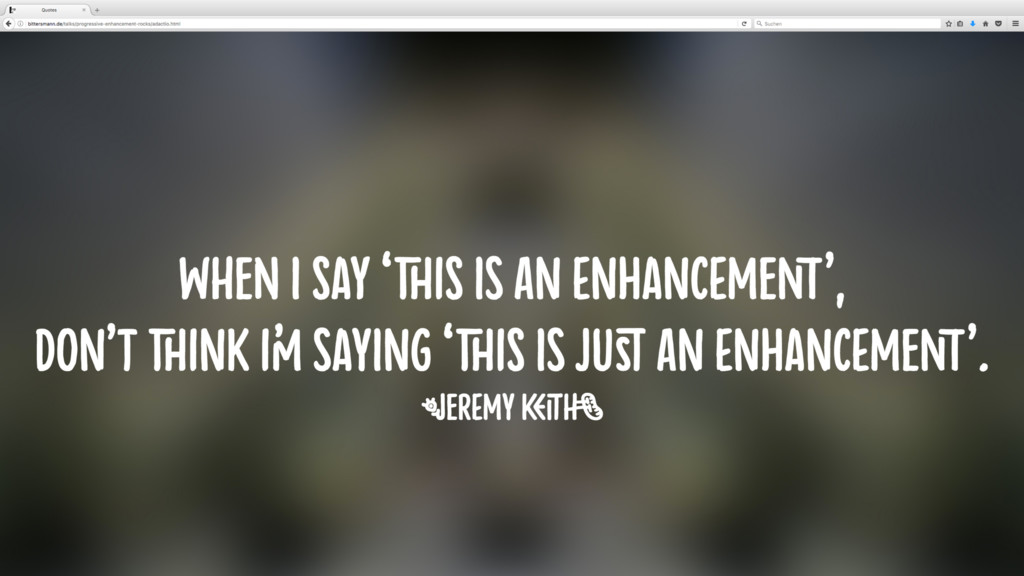
But what is that—progressive enhancement? It “isn’t a technology. It’s more like a way of thinking,” says Jeremy Keith.
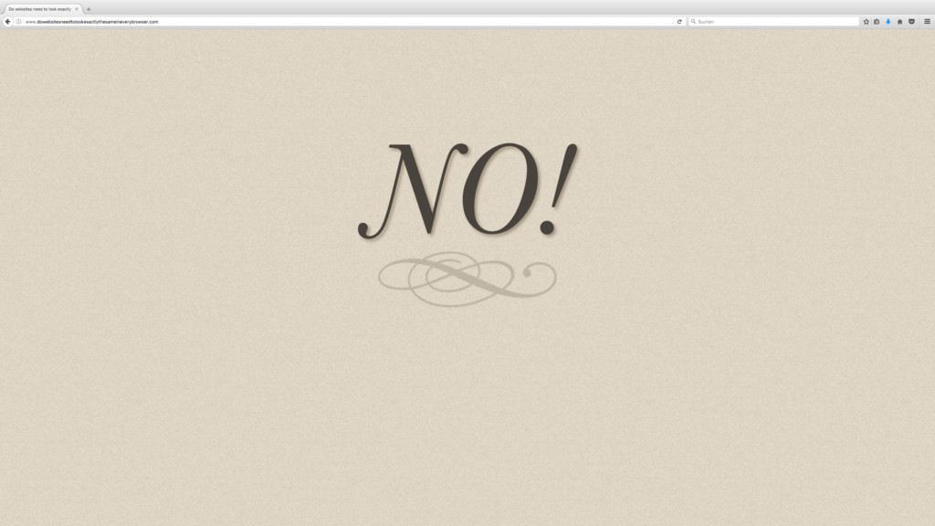
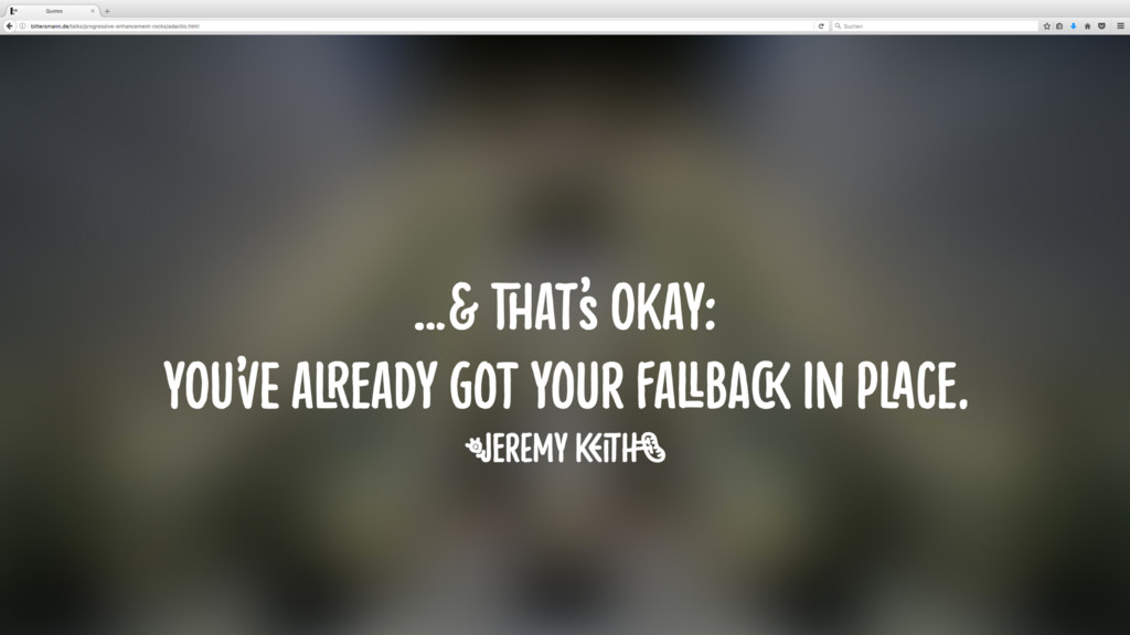
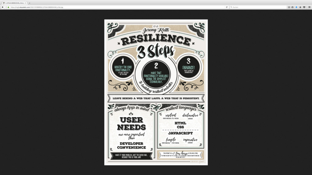
The key to thinking this way is: accepting that websites/web applications do not need to look/behave the same in every browser. Make the core functionality available using the simplest technology, then enhance from there—secure in the knowledge that even if a certain feature is not supported in some browsers or on some devices, that’s okay: the fallback is in place and works everywhere.
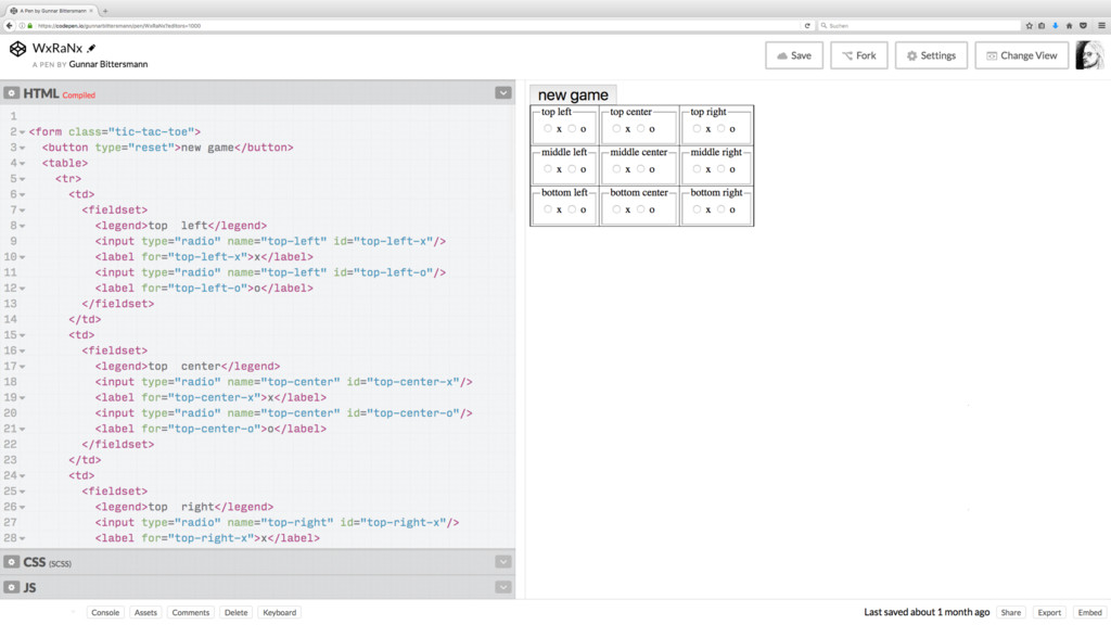
As an example we’ve implemented a tic-tac-toe browser game: the core functionality in plain HTML using interactive form elements. It’s surely not fun to use yet, but it works (which also means: it’s keyboard-accessible). And as Jeremy Keith used to say, enhancement does not mean it’s just an enhancement. We’ve enhanced the look with CSS and the feel with JavaScript. The final result still has accessibility baked in (i.e. not taken away), while providing a pleasant user experience.
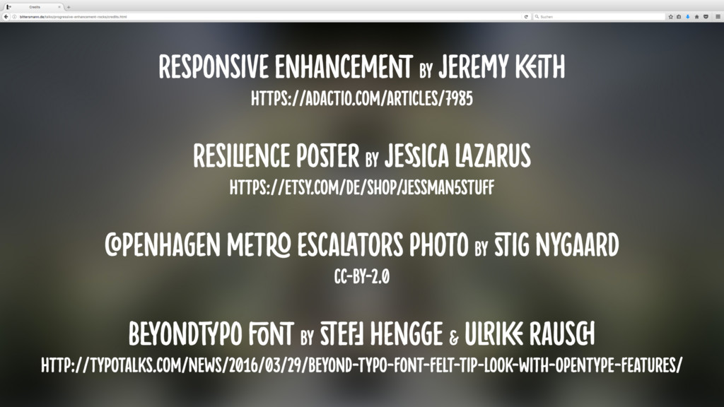
Credits:
Responsive Enhancement by Jeremy Keith https://adactio.com/articles/7985
Resilience poster by Jessica Lazarus https://etsy.com/de/shop/jessman5Stuff
BeyondTYPO font by Steff Hengge & Ulrike Rausch http://typotalks.com/news/2016/03/29/beyond-typo-font-felt-tip-look-with-opentype-features/