Upgrade to Pro — share decks privately, control downloads, hide ads and more …

QCBS R workshop - Visualization

QCBS R workshop - Visualization

eric-pedersen

March 22, 2013
Tweet

More Decks by eric-pedersen

Other Decks in Education

Transcript

  1. Plotting in
    Open Source Statistical
    Programming
    map courtesy of James Cheshire (spatialanalysis.co.uk/2012/02/great-maps-ggplot2/)

    View Slide

  2. Tables
    Data
    Graphs
    Statistics
    Understanding
    Sigmaplot
    Excel
    SAS
    Why do your plotting in R?
    Simpler workflow:

    View Slide

  3. Tables
    Data
    Statistics
    Understanding
    Graphs
    Why do your plotting in R?
    Simpler workflow:

    View Slide

  4. Why do your plotting in R?
    Flexible and beautiful graphics:

    View Slide

  5. Why do your plotting in R?
    Flexible and beautiful graphics:

    View Slide

  6. Why do your plotting in R?
    Flexible and beautiful graphics:

    View Slide

  7. Enough slides! Now for a
    live demo

    View Slide

  8. *
    Challenge 1:
    Building a plot layer by
    layer
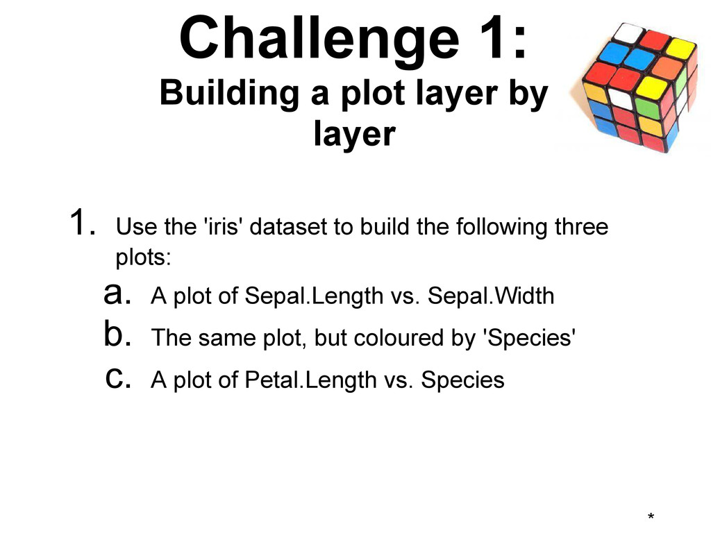
    1. Use the 'iris' dataset to build the following three
    plots:
    a. A plot of Sepal.Length vs. Sepal.Width
    b. The same plot, but coloured by 'Species'
    c. A plot of Petal.Length vs. Species

    View Slide

  9. *
    Challenge 2:
    Playing with aesthetics
    and geoms
    1. Use 
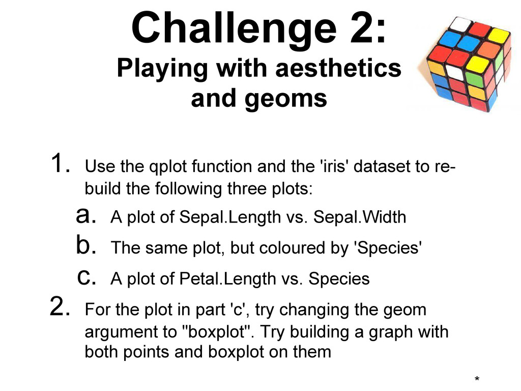
the qplot function and the 'iris' dataset to re-
    build the following three plots:
    a. A plot of Sepal.Length vs. Sepal.Width
    b. The same plot, but coloured by 'Species'
    c. A plot of Petal.Length vs. Species
    2. For the plot in part 'c', try changing the geom
    argument to "boxplot". Try building a graph with
    both points and boxplot on them

    View Slide

  10. *
    Challenge 3:
    Faceting and scaling
    1. Try to build the following plots using the iris data:
    a. Petal.Width vs. Petal.Height, faceted in a row
    by Species; and the same plot by column
    b. Sepal.Width vs. Sepal.Height, with the x-axis
    log-transformed, the y-axis log-transformed,
    and both axes log-transformed

    View Slide

  11. ggplot2: using the Grammar of
    Graphics
    ggplot2: a different way of plotting: building
    plots by describing what you want, and let it
    figure out how to plot it.

    View Slide

  12. ggplot2: using the Grammar of
    Graphics
    ggplot2:
    Builds plots out of simpler components:
    ● data
    ● aesthetics: e.g. coordinates, colour, size of points
    ● geoms: the type of plot layer: line, point, etc.
    ● facets: organizing graphs into subplots
    ● transforms: logs, square roots, continuous to discrete
    etc.
    ● stats: functions of the raw data
    ● coordinates: e.g. Euclidean, map coords, polar
    ● themes: font size, grids, etc.

    View Slide

  13. Further reading
    Plotting in general:
    R Graphics
    The R Book
    ggplot2 references:
    The creator, Hadley Wickham's website
    The in-depth documentation website
    The book: ggplot2: Elegant Graphics for Data
    Analysis

    View Slide