IRC, just come say hi and ask what to do, we will find you a task discord.gg/opensuse matrix.to/#/#opensuse-artwork:matrix.org #opensuse-artwork @ freenode.net
way for openSUSE to stand out (let’s ignore the name topic for now) • I can’t modify the logo on Wikipedia page, which has white background in the eye, so let’s change the entire logo for this reason
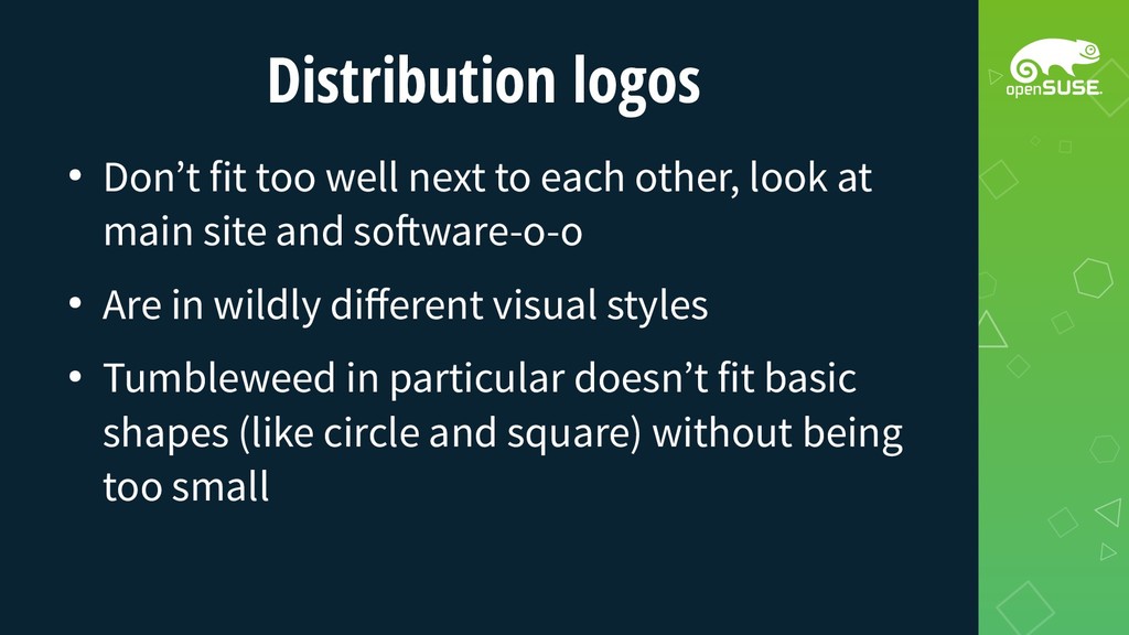
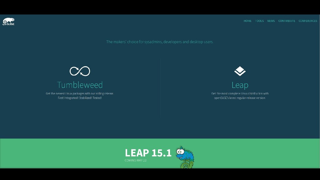
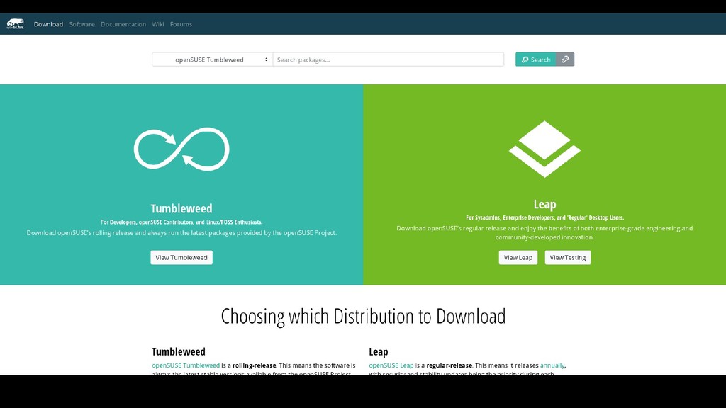
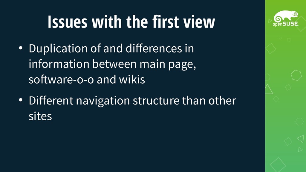
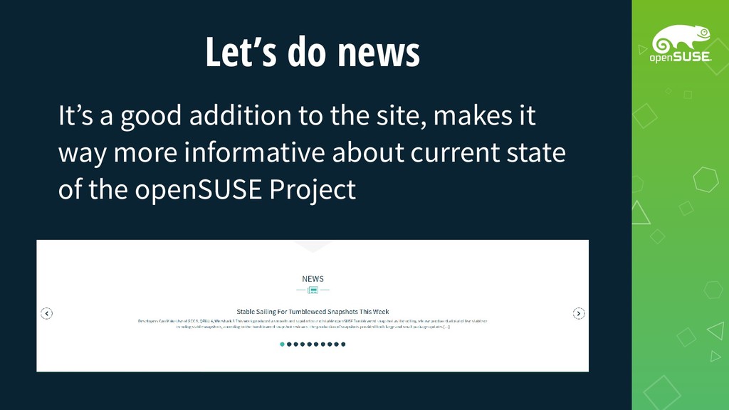
other, look at main site and software-o-o • Are in wildly different visual styles • Tumbleweed in particular doesn’t fit basic shapes (like circle and square) without being too small
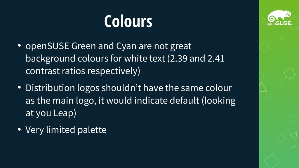
colours for white text (2.39 and 2.41 contrast ratios respectively) • Distribution logos shouldn’t have the same colour as the main logo, it would indicate default (looking at you Leap) • Very limited palette
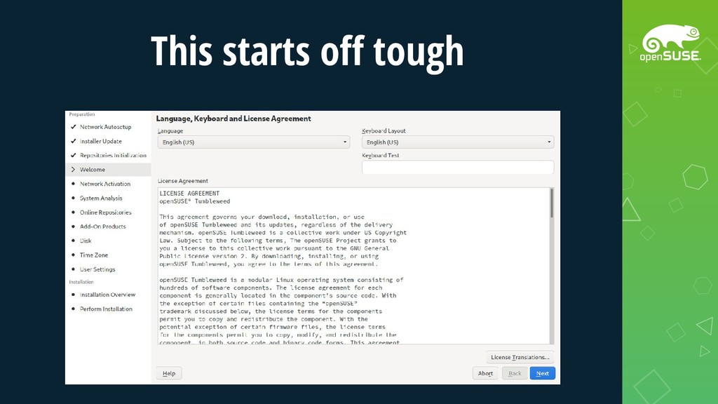
know what they want, let’s mock everything up, decide what widgets we need and then start implementing stuff properly when we know what and where we need stuff exactly
![Artwork, Branding, UI&UX Why UI? I mean, Stasiek Michalski [email protected]](https://files.speakerdeck.com/presentations/9ce104eecec346af86e0cae11a3daf50/slide_0.jpg)