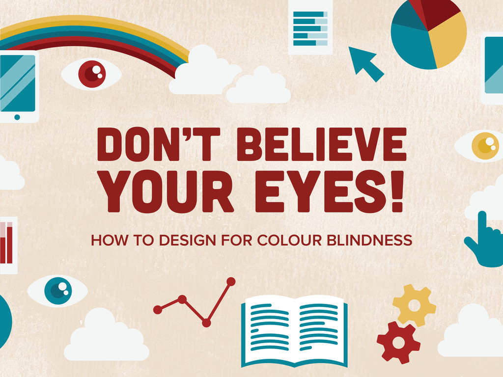
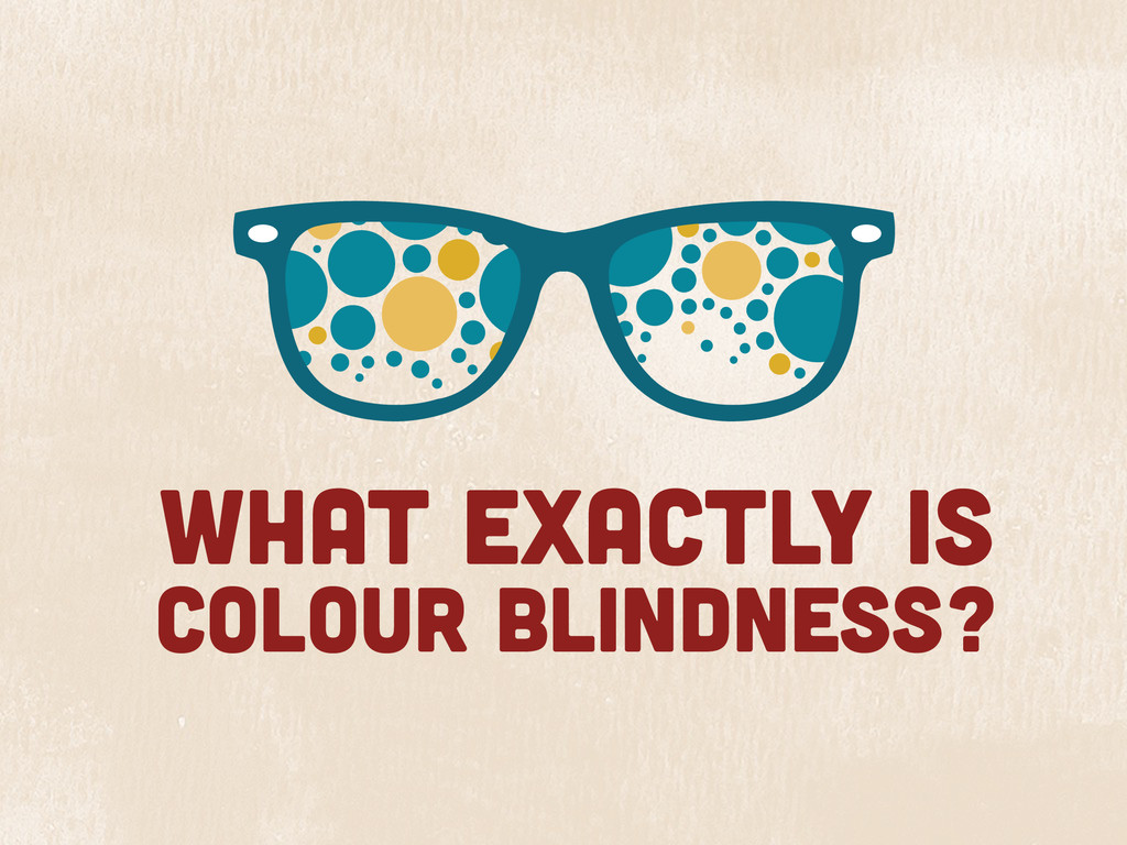
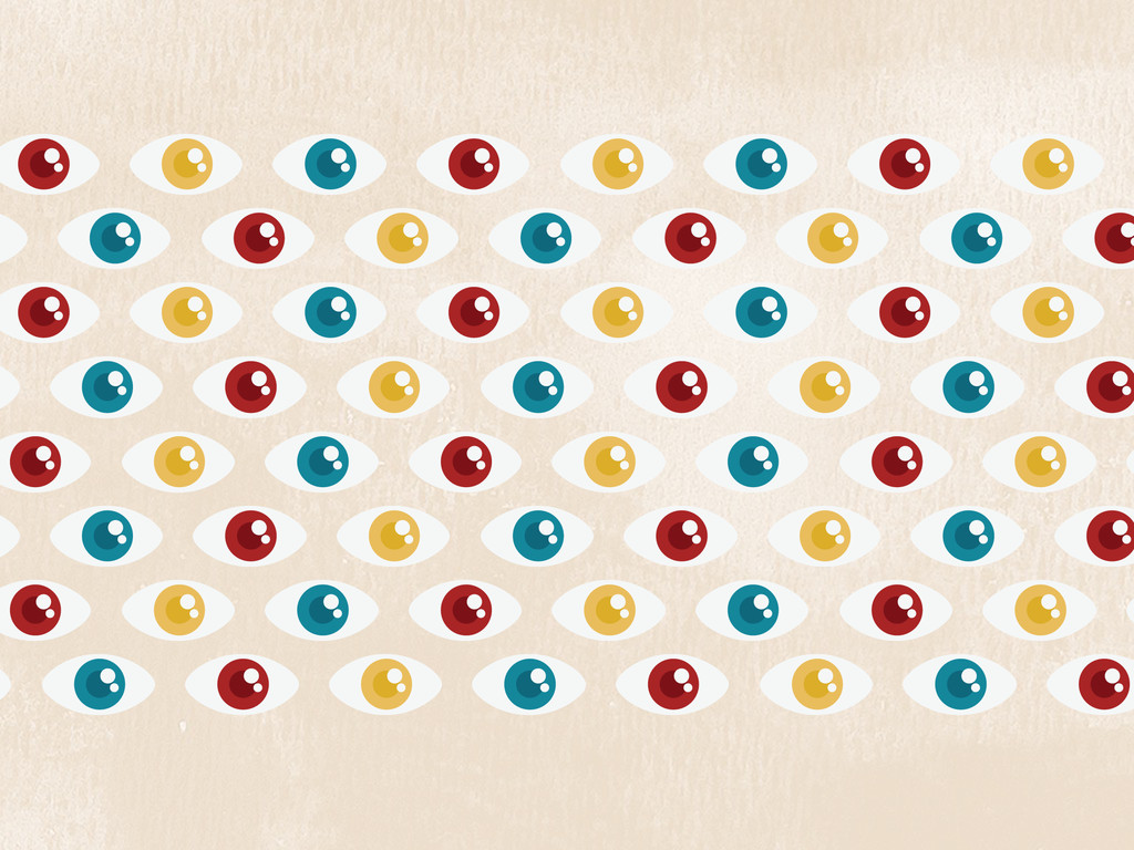
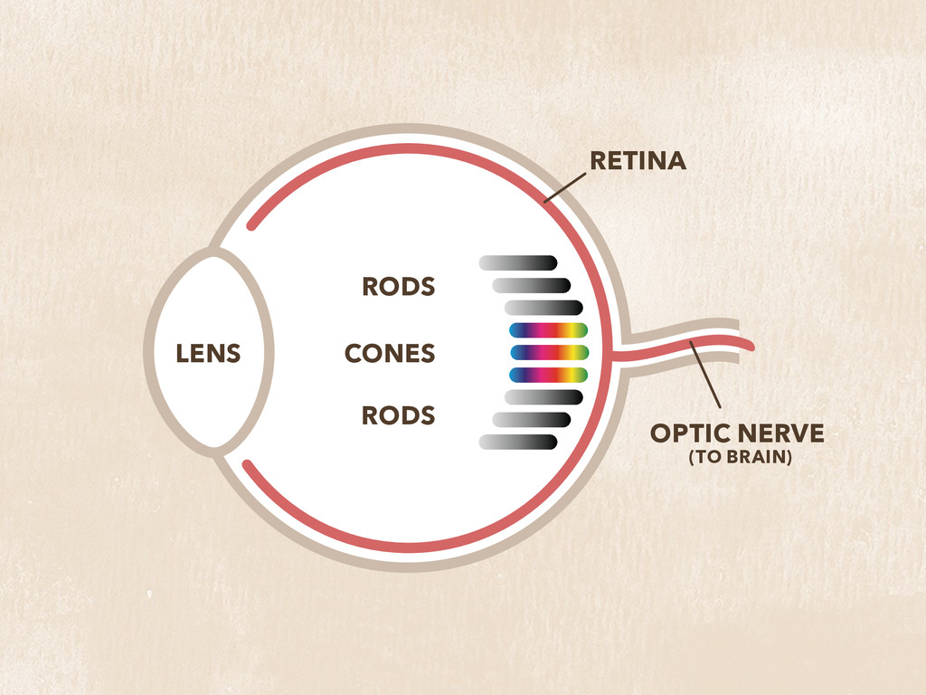
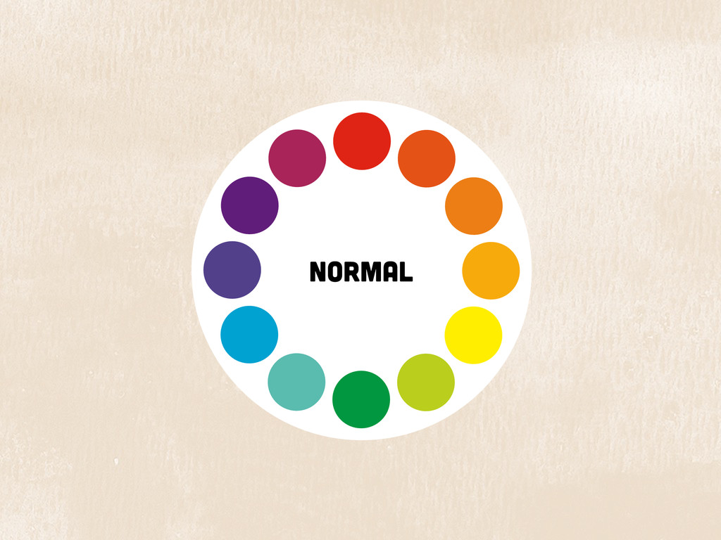
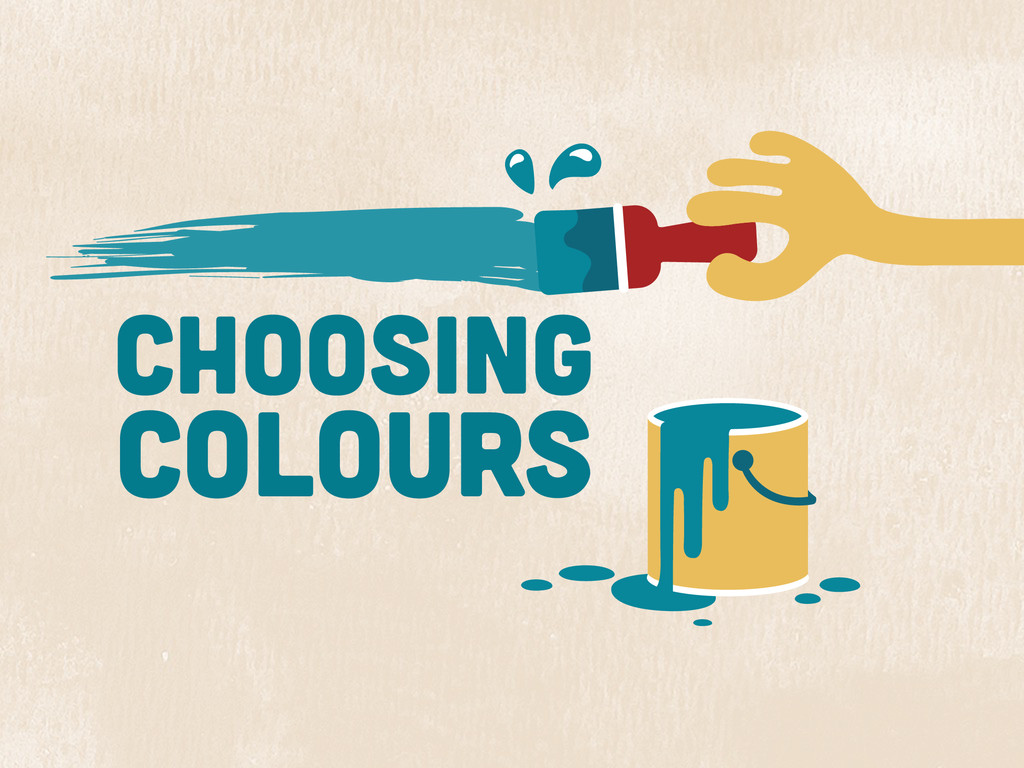
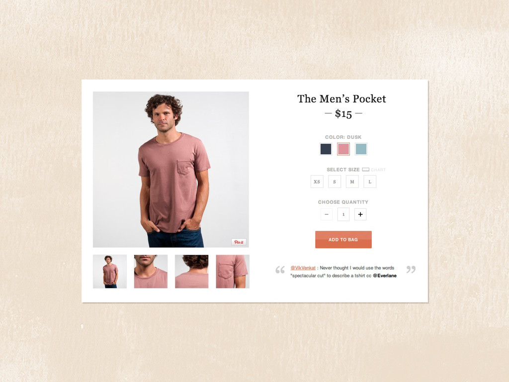
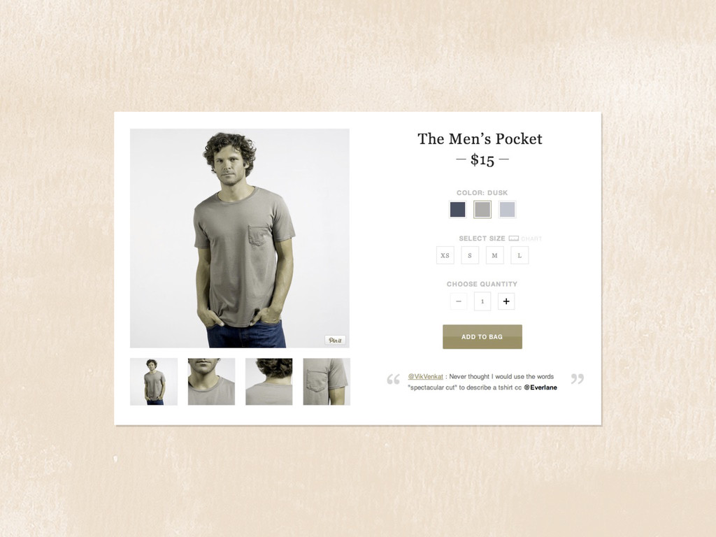
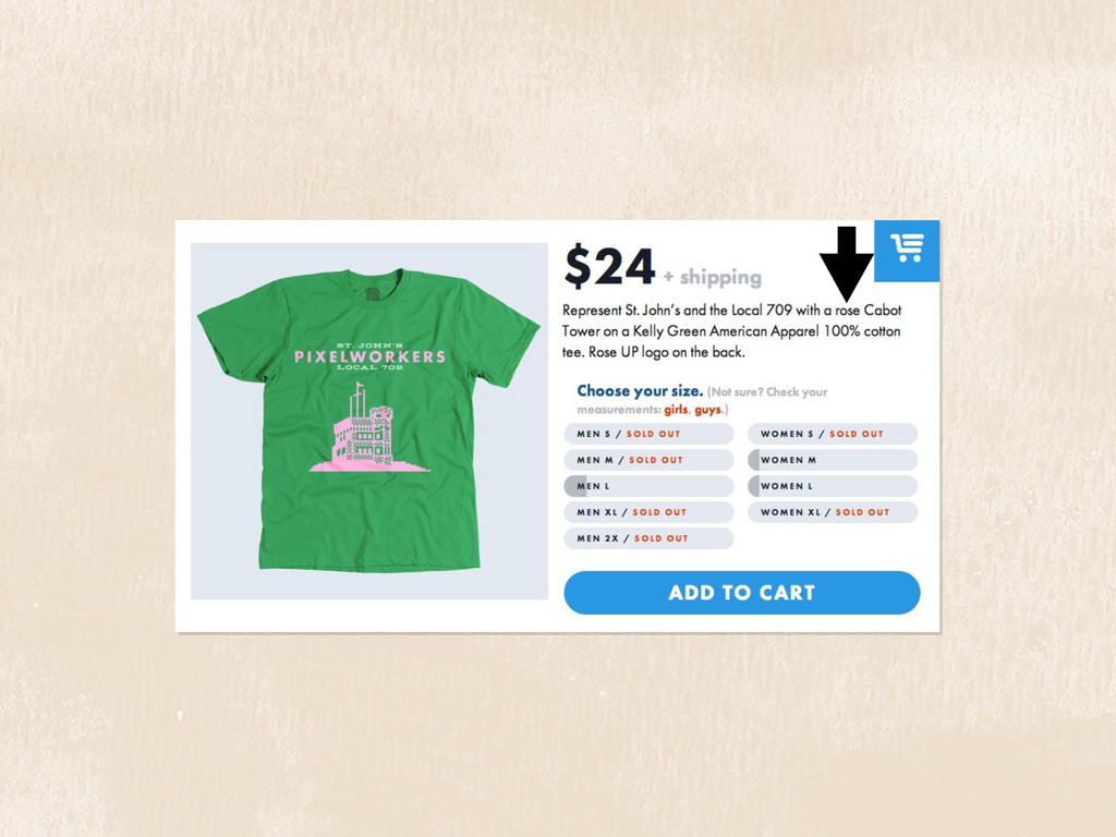
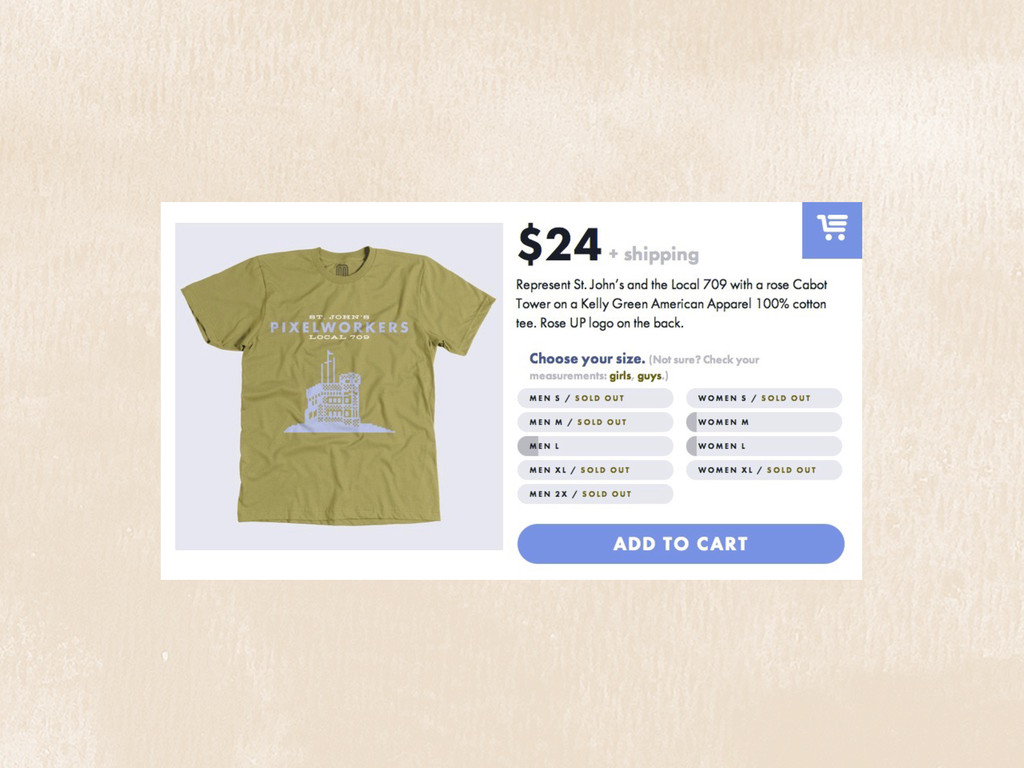
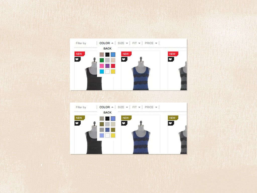
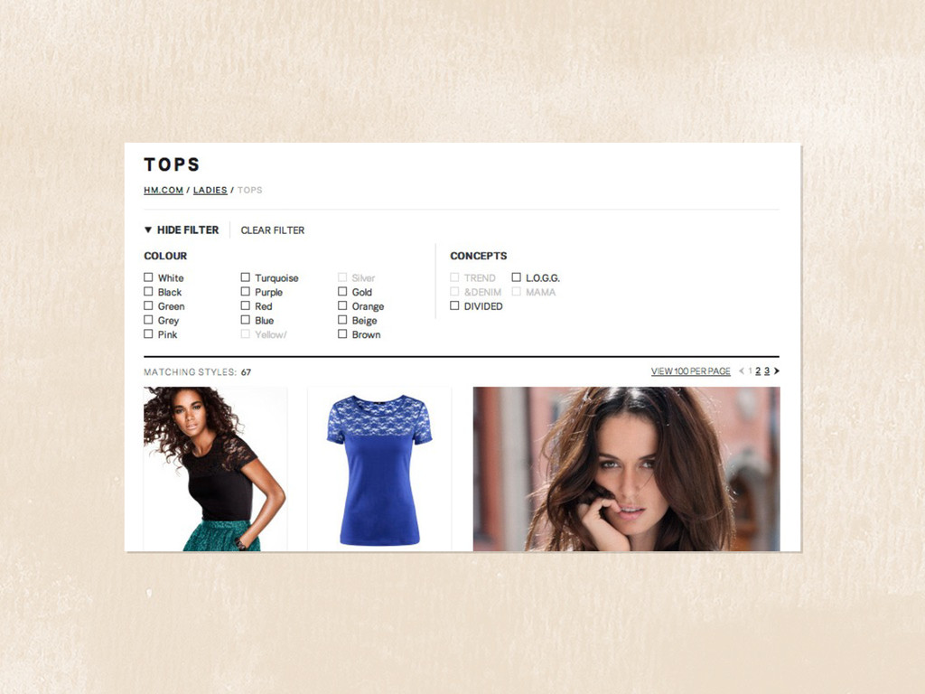
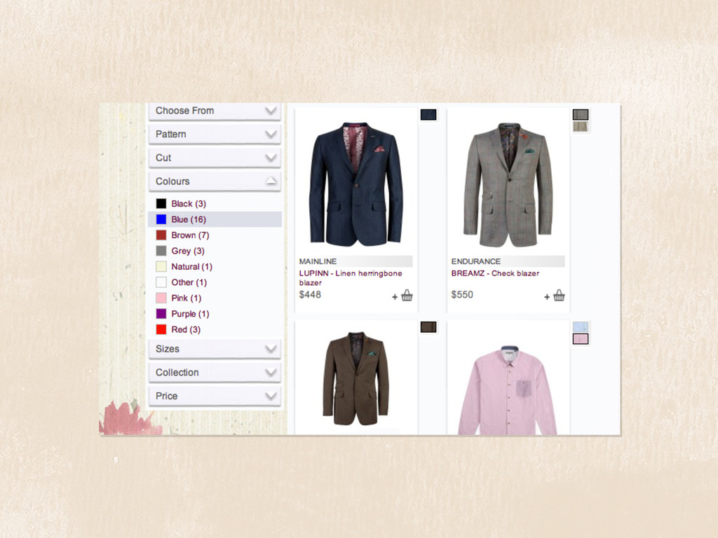
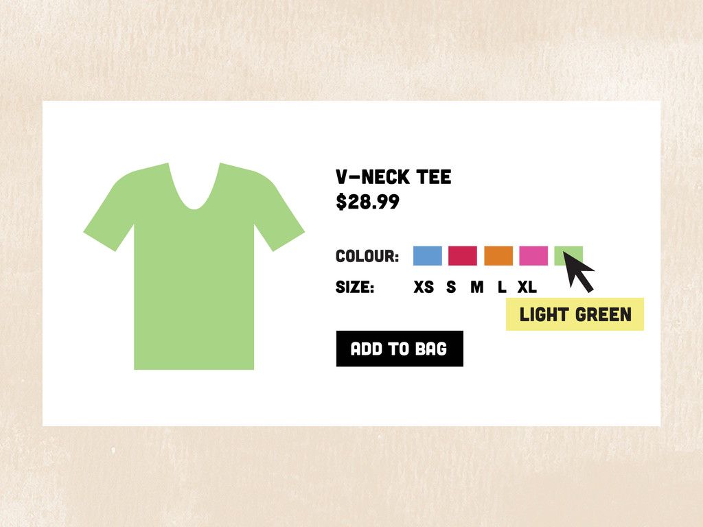
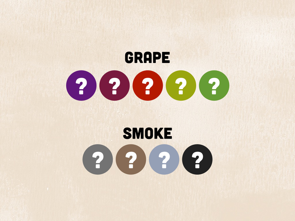
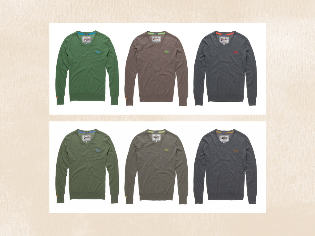
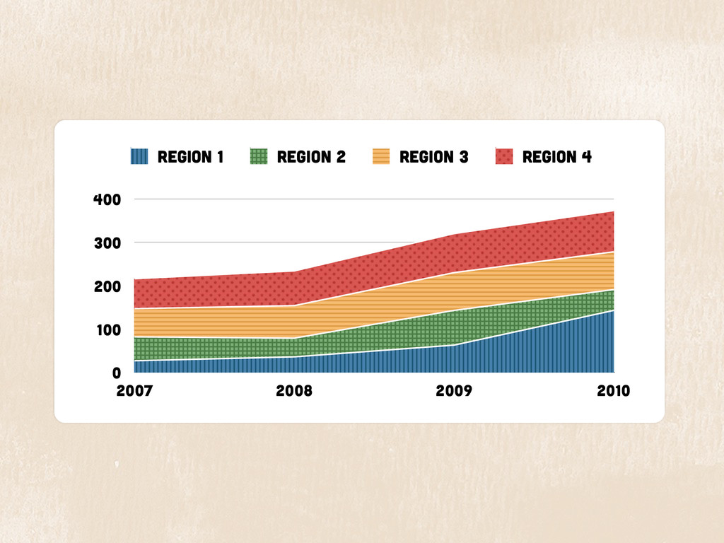
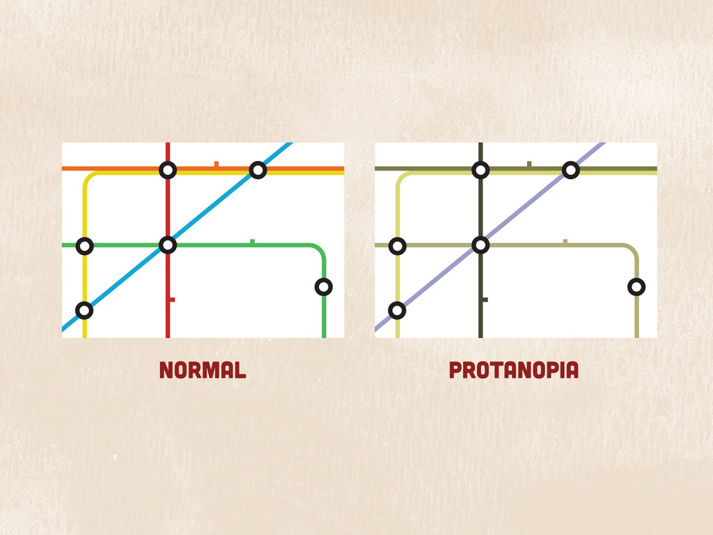
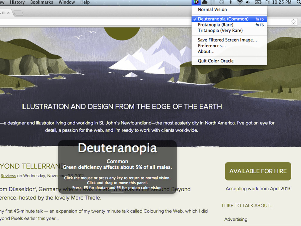
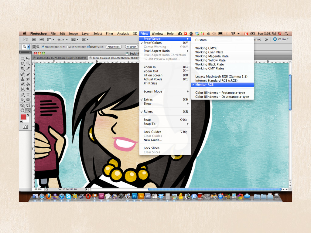
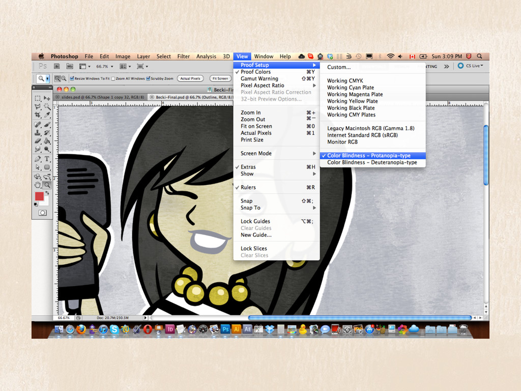
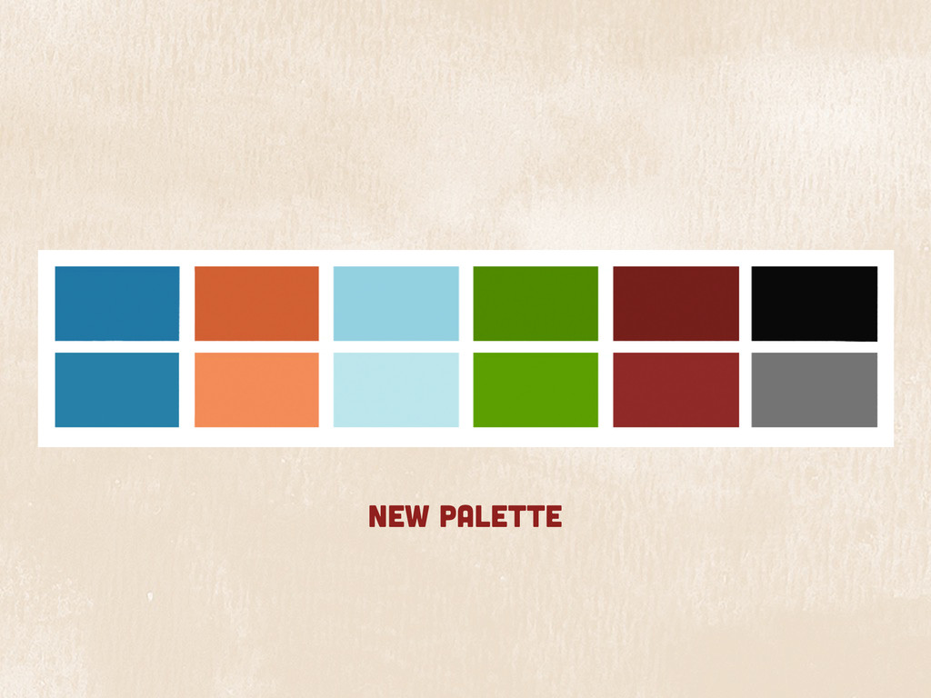
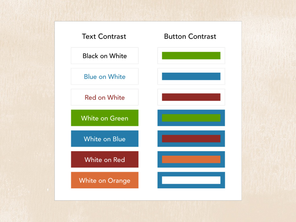
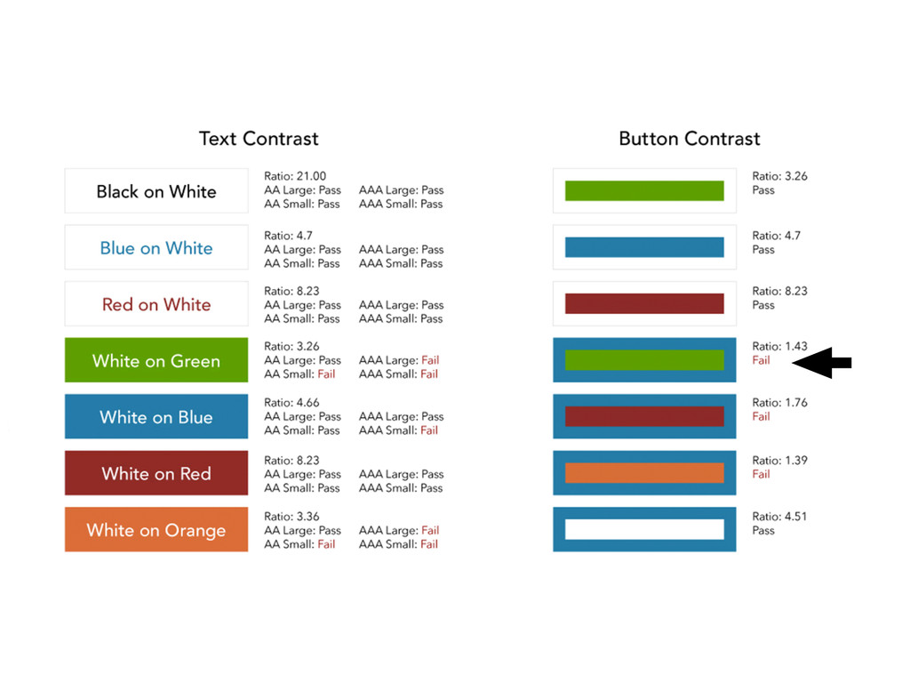
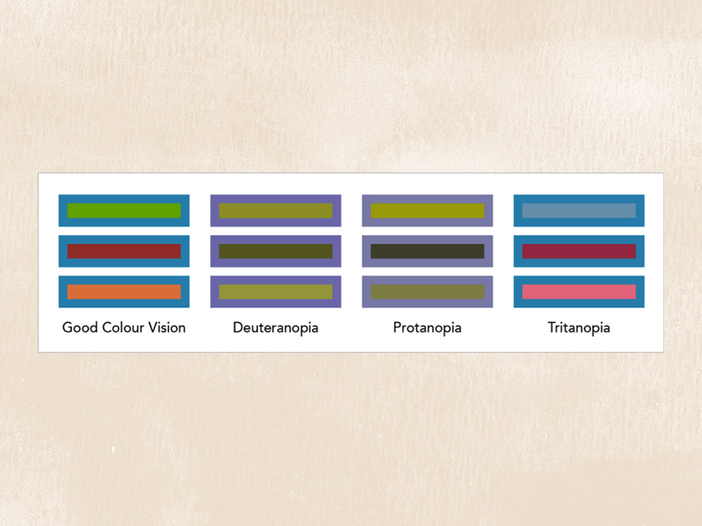
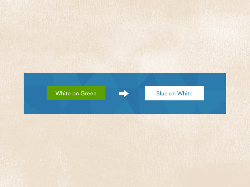
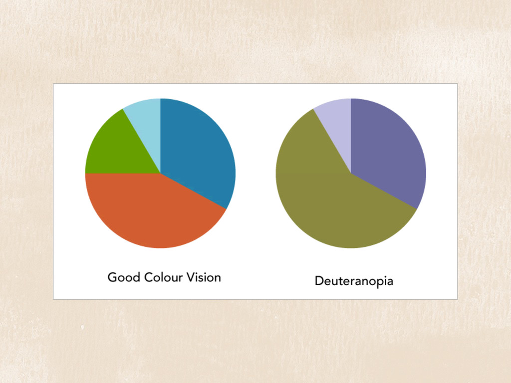
We often take colour for granted when choosing palettes for our designs, assuming the appearance will be the same for everyone.
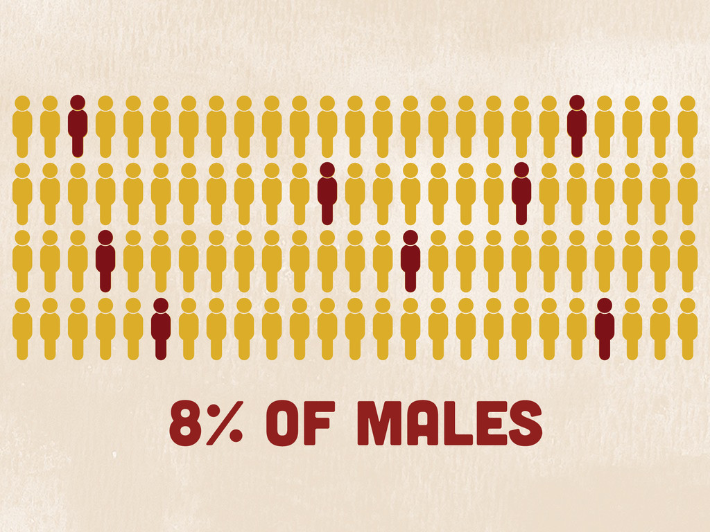
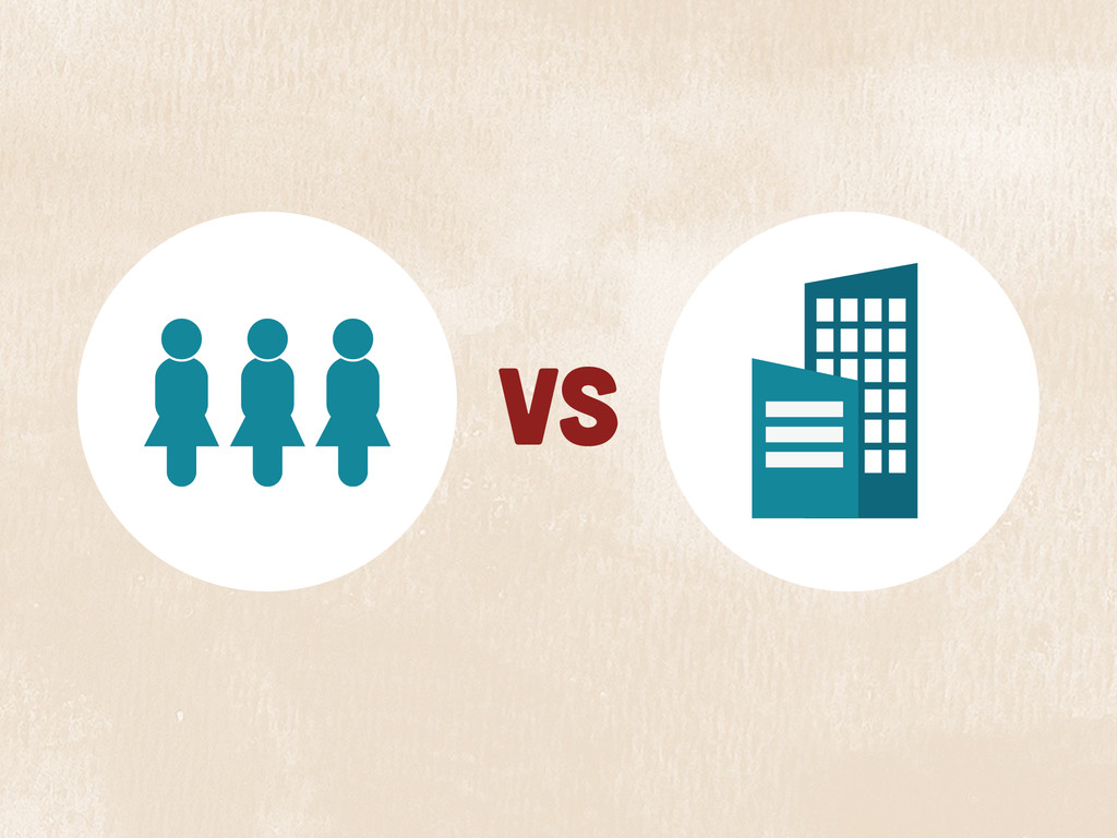
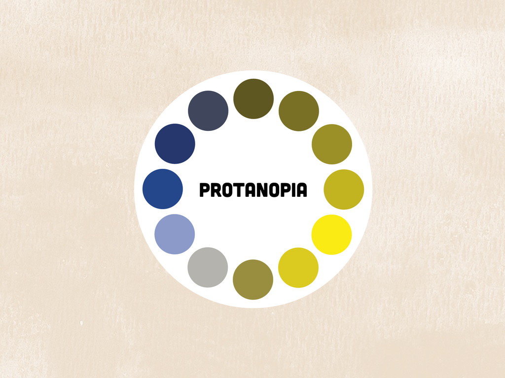
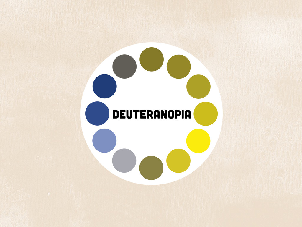
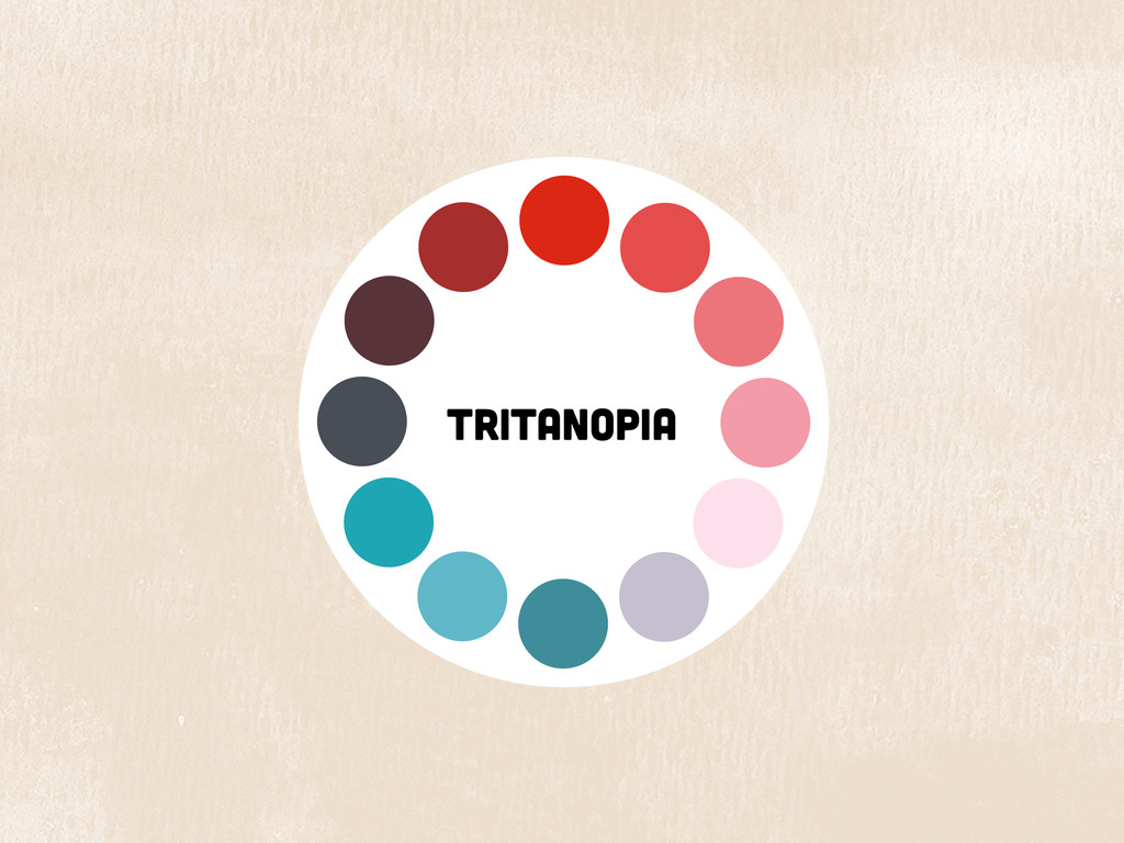
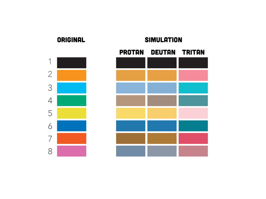
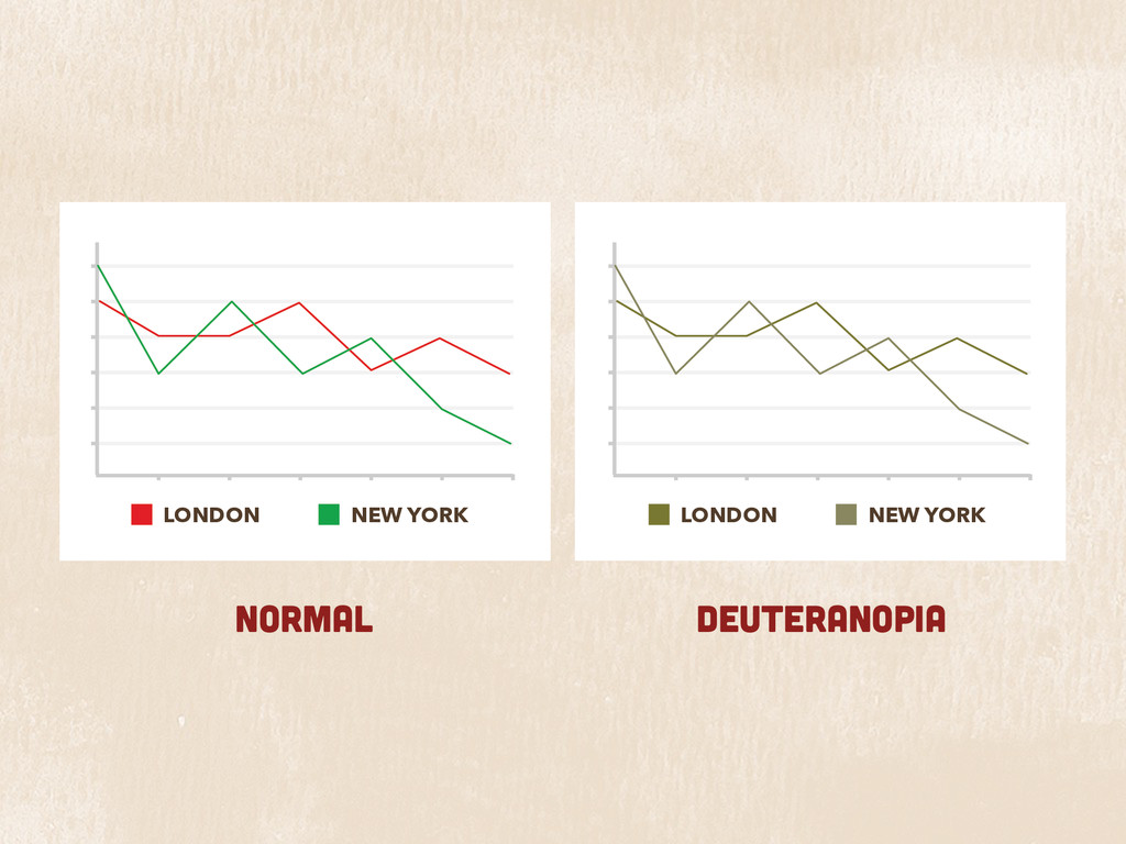
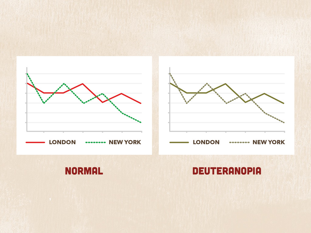
In reality, the choices that look good to people with good colour vision could cause serious usability problems for people affected by various forms of colour-blindness; a type of disability that affects the perception of colour and occurs in a surprisingly large percentage of the population.
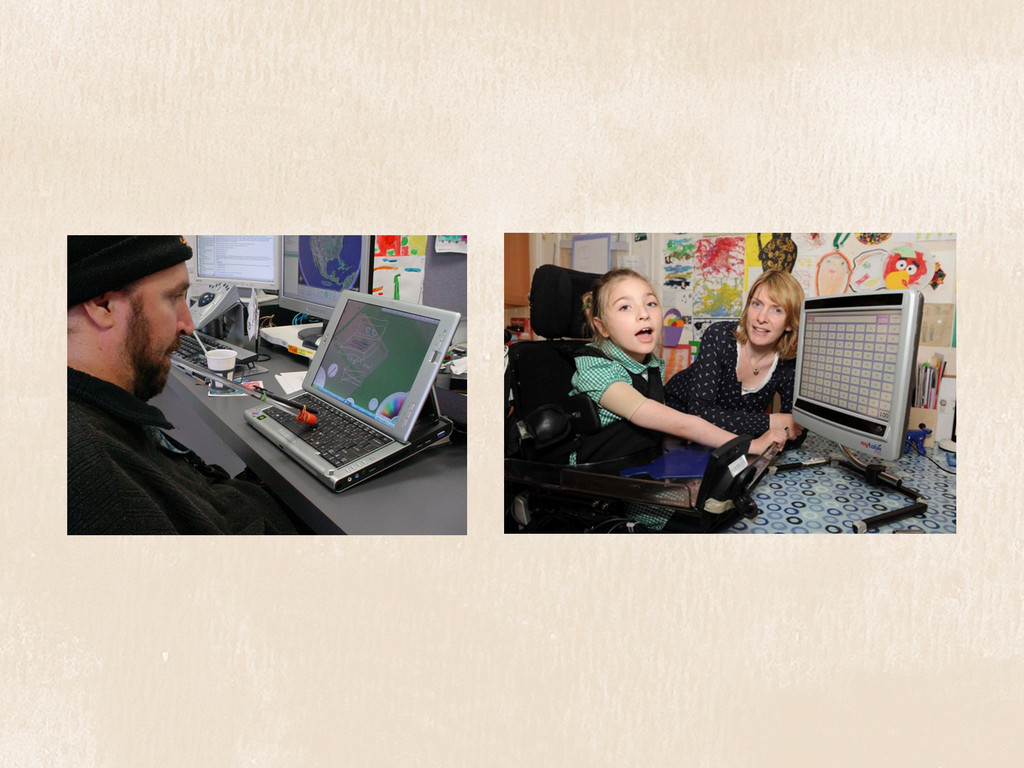
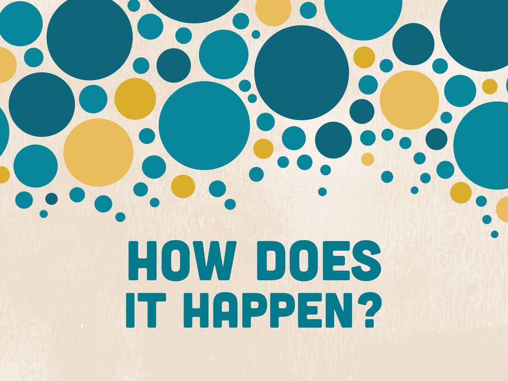
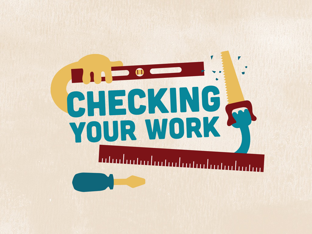
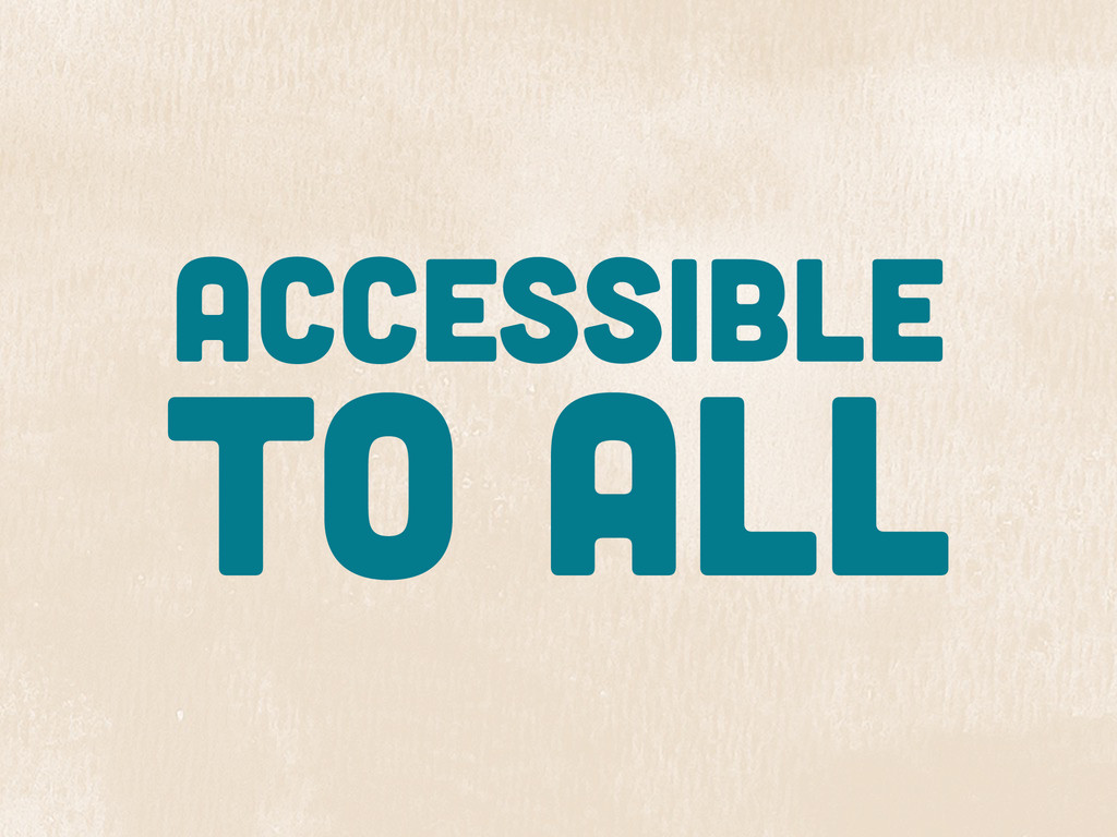
If you're a web designer, app designer, or game designer, this talk is for you! Geri will teach you how to create designs that are accessible to people with colour-blindness without sacrificing aesthetics.