Upgrade to Pro — share decks privately, control downloads, hide ads and more …

Thinking about CSS Architecture

Hiroki Tani
September 15, 2013

Thinking about CSS Architecture

Hiroki Tani

September 15, 2013
Tweet

More Decks by Hiroki Tani

Other Decks in Technology

Transcript

  1. .text { color: black; } .catchcopy { color: red; }

    #message .text { color: green; }
  2. k1 1 l 12 9 3 6 10mIn 60mIn...aNd MoRe

    1 1 l 12 9 3 6 1 1 l 12 9 3 6 111 1 1 l 12 9 3 6 1 1 l 12 9 3 6 1 1 l 12 9 3 6 1 1 l 12 9 3 6 ¤ ¥
  3. k 10mIn BUgS... 1 1 1 ± ' l l

    l l l l H H ± ' l l l l l l H H ± ' l l l l l l H H 1 1 l 12 9 3 6 ¤ ¥
  4. k 1 1 12 9 6 3 l 30mIn 1

    1 12 9 6 3 l 30mIn ¤ ¥
  5. .media { overflow: hidden; // Clearfix *zoom: 1; // Clearfix

    } .media-image { float: left; margin-right: 10px; } .media-image > img { display: block; } .media-body { overflow: hidden; }
  6. h2 { font-weight: bold; font-size: 16px; } #news h2 {

    border-bottom: 1px solid black; padding-bottom: 0.5em; }
  7. h2 { font-weight: bold; font-size: 16px; } #news h2, #speakers

    h2 { border-bottom: 1px solid black; padding-bottom: 0.5em; }
  8. <div id="speakers"> <h1>Hiroki Tani</h1> <h2 class="heading headline">Session Title</h2> <div> <p>...</p>

    </div> <div> <h2 class="heading">Books</h2> <ul> <li>...</li> </ul> </div> </div>
  9. /* # Base */ body, form { margin: 0; padding:

    0; } a { color: #039; } a:hover { color: #03F; }
  10. /* # Layout */ .l-header, l-article, l-footer { width: 960px;

    margin: auto; } .l-article { border: solid #CCC; border-width: 1px 0 0; } .l-grid { margin: 0; padding: 0; list-style-type: none; } .l-grid > li { display: inline-block; margin: 0 0 10px 10px; }
  11. /* # Layout */ #header, #article, #footer { width: 960px;

    margin: auto; } .l-article { border: solid #CCC; border-width: 1px 0 0; } .l-grid { margin: 0; padding: 0; list-style-type: none; } .l-grid > li { display: inline-block; margin: 0 0 10px 10px; }
  12. /* # Layout */ .l-container { width: 960px; margin: auto;

    } .l-article { border: solid #CCC; border-width: 1px 0 0; } .l-grid { margin: 0; padding: 0; list-style-type: none; } .l-grid > li { display: inline-block; margin: 0 0 10px 10px; }
  13. /* # State */ .is-hidden { display: none; } .is-error

    { font-weight: bold; color: red; } .is-tab-active { border-bottom-color: transparent; }
  14. /* # Theme */ /* ## Pink Theme CSS */

    .theme-header { background-image: url("/theme/pink/ header.png"); } .theme-border { 1px solid pink; }
  15. /* # Module */ /* ## Button */ .btn {

    ... } .btn-primary { ... } .btn-small { ... } /* ## UIlist */ .uilist { ... } .uilist-item { ... } .uilist-item-icon { ... } /* ## Widget */ .widget { ... } .widget-title { ... } .widget-body { ... }
  16. <div class="review"> <h1>CSS Architecture</h1> <p class="reviewer">Review: <span>Hiroki Tani</ span></p> <time

    datetime="2013-09-14">2013/09/14</time> <p class="review-summary">CSS Bible!</p> <p class="review-description">...</p> Rating: <span class="rating">4.5</span> </div>
  17. <div itemscope itemtype="http://data- vocabulary.org/Review"> <h1 itemprop="itemreviewed">CSS Architecture</ h1> <p>Review: <span

    itemprop="reviewer">Hiroki Tani</span></p> <time itemprop="dtreviewed" datetime="2013-09-14">2013/09/14</time> <p itemprop="summary">CSS Bible!</p> <p itemprop="description">...</p> Rating: <span itemprop="rating">4.5</span> </div>
  18. /* Sass(.scss) */ %btn { border-radius: 6px; padding: 0.5em 1em;

    background-color: #CCC; } .btn-primary { @extend %btn; background-image: linear-gradient(...); color: #FFF; }
  19. /* CSS */ .btn-primary { border-radius: 6px; adding: 0.5em 1em;

    background-color: #CCC; background-image: linear-gradient(...); color: #FFF; }
  20. /* Sass(.scss) */ %btn { border-radius: 6px; padding: 0.5em 1em;

    background-color: #CCC; } %btn-primary { border-radius: 6px; padding: 0.5em 1em; background-color: #CCC; } %btn-large { font-size: 18px; } .save { @extend %btn; @extend %btn-primary; @extend %btn-large; }
  21. /* CSS */ .save { border-radius: 6px; adding: 0.5em 1em;

    background-color: #CCC; background-image: linear-gradient(...); color: #FFF; font-size: 18px; }
  22. .clearfix:after,.btn_type2_A:after,.bnavi ul:after,.box_3col:after,.userData dl:after,.likeTool:after,.likeUser ul:after,.commentUser ul:after,.userData:after,.circleList li a:after,.time_count:after,.paging ul:after,.myData:after,.status:after,.bar:after,.month:a fter,.month2:after,.about:after,.sort:after,.mainList ul:after,.mainList2

    li ul:after,.bnr_2col:after,.likeTool_lp:after,.flow:after, .radio:after,.btn_entry_2col:after,.sort2:after,ul#popup _message:after,.sort3:after,.f_circleList:after,.f_circl eList a:after,.mainList3 dl:after,.mainList3 ul:after,.box_2col:after,.frame_desc dl:after { content: ""; display: block; clear: both; height: 0; }
  23. /* # Module */ /* ## Button */ .btn {

    ... } .btn-primary { ... } .btn-small { ... } /* ## Widget */ .widget { ... } .widget-title { ... } .widget-body { ... }
  24. .ranking { ... } .ranking__thumbnail { ... } .ranking__item {

    ... } .nav-line { ... } .nav-line__item { ... } .nav-line_separated { ... } .nav-line_separated__item { ... }
  25. /* # Module */ /* ## Button */ .btn {

    ... } .btn_primary { ... } .btn_small { ... } /* ## Widget */ .widget { ... } .widget__title { ... } .widget__body { ... }
  26. /* # Module */ /* ## Button */ .btn {

    ... } .btn--primary { ... } .btn--small { ... } /* ## Widget */ .widget { ... } .widget__title { ... } .widget__body { ... }
  27. /* A button suitable for giving stars to someone. :hover

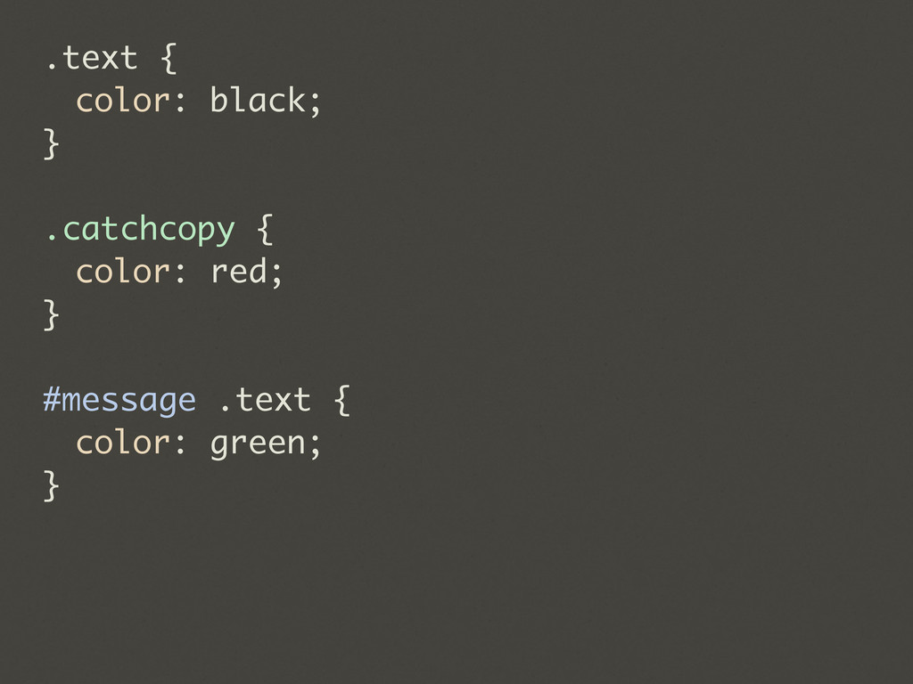
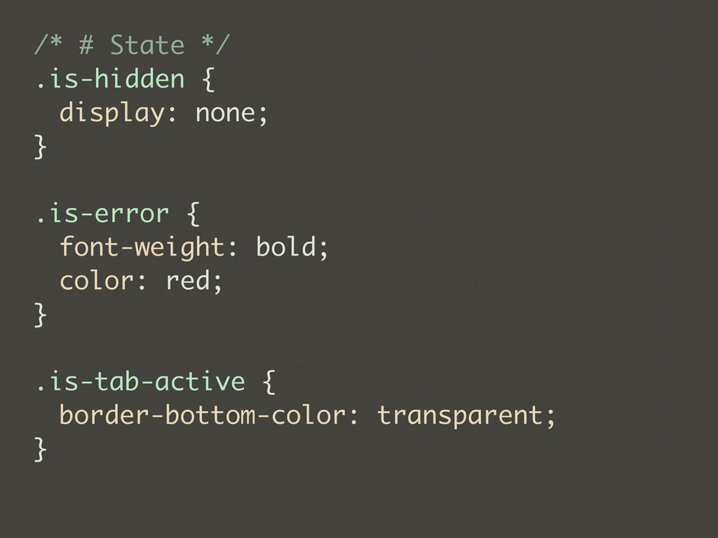
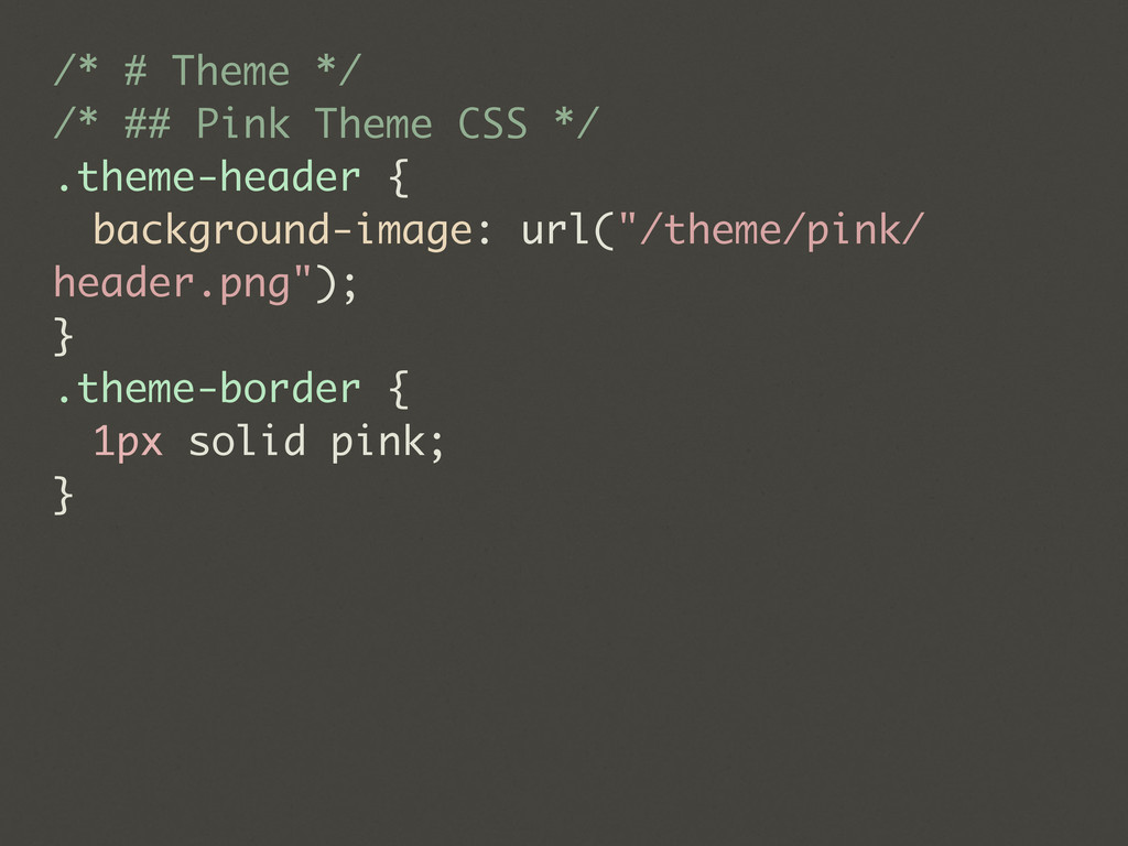
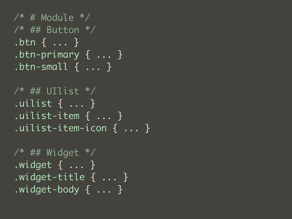
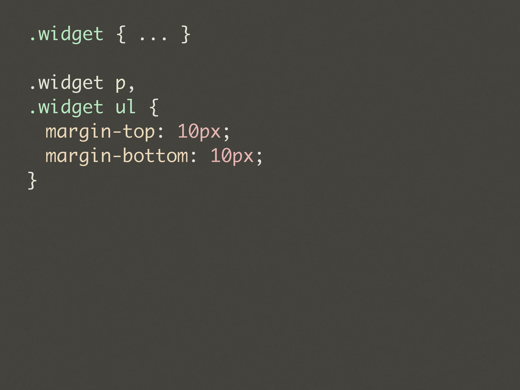
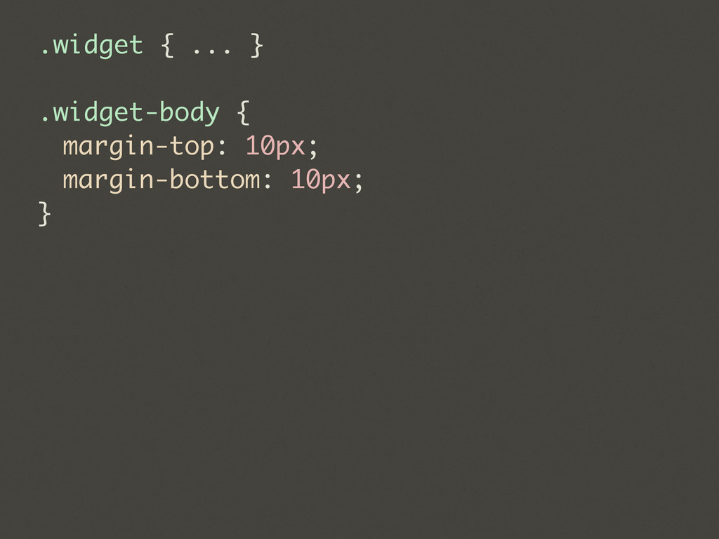
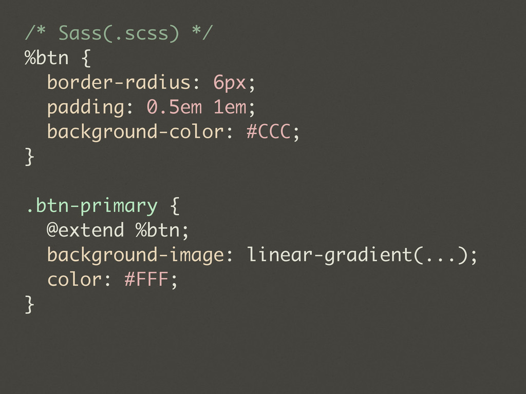
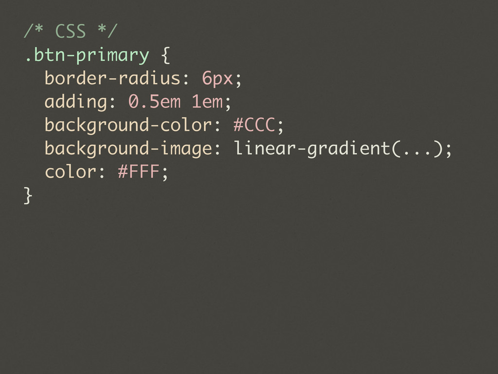
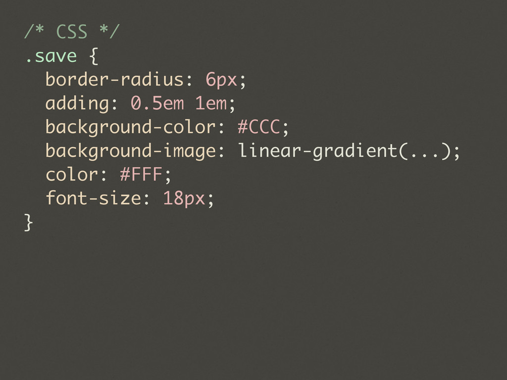
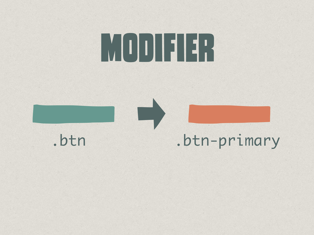
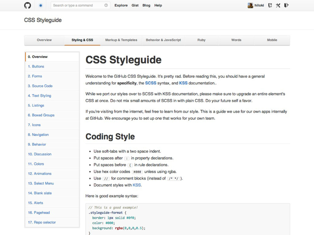
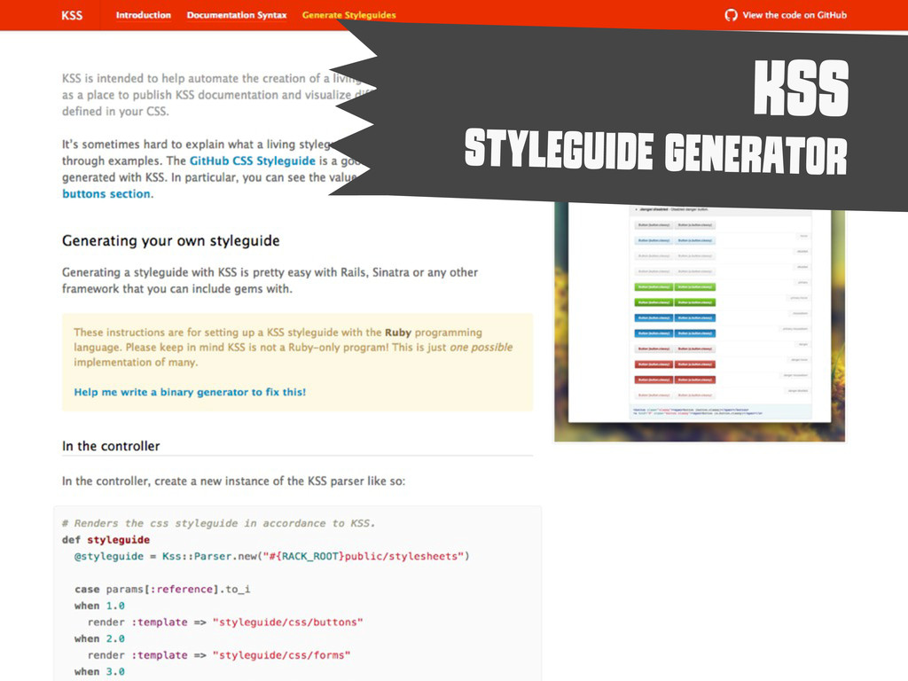
    - Subtle hover highlight. .stars-given - A highlight indicating you've already given a star. .stars-given:hover - Subtle hover highlight on top of stars-given styling. .disabled - Dims the button to indicate it cannot be used. Styleguide 2.1.3. */ a.button.star{ ... } a.button.star.stars-given{ ... } a.button.star.disabled{ ... }
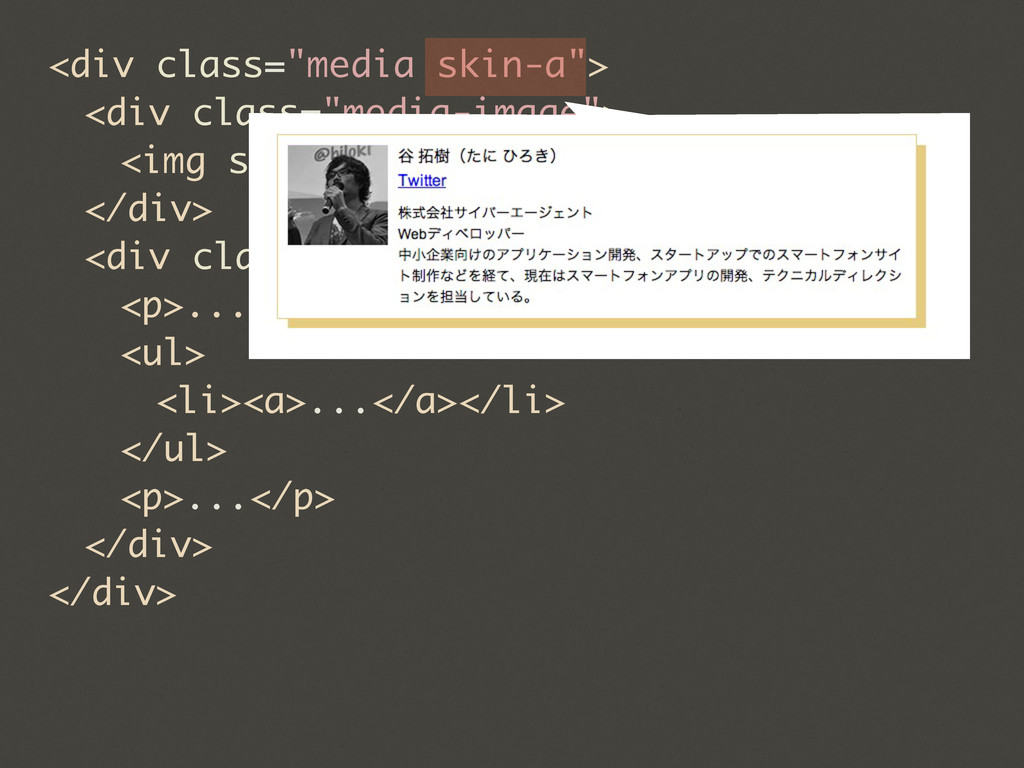
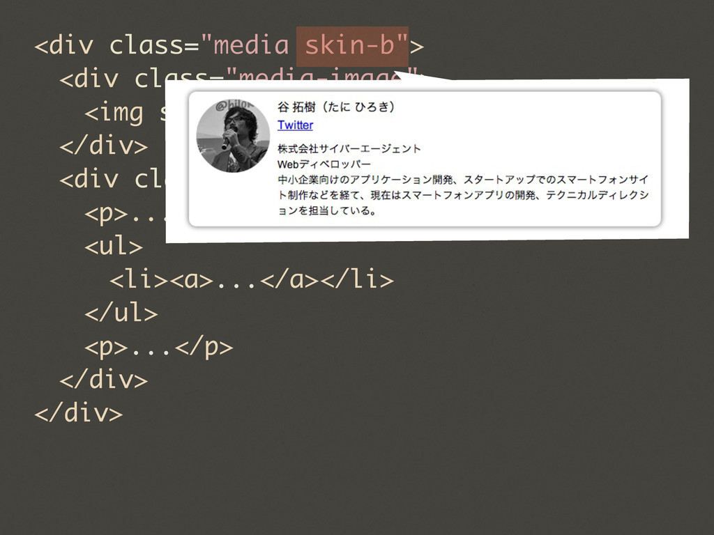
  28. ®©° ALl CoDe In AnY CoDe-BaSe ShOuLd lOoK LiKe A

    SiNgLe PeRsOn TyPeD It, eVeN WhEn MaNy PeOpLe ArE cOnTrIbUtInG To It. NIcOlAs gaLlAgHeR