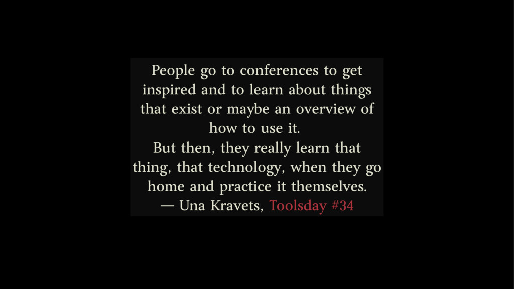
about things that exist or maybe an overview of how to use it. But then, they really learn that thing, that technology, when they go home and practice it themselves. ― Una Kravets, Toolsday #34
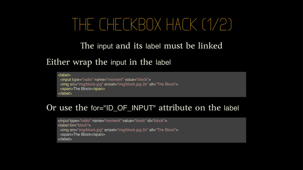
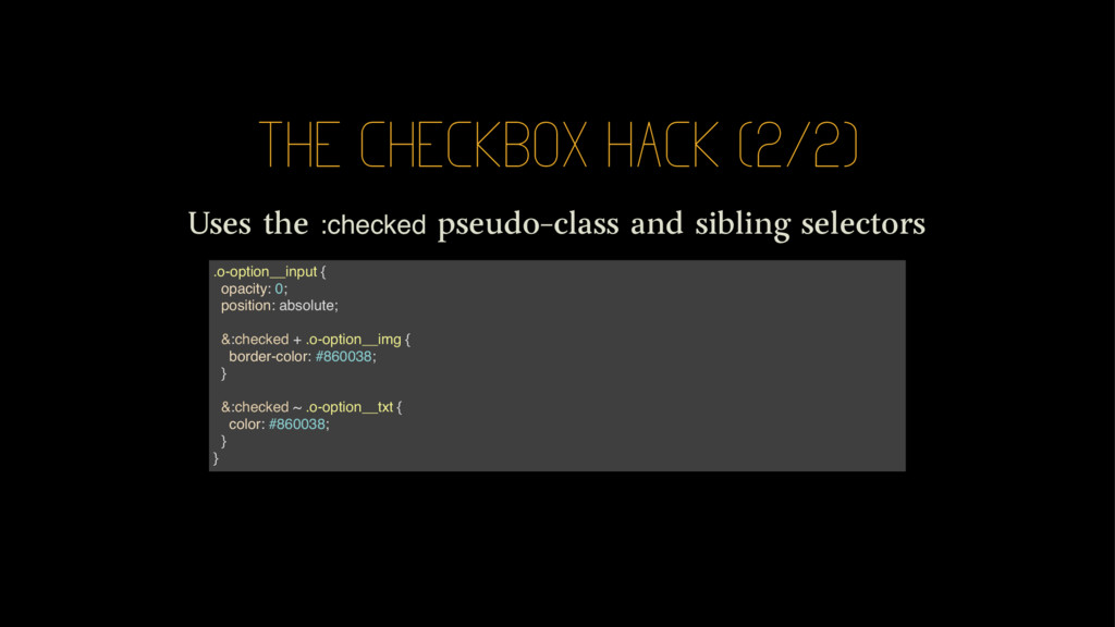
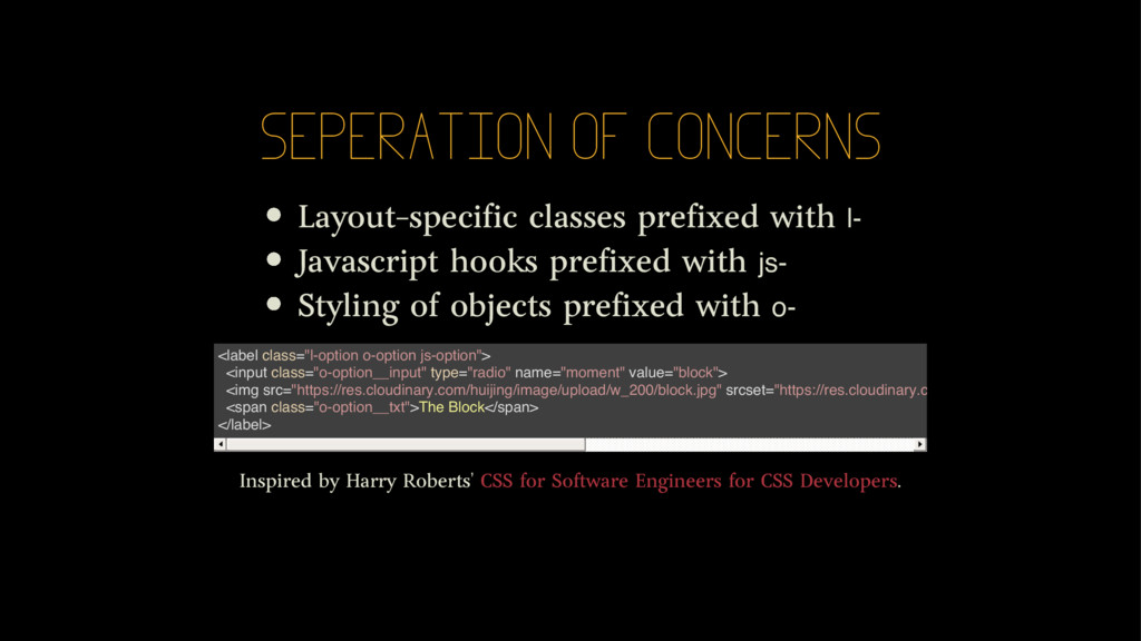
be linked Either wrap the input in the label Or use the for="ID_OF_INPUT" attribute on the label <label> <input type="radio" name="moment" value="block"> <img src="img/block.jpg" srcset="img/block.jpg 2x" alt="The Block"> <span>The Block</span> </label> <input type="radio" name="moment" value="block" id="block"> <label for="block"> <img src="img/block.jpg" srcset="img/block.jpg 2x" alt="The Block"> <span>The Block</span> </label>
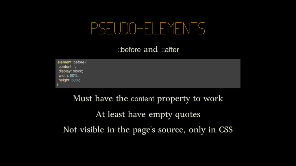
work At least have empty quotes Not visible in the page's source, only in CSS .element::before { content: ''; display: block; width: 50%; height: 50%; }
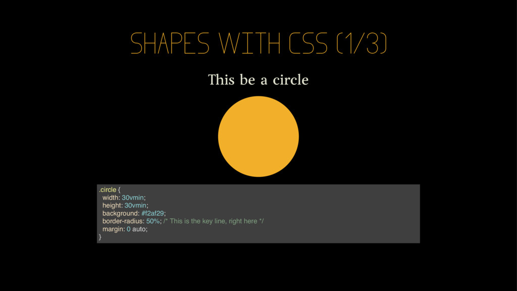
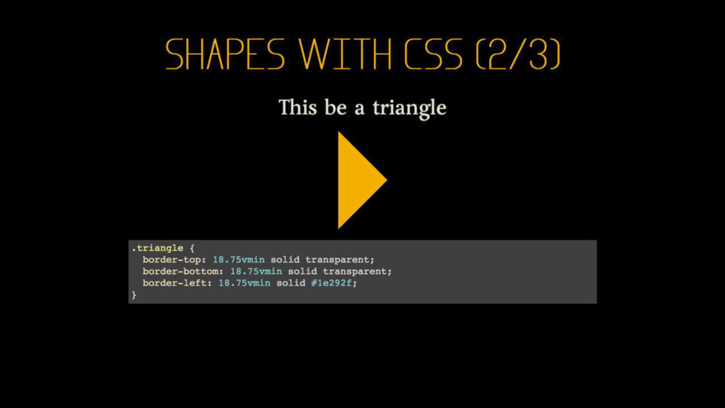
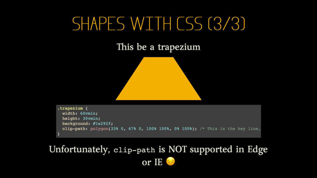
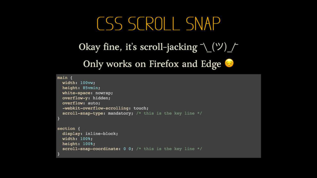
“Checkbox Hack” High Performance Animations Learning To Use The :before And :after Pseudo- Elements In CSS Creating Responsive Shapes With Clip-Path And Breaking Out Of The Box Single Div Drawings with CSS Introducing CSS Scroll Snap Points
 huijing
 ytakahashii
 palkan
 gunnarmorling
 contour_gara
 yoshikouki
 javiergs
 kuranuki
 hirokiomote
 syumai
 bake0937
 jakewharton
 kntkymt
 katiecoart
 wayneb77
 rkaga
rkaga
 tessaabrams
 raygrieselhuber
 addyosmani
 baasie
 sugarenia
 afnizarnur
 ipullrank
 keavy
keavy
 apolaine