Upgrade to Pro — share decks privately, control downloads, hide ads and more …

Mobile applications Development - Lecture 11

Mobile applications Development - Lecture 11

CSS3 Refresher

This presentation has been developed in the context of the Mobile Applications Development course at the Computer Science Department of the University of L’Aquila (Italy).

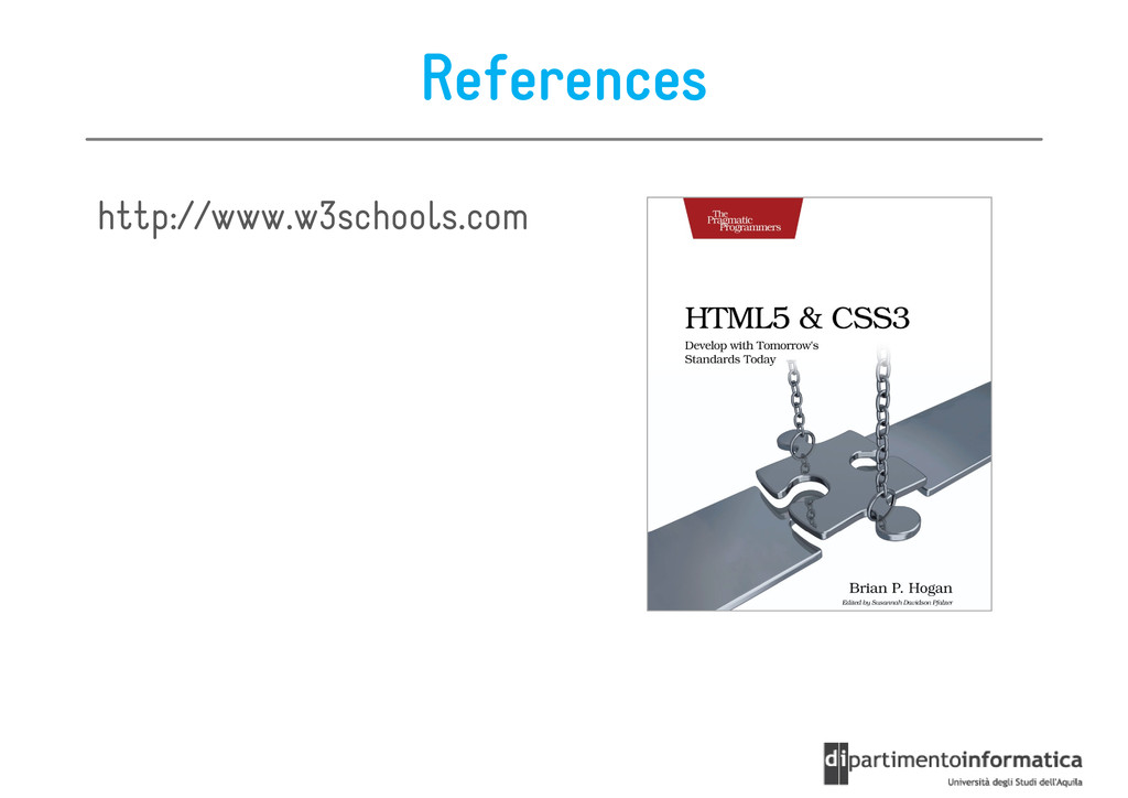
http://www.di.univaq.it/malavolta

Ivano Malavolta

April 30, 2012
Tweet

More Decks by Ivano Malavolta

Other Decks in Technology

Transcript

  1. Roadmap • Intro • Basics • Basics • Selectors •

    Box Model • Positioning & Floats • Fonts • Fonts • Visual Effects • Media Queries
  2. CSS3 Main Drivers Simplicity Simplicity Simplicity Simplicity – less images

    – less images – less markup – less Javascript – less Flash Better Better Better Better performance performance performance performance – fewer HTTP requests – fewer HTTP requests Better Better Better Better Search Search Search Search Engine Engine Engine Engine Placement Placement Placement Placement – text as real text, not images or Flash – speed
  3. Roadmap • Intro • Basics • Basics • Selectors •

    Box Model • Positioning & Floats • Fonts • Fonts • Visual Effects • Media Queries
  4. Basics Generic Generic Generic Generic Syntax Syntax Syntax Syntax: ::

    : selector { property: value; property2: value2, value3; ... ... }
  5. Inheritance If an HTML element B B B B is

    nested into another element A A A A - B inherits the style of A B inherits the style of A unless B has an explicit style definition body { background-color: red; } div { background-color: green; }
  6. Lists div { list-style-image: url(image.png); list-style-image: url(image.png); list-style-position: inside; list-style-style:

    circle; } Style disc | circle square | decimal Position inside | outside square | decimal lower-roman | upper-roman | lower-alpha | upper-alpha | none
  7. Backgrounds You can style a background of any element div

    { background:url(img.png), url(img2.png); background-size:80px 60px; background-repeat:no-repeat; background-origin:content-box; background-origin:content-box; } repeat no-repeat | repeat repeat-x | repeat-y origin top left | top center | top right | center left | border-box | content-box etc.
  8. Background & Colors div { background-color: blue; background-color: blue; background-color:

    rgba(0, 0, 255, 0.2); background-color: hsla(240, 100%, 50%, 0.2); } RGBA = RGB + opacity HSL RGBA = RGB + opacity HSLA = HSL + opacity HSL hue saturation lightness
  9. Gradients They can be used in every place you can

    use an image div { background: -webkit-gradient(linear, right top, left bottom, from(white), to(black)); } linear the type of gradient (also radial, or repeating-linear) linear the type of gradient (also radial, or repeating-linear) right-top start of the gradient left-bottom end of the gradient from starting color to final color
  10. Text p { color: grey; Text-align left | right color:

    grey; letter-spacing: 5px; text-align: center; text-decoration: underline; text-indent: 10px; text-transform: capitalize; left | right center | justify Text-decoration text-transform: capitalize; word-spacing: 10px; } Text-decoration none underline overline line through text-transform None | capitalize | Lowercase | uppercase
  11. Text Effects p { text-shadow: 2px 10px 5px #FF0000; text-shadow:

    2px 10px 5px #FF0000; text-overflow: ellipsis; word-wrap:break-word; } 2px horizontal shadow 10px vertical shadow 10px vertical shadow 5px blur distance #FF0000 color
  12. Roadmap • Intro • Basics • Basics • Selectors •

    Box Model • Positioning & Floats • Fonts • Fonts • Visual Effects • Media Queries
  13. Selectors Classical ways to select elements in CSS2: • by

    type type type type a { color: red; } • by id id id id #redLink { color: red; } • by class class class class • by class class class class . .. .redLink { color: red; }
  14. Other Selectors from CSS1 & CSS2 • div p div

    p div p div p all <p> elements inside a <div> • div>p div>p div>p div>p all <p> elements where the parent is a <div> • div>p div>p div>p div>p all <p> elements where the parent is a <div> • div+p div+p div+p div+p all <p> elements that are placed immediately after <div> • [target] [target] [target] [target] all elements with a target attribute • [target=_blank] [target=_blank] [target=_blank] [target=_blank] all elements with target= "_blank“ "_blank“ • p:first p:first p:first p:first- - - -child child child child every <p> element that is the first child of its parent
  15. Some selectors introduced in CSS3 • a[ a[ a[ a[src

    src src src^="https"] ^="https"] ^="https"] ^="https"] every <a> element whose src attribute value begins with "https” attribute value begins with "https” • a[ a[ a[ a[src src src src$=". $=". $=". $=".pdf pdf pdf pdf"] "] "] "] every <a> element whose src attribute value ends with ".pdf” • a[ a[ a[ a[src src src src*=“mobile"] *=“mobile"] *=“mobile"] *=“mobile"] every <a> element whose src attribute value contains the substring “mobile“ • p:nth p:nth p:nth p:nth- - - -child(2) child(2) child(2) child(2) every <p> element that is the second • p:nth p:nth p:nth p:nth- - - -child(2) child(2) child(2) child(2) every <p> element that is the second child of its parent • p:nth p:nth p:nth p:nth- - - -last last last last- - - -child(2) child(2) child(2) child(2) every <p> element that is the second child of its parent, counting from the last child • :not(p) :not(p) :not(p) :not(p) every element that is not a <p> element
  16. Roadmap • Intro • Basics • Basics • Selectors •

    Box Model • Positioning & Floats • Fonts • Fonts • Visual Effects • Media Queries
  17. Borders & dimensions div { width: 100px; width: 100px; height:

    40px; padding: 10px; border: 5px solid gray; margin: 10px; border-radius: 10px; box-shadow: 10px 10px 5px red; box-shadow: 10px 10px 5px red; }
  18. Roadmap • Intro • Basics • Basics • Selectors •

    Box Model • Positioning & Floats • Fonts • Fonts • Visual Effects • Media Queries
  19. The Display Property It specifies if/how an element is displayed

    div { display: none; } The element will be hidden, and the page will be The element will be hidden, and the page will be displayed as if the element is not there
  20. The Display Property Other usual values: block block • a

    block element is an element that takes up the full width available, and has a line break before and after it inline • an inline element only takes up as much width as necessary • it can contain only other inline elements inline-block • the element is placed as an inline element (on the same line as adjacent content), but it behaves as a block element – you can set width and height, top and bottom margins and paddings
  21. Flex Box It helps in styling elements to be arranged

    horizontally or vertically vertically box: • a new value for the display property • a new property box-orient #div { display: box; box-orient: horizontal; }
  22. Flex Box main elements display: box opts an element and

    its immediate children into the opts an element and its immediate children into the flexible box model box-orient Values: horizontal horizontal horizontal horizontal | vertical | inherit How should the box's children be aligned aligned aligned aligned? box-direction Values: normal normal normal normal | reverse | inherit sets the order order order order in which the elements will be displayed
  23. Flex Box main elements box-pack Values: start start start start

    | end | center | justify Values: start start start start | end | center | justify Sets the alignment of the box along the box- orient axis box-orient: horizontal; box-pack: end; box-pack: end;
  24. Flex Box main elements box-align Values: start | end |

    center | baseline | stretch stretch stretch stretch Values: start | end | center | baseline | stretch stretch stretch stretch Sets how the box's children are aligned in the box box-orient: horizontal; box-align: center; box-align: center;
  25. Flex Box Children by default child elements are not flexible

    their dimension is set according to their width box-flex can be set to any integer It sets how a child element occupy the box’s space #box1 { width: 100px; } #box2 { box-flex: 1; box-flex: 1; } #box3 { box-flex: 2; }
  26. The visibility Property It specifies if an element should be

    visible or hidden div.hidden { visibility: hidden; } The element will be hidden, but still affect the layout It can also be set to visible, collapse, inherit
  27. Relative Positioning Elements behave exactly the same way as statically

    positioned elements way as statically positioned elements we can adjust a relatively positioned element with offset properties: top, top, top, top, right, right, right, right, bottom, and bottom, and bottom, and bottom, and left left left left http://bit.ly/I8cEaF
  28. Relative Positioning It is possible to create a coordinate system

    for child elements elements http://bit.ly/I8cEaF
  29. Absolute Positioning an absolutely positioned element is removed from the

    normal flow normal flow it won’t affect or be affected by any other element in the flow http://bit.ly/I8cEaF
  30. Fixed Positioning shares all the rules of an absolutely positioned

    element http://bit.ly/I8cEaF a fixed element does not scroll with the document
  31. Inherit Positioning The element inherits inherits inherits inherits the value

    of its parent element Typically, position property elements do not naturally inherit their parent’s values the static value is assigned if no position value is given http://bit.ly/I8cEaF
  32. Float A floated element will move as far to the

    left or will move as far to the left or will move as far to the left or will move as far to the left or right as it can right as it can right as it can right as it can right as it can right as it can right as it can right as it can Elements are floated only horizontally horizontally horizontally horizontally The float CSS property can accept one of 4 values: left, left, left, left, right, right, right, right, none, and none, and none, and none, and inherit inherit inherit inherit
  33. Float The elements before the floating element will not be

    affected affected The elements after the floating element will flow around it - to avoid this, use the clear clear clear clear property Generally, a floated element should have an explicitly set explicitly set explicitly set explicitly set Generally, a floated element should have an explicitly set explicitly set explicitly set explicitly set width width width width For a deeper explanation of CSS float: http://bit.ly/I8cAb5
  34. Roadmap • Intro • Basics • Basics • Selectors •

    Box Model • Positioning & Floats • Fonts • Fonts • Visual Effects • Media Queries
  35. Fonts Before CSS3, web designers had to use fonts that

    were already installed on the user's device already installed on the user's device With CSS3, web designers can use whatever font they like @font-face { font-family: NAME; src: url(Dimbo.ttf); font-weight normal bold src: url(Dimbo.ttf); font-weight: normal; font-style: normal; } font-style normal italic oblique bold 100 200 …
  36. Fonts Usage To use the font for an HTML element,

    refer to the name of the font (NAME) through the font font font font- - - -family family family family of the font (NAME) through the font font font font- - - -family family family family property div { font-family: NAME; font-family: NAME; }
  37. Roadmap • Intro • Basics • Basics • Selectors •

    Box Model • Positioning & Floats • Fonts • Fonts • Visual Effects • Media Queries
  38. Visual Effects Three main mechanisms: 1. 1. 1. 1. Transforms

    Transforms Transforms Transforms ( ( ( (both both both both 2D and 3D) 2D and 3D) 2D and 3D) 2D and 3D) 2. 2. 2. 2. Transitions Transitions Transitions Transitions 3. 3. 3. 3. Animations Animations Animations Animations
  39. Transforms A transform is an effect that lets an element

    change shape, size, position shape, size, position shape, size, position shape, size, position, … change shape, size, position shape, size, position shape, size, position shape, size, position, … You can transform your elements using 2D or 3D transformations http://bit.ly/IroJ7S
  40. Transitions They are used to add an effect when changing

    from one style to another style to another The effect can be gradual gradual gradual gradual A transition is composed of 2 parts: 1. The CSS property to add the effect 2. The duration of the effect The effect will start when the specified CSS property changes value
  41. Transition syntax A transition contains 4 properties: • property property

    property property • property property property property – the name of the CSS property the transition effect is for (can be all) • duration duration duration duration – how many seconds (or milliseconds) the transition effect takes to complete takes to complete • timing timing timing timing- - - -function function function function – linear, ease, ease-in, ease-out, ease-in-out • delay delay delay delay – when the transition effect will start
  42. Example .imageThumbnail { width; 200px; transition: all ease-in 3s; transition:

    all ease-in 3s; } .zoomed { position: absolute; left: 0px; top: 0px; top: 0px; width: 480px; } $(‘.imageThumbnail’).addClass(‘zoomed’);
  43. Animations An animation is an effect that lets an element

    gradually element gradually element gradually element gradually change from one style to another change from one style to another change from one style to another change from one style to another You can change style in loop, repeating, etc. To bind bind bind bind an animation to an element, you have to specify at least: 1. Name of the animation 1. Name of the animation 2. Duration of the animation div { animation: test 5s ease-in; }
  44. Animation Definition An animation is defined in a keyframe keyframe

    keyframe keyframe It splits the animation into parts, and assign a specific style to each part The various steps within an animation are given as percentuals 0% beginning of the animation (from) 100% end of the animation (to)
  45. Example @keyframes test{ 0% {background: red; left:0px; top:0px;} 25% {background:

    yellow; left:200px; top:0px;} 25% {background: yellow; left:200px; top:0px;} 50% {background: blue; left:200px; top:200px;} 75% {background: green; left:0px; top:200px;} 100% {background: red; left:0px; top:0px;} } results in results in http://bit.ly/IrtfTY http://bit.ly/IrtfTY http://bit.ly/IrtfTY http://bit.ly/IrtfTY
  46. Transitions VS Animations • Trigger – Transitions must be bound

    to a CSS property change – Transitions must be bound to a CSS property change – Animations start autonomously • States – Transitions have start and end states – Animations can have multiple states • Repeats • Repeats – Transitions can be perfomed once for each activation – Animations can be looped
  47. Roadmap • Intro • Basics • Basics • Selectors •

    Box Model • Positioning & Floats • Fonts • Fonts • Visual Effects • Media Queries
  48. Media Types Media Queries are based on Media Media Media

    Media Types Types Types Types A media type is a specification of the actual actual actual actual media media media media that is being used to access the page Examples of media types include • screen screen screen screen: computer screens • print print print print: printed document • braille braille braille braille: for Braille-based devices • tv tv tv tv: for television devices
  49. Media Types There are two main ways to specify a

    media type: • <link> <link> <link> <link> in the HTML page • <link> <link> <link> <link> in the HTML page <link rel=“stylesheet” href=“style.css” media=“screen” /> • @media @media @media @media within the CSS file @media screen { div { color: red; } }
  50. Media Queries They They They They allow allow allow allow

    you you you you to to to to to to to to change style based on specific change style based on specific change style based on specific change style based on specific conditions conditions conditions conditions conditions conditions conditions conditions For example, they can be about • device’s display size display size display size display size • orientation orientation orientation orientation of the device • Resolution Resolution Resolution Resolution of the display • ...
  51. Media Queries A media query is a boolean boolean boolean

    boolean expression expression expression expression The CSS associated with the media query expression is applied only if it evaluates to true A media query consists of 1. a media type 1. a media type 2. a set of media features @media screen and orientation: portrait
  52. The AND operator You can combine multiple expressions by using

    the and and and and operator the and and and and operator @media screen and (max-device-width: 480px){ /* your style */ }
  53. The COMMA operator The comma keyword acts as an or

    or or or operator @media screen and (color), handheld and (color) { /* your style */ }
  54. The NOT operator You can explicitly ignore a specific type

    of device by using the not not not not operator using the not not not not operator @media not (width:480px) { /* your style */ }
  55. The ONLY expression It is used to “hide hide hide

    hide” the CSS to older browsers that can read media types but cannot handle media queries read media types but cannot handle media queries In this case the styling information will not be visible to those browsers @media only screen @media only screen and (min-device-width : 320px) and (max-device-width : 480px) { /* Styles */ } Smartphones (portrait and landscape)
  56. Examples Retina Displays @media only screen and -webkit-min-device-pixel-ratio: 2 @media

    only screen and -webkit-min-device-pixel-ratio: 2 iPad in landscape orientation @media only screen and (device-width: 768px) and (orientation: landscape) iPhone and Android devices iPhone and Android devices @media only screen and (min-device-width: 320px) and (max-device-width: 480px)