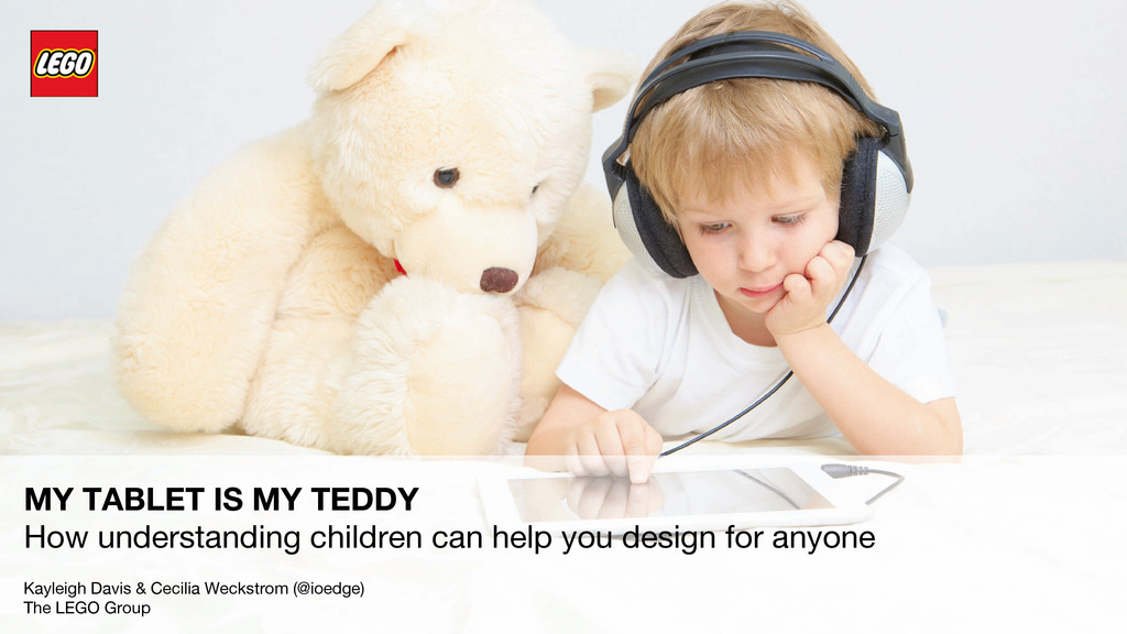
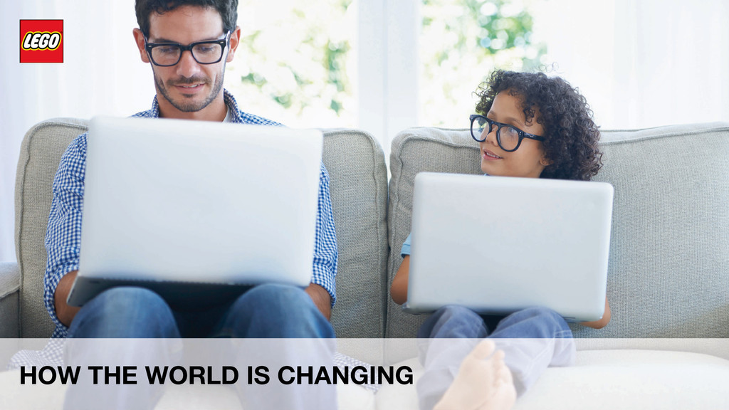
The world is changing fast and those not even aware of the change are children growing up with tablets as playthings and the internet in their beds. A space rife with legislation around privacy and child safety, under pressure to be relevant and engaging in ever decreasing attention spans – designing for children is probably the hardest thing you can do. The old paradigms don’t work for the digital natives, yet what works for children, often works for everyone else too. Find out how LEGO created a system in online to radically increase speed in development and offer a better experience to both young and old online. Keynote at UXLondon 2015.
SLIDE NOTES:
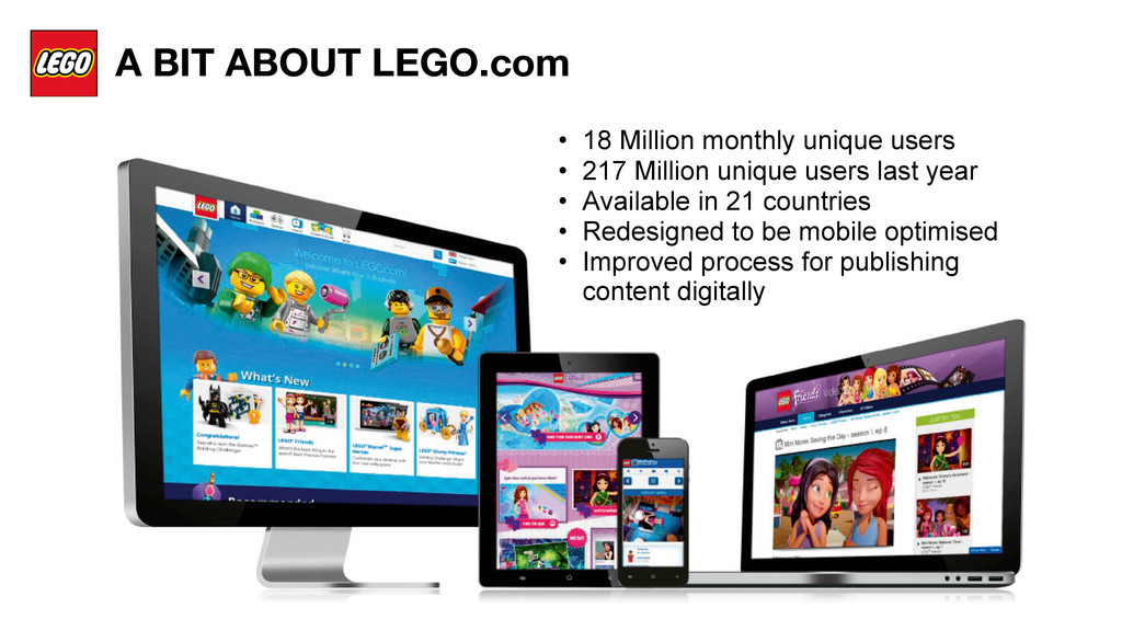
SLIDE 2 - LEGO.com and our work in the online space:
LEGO.com has 18 million monthly uniques, 217 million unique users last year, is in 21 countries, features 34 different themes, and was redesigned to be mobile optimised and to improve the way that we handle publishing content digitally.
Migration from old to new has been a bit like building the plane while we are flying it. We used the Create Once Publish Everywhere framework enabling us to push content to any platform and device, while the site is live,It’s been tough, but it meant that when Google’s Mobilgeddon hit in late April, we were ready. Rather than tell you the story about this, we wanted to share with you what we discovered while working on redesigning LEGO.com.
SLIDE 3 – How we work:
Our approach is one of exploration and iteration. To understand the values and needs of our varied user base we built early prototypes of sometimes extreme ideas to provoke sharing and interaction. We invited kids and adults in to explore and co-create, and tell us what they would like to see more of.
We then further developed those concepts and developed fully working prototypes that we tested using ipads and desktops. We had both kids and adults test them, and did iteration cycles to keep improving on the designs based on our findings. This process didn’t just help us understand the needs of our audience, but made us uncover some broader trends about how kids and adults are becoming increasingly similar in their needs. This is insight you can use to your advantage.
SLIDE 4 - HOW IS THE WORLD CHANGING - e.g in what ways are adults and children becoming similar in their needs online**?
SLIDE 5 **Squeezed for Time**
What Children and adults have in common in that we are both squeezed for time - parents due to many competing priorities and always-on work, and children because screen time is increasingly limited and they want to make the most of their time online. Every interaction counts, often gaming experiences are the most rewarding because they sprinkle achievements and progress into every tap.
SLIDE 6 **Willing to herd**:
The time constraints mean both children and adults are eager to find what matters faster so we look for the most shared or most viewed to give us guidance. We want to know what others like so when we don’t have an opinion ourselves we can quickly form one. I’m having what she is having.
SLIDE 7 **No second chances**
As adults we live in our screens to the point where distraction is the norm and our attention is both fragmented and shorter. Shorter attention spans give way to reduced patience, experiences don’t get second chances, and we won’t read the manual to figure out how something works. Kids abandon things that aren’t fun as the next exciting thing is only a tap away.
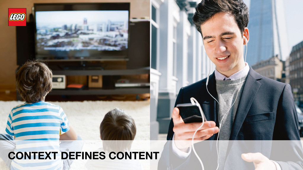
SLIDE 8 **Context defines content**
We expect content to adapt to us, rather than us to adapt and look for the content. We increasingly expect content and sites to adjust to where we are, what we like, what is happening right now and the devices we are using. We depend on contexts and relationships to work out what is the most important content and are frustrated when this strategy doesn’t work.
For kids it comes from the fact that abstract thought like understanding categories is only something kids learn to do when they are 8 or older. For adults this comes from a combination of lack of patience, and reduced attention spans which takes away our willingness to focus and figure things out.
SLIDE 9 **Touching makes it real**
Touching what you can see is natural, to the point that kids struggle to use mice and keyboards. Gestures on tablets mimic the way that we interact with the physical world, making it much more intuitive for people to pick up and use instantaneously, without conscious thinking. Tablets have made our content tangible - we touch our content and manipulate it directly, rather than clicking and moving the cursor. Visuals in particular become the primary way for us to navigate,
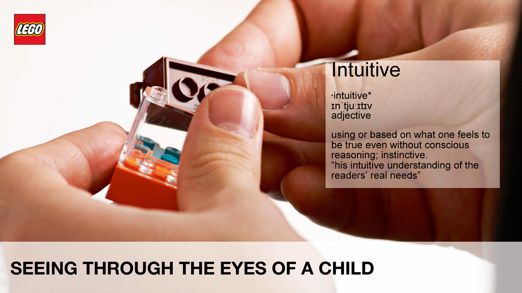
SLIDE 10 What makes sense to a child is what we as adults call intuitive
How children and adults pay attention is becoming similar, and what is designed to make sense to a child feels intuitive to adults. We should learn to see the world from the eyes of a child in order to create better, more intuitive experiences for all.**
*intuitive*
ɪnˈtjuːɪtɪv
adjective
using or based on what one feels to be true even without conscious reasoning; instinctive.
“his intuitive understanding of the readers’ real needs”
synonyms: instinctive, intuitional, instinctual; More
(chiefly of computer software) easy to use and understand.
- Something you know how to operate/use without thinking
- You didn’t have to read the manual
- You aren’t confused by the options
SLIDE 11 Make it Intuitive
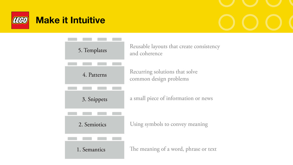
To make something intuitive you first need to understand that it is not going to happen from one element alone. Intuitive experiences normally are a combination of various layers of information that each compliment one another. We identified 5 different layers of information that helped with this, these are:
Semantics – By simply understanding the different language our users used for calling things we were able to move away from internal language and use terminology that our users better understood
Semiotics – By understanding how kids see and perceive the world around them, enabled us to design iconography and imagery that best reflected their frame of reference
Snippets – By combining both semantics and semiotics we were able to standardize how we show our various content types as small snippets of information. Which helped our users instantly recognize the nuances between content types
Patterns – By consistently using our snippets in similar ways to navigate and group content types enabled users to adopt patterns faster and become more familiar with interaction across components
Templates – By creating standardised templates and page layouts meant our users became much more familiar with information hierarchies and created consistency across sites
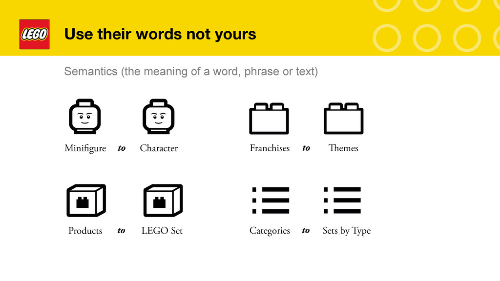
SLIDE 12 - Use their words not yours
Semantics – By using the language that was most commonly understood by our users helped us to move away from internally driven terminology. For instance we replaced the name ‘Minifigure’ to the better known ‘Character’ and from products to ‘LEGO Sets’.
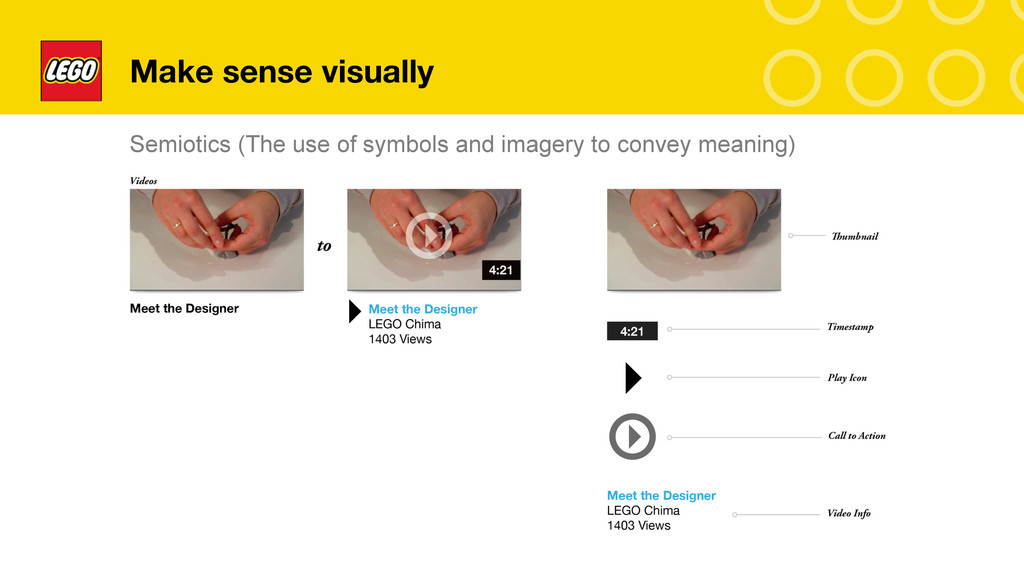
Slide 13 Make sense visually
Semiotics – We also spent time trying to better understand how kids visually understood the world around them. During testing we uncovered some interesting trends – one was that most generic icons are out of date. Children commonly did not know what a TV with an aerial was – as these no longer exist, and it would be very uncommon for them to have seen one in their lifetime. By understanding these trends it enabled us to think very carefully about the visual elements we placed on the page. Making sure that what we put there was something that even a 5 year old would know. Its also important to note that idiosyncratic or metaphorical imagery is also not very well understood by children as they lack the ability of abstraction until the age of 8.
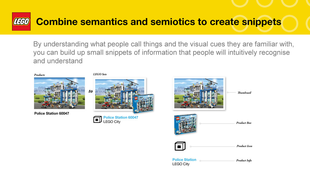
Slide 14 Combine Semantics and Semiotics to create snippets
Snippets – By combining both semantics and semiotics enables you to create snippets. These small pieces of information are good at helping your users decipher what the content is and the action that will happen from using it. By understanding what your content is best known as (semantics) and what your users visualizes it best as (semiotics) and then by reinforcing what the content is by either A. adding subsidiary information such as price, views etc and finally and B. Adding a clear call to action that includes verbs like PLAY, WATCH or GET. Will help users to consistently identify content better across your site.
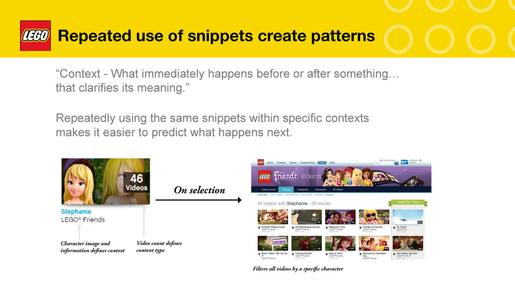
Slide 15 Repeated use of snippets create patterns
Patterns – are created by consistently reusing the same snippets in varying contexts to make it easier to predict what happens next. A good example here shows how by using the character image and subsidary information clarifies what the context is, the video count helps to further reinforce that by selecting this item you will be shown all videos related to this specific character. Even if a child is unable to read the name Stephanie or LEGO friends – They normally recognise the character’s mugshot helping them to decipher what the filter is.
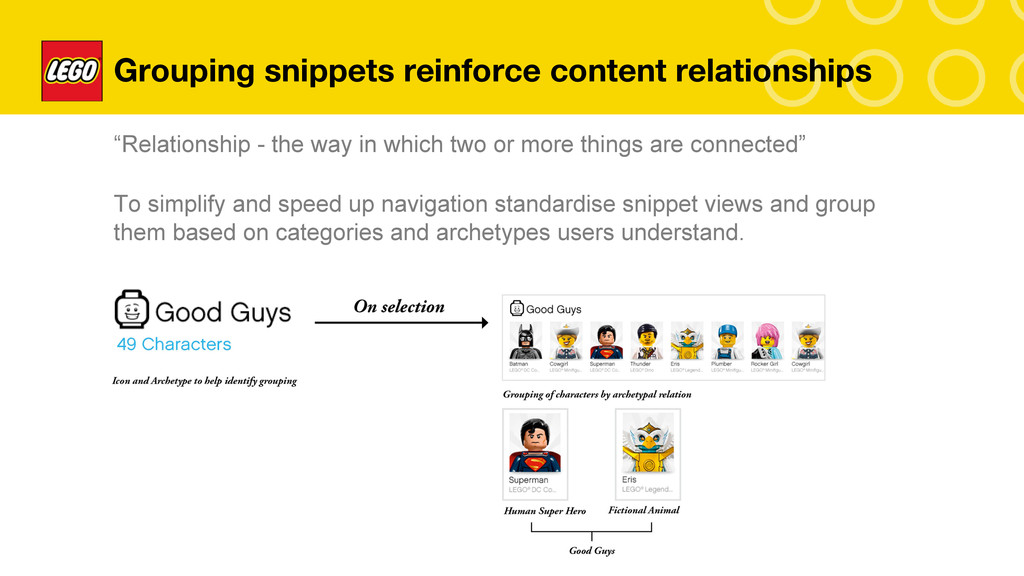
Slide 16 Grouping Snippets reinforce content relationships
The grouping of snippets also helps users to identify relationships between the content. By grouping content by archetypal relation we found that children were able to navigate content in many more ways that just by the generic LEGO Theme’s. We were able to offer navigational paradigms that matched their mental models much better than previously possible. We created categories like good guys, bad guys, creatures, space, vehicles etc. This has helped us to develop a taxonomy that is unique to our LEGO users.
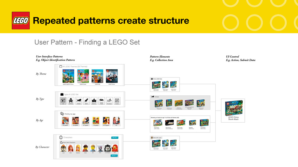
Slide 17 Repeated Patterns create Structure
We furthered this by creating multiple entries to the same content types – we discovered that some of our users typically try to find sets that include their favorite characters, or that parents look for sets that are most appropriate for their kids by the age range. We also found that most people had no idea of what our LEGO Franchises were called and simply just wanted to find sets like space and rocket ships. Cars, and animals. These patterns helped us to define structured ways of organizing our taxonomy to create entries to lots of different LEGO content consistently across our sites.
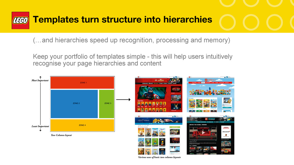
Slide 18 Templates turn structure into hierarchies
To help further reinforce structure and hierarchies within our site we developed standardised templates that enabled us to place content in order of most importance, this helped our younger and older users to get a sense of what content is in focus and what is supplementary and to find content much quicker, meaning our users were able to adopt a more systematic strategy when scanning pages and resulting in fewer revisits.
We found that by keeping our portfolio of templates small and simple made it easier to maintain, to design responsively and easier for users to familiarize themselves with.
Slide 19
To wrap things up we simply conclude on two points:
1. To make things intuitive it helps to see the world through the eyes of a child. Children intuitively pay attention to the small details and patterns that the rest of us take for granted but frequently get wrong. What kids struggle with others struggle with too – and if they don’t they aren’t probably telling you the truth.
2. Designing for and asking kids for feedback isn’t just important if you have stuff that kids will look at – they can frequently help you make sense of stuff you want to appeal to adults too. By using this audience as your panel for feedback you will struggle, but it will make you a better designer and developer because it will force you to make sense of your snippets, the patterns you want to instill and eventually what templates you will need to communicate and engage. It will make for a more robust experience and one that will not just be usable, but delightful.
One of the virtues of being very young is that you don’t let the facts get in the way of your imagination ~ Sam Levenson