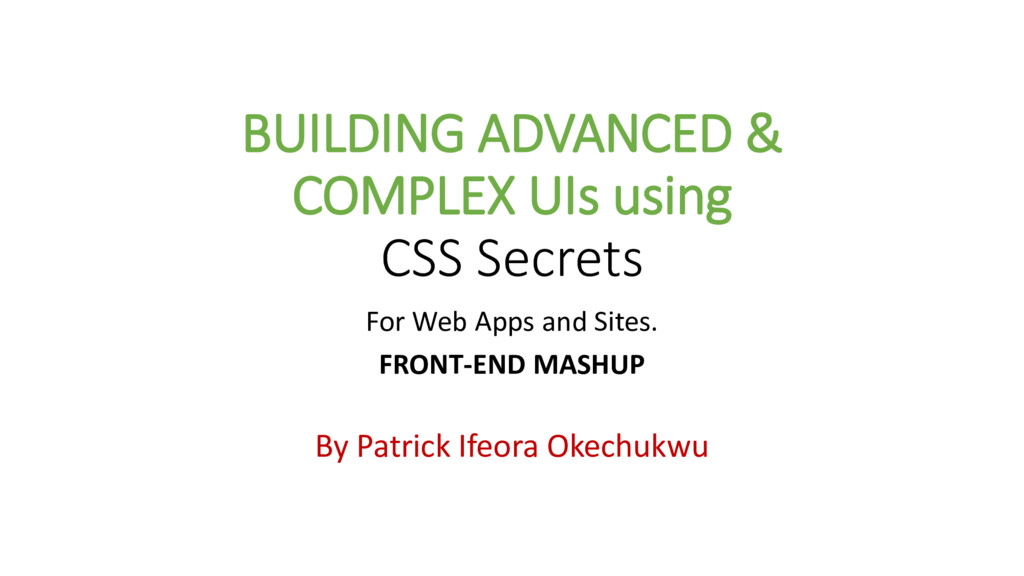
This is a detailed set of slides on my presentation at the WeCode August Meetup 2017 for mastering CSS and it's secrets and using this secrets to build complex awesome UIs.
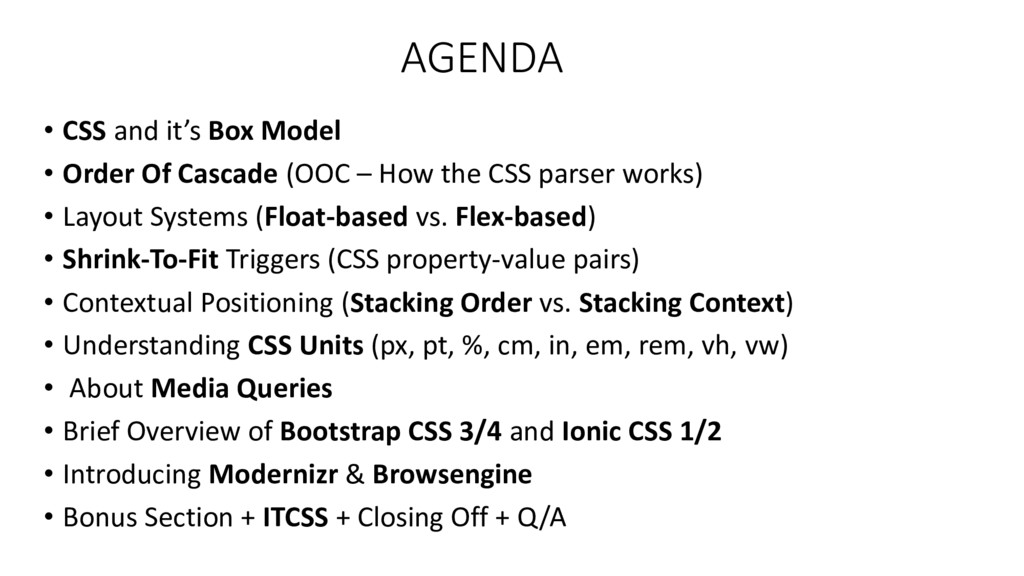
Of Cascade (OOC – How the CSS parser works) • Layout Systems (Float-based vs. Flex-based) • Shrink-To-Fit Triggers (CSS property-value pairs) • Contextual Positioning (Stacking Order vs. Stacking Context) • Understanding CSS Units (px, pt, %, cm, in, em, rem, vh, vw) • About Media Queries • Brief Overview of Bootstrap CSS 3/4 and Ionic CSS 1/2 • Introducing Modernizr & Browsengine • Bonus Section + ITCSS + Closing Off + Q/A
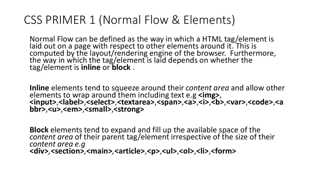
be defined as the way in which a HTML tag/element is laid out on a page with respect to other elements around it. This is computed by the layout/rendering engine of the browser. Furthermore, the way in which the tag/element is laid depends on whether the tag/element is inline or block . Inline elements tend to squeeze around their content area and allow other elements to wrap around them including text e.g <img>, <input>,<label>,<select>,<textarea>,<span>,<a>,<i>,<b>,<var>,<code>,<a bbr>,<u>,<em>,<small>,<strong> Block elements tend to expand and fill up the available space of the content area of their parent tag/element irrespective of the size of their content area e.g <div>,<section>,<main>,<article>,<p>,<ul>,<ol>,<li>,<form>
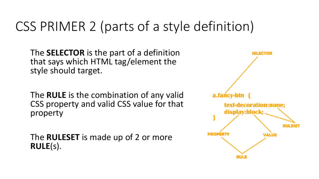
is the part of a definition that says which HTML tag/element the style should target. The RULE is the combination of any valid CSS property and valid CSS value for that property The RULESET is made up of 2 or more RULE(s).
designer hands you a design board and/or UI mockup to implement, your first task is to draw a bunch of boxes on or according to it (especially when the design is only digitally a essi le a d deter i e ho the ’re supposed to sta k, alig , arranged, grow/stretch, overlap and wrap to achieve the desired desig . O e ou’ e got that do e, it should e prett eas to ode it up using any of the available layout systems in CSS. ͟ – O e gu like that…
exactly is the CSS Box Model ??? The CSS box model is the rule that guides the behavior of each and every HTML tag/element as regards normal flow. It also determines the 4 major different parts of the tag/element (i.e. margin, padding, border and content-area) that are used to effectively size out the element in relation to other HTML tag/elements around.
Selector Specificity 3. Source Order 4. Parent-To-Child Rule Inheritance The location of Style Definition/Style Sheet (external, internal, inline) will sometimes affect the order-of-cascade but only if the target HTML tag/element has no prior CSS rule(s) applied to it in an external or internal style sheet.
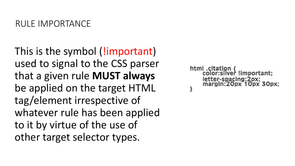
to the CSS parser that a given rule MUST always be applied on the target HTML tag/element irrespective of whatever rule has been applied to it by virtue of the use of other target selector types.
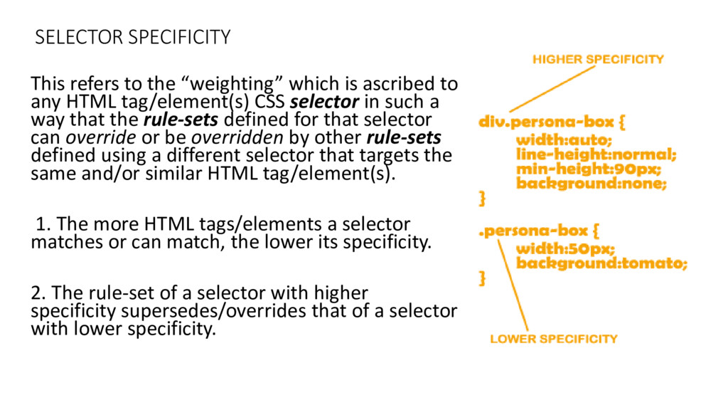
is as ri ed to any HTML tag/element(s) CSS selector in such a way that the rule-sets defined for that selector can override or be overridden by other rule-sets defined using a different selector that targets the same and/or similar HTML tag/element(s). 1. The more HTML tags/elements a selector matches or can match, the lower its specificity. 2. The rule-set of a selector with higher specificity supersedes/overrides that of a selector with lower specificity.
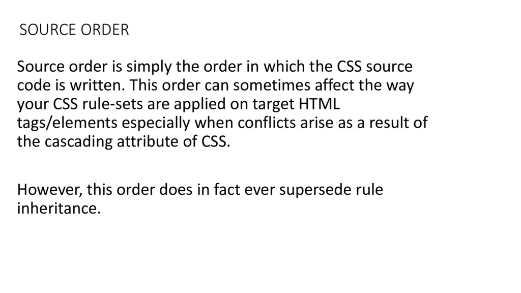
the CSS source code is written. This order can sometimes affect the way your CSS rule-sets are applied on target HTML tags/elements especially when conflicts arise as a result of the cascading attribute of CSS. However, this order does in fact ever supersede rule inheritance.
value pairs defined on a given HTML tag/element are passed on to the child HTML tag/ elements inside it. By way of inheritance. Examples of inheritable properties: color, overflow, line-height, font-size, font- family, opacity, text-align
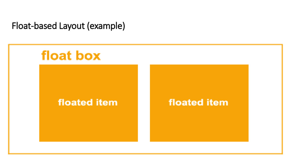
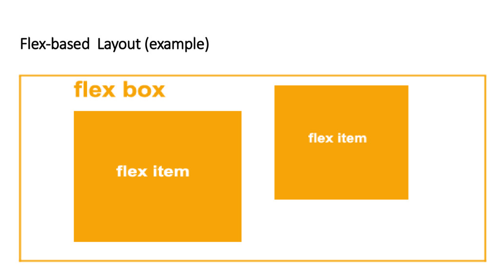
systems in CSS today. By layout systems, this refers to the manner in which different HTML tags/elements are laid out (or arranged) on a page. These 2 layout systems allow for grouping, stacking, overlapping, shrinking, stretching of the HTML tags/elements. They are: 1. Float-based System 2. Flex-Based System
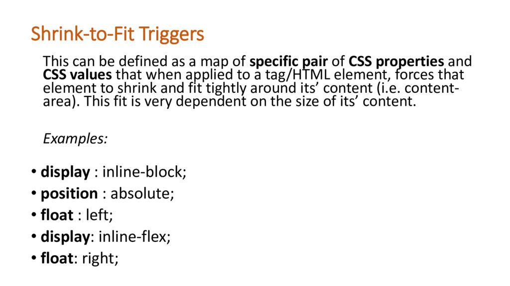
• float : left; • display: inline-flex; • float: right; This can be defined as a map of specific pair of CSS properties and CSS values that when applied to a tag/HTML element, forces that ele e t to shri k a d fit tightl arou d its’ o te t i.e. o te t- area . This fit is er depe de t o the size of its’ o te t. Examples:
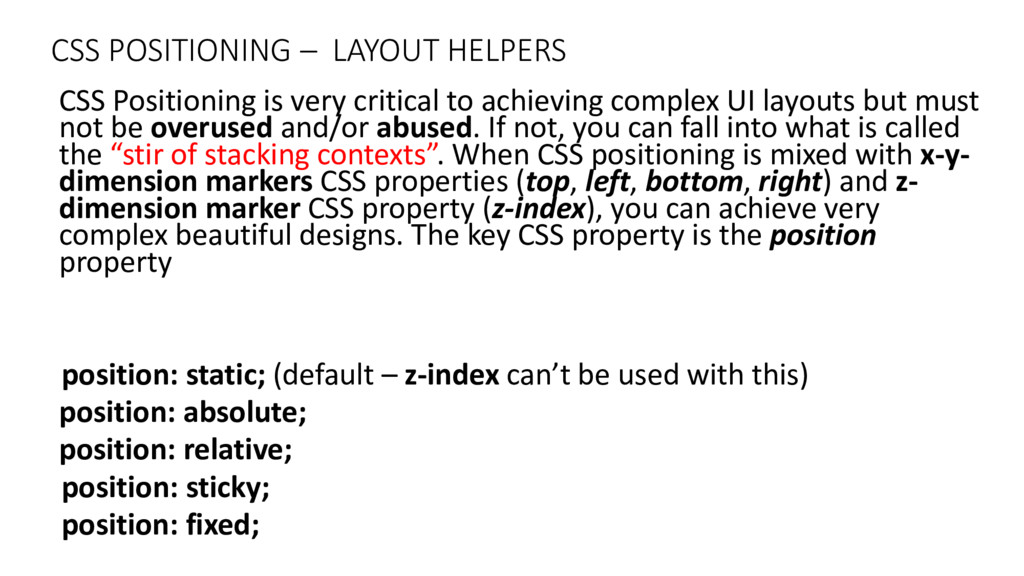
to achieving complex UI layouts but must not be overused and/or abused. If not, you can fall into what is called the stir of sta ki g o te ts . When CSS positioning is mixed with x-y- dimension markers CSS properties (top, left, bottom, right) and z- dimension marker CSS property (z-index), you can achieve very complex beautiful designs. The key CSS property is the position property position: static; (default – z-index a ’t e used ith this position: absolute; position: relative; position: sticky; position: fixed;
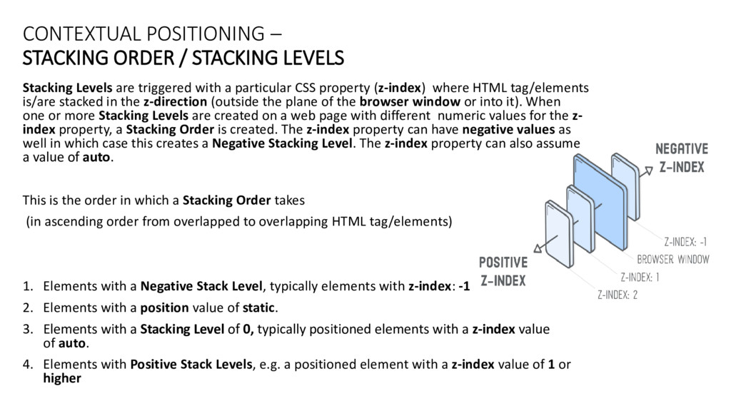
are triggered with a particular CSS property (z-index) where HTML tag/elements is/are stacked in the z-direction (outside the plane of the browser window or into it). When one or more Stacking Levels are created on a web page with different numeric values for the z- index property, a Stacking Order is created. The z-index property can have negative values as well in which case this creates a Negative Stacking Level. The z-index property can also assume a value of auto. This is the order in which a Stacking Order takes (in ascending order from overlapped to overlapping HTML tag/elements) 1. Elements with a Negative Stack Level, typically elements with z-index: -1 2. Elements with a position value of static. 3. Elements with a Stacking Level of 0, typically positioned elements with a z-index value of auto. 4. Elements with Positive Stack Levels, e.g. a positioned element with a z-index value of 1 or higher
a Stacking Level or a combination of specific CSS property-value pair-range nested in one another. You can have multiple Stacking Contexts on a given webpage. A Stacking Context can also be nested into another Stacking Context . Stacking Contexts are self- contained bunches of 2 or more Stacking Levels nested in depth (i.e. When a Stacking Level is the child of another Stacking Level which is the child of another Stacking Level). The sta ki g is do e according to the value assigned for each Stacking Level whether or not they are children of a higher Stacking Level or not. Whenever you have one Stacking Context inside another. The outermost Stacking Level of the outermost Stacking Context is SUPREME. CSS property-value pairs that can create a Stacking Context are as follows: 1. opacity: 0.1 - 1 2. transform: rotate(30deg) – scale(2) 3. the HTML element 4. a Flex-Item with a z-index:1 or higher 5. z-index: 1 or higher
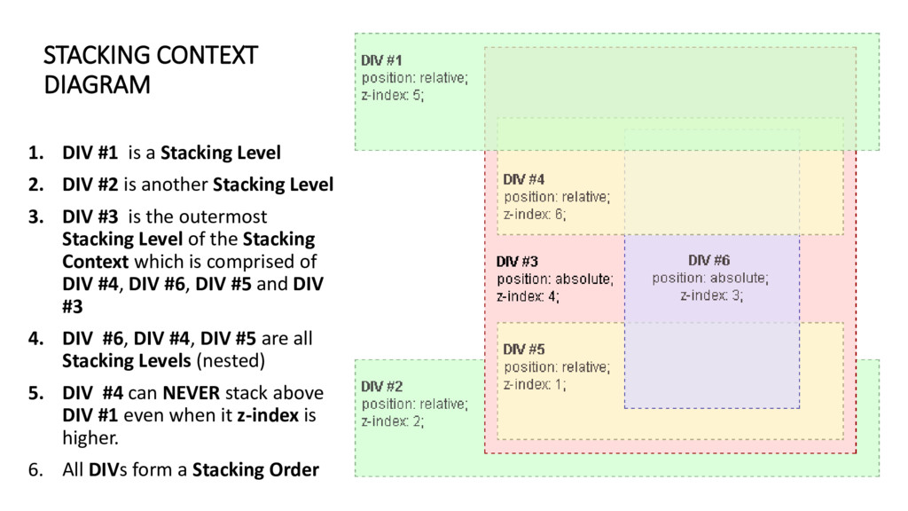
2. DIV #2 is another Stacking Level 3. DIV #3 is the outermost Stacking Level of the Stacking Context which is comprised of DIV #4, DIV #6, DIV #5 and DIV #3 4. DIV #6, DIV #4, DIV #5 are all Stacking Levels (nested) 5. DIV #4 can NEVER stack above DIV #1 even when it z-index is higher. 6. All DIVs form a Stacking Order
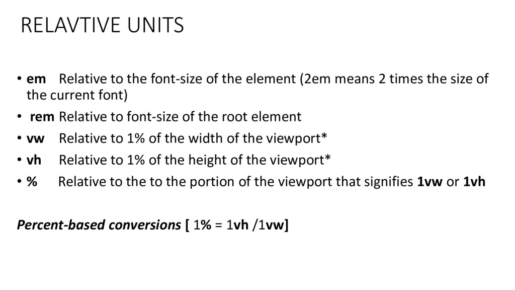
units for any CSS property that takes in a numeric value with a unit. E.g. margin, padding, line-height, width, height, min-width, min-height, max-width, max-height, font-size, border-width Relative Units: (em, rem, %, vw, vh) are flexible units. lengths expressed in any of these will appear relative to another fixed length property-value. Usually, the value of the width or height of the browser viewport or the size of a HTML tag/element font size.The %, em and rem units are practical in creating perfectly scalable layout! Absolute Units: (px, cm, pc, in, pt) are fixed length and a length expressed in any of these will appear as exactly that size in real life.
element (2em means 2 times the size of the current font) • rem Relative to font-size of the root element • vw Relative to 1% of the width of the viewport* • vh Relative to 1% of the height of the viewport* • % Relative to the to the portion of the viewport that signifies 1vw or 1vh Percent-based conversions [ 1% = 1vh /1vw]
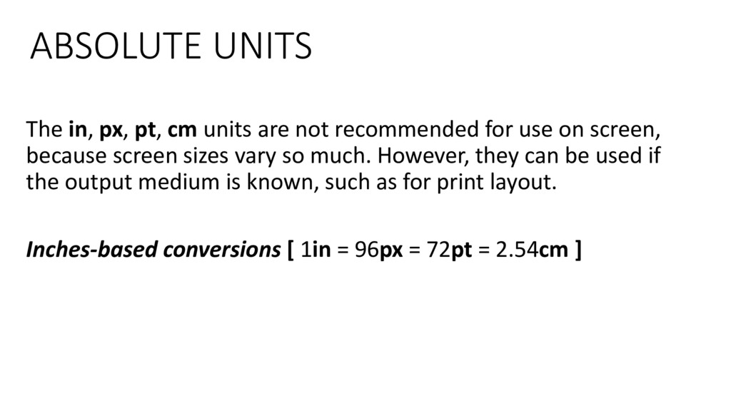
recommended for use on screen, because screen sizes vary so much. However, they can be used if the output medium is known, such as for print layout. Inches-based conversions [ 1in = 96px = 72pt = 2.54cm ]
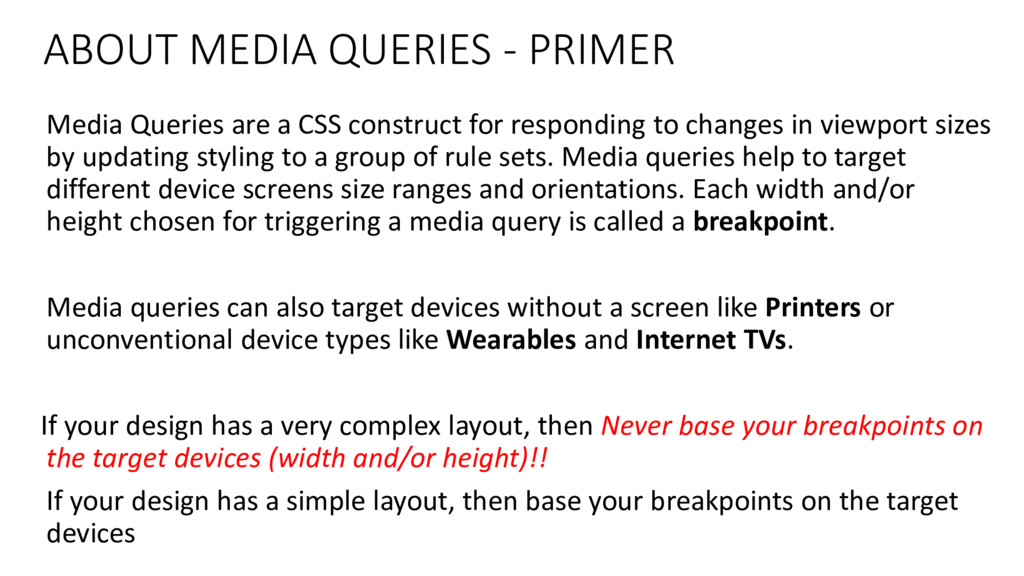
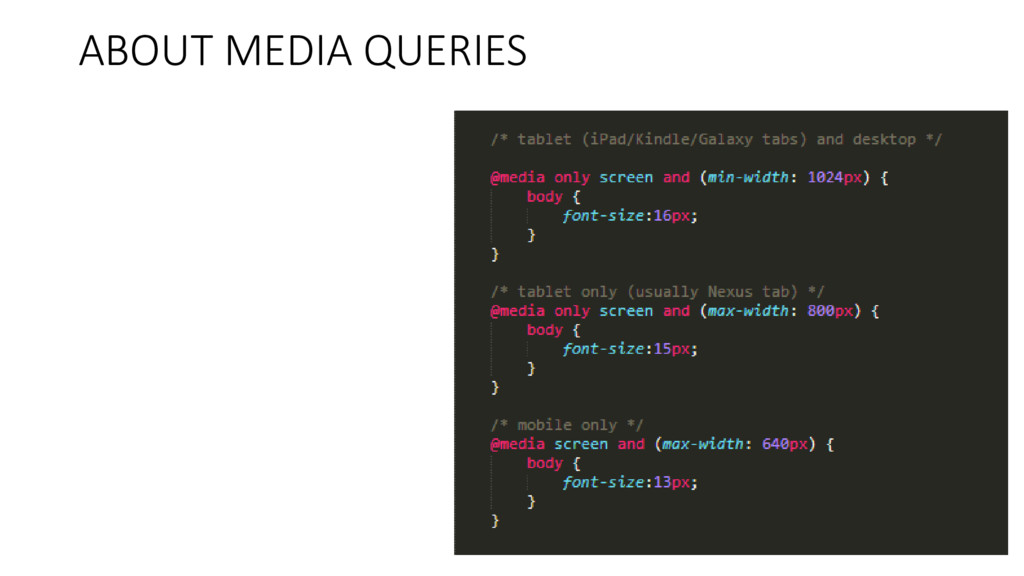
construct for responding to changes in viewport sizes by updating styling to a group of rule sets. Media queries help to target different device screens size ranges and orientations. Each width and/or height chosen for triggering a media query is called a breakpoint. Media queries can also target devices without a screen like Printers or unconventional device types like Wearables and Internet TVs. If your design has a very complex layout, then Never base your breakpoints on the target devices (width and/or height)!! If your design has a simple layout, then base your breakpoints on the target devices
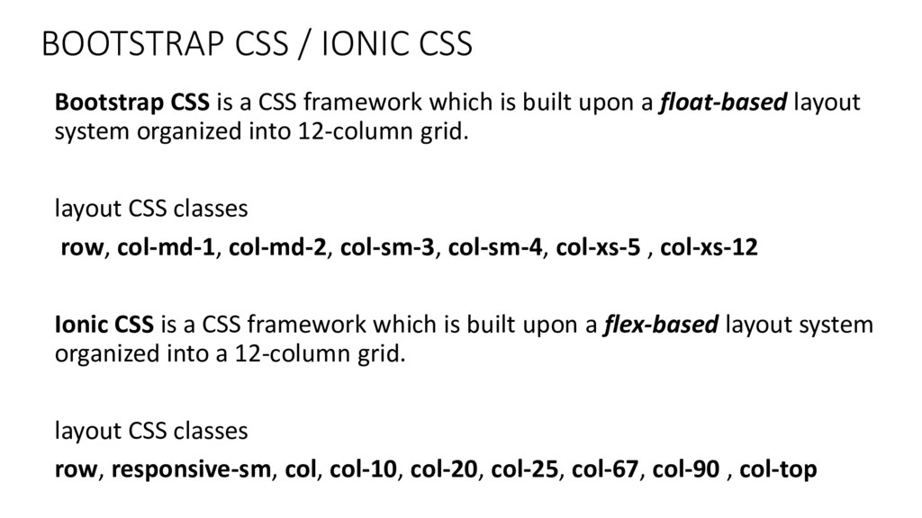
framework which is built upon a float-based layout system organized into 12-column grid. layout CSS classes row, col-md-1, col-md-2, col-sm-3, col-sm-4, col-xs-5 , col-xs-12 Ionic CSS is a CSS framework which is built upon a flex-based layout system organized into a 12-column grid. layout CSS classes row, responsive-sm, col, col-10, col-20, col-25, col-67, col-90 , col-top
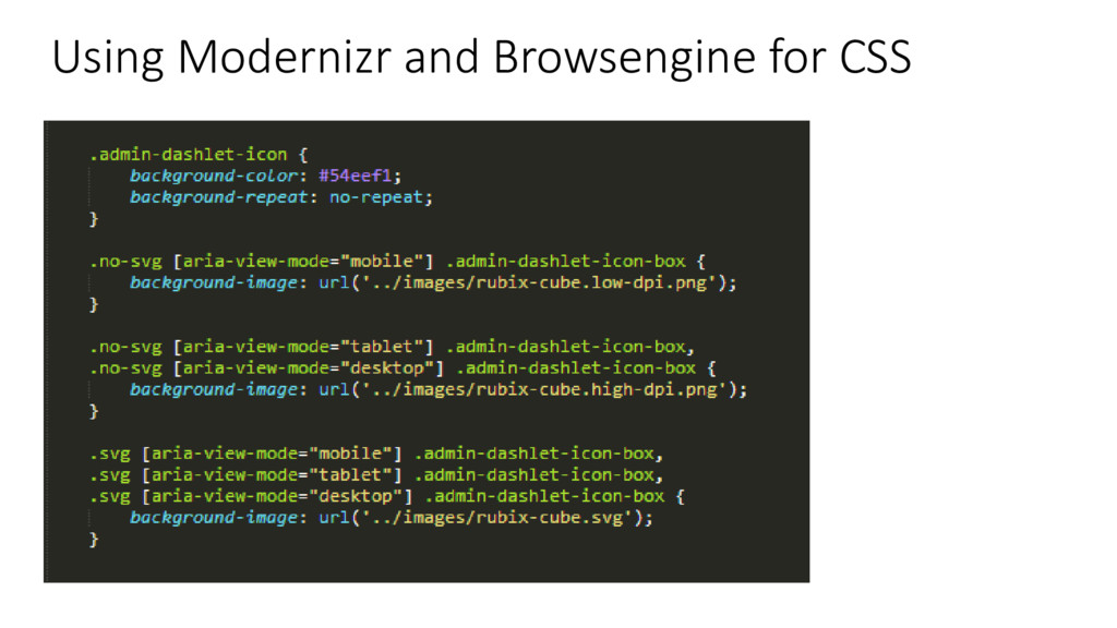
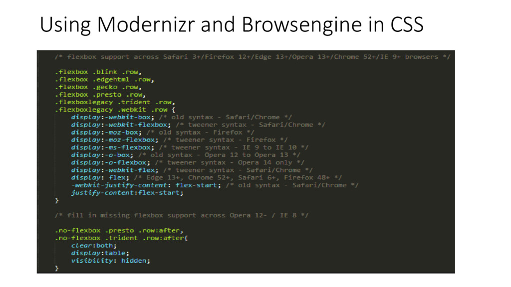
Detection. It continually adds a class name to the HTML tag whenever a feature is detected to be supported by the browser. See https://www.github.com/Modernizr/Modernizr BrowseEngine is a JavaScript Library for View-Port, Device Type and Browser Engine Property Detection. It continually adds a class name and special attributes to the BODY tag whenever the device type and/or browser engine is detected. See https://www.github.com/isocroft/Browsengine
 isocroft
 naoya
naoya
 iidatakuma
 jinwatanabe
 nrslib
 uyuki234
 x5gtrn
 panda728
 tonkotsuboy_com
 tooppoo
 wemra
wemra
 ioki
ioki
 tammyeverts
 marcoroth
 oripsolob
 codingconduct
 erikaheidi
 bermonpainter
 auna
auna
 lynnandtonic
 geshan
 reverentgeek
 morganepeng