Upgrade to Pro — share decks privately, control downloads, hide ads and more …

Typography & the State of the Web Today

Jeff Archibald
November 20, 2011

Typography & the State of the Web Today

A look at web typography: where we came from; what we can do today; tips, tricks & best practices and more.

Jeff Archibald

November 20, 2011
Tweet

More Decks by Jeff Archibald

Other Decks in Design

Transcript

  1. WHO IS THIS GUY? ‣ JEFF ARCHIBALD ‣ Web &

    Graphic Designer ‣ Paper Leaf Design ‣ paper-leaf.com ‣ Coffee, whiskey & beer appreciator ‣ Type nerd
  2. WHY ARE WE HERE? 95% OF THE INFORMATION ON THE

    WEB IS WRITTEN LANGUAGE *Source: 2006 article on www.informationarchitects.jp
  3. WHY ARE WE HERE? ‣ WEB TYPOGRAPHY ‣ Where we

    came from ‣ What we can do today ‣ @font-face, services, perfecting type, scripts ‣ Dos and Don’ts, Tips & Tricks ‣ Examples, Inspiration & Resources
  4. THE END GOAL: ‣ YOU WILL LEAVE WITH ‣ An

    increased understanding of web typography ‣ At least a few tips & tricks to apply to your next design/build. ‣ A great topic for your next date
  5. WHERE WE CAME FROM // TYPOGRAPHY & THE WEB ‣

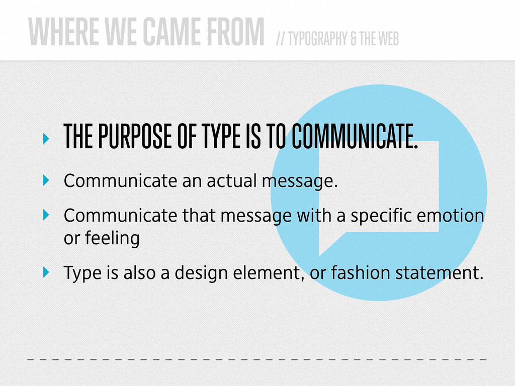
    THE PURPOSE OF TYPE IS TO COMMUNICATE. ‣ Communicate an actual message. ‣ Communicate that message with a specific emotion or feeling ‣ Type is also a design element, or fashion statement.
  6. WHERE WE CAME FROM // TYPOGRAPHY & THE WEB ‣

    BACK IN THA DAY ‣ We could only use the dreaded....
  7. WHERE WE CAME FROM // TYPOGRAPHY & THE WEB ‣

    SYSTEM FONTS (DUN DUN DUNNNNN)
  8. WHERE WE CAME FROM // TYPOGRAPHY & THE WEB ‣

    SYSTEM FONTS ‣ Tahoma ‣ Verdana ‣ Trebuchet MS ‣ Times New Roman ‣ Georgia ‣ Etc.
  9. WHERE WE CAME FROM // TYPOGRAPHY & THE WEB ‣

    FLASH REPLACEMENT ‣ cufon ‣ sIFR good support, consistent display difficult configuration, poor selection, text scaling
  10. WHAT WE CAN DO TODAY // TYPOGRAPHY & THE WEB

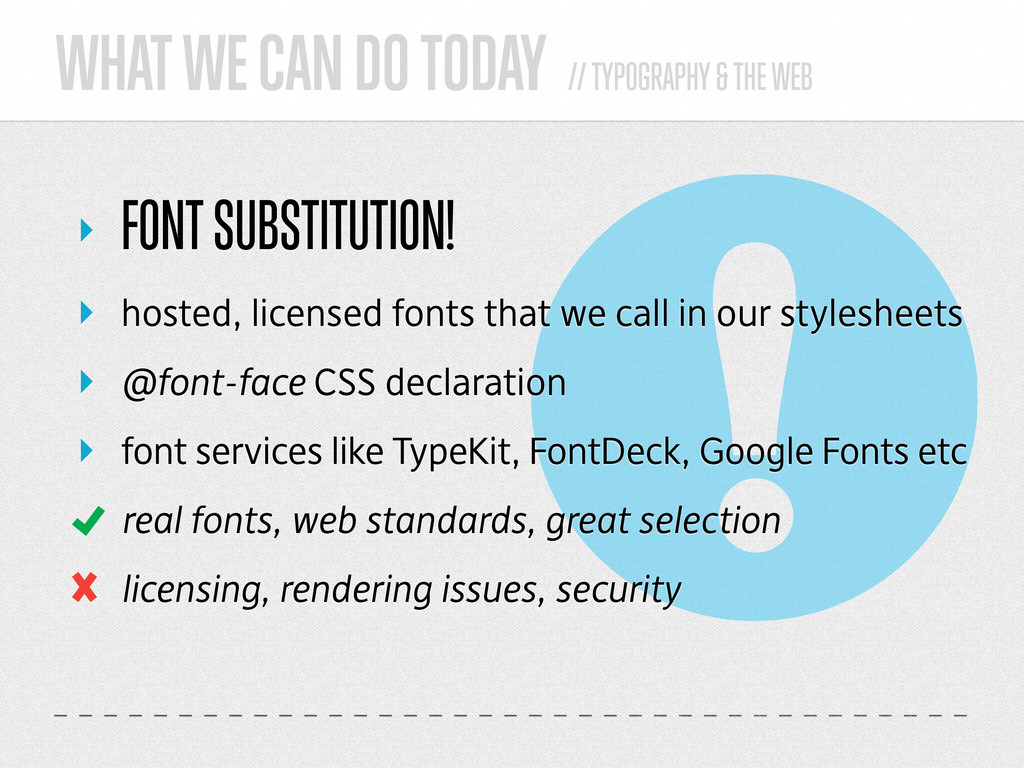
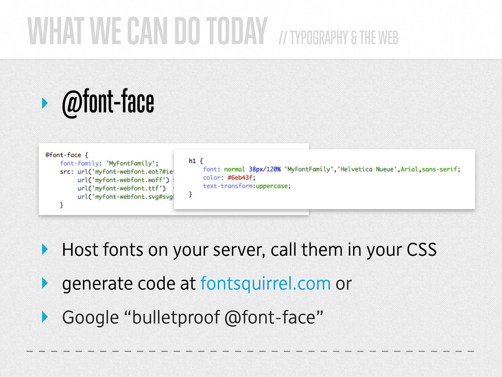
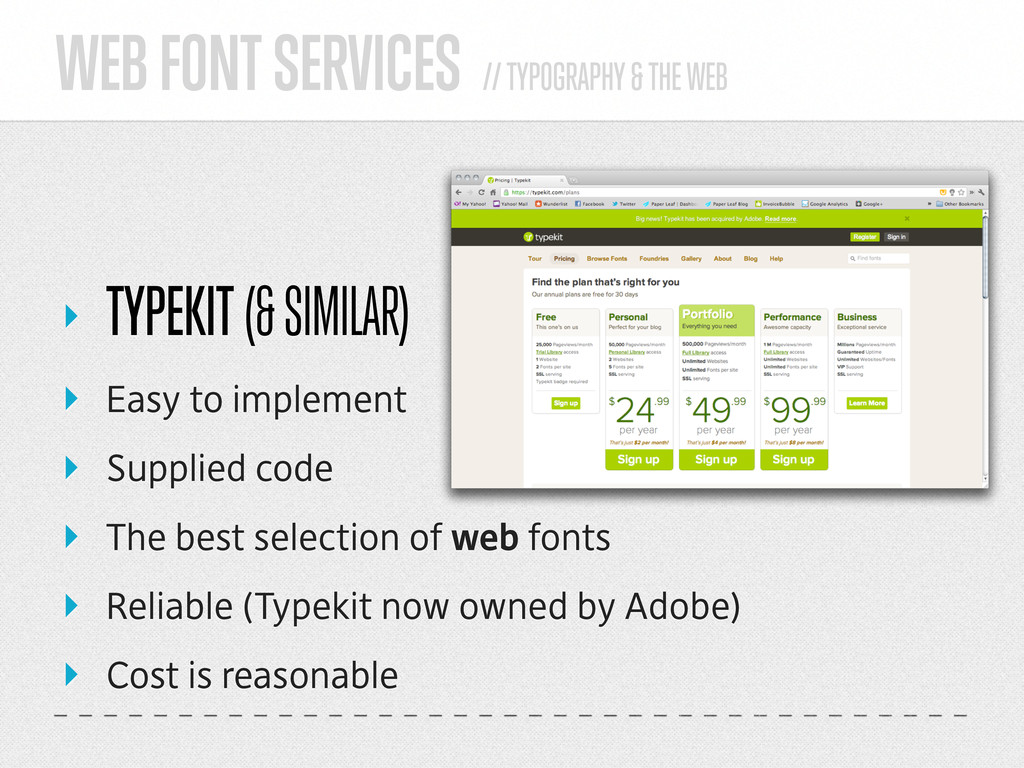
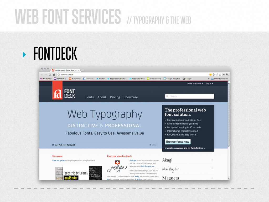
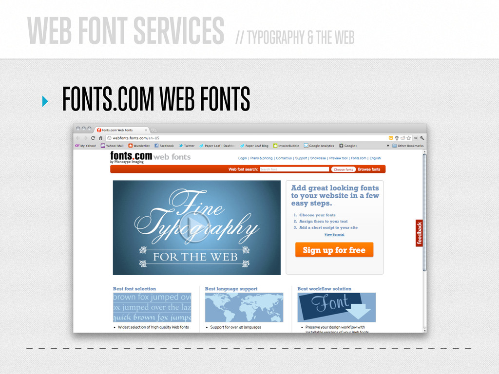
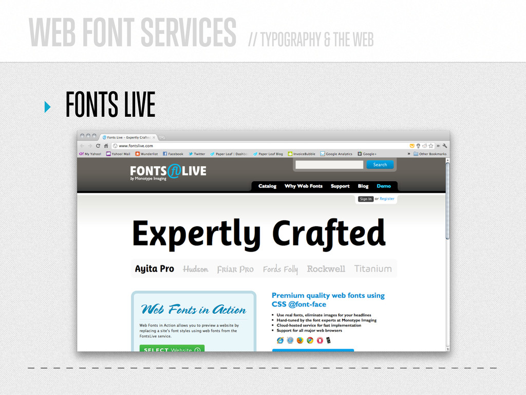
    ‣ FONT SUBSTITUTION! ‣ hosted, licensed fonts that we call in our stylesheets ‣ @font-face CSS declaration ‣ font services like TypeKit, FontDeck, Google Fonts etc real fonts, web standards, great selection licensing, rendering issues, security
  11. WHAT WE CAN DO TODAY // TYPOGRAPHY & THE WEB

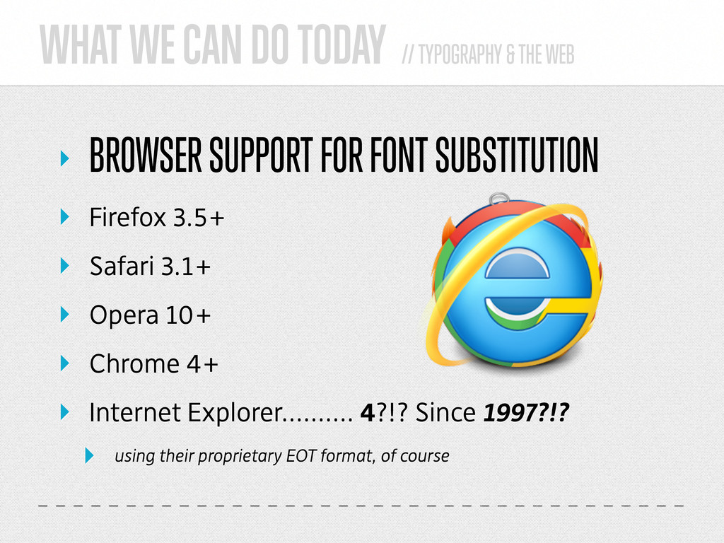
    ‣ BROWSER SUPPORT FOR FONT SUBSTITUTION ‣ Firefox 3.5+ ‣ Safari 3.1+ ‣ Opera 10+ ‣ Chrome 4+ ‣ Internet Explorer.......... 4?!? Since 1997?!? ‣ using their proprietary EOT format, of course
  12. WHAT WE CAN DO TODAY // TYPOGRAPHY & THE WEB

    ‣ @font-face ‣ Host fonts on your server, call them in your CSS ‣ generate code at fontsquirrel.com or ‣ Google “bulletproof @font-face”
  13. @font-face // TYPOGRAPHY & THE WEB ‣ FONT SQUIRREL ‣

    All free fonts ‣ Good selection ‣ @font-face kit generator ‣ Just because it’s there, doesn’t mean you should use it.
  14. @font-face // TYPOGRAPHY & THE WEB ‣ FONTSPRING ‣ Better

    selection ‣ Supplied code ‣ Not free, but licenses are very reasonable ‣ Print & web licenses
  15. WHAT WE CAN DO TODAY // TYPOGRAPHY & THE WEB

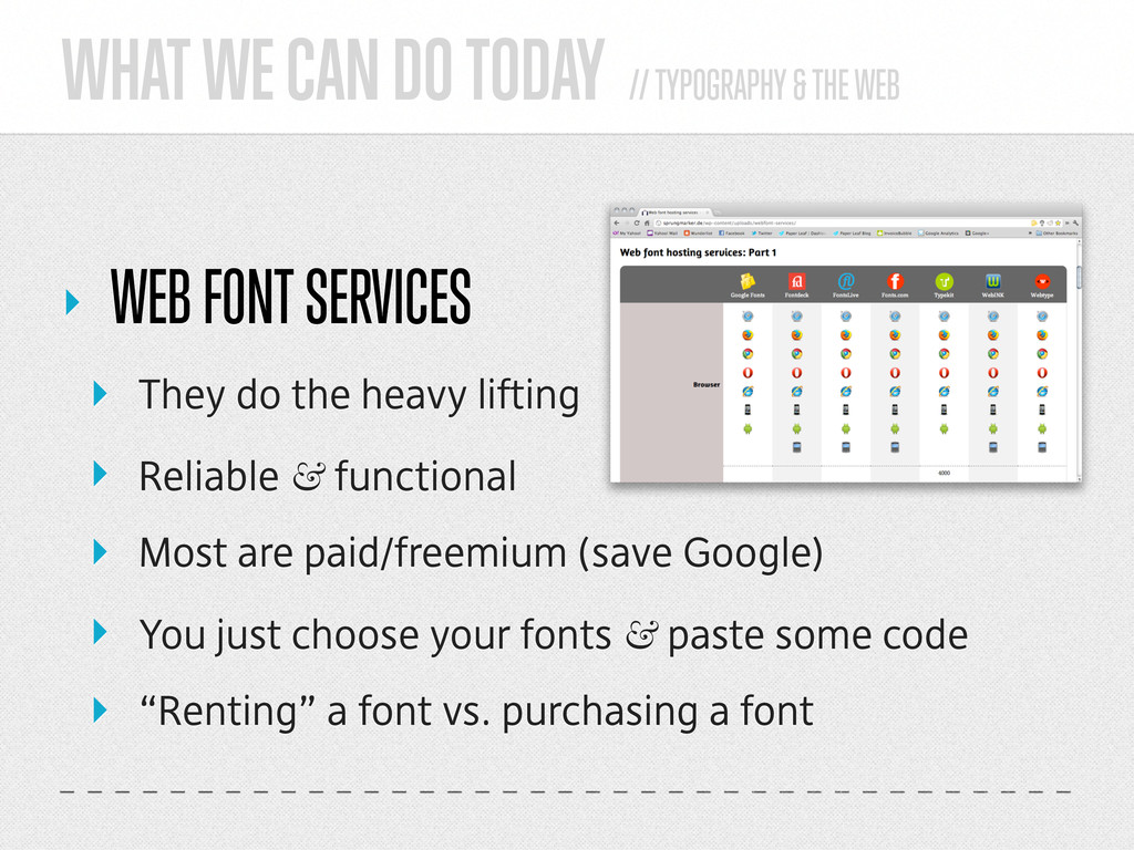
    ‣ WEB FONT SERVICES ‣ They do the heavy lifting ‣ Reliable & functional ‣ Most are paid/freemium (save Google) ‣ You just choose your fonts & paste some code ‣ “Renting” a font vs. purchasing a font
  16. WEB FONT SERVICES // TYPOGRAPHY & THE WEB ‣ GOOGLE

    WEB FONTS ‣ Easy to implement ‣ Supplied code ‣ Good selection of free fonts ‣ Reliable (it is Google, after all)
  17. WEB FONT SERVICES // TYPOGRAPHY & THE WEB ‣ TYPEKIT

    (& SIMILAR) ‣ Easy to implement ‣ Supplied code ‣ The best selection of web fonts ‣ Reliable (Typekit now owned by Adobe) ‣ Cost is reasonable
  18. ‣ PERFECTING YOUR WEB TYPE. I was going to say

    “purrfecting” and put in a cat photo
  19. PERFECTING YOUR WEB TYPE // TYPOGRAPHY & THE WEB ‣

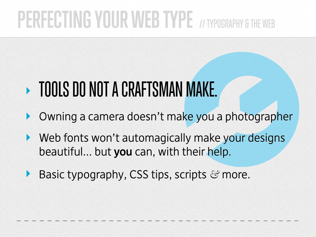
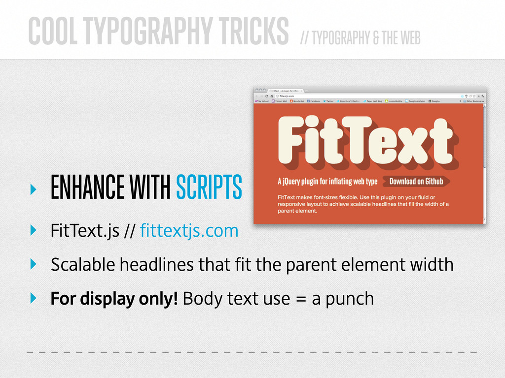
    TOOLS DO NOT A CRAFTSMAN MAKE. ‣ Owning a camera doesn’t make you a photographer ‣ Web fonts won’t automagically make your designs beautiful... but you can, with their help. ‣ Basic typography, CSS tips, scripts & more.
  20. PERFECTING YOUR WEB TYPE // TYPOGRAPHY & THE WEB ‣

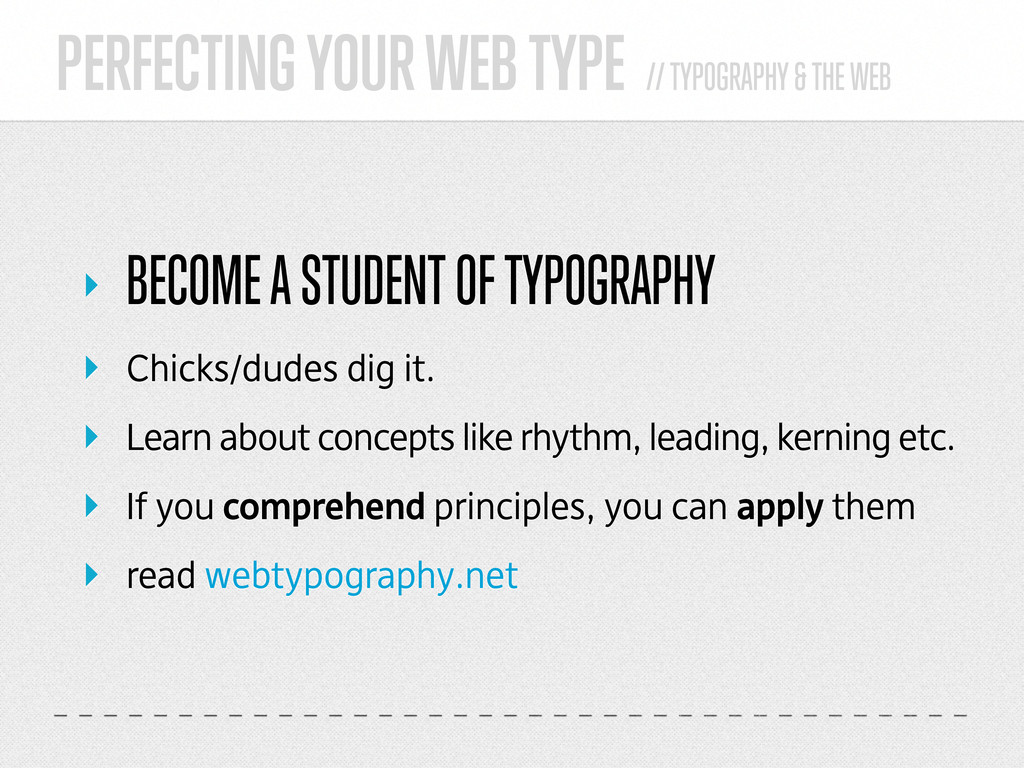
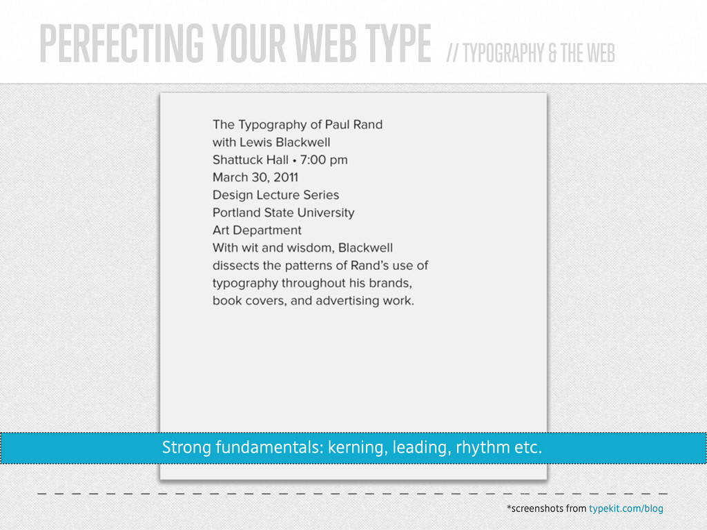
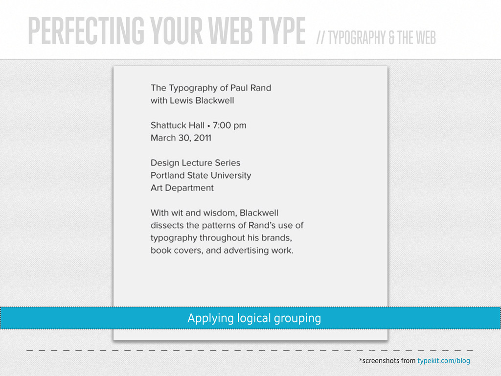
    BECOME A STUDENT OF TYPOGRAPHY ‣ Chicks/dudes dig it. ‣ Learn about concepts like rhythm, leading, kerning etc. ‣ If you comprehend principles, you can apply them ‣ read webtypography.net
  21. PERFECTING YOUR WEB TYPE // TYPOGRAPHY & THE WEB ‣

    USE FONTS AS THEY WERE INTENDED TO BE USED. ‣ That ^ is not a typeface suitable for body copy.
  22. PERFECTING YOUR WEB TYPE // TYPOGRAPHY & THE WEB ‣

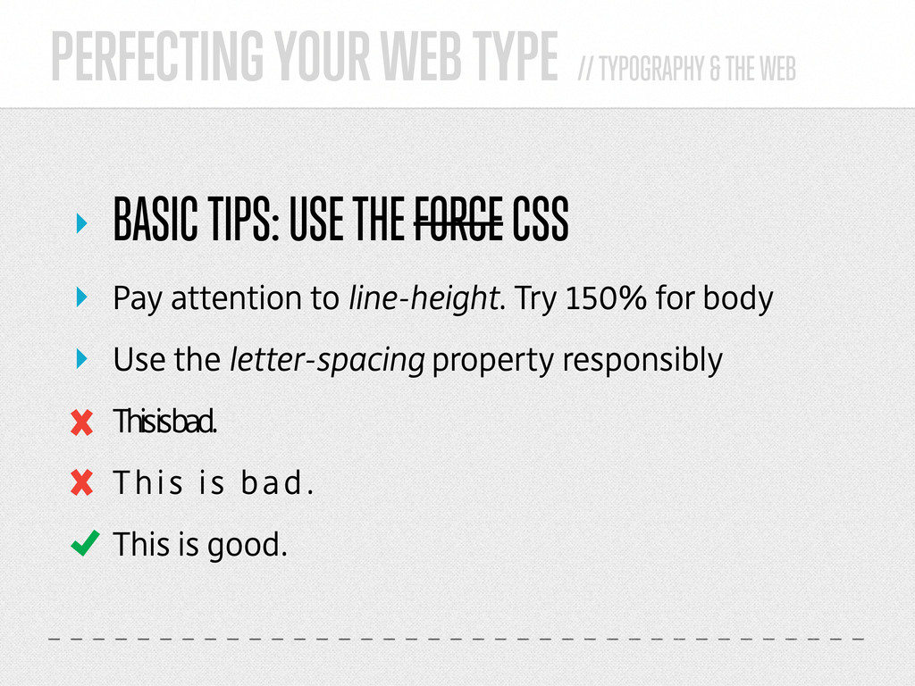
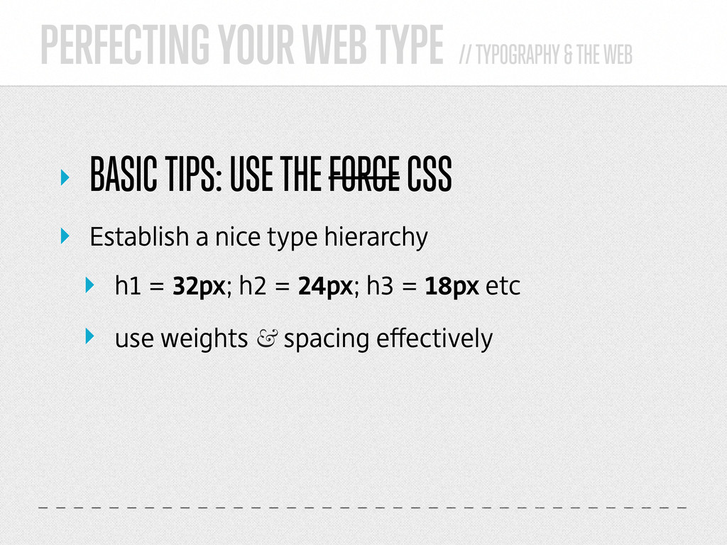
    BASIC TIPS: USE THE FORCE CSS ‣ Pay attention to line-height. Try 150% for body ‣ Use the letter-spacing property responsibly This is bad. This is bad. This is good.
  23. PERFECTING YOUR WEB TYPE // TYPOGRAPHY & THE WEB ‣

    BASIC TIPS: USE THE FORCE CSS ‣ Establish a nice type hierarchy ‣ h1 = 32px; h2 = 24px; h3 = 18px etc ‣ use weights & spacing effectively
  24. PERFECTING YOUR WEB TYPE // TYPOGRAPHY & THE WEB *screenshots

    from typekit.com/blog Strong fundamentals: kerning, leading, rhythm etc.
  25. PERFECTING YOUR WEB TYPE // TYPOGRAPHY & THE WEB *screenshots

    from typekit.com/blog Applying logical grouping
  26. PERFECTING YOUR WEB TYPE // TYPOGRAPHY & THE WEB *screenshots

    from typekit.com/blog Weight change for emphasis on important elements
  27. PERFECTING YOUR WEB TYPE // TYPOGRAPHY & THE WEB *screenshots

    from typekit.com/blog Introducing type size hierarchy
  28. PERFECTING YOUR WEB TYPE // TYPOGRAPHY & THE WEB *screenshots

    from typekit.com/blog Breaking the grid for visual interest
  29. COOL TYPOGRAPHY TRICKS // TYPOGRAPHY & THE WEB ‣ CSS

    LIGATURES/PAIRS ‣ text-rendering:optimizeLegibility; ‣ improves handling of ligatures & pairs
  30. COOL TYPOGRAPHY TRICKS // TYPOGRAPHY & THE WEB ‣ CSS

    DROP CAPS ‣ Automated drop-caps in WordPress Tutorial viewable at tinyurl.com/wp-dropcaps
  31. COOL TYPOGRAPHY TRICKS // TYPOGRAPHY & THE WEB ‣ ENHANCE

    WITH CSS3 ‣ text-shadow: 0px 1px 1px #fff; x offset y offset blur color
  32. COOL TYPOGRAPHY TRICKS // TYPOGRAPHY & THE WEB ‣ ENHANCE

    WITH CSS3 ‣ Text transform property
  33. COOL TYPOGRAPHY TRICKS // TYPOGRAPHY & THE WEB ‣ ENHANCE

    WITH SCRIPTS ‣ Lettering.js // letteringjs.com ‣ Down-to-the-letter control ‣ Kerning & editorial-style design
  34. COOL TYPOGRAPHY TRICKS // TYPOGRAPHY & THE WEB ‣ ENHANCE

    WITH SCRIPTS ‣ FitText.js // fittextjs.com ‣ Scalable headlines that fit the parent element width ‣ For display only! Body text use = a punch
  35. ‣ THINGS TO BE WARY OF Don’t be a type

    criminal or I will hurt you
  36. THINGS TO BE WARY OF // TYPOGRAPHY & THE WEB

    ‣ ABUSING YOUR NEWFOUND POWER ‣ There are way more horrible fonts for you to use now ‣ text-shadow can be made to do terrible, awful things
  37. THINGS TO BE WARY OF // TYPOGRAPHY & THE WEB

    ‣ ABUSING YOUR NEWFOUND POWER FUN! FUNNER! FUNNEST!
  38. THINGS TO BE WARY OF // TYPOGRAPHY & THE WEB

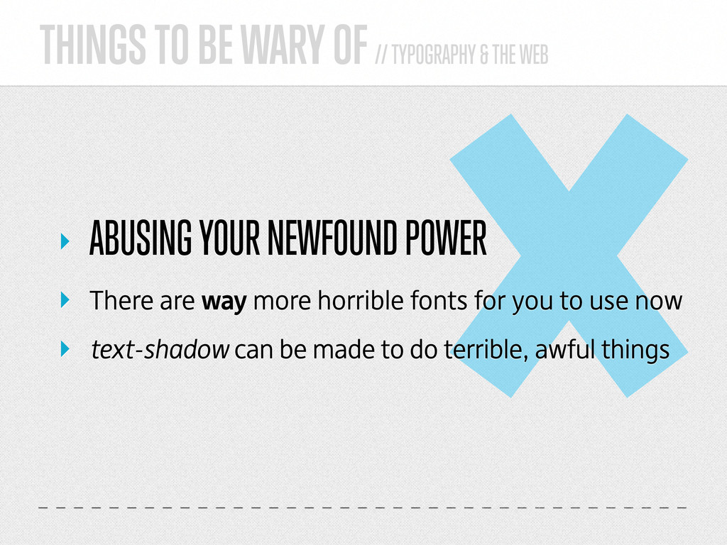
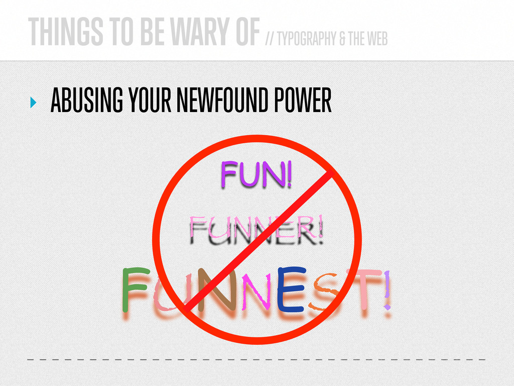
    ‣ ABUSING YOUR NEWFOUND POWER ‣ respect the foundries ‣ use only web-licensed fonts ‣ so much choice; no reason to use unlicensed fonts ‣ soon all foundries will be on board with web fonts
  39. THINGS TO BE WARY OF // TYPOGRAPHY & THE WEB

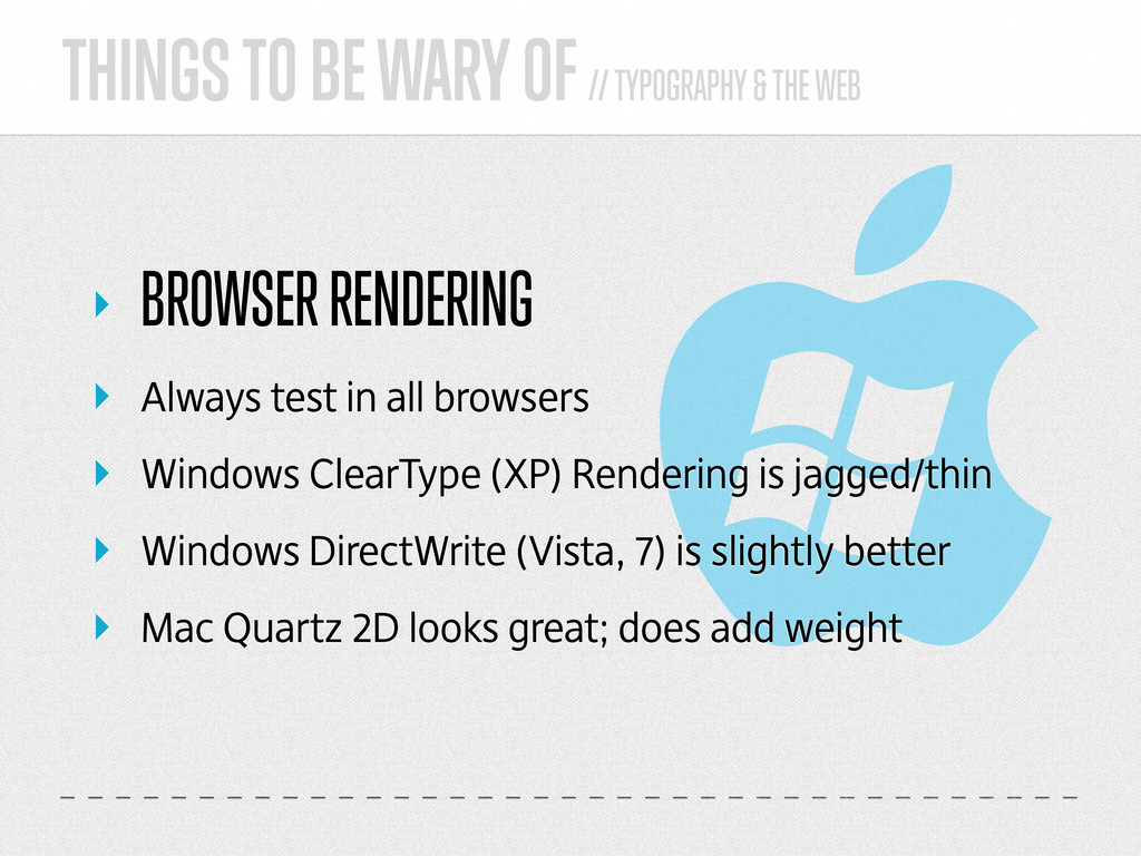
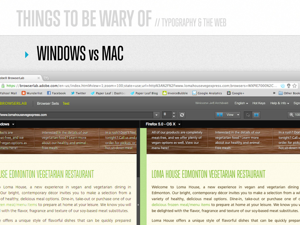
    ‣ BROWSER RENDERING ‣ Always test in all browsers ‣ Windows ClearType (XP) Rendering is jagged/thin ‣ Windows DirectWrite (Vista, 7) is slightly better ‣ Mac Quartz 2D looks great; does add weight
  40. INSPIRATION & RESOURCES // TYPOGRAPHY & THE WEB ‣ RESOURCES

    ‣ webtypography.net ‣ fontsquirrel.com ‣ fontspring.com ‣ google.com/webfonts ‣ typekit.com ‣ fontdeck.com
  41. INSPIRATION & RESOURCES // TYPOGRAPHY & THE WEB ‣ RESOURCES

    ‣ letteringjs.com ‣ fittextjs.com ‣ wp-typography plugin ‣ browserlab.adobe.com ‣ Trump Gothic typeface family ‣ DejaWeb typeface family
  42. ‣ THANKS. QUESTIONS? Preferably about typography & the web, but

    I’m easy. Jeff Archibald // @paper_leaf // WordCamp Edmonton 2011