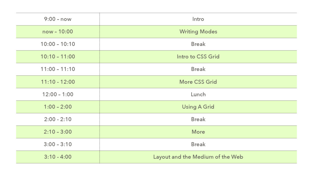
– 10:10 Break 10:10 – 11:00 Intro to CSS Grid 11:00 – 11:10 Break 11:10 - 12:00 More CSS Grid 12:00 – 1:00 Lunch 1:00 – 2:00 Using A Grid 2:00 - 2:10 Break 2:10 – 3:00 More 3:00 – 3:10 Break 3:10 - 4:00 Layout and the Medium of the Web
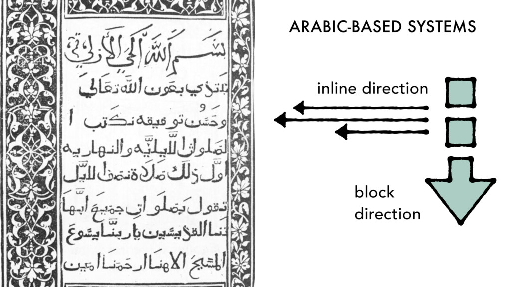
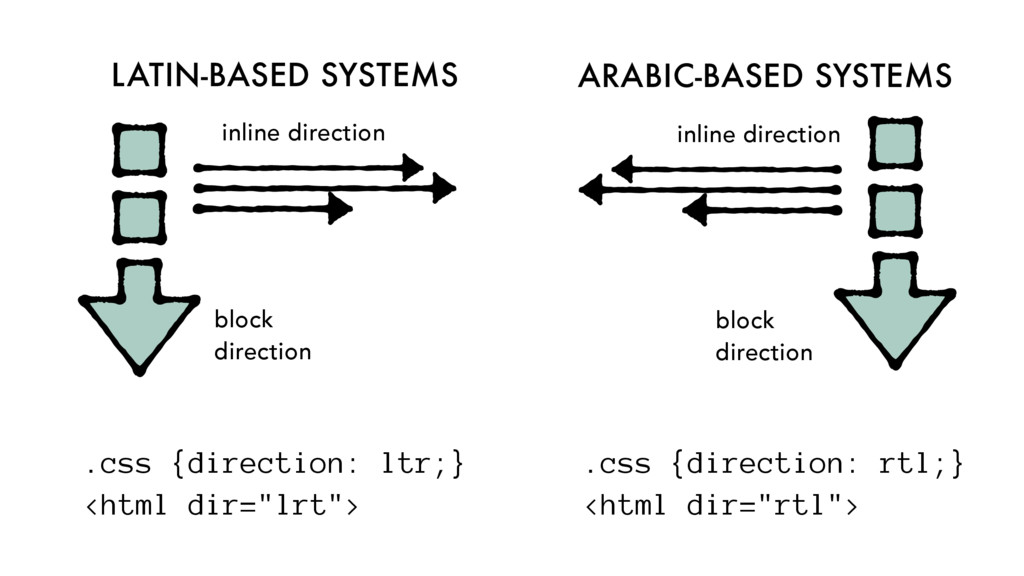
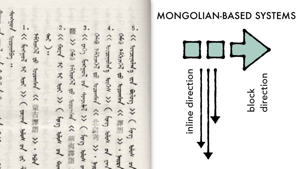
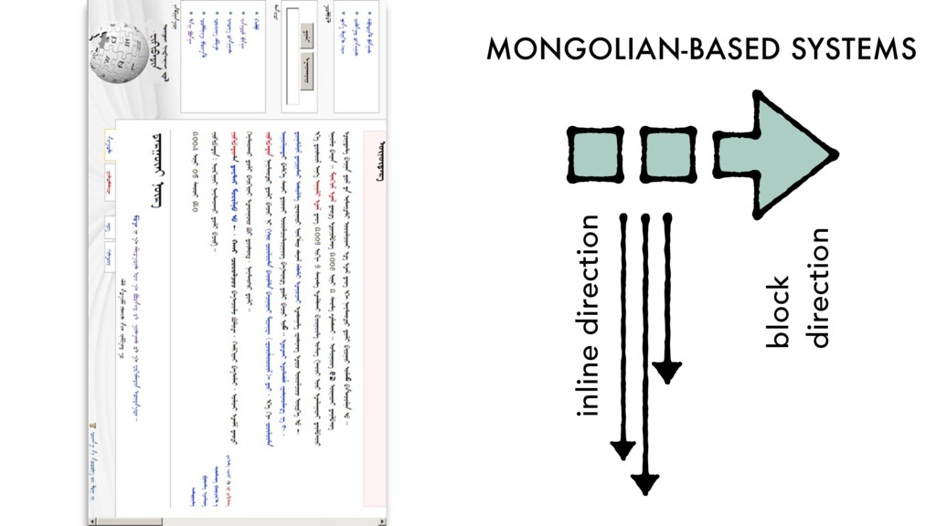
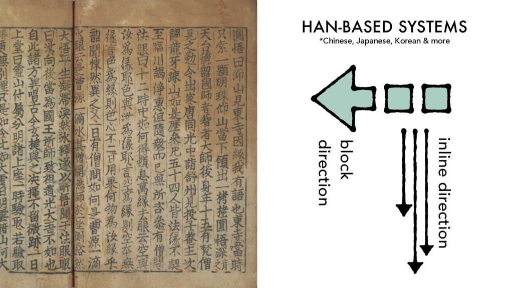
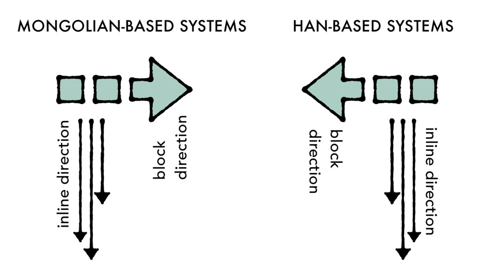
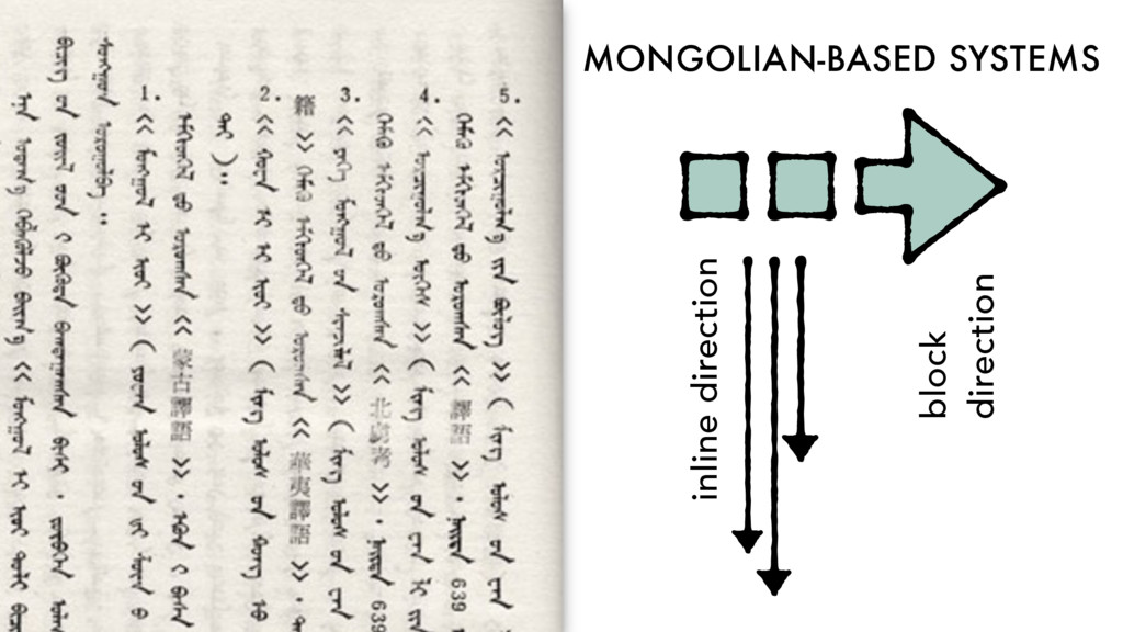
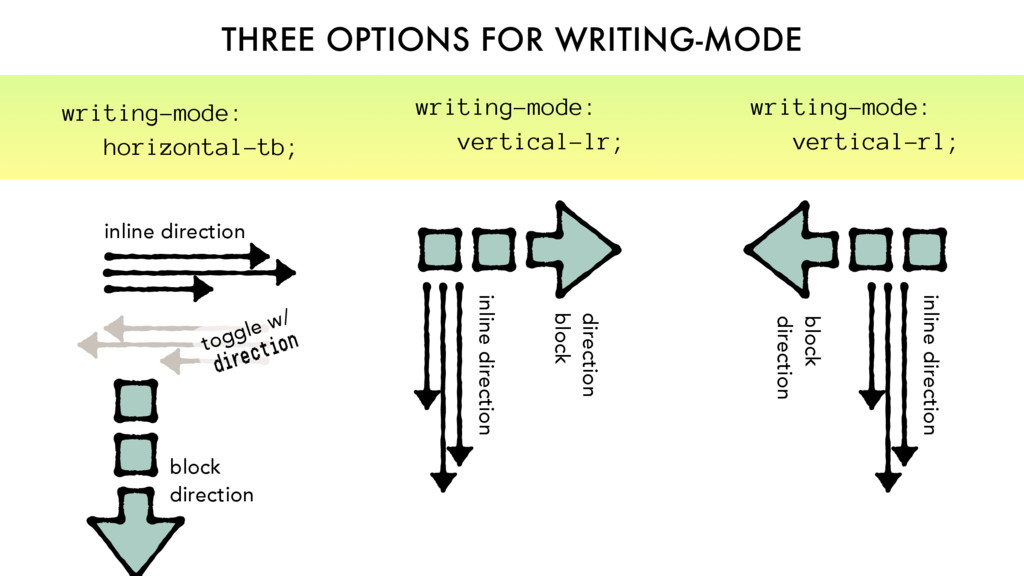
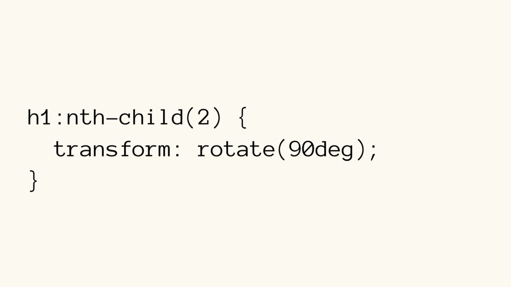
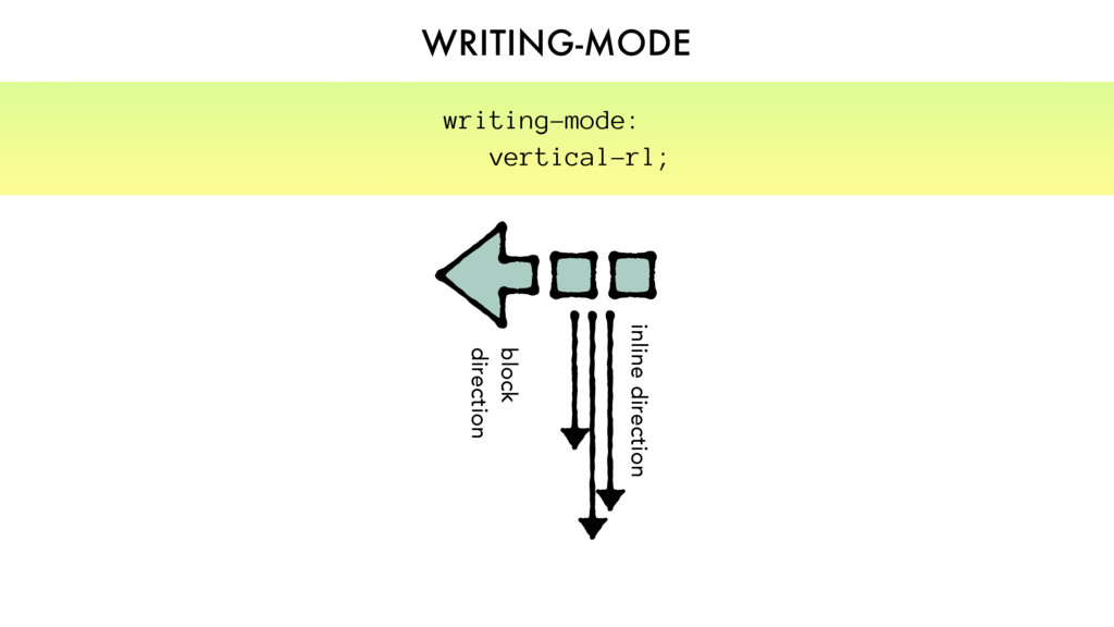
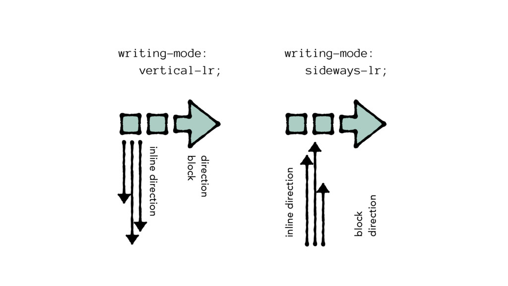
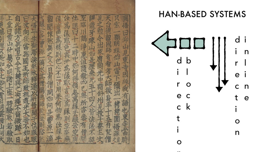
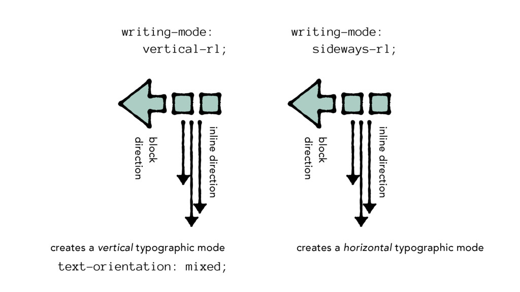
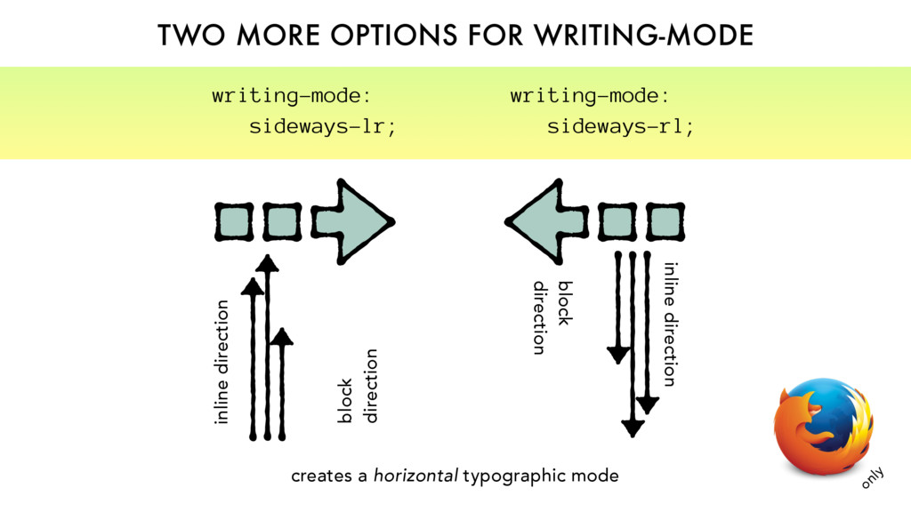
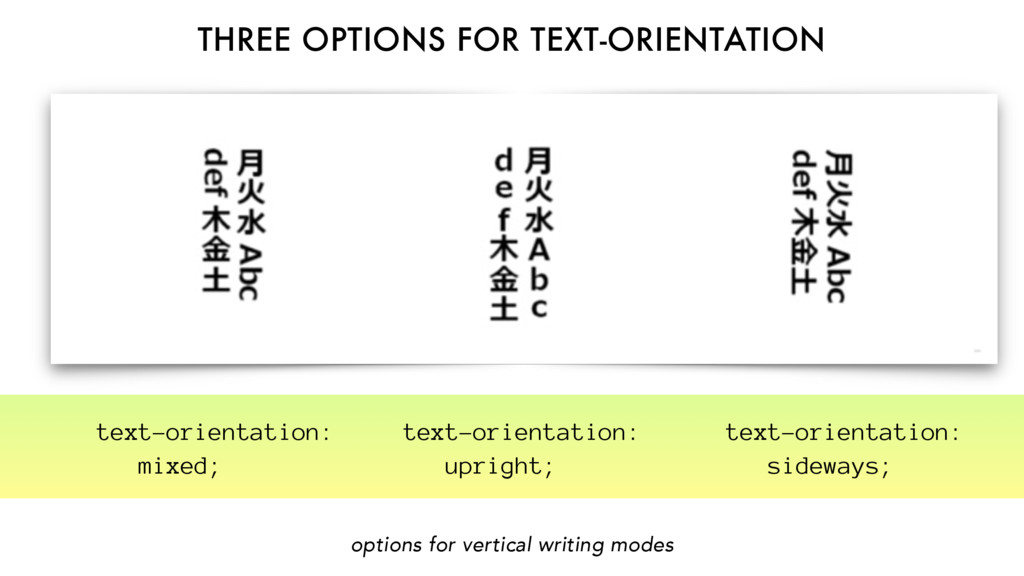
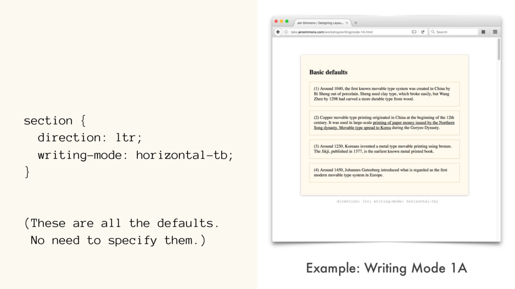
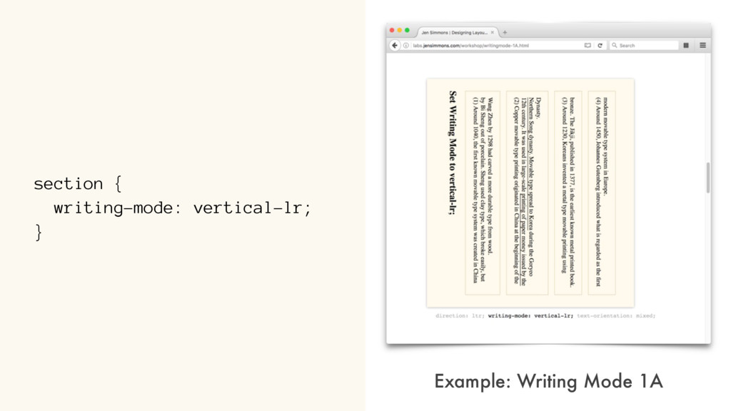
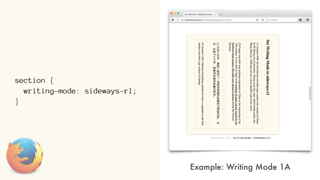
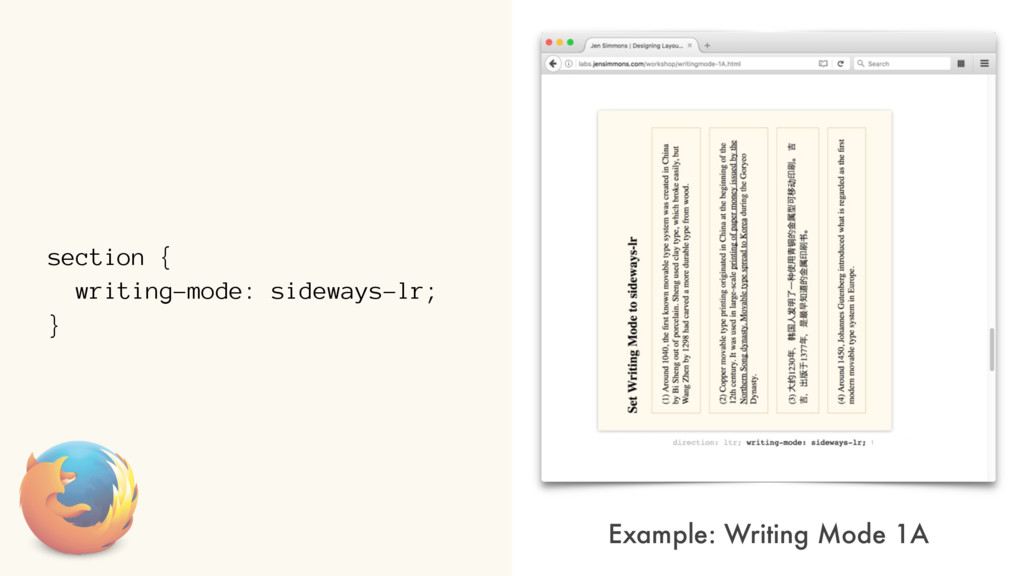
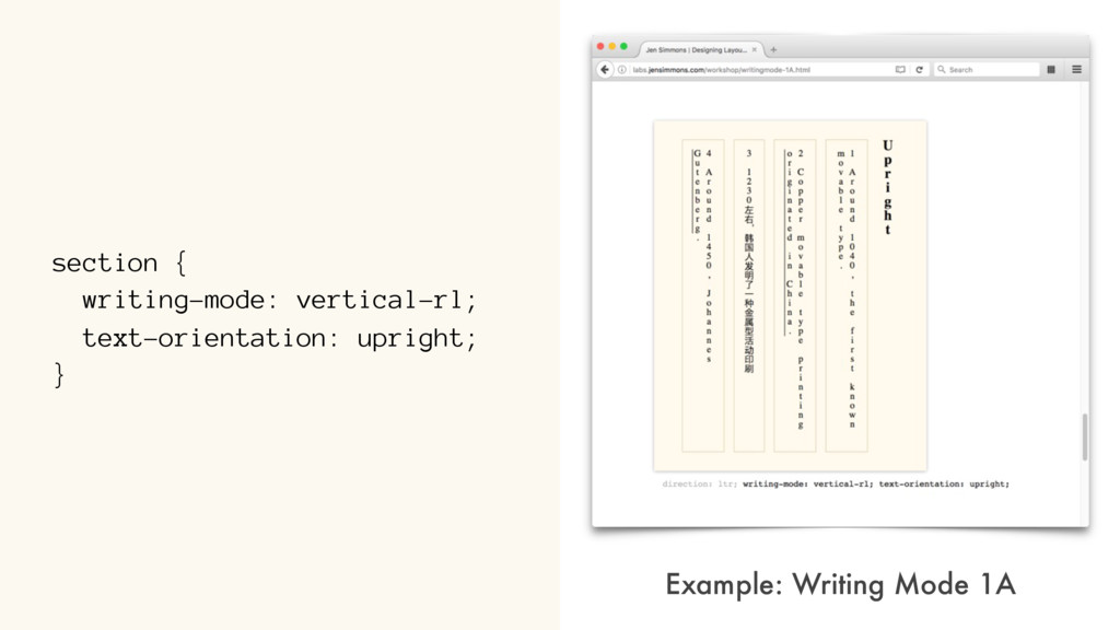
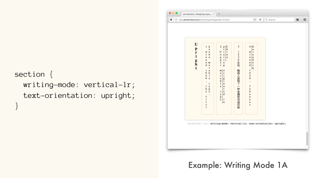
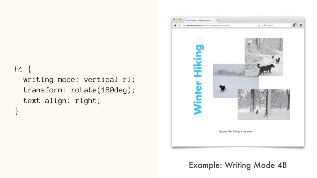
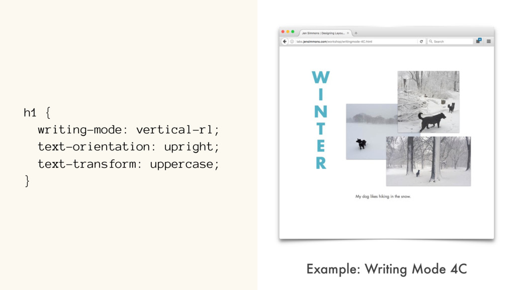
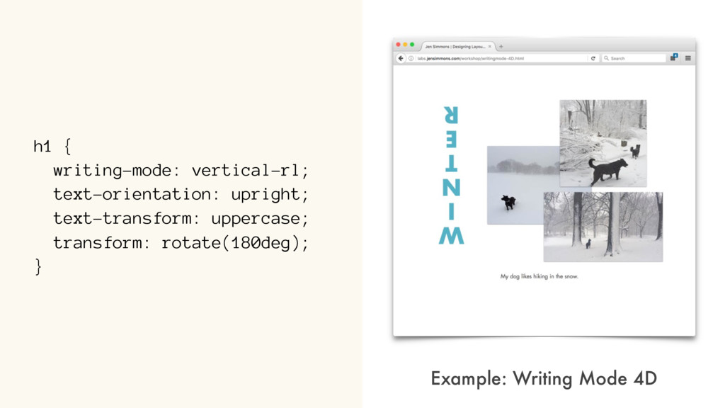
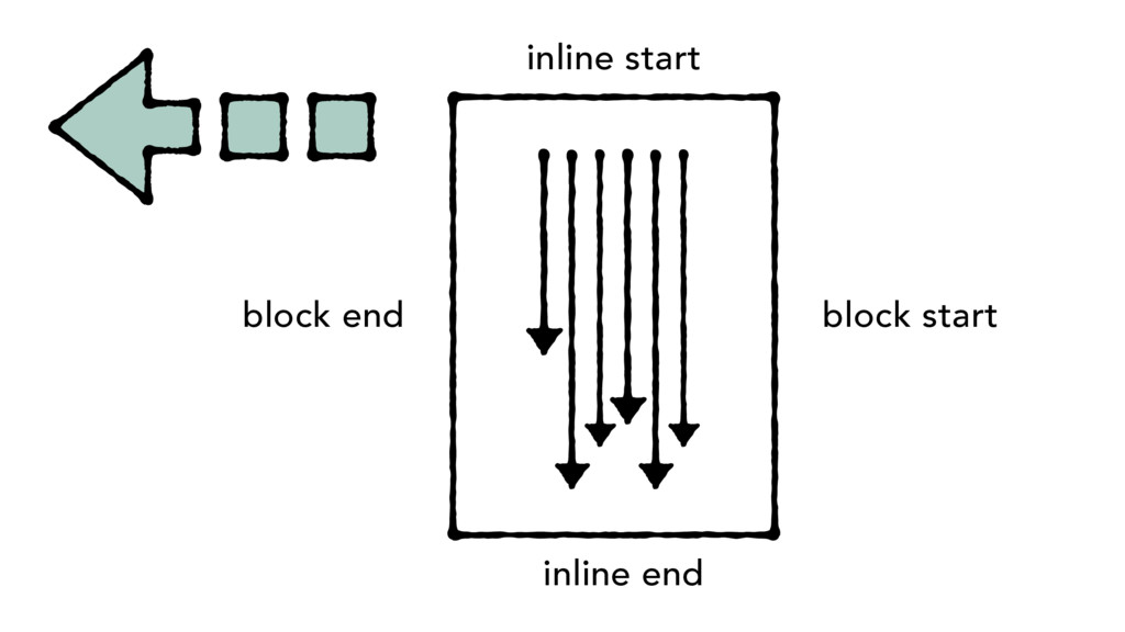
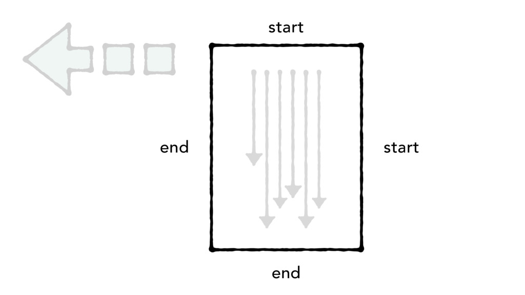
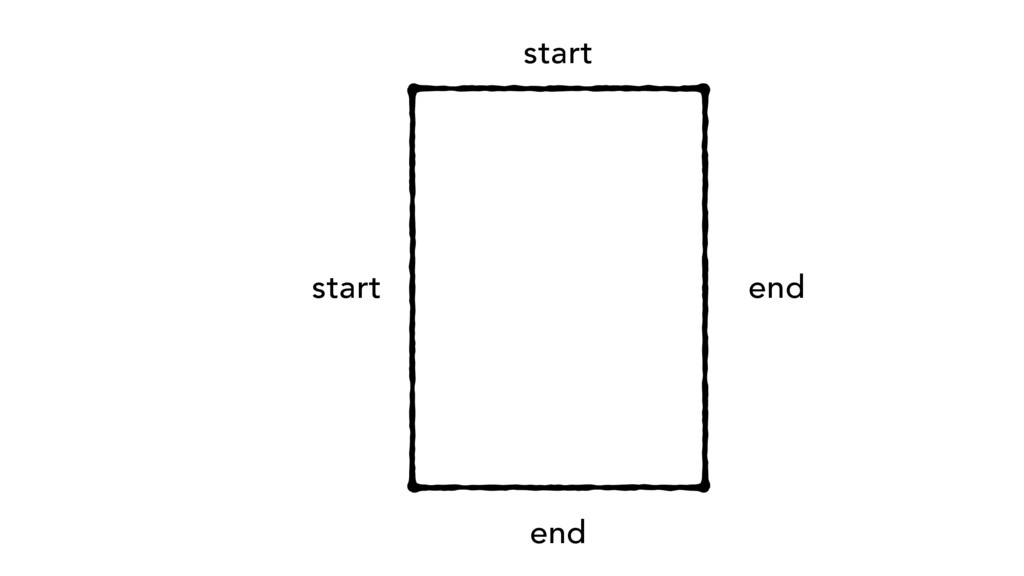
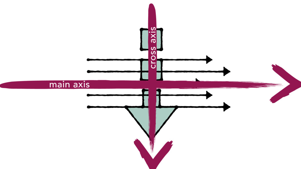
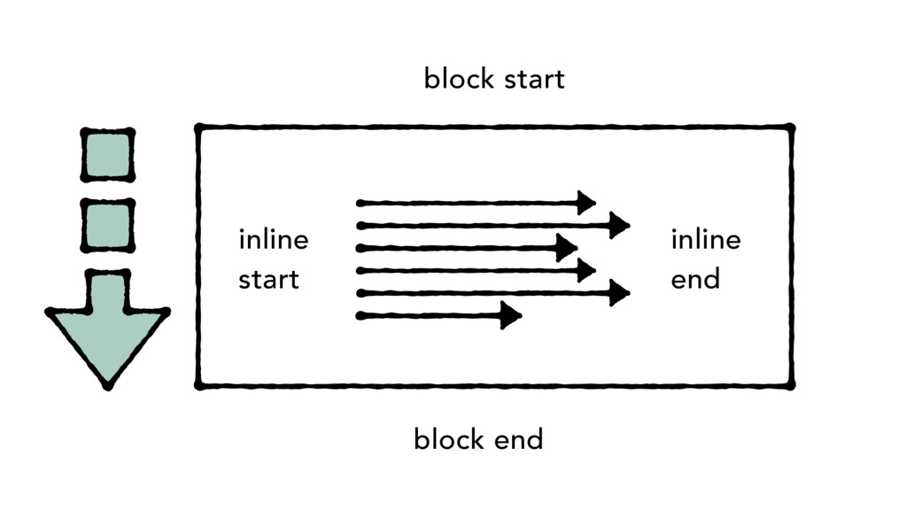
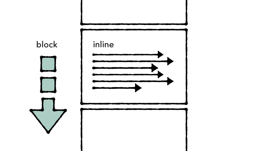
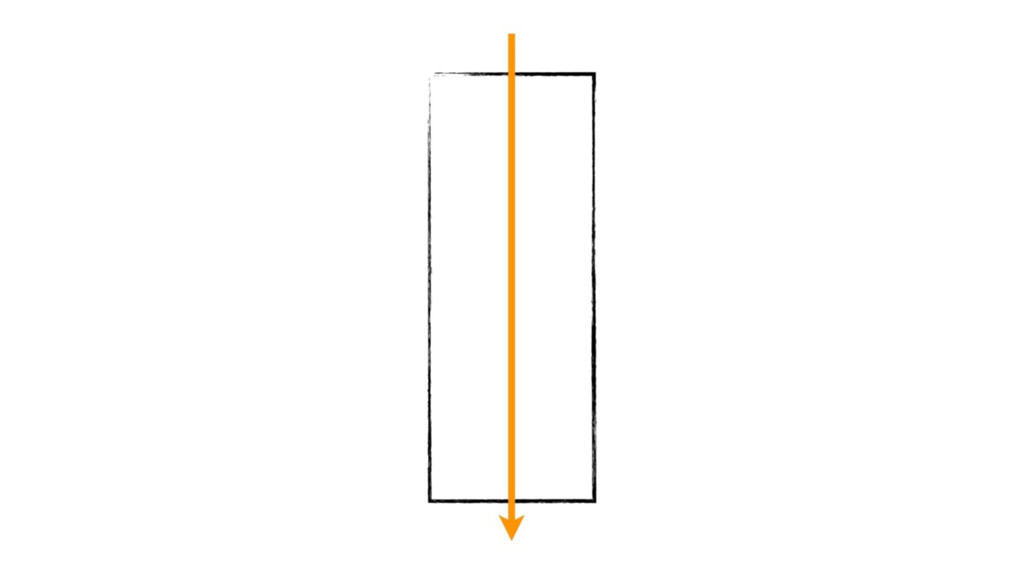
block direction inline direction writing-mode: vertical-rl; block direction inline direction toggle w/ direction writing-mode: horizontal-tb; creates a vertical typographic mode
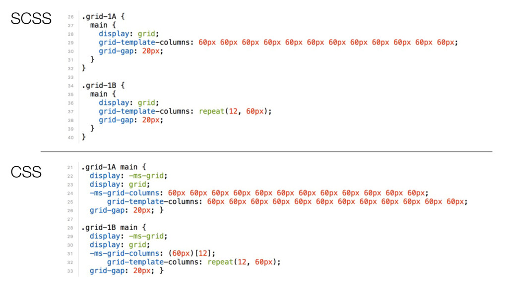
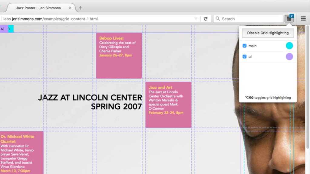
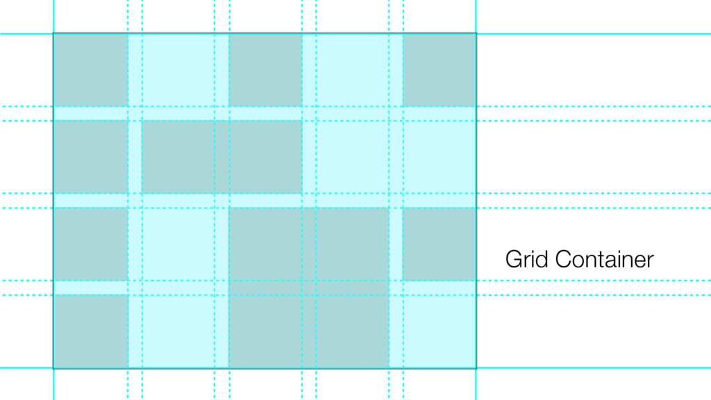
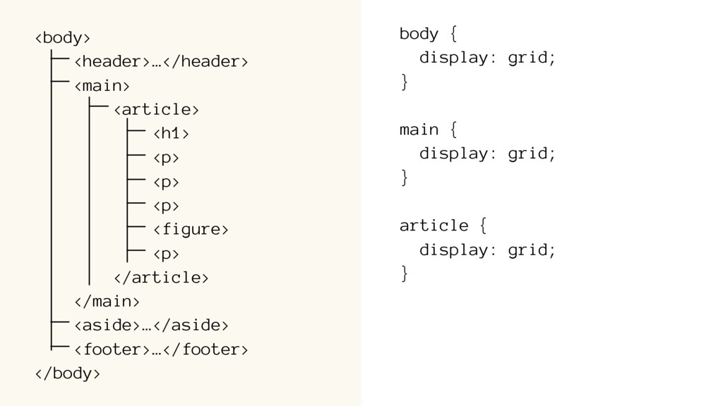
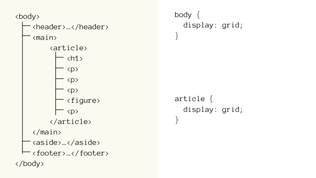
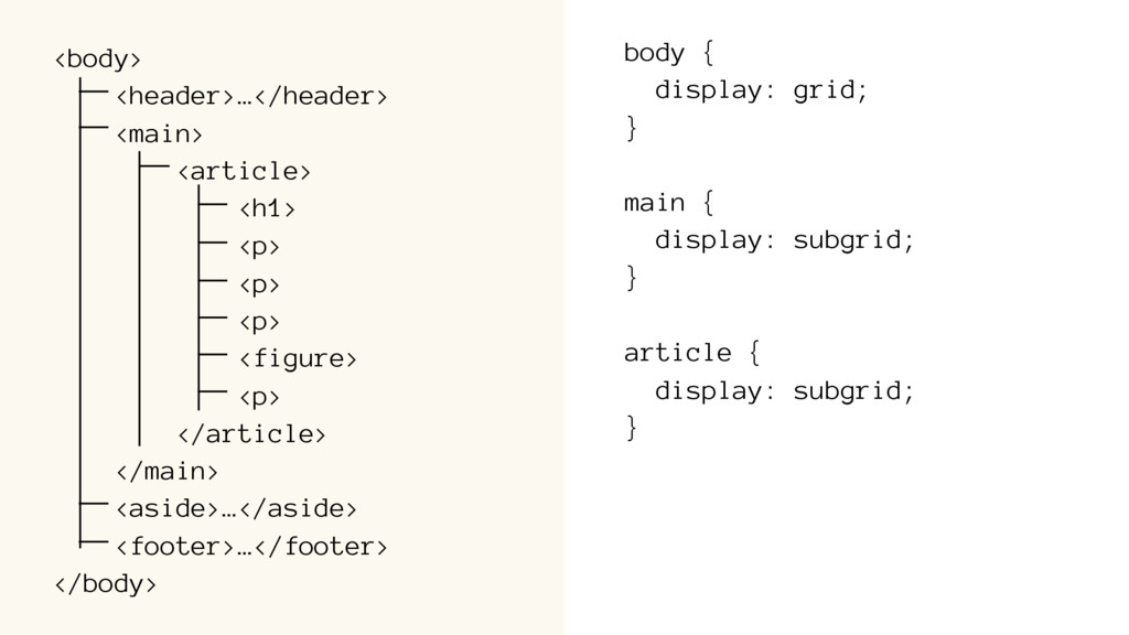
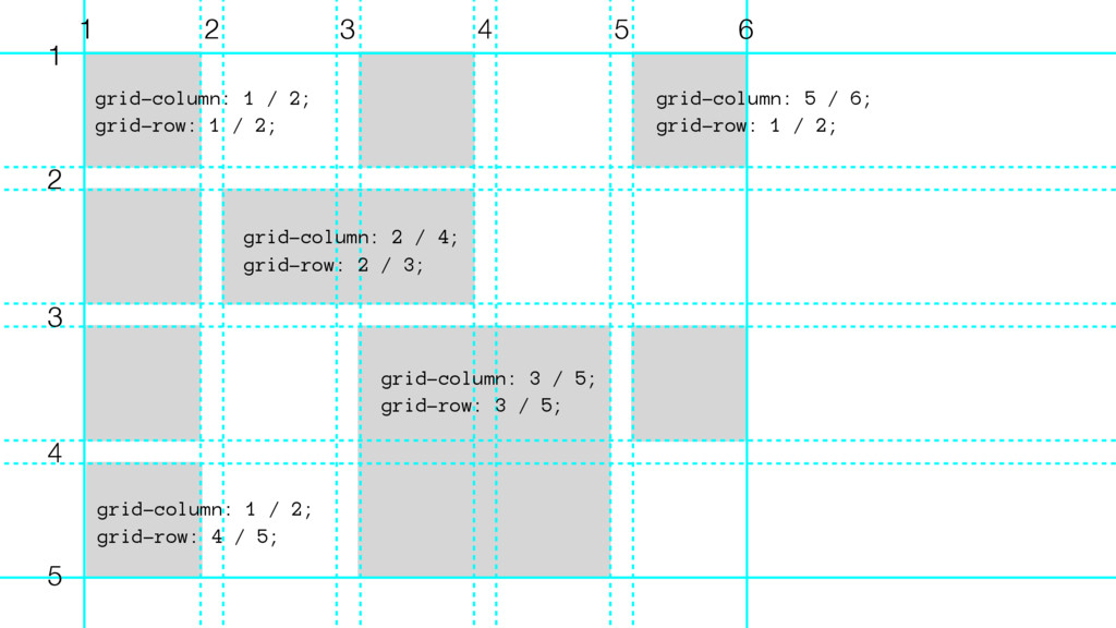
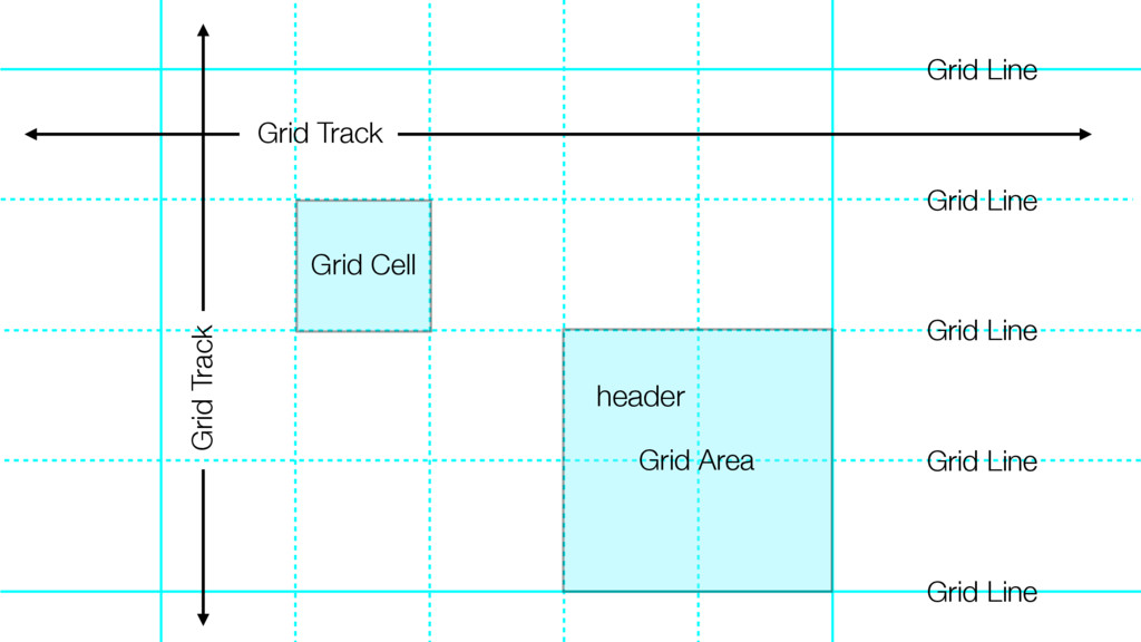
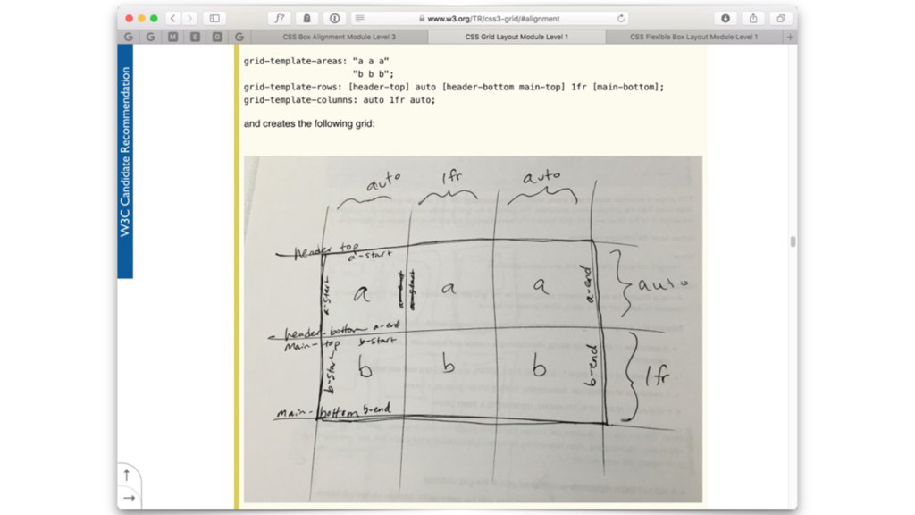
line 1 to 5 grid-row: 3 / 5 // goes from horizontal line 3 to 5 } some other syntax options (each with different results) grid-column: 3 / 5; // starts at line 3, goes to line 5 grid-column: 3 / span 2; // starts at line 3, spans 2 cells grid-column: span 2 / 5; // spans 2 cells, ends at line 5 grid-column: span 2; // spans 2 cells, placed by algorithm grid-column: 4; // starts at line 4 grid-column: 1 / -1; // starts at line 1, goes to line -1 grid-column: horse / pig;
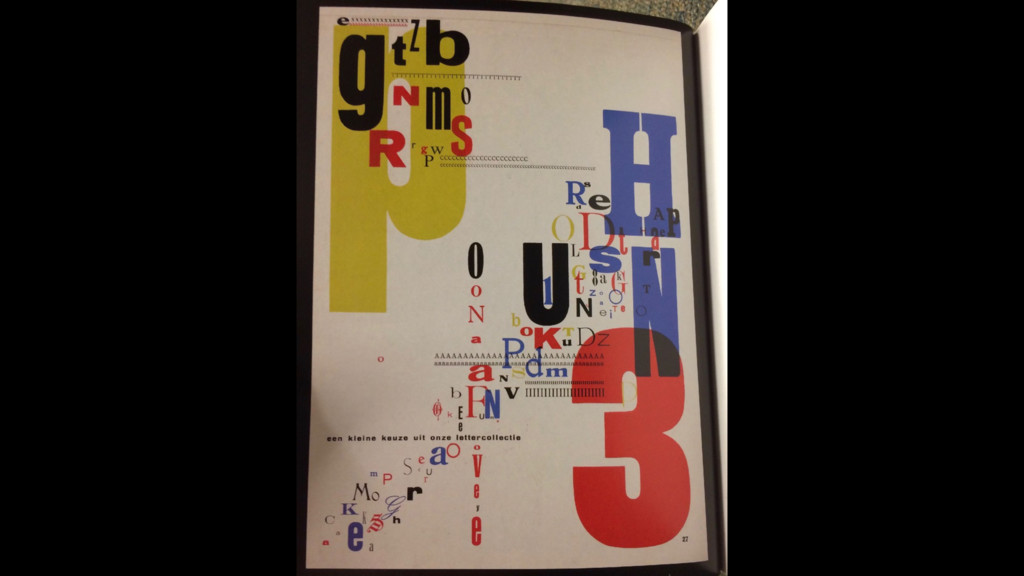
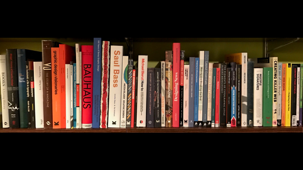
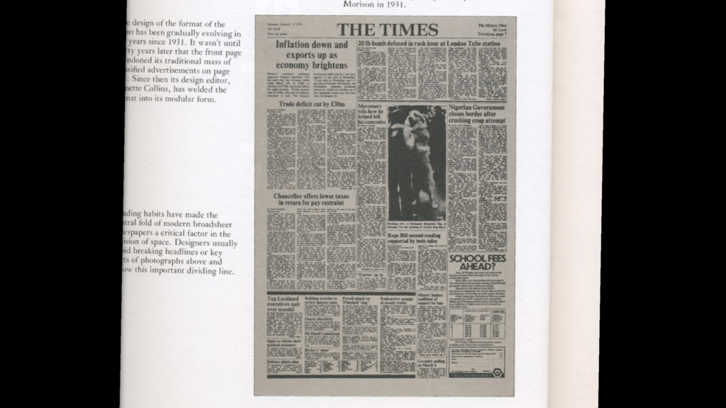
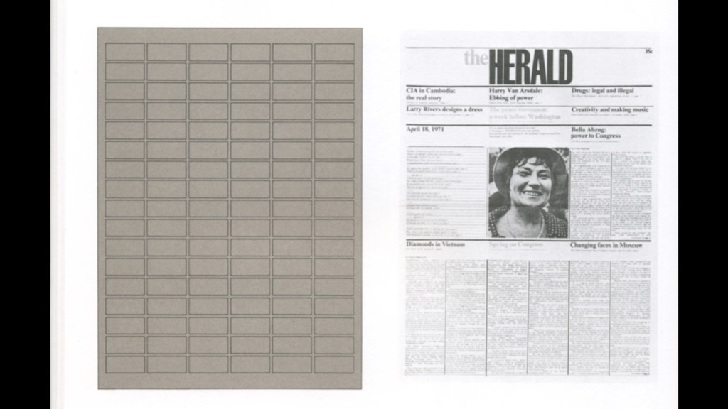
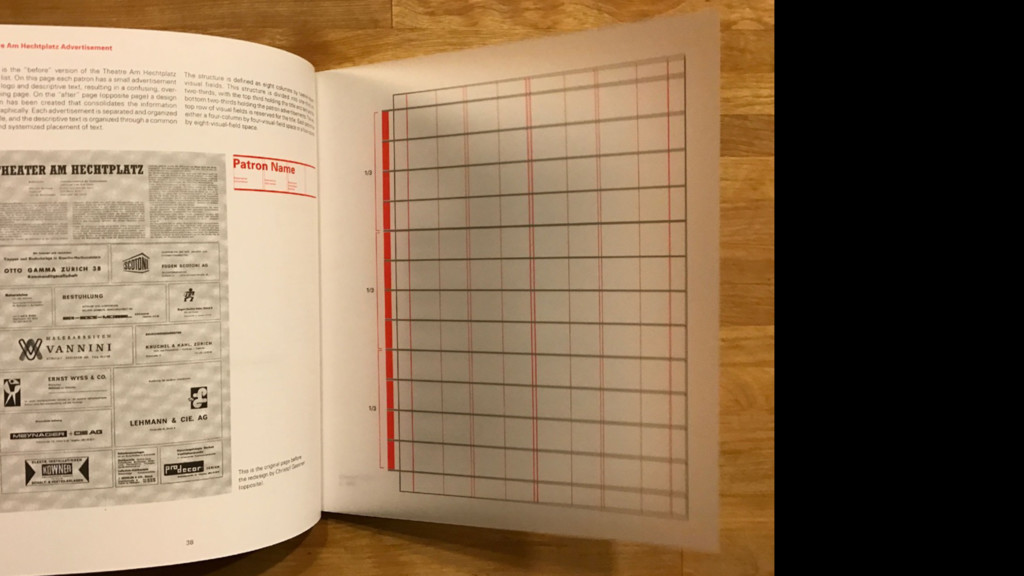
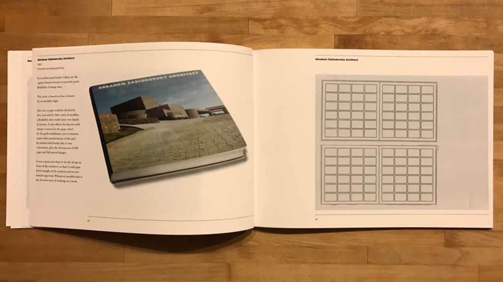
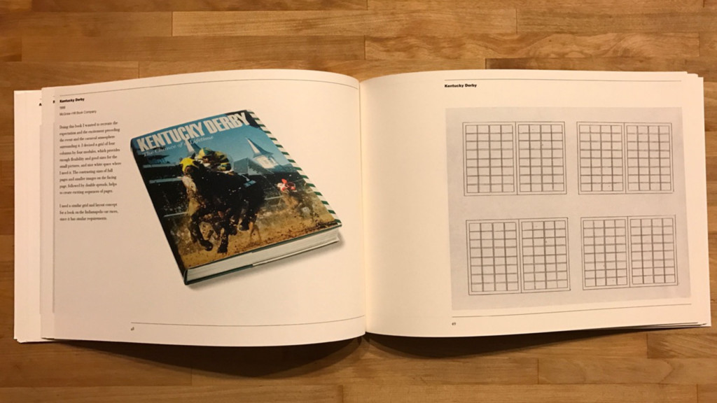
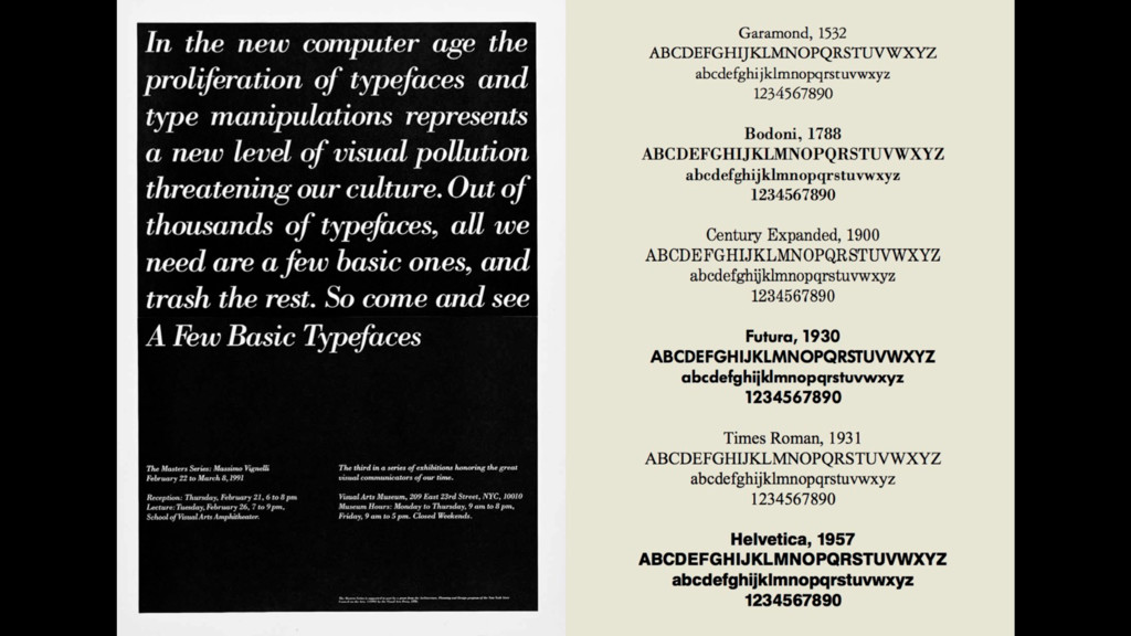
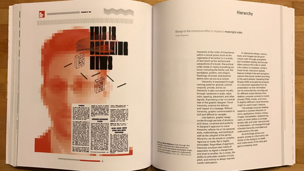
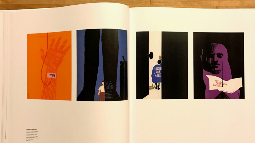
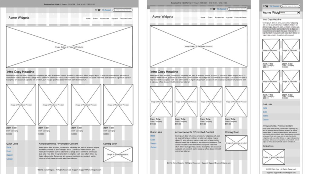
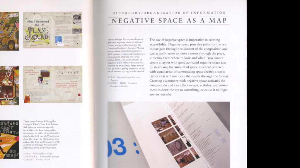
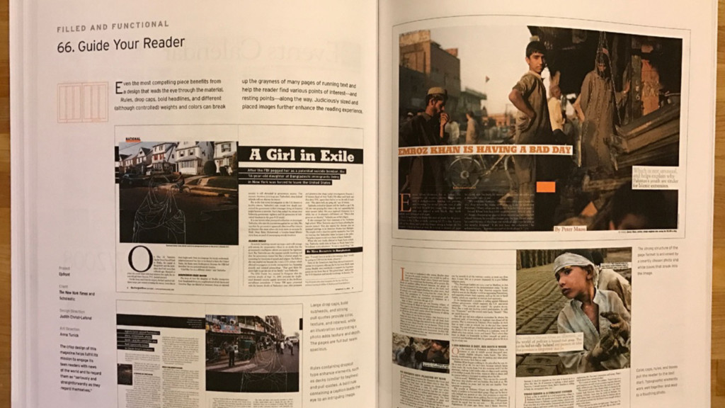
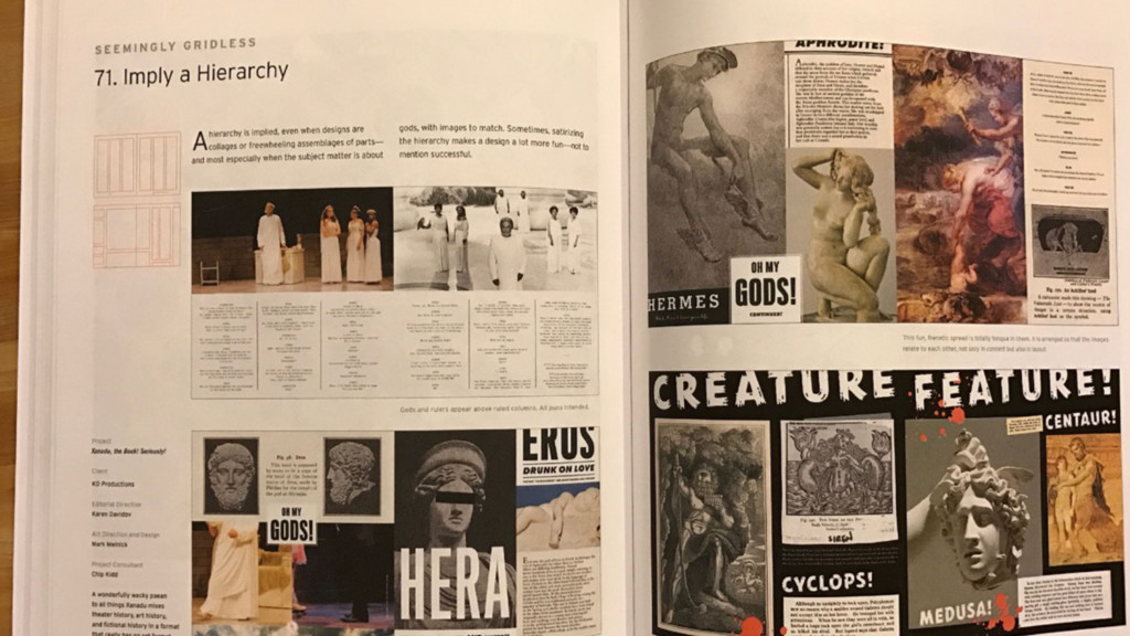
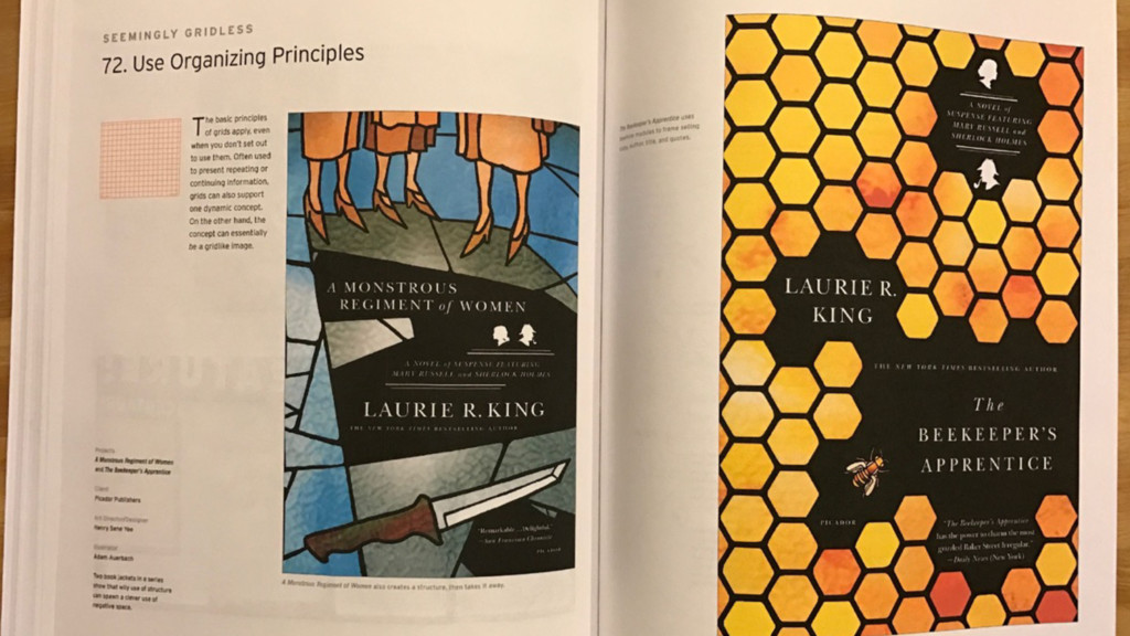
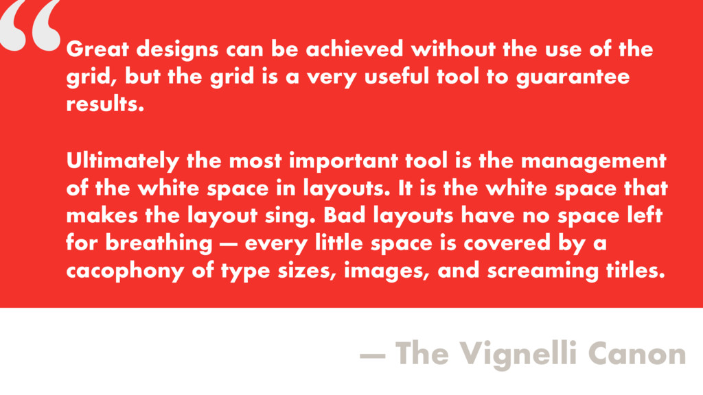
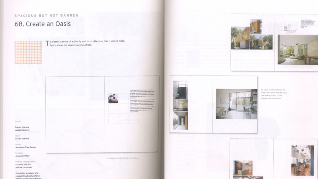
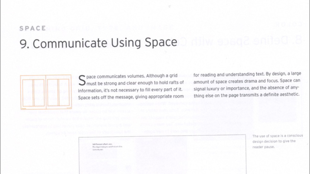
without the use of the grid, but the grid is a very useful tool to guarantee results. Ultimately the most important tool is the management of the white space in layouts. It is the white space that makes the layout sing. Bad layouts have no space left for breathing — every little space is covered by a cacophony of type sizes, images, and screaming titles.
 jensimmons
 mhand01
 littlebusters
 abokadotyann
 a2k
a2k
 hilokifigma
 videlvequio
 teba_eleven
 calpin
 saka2jp
 sony
sony
 karad
karad
 yuri_ohashi
.jpg) cargoodrich
cargoodrich
 honzajavorek
 jonrohan
 ipullrank
 reverentgeek
 axbom
axbom
 rabernat
 samanthasiow
 rocio
rocio
 destraynor
 garrettdimon
 mfonobong
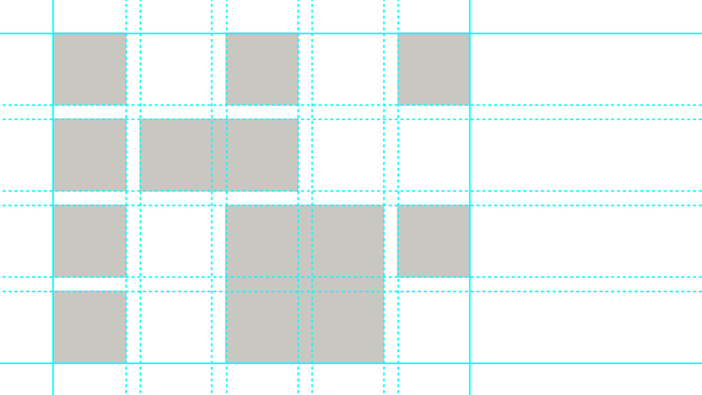
![.container { grid-template-rows:[cow] 1fr [horse] 1fr [dog] 1fr [pig] 1fr](https://files.speakerdeck.com/presentations/426b1b35dbbd4847b42518a6e3e1481f/slide_246.jpg)
![grid-template-rows:1fr 1fr 1fr; grid-template-rows:[cow] 1fr [horse] 1fr [dog] 1fr [pig];](https://files.speakerdeck.com/presentations/426b1b35dbbd4847b42518a6e3e1481f/slide_247.jpg)
![grid-template-rows: repeat(4,[foo-start] 1fr [foo-end] 300px);](https://files.speakerdeck.com/presentations/426b1b35dbbd4847b42518a6e3e1481f/slide_248.jpg)