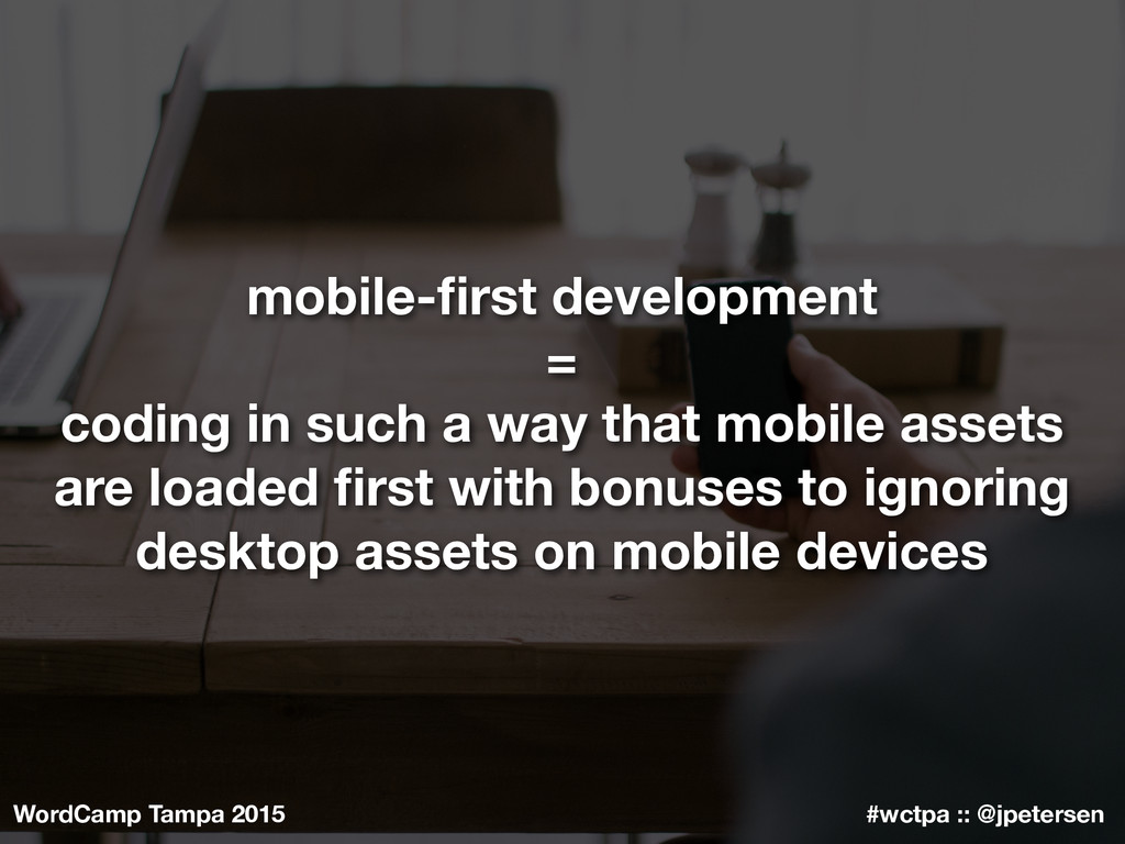
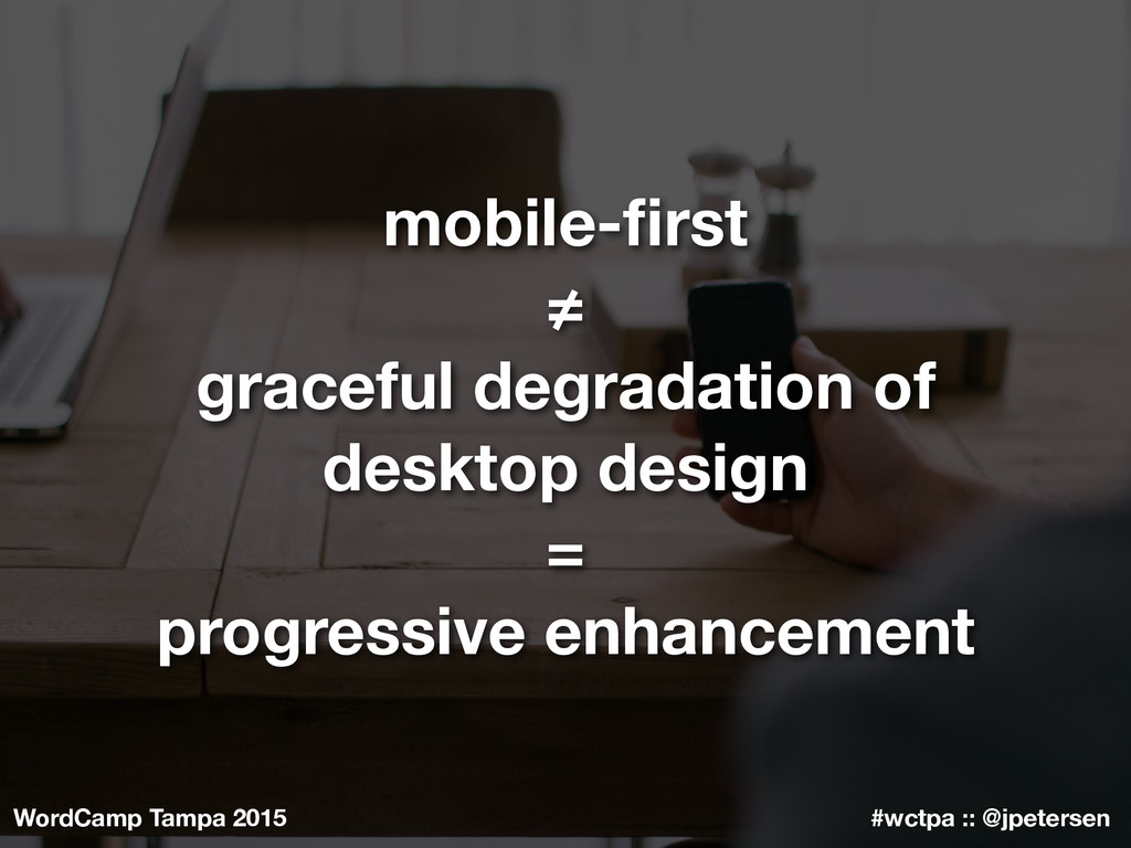
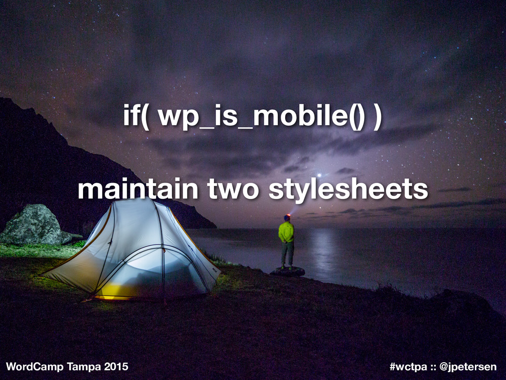
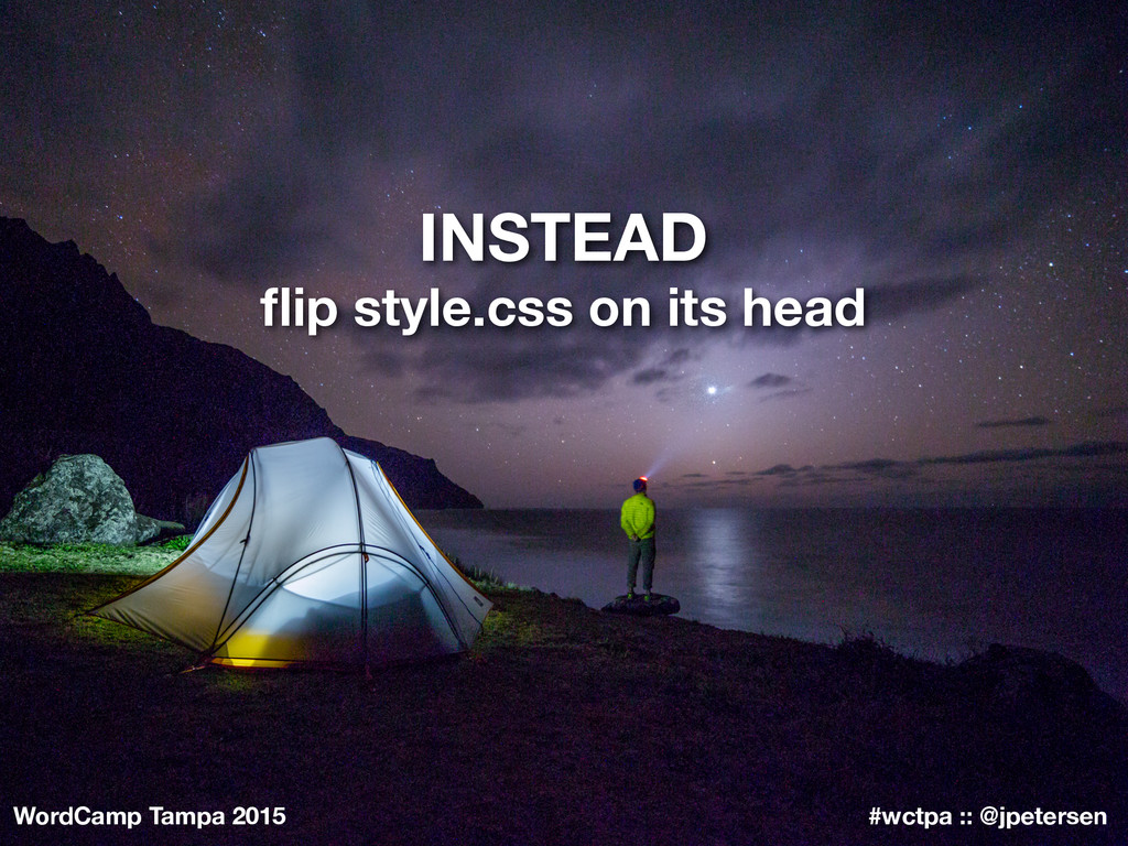
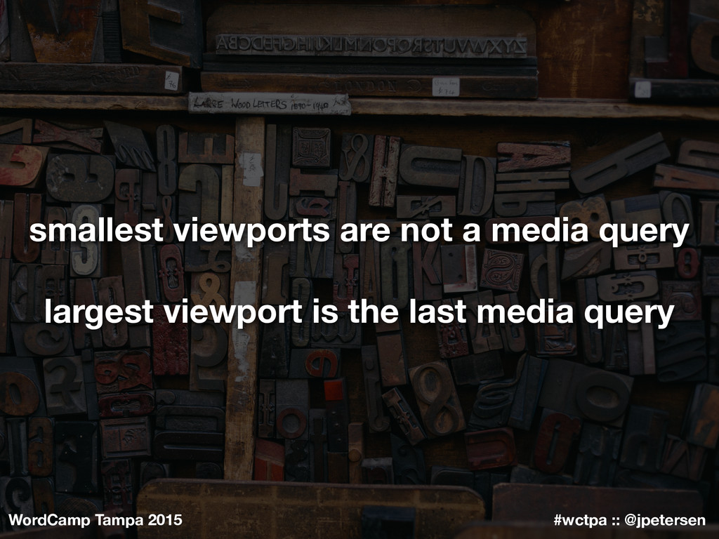
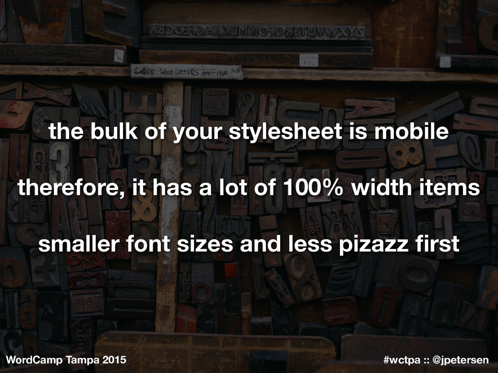
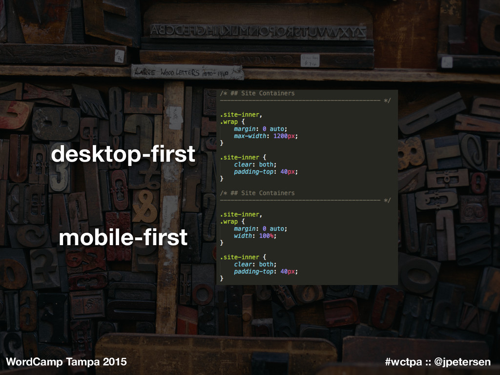
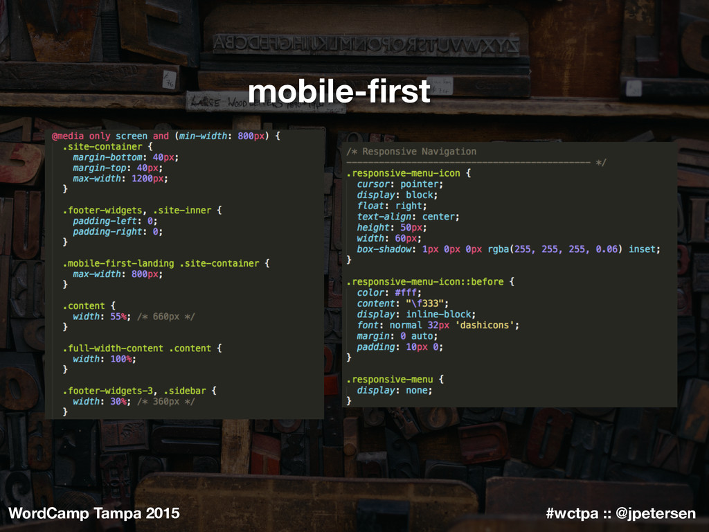
Mobile-first is one of those phrases getting thrown around a lot now, but most often mistakenly as interchangeable with “mobile responsive.” Mobile-first is the holistic design and development approach of both designing for phones first and flipping the stylesheet on its head so media queries are for large mobile on up to desktop and CSS without media queries are for the phone viewport.
 jpetersen
 yama3133
 kaminashi
 spatial_ai_network
 watany
 kaym
kaym
 nari_ex
 diggymo
 hiroyaonoe
 nek0128
 yukiogawa
 wxyzzz
 srenext
 bkeepers
 tammyeverts
 ryanjones
 baasie
 techseoconnect
 kimpetersen
 eileencodes
 stephaniewalter
 trishagee
 aleyda
 akademiya2063
 jeffersonlam