Native to Charlotte area • 40 years old • Live in Plaza Midwood/East Charlotte with my wife Alison, son Hollis • Currently FED Wray Ward, 1.5 years Intro
Native to Charlotte area • 40 years old • Live in Plaza Midwood/East Charlotte with my wife Alison, son Hollis • Currently FED Wray Ward, 1.5 years • Passion for FED; Interaction, Performance, Tooling, Animation Intro
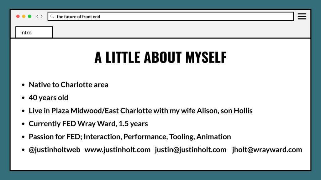
Native to Charlotte area • 40 years old • Live in Plaza Midwood/East Charlotte with my wife Alison, son Hollis • Currently FED Wray Ward, 1.5 years • Passion for FED; Interaction, Performance, Tooling, Animation • @justinholtweb www.justinholt.com [email protected][email protected] Intro
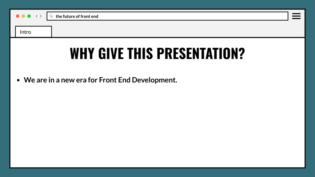
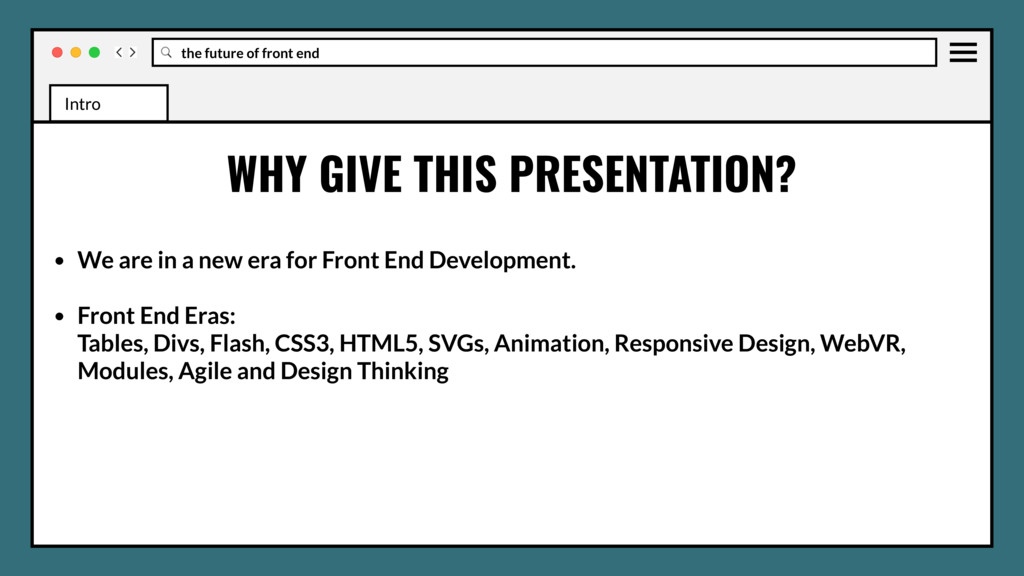
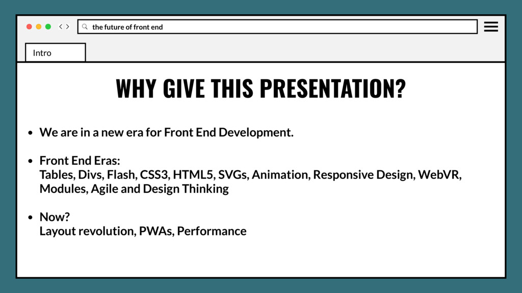
We are in a new era for Front End Development. • Front End Eras: Tables, Divs, Flash, CSS3, HTML5, SVGs, Animation, Responsive Design, WebVR, Modules, Agile and Design Thinking Intro Intro
We are in a new era for Front End Development. • Front End Eras: Tables, Divs, Flash, CSS3, HTML5, SVGs, Animation, Responsive Design, WebVR, Modules, Agile and Design Thinking • Now? Layout revolution, PWAs, Performance Intro Intro
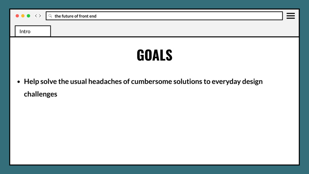
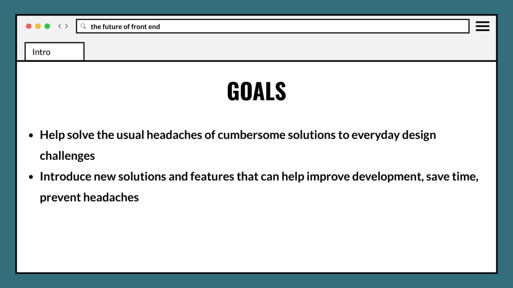
headaches of cumbersome solutions to everyday design challenges • Introduce new solutions and features that can help improve development, save time, prevent headaches GOALS Intro Intro Intro
headaches of cumbersome solutions to everyday design challenges • Introduce new solutions and features that can help improve development, save time, prevent headaches • Take away new features you can ship right now in production GOALS Intro Intro Intro
headaches of cumbersome solutions to everyday design challenges • Introduce new solutions and features that can help improve development, save time, prevent headaches • Take away new features you can ship right now in production • Start thinking about future features and how they affect your work/tooling GOALS Intro Intro Intro
examples but some just discussions • CSS examples may be in SASS/SCSS • Only display normal declarations, post process for browser-prefixes (Autoprefixer) ** A FEW NOTES Intro Intro Intro
examples but some just discussions • CSS examples may be in SASS/SCSS • Only display normal declarations, post process for browser-prefixes (Autoprefixer) ** • JavaScript examples may be in ES6, post process for transpiling (Babel/Browserify or Webpack) A FEW NOTES Intro Intro Intro
examples but some just discussions • CSS examples may be in SASS/SCSS • Only display normal declarations, post process for browser-prefixes (Autoprefixer) ** • JavaScript examples may be in ES6, post process for transpiling (Babel/Browserify or Webpack) • 4 space tabs always, well because… A FEW NOTES Intro Intro Intro
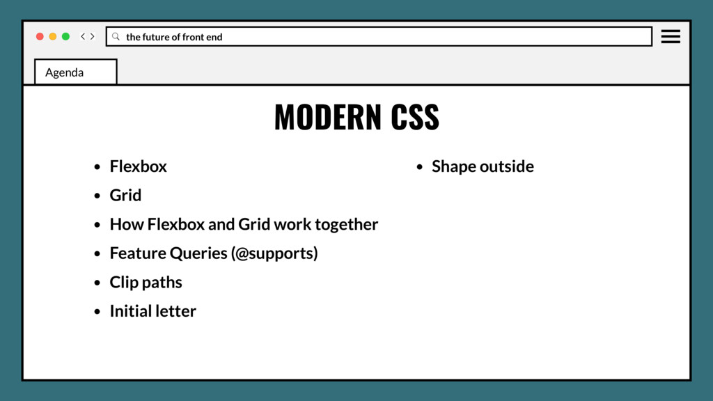
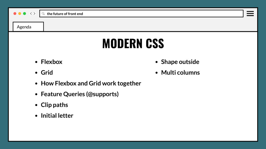
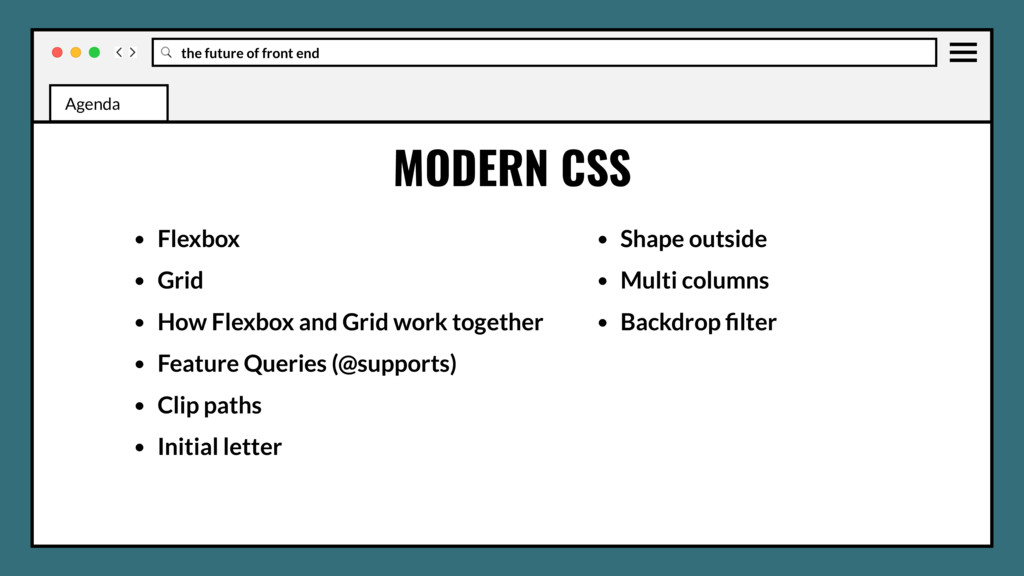
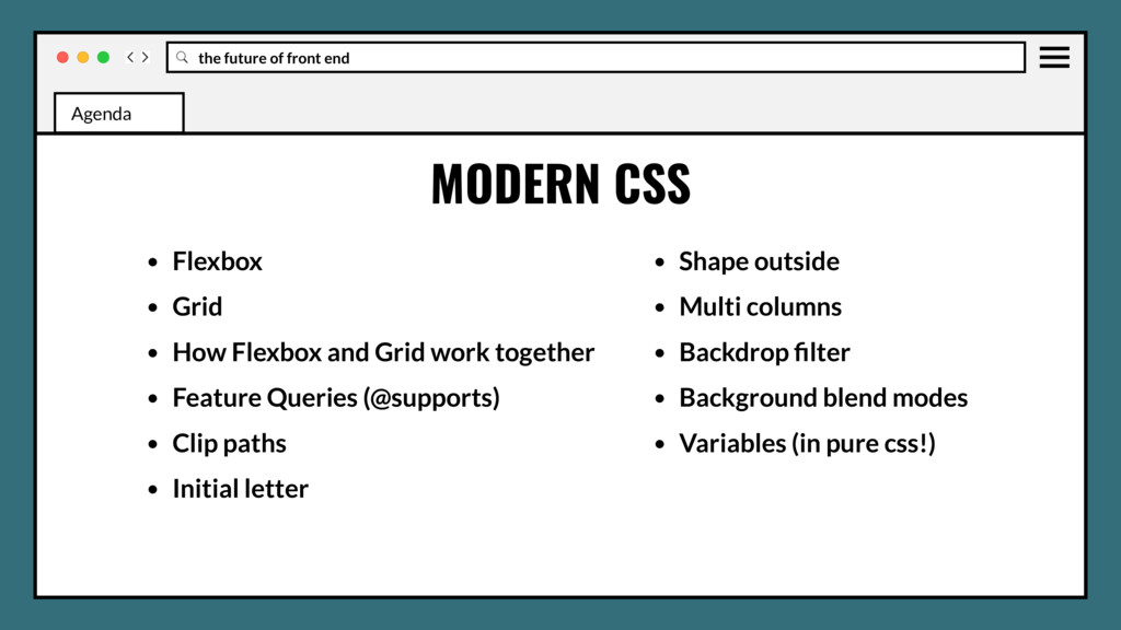
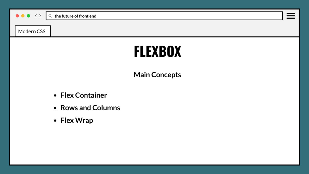
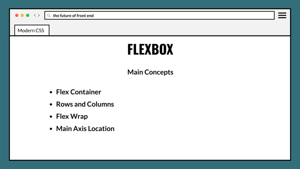
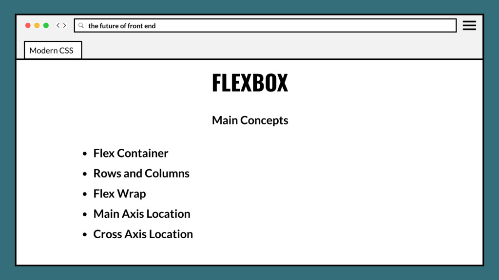
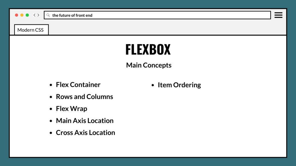
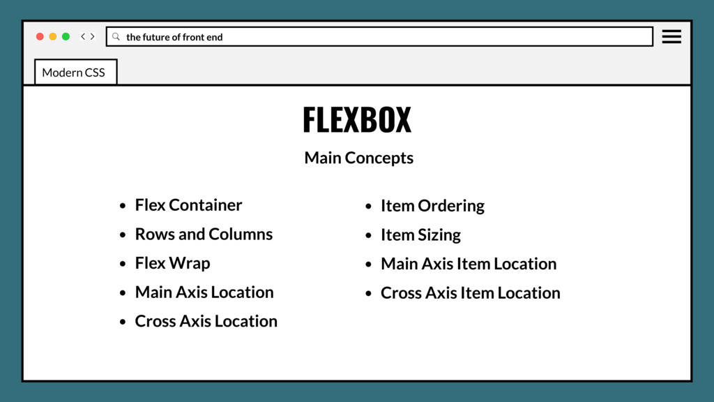
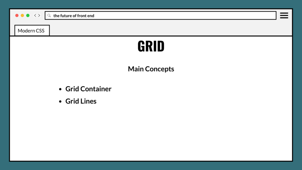
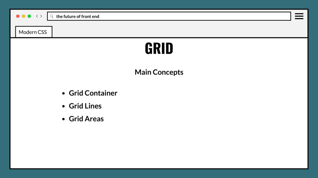
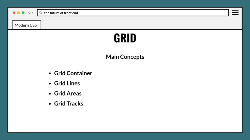
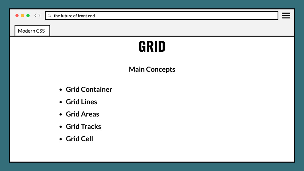
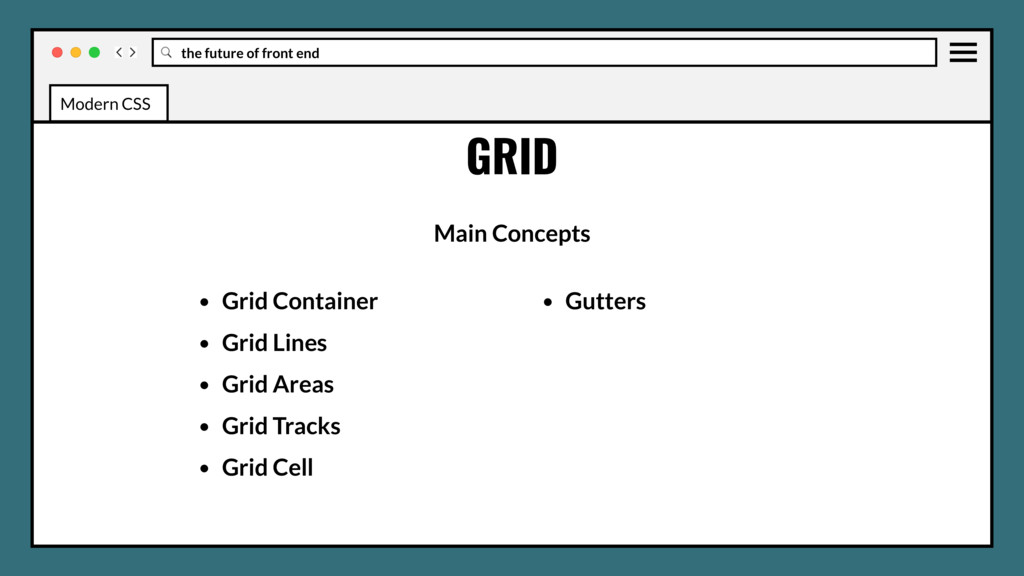
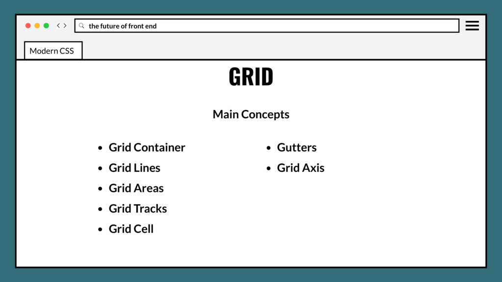
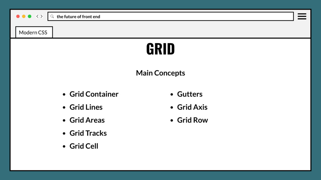
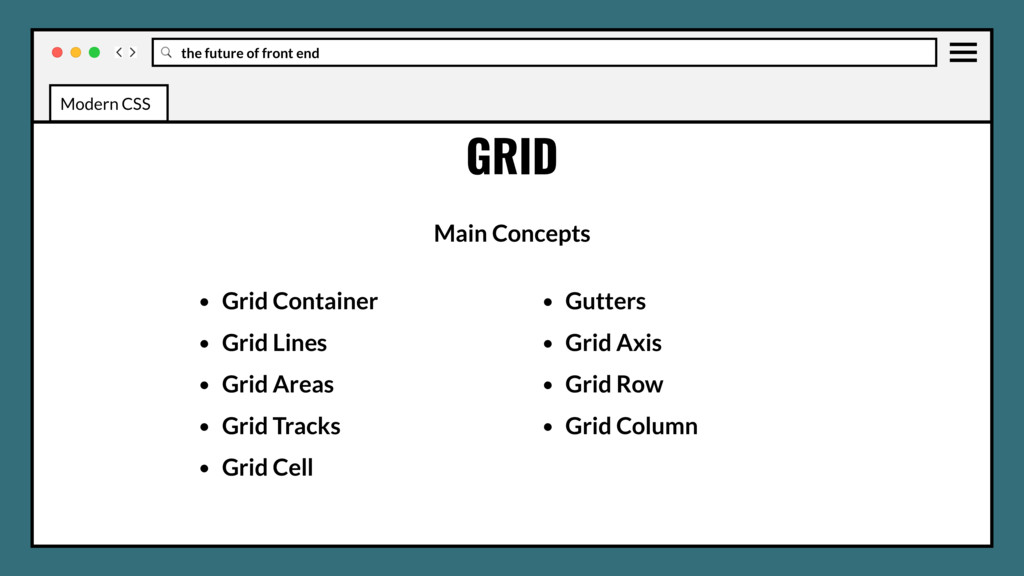
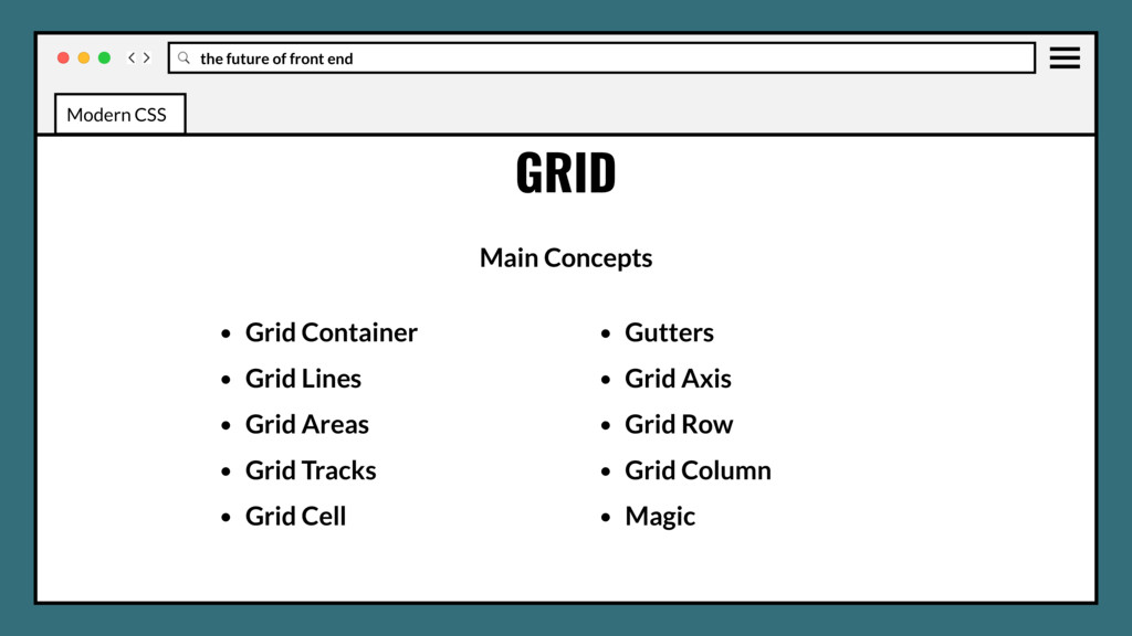
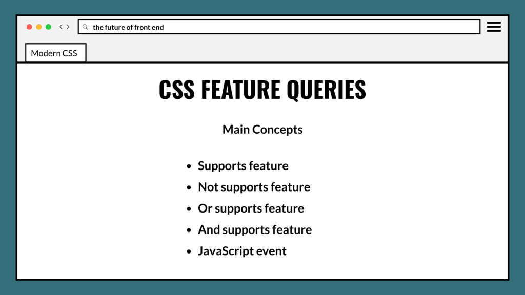
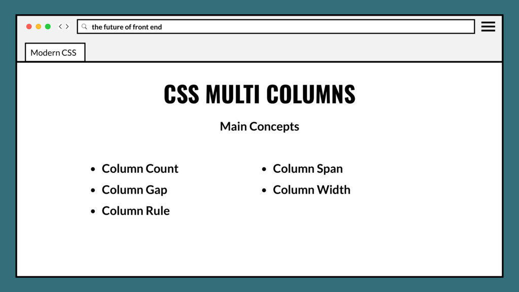
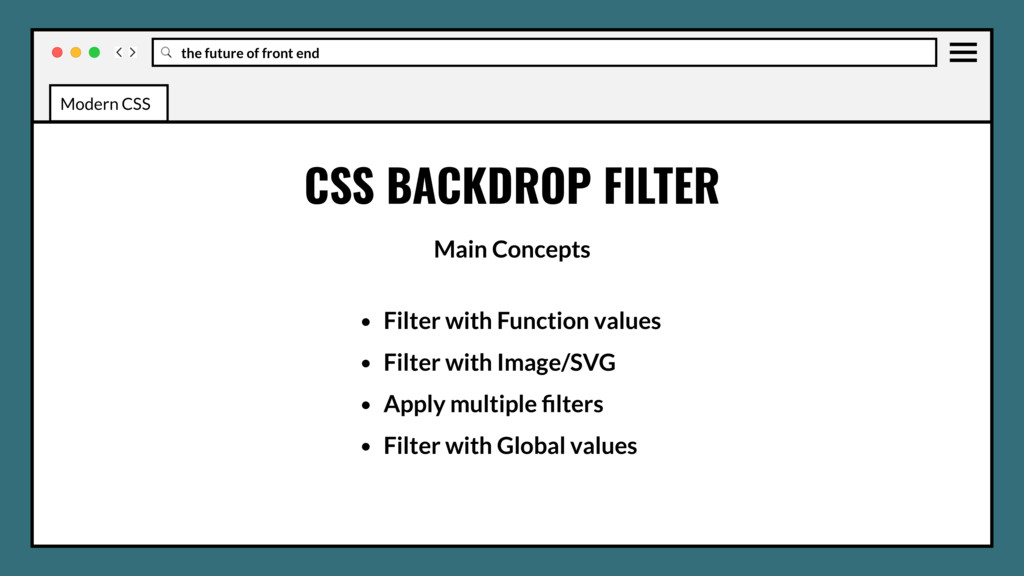
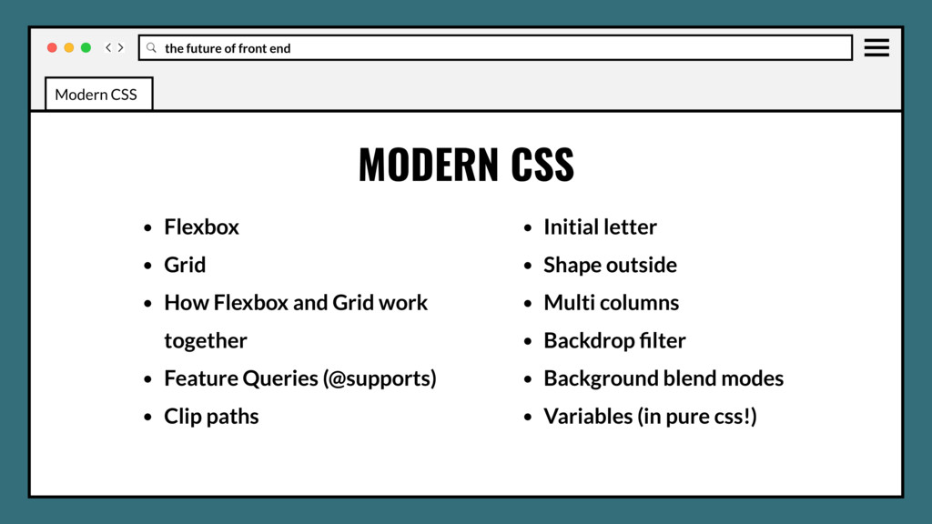
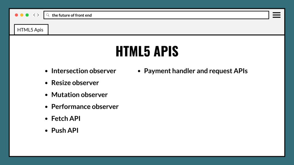
Grid • How Flexbox and Grid work together • Feature Queries (@supports) • Clip paths • Initial letter • Shape outside • Multi columns • Backdrop filter Agenda
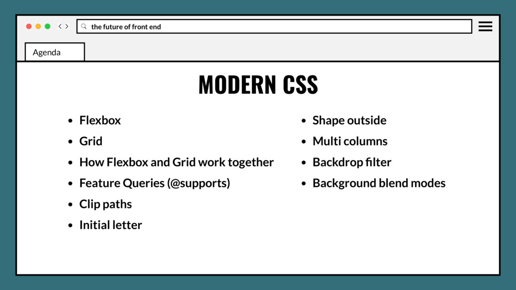
Grid • How Flexbox and Grid work together • Feature Queries (@supports) • Clip paths • Initial letter • Shape outside • Multi columns • Backdrop filter • Background blend modes • Variables (in pure css!) Agenda
WG and stages • Font display • Position sticky • :matches and :not selectors • CSS element queries • Css object fit and object-position • CSS image-set Agenda
WG and stages • Font display • Position sticky • :matches and :not selectors • CSS element queries • Css object fit and object-position • CSS image-set • CSS media query ranges Agenda
WG and stages • Font display • Position sticky • :matches and :not selectors • CSS element queries • Css object fit and object-position • CSS image-set • CSS media query ranges • CSS color-mod and gray Agenda
WG and stages • Font display • Position sticky • :matches and :not selectors • CSS element queries • Css object fit and object-position • CSS image-set • CSS media query ranges • CSS color-mod and gray • CSS nesting and when/else rules Agenda
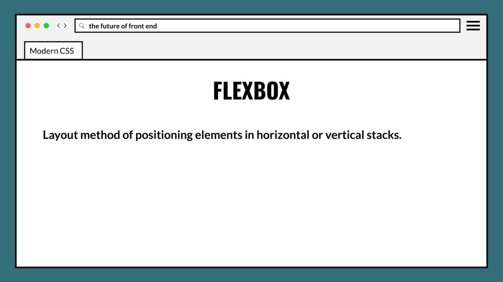
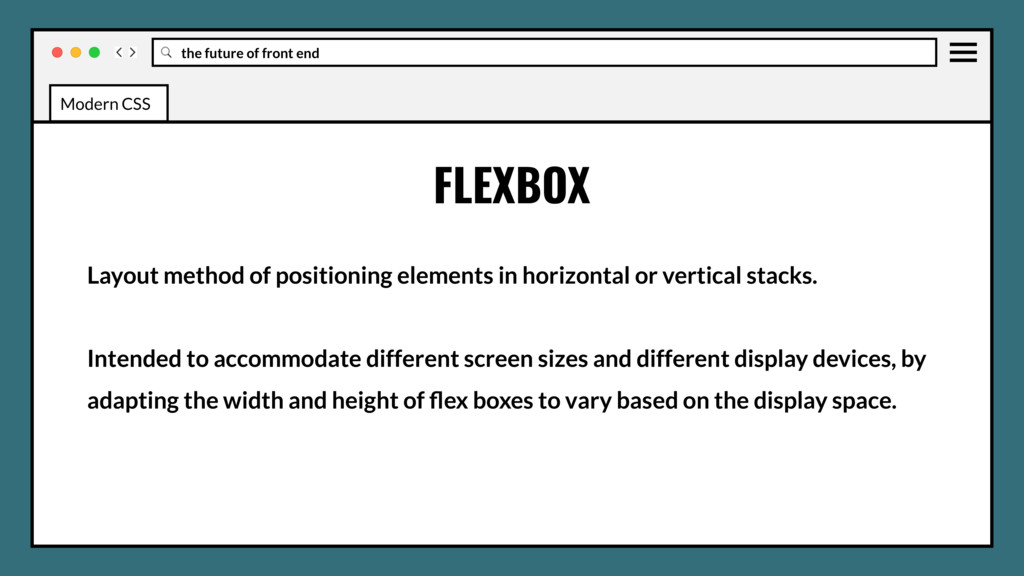
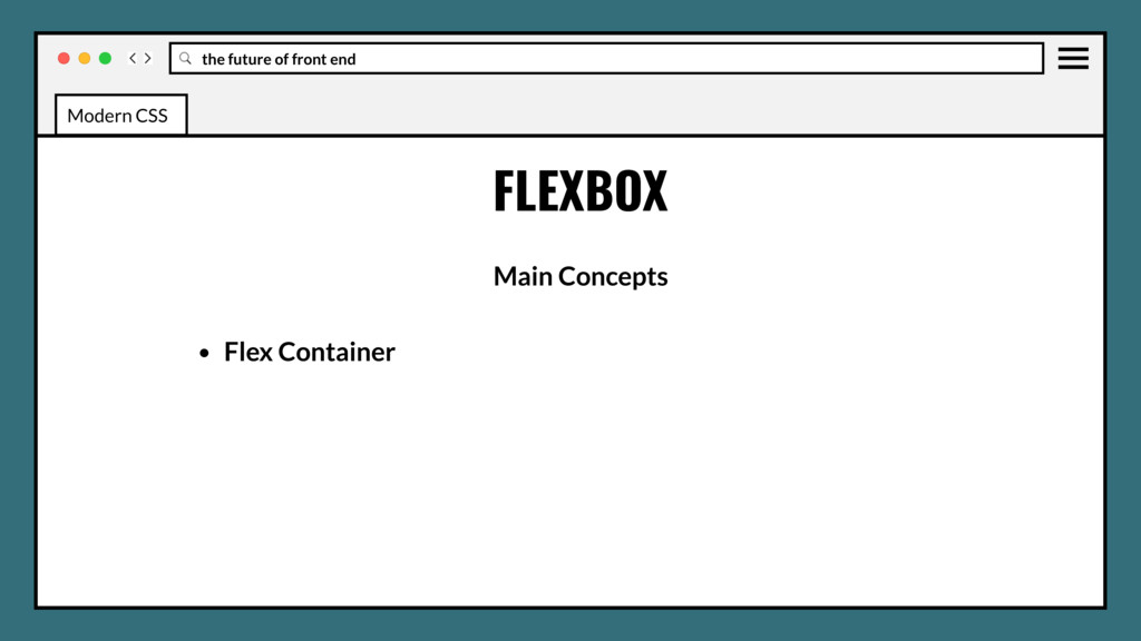
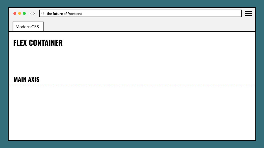
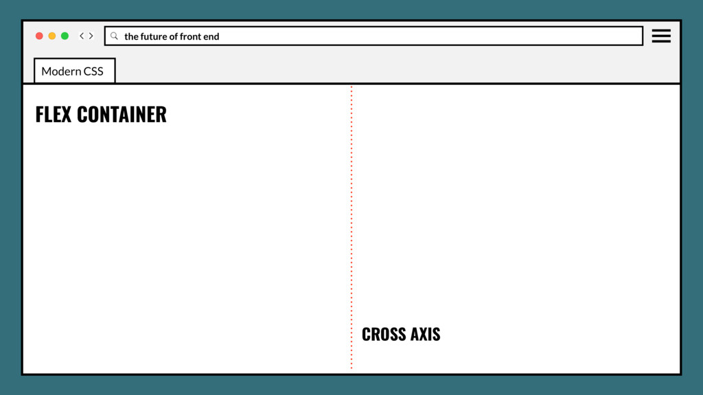
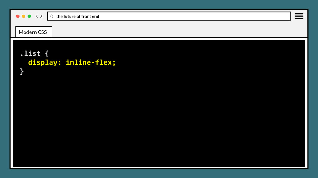
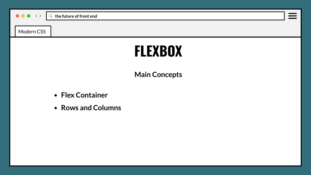
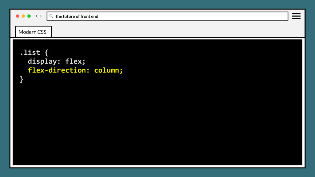
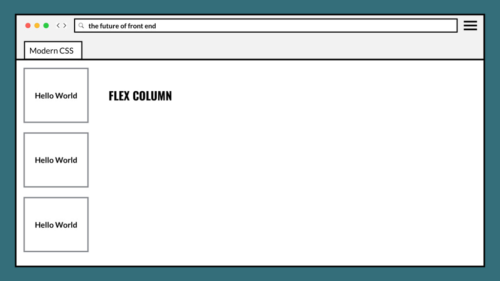
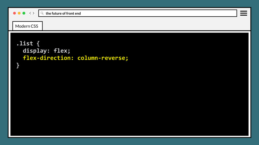
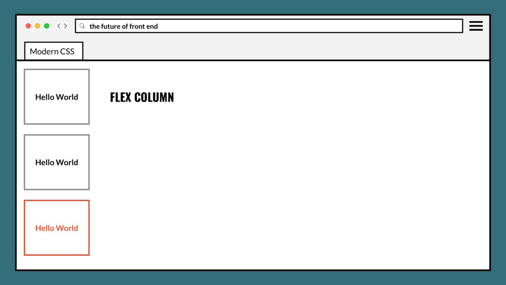
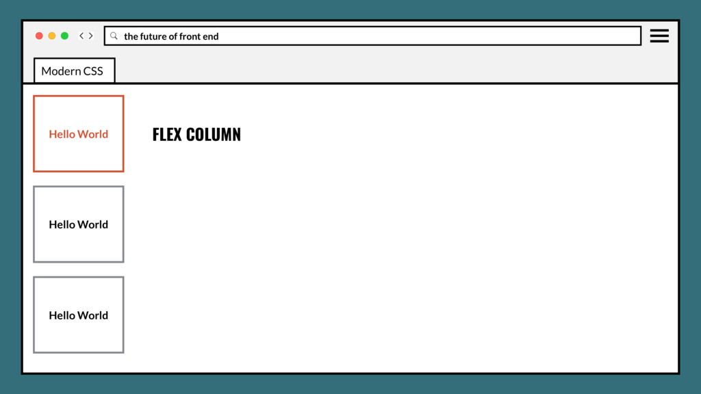
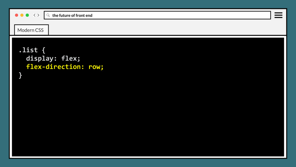
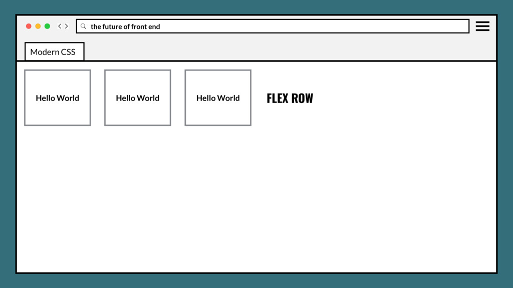
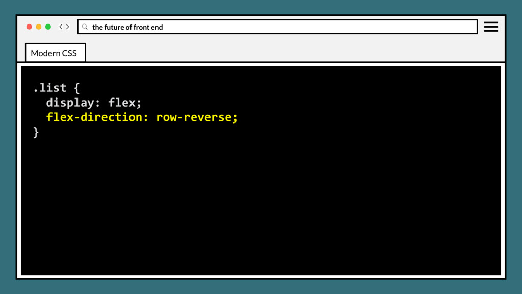
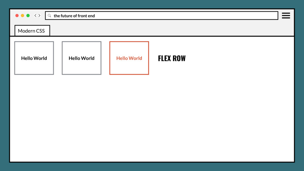
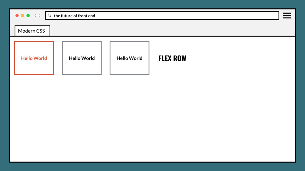
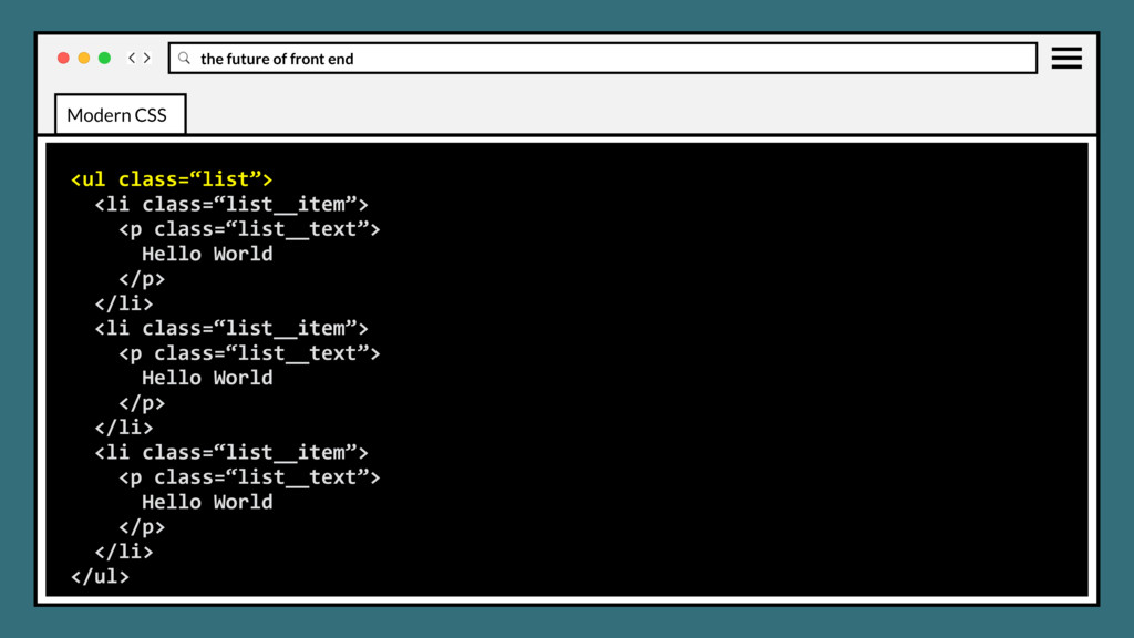
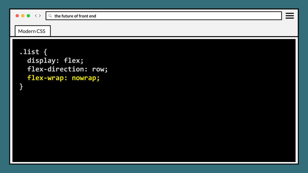
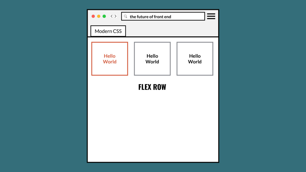
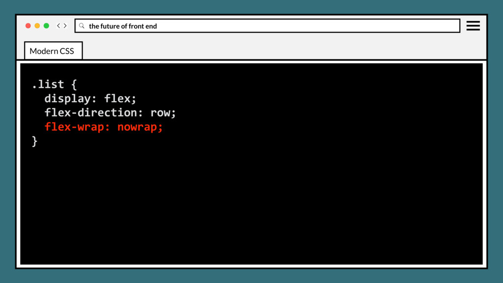
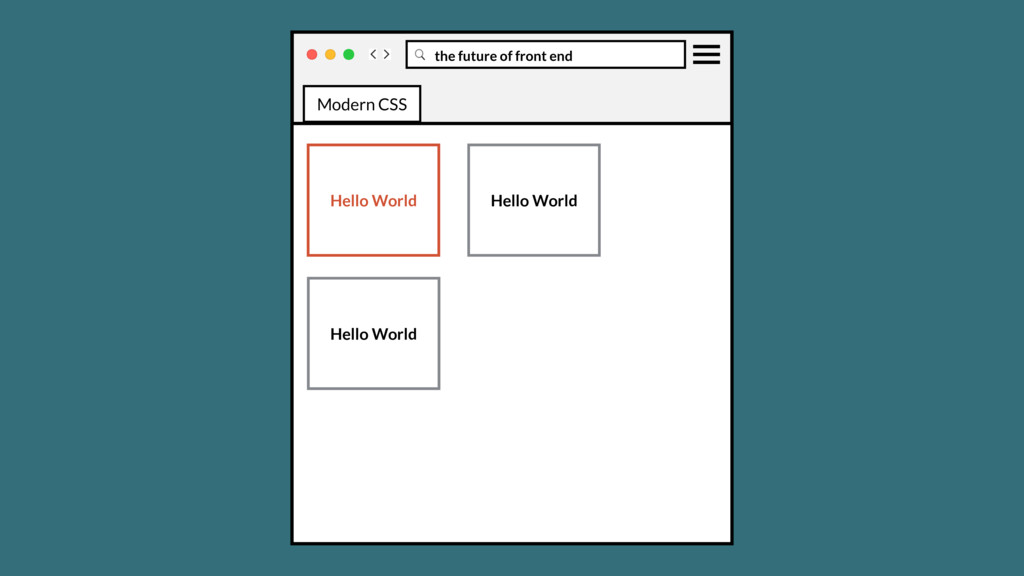
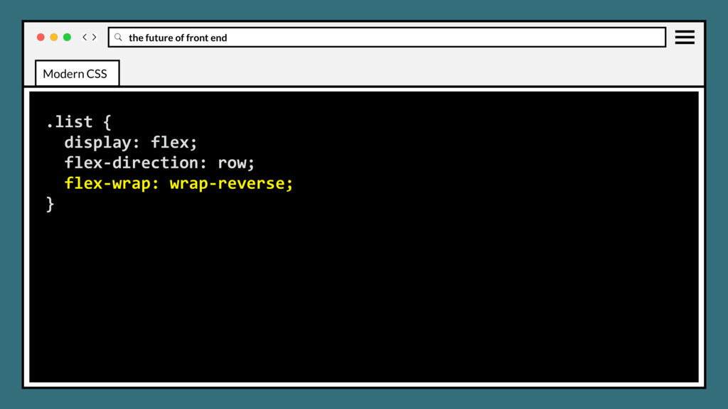
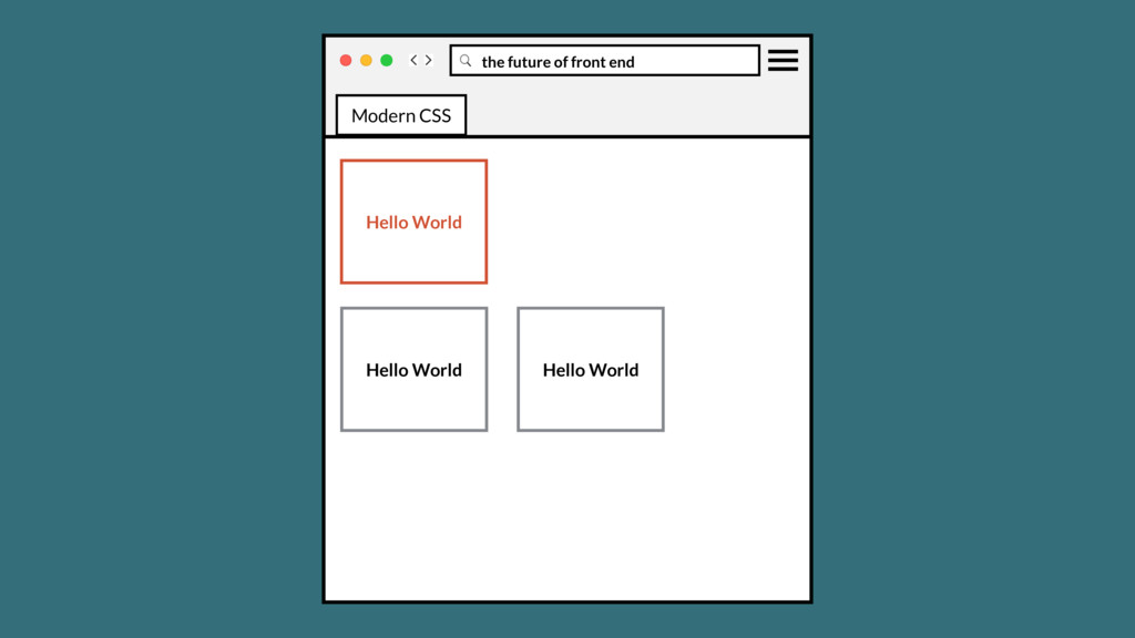
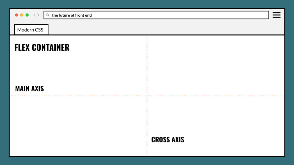
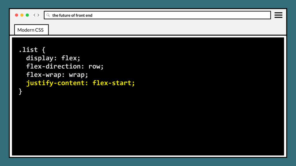
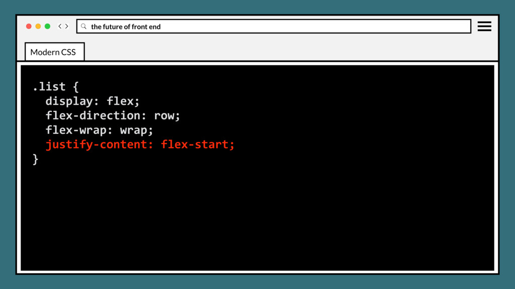
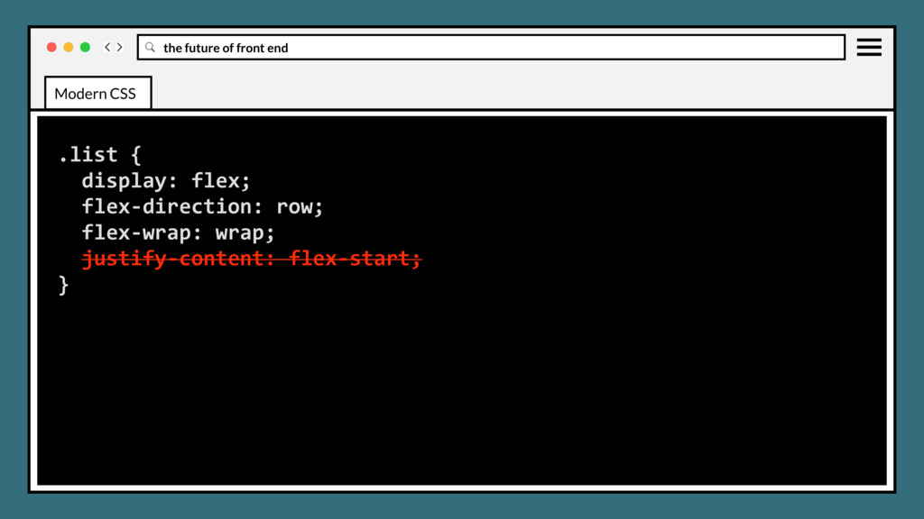
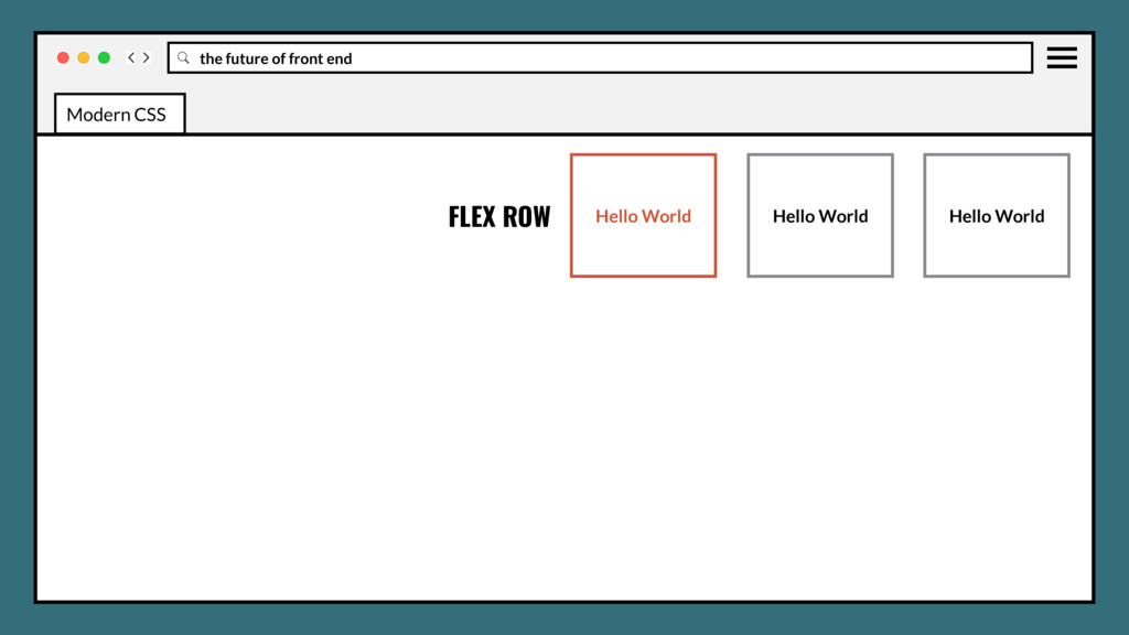
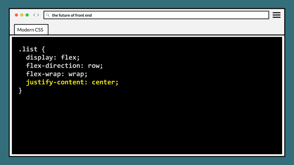
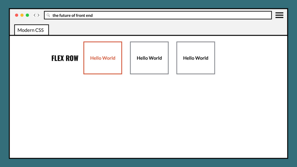
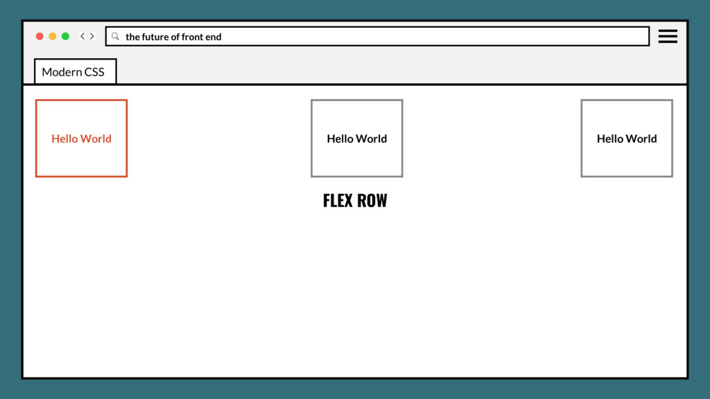
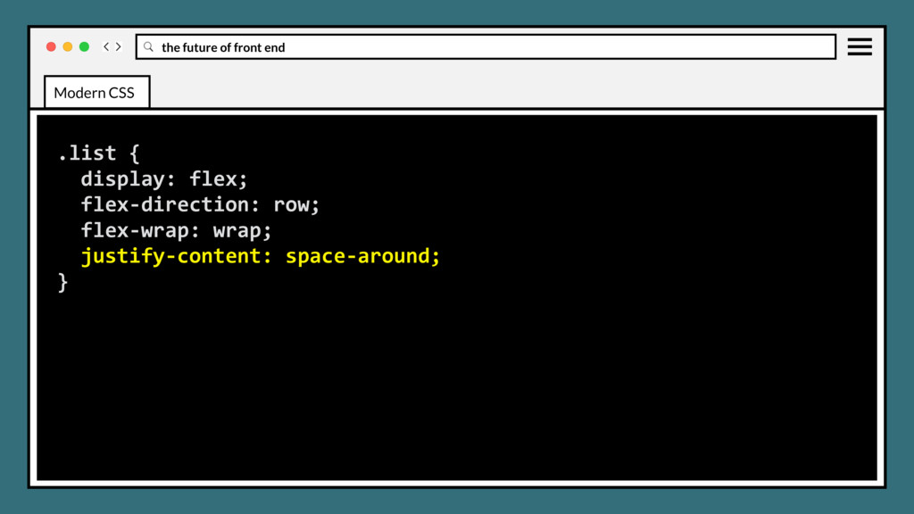
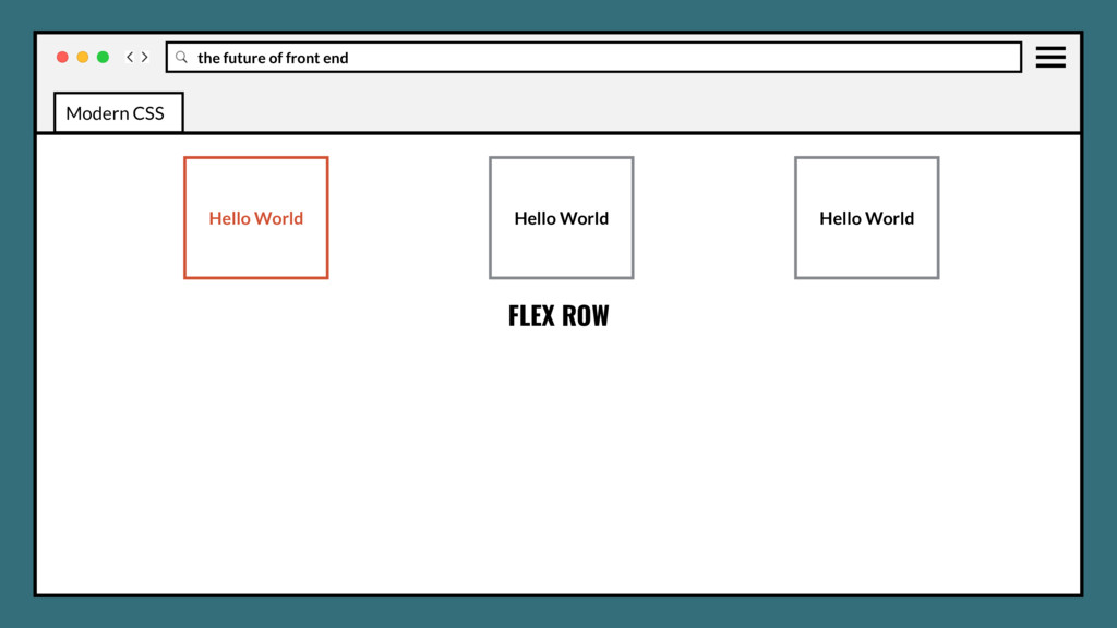
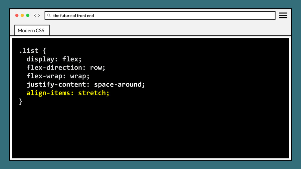
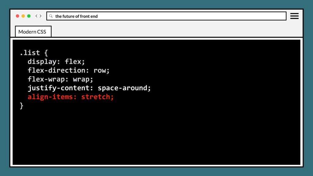
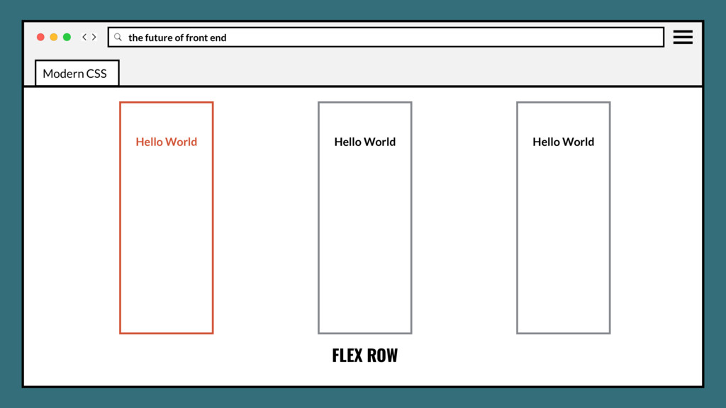
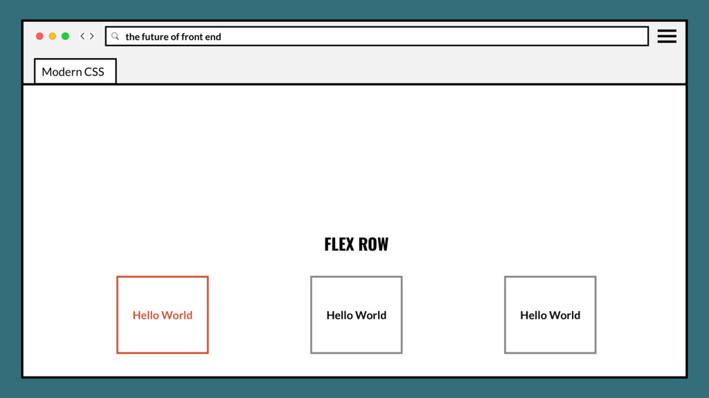
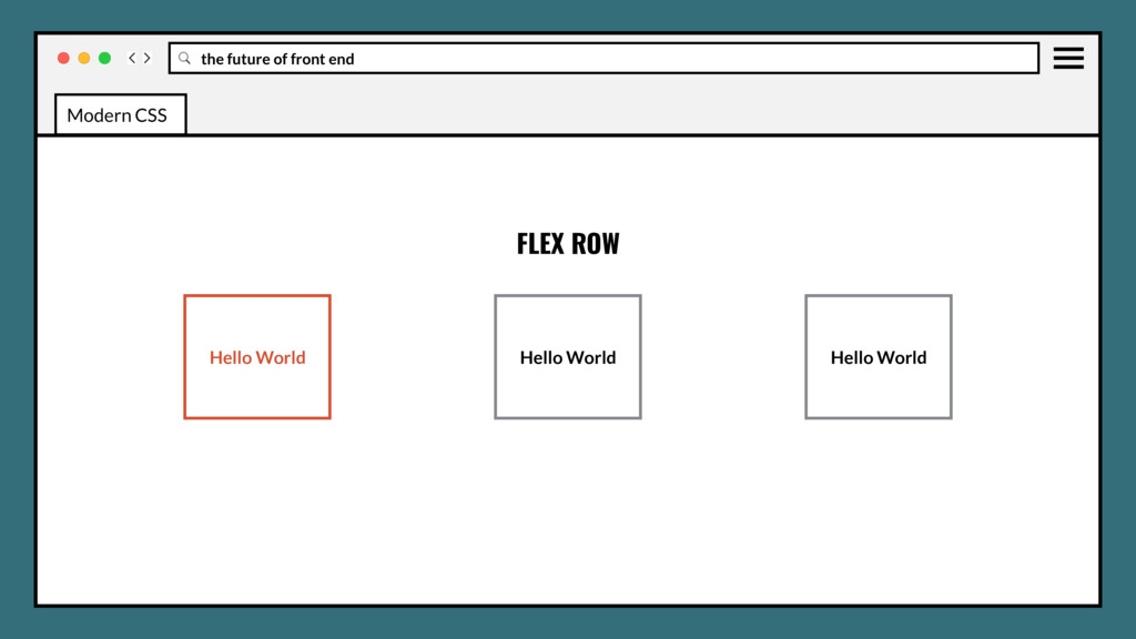
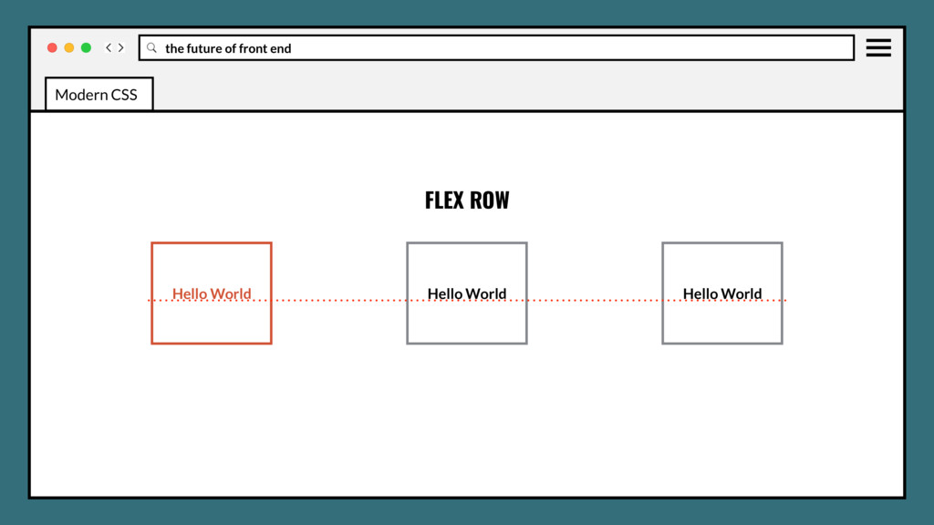
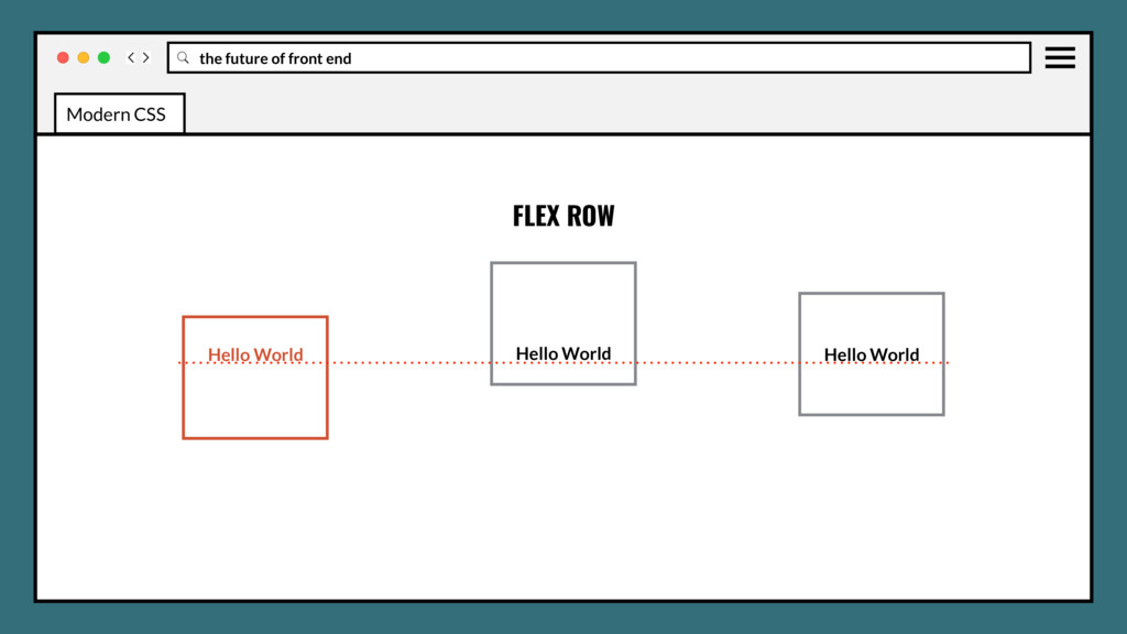
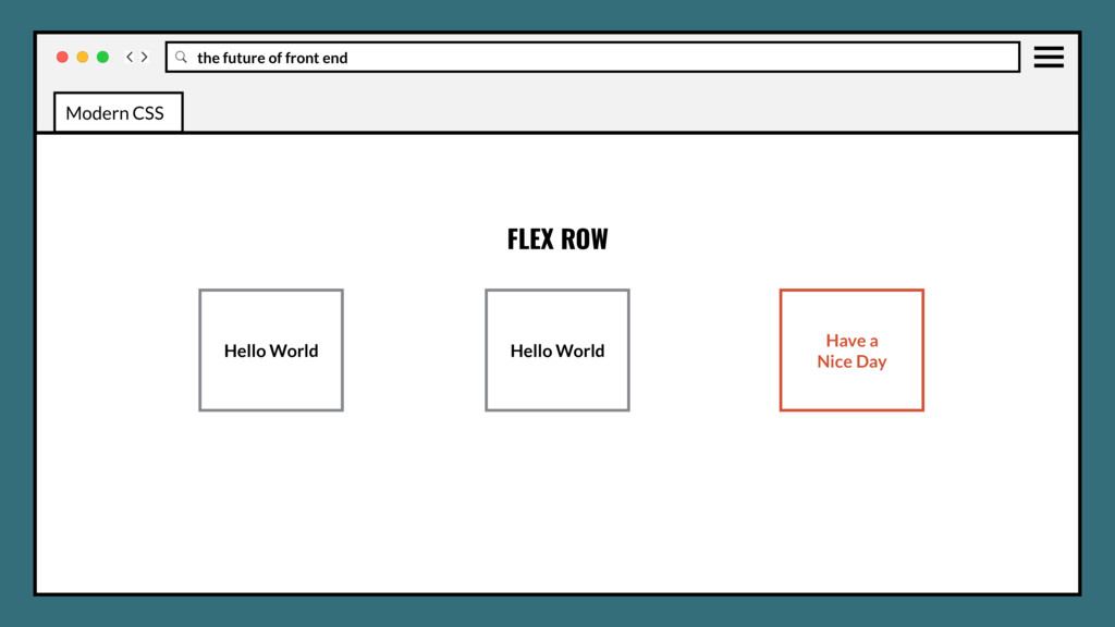
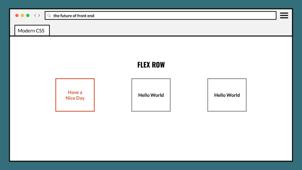
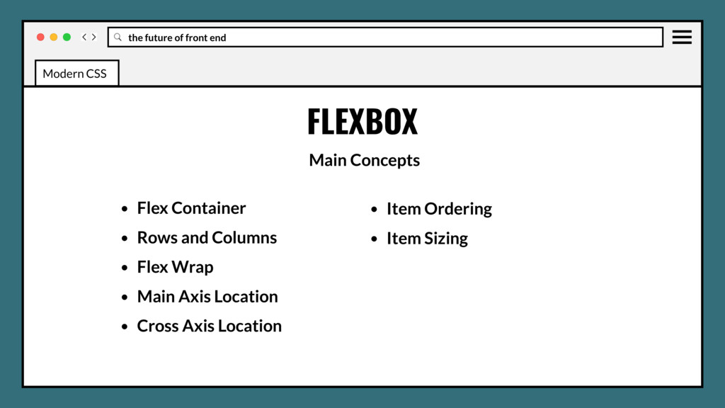
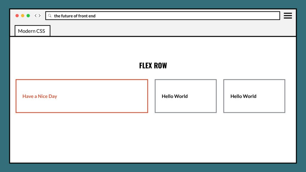
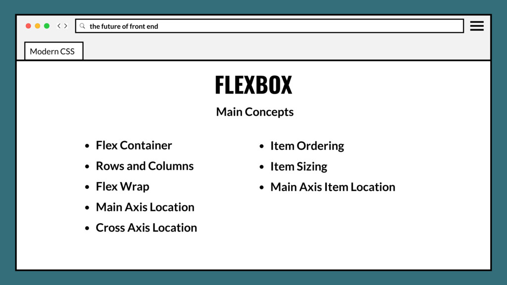
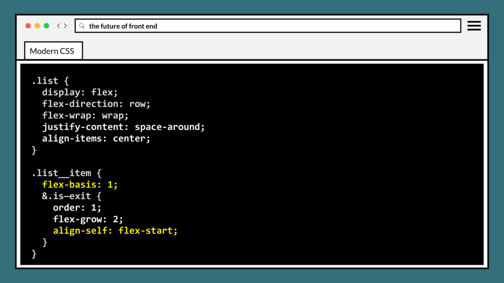
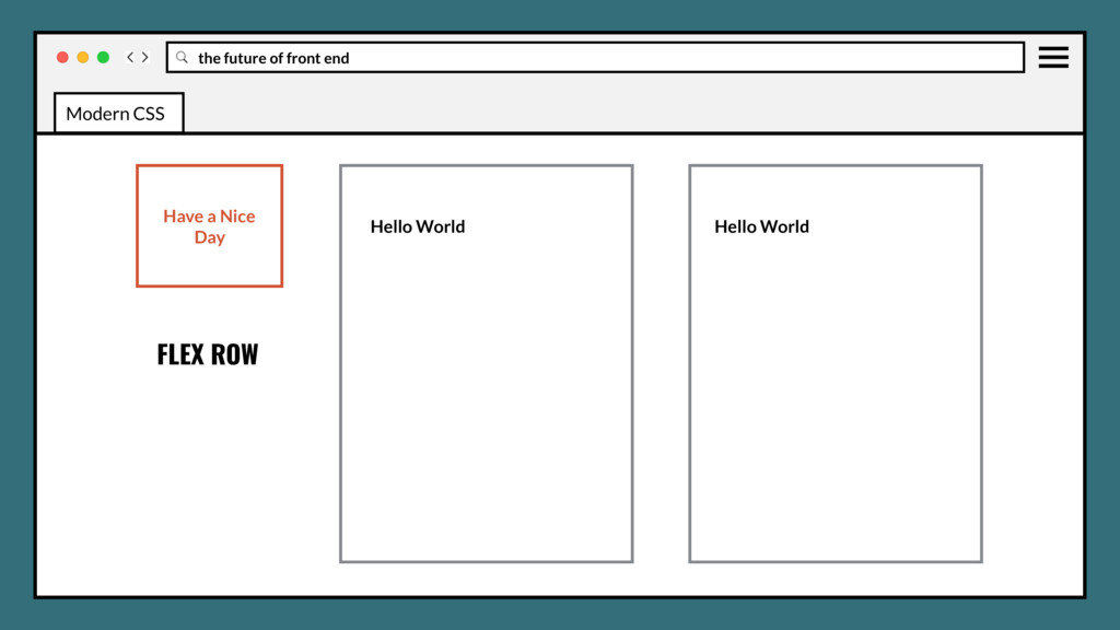
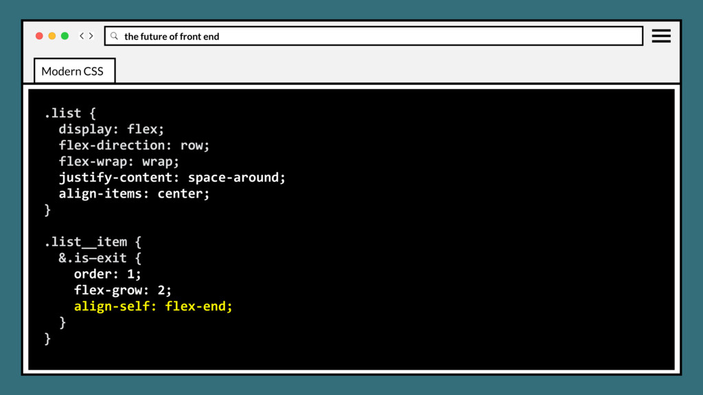
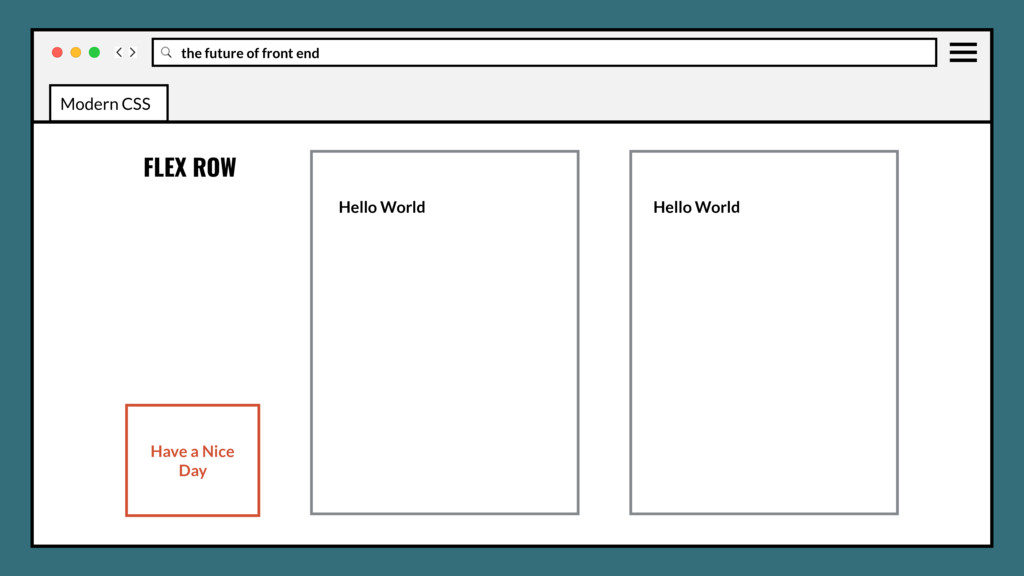
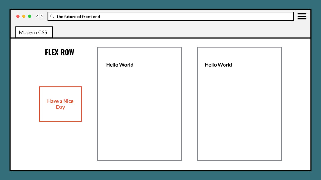
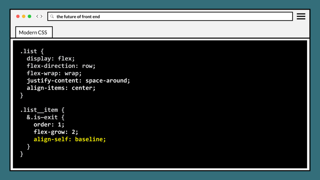
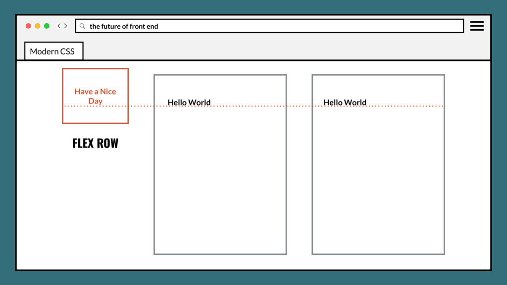
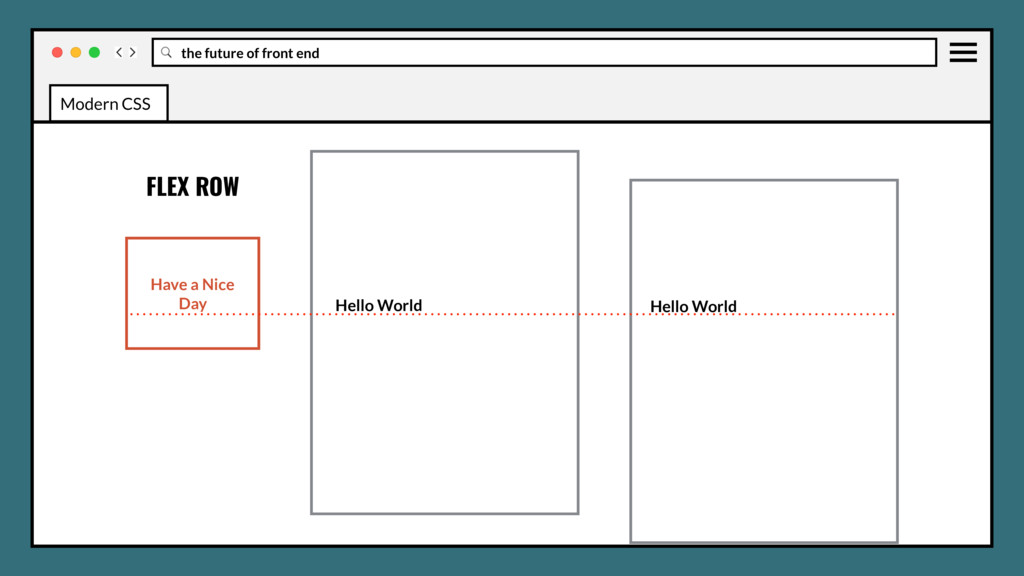
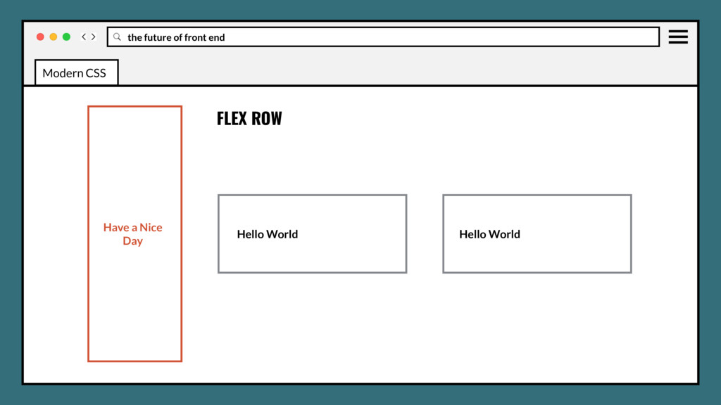
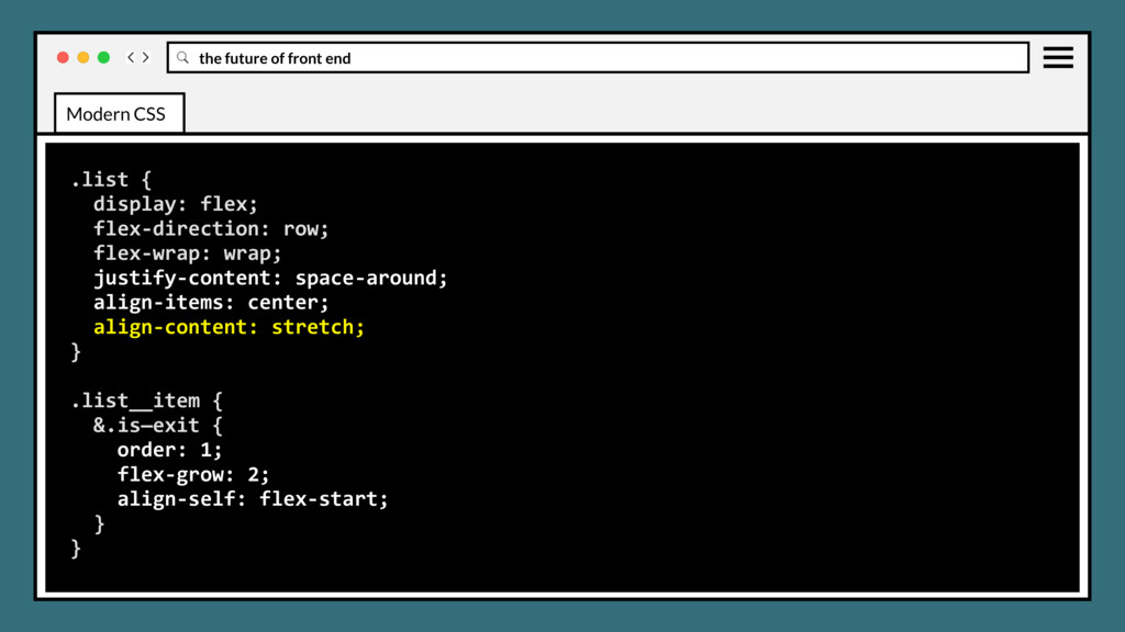
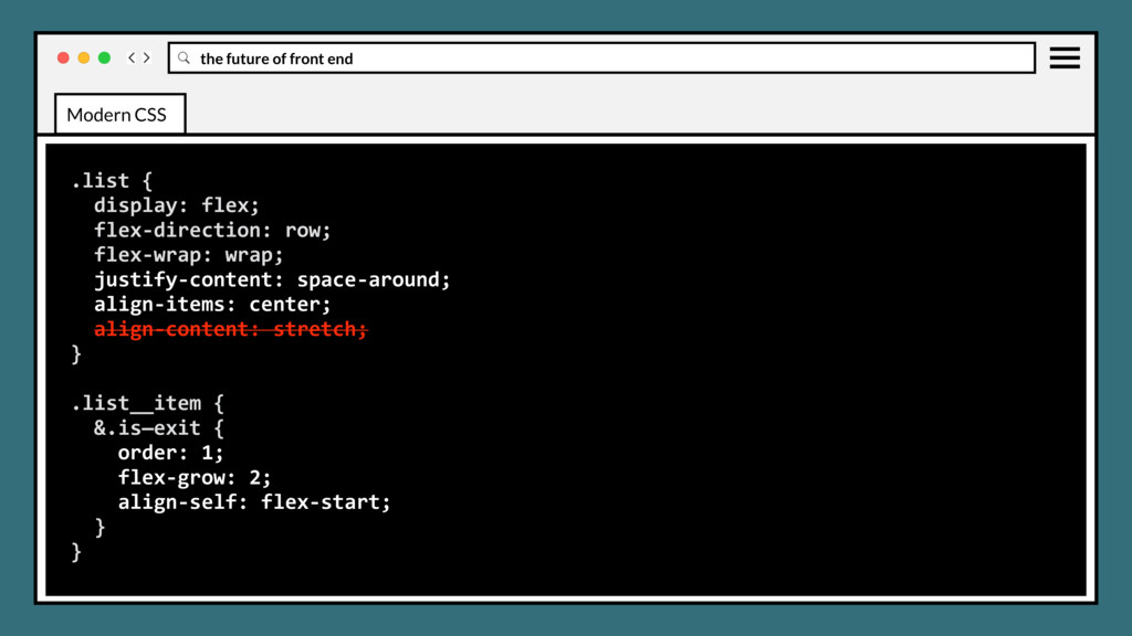
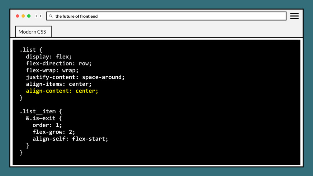
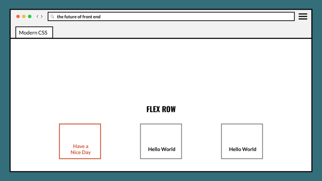
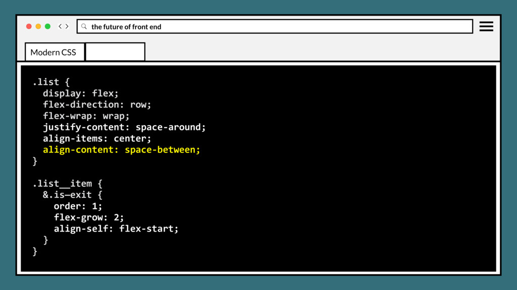
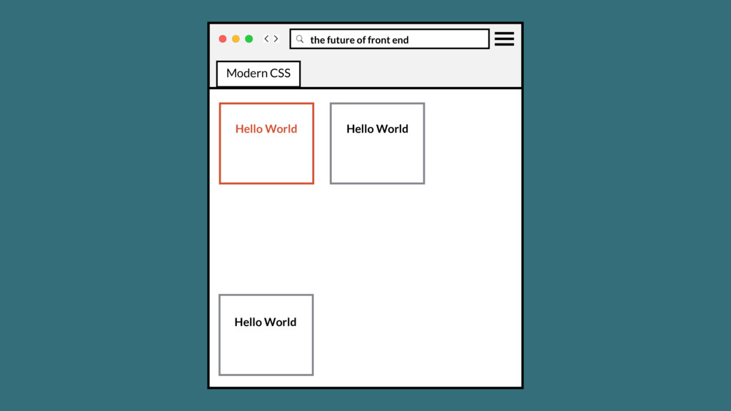
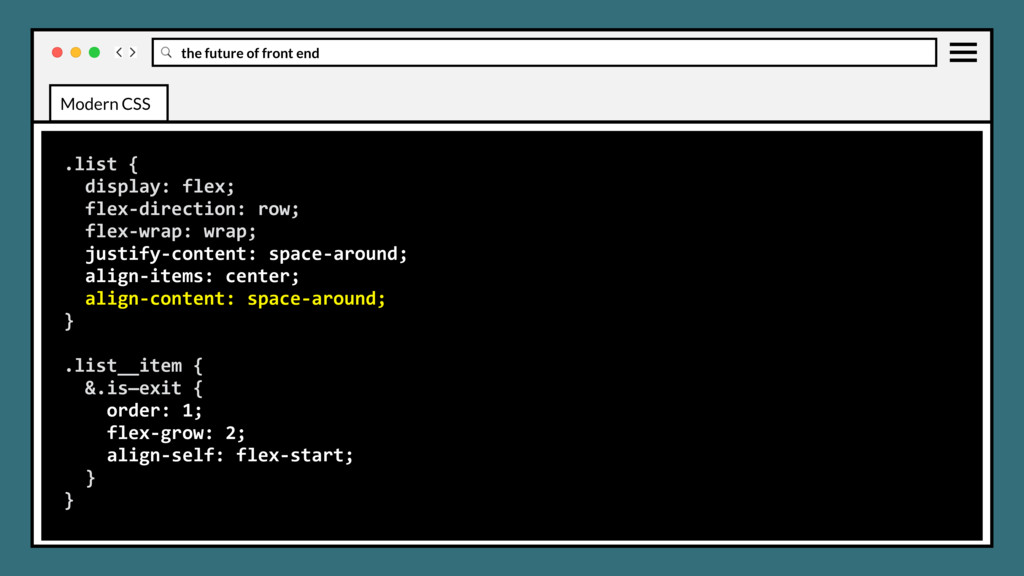
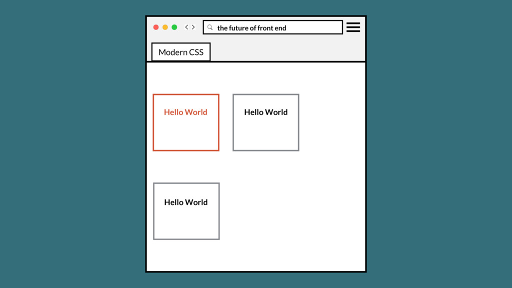
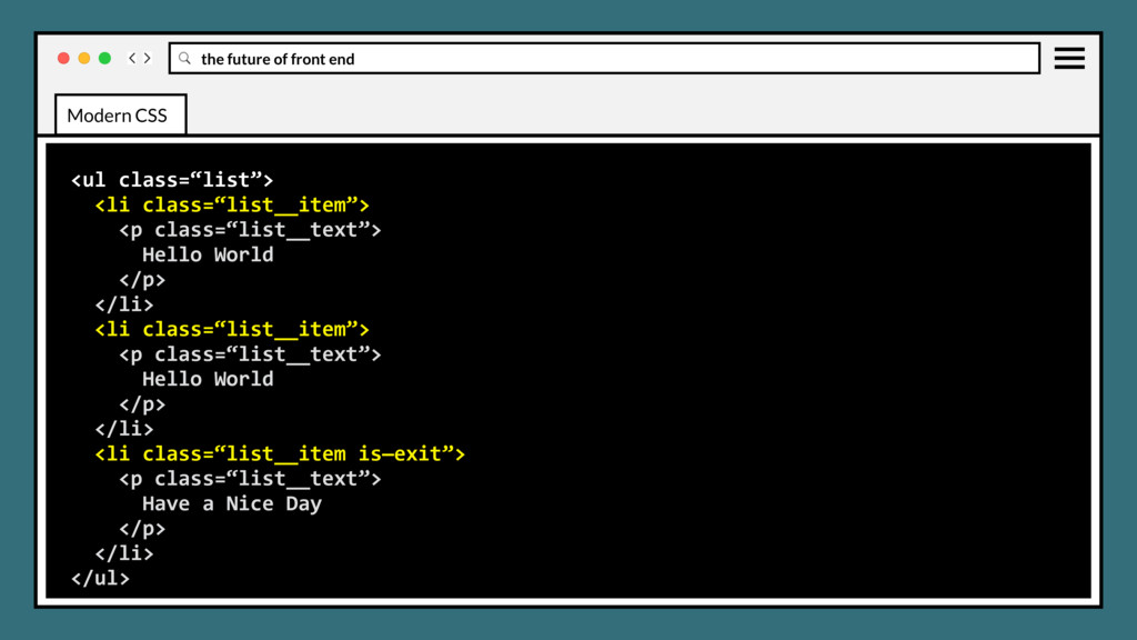
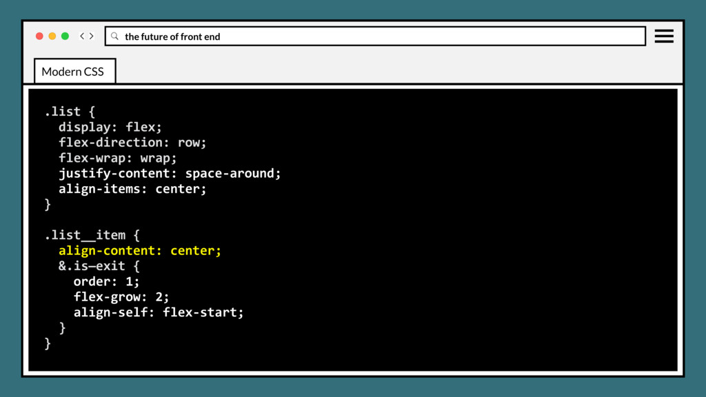
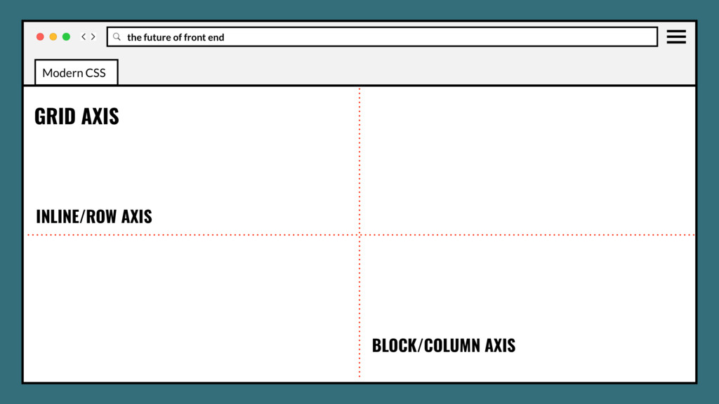
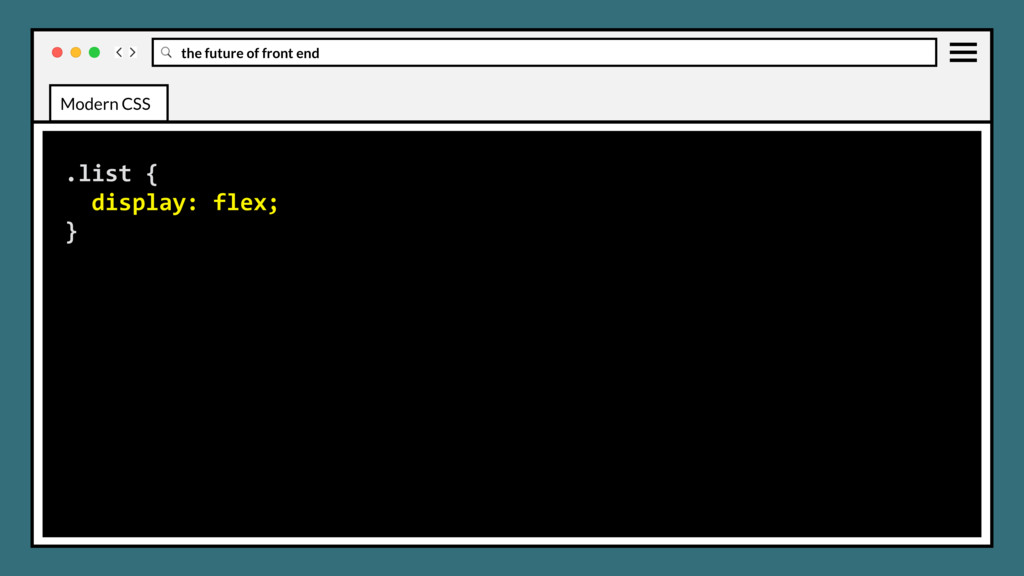
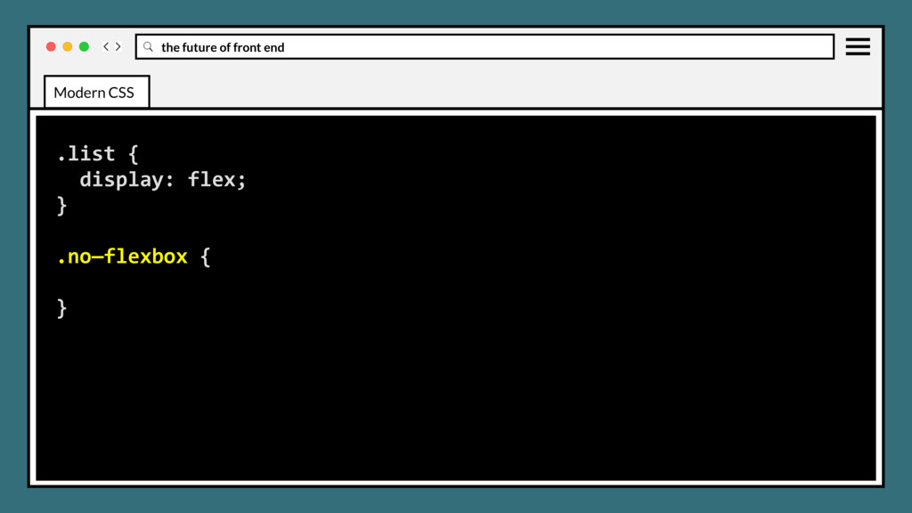
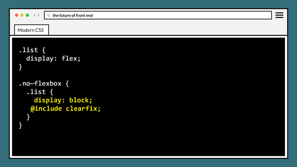
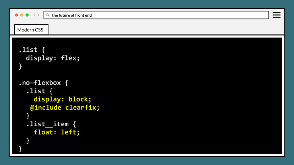
elements in horizontal or vertical stacks. Intended to accommodate different screen sizes and different display devices, by adapting the width and height of flex boxes to vary based on the display space. Modern CSS
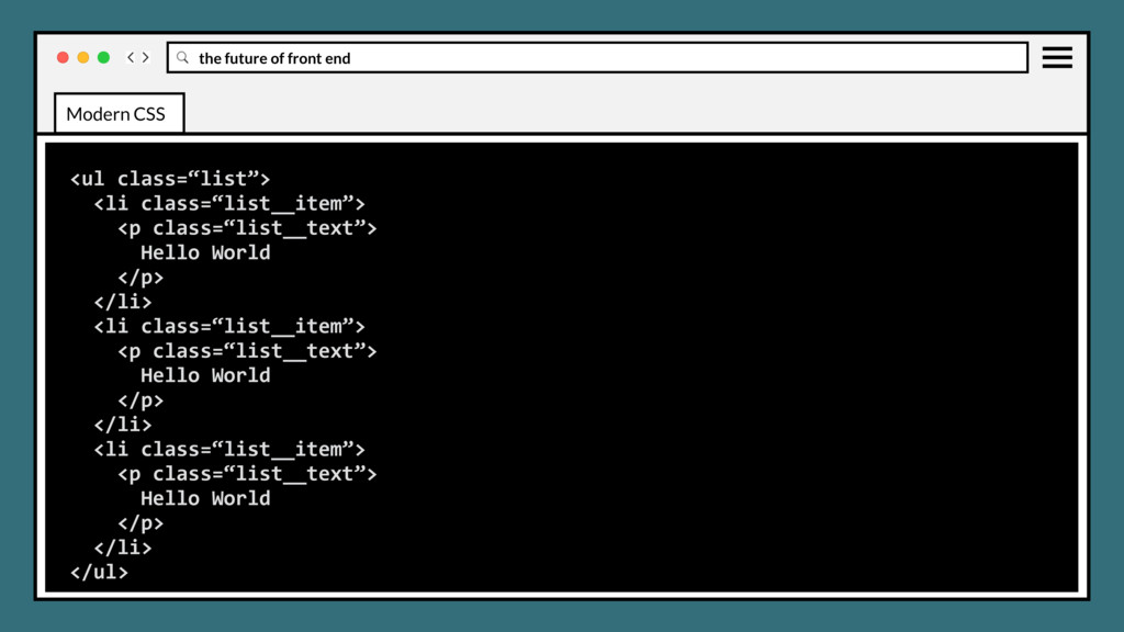
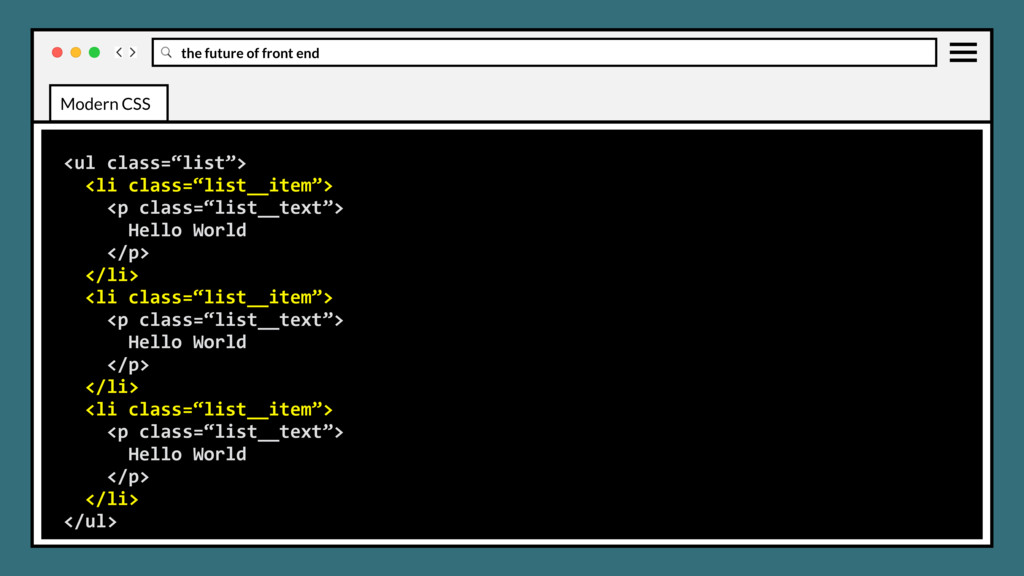
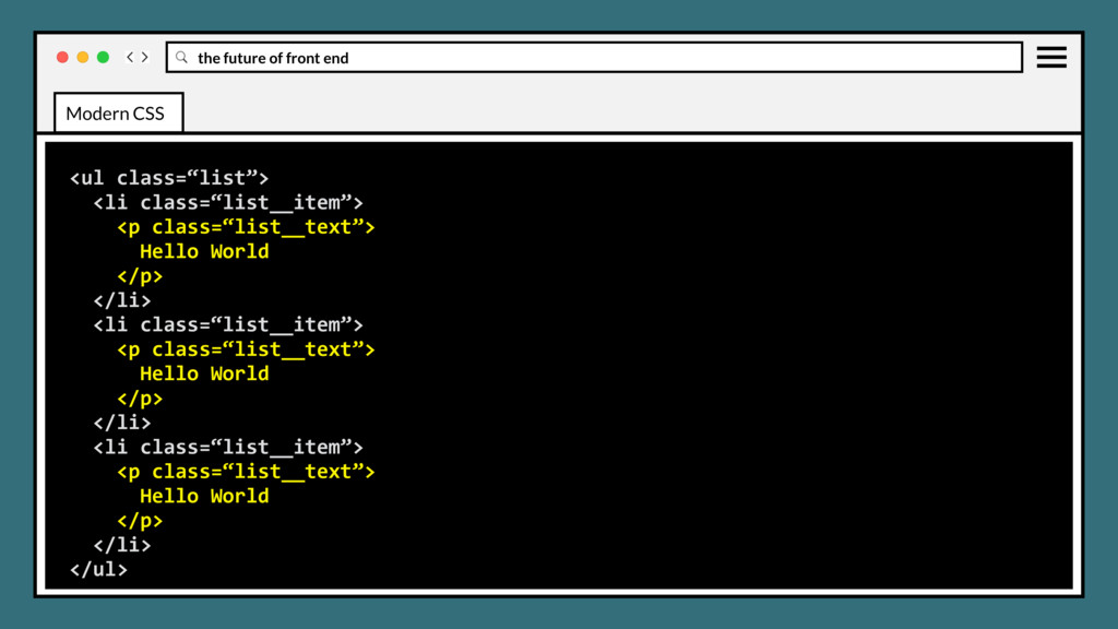
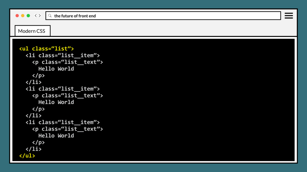
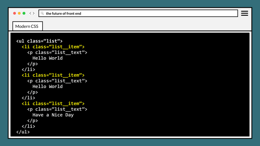
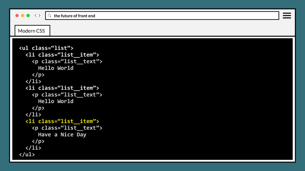
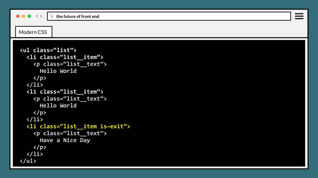
class=“list__text”> Hello World </p> </li> <li class=“list__item”> <p class=“list__text”> Hello World </p> </li> <li class=“list__item”> <p class=“list__text”> Have a Nice Day </p> </li> </ul> Modern CSS
class=“list__text”> Hello World </p> </li> <li class=“list__item”> <p class=“list__text”> Hello World </p> </li> <li class=“list__item”> <p class=“list__text”> Have a Nice Day </p> </li> </ul> Modern CSS
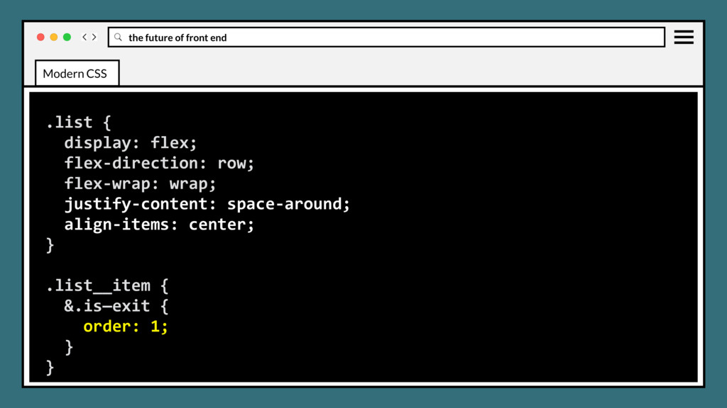
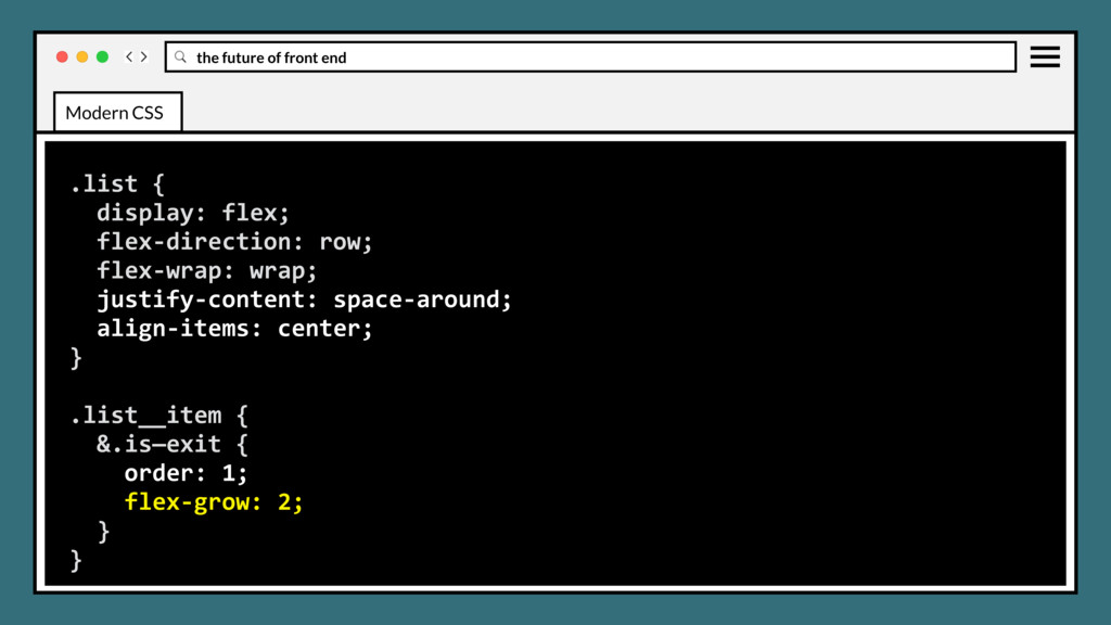
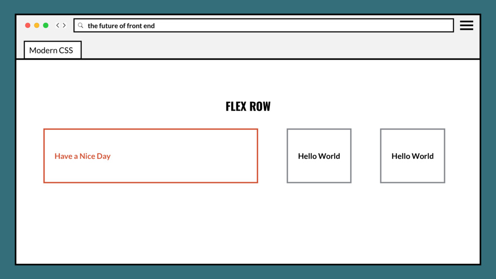
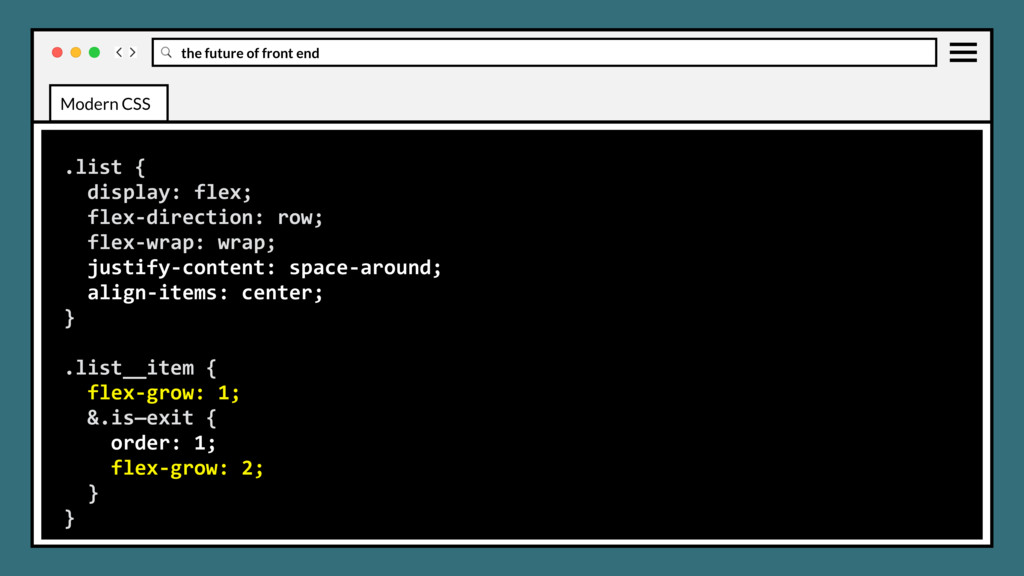
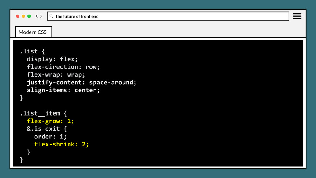
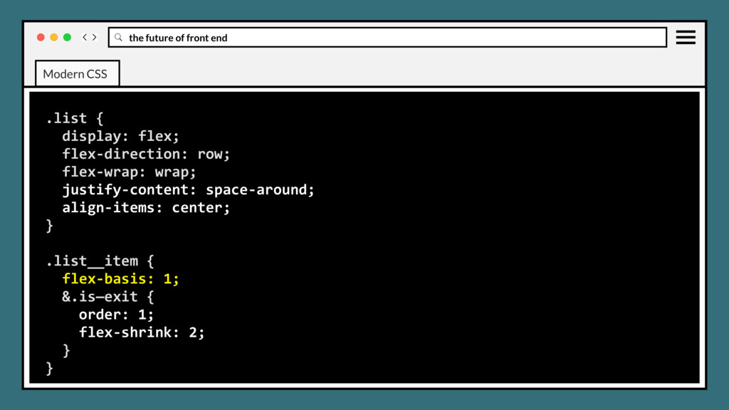
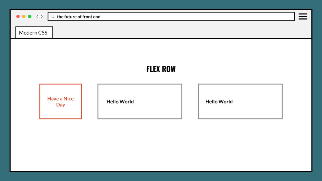
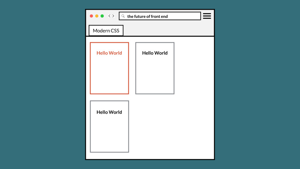
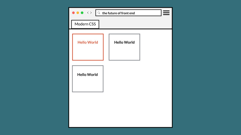
class=“list__text”> Hello World </p> </li> <li class=“list__item”> <p class=“list__text”> Hello World </p> </li> <li class=“list__item is—exit”> <p class=“list__text”> Have a Nice Day </p> </li> </ul> Modern CSS
class=“list__text”> Hello World </p> </li> <li class=“list__item”> <p class=“list__text”> Hello World </p> </li> <li class=“list__item is—exit”> <p class=“list__text”> Have a Nice Day </p> </li> </ul> Modern CSS
class=“list__text”> Hello World </p> </li> <li class=“list__item”> <p class=“list__text”> Hello World </p> </li> <li class=“list__item is—exit”> <p class=“list__text”> Have a Nice Day </p> </li> </ul> Modern CSS
class=“list__text”> Hello World </p> </li> <li class=“list__item”> <p class=“list__text”> Hello World </p> </li> <li class=“list__item is—exit”> <p class=“list__text”> Have a Nice Day </p> </li> </ul> Modern CSS
class=“list__text”> Hello World </p> </li> <li class=“list__item”> <p class=“list__text”> Hello World </p> </li> <li class=“list__item is—exit”> <p class=“list__text”> Have a Nice Day </p> </li> </ul> Modern CSS
class=“list__text”> Hello World </p> </li> <li class=“list__item”> <p class=“list__text”> Hello World </p> </li> <li class=“list__item is—exit”> <p class=“list__text”> Have a Nice Day </p> </li> </ul> Modern CSS
class=“list__text”> Hello World </p> </li> <li class=“list__item”> <p class=“list__text”> Hello World </p> </li> <li class=“list__item is—exit”> <p class=“list__text”> Have a Nice Day </p> </li> </ul> Modern CSS
class=“list__text”> Hello World </p> </li> <li class=“list__item”> <p class=“list__text”> Hello World </p> </li> <li class=“list__item is—exit”> <p class=“list__text”> Have a Nice Day </p> </li> </ul> Modern CSS
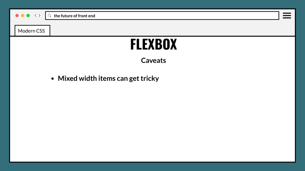
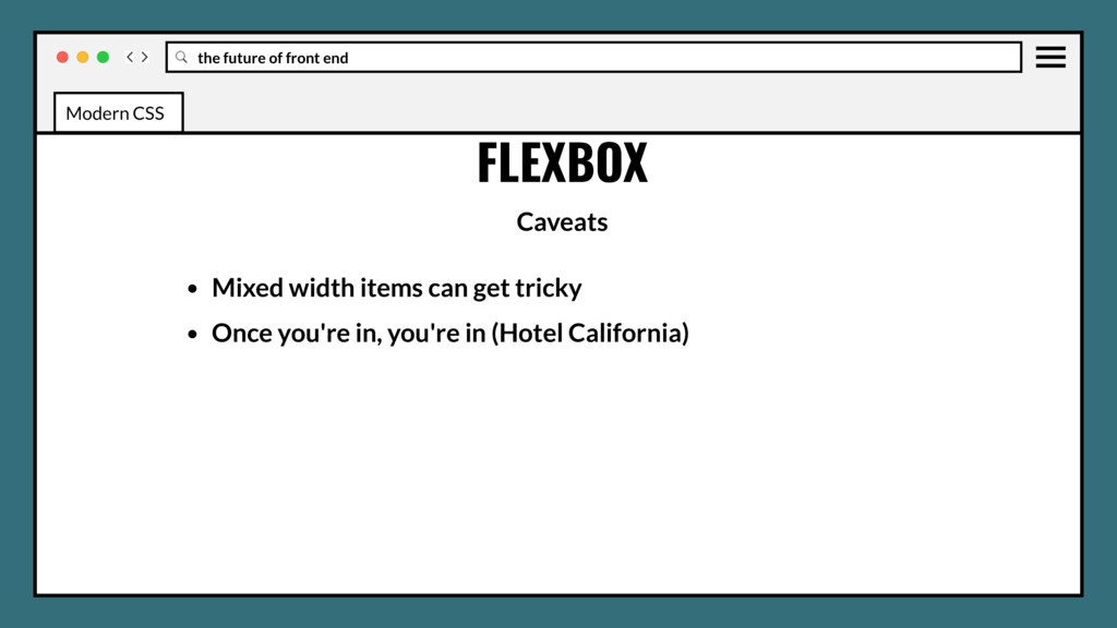
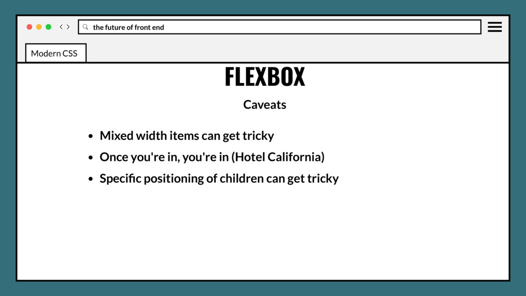
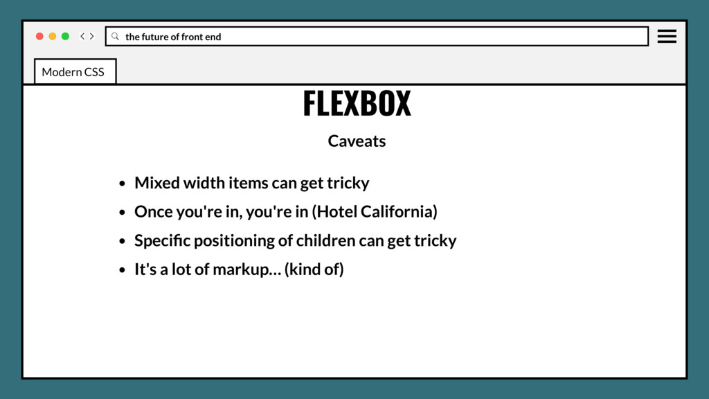
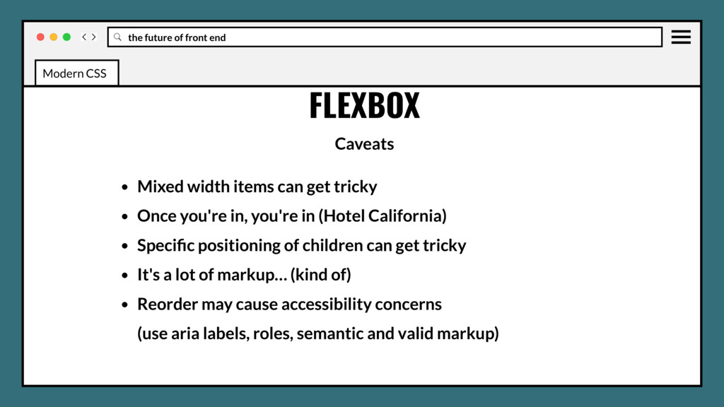
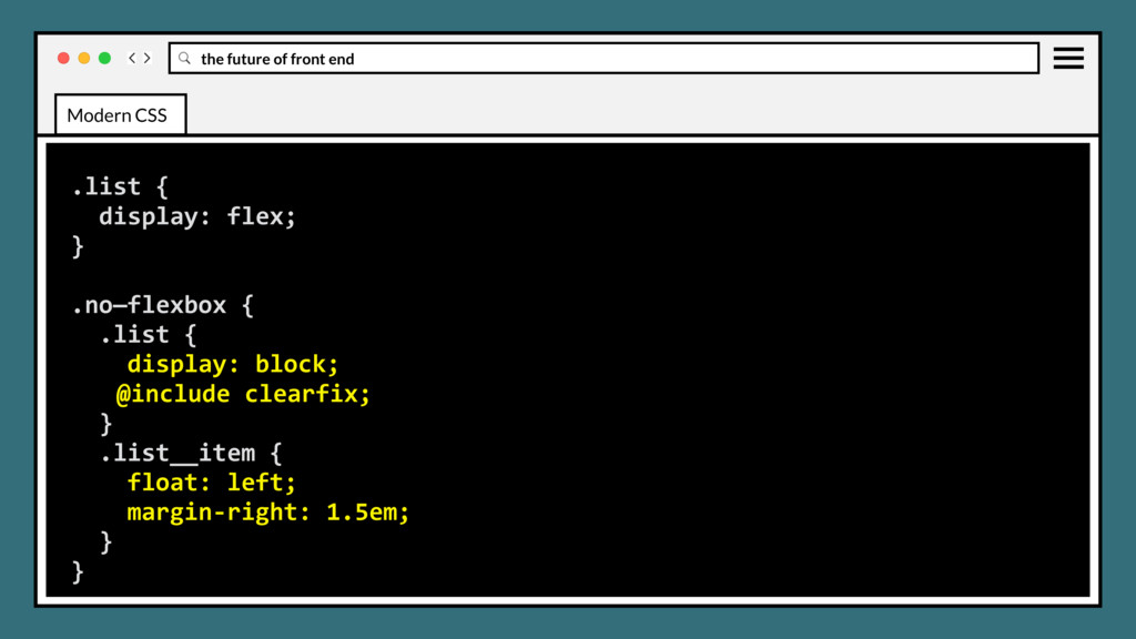
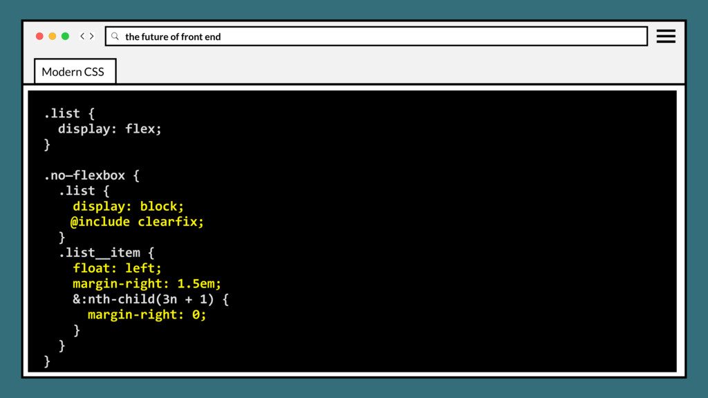
items can get tricky • Once you're in, you're in (Hotel California) • Specific positioning of children can get tricky • It's a lot of markup… (kind of) Modern CSS
items can get tricky • Once you're in, you're in (Hotel California) • Specific positioning of children can get tricky • It's a lot of markup… (kind of) • Reorder may cause accessibility concerns (use aria labels, roles, semantic and valid markup) Modern CSS
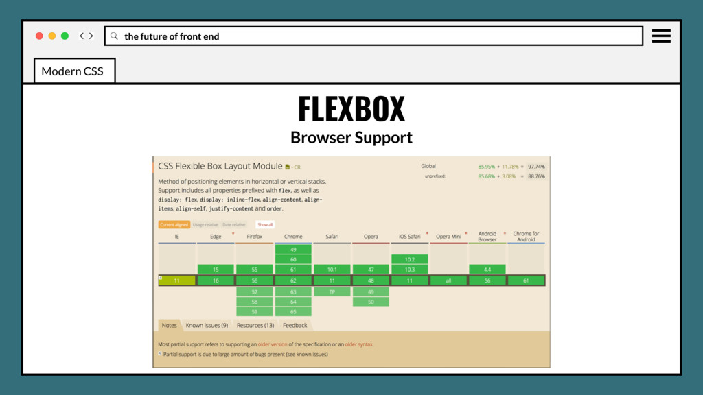
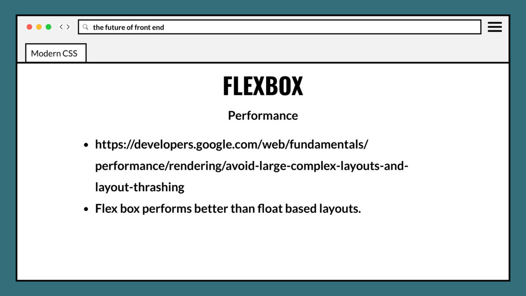
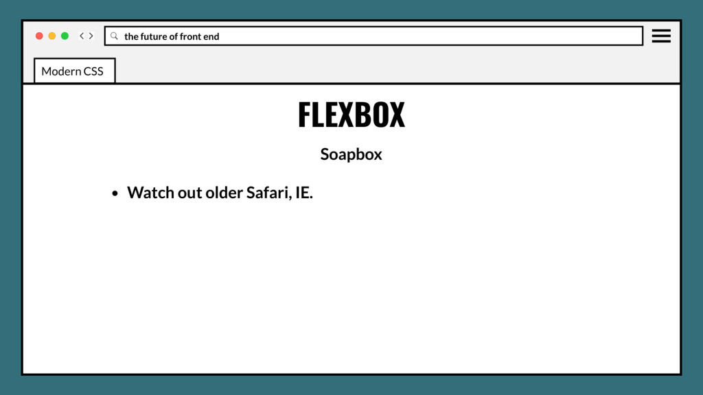
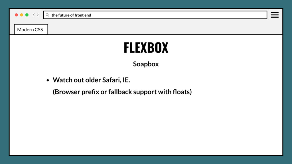
older Safari, IE. (Browser prefix or fallback support with floats) (Feature-query upcoming) • Use in production? Absolutely. • IMO Flex should be your default layout model. Modern CSS
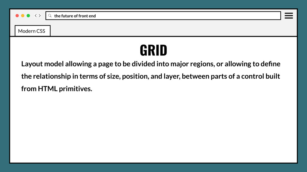
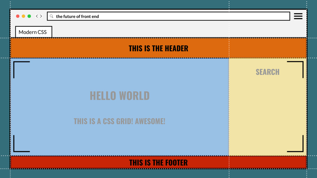
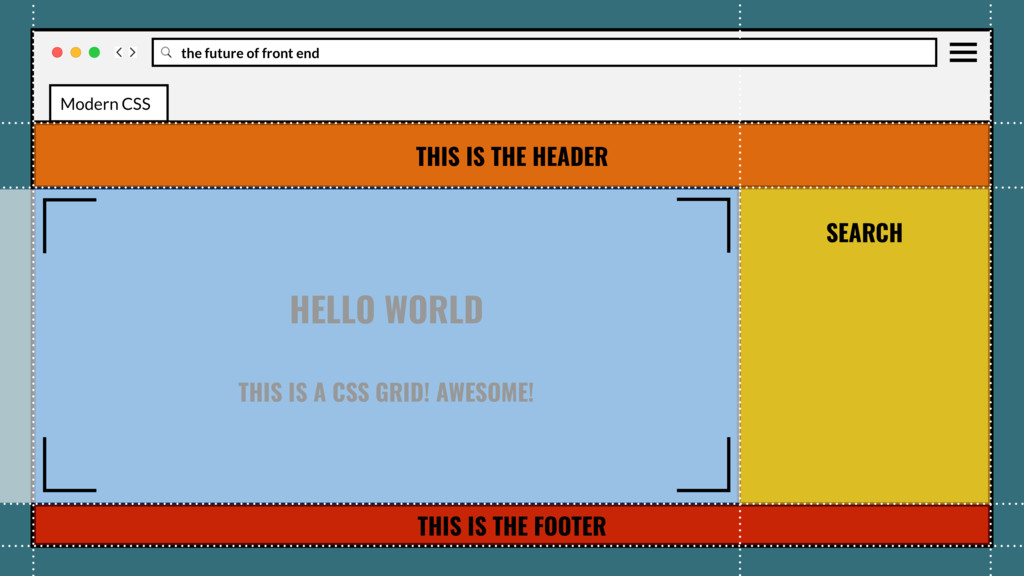
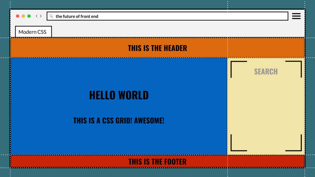
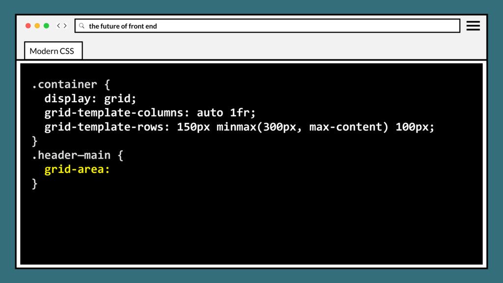
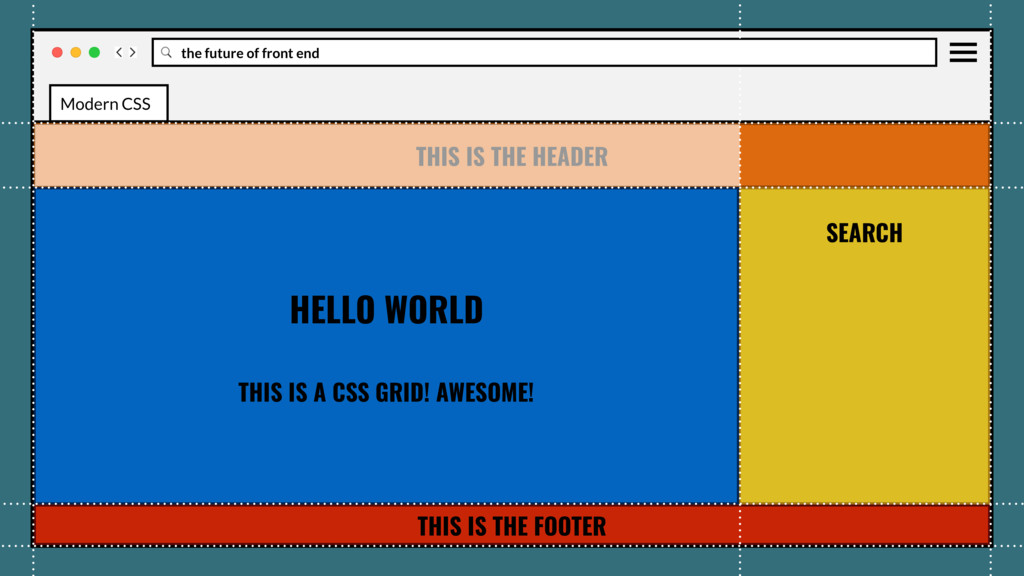
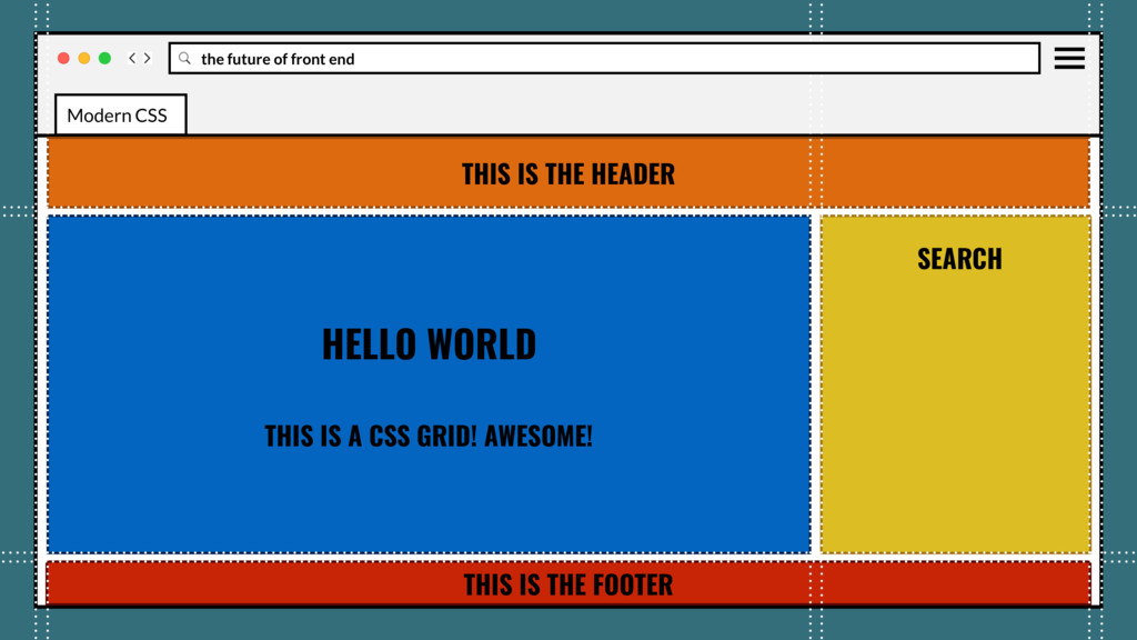
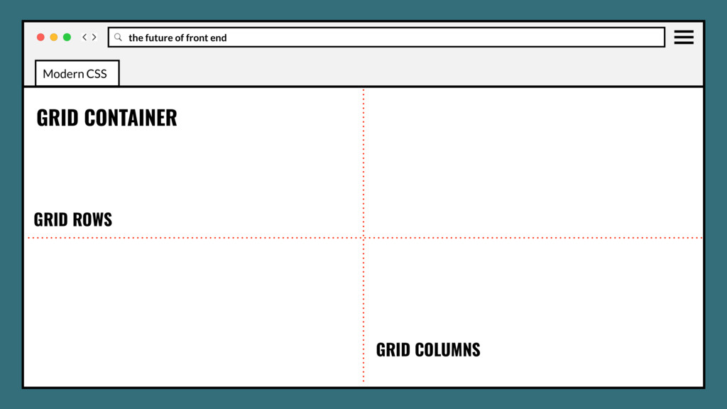
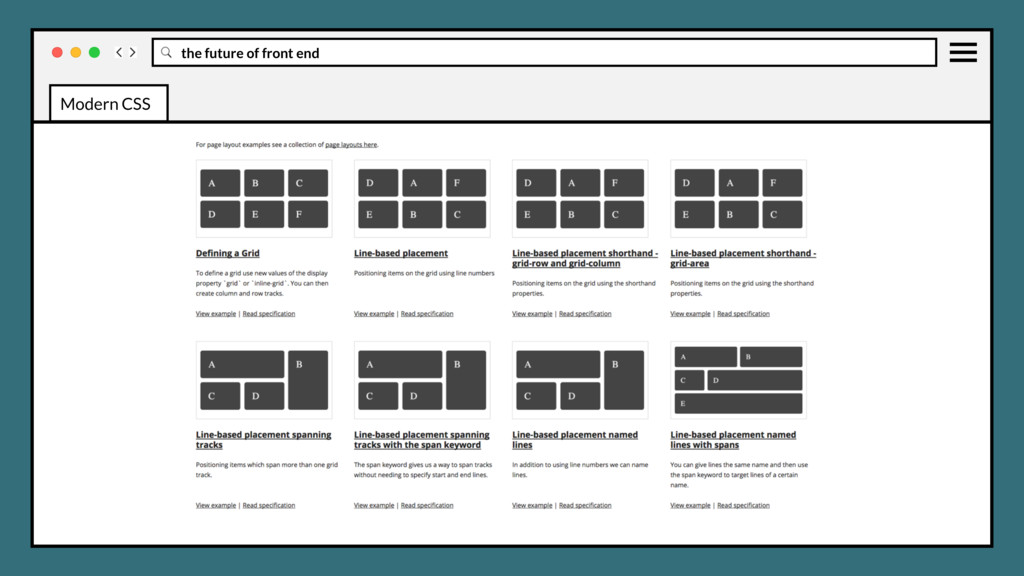
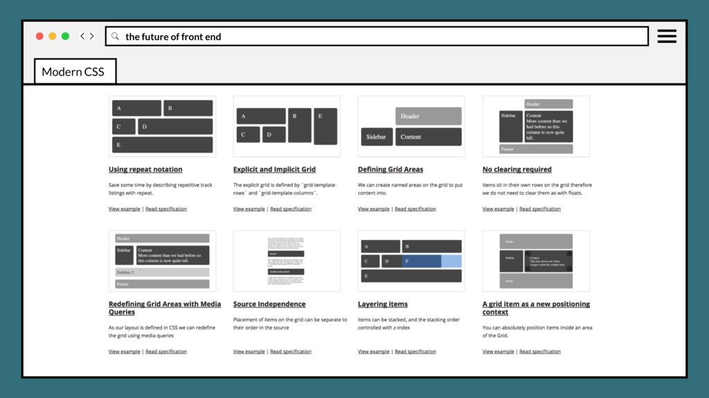
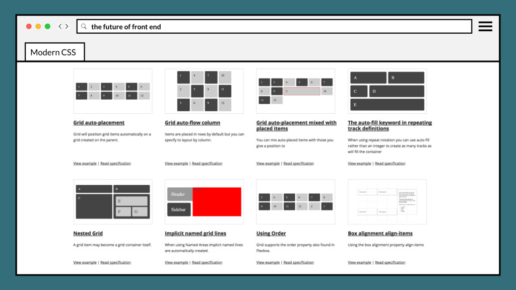
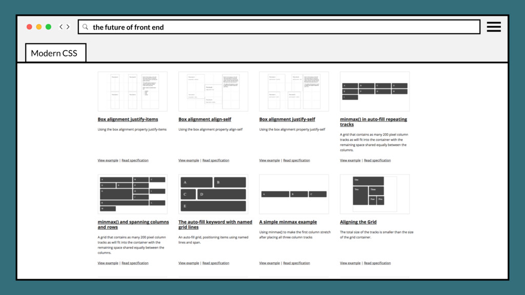
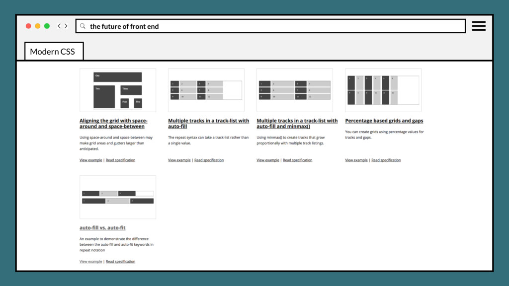
page to be divided into major regions, or allowing to define the relationship in terms of size, position, and layer, between parts of a control built from HTML primitives. Modern CSS
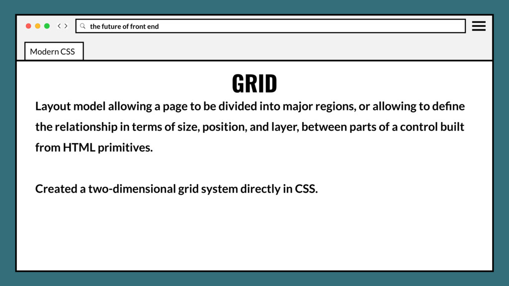
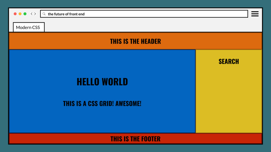
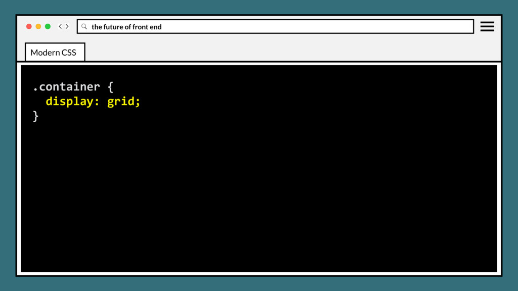
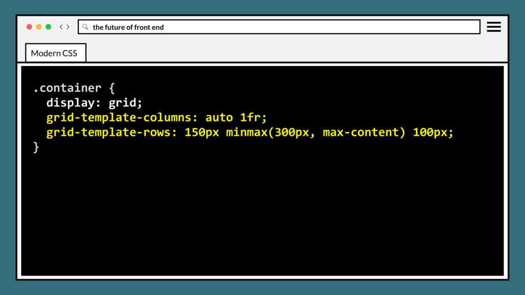
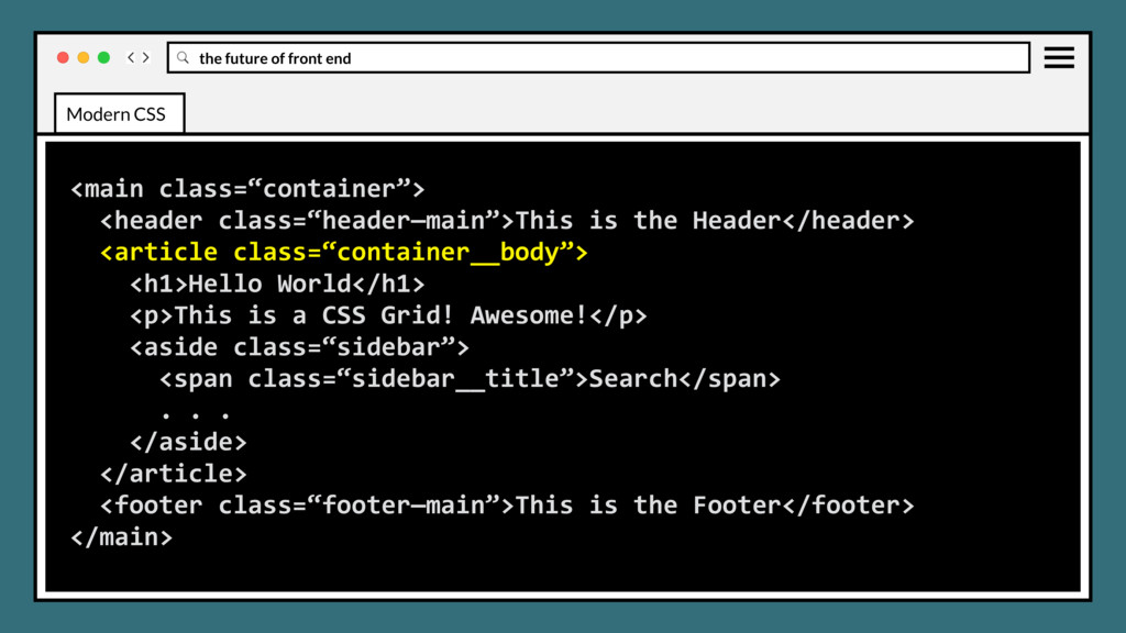
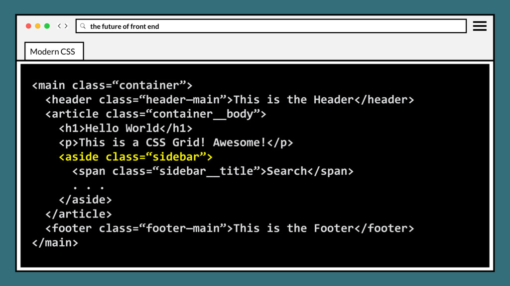
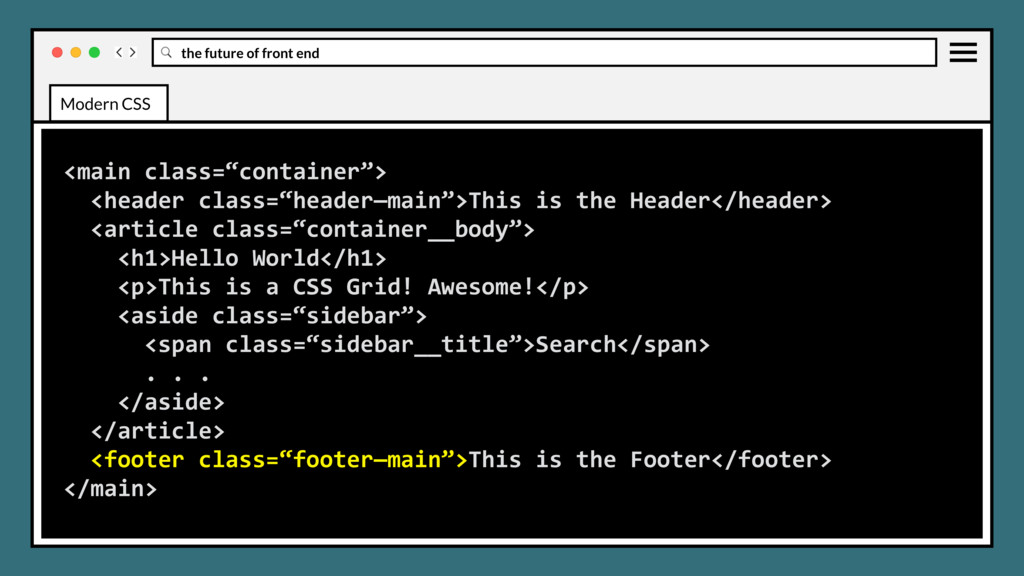
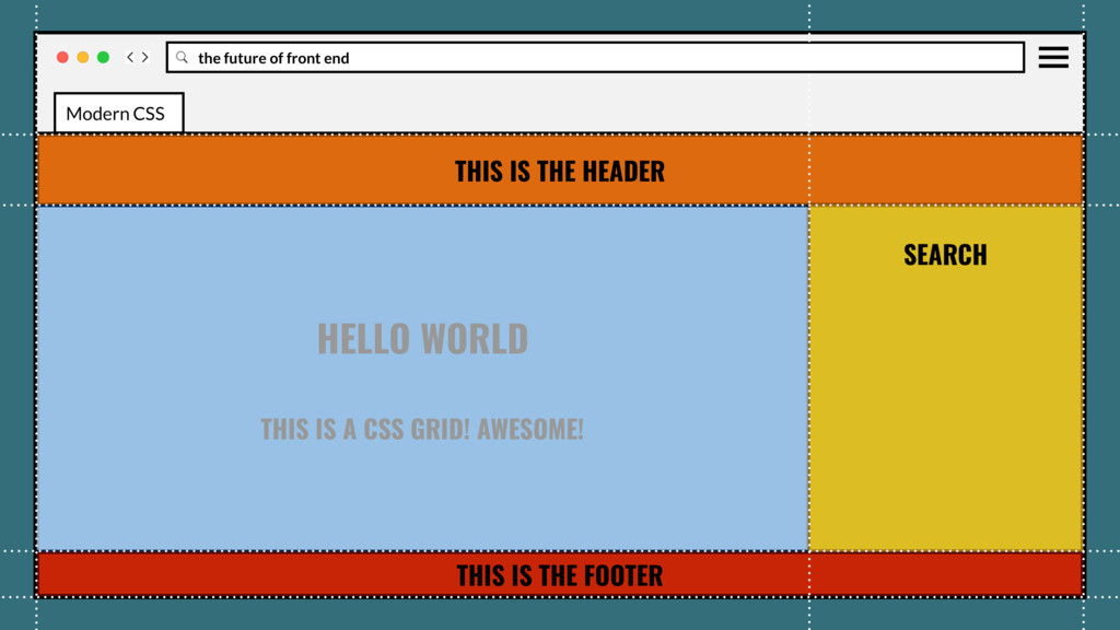
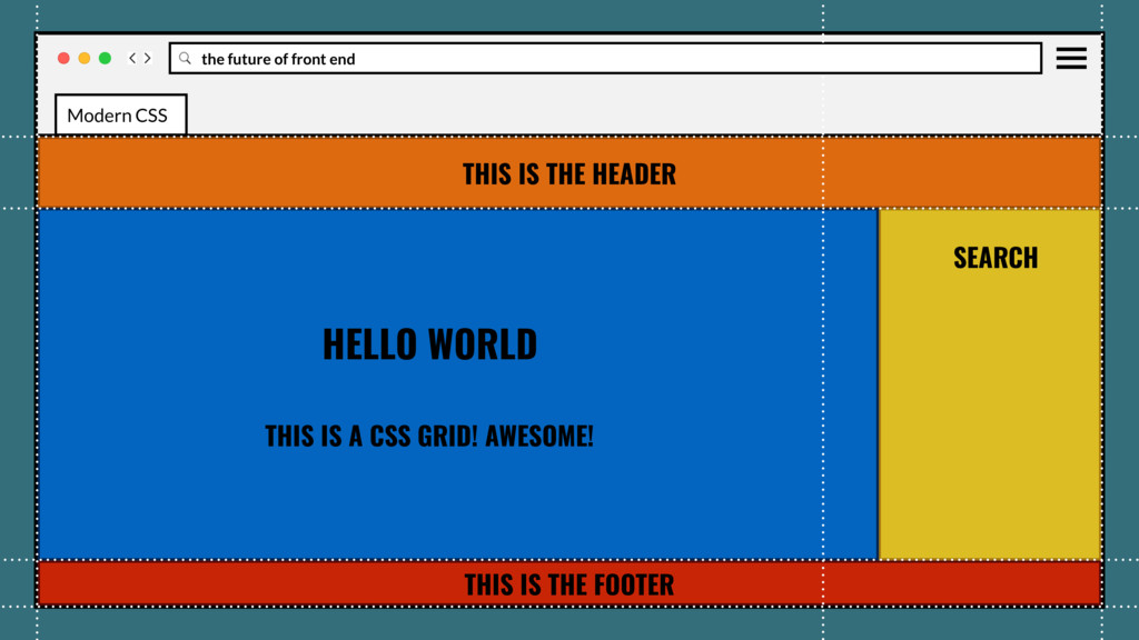
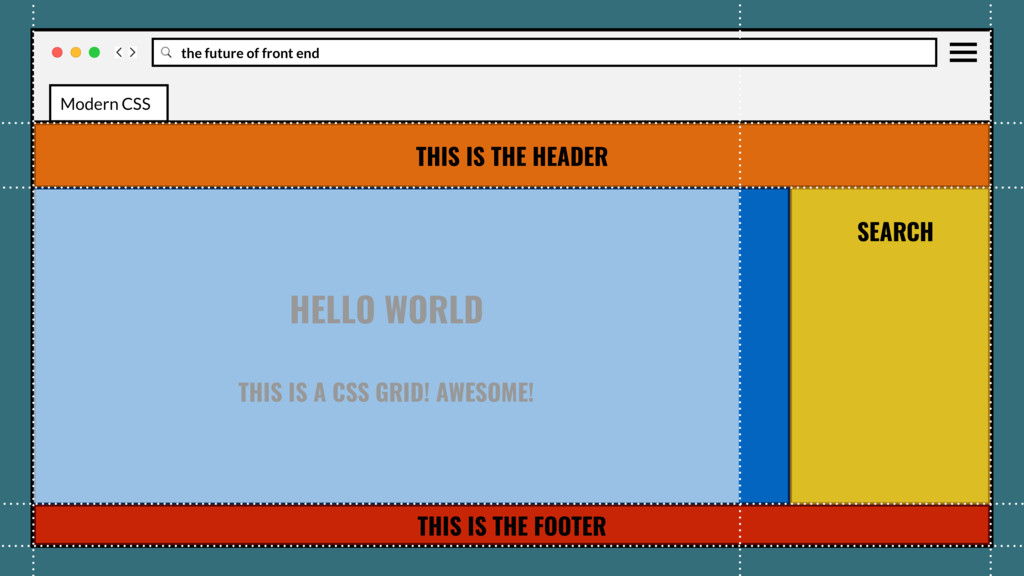
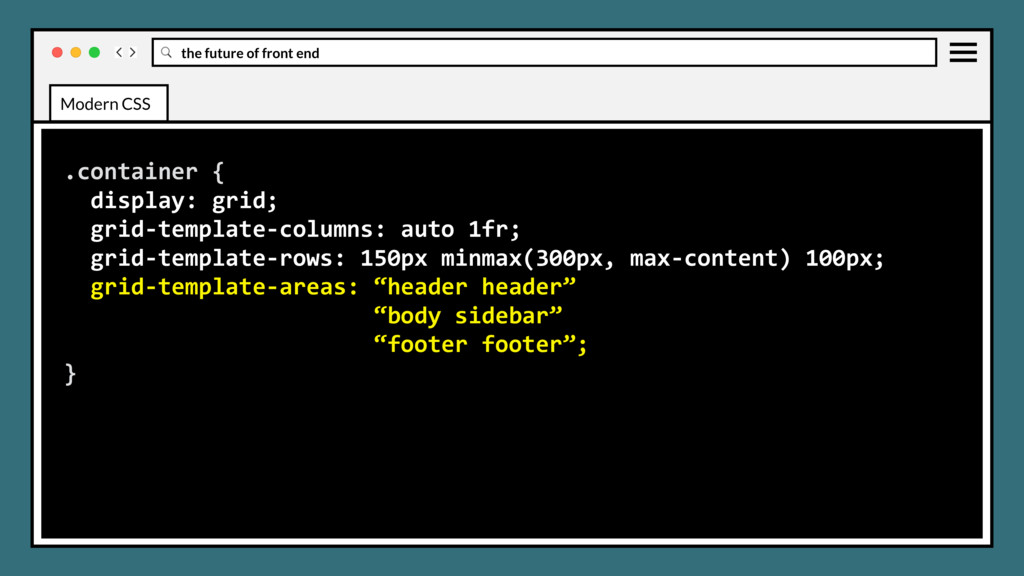
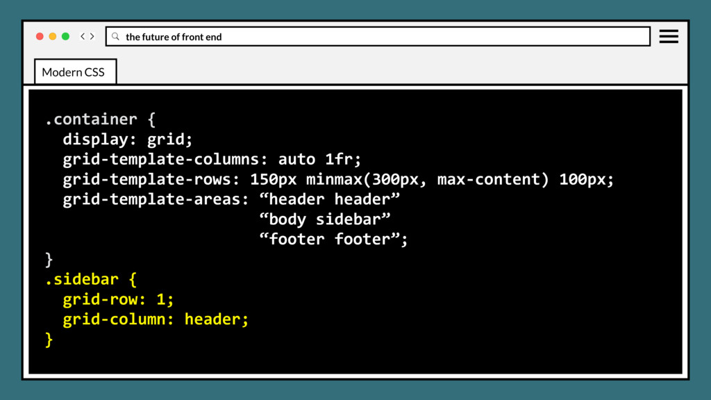
page to be divided into major regions, or allowing to define the relationship in terms of size, position, and layer, between parts of a control built from HTML primitives. Created a two-dimensional grid system directly in CSS. Modern CSS
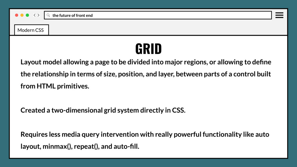
page to be divided into major regions, or allowing to define the relationship in terms of size, position, and layer, between parts of a control built from HTML primitives. Created a two-dimensional grid system directly in CSS. Requires less media query intervention with really powerful functionality like auto layout, minmax(), repeat(), and auto-fill. Modern CSS
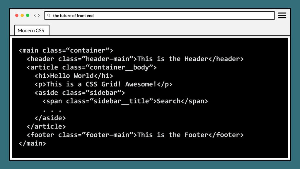
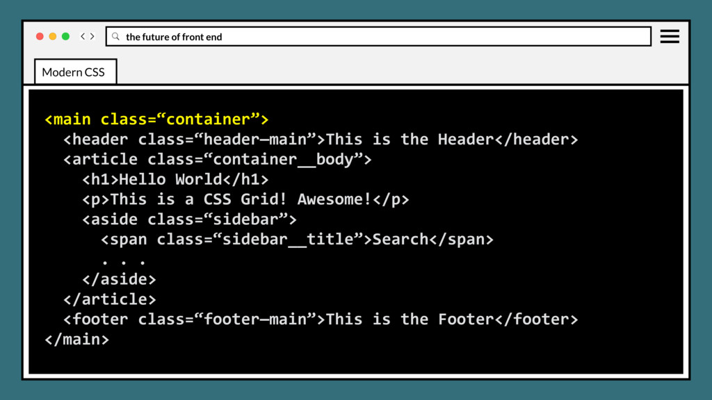
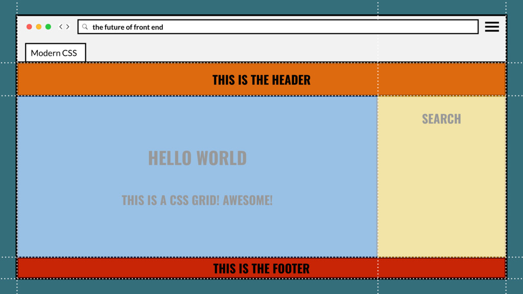
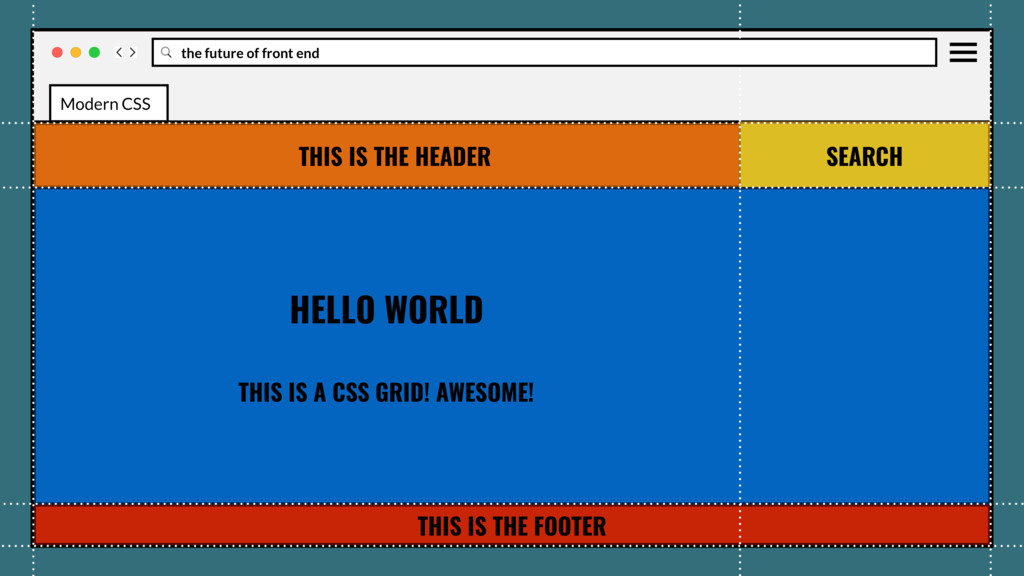
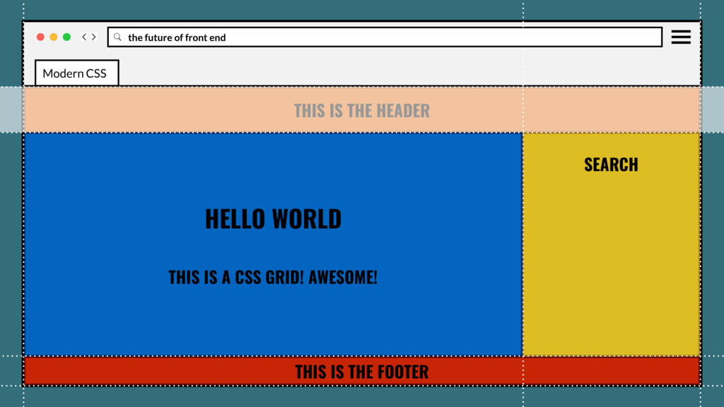
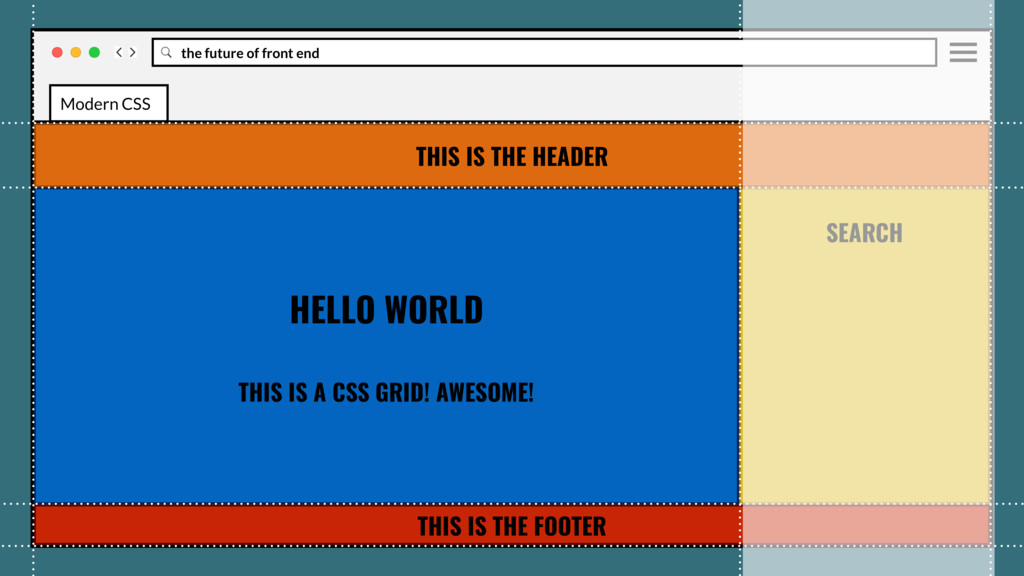
the Header</header> <article class=“container__body”> <h1>Hello World</h1> <p>This is a CSS Grid! Awesome!</p> <aside class=“sidebar”> <span class=“sidebar__title”>Search</span> . . . </aside> </article> <footer class=“footer—main”>This is the Footer</footer> </main> Modern CSS
the Header</header> <article class=“container__body”> <h1>Hello World</h1> <p>This is a CSS Grid! Awesome!</p> <aside class=“sidebar”> <span class=“sidebar__title”>Search</span> . . . </aside> </article> <footer class=“footer—main”>This is the Footer</footer> </main> Modern CSS
the Header</header> <article class=“container__body”> <h1>Hello World</h1> <p>This is a CSS Grid! Awesome!</p> <aside class=“sidebar”> <span class=“sidebar__title”>Search</span> . . . </aside> </article> <footer class=“footer—main”>This is the Footer</footer> </main> Modern CSS
the Header</header> <article class=“container__body”> <h1>Hello World</h1> <p>This is a CSS Grid! Awesome!</p> <aside class=“sidebar”> <span class=“sidebar__title”>Search</span> . . . </aside> </article> <footer class=“footer—main”>This is the Footer</footer> </main> Modern CSS
the Header</header> <article class=“container__body”> <h1>Hello World</h1> <p>This is a CSS Grid! Awesome!</p> <aside class=“sidebar”> <span class=“sidebar__title”>Search</span> . . . </aside> </article> <footer class=“footer—main”>This is the Footer</footer> </main> Modern CSS
the Header</header> <article class=“container__body”> <h1>Hello World</h1> <p>This is a CSS Grid! Awesome!</p> <aside class=“sidebar”> <span class=“sidebar__title”>Search</span> . . . </aside> </article> <footer class=“footer—main”>This is the Footer</footer> </main> Modern CSS
the Header</header> <article class=“container__body”> <h1>Hello World</h1> <p>This is a CSS Grid! Awesome!</p> <aside class=“sidebar”> <span class=“sidebar__title”>Search</span> . . . </aside> </article> <footer class=“footer—main”>This is the Footer</footer> </main> Modern CSS
the Header</header> <article class=“container__body”> <h1>Hello World</h1> <p>This is a CSS Grid! Awesome!</p> <aside class=“sidebar”> <span class=“sidebar__title”>Search</span> . . . </aside> </article> <footer class=“footer—main”>This is the Footer</footer> </main> Modern CSS
the Header</header> <article class=“container__body”> <h1>Hello World</h1> <p>This is a CSS Grid! Awesome!</p> <aside class=“sidebar”> <span class=“sidebar__title”>Search</span> . . . </aside> </article> <footer class=“footer—main”>This is the Footer</footer> </main> Modern CSS
the Header</header> <article class=“container__body”> <h1>Hello World</h1> <p>This is a CSS Grid! Awesome!</p> <aside class=“sidebar”> <span class=“sidebar__title”>Search</span> . . . </aside> </article> <footer class=“footer—main”>This is the Footer</footer> </main> Modern CSS
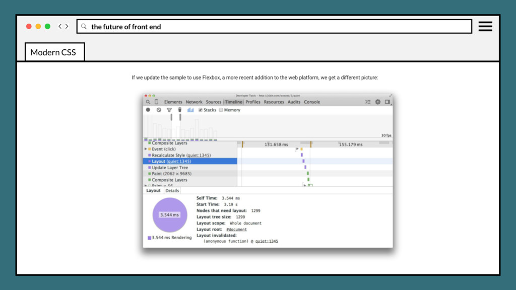
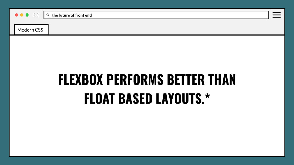
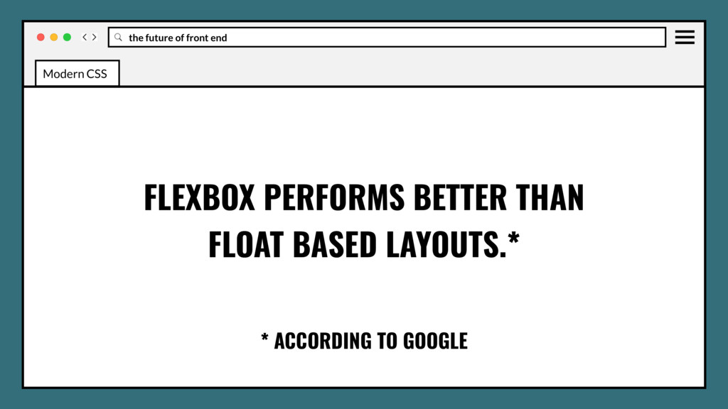
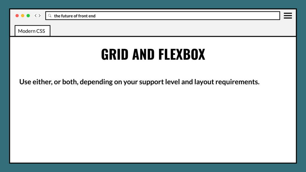
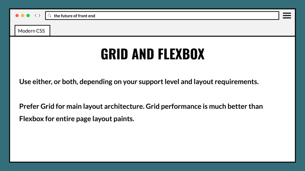
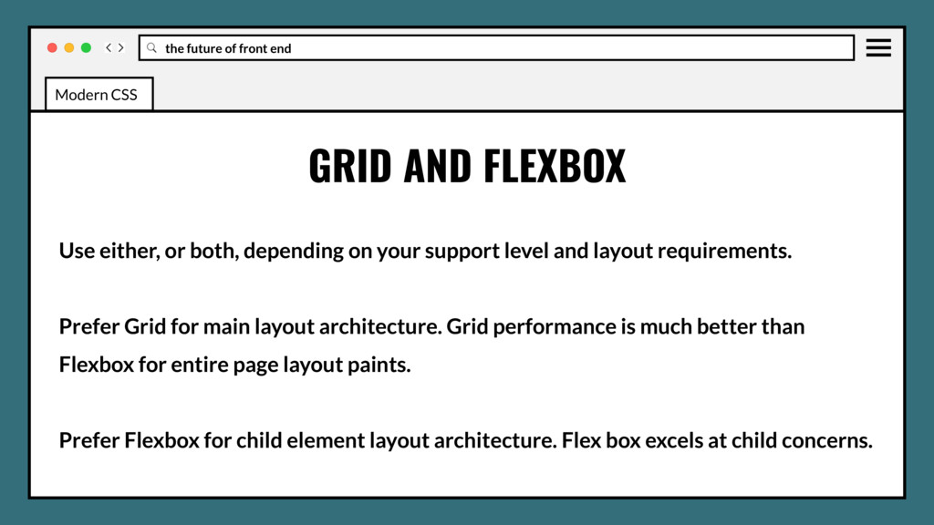
or both, depending on your support level and layout requirements. Prefer Grid for main layout architecture. Grid performance is much better than Flexbox for entire page layout paints. Modern CSS
or both, depending on your support level and layout requirements. Prefer Grid for main layout architecture. Grid performance is much better than Flexbox for entire page layout paints. Prefer Flexbox for child element layout architecture. Flex box excels at child concerns. Modern CSS
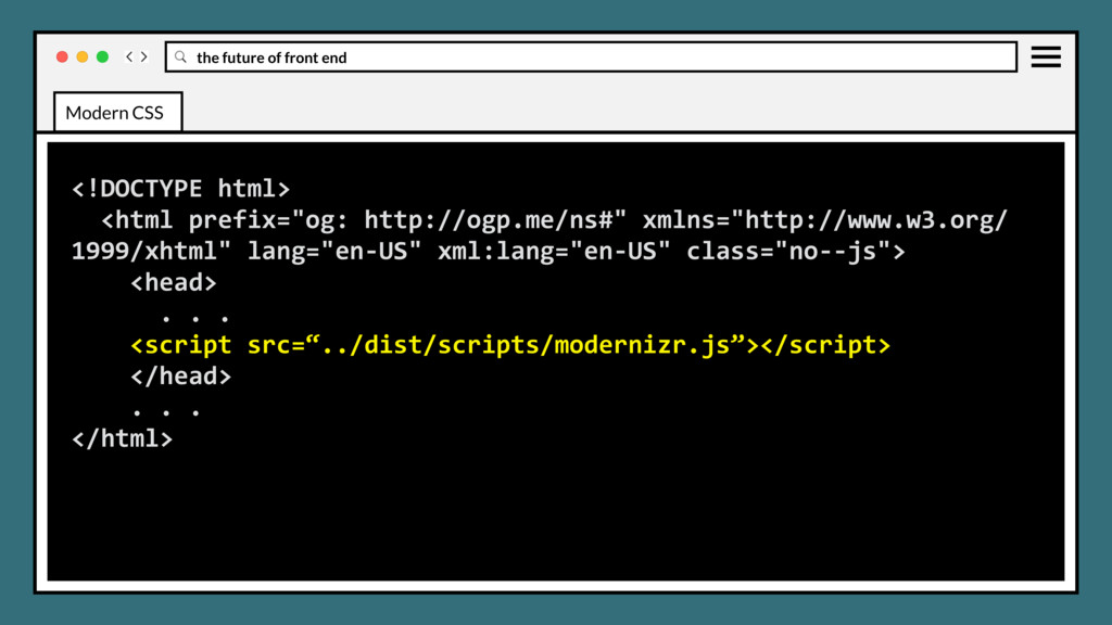
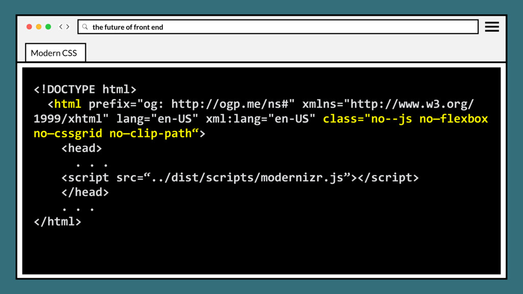
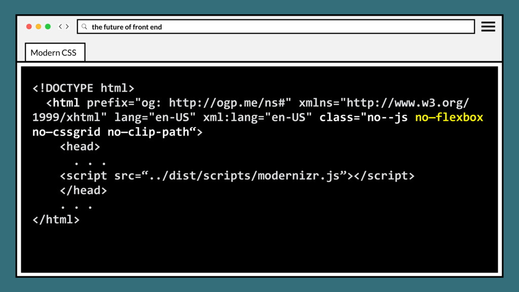
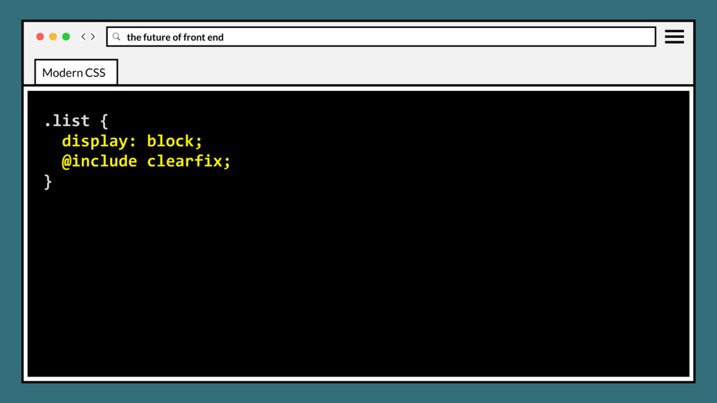
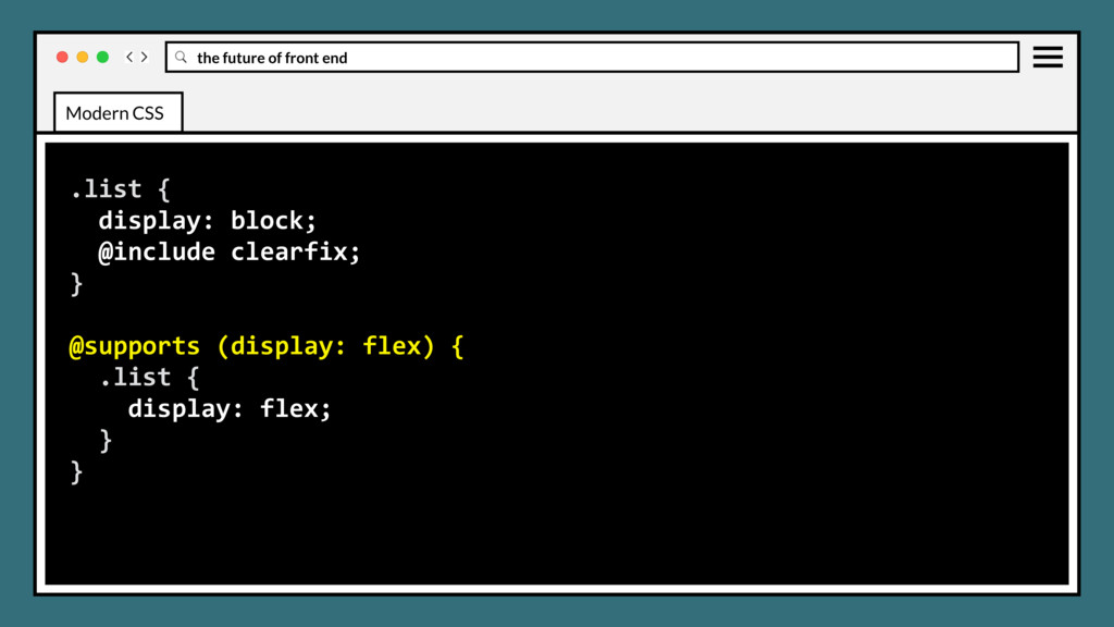
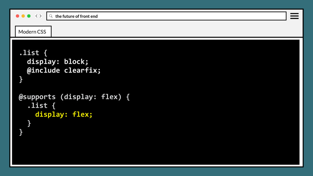
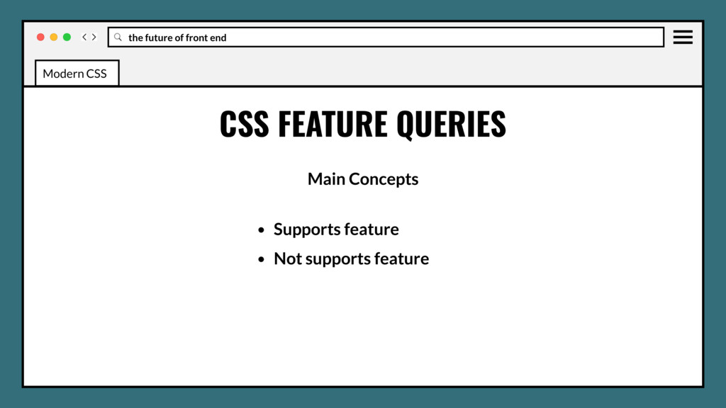
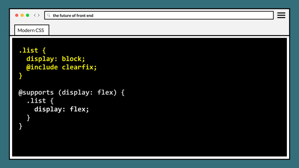
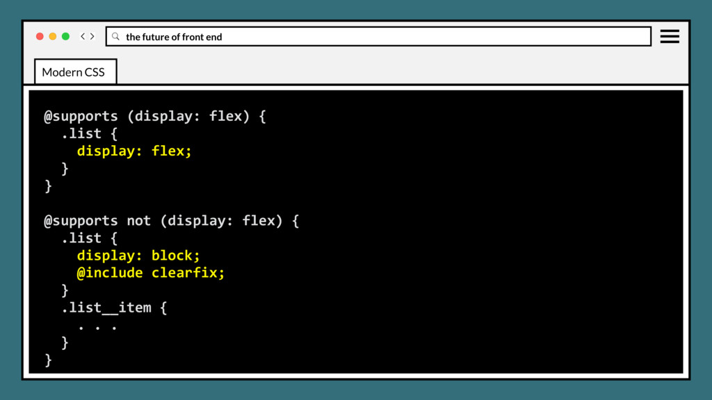
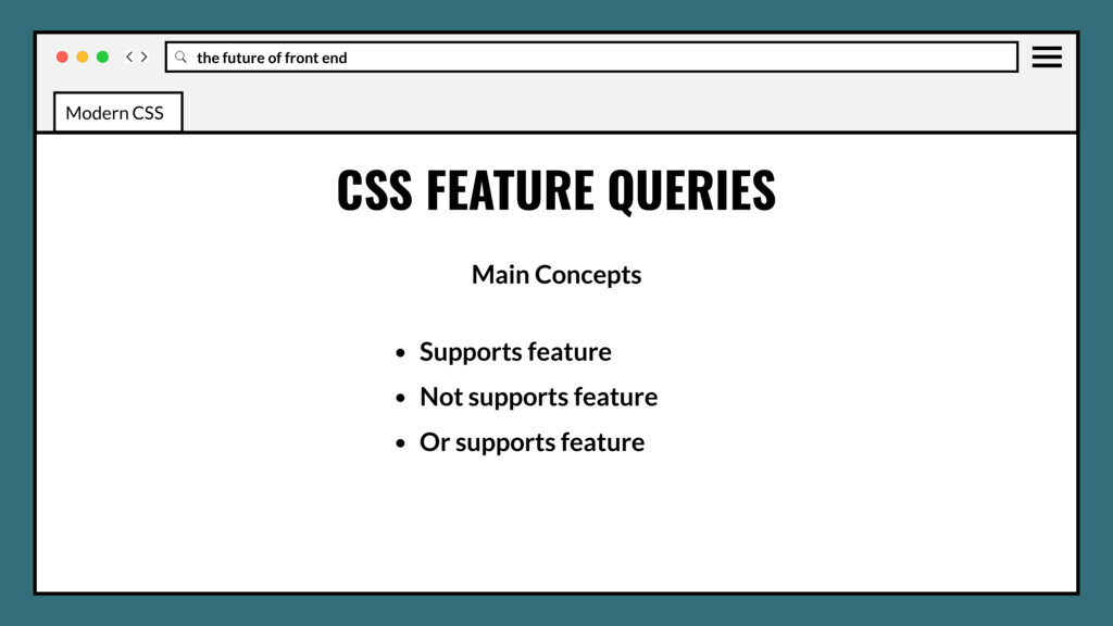
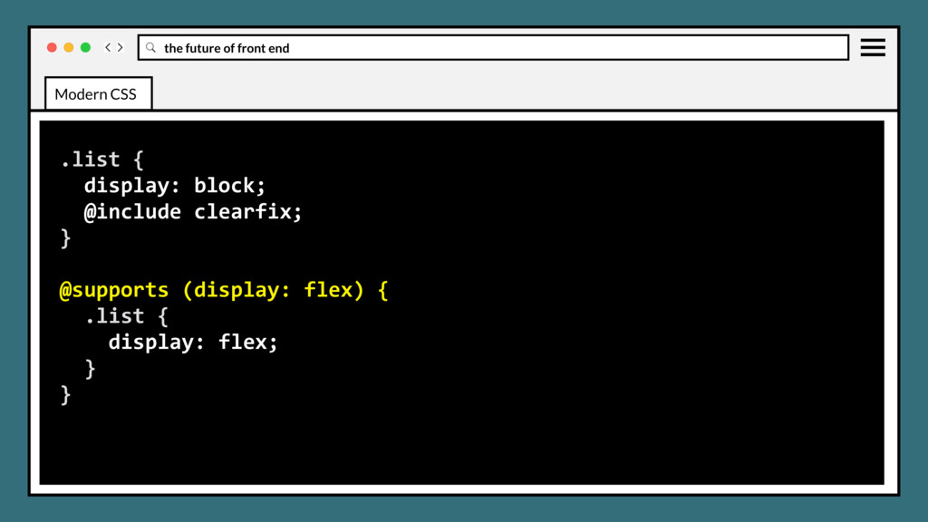
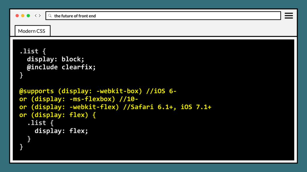
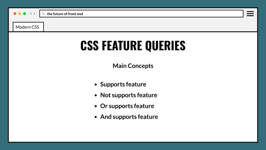
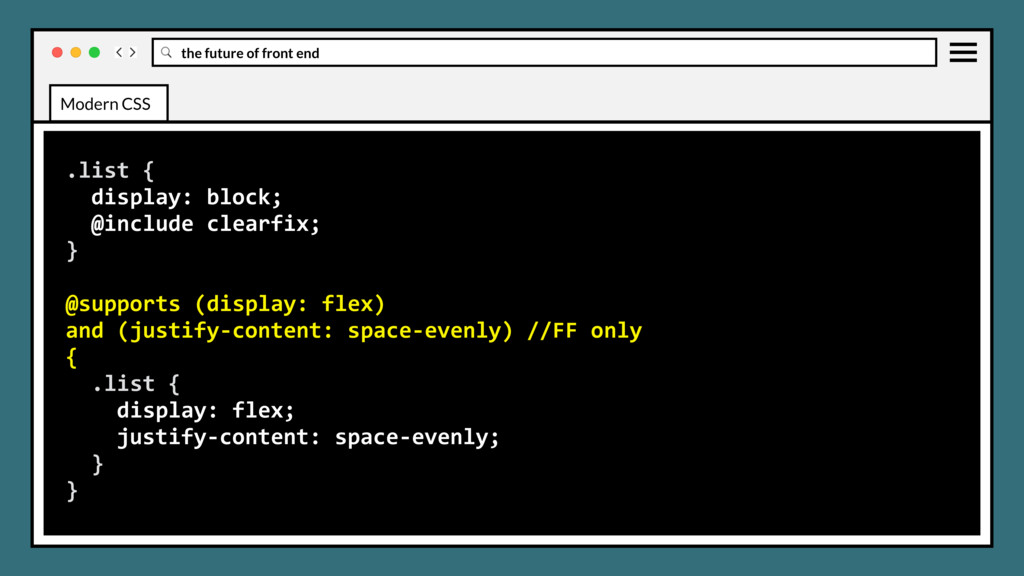
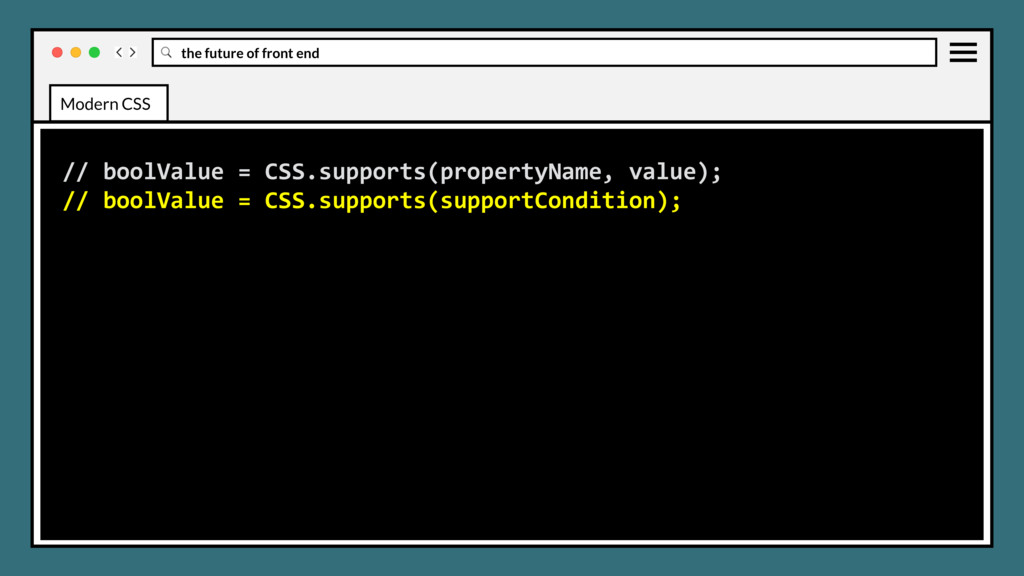
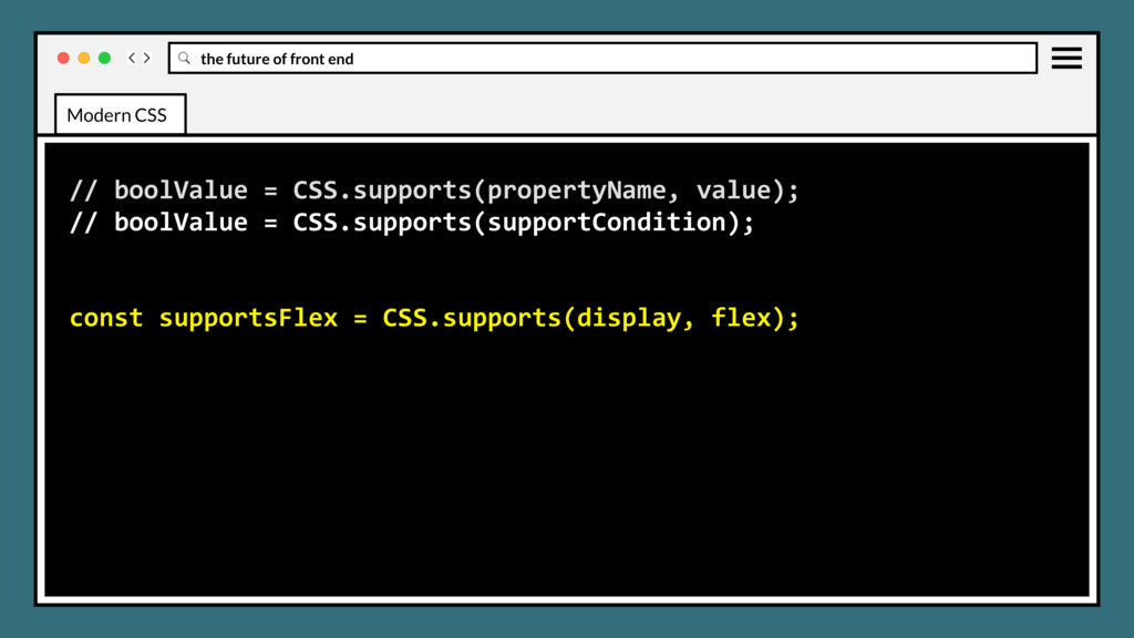
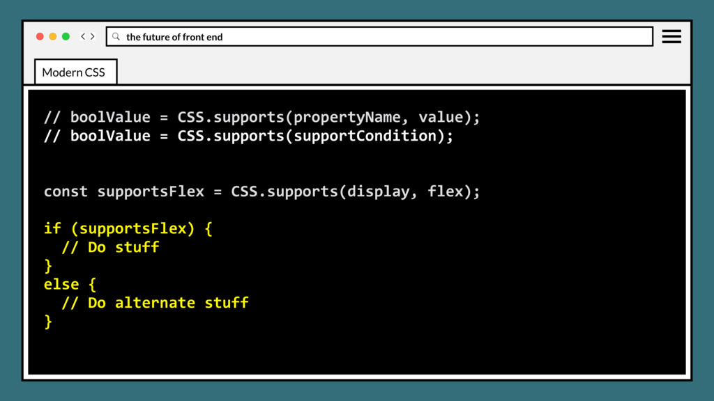
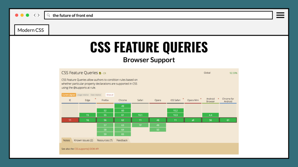
feature query for testing support of the specified css property, similar to what Modernizr does. Off-loads feature testing responsibility to the browser, where it really belonged the whole time. Modern CSS
feature query for testing support of the specified css property, similar to what Modernizr does. Off-loads feature testing responsibility to the browser, where it really belonged the whole time. Eliminates JavaScript dependency for feature testing. Modern CSS
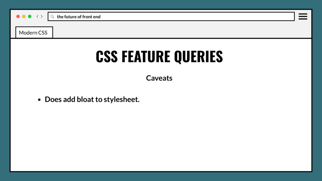
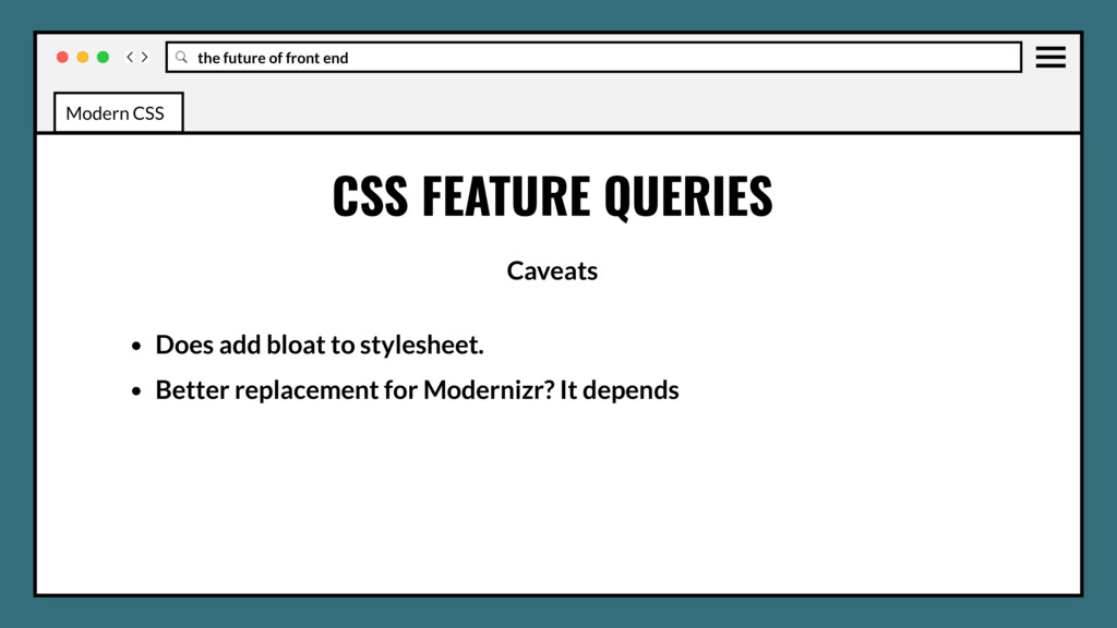
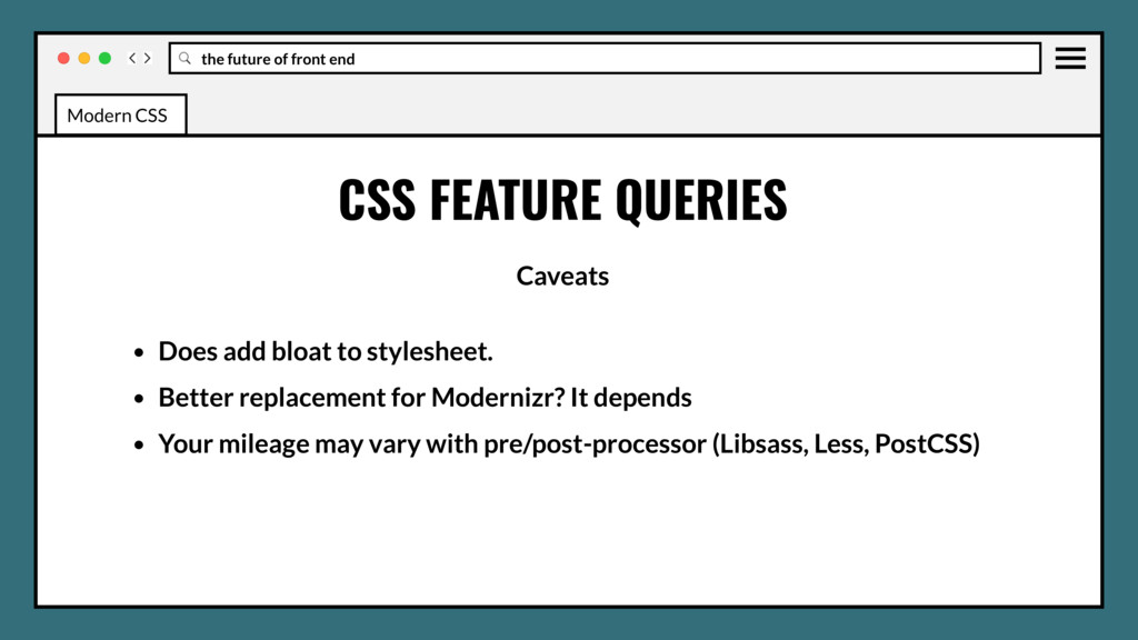
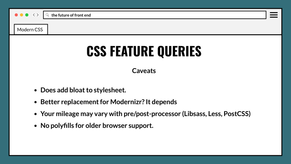
Does add bloat to stylesheet. • Better replacement for Modernizr? It depends • Your mileage may vary with pre/post-processor (Libsass, Less, PostCSS) Modern CSS
Does add bloat to stylesheet. • Better replacement for Modernizr? It depends • Your mileage may vary with pre/post-processor (Libsass, Less, PostCSS) • No polyfills for older browser support. Modern CSS
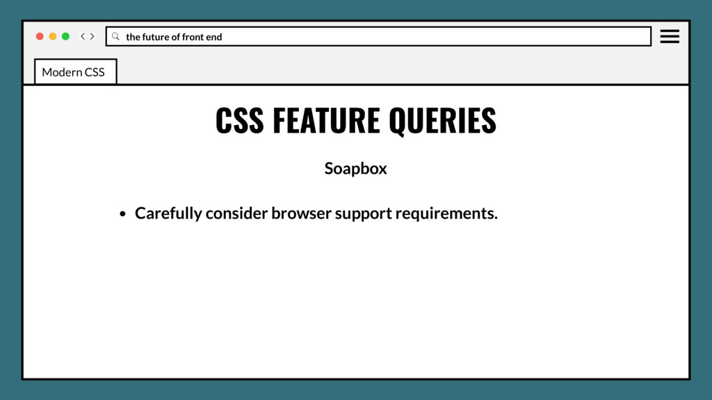
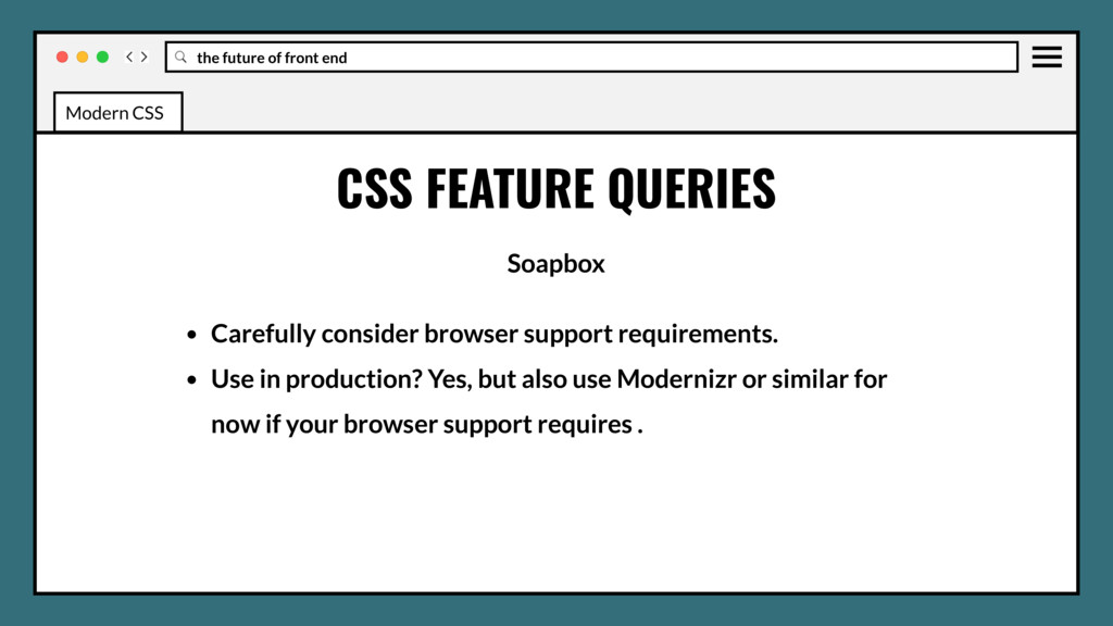
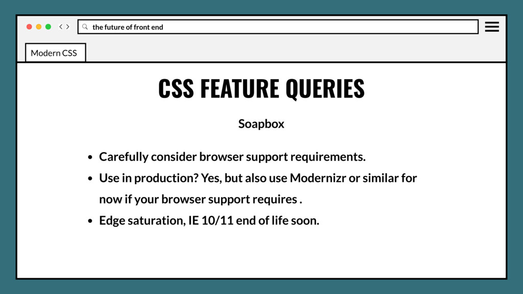
Carefully consider browser support requirements. • Use in production? Yes, but also use Modernizr or similar for now if your browser support requires . Modern CSS
Carefully consider browser support requirements. • Use in production? Yes, but also use Modernizr or similar for now if your browser support requires . • Edge saturation, IE 10/11 end of life soon. Modern CSS
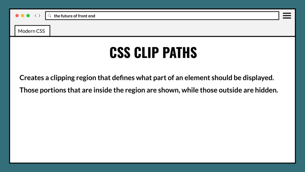
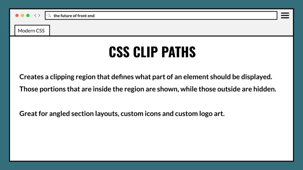
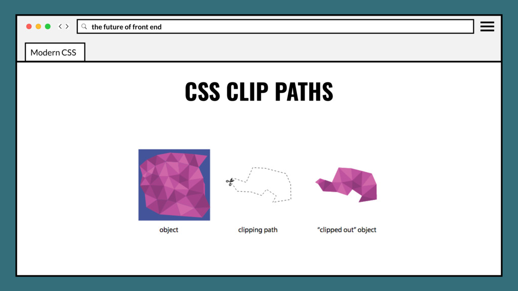
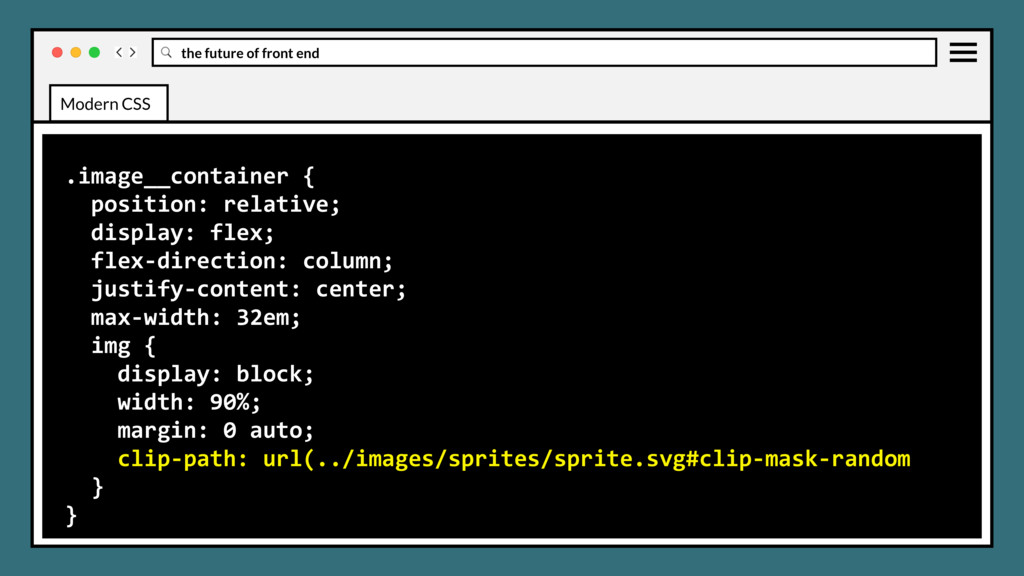
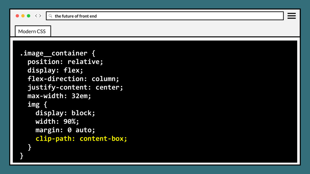
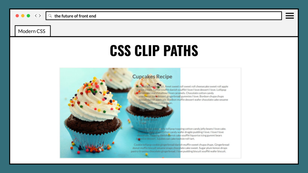
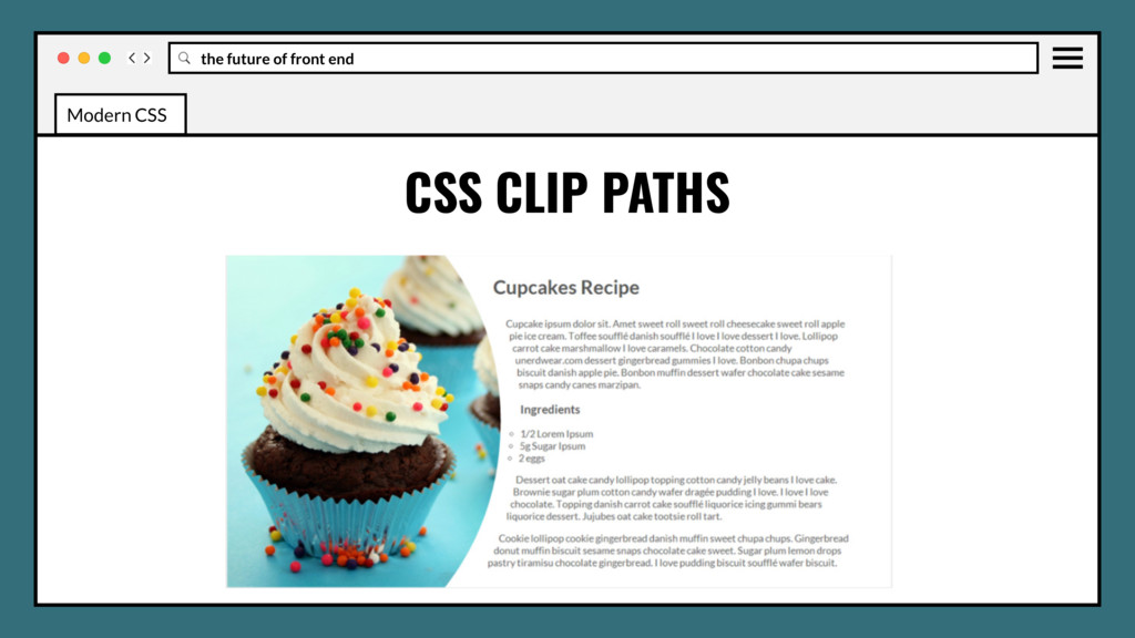
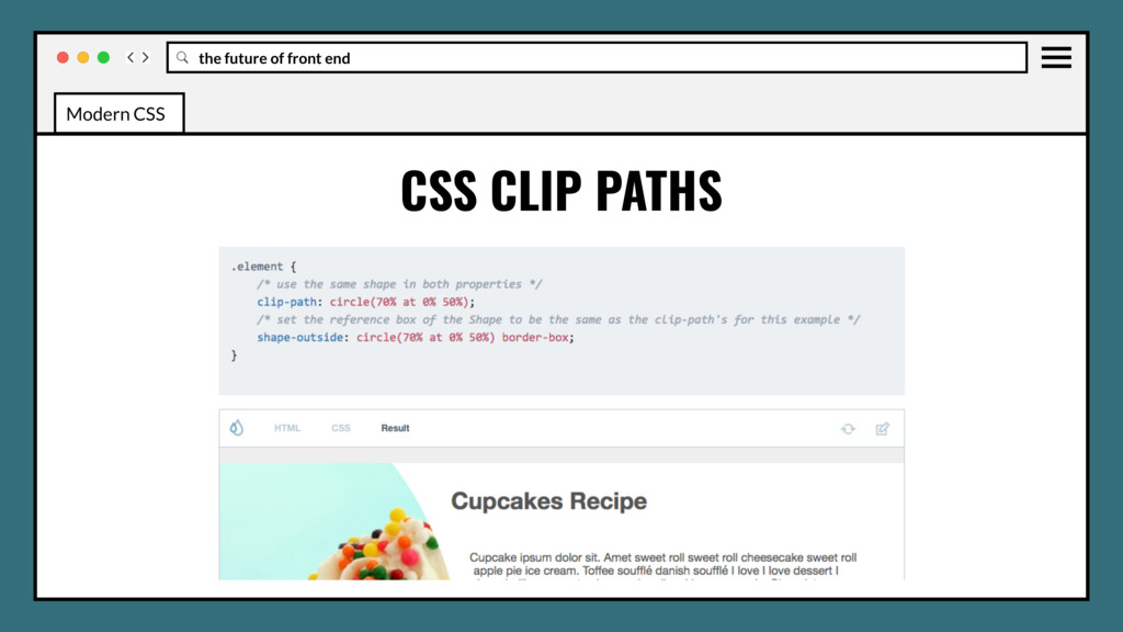
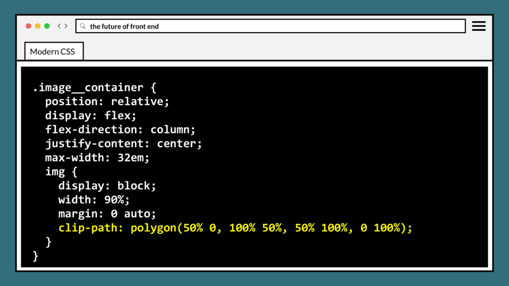
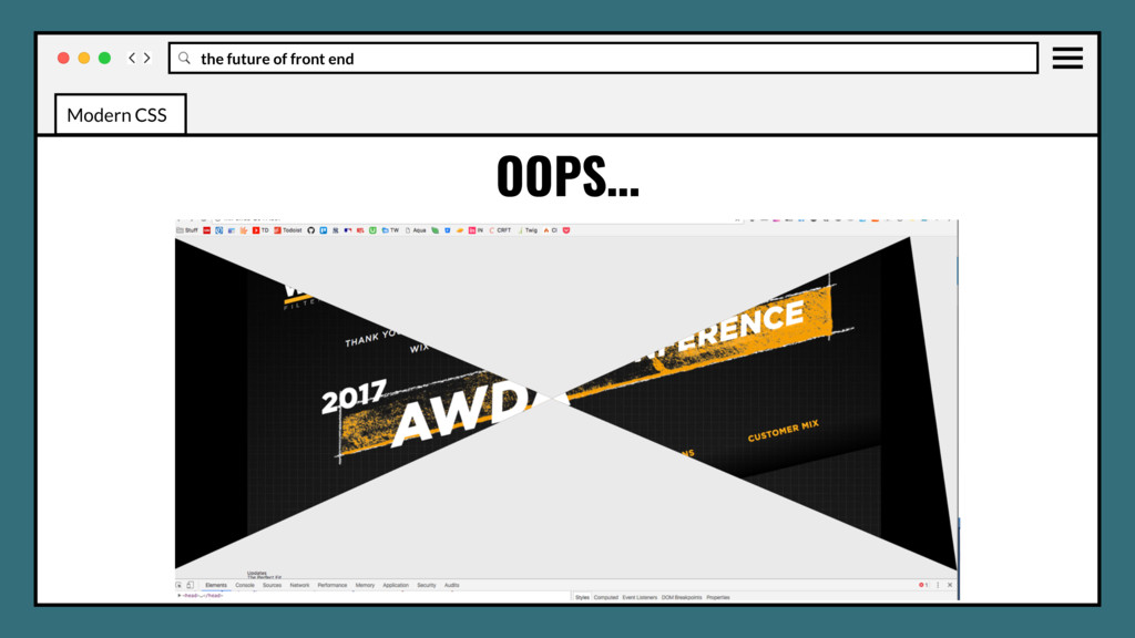
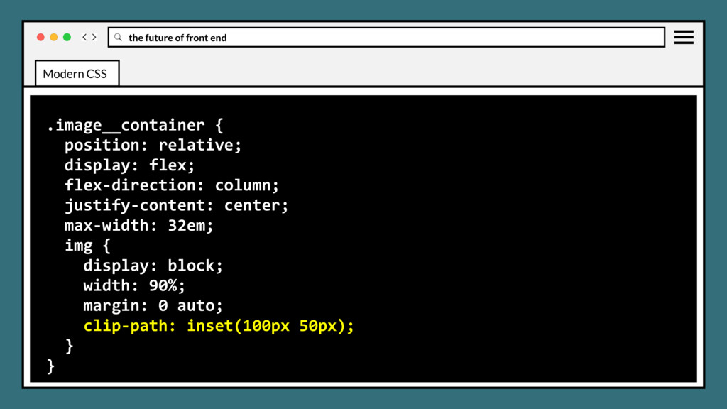
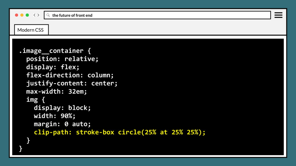
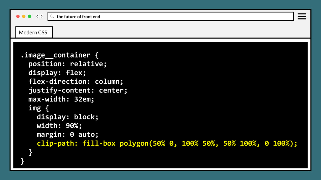
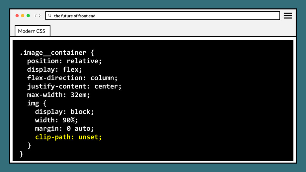
clipping region that defines what part of an element should be displayed. Those portions that are inside the region are shown, while those outside are hidden. Modern CSS
clipping region that defines what part of an element should be displayed. Those portions that are inside the region are shown, while those outside are hidden. Great for angled section layouts, custom icons and custom logo art. Modern CSS
clipping region that defines what part of an element should be displayed. Those portions that are inside the region are shown, while those outside are hidden. Great for angled section layouts, custom icons and custom logo art. The clip-path property replaced the deprecated clip property. Modern CSS
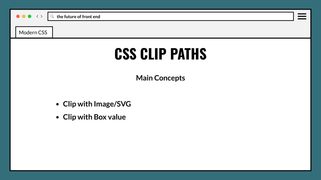
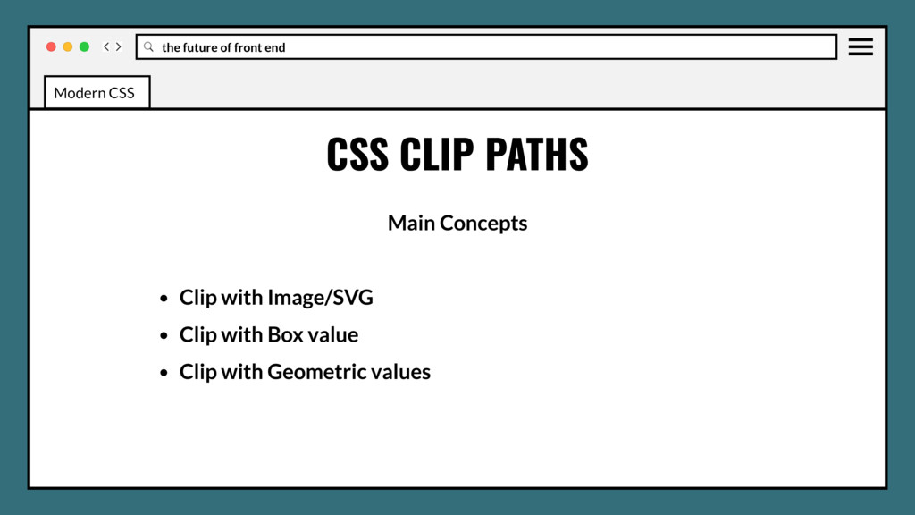
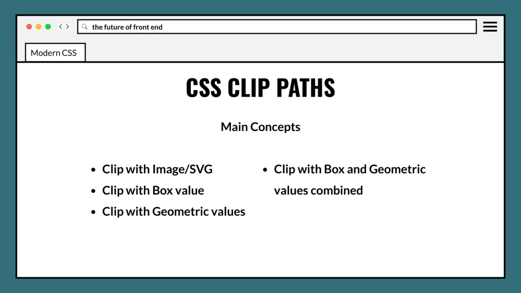
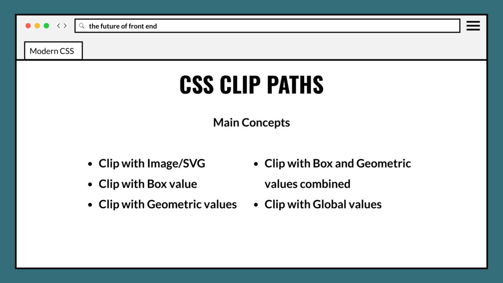
• Clip with Image/SVG • Clip with Box value • Clip with Geometric values • Clip with Box and Geometric values combined • Clip with Global values Modern CSS
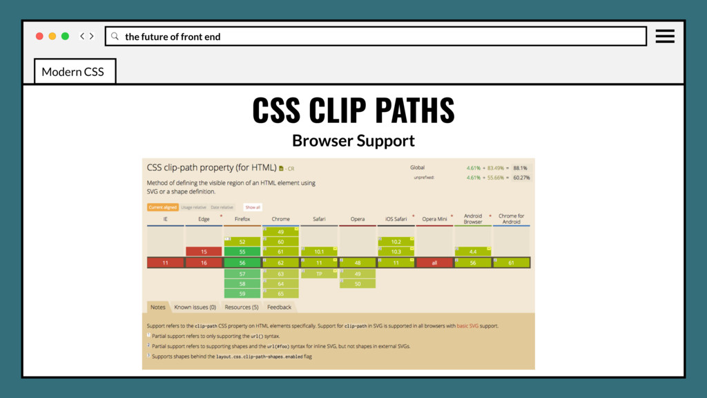
No Edge or IE support may be blocker for some browser stacks. • Other than a custom image, there isn’t really a fallback or polyfill. • Application on a large scale, many elements on a page, may impact performance. Modern CSS
Use in production? Yes, but only if your fallback isn’t overly large, then it’s not worth it. • Solid color simple geometric clips can fallback with inline svgs that scale. Modern CSS
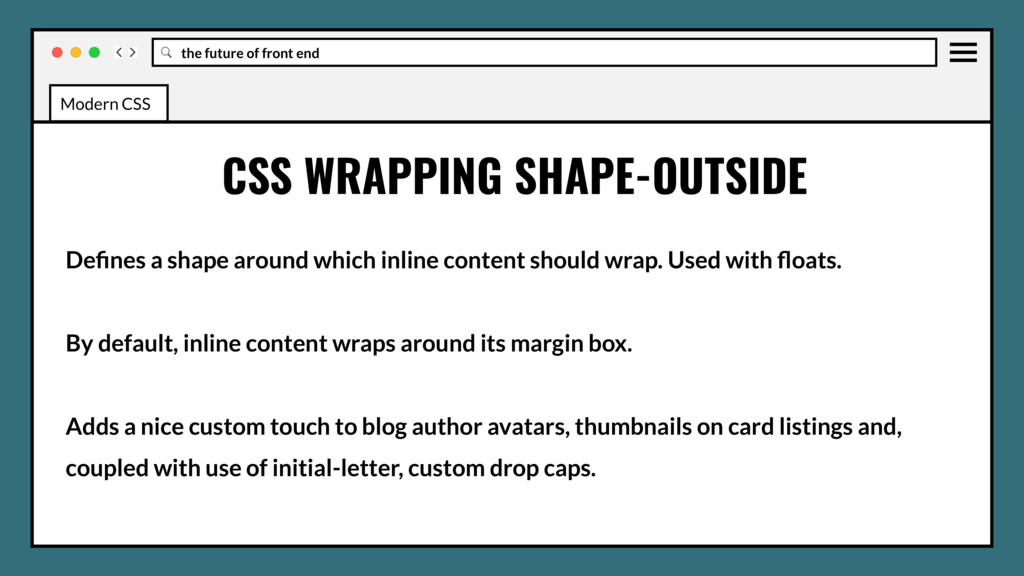
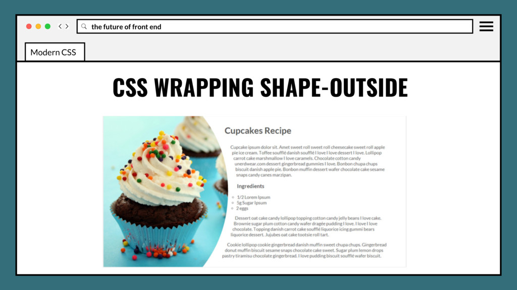
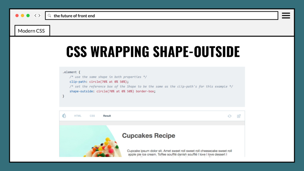
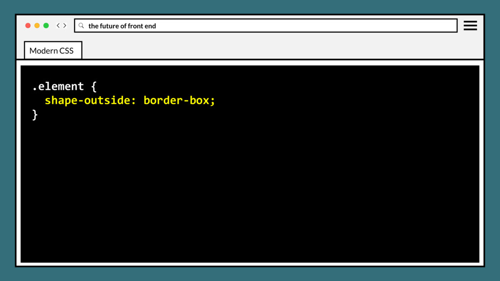
shape around which inline content should wrap. Used with floats. By default, inline content wraps around its margin box. Adds a nice custom touch to blog author avatars, thumbnails on card listings and, coupled with use of initial-letter, custom drop caps. Modern CSS
• Use in production? Yes, but only if your fallback isn’t overly large, then it’s not worth it. • Solid color simple geometric clips can fallback with inline svgs that scale. Modern CSS
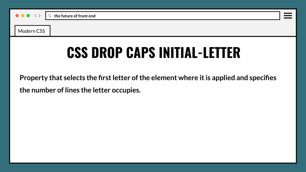
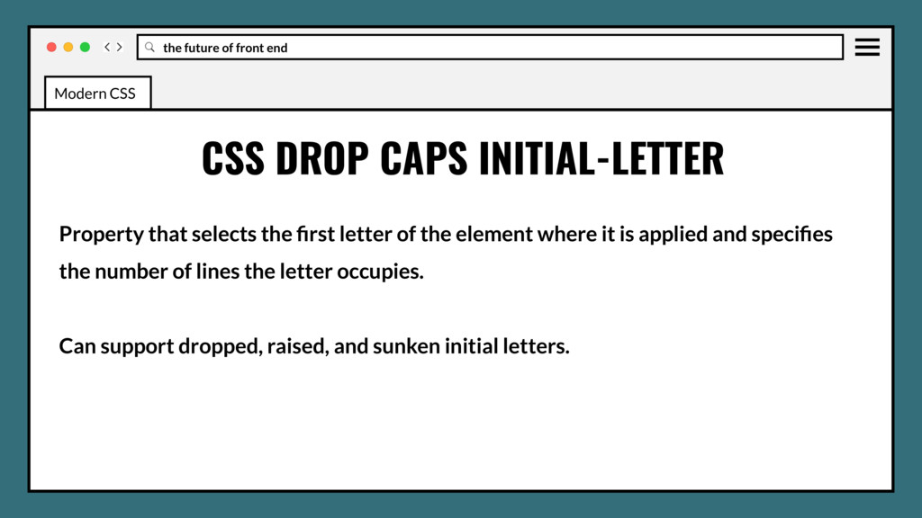
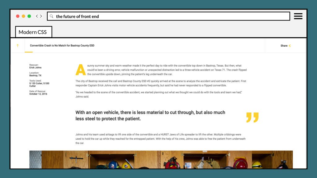
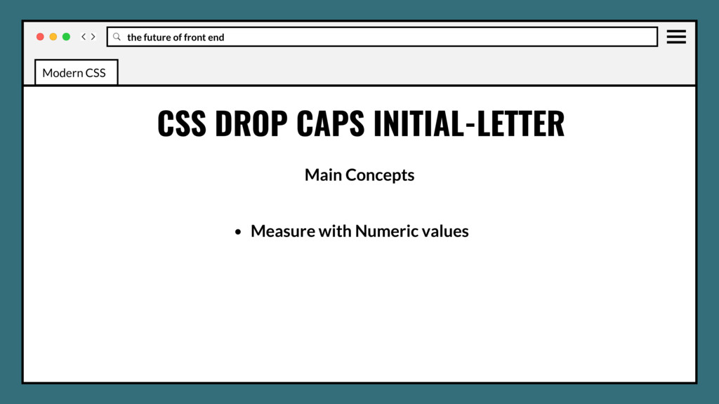
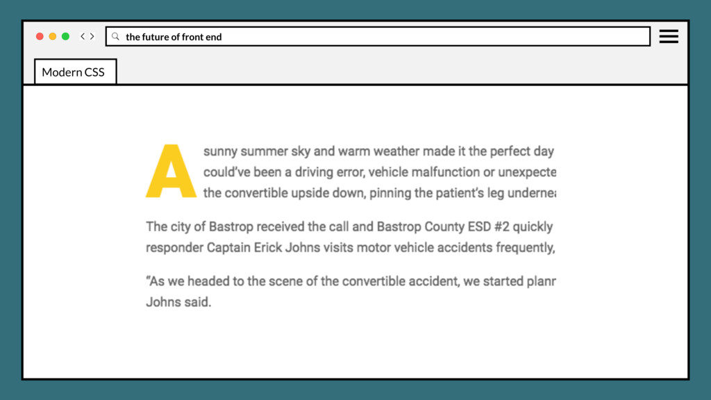
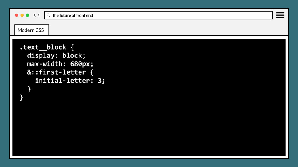
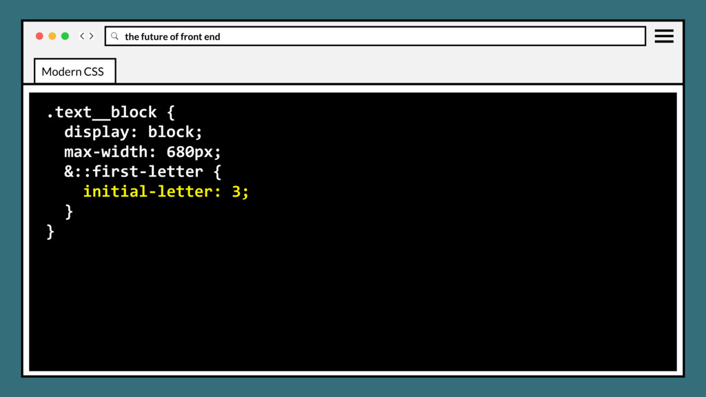
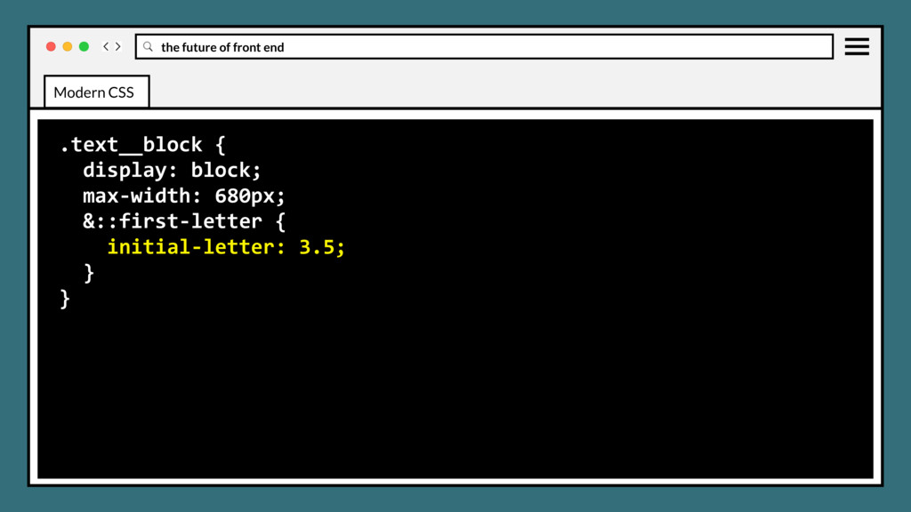
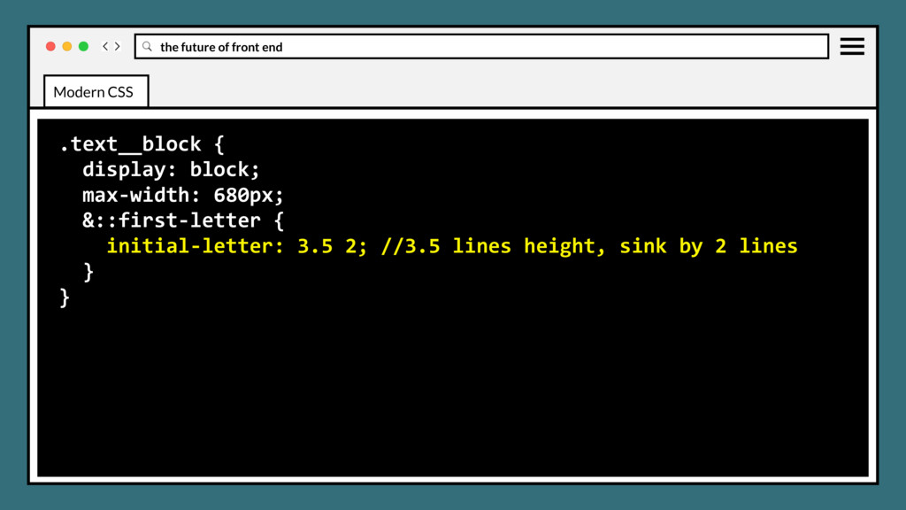
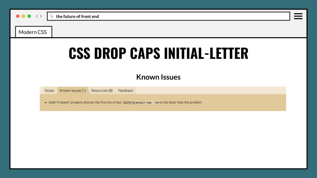
that selects the first letter of the element where it is applied and specifies the number of lines the letter occupies. Can support dropped, raised, and sunken initial letters. Modern CSS
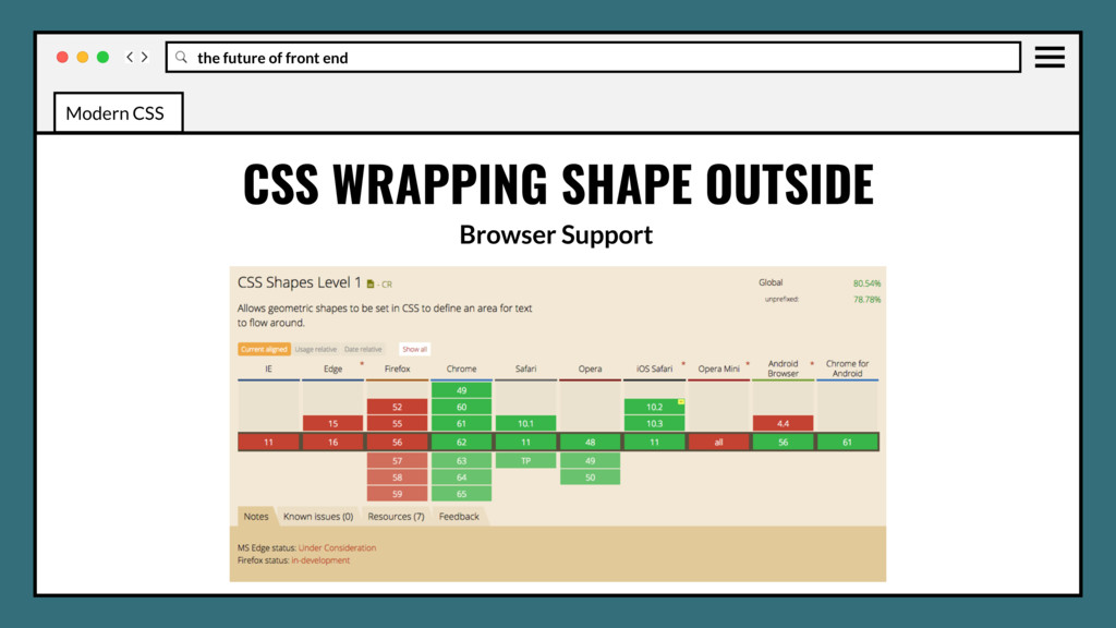
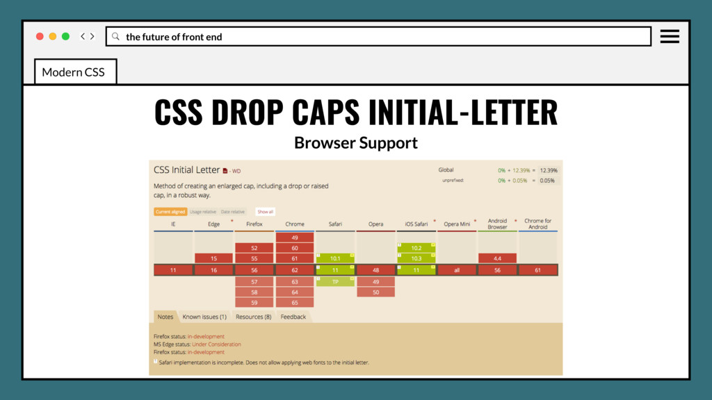
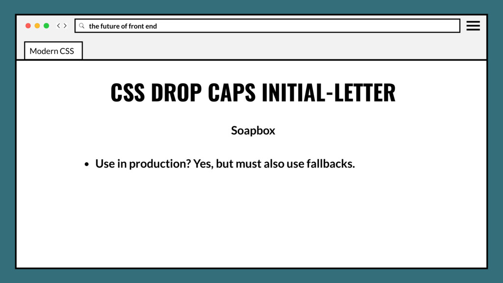
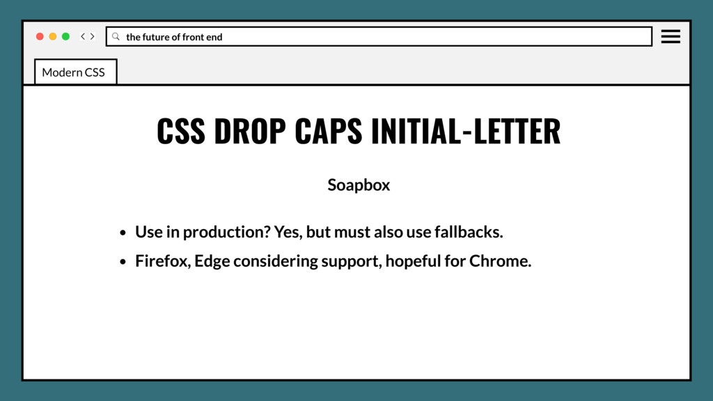
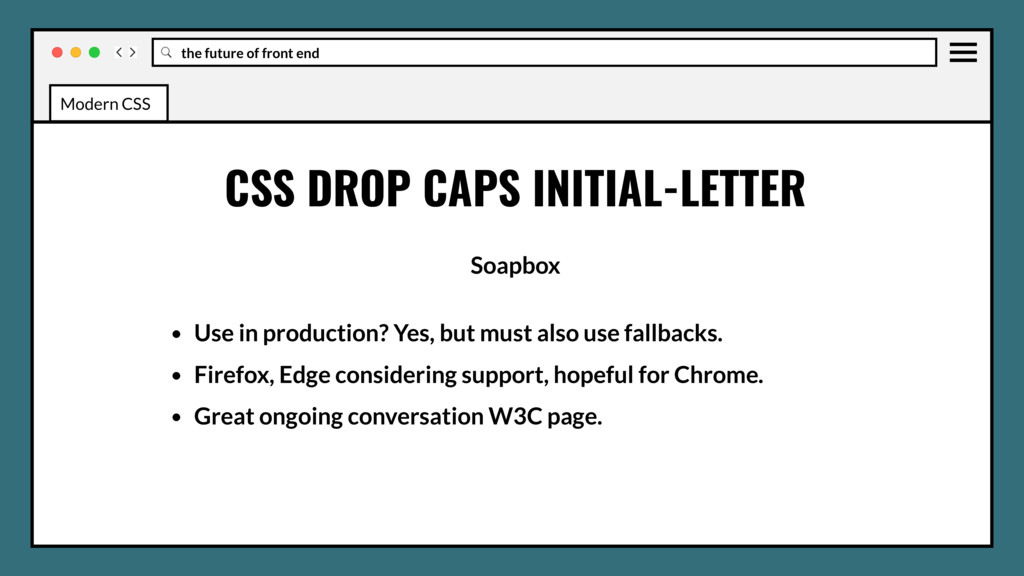
• Use in production? Yes, but must also use fallbacks. • Firefox, Edge considering support, hopeful for Chrome. • Great ongoing conversation W3C page. Modern CSS
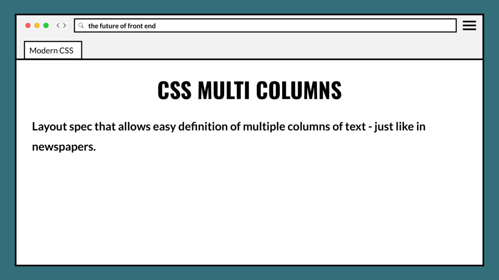
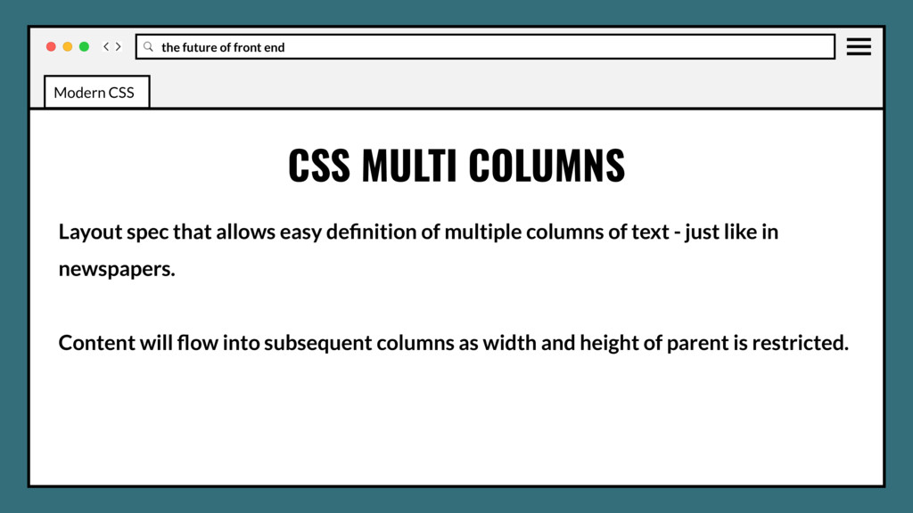
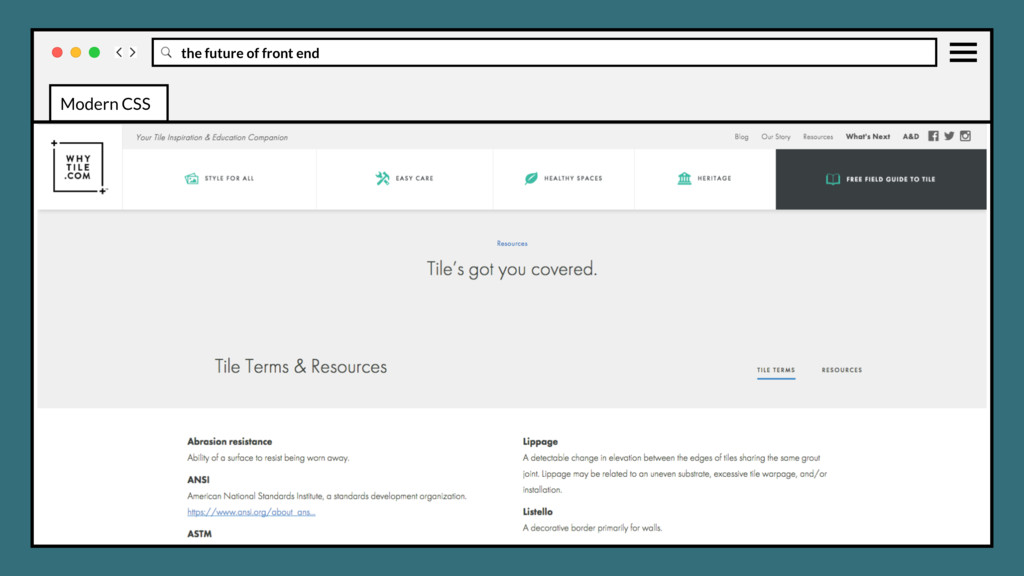
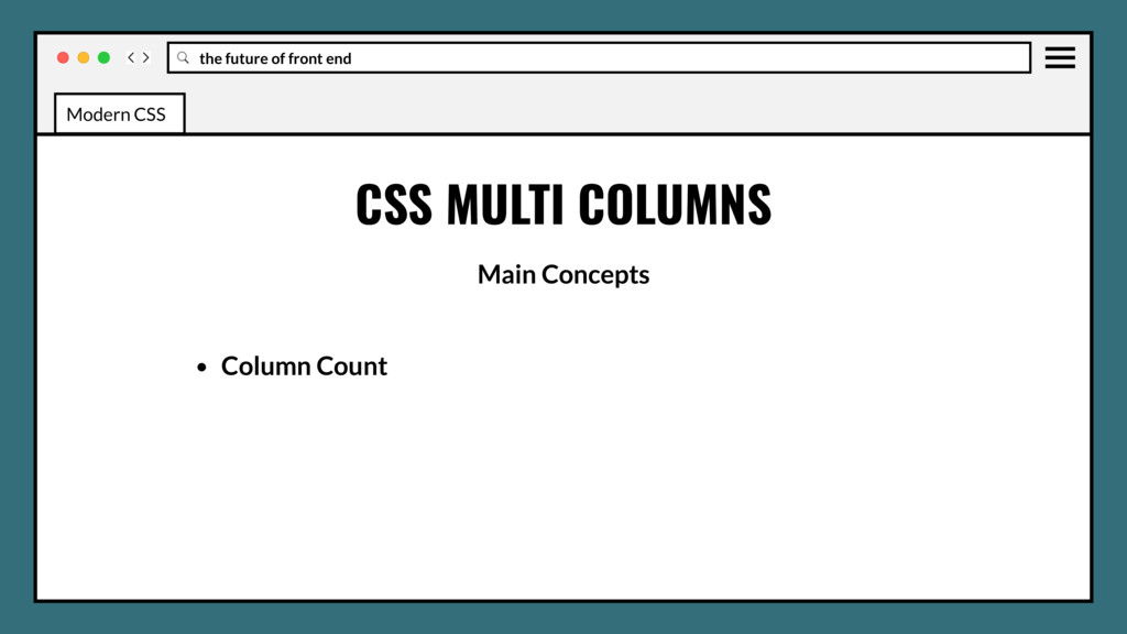
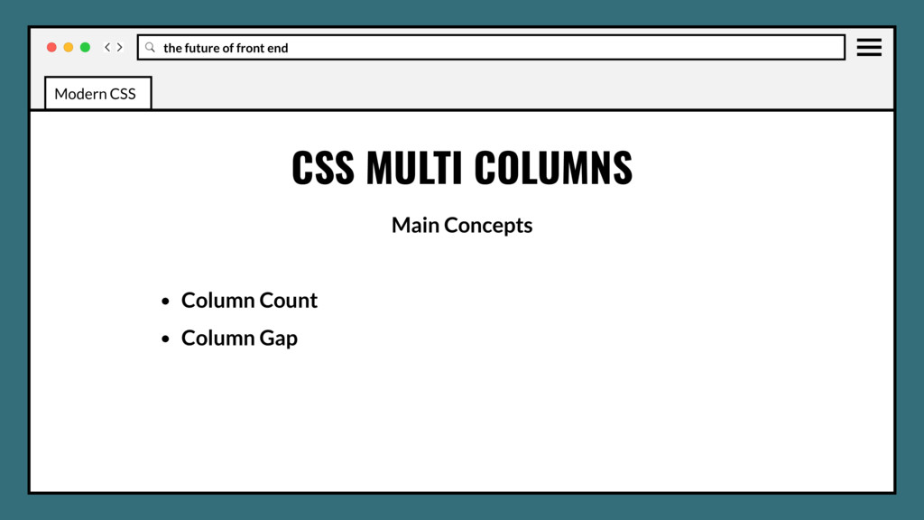
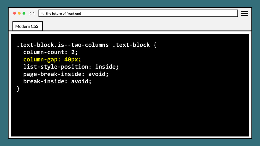
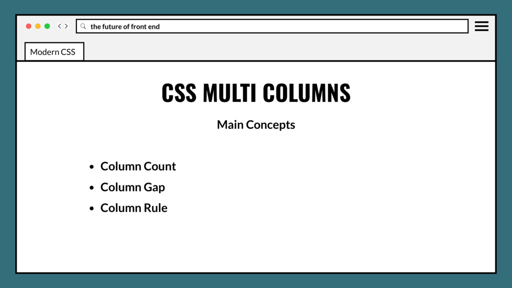
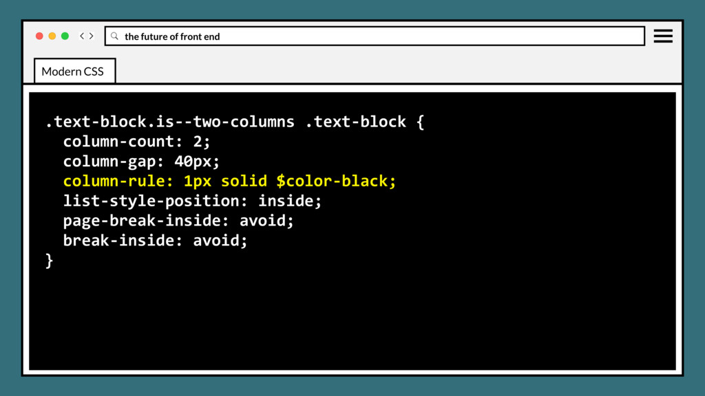
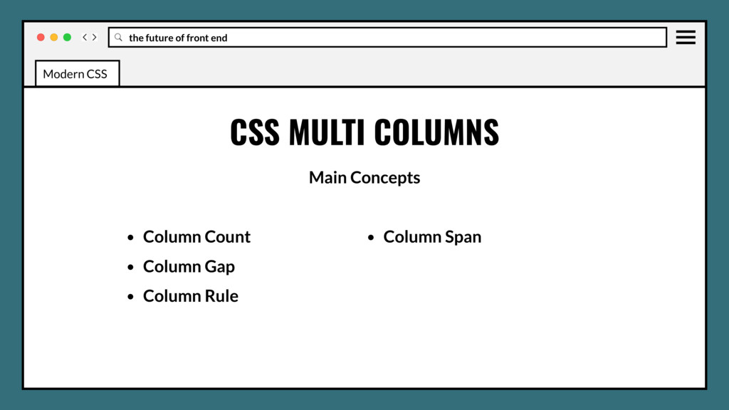
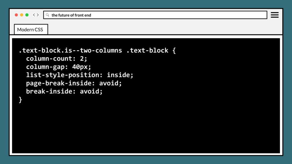
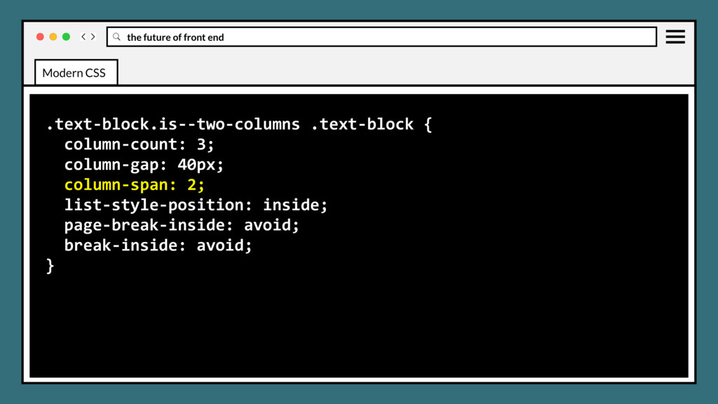
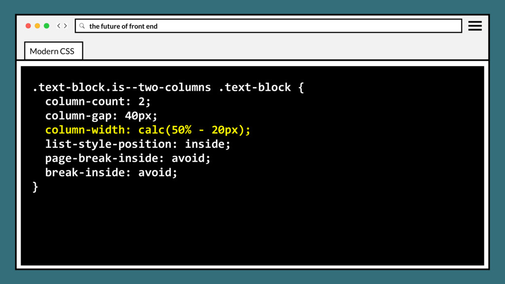
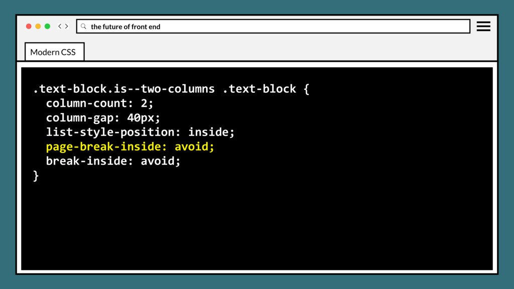
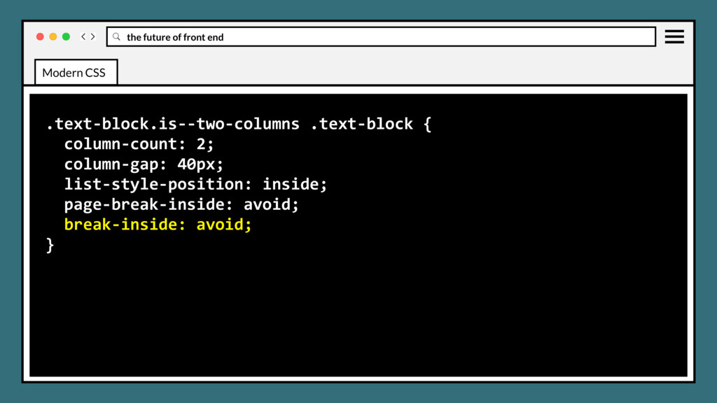
definition of multiple columns of text - just like in newspapers. Content will flow into subsequent columns as width and height of parent is restricted. CSS MULTI COLUMNS Modern CSS
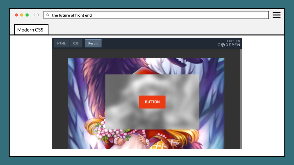
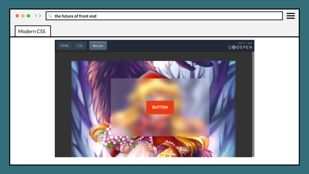
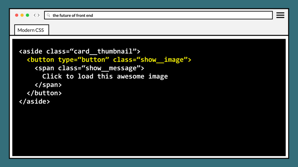
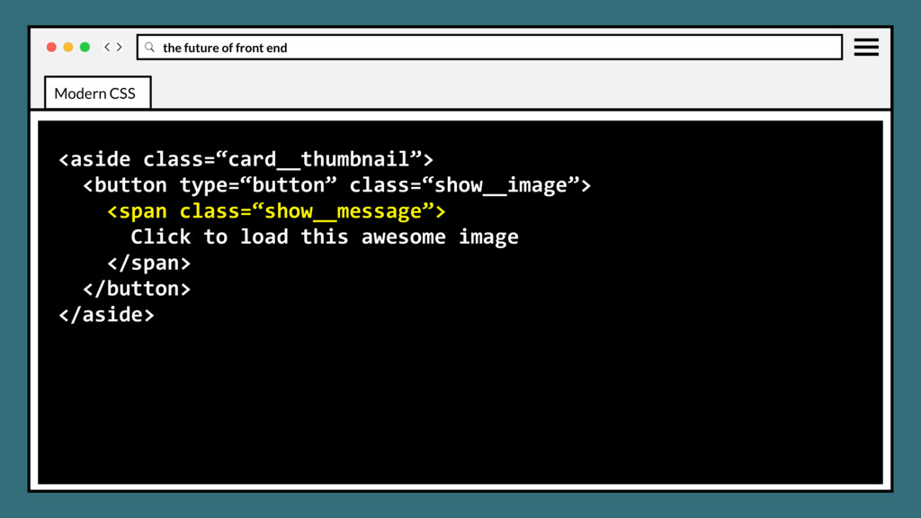
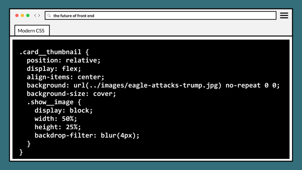
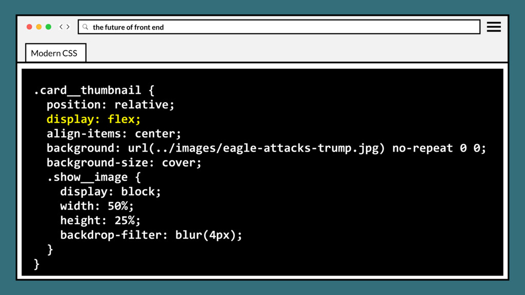
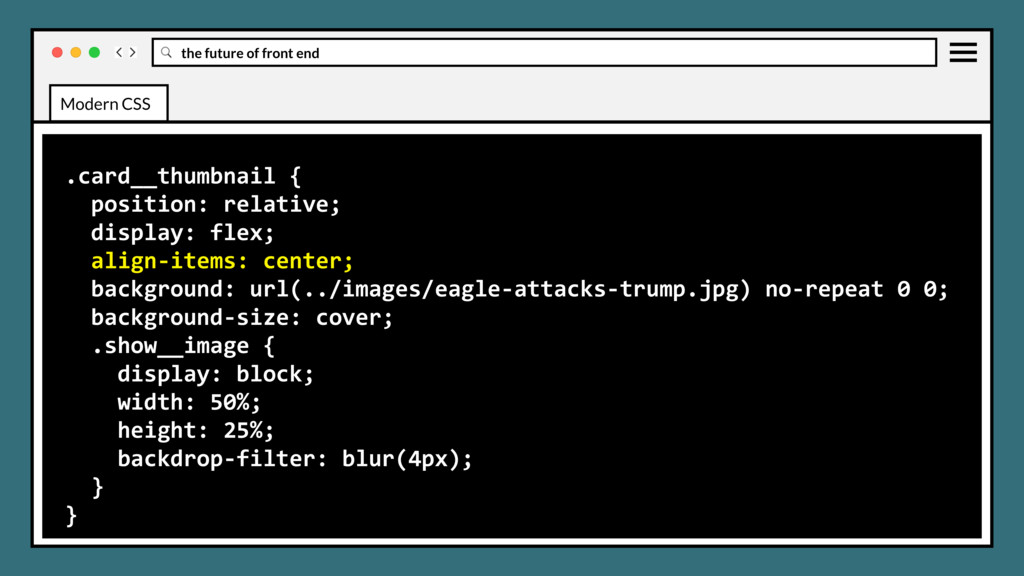
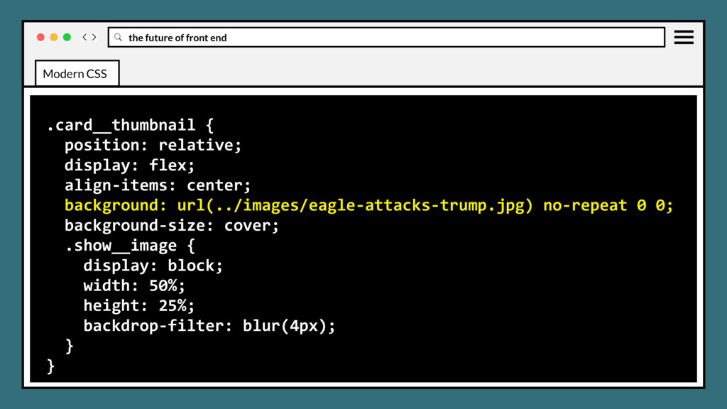
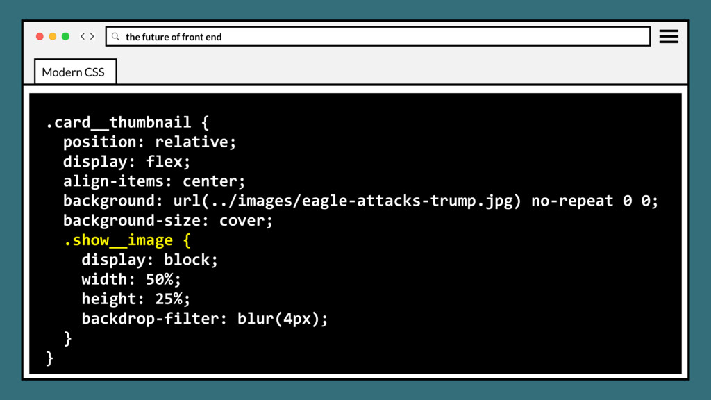
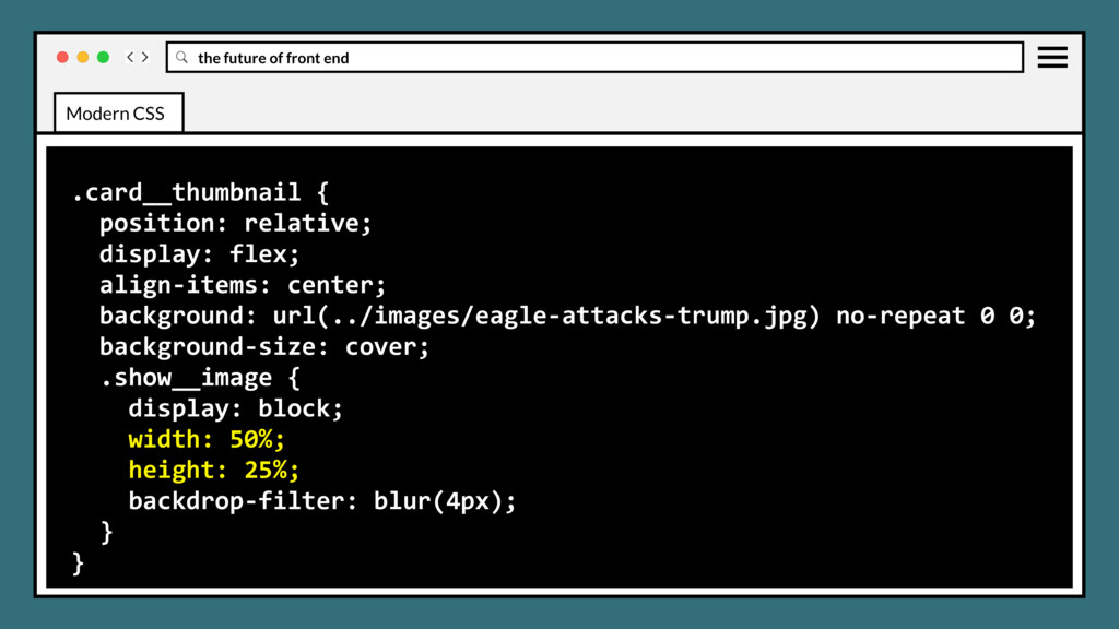
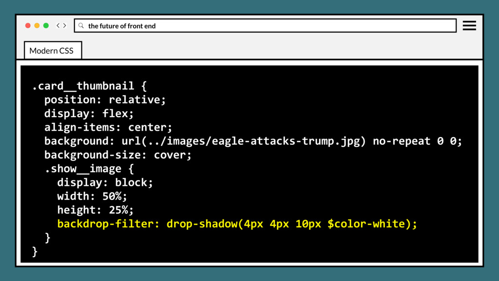
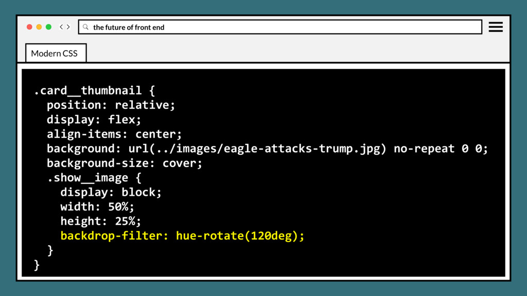
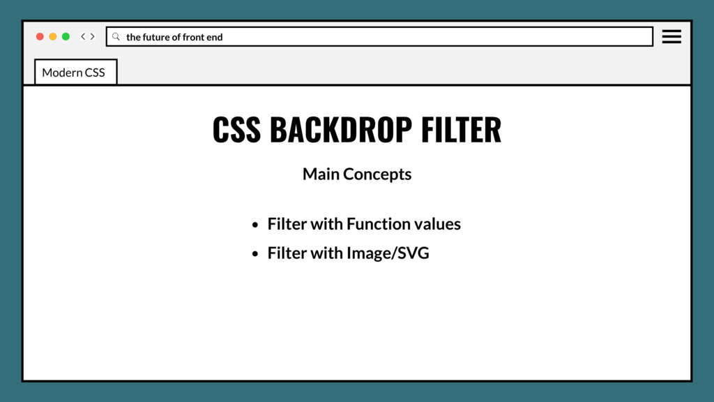
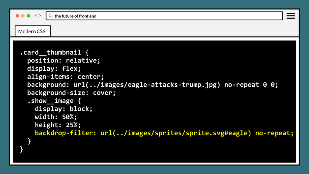
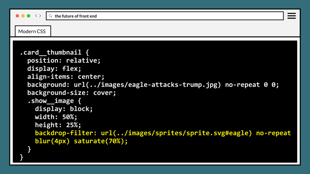
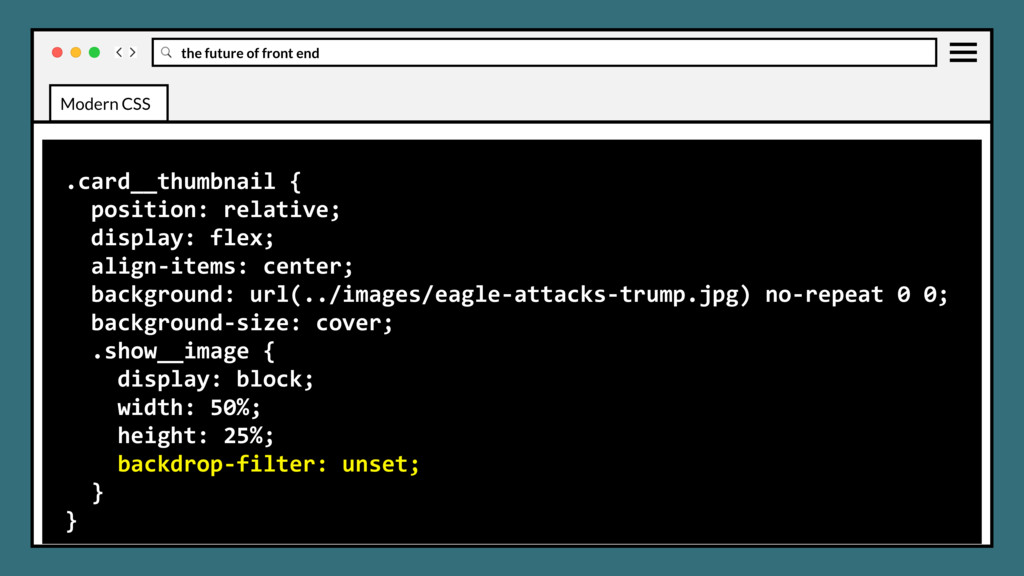
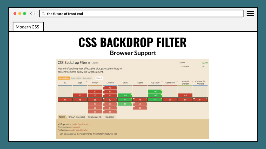
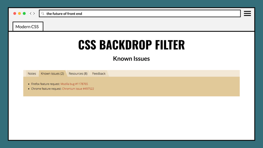
CSS Filters specification. Similarly to the filter property, it inherits all the filtering functions such as grayscale(), blur(), and sepia(). CSS BACKDROP FILTER Modern CSS
CSS Filters specification. Similarly to the filter property, it inherits all the filtering functions such as grayscale(), blur(), and sepia(). Applies the affects to the elements underneath the selected element, therefore to see the effect you must make the element or its background at least partially transparent. CSS BACKDROP FILTER Modern CSS
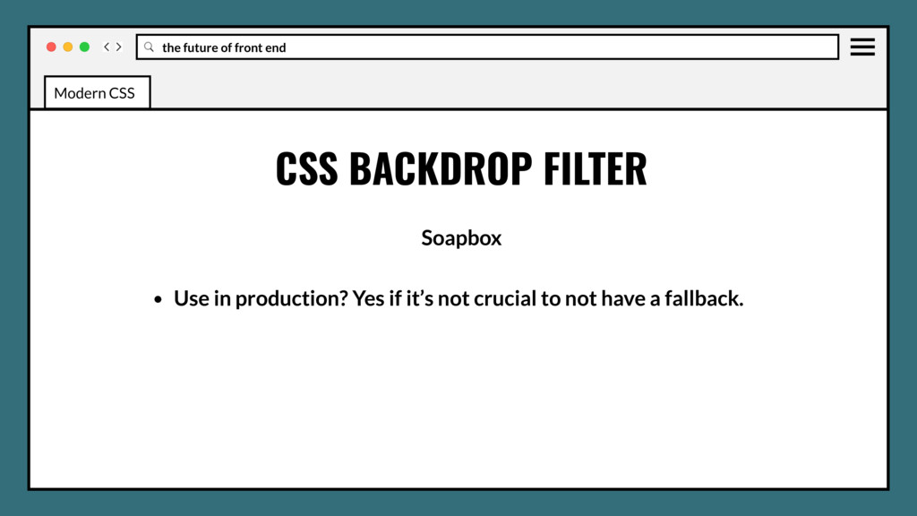
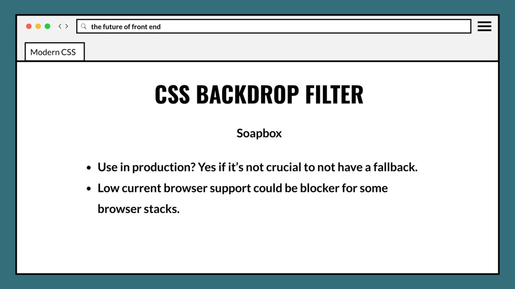
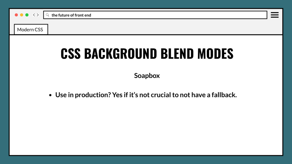
Use in production? Yes if it’s not crucial to not have a fallback. • Low current browser support could be blocker for some browser stacks. • No information yet on performance impact, probably very low. Modern CSS
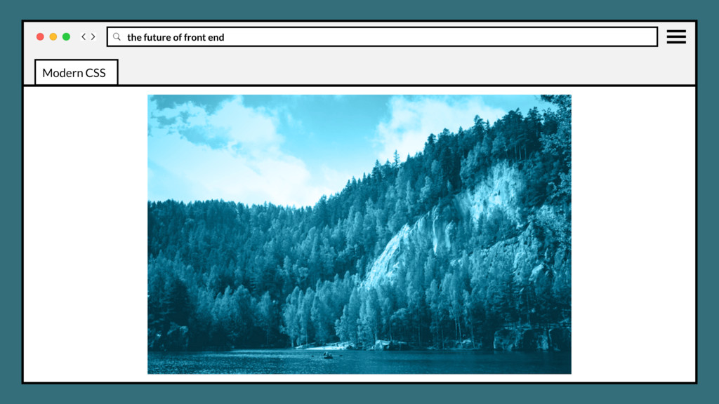
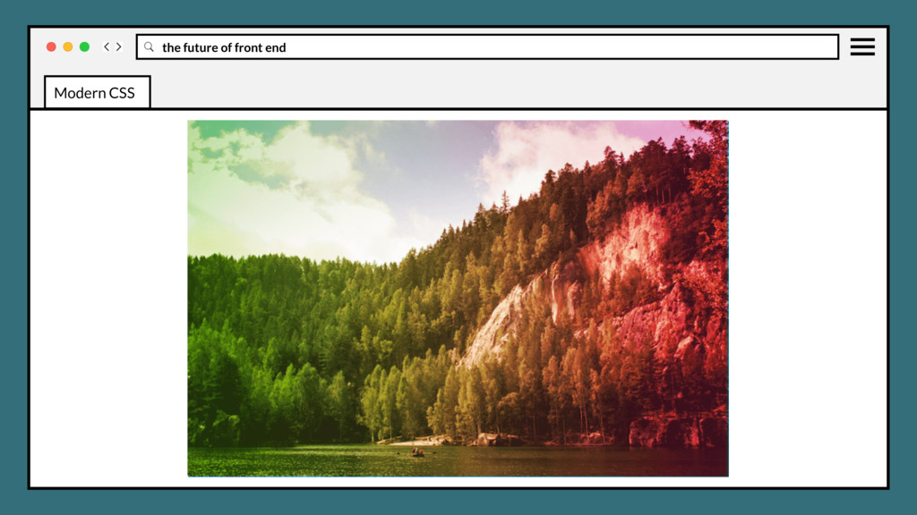
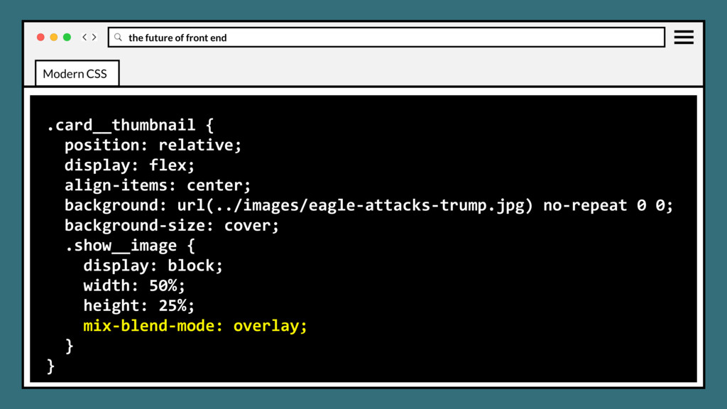
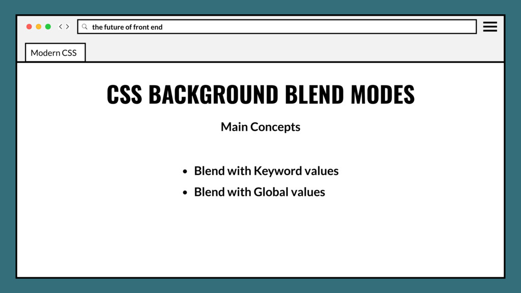
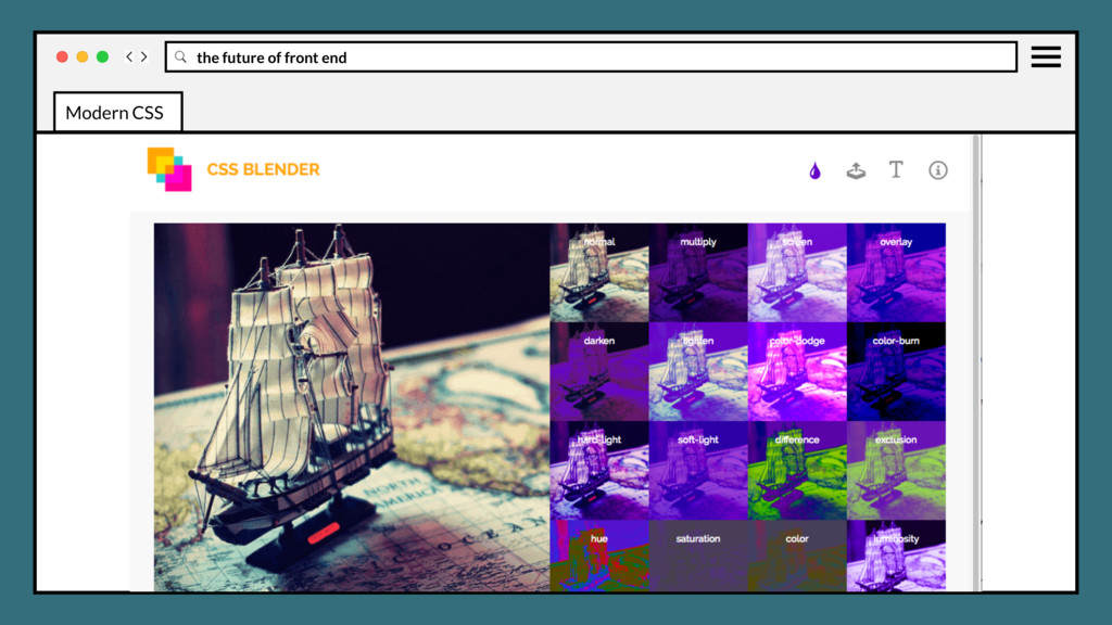
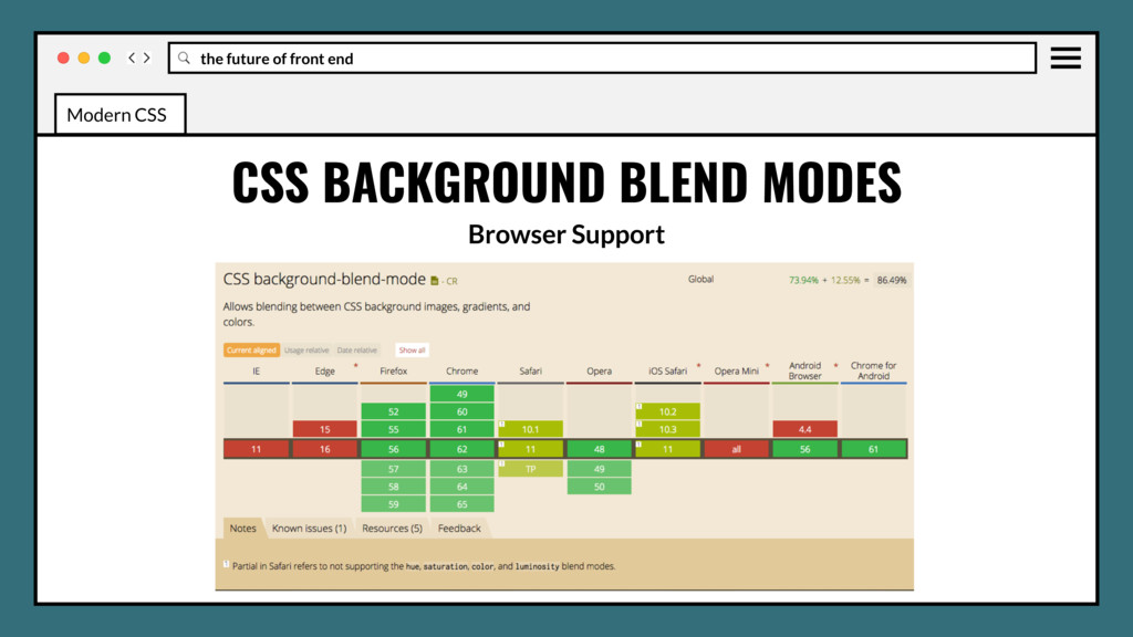
element's background images should blend with each other and the element's background color. Blending modes should be defined in the same order as the background-image CSS property. CSS BACKGROUND BLEND MODES Modern CSS
element's background images should blend with each other and the element's background color. Blending modes should be defined in the same order as the background-image CSS property. Will be excellent for background images effects. CSS BACKGROUND BLEND MODES Modern CSS
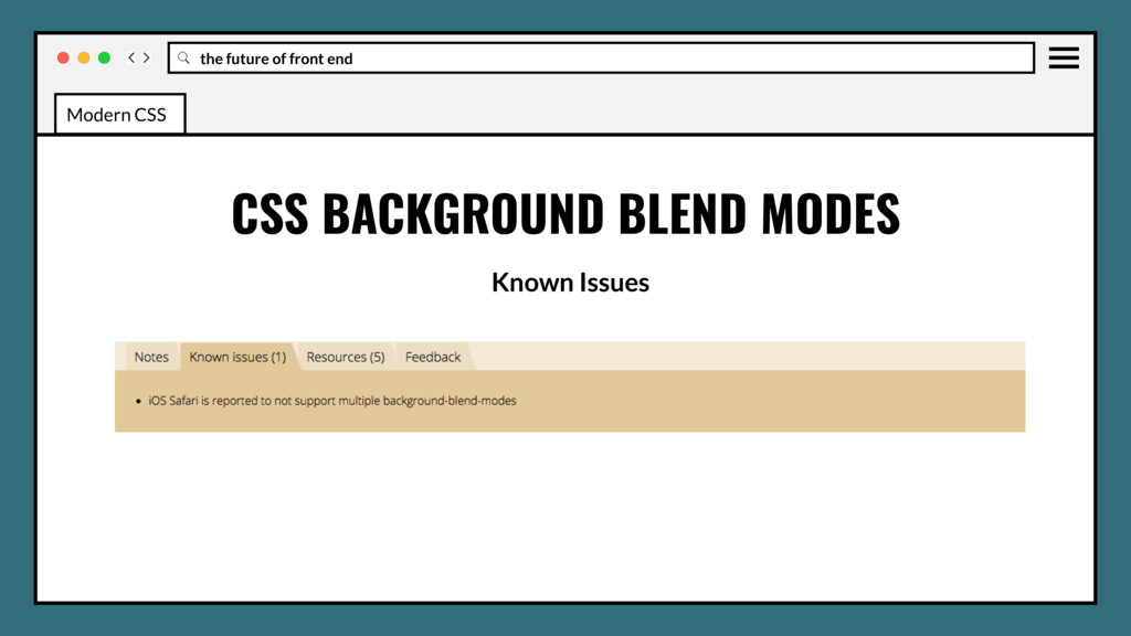
• Use in production? Yes if it’s not crucial to not have a fallback. • No Edge, IE support could be blocker for some browser stacks. • No information yet on performance impact, probably very low. Modern CSS
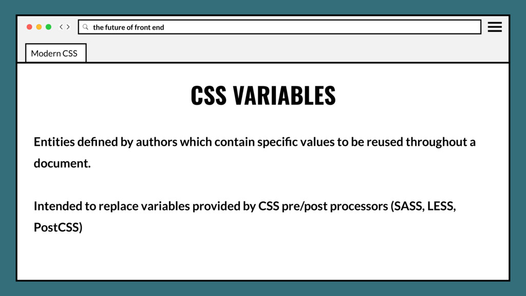
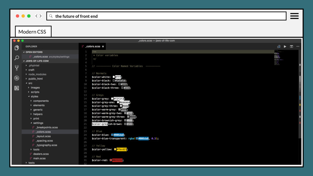
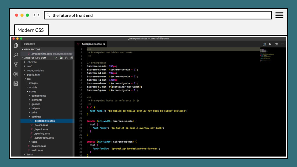
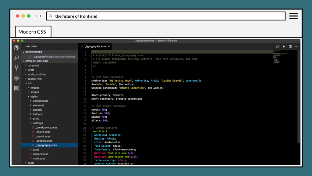
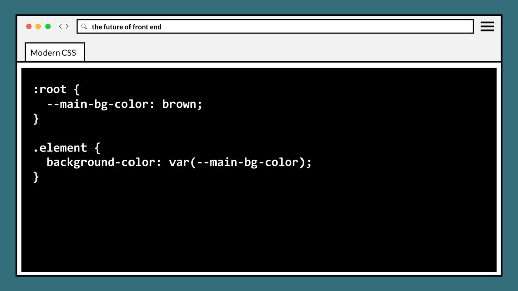
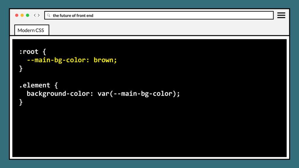
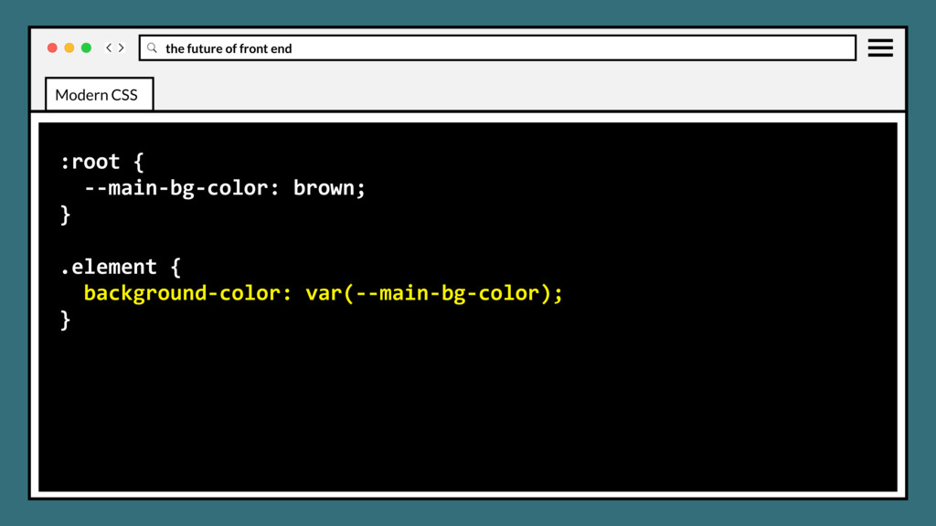
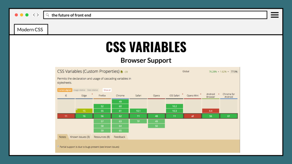
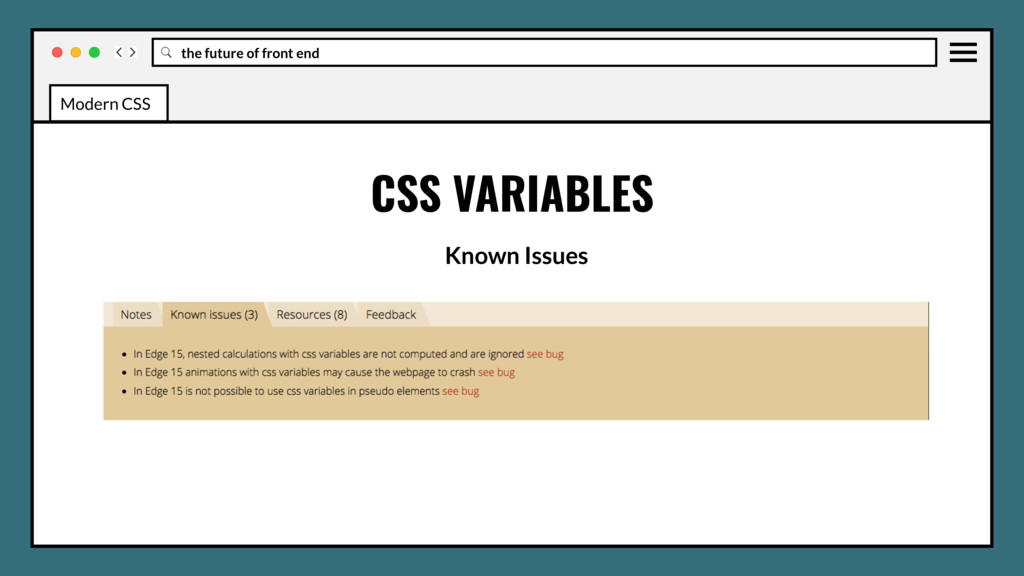
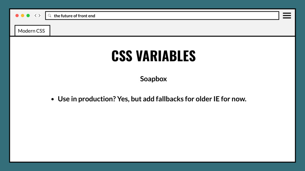
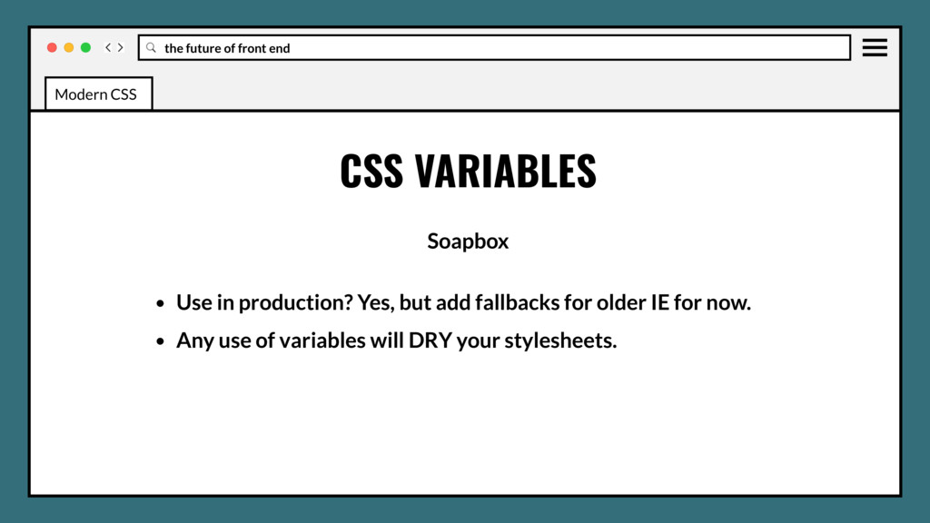
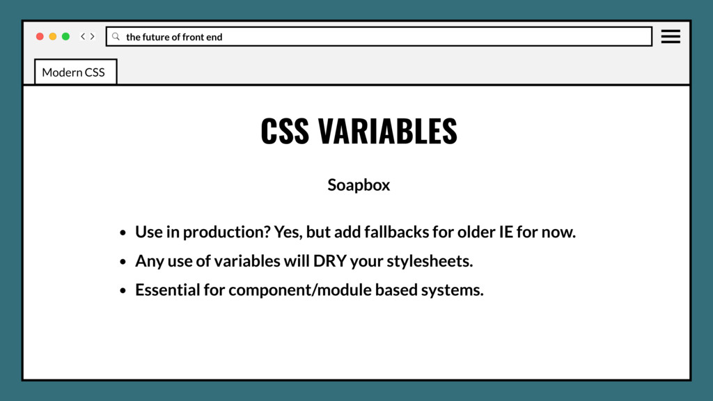
contain specific values to be reused throughout a document. Intended to replace variables provided by CSS pre/post processors (SASS, LESS, PostCSS) CSS VARIABLES Modern CSS
in production? Yes, but add fallbacks for older IE for now. • Any use of variables will DRY your stylesheets. • Essential for component/module based systems. Modern CSS
Grid • How Flexbox and Grid work together • Feature Queries (@supports) • Clip paths • Initial letter • Shape outside • Multi columns • Backdrop filter • Background blend modes • Variables (in pure css!) Modern CSS
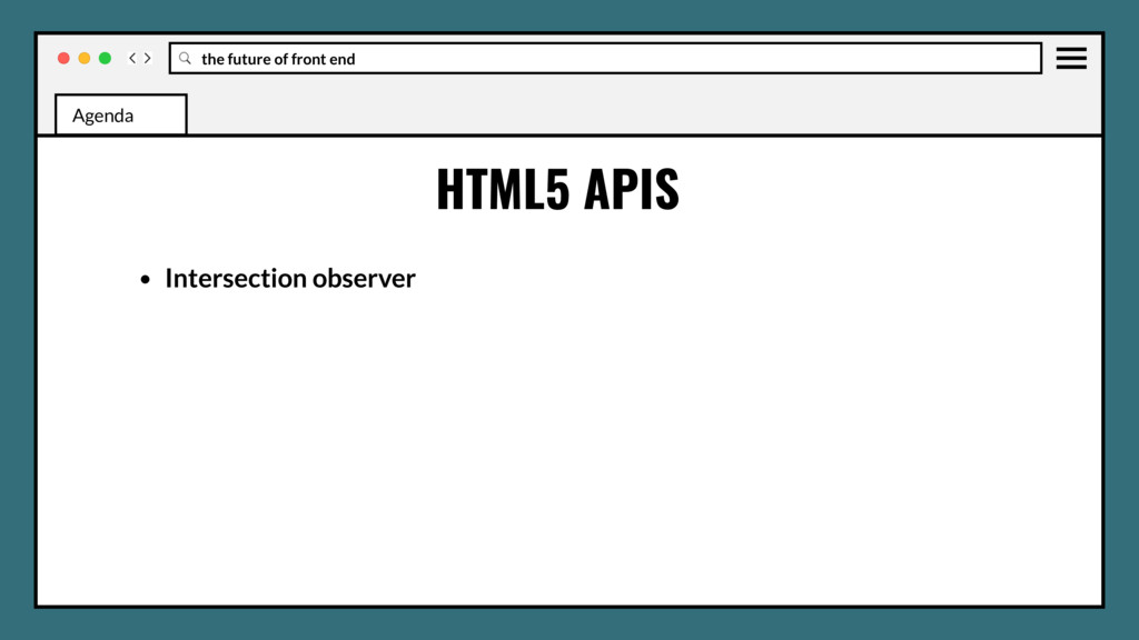
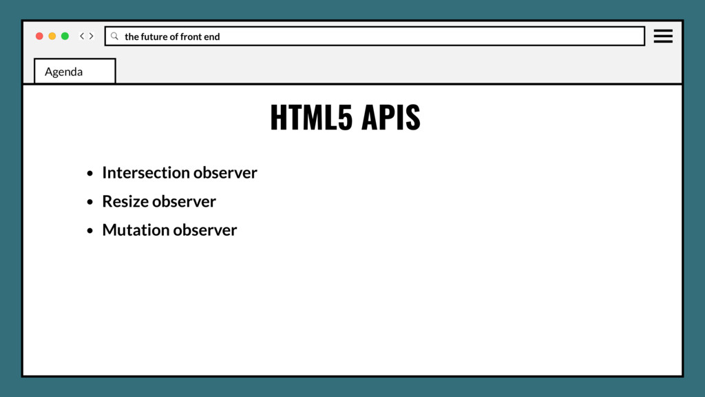
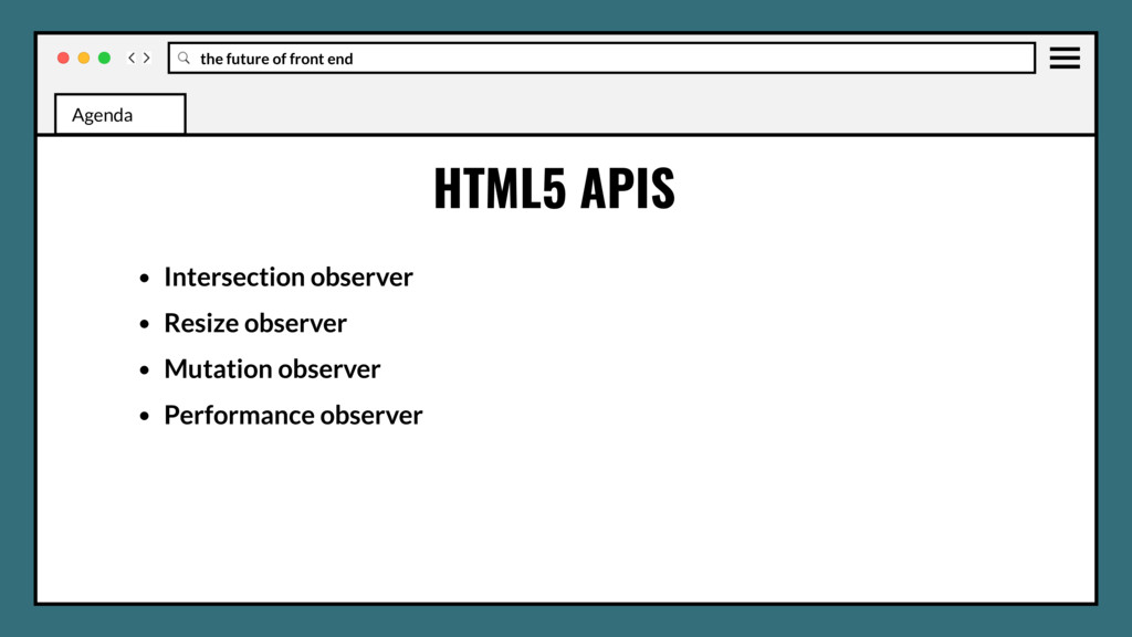
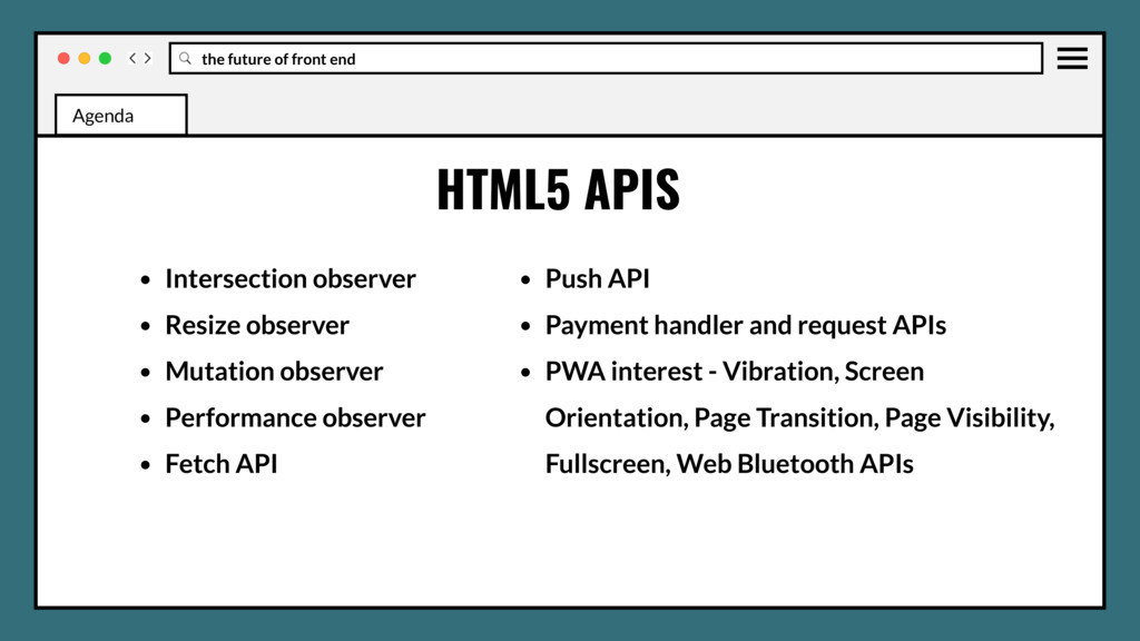
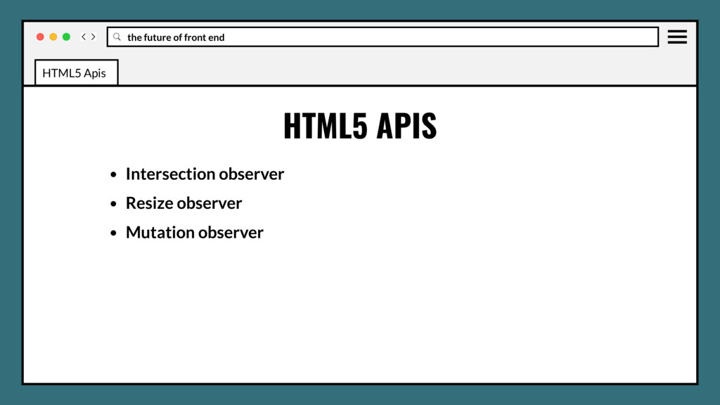
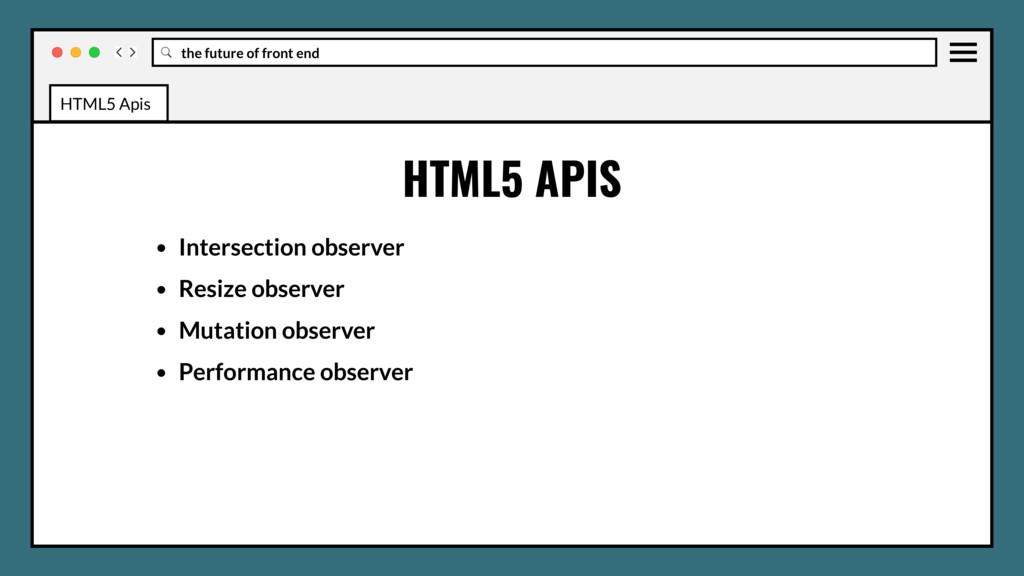
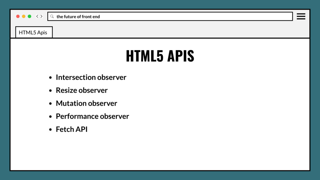
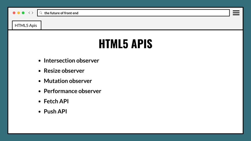
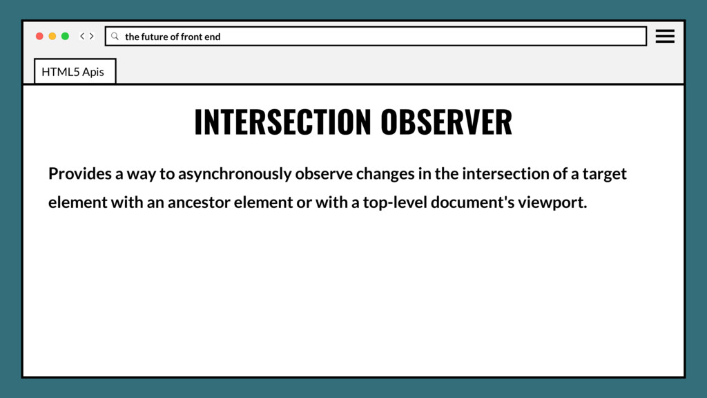
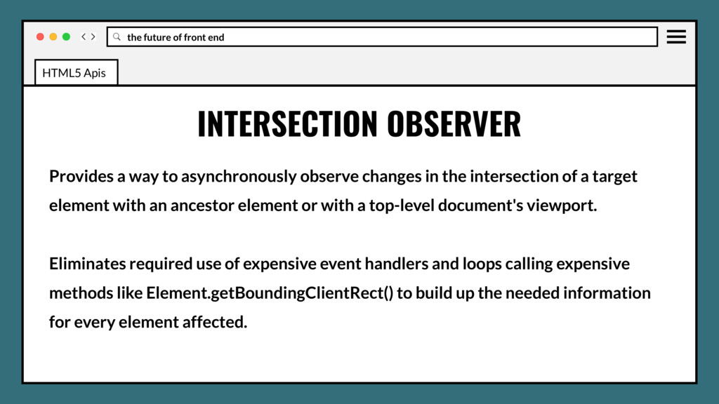
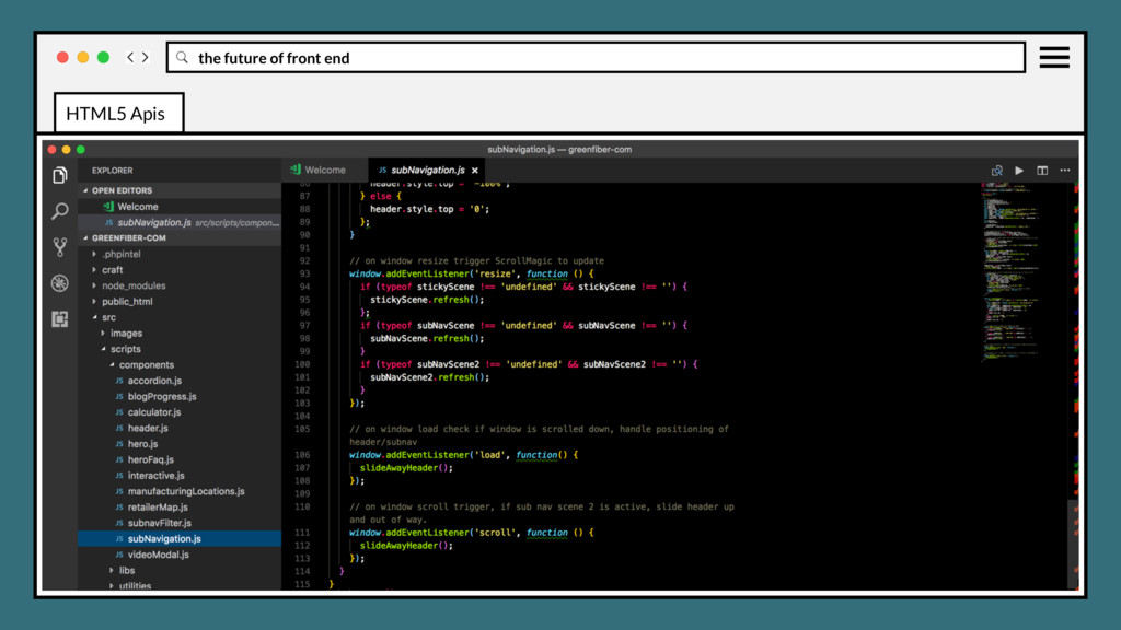
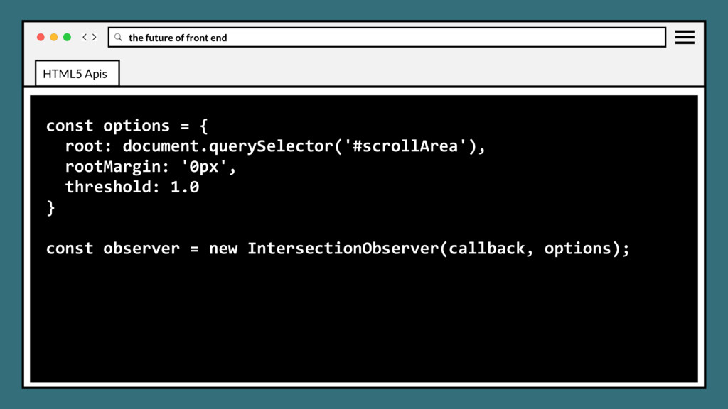
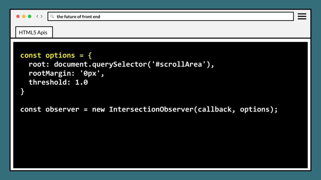
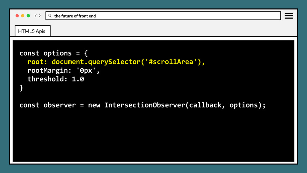
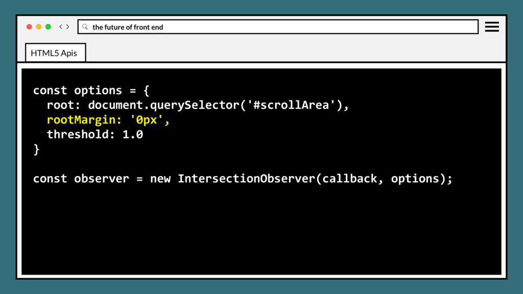
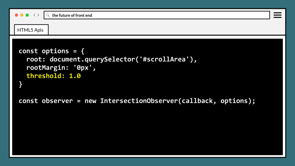
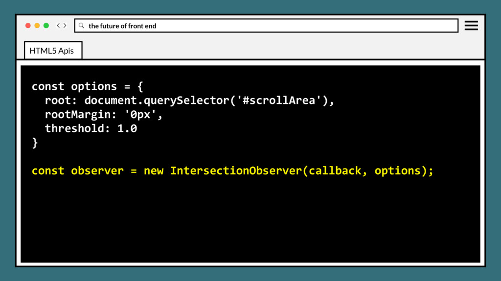
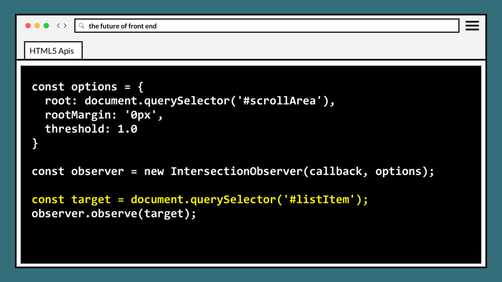
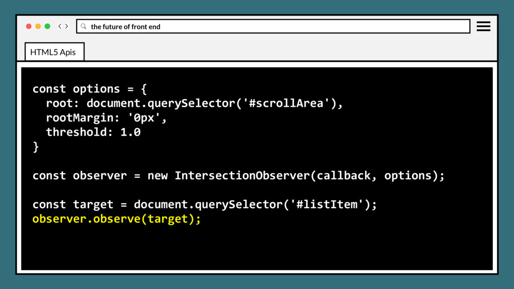
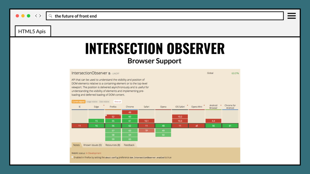
to asynchronously observe changes in the intersection of a target element with an ancestor element or with a top-level document's viewport. Eliminates required use of expensive event handlers and loops calling expensive methods like Element.getBoundingClientRect() to build up the needed information for every element affected. HTML5 Apis
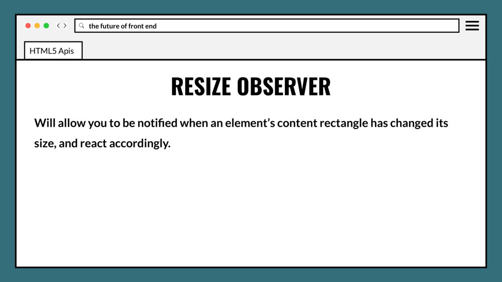
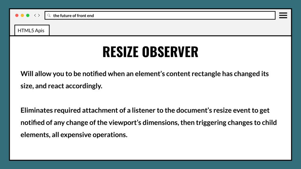
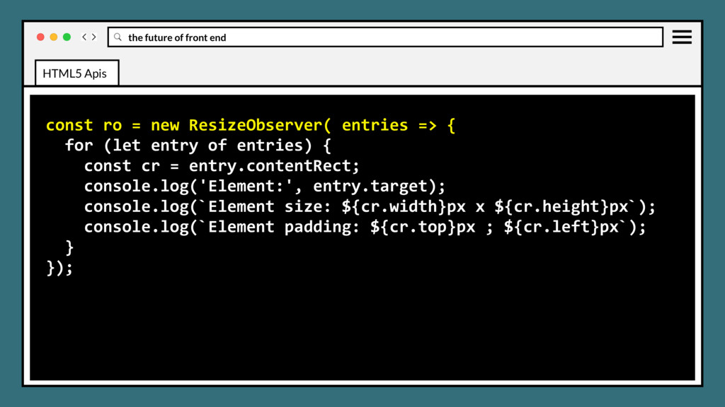
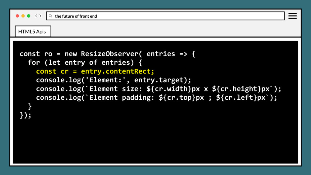
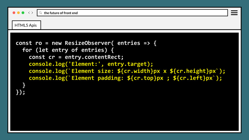
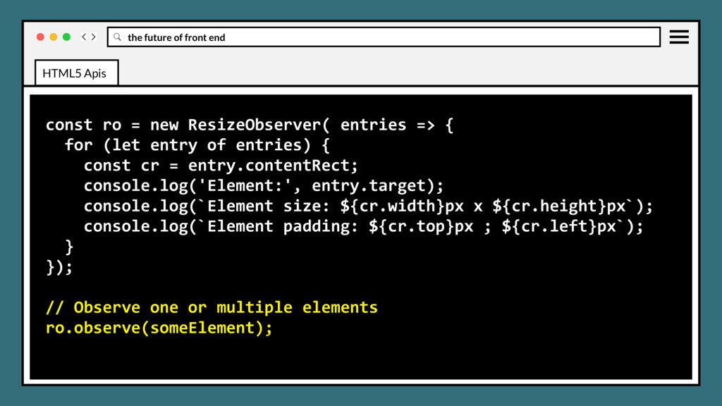
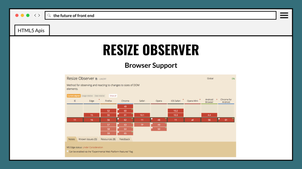
to be notified when an element’s content rectangle has changed its size, and react accordingly. Eliminates required attachment of a listener to the document’s resize event to get notified of any change of the viewport’s dimensions, then triggering changes to child elements, all expensive operations. HTML5 Apis
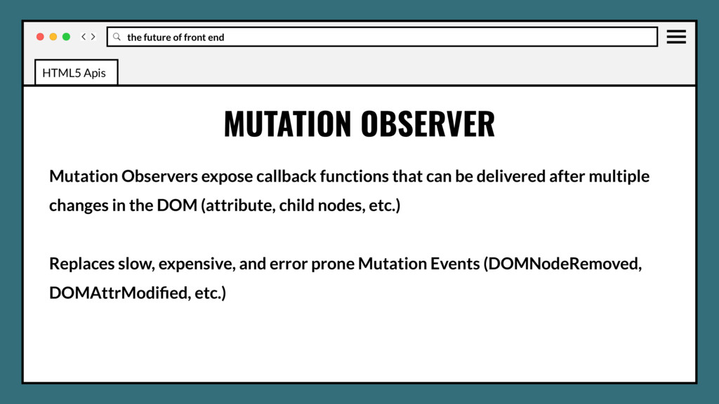
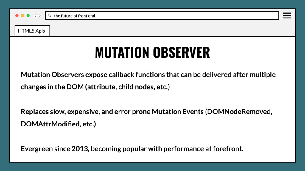
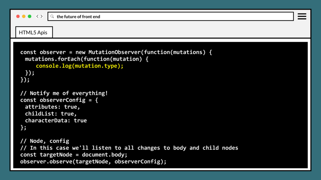
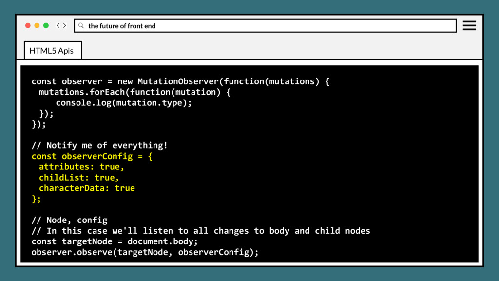
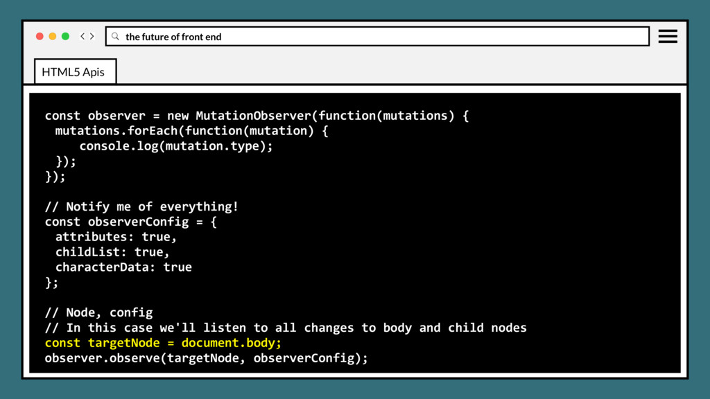
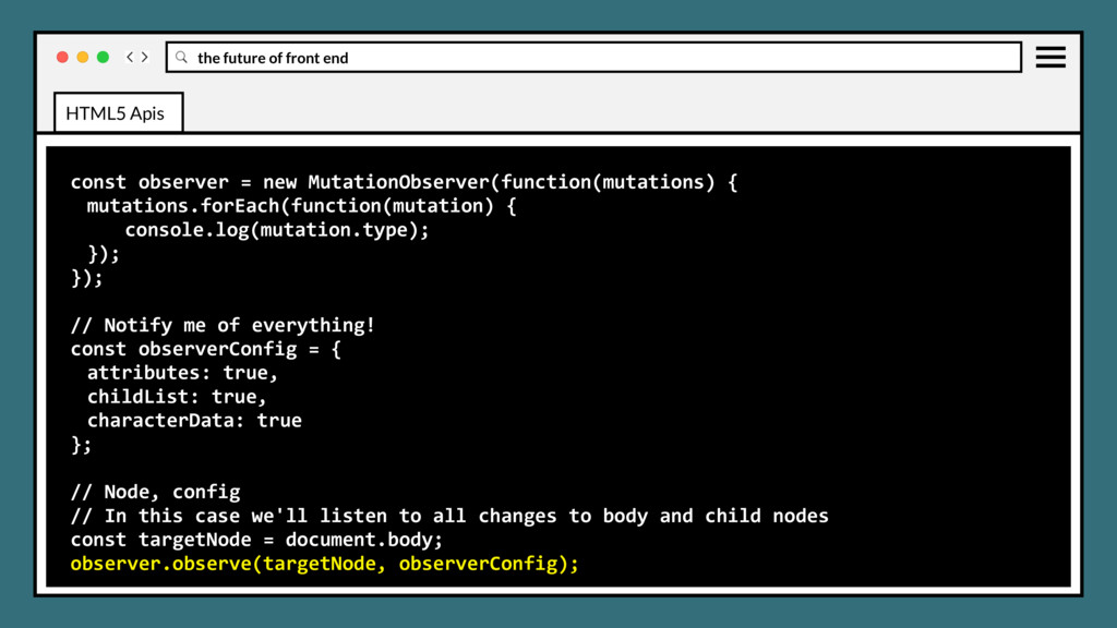
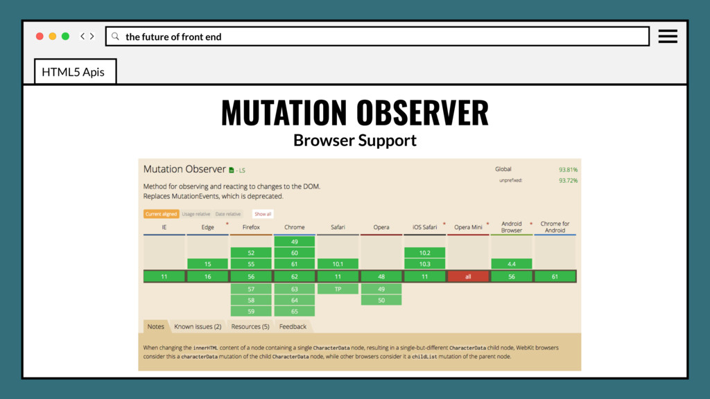
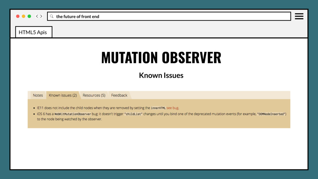
callback functions that can be delivered after multiple changes in the DOM (attribute, child nodes, etc.) Replaces slow, expensive, and error prone Mutation Events (DOMNodeRemoved, DOMAttrModified, etc.) HTML5 Apis
callback functions that can be delivered after multiple changes in the DOM (attribute, child nodes, etc.) Replaces slow, expensive, and error prone Mutation Events (DOMNodeRemoved, DOMAttrModified, etc.) Evergreen since 2013, becoming popular with performance at forefront. HTML5 Apis
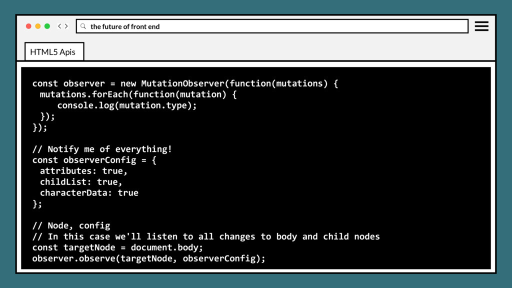
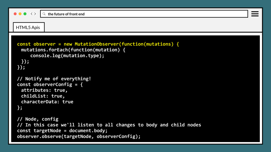
{ mutations.forEach(function(mutation) { console.log(mutation.type); }); }); // Notify me of everything! const observerConfig = { attributes: true, childList: true, characterData: true }; // Node, config // In this case we'll listen to all changes to body and child nodes const targetNode = document.body; observer.observe(targetNode, observerConfig); HTML5 Apis
{ mutations.forEach(function(mutation) { console.log(mutation.type); }); }); // Notify me of everything! const observerConfig = { attributes: true, childList: true, characterData: true }; // Node, config // In this case we'll listen to all changes to body and child nodes const targetNode = document.body; observer.observe(targetNode, observerConfig); HTML5 Apis
{ mutations.forEach(function(mutation) { console.log(mutation.type); }); }); // Notify me of everything! const observerConfig = { attributes: true, childList: true, characterData: true }; // Node, config // In this case we'll listen to all changes to body and child nodes const targetNode = document.body; observer.observe(targetNode, observerConfig); HTML5 Apis
{ mutations.forEach(function(mutation) { console.log(mutation.type); }); }); // Notify me of everything! const observerConfig = { attributes: true, childList: true, characterData: true }; // Node, config // In this case we'll listen to all changes to body and child nodes const targetNode = document.body; observer.observe(targetNode, observerConfig); HTML5 Apis
{ mutations.forEach(function(mutation) { console.log(mutation.type); }); }); // Notify me of everything! const observerConfig = { attributes: true, childList: true, characterData: true }; // Node, config // In this case we'll listen to all changes to body and child nodes const targetNode = document.body; observer.observe(targetNode, observerConfig); HTML5 Apis
{ mutations.forEach(function(mutation) { console.log(mutation.type); }); }); // Notify me of everything! const observerConfig = { attributes: true, childList: true, characterData: true }; // Node, config // In this case we'll listen to all changes to body and child nodes const targetNode = document.body; observer.observe(targetNode, observerConfig); HTML5 Apis
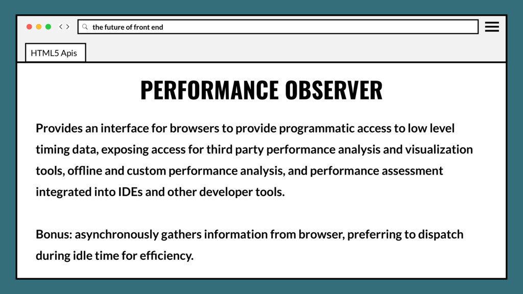
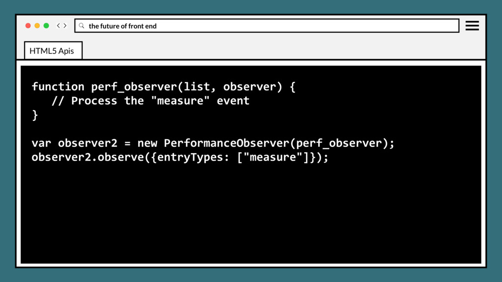
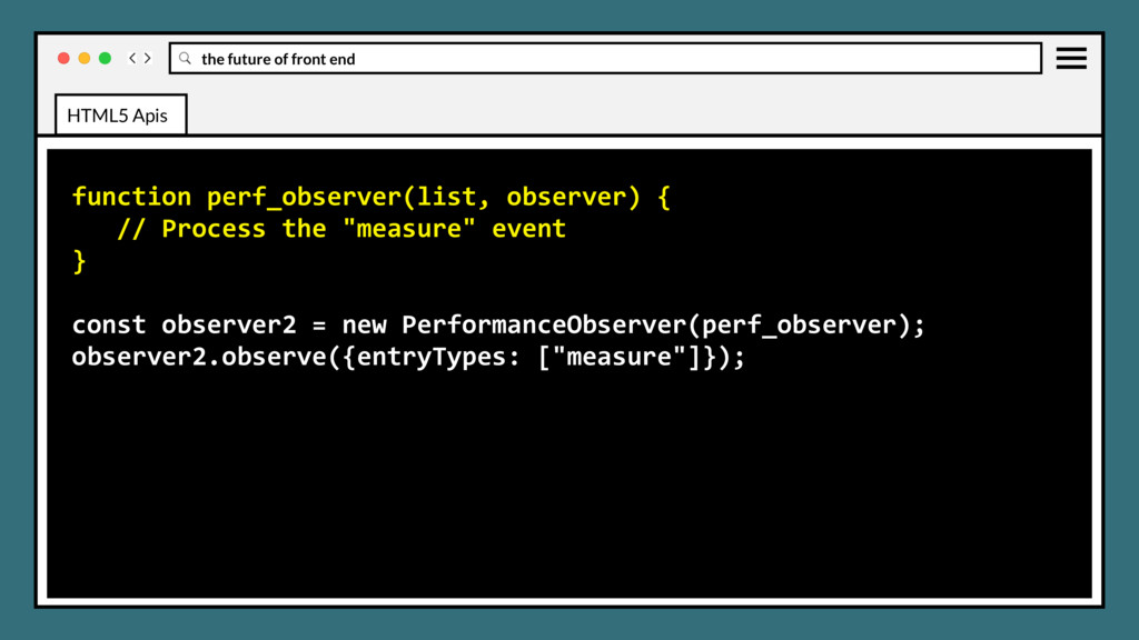
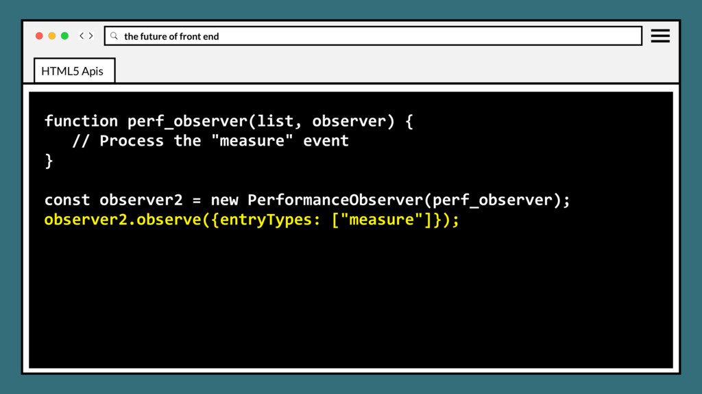
for browsers to provide programmatic access to low level timing data, exposing access for third party performance analysis and visualization tools, offline and custom performance analysis, and performance assessment integrated into IDEs and other developer tools. HTML5 Apis
for browsers to provide programmatic access to low level timing data, exposing access for third party performance analysis and visualization tools, offline and custom performance analysis, and performance assessment integrated into IDEs and other developer tools. Bonus: asynchronously gathers information from browser, preferring to dispatch during idle time for efficiency. HTML5 Apis
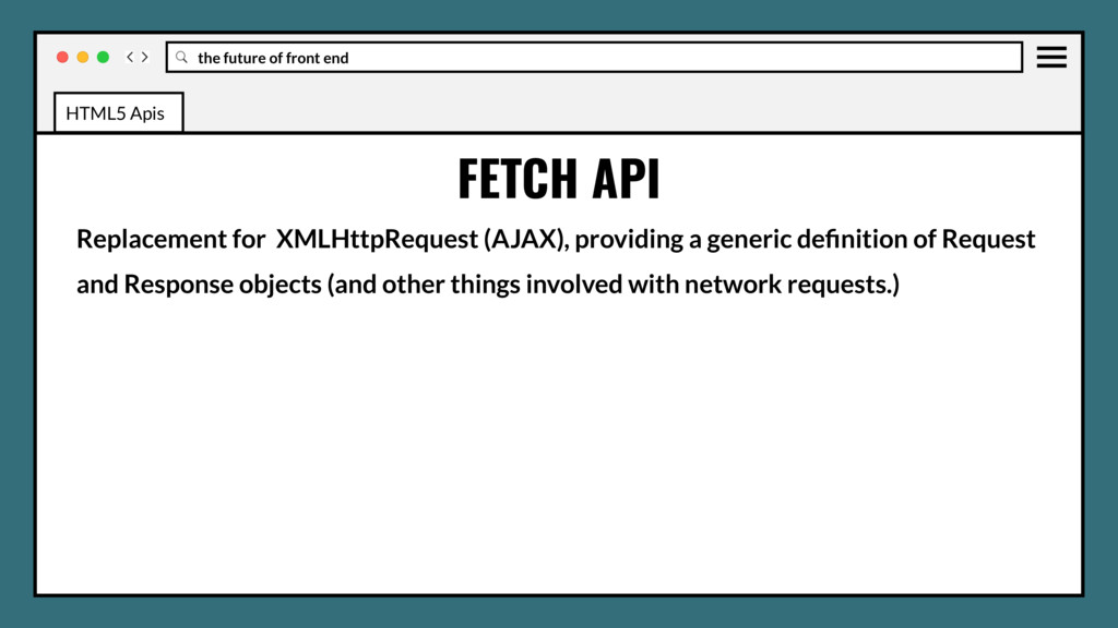
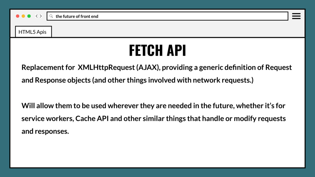
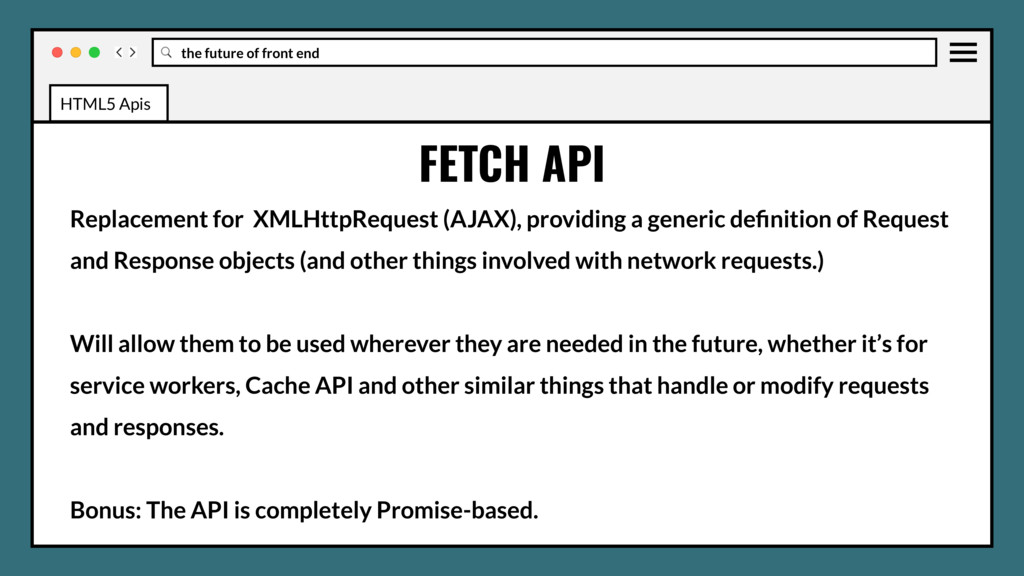
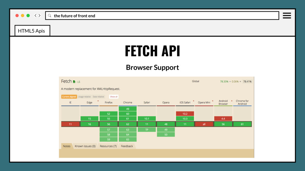
(AJAX), providing a generic definition of Request and Response objects (and other things involved with network requests.) Will allow them to be used wherever they are needed in the future, whether it’s for service workers, Cache API and other similar things that handle or modify requests and responses. HTML5 Apis
(AJAX), providing a generic definition of Request and Response objects (and other things involved with network requests.) Will allow them to be used wherever they are needed in the future, whether it’s for service workers, Cache API and other similar things that handle or modify requests and responses. Bonus: The API is completely Promise-based. HTML5 Apis
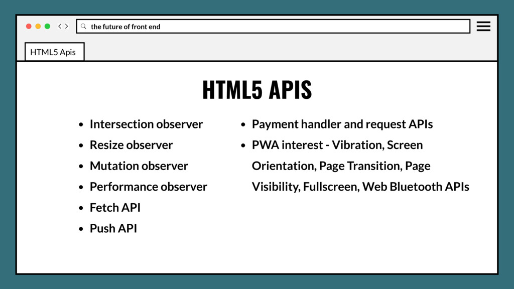
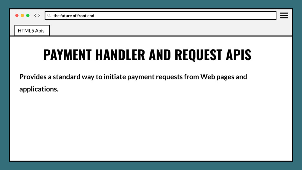
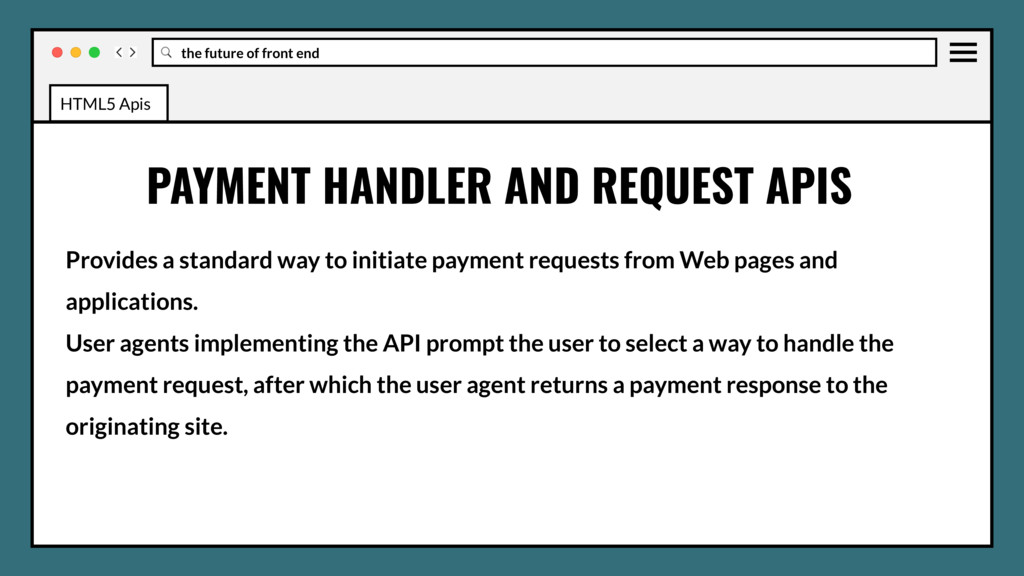
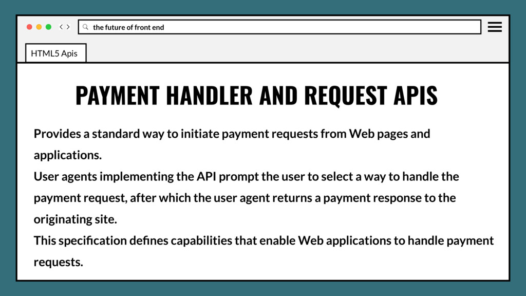
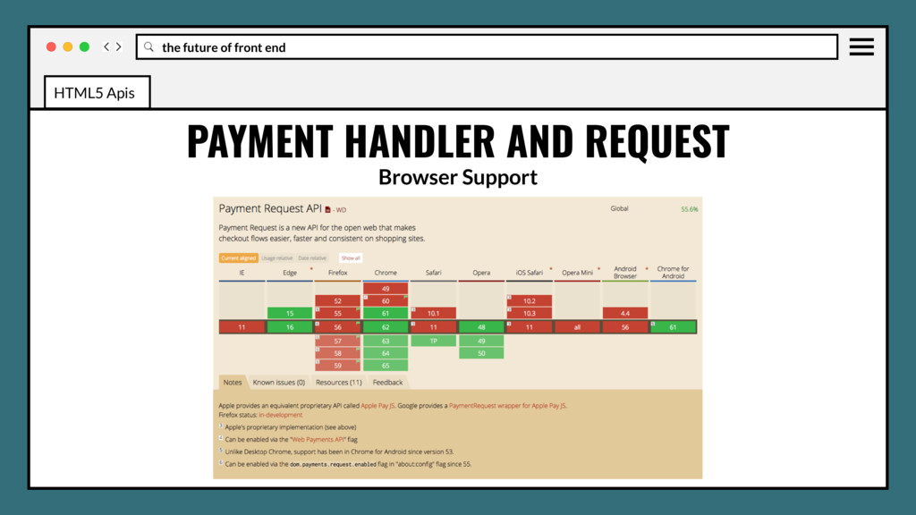
initiate payment requests from Web pages and applications. User agents implementing the API prompt the user to select a way to handle the payment request, after which the user agent returns a payment response to the originating site. PAYMENT HANDLER AND REQUEST APIS HTML5 Apis
initiate payment requests from Web pages and applications. User agents implementing the API prompt the user to select a way to handle the payment request, after which the user agent returns a payment response to the originating site. This specification defines capabilities that enable Web applications to handle payment requests. PAYMENT HANDLER AND REQUEST APIS HTML5 Apis
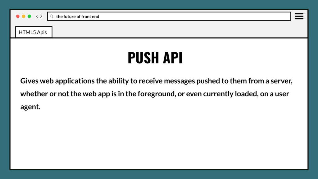
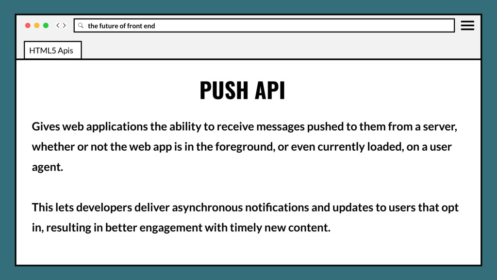
to receive messages pushed to them from a server, whether or not the web app is in the foreground, or even currently loaded, on a user agent. PUSH API HTML5 Apis
to receive messages pushed to them from a server, whether or not the web app is in the foreground, or even currently loaded, on a user agent. This lets developers deliver asynchronous notifications and updates to users that opt in, resulting in better engagement with timely new content. PUSH API HTML5 Apis
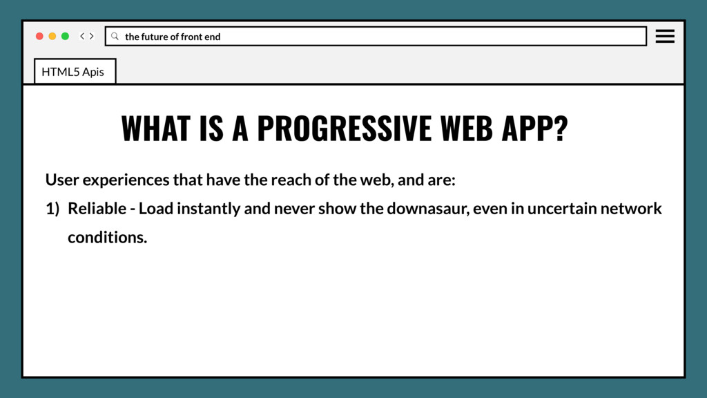
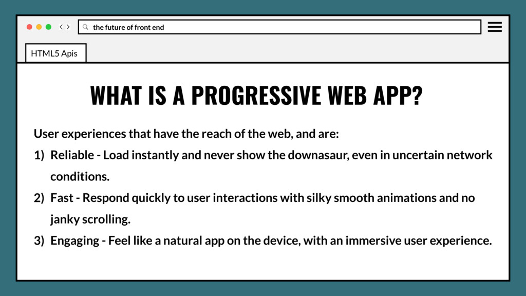
reach of the web, and are: 1) Reliable - Load instantly and never show the downasaur, even in uncertain network conditions. WHAT IS A PROGRESSIVE WEB APP? HTML5 Apis
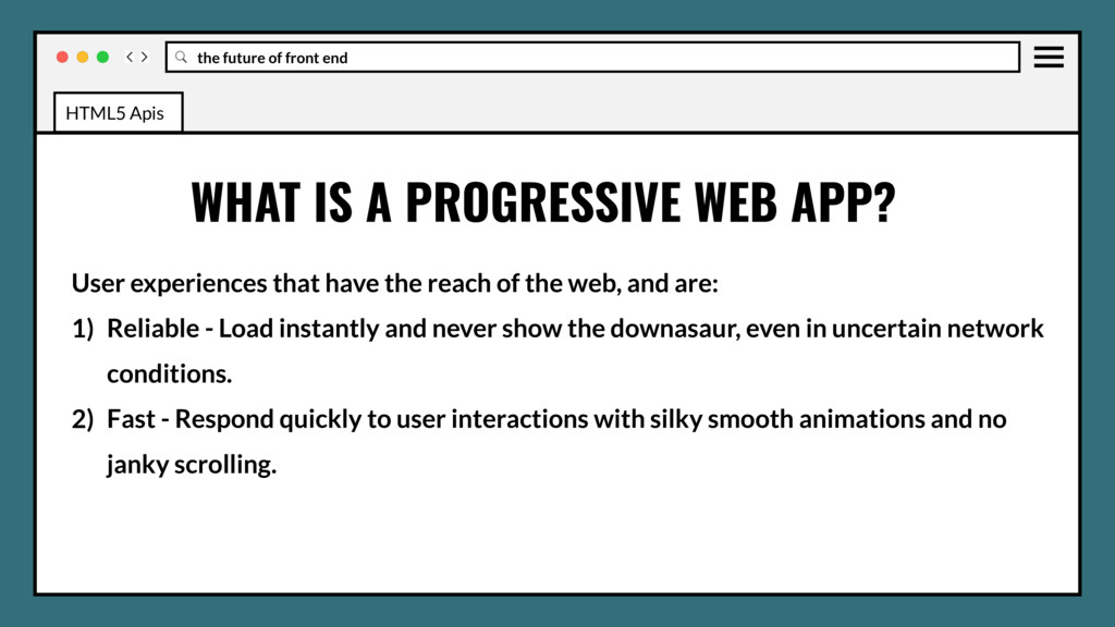
reach of the web, and are: 1) Reliable - Load instantly and never show the downasaur, even in uncertain network conditions. 2) Fast - Respond quickly to user interactions with silky smooth animations and no janky scrolling. WHAT IS A PROGRESSIVE WEB APP? HTML5 Apis
reach of the web, and are: 1) Reliable - Load instantly and never show the downasaur, even in uncertain network conditions. 2) Fast - Respond quickly to user interactions with silky smooth animations and no janky scrolling. 3) Engaging - Feel like a natural app on the device, with an immersive user experience. WHAT IS A PROGRESSIVE WEB APP? HTML5 Apis
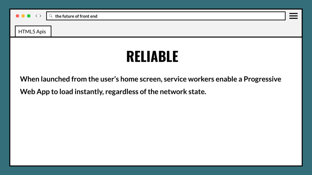
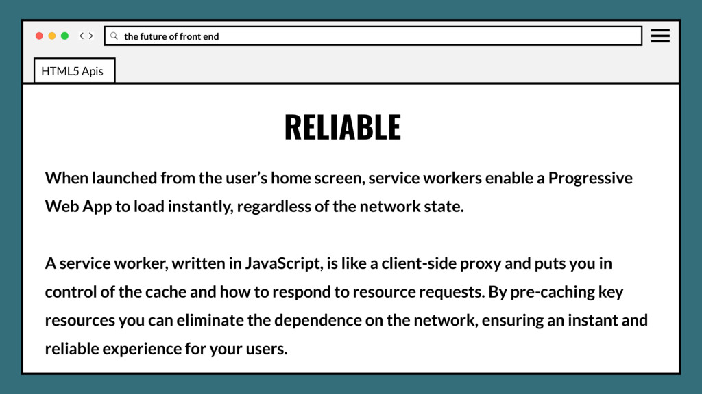
home screen, service workers enable a Progressive Web App to load instantly, regardless of the network state. A service worker, written in JavaScript, is like a client-side proxy and puts you in control of the cache and how to respond to resource requests. By pre-caching key resources you can eliminate the dependence on the network, ensuring an instant and reliable experience for your users. RELIABLE HTML5 Apis
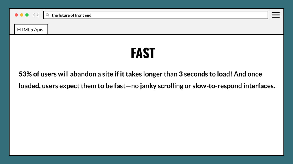
a site if it takes longer than 3 seconds to load! And once loaded, users expect them to be fast—no janky scrolling or slow-to-respond interfaces. FAST HTML5 Apis
and live on the user's home screen, without the need for an app store. They offer an immersive full screen experience with help from a web app manifest file and can even re-engage users with web push notifications. ENGAGING HTML5 Apis
and live on the user's home screen, without the need for an app store. They offer an immersive full screen experience with help from a web app manifest file and can even re-engage users with web push notifications. The Web App Manifest allows you to control how your app appears and how it's launched. You can specify home screen icons, the page to load when the app is launched, screen orientation, and even whether or not to show the browser chrome. ENGAGING HTML5 Apis
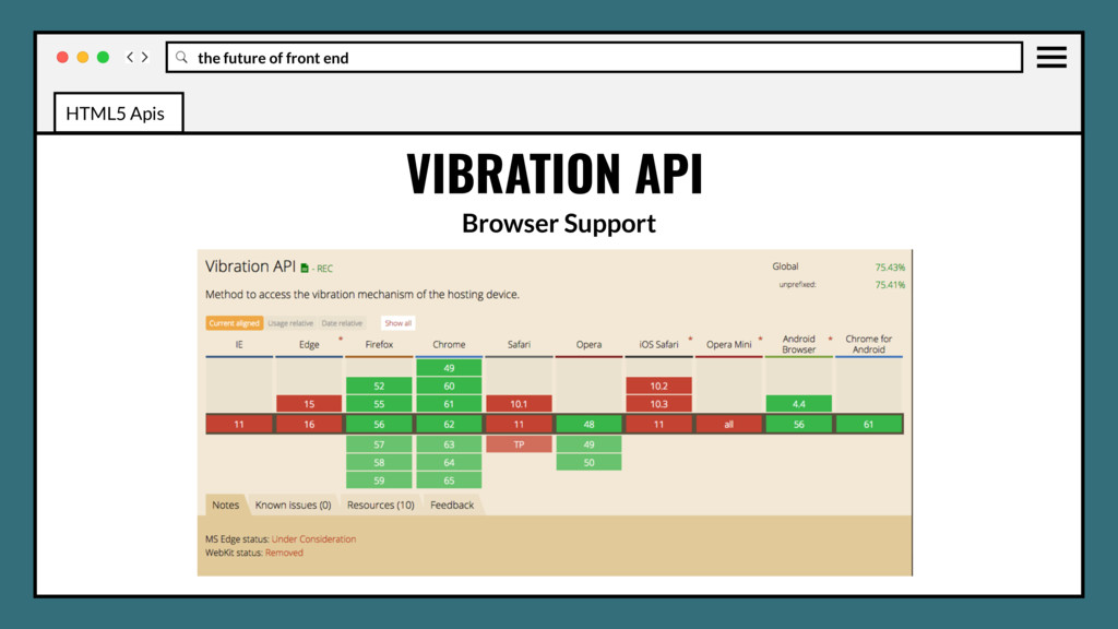
vibration hardware, which lets software code provide physical feedback to the user by causing the device to shake. The Vibration API offers Web apps the ability to access this hardware, allowing use to enhance UI actions and notifications. VIBRATION API HTML5 Apis
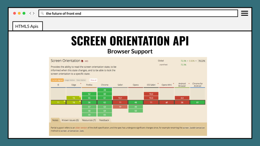
the ability to read the screen orientation type and angle, to be informed when the screen orientation state changes, and be able to lock the screen orientation to a specific state. SCREEN ORIENTATION API HTML5 Apis
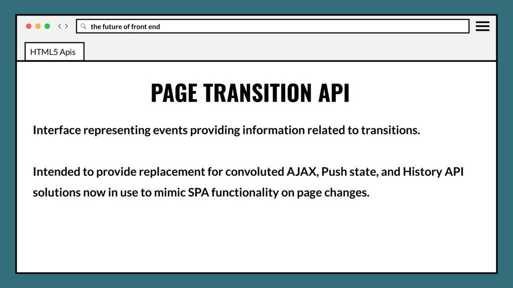
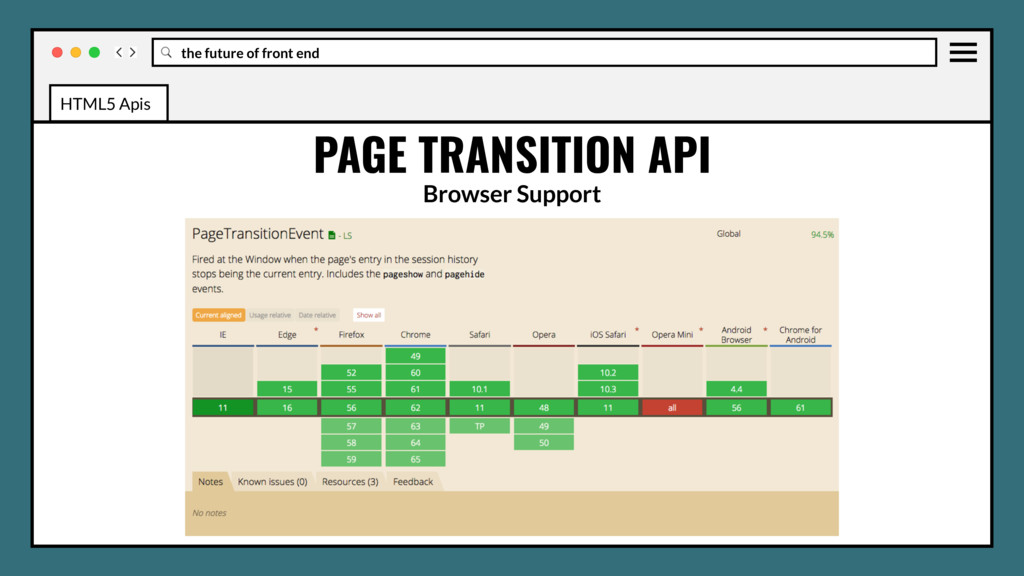
related to transitions. Intended to provide replacement for convoluted AJAX, Push state, and History API solutions now in use to mimic SPA functionality on page changes. PAGE TRANSITION API HTML5 Apis
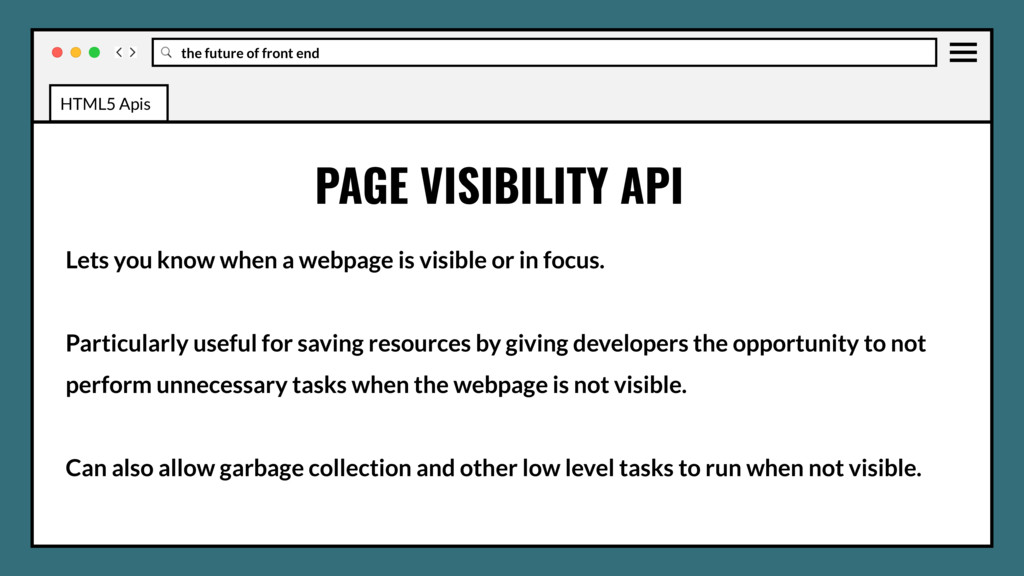
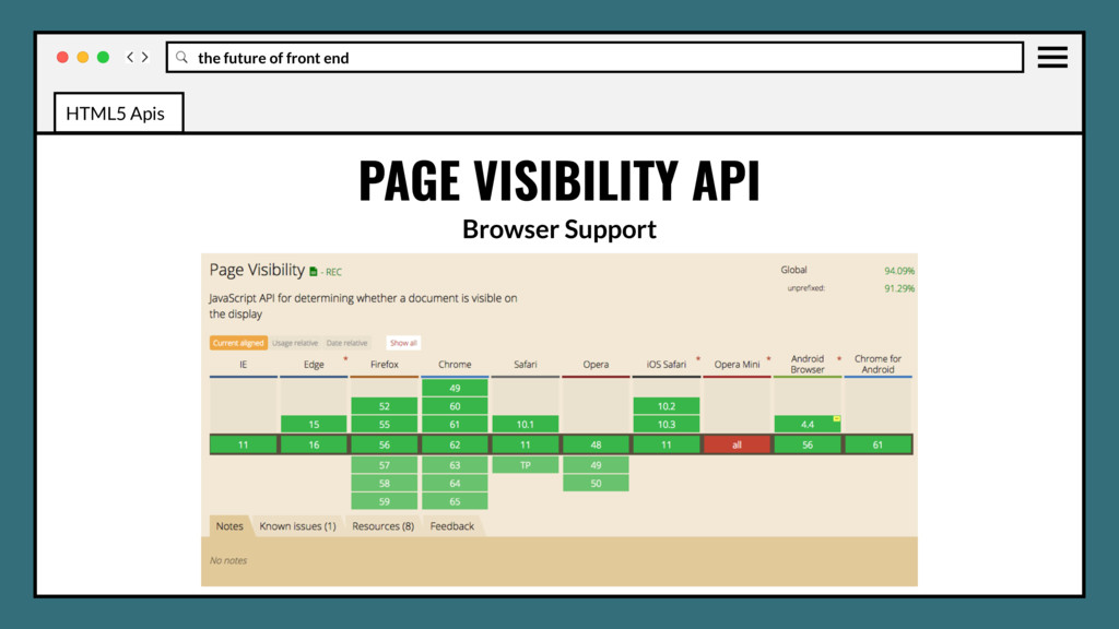
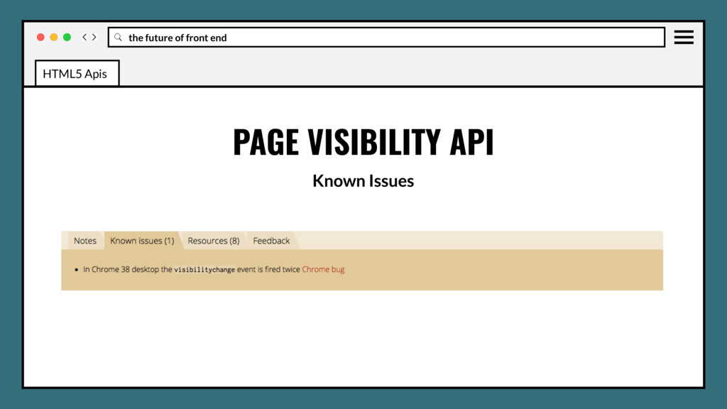
webpage is visible or in focus. Particularly useful for saving resources by giving developers the opportunity to not perform unnecessary tasks when the webpage is not visible. PAGE VISIBILITY API HTML5 Apis
webpage is visible or in focus. Particularly useful for saving resources by giving developers the opportunity to not perform unnecessary tasks when the webpage is not visible. Can also allow garbage collection and other low level tasks to run when not visible. PAGE VISIBILITY API HTML5 Apis
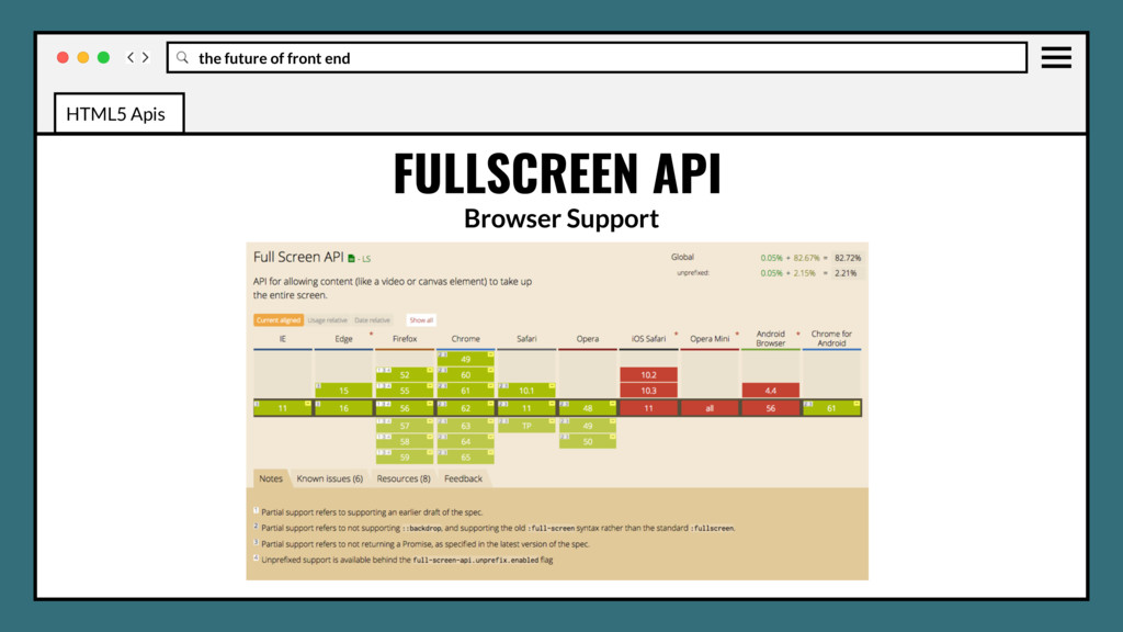
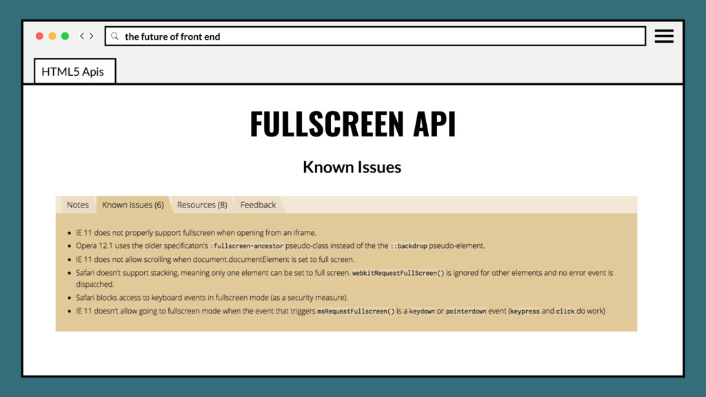
web content to be presented using the user's entire screen. Lets you easily direct the browser to make an element and its children, if any, occupy the fullscreen, eliminating all browser user interface and other applications from the screen for the duration. FULLSCREEN API HTML5 Apis
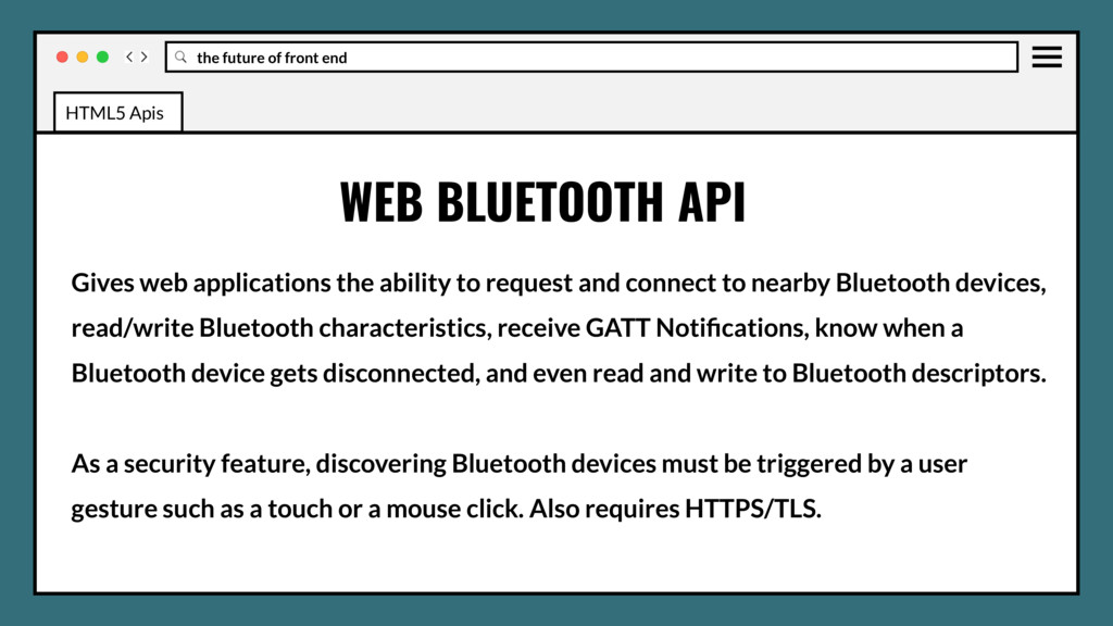
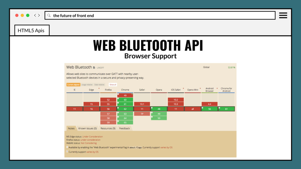
to request and connect to nearby Bluetooth devices, read/write Bluetooth characteristics, receive GATT Notifications, know when a Bluetooth device gets disconnected, and even read and write to Bluetooth descriptors. WEB BLUETOOTH API HTML5 Apis
to request and connect to nearby Bluetooth devices, read/write Bluetooth characteristics, receive GATT Notifications, know when a Bluetooth device gets disconnected, and even read and write to Bluetooth descriptors. As a security feature, discovering Bluetooth devices must be triggered by a user gesture such as a touch or a mouse click. Also requires HTTPS/TLS. WEB BLUETOOTH API HTML5 Apis
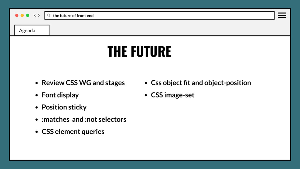
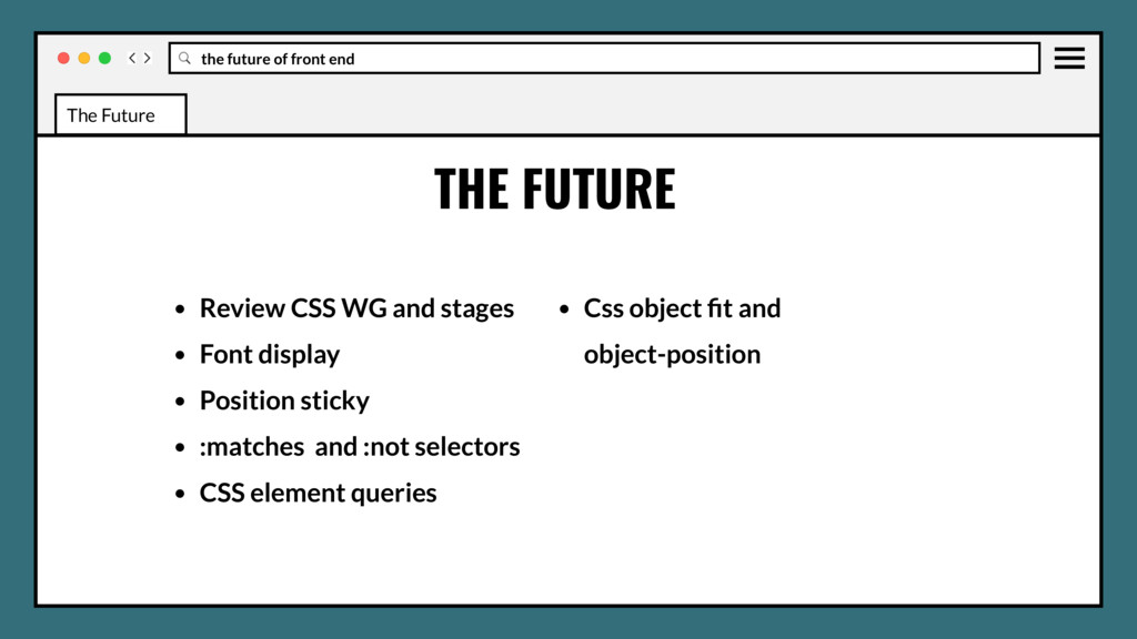
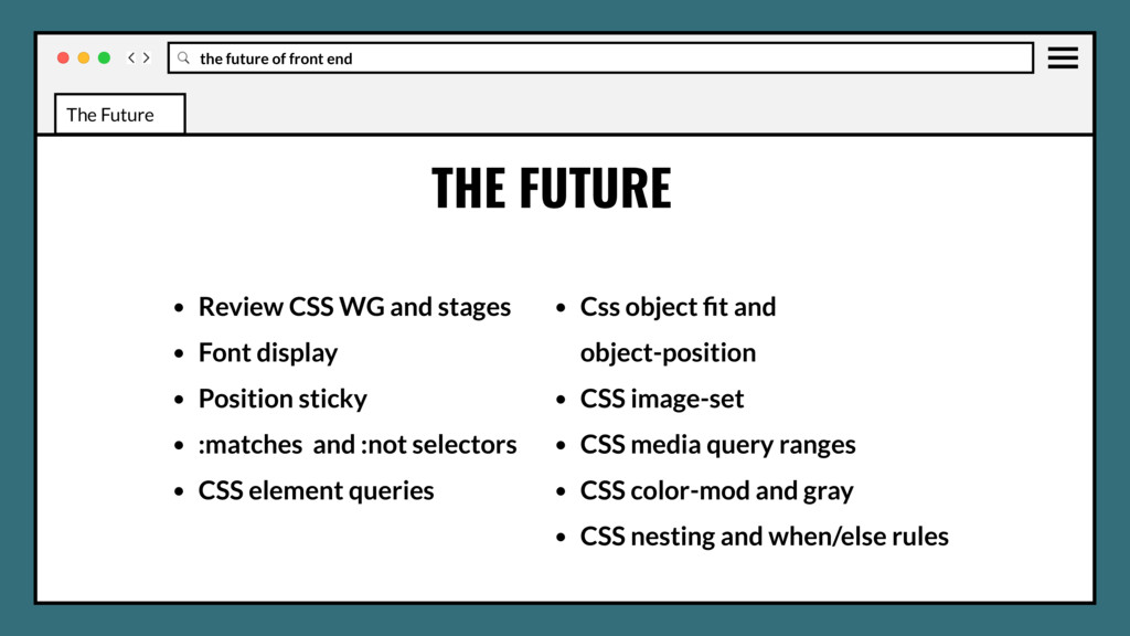
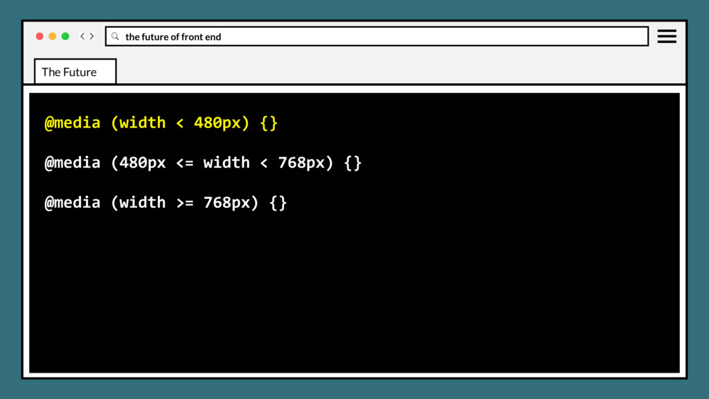
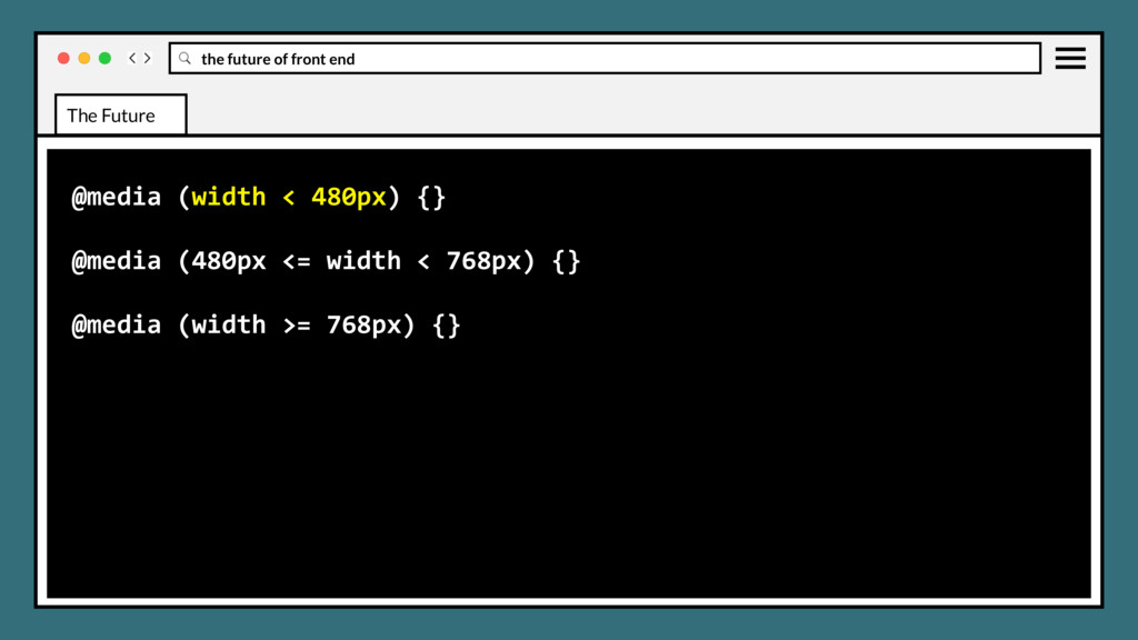
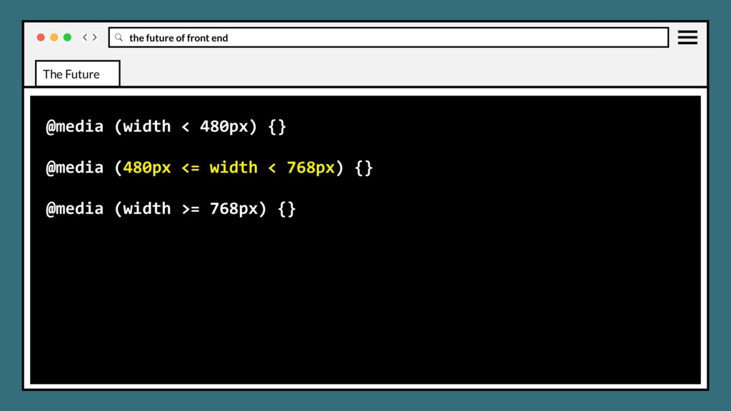
WG and stages • Font display • Position sticky • :matches and :not selectors • CSS element queries • Css object fit and object-position • CSS image-set The Future
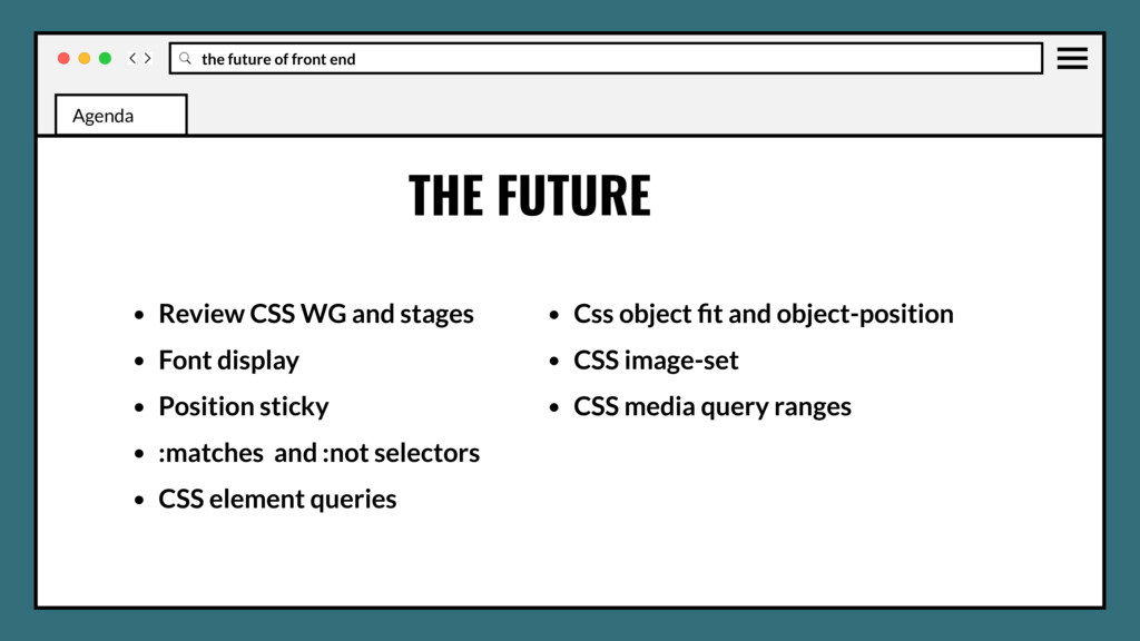
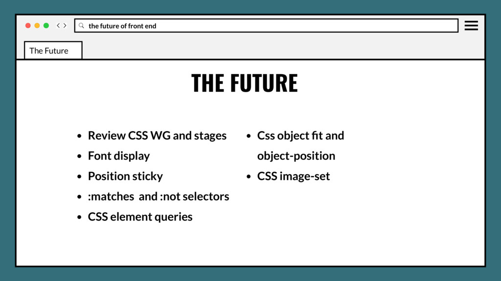
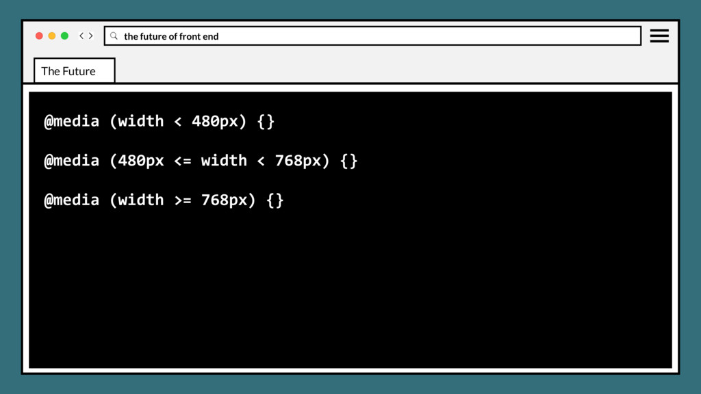
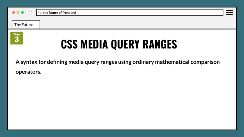
WG and stages • Font display • Position sticky • :matches and :not selectors • CSS element queries • Css object fit and object-position • CSS image-set • CSS media query ranges The Future
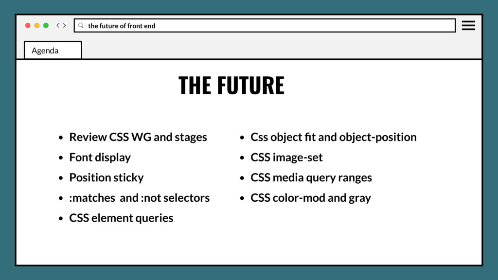
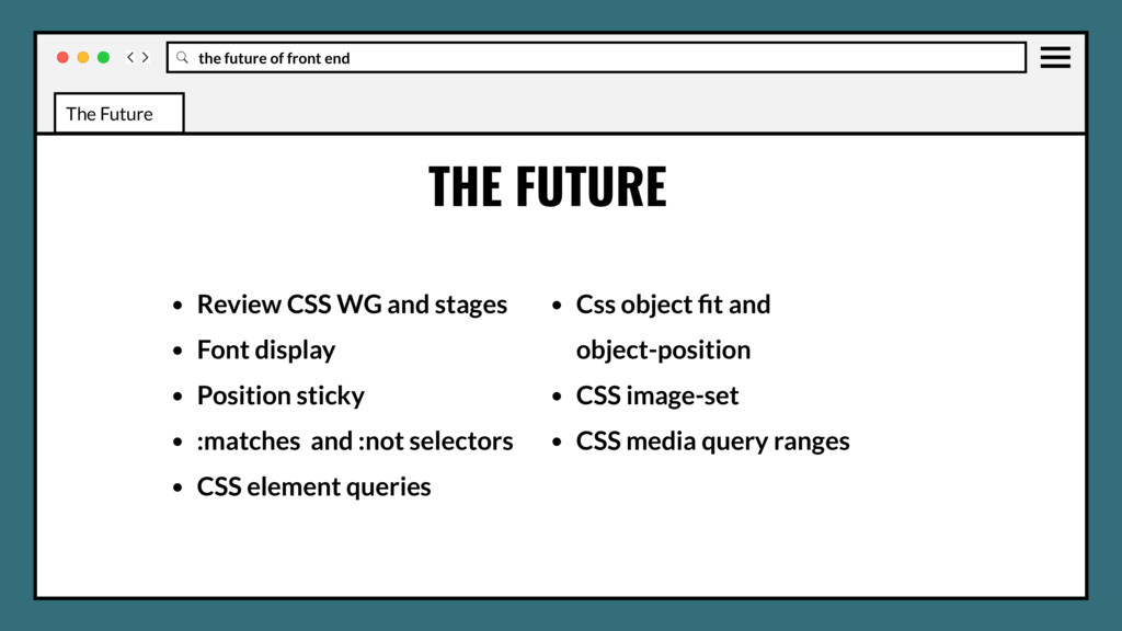
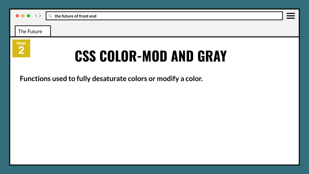
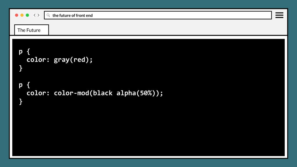
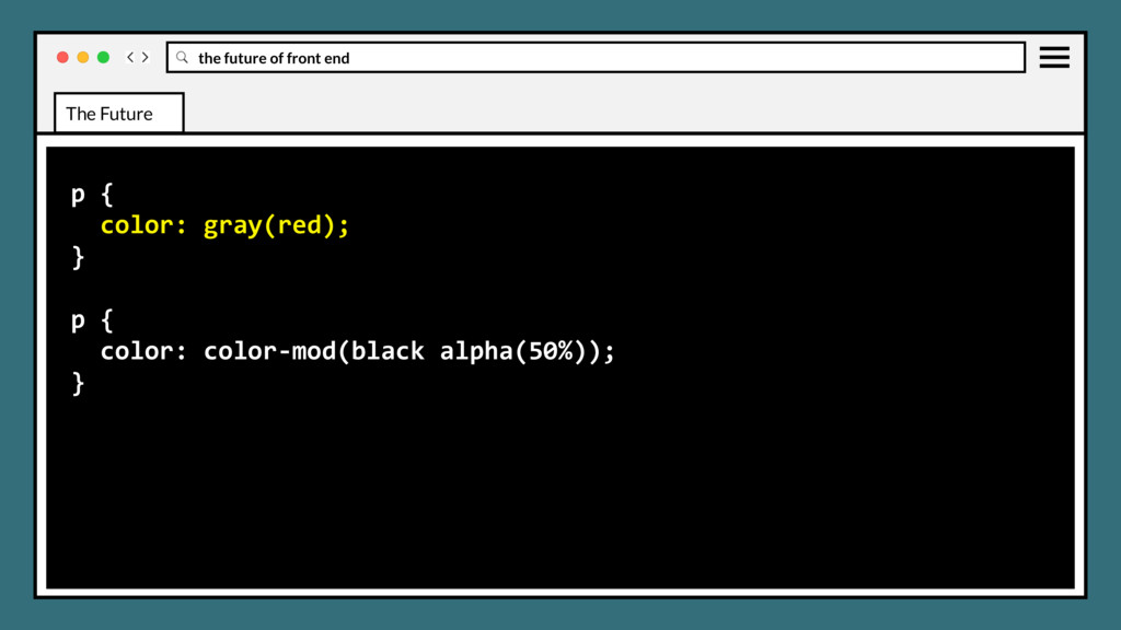
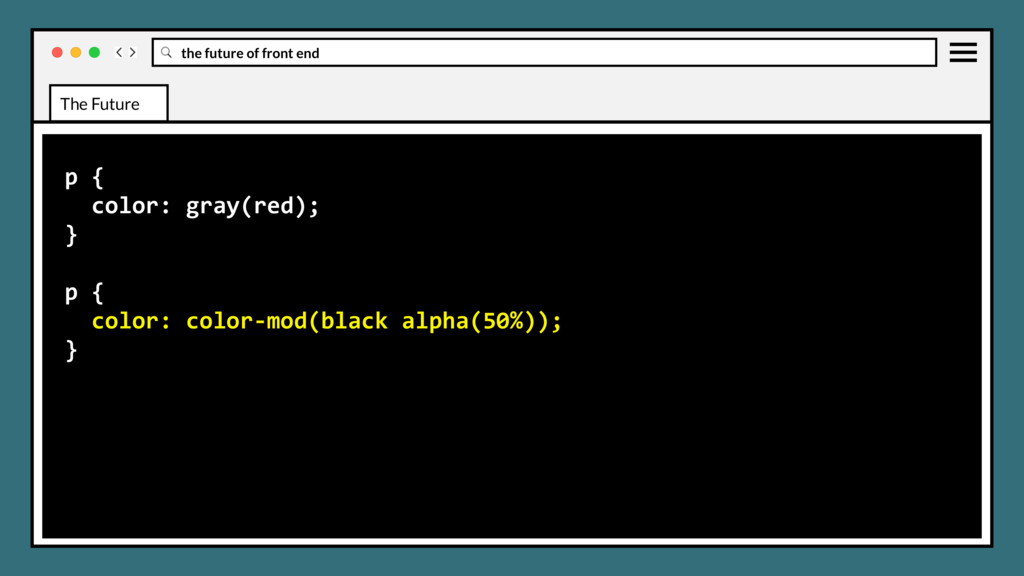
WG and stages • Font display • Position sticky • :matches and :not selectors • CSS element queries • Css object fit and object-position • CSS image-set • CSS media query ranges • CSS color-mod and gray The Future
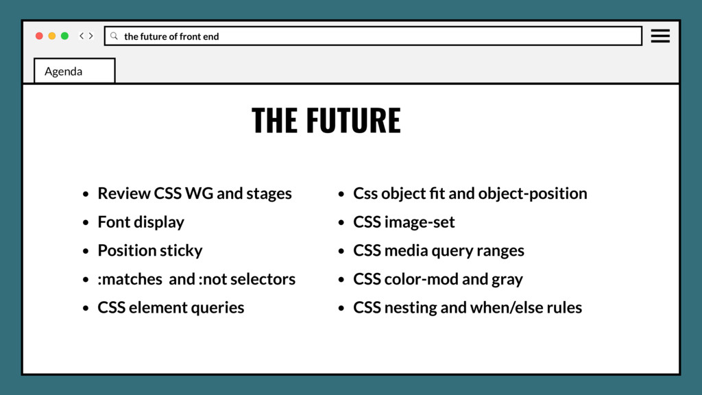
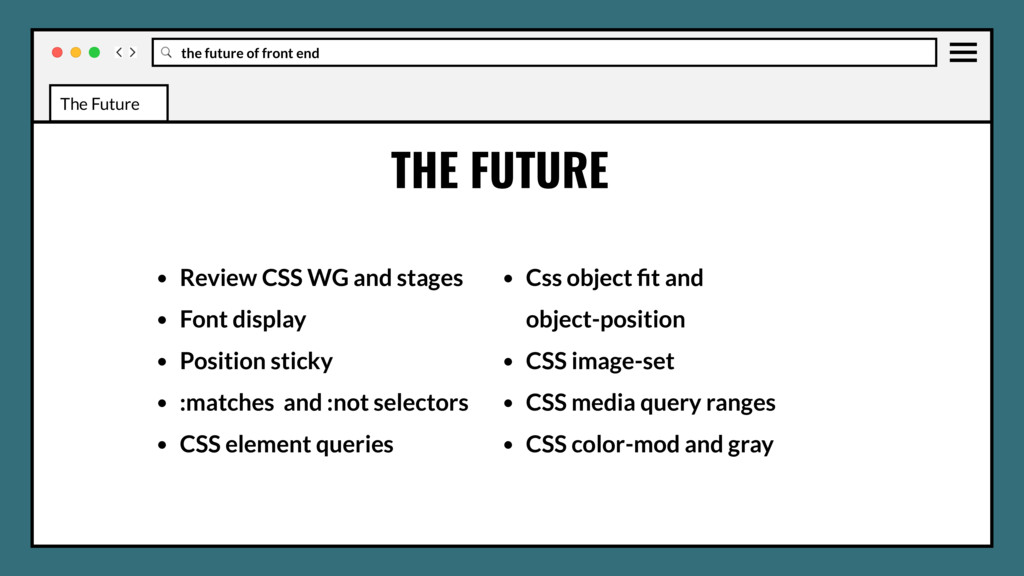
WG and stages • Font display • Position sticky • :matches and :not selectors • CSS element queries • Css object fit and object-position • CSS image-set • CSS media query ranges • CSS color-mod and gray • CSS nesting and when/else rules The Future
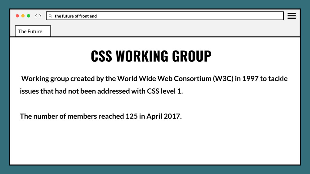
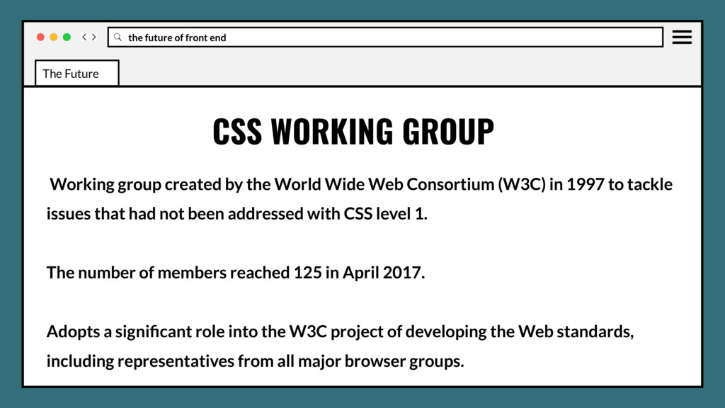
World Wide Web Consortium (W3C) in 1997 to tackle issues that had not been addressed with CSS level 1. The number of members reached 125 in April 2017. CSS WORKING GROUP The Future
World Wide Web Consortium (W3C) in 1997 to tackle issues that had not been addressed with CSS level 1. The number of members reached 125 in April 2017. Adopts a significant role into the W3C project of developing the Web standards, including representatives from all major browser groups. CSS WORKING GROUP The Future
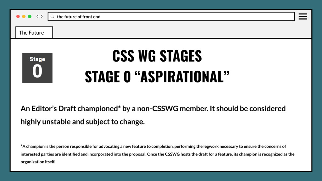
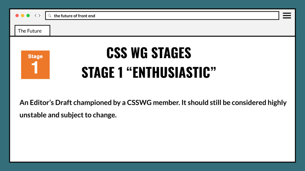
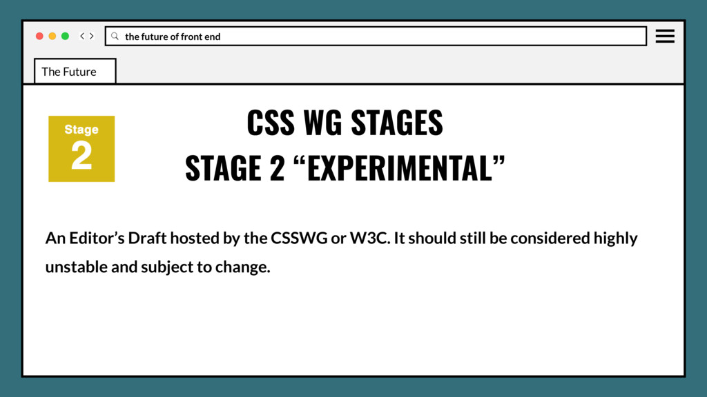
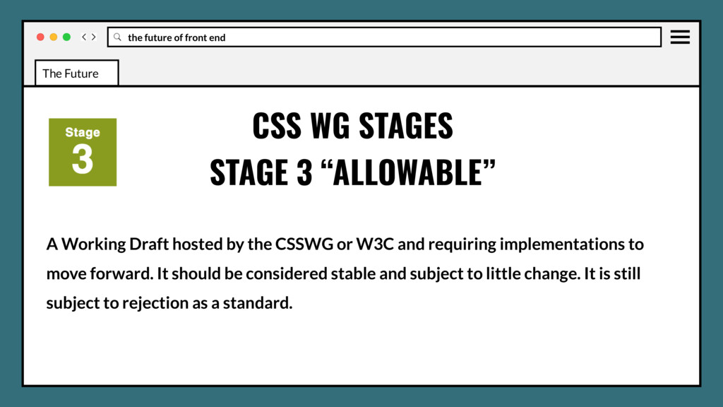
accomplish real things and get involved in the creation of standards, testing, feedback, and new use cases. Current staging process reflects the real-life stability of new CSS features. CSS WG STAGES The Future
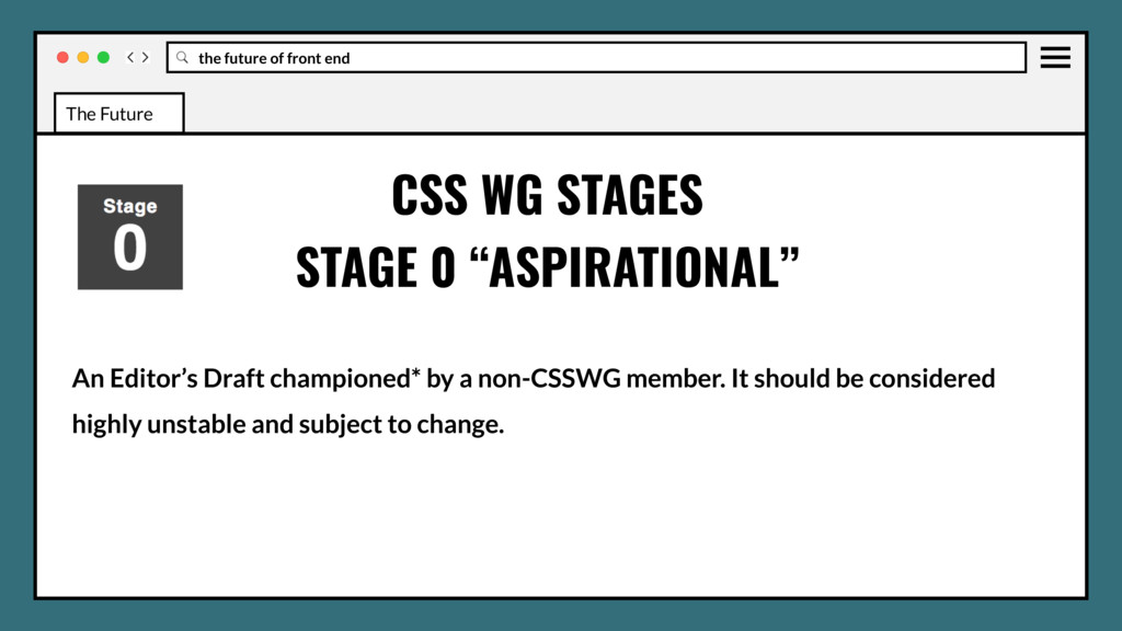
a non-CSSWG member. It should be considered highly unstable and subject to change. *A champion is the person responsible for advocating a new feature to completion, performing the legwork necessary to ensure the concerns of interested parties are identified and incorporated into the proposal. Once the CSSWG hosts the draft for a feature, its champion is recognized as the organization itself. CSS WG STAGES STAGE 0 “ASPIRATIONAL” The Future
the CSSWG or W3C and requiring implementations to move forward. It should be considered stable and subject to little change. It is still subject to rejection as a standard. CSS WG STAGES STAGE 3 “ALLOWABLE” The Future
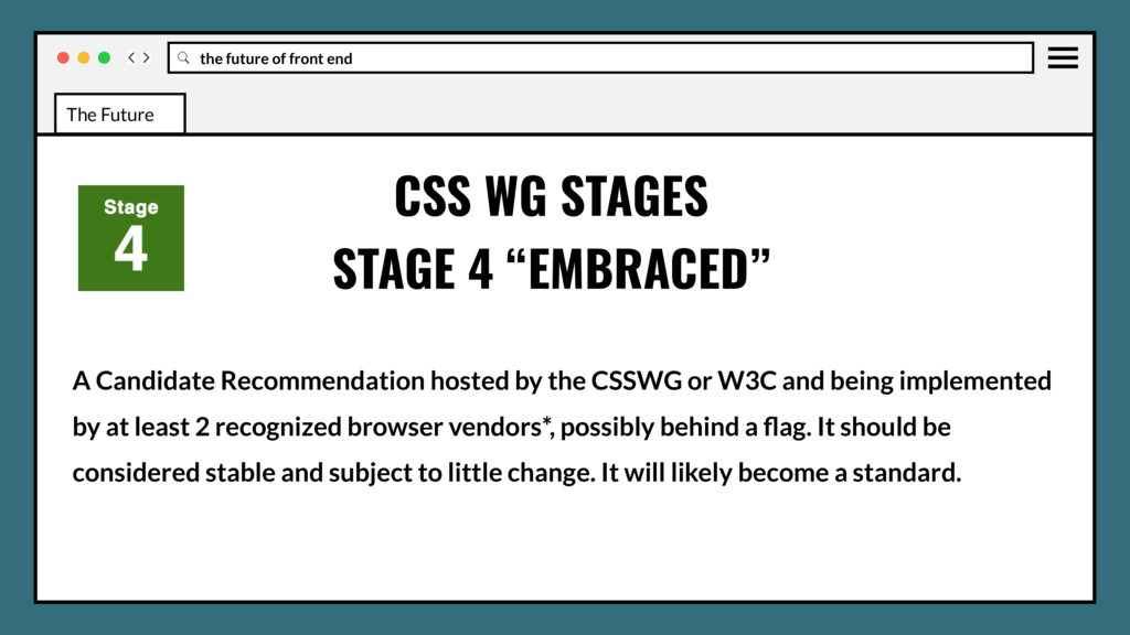
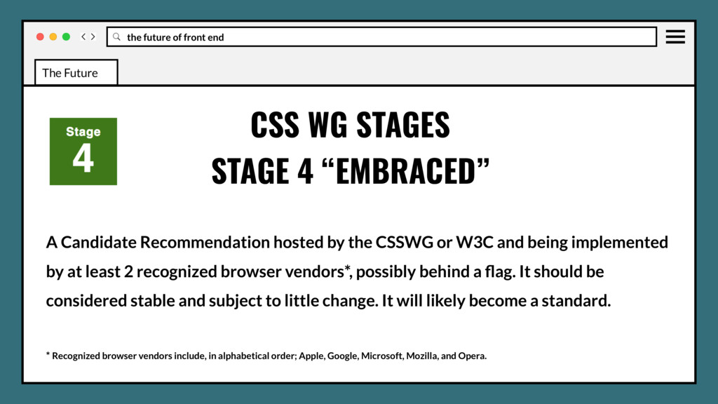
the CSSWG or W3C and being implemented by at least 2 recognized browser vendors*, possibly behind a flag. It should be considered stable and subject to little change. It will likely become a standard. CSS WG STAGES STAGE 4 “EMBRACED” The Future
the CSSWG or W3C and being implemented by at least 2 recognized browser vendors*, possibly behind a flag. It should be considered stable and subject to little change. It will likely become a standard. * Recognized browser vendors include, in alphabetical order; Apple, Google, Microsoft, Mozilla, and Opera. CSS WG STAGES STAGE 4 “EMBRACED” The Future
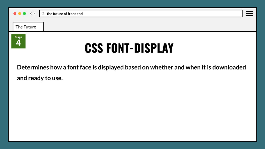
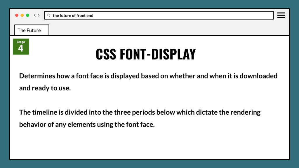
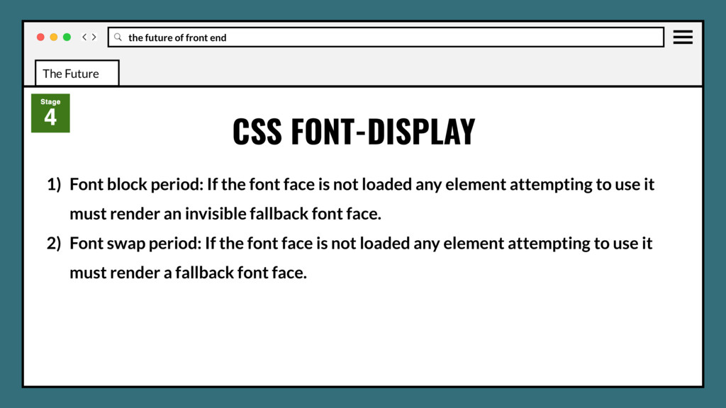
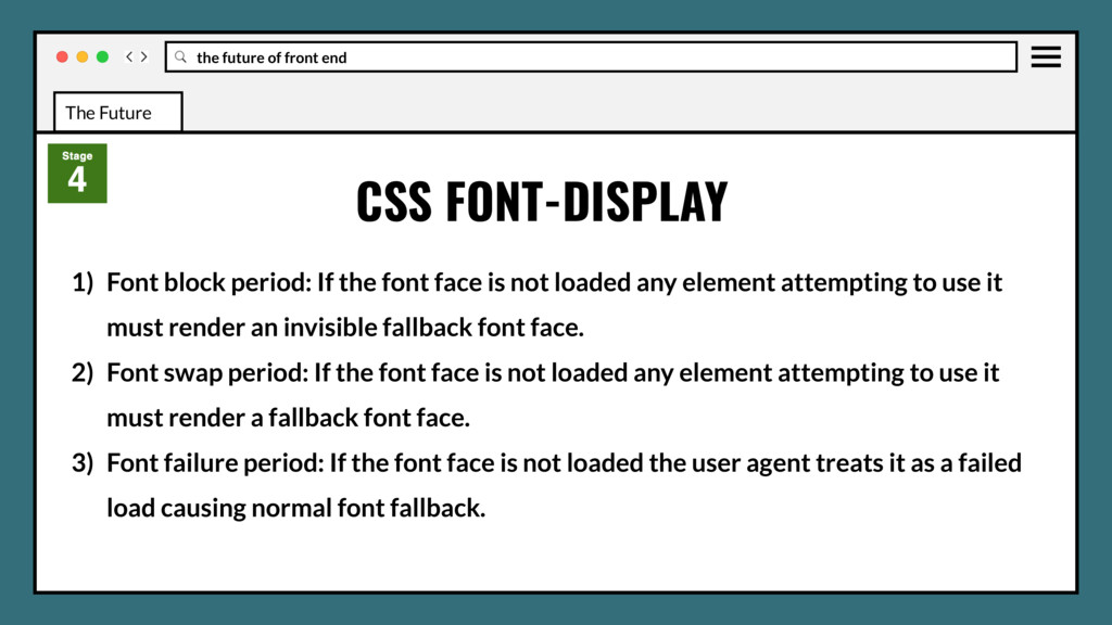
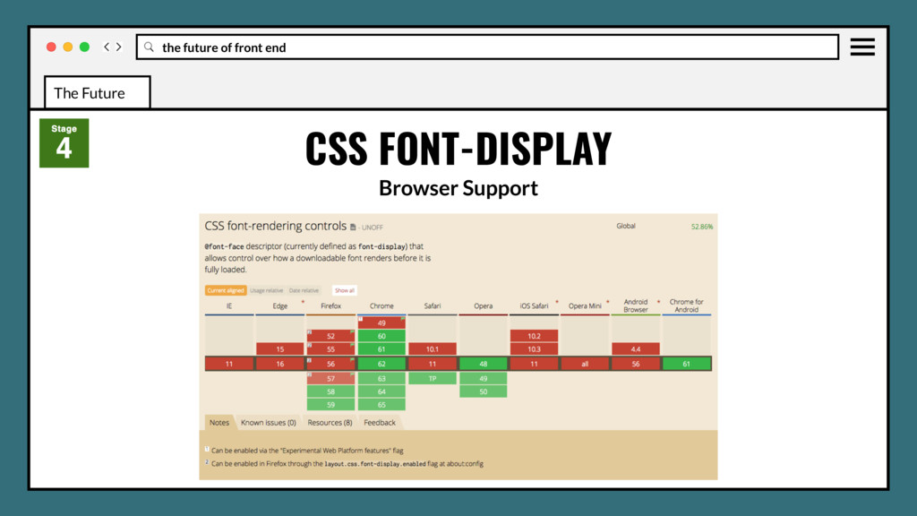
is displayed based on whether and when it is downloaded and ready to use. The timeline is divided into the three periods below which dictate the rendering behavior of any elements using the font face. CSS FONT-DISPLAY The Future
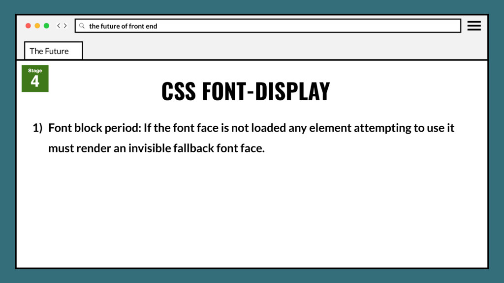
the font face is not loaded any element attempting to use it must render an invisible fallback font face. 2) Font swap period: If the font face is not loaded any element attempting to use it must render a fallback font face. CSS FONT-DISPLAY The Future
the font face is not loaded any element attempting to use it must render an invisible fallback font face. 2) Font swap period: If the font face is not loaded any element attempting to use it must render a fallback font face. 3) Font failure period: If the font face is not loaded the user agent treats it as a failed load causing normal font fallback. CSS FONT-DISPLAY The Future
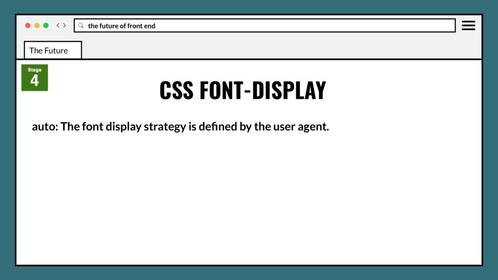
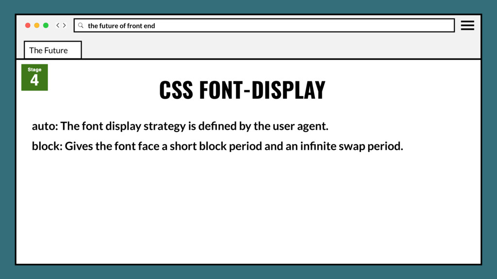
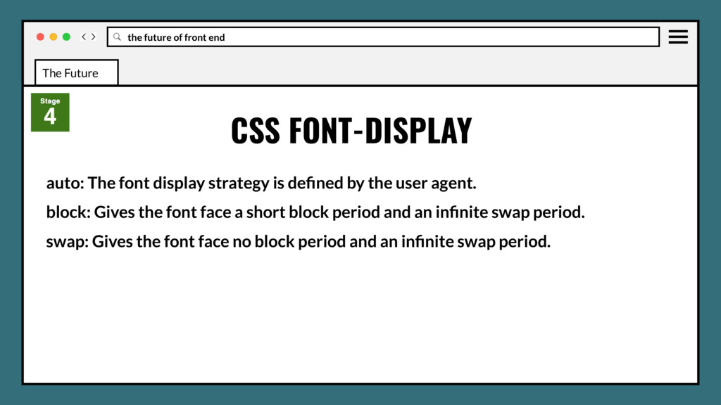
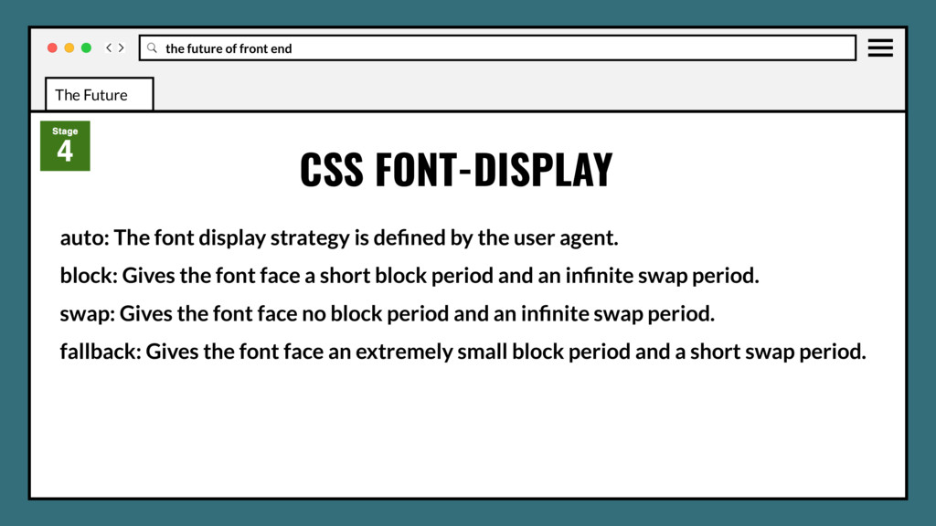
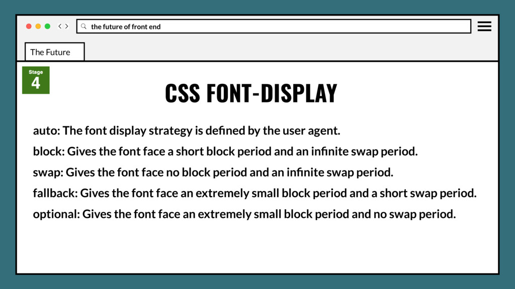
The font display strategy is defined by the user agent. block: Gives the font face a short block period and an infinite swap period. swap: Gives the font face no block period and an infinite swap period.
The font display strategy is defined by the user agent. block: Gives the font face a short block period and an infinite swap period. swap: Gives the font face no block period and an infinite swap period. fallback: Gives the font face an extremely small block period and a short swap period.
The font display strategy is defined by the user agent. block: Gives the font face a short block period and an infinite swap period. swap: Gives the font face no block period and an infinite swap period. fallback: Gives the font face an extremely small block period and a short swap period. optional: Gives the font face an extremely small block period and no swap period.
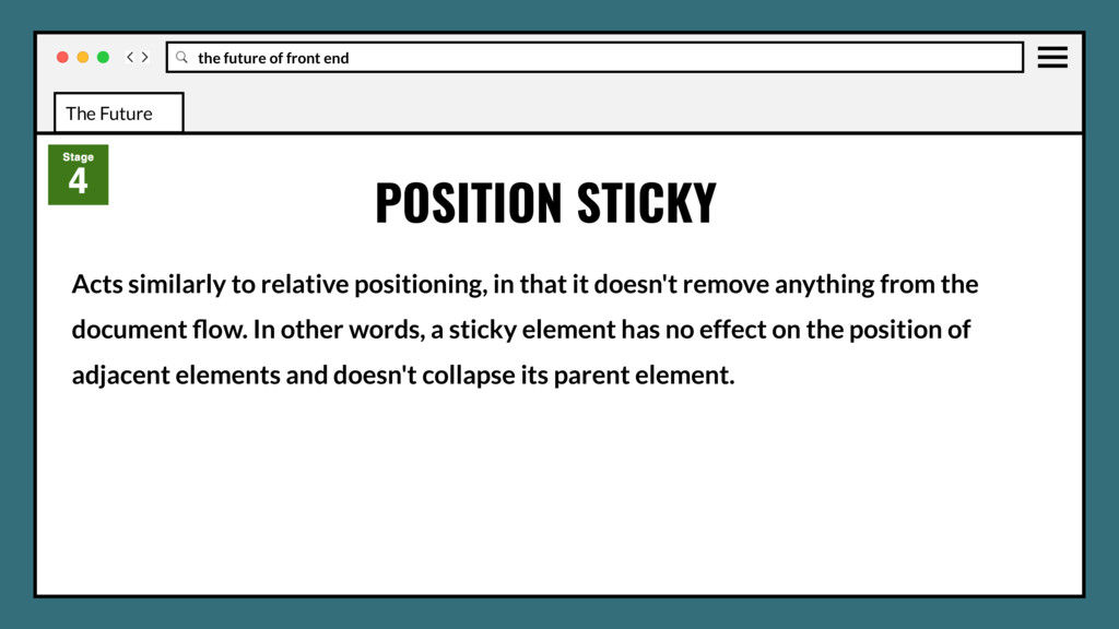
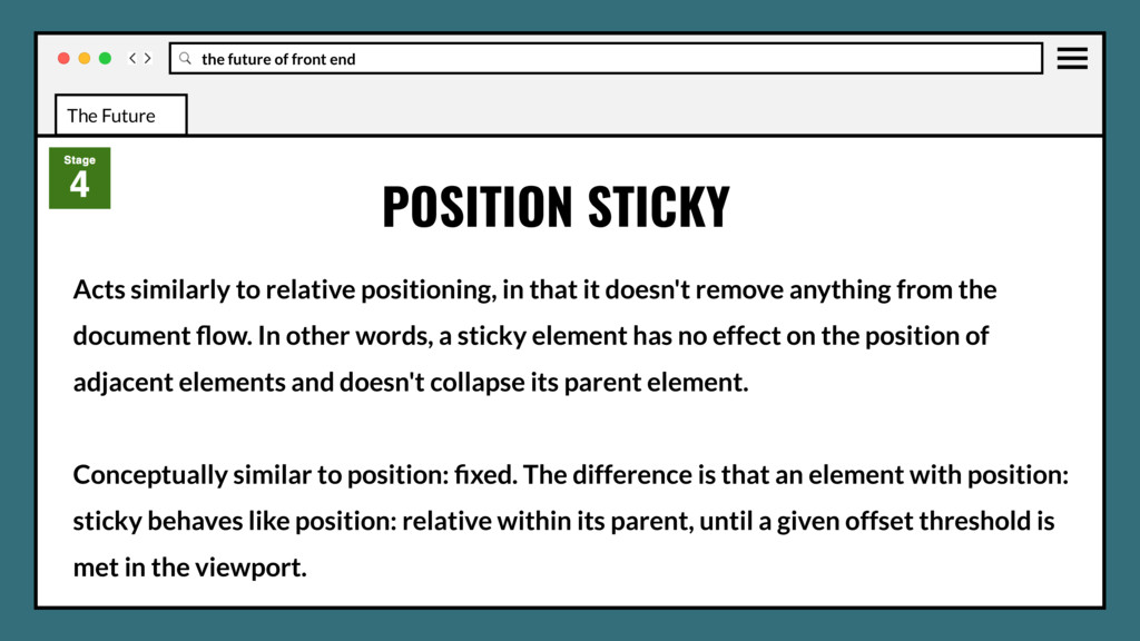
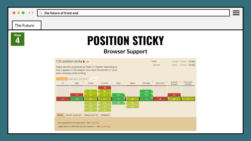
in that it doesn't remove anything from the document flow. In other words, a sticky element has no effect on the position of adjacent elements and doesn't collapse its parent element. POSITION STICKY The Future
in that it doesn't remove anything from the document flow. In other words, a sticky element has no effect on the position of adjacent elements and doesn't collapse its parent element. Conceptually similar to position: fixed. The difference is that an element with position: sticky behaves like position: relative within its parent, until a given offset threshold is met in the viewport. POSITION STICKY The Future
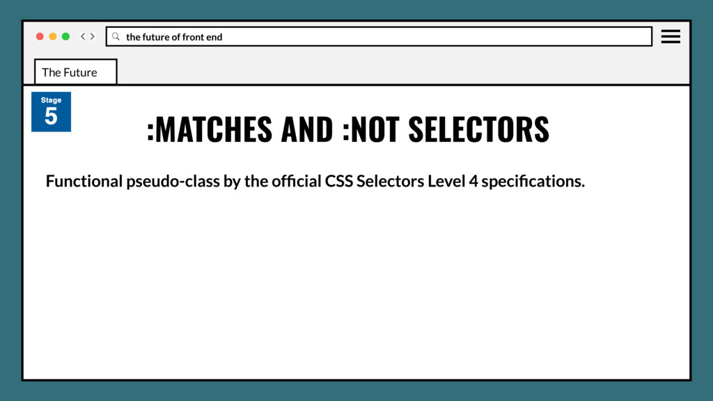
CSS Selectors Level 4 specifications. It doesn't serve any purpose in itself except making some complex selectors lighter by allowing them to be grouped. In a way, we can think as :matches as syntactic sugar. :MATCHES AND :NOT SELECTORS The Future
CSS Selectors Level 4 specifications. It doesn't serve any purpose in itself except making some complex selectors lighter by allowing them to be grouped. In a way, we can think as :matches as syntactic sugar. Basically it keeps you away from repeating a compound selector when there is only one item that varies. :MATCHES AND :NOT SELECTORS The Future
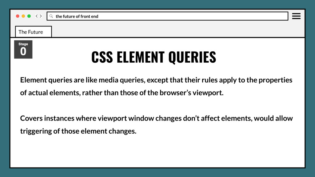
queries, except that their rules apply to the properties of actual elements, rather than those of the browser’s viewport. CSS ELEMENT QUERIES The Future
queries, except that their rules apply to the properties of actual elements, rather than those of the browser’s viewport. Covers instances where viewport window changes don’t affect elements, would allow triggering of those element changes. CSS ELEMENT QUERIES The Future
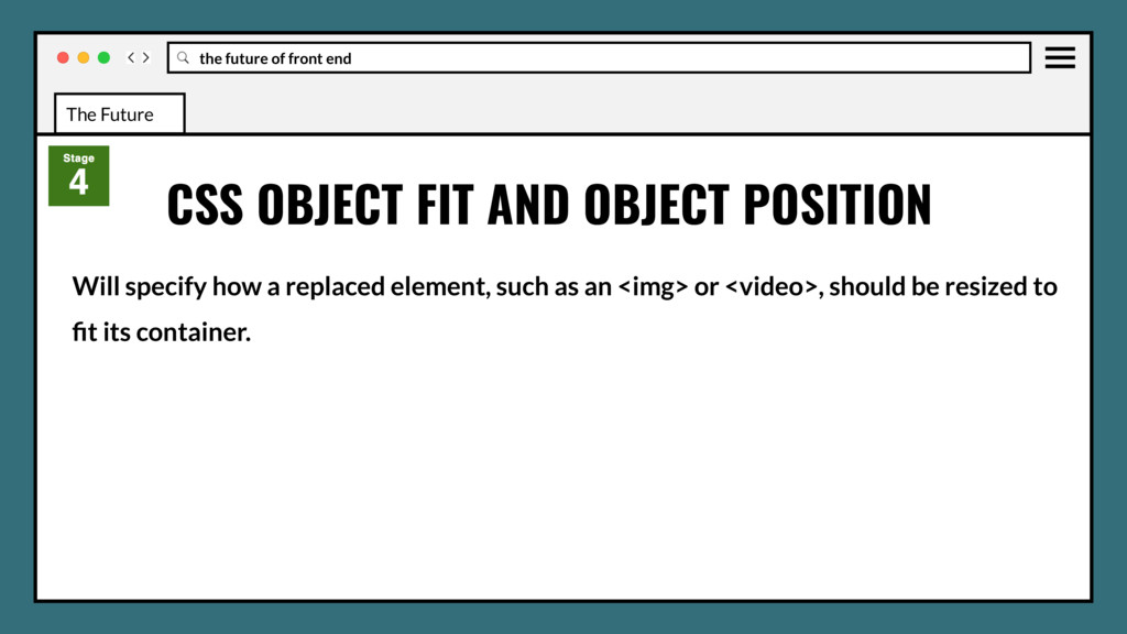
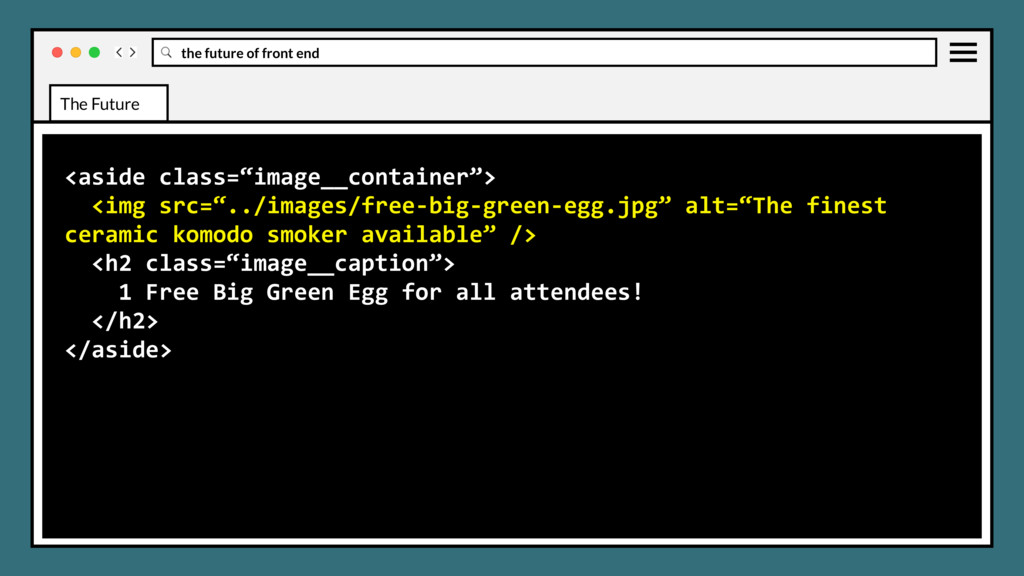
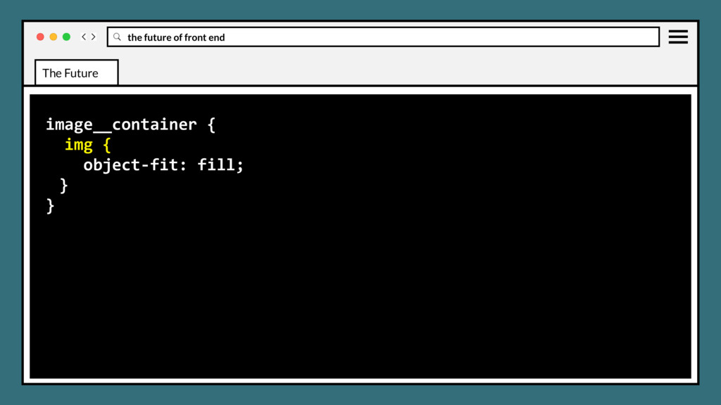
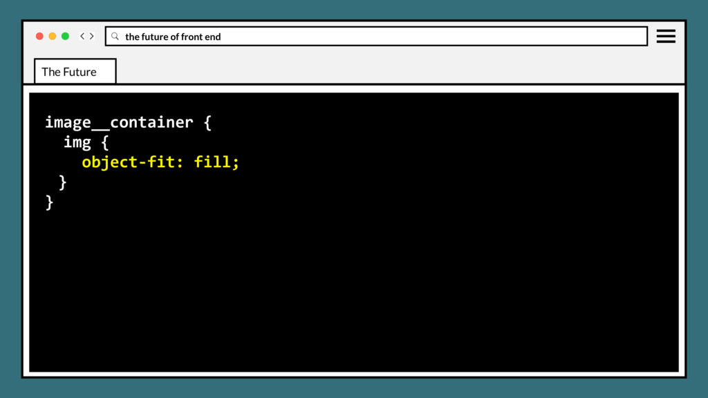
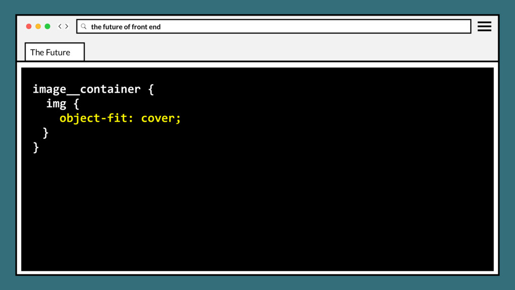
element, such as an <img> or <video>, should be resized to fit its container. Mirrors CSS background-size property values and display effects. CSS OBJECT FIT AND OBJECT POSITION The Future
element, such as an <img> or <video>, should be resized to fit its container. Mirrors CSS background-size property values and display effects. Object-position will be used in conjunction to position element in container. CSS OBJECT FIT AND OBJECT POSITION The Future
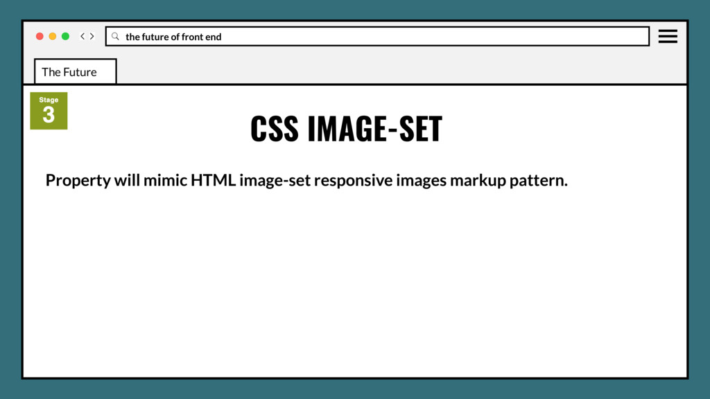
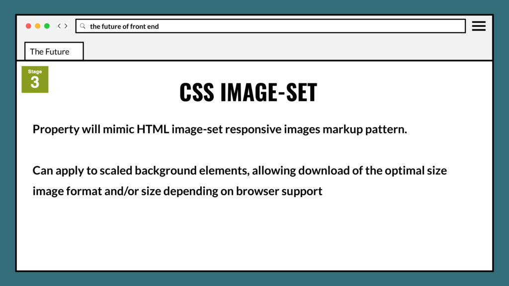
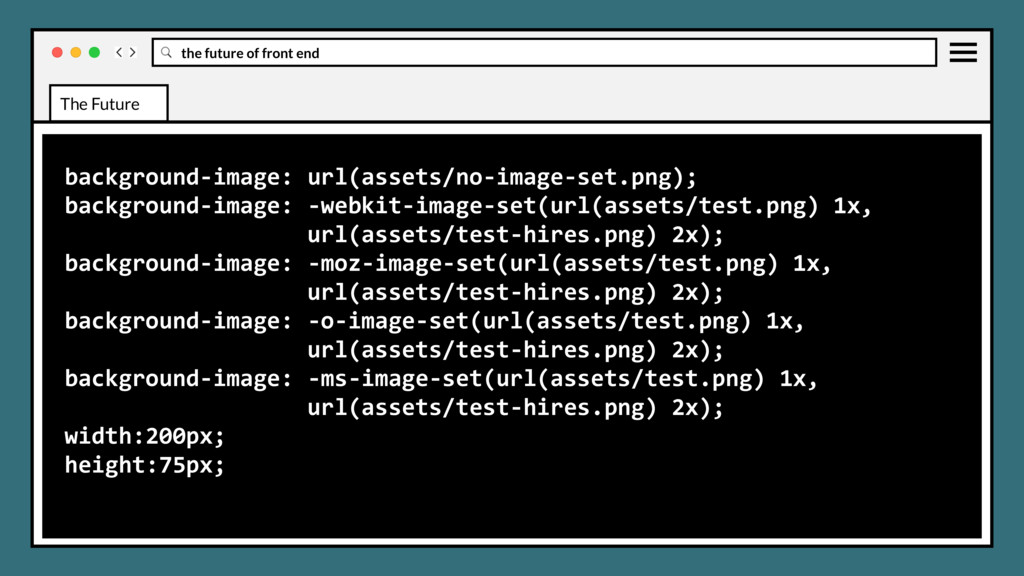
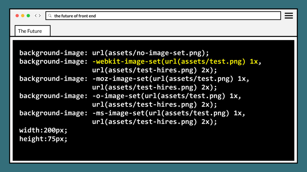
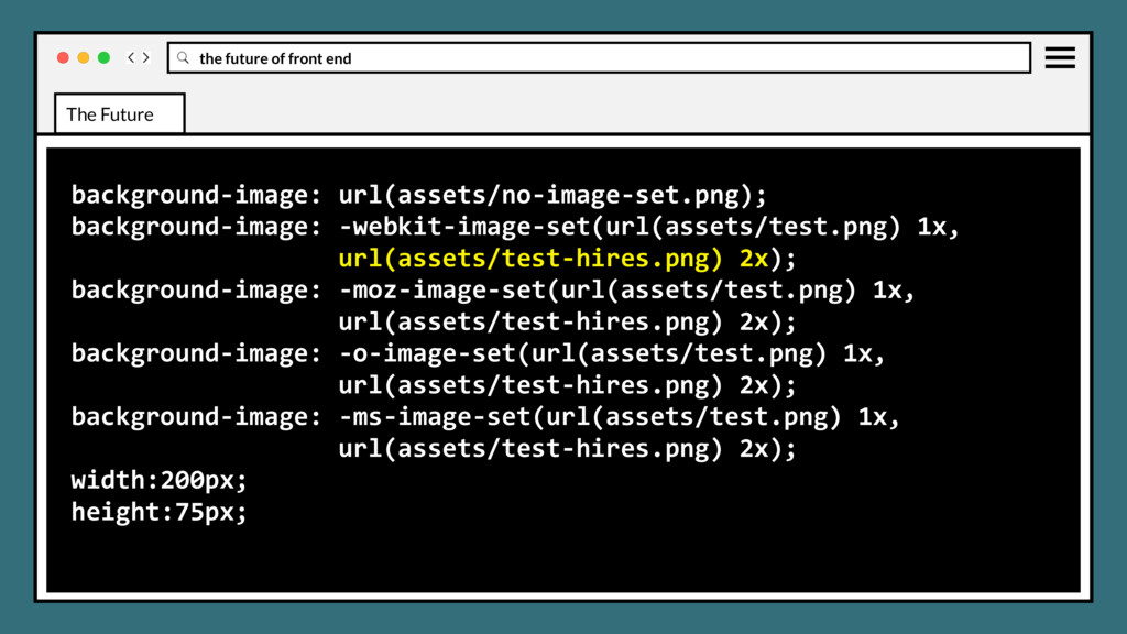
responsive images markup pattern. Can apply to scaled background elements, allowing download of the optimal size image format and/or size depending on browser support CSS IMAGE-SET The Future
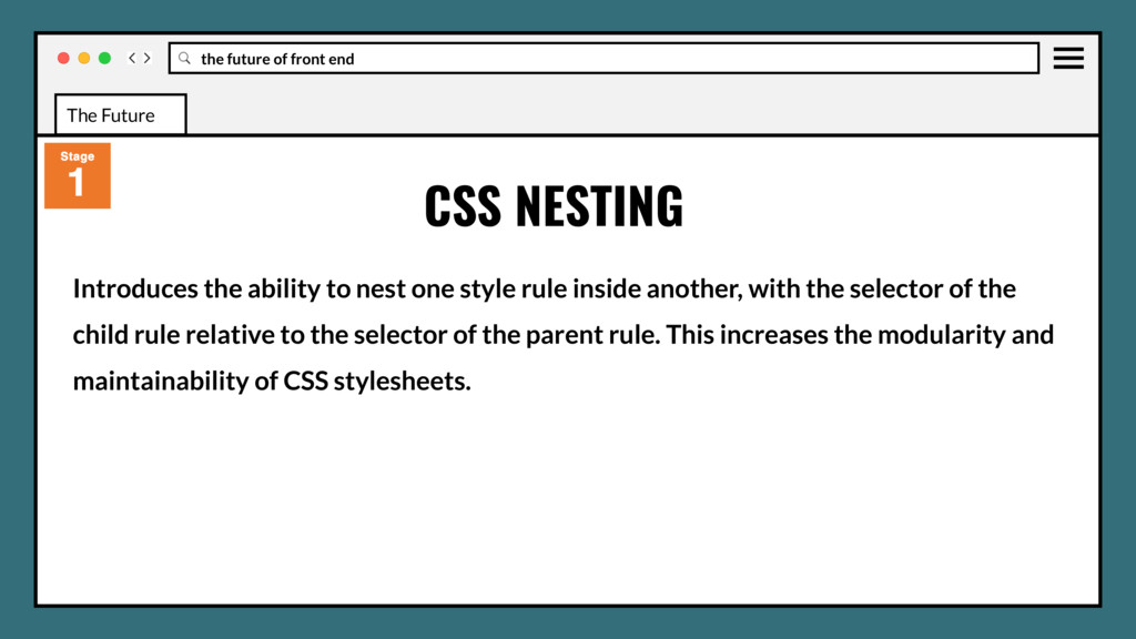
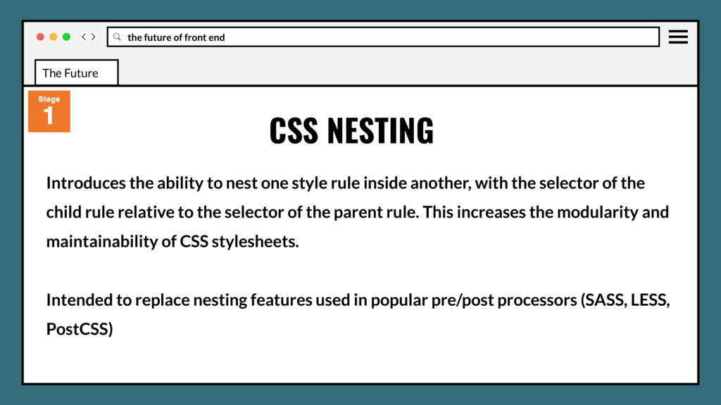
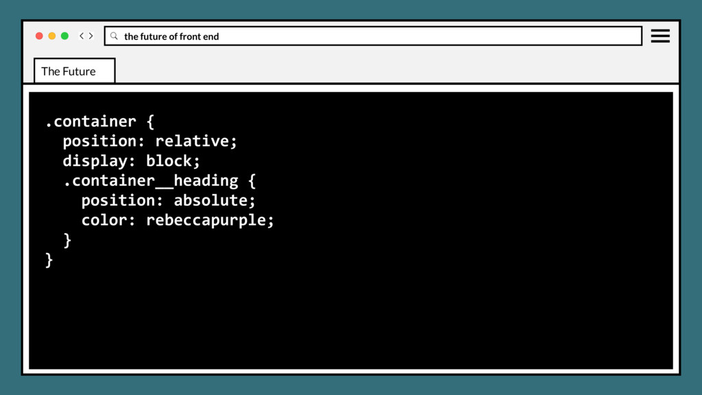
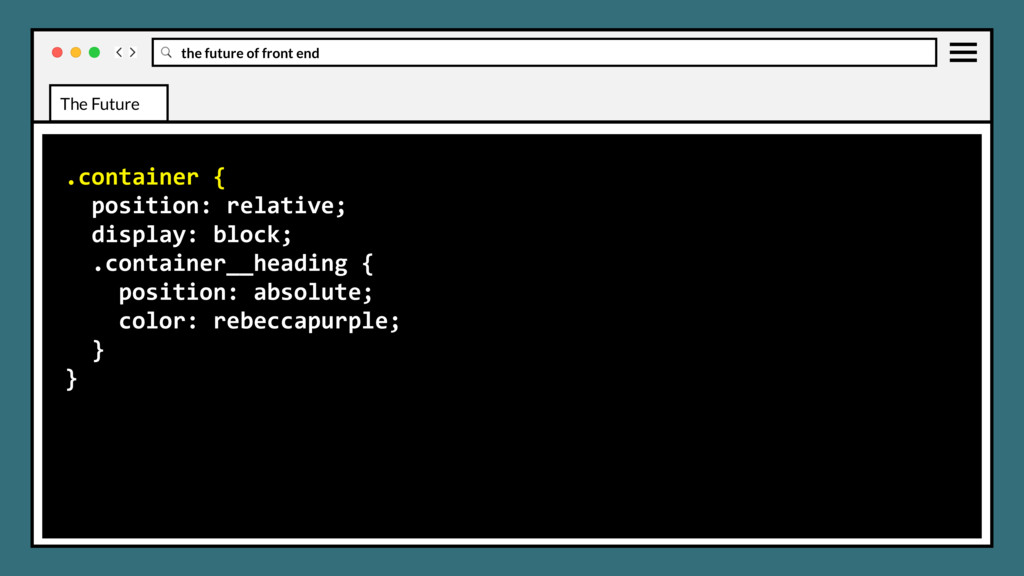
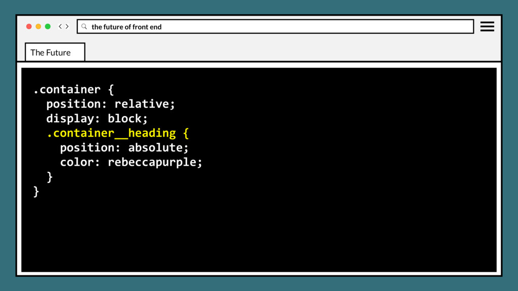
one style rule inside another, with the selector of the child rule relative to the selector of the parent rule. This increases the modularity and maintainability of CSS stylesheets. CSS NESTING The Future
one style rule inside another, with the selector of the child rule relative to the selector of the parent rule. This increases the modularity and maintainability of CSS stylesheets. Intended to replace nesting features used in popular pre/post processors (SASS, LESS, PostCSS) CSS NESTING The Future
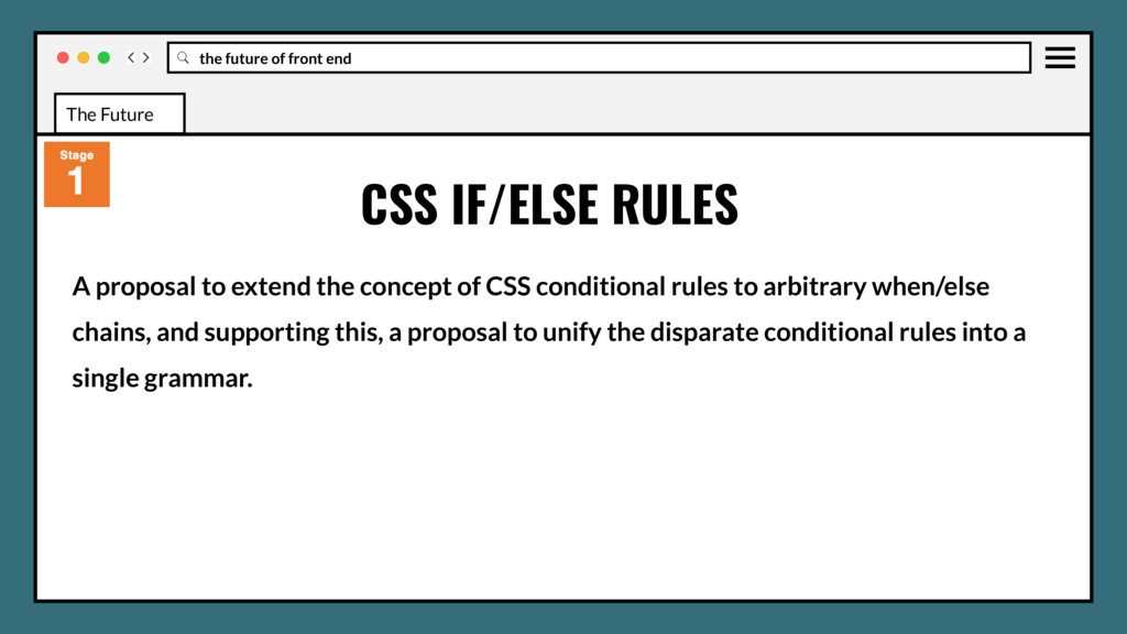
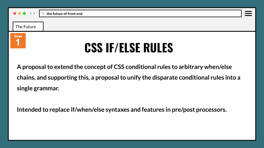
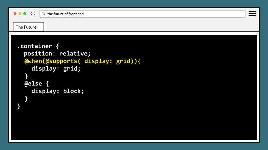
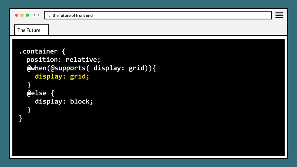
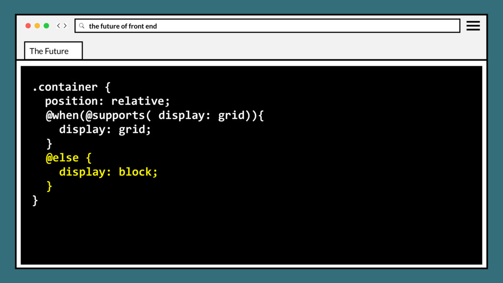
concept of CSS conditional rules to arbitrary when/else chains, and supporting this, a proposal to unify the disparate conditional rules into a single grammar. CSS IF/ELSE RULES The Future
concept of CSS conditional rules to arbitrary when/else chains, and supporting this, a proposal to unify the disparate conditional rules into a single grammar. Intended to replace if/when/else syntaxes and features in pre/post processors. CSS IF/ELSE RULES The Future
 justinholtweb
 akihisaikeda
 johnroyer
.png) yuriko1211
yuriko1211
 mototakatsu
 77web
77web
 philipschwarz
 sumedhbala
 funnyycat
 snhryt
 mackee
 ochtum
 minodriven
 michaelherold
 techseoconnect
 mclloyd
 sachag
 sabderemane
 denniskardys
 rmw
rmw
 asonas
 scottboms
 geshan
 62gerente
 sferik