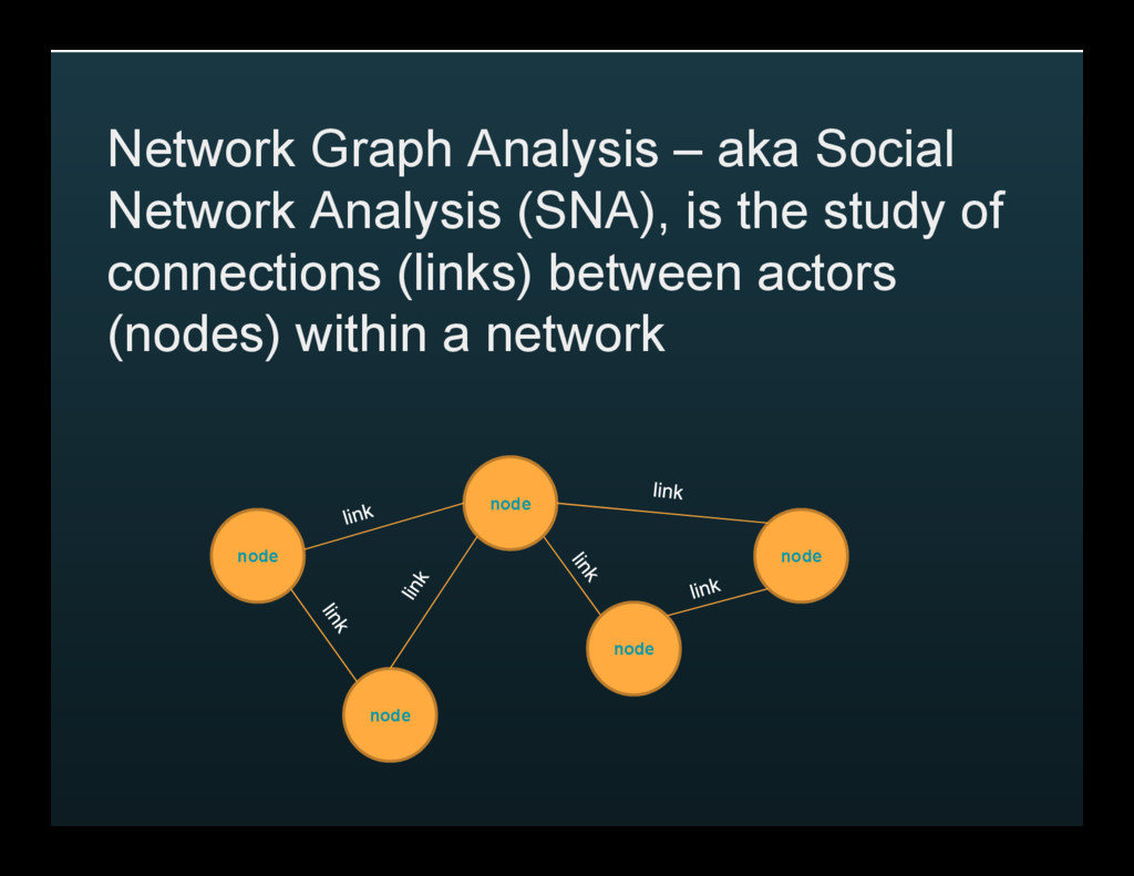
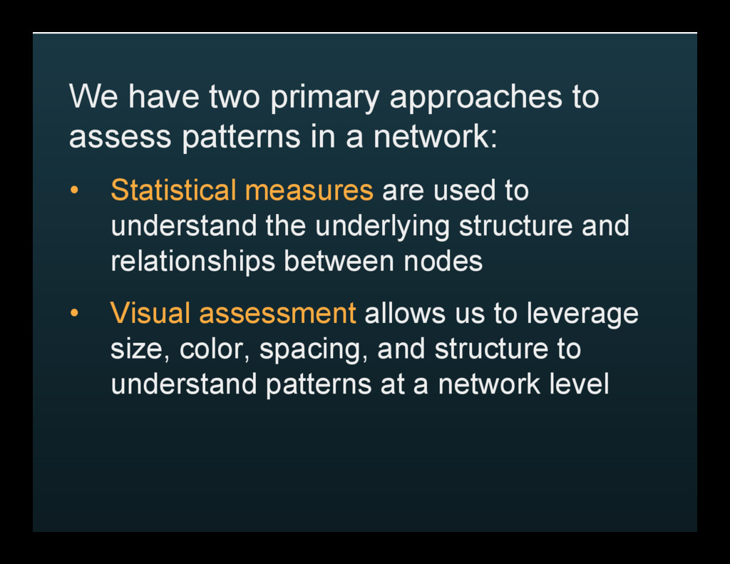
network: • Statistical measures are used to understand the underlying structure and relationships between nodes • Visual assessment allows us to leverage size, color, spacing, and structure to understand patterns at a network level
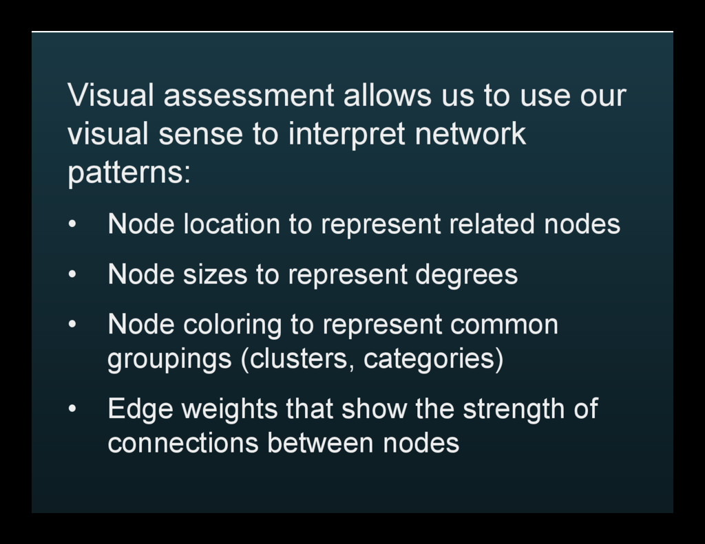
interpret network patterns: • Node location to represent related nodes • Node sizes to represent degrees • Node coloring to represent common groupings (clusters, categories) • Edge weights that show the strength of connections between nodes
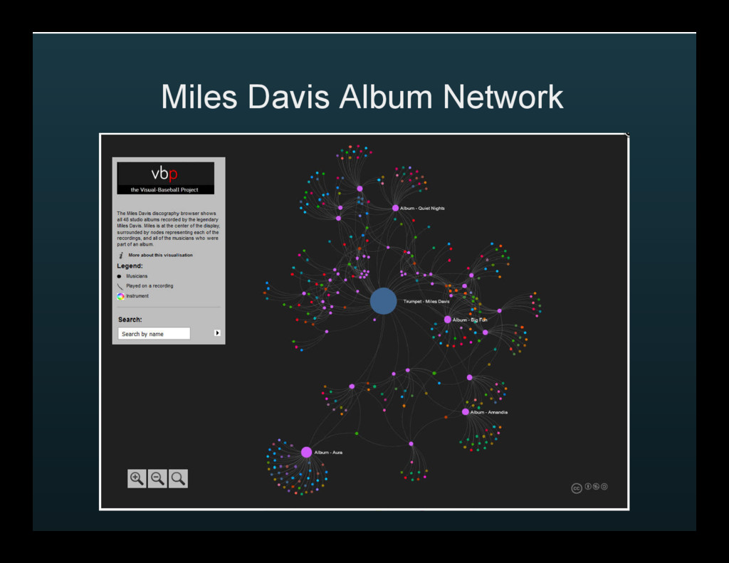
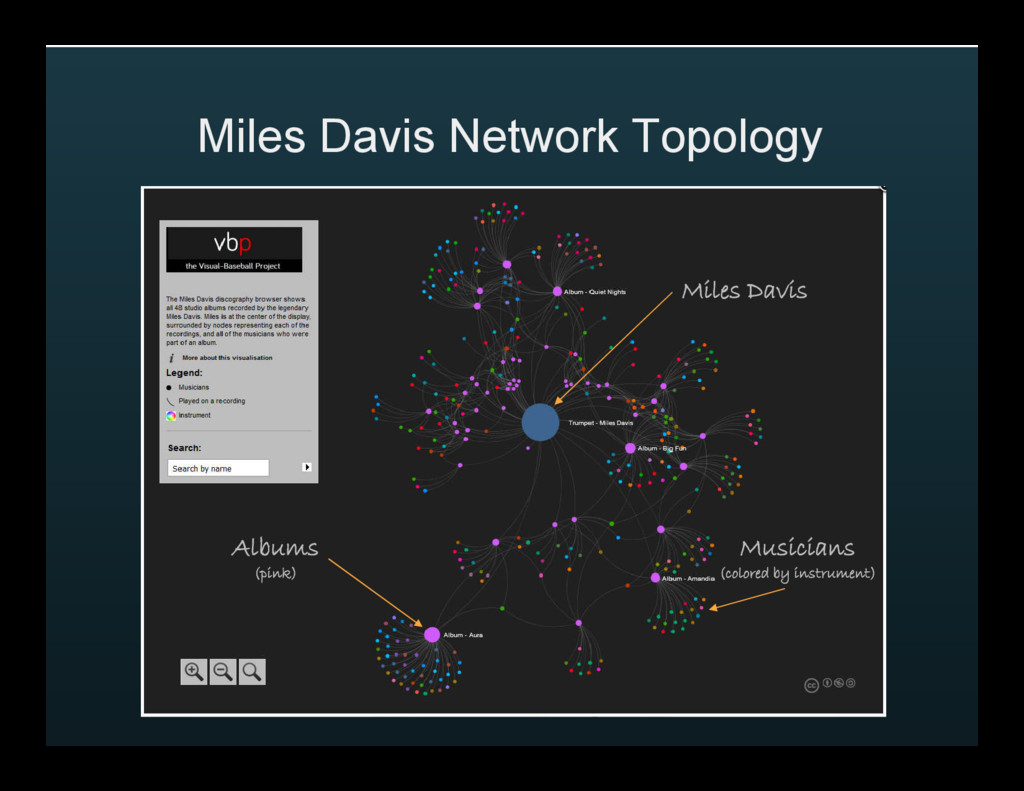
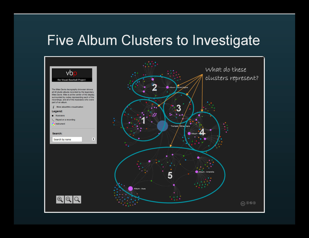
the multiple phases within his long and varied career, and to see the shifting patterns in his musical partnerships and styles http://visual-baseball.com/gephi/jazz/miles_davis/#
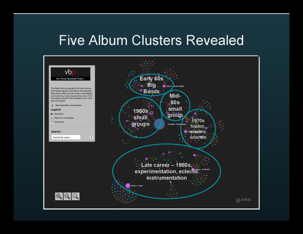
elements of time, instrumentation, number of musicians, and types of instruments. With just a few minutes of traversing the network, we gain a greater understanding of Miles Davis’ musical career
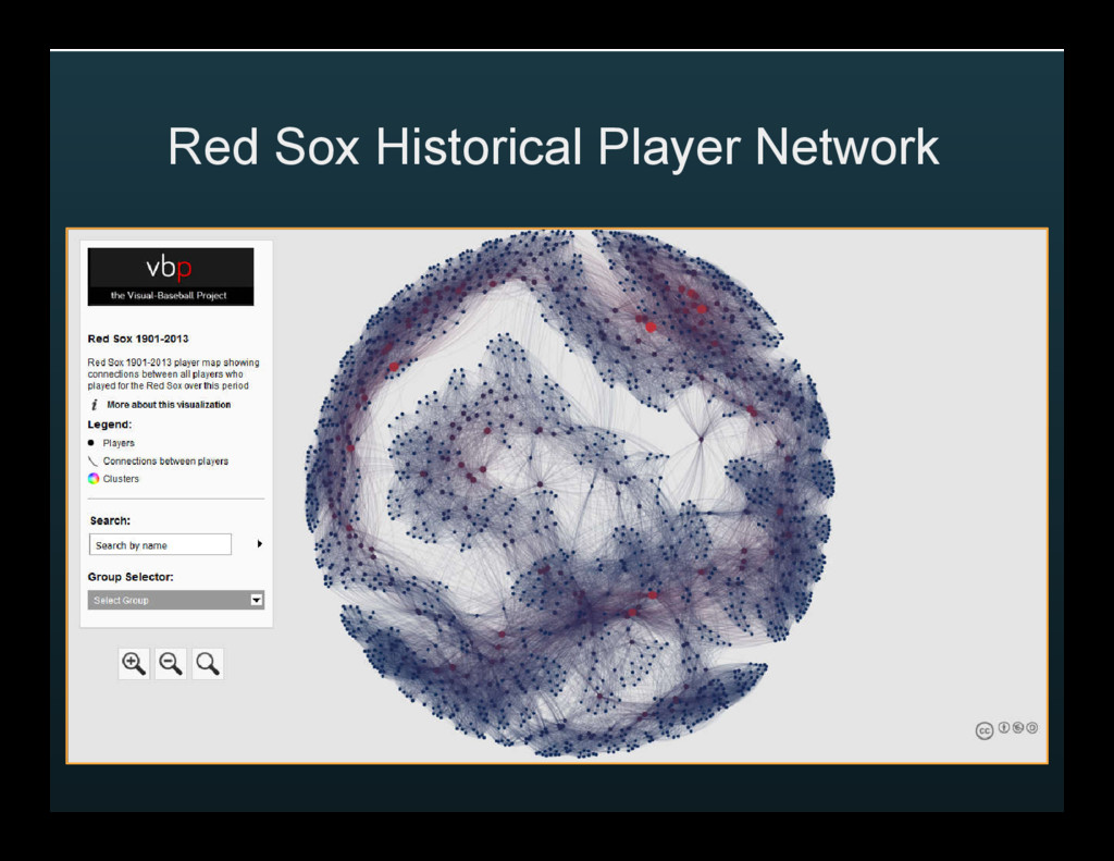
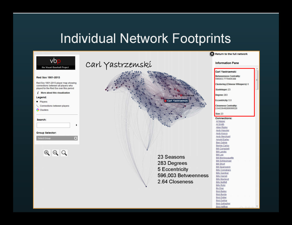
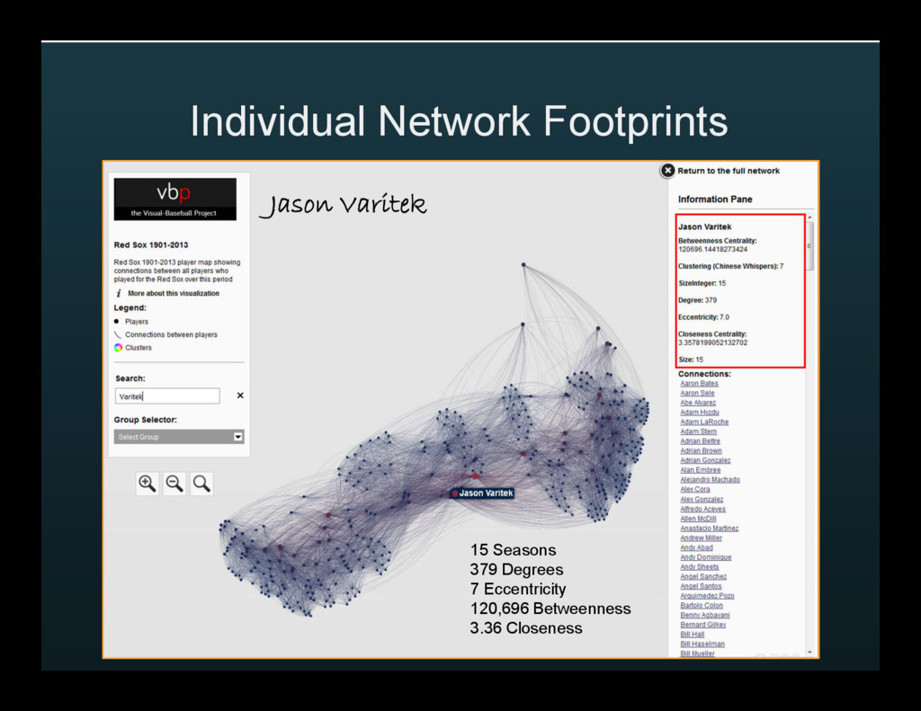
understand connections between players across eras, and to understand influence and groupings within the network, as defined by degrees and other centrality measures http://visual-baseball.com/gephi/teams/redsox_network/
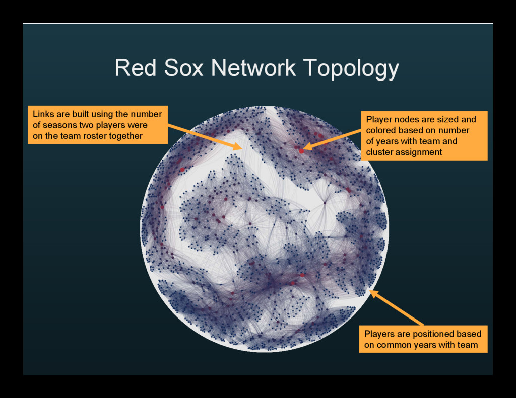
based on number of years with team and cluster assignment Players are positioned based on common years with team Links are built using the number of seasons two players were on the team roster together
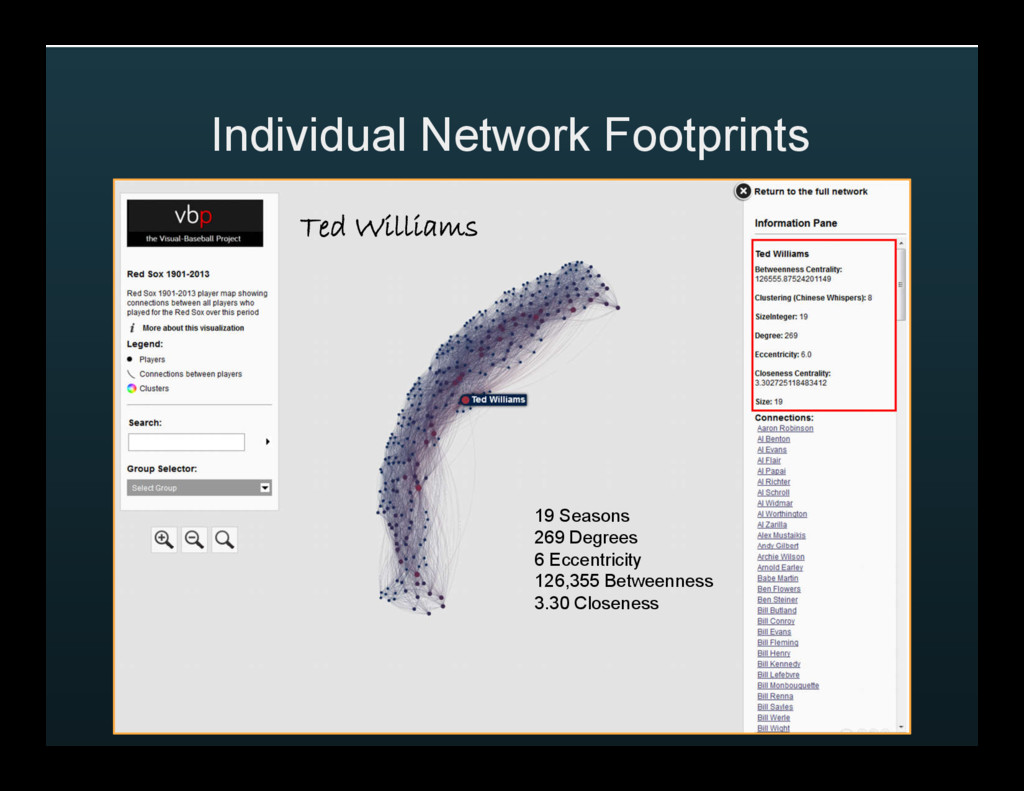
quickly observable differences using centrality measures: • Despite playing several fewer seasons than either Williams or Yastrzemski, Varitek has the most connections; but Yastrzemski could get you to more players faster by being very central to the network structure
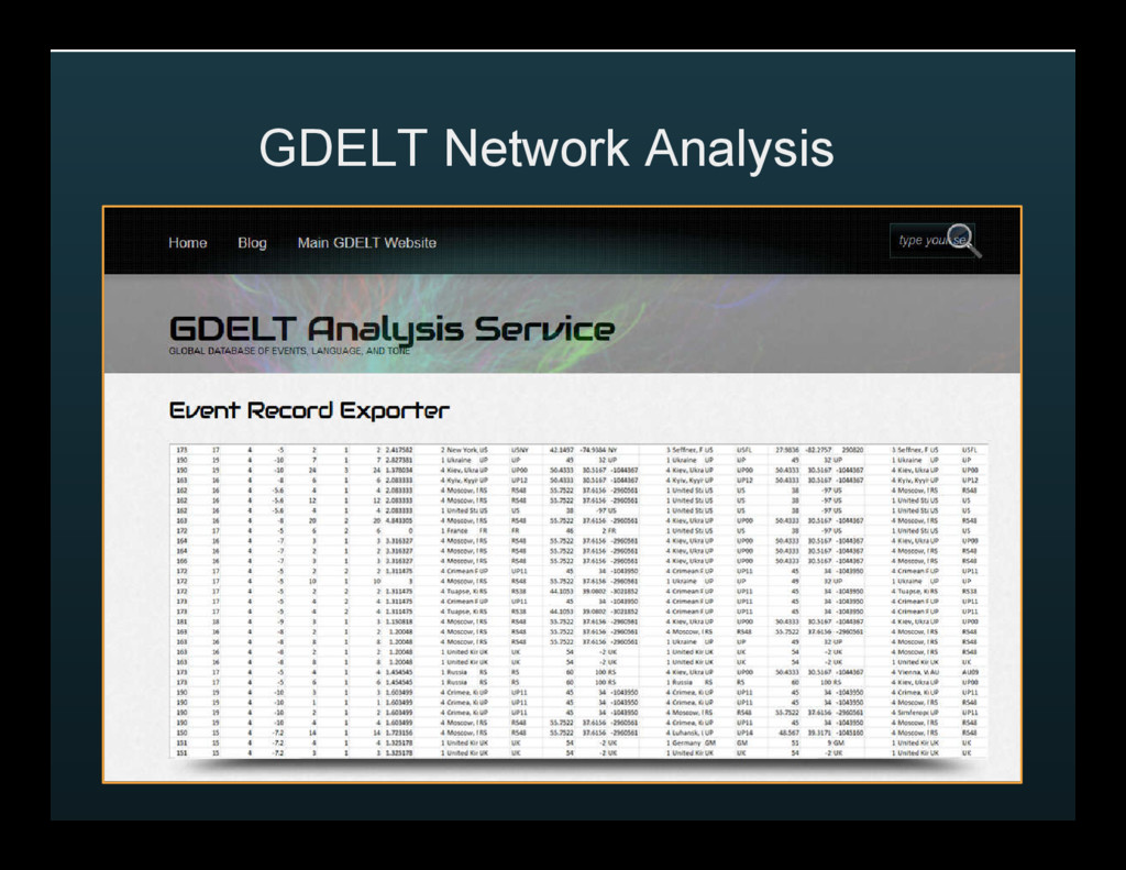
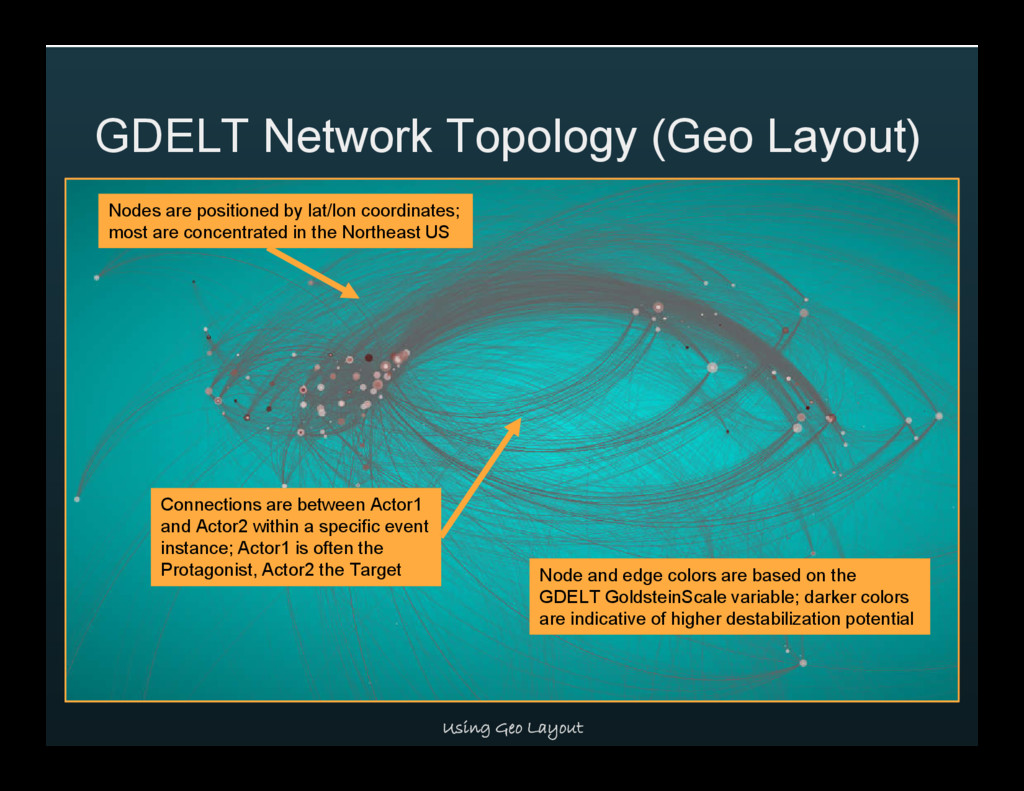
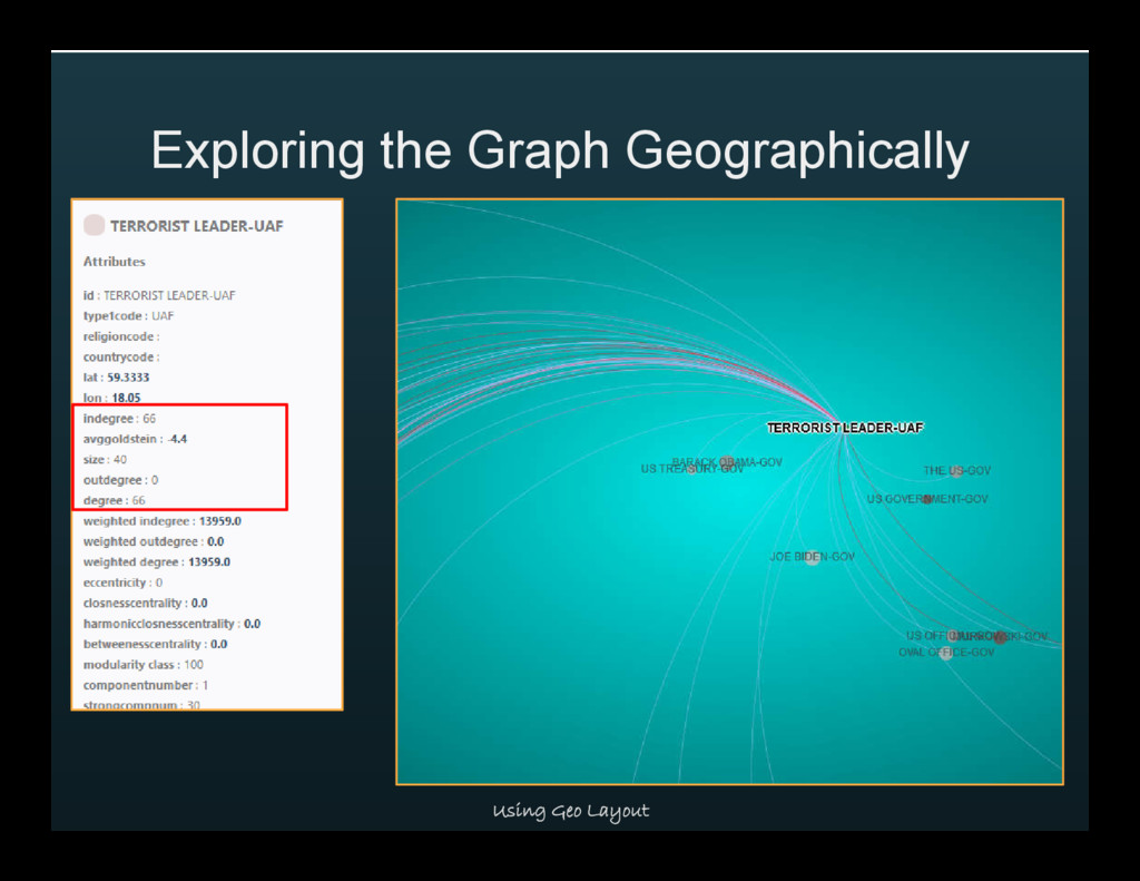
network data based on published accounts of news events around the world. Our exploration focuses on US Government threats reported between March 1st and April 30, 2016
between Actor1 and Actor2 within a specific event instance; Actor1 is often the Protagonist, Actor2 the Target Nodes are positioned by lat/lon coordinates; most are concentrated in the Northeast US Node and edge colors are based on the GDELT GoldsteinScale variable; darker colors are indicative of higher destabilization potential
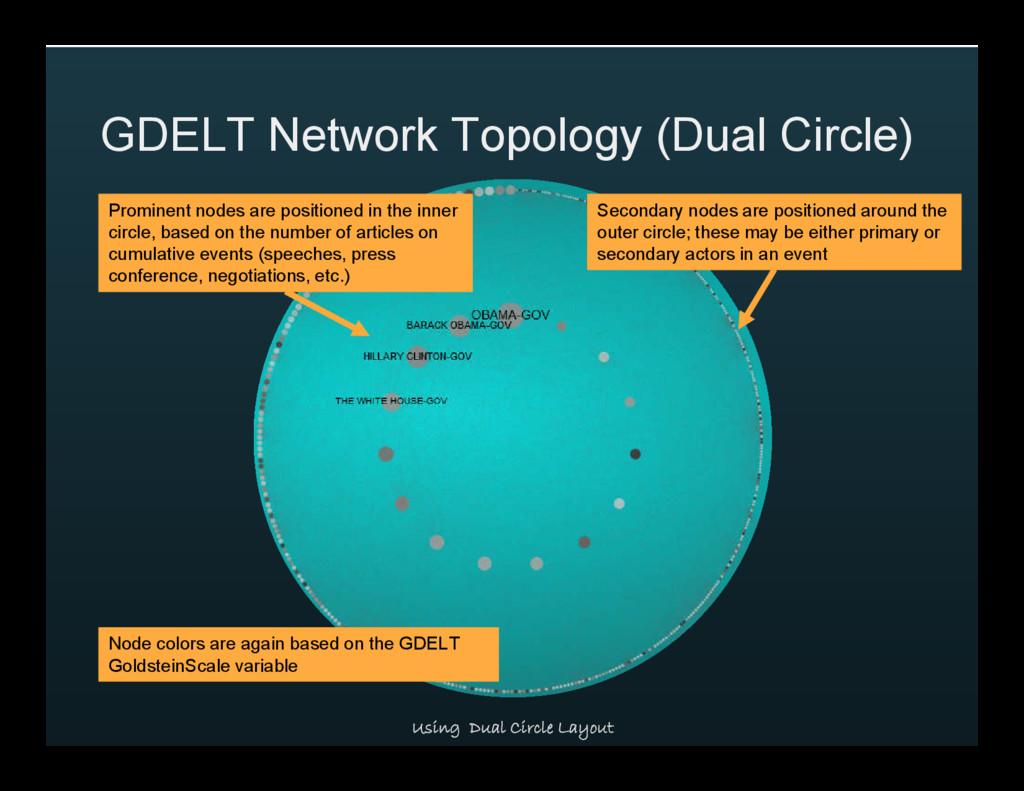
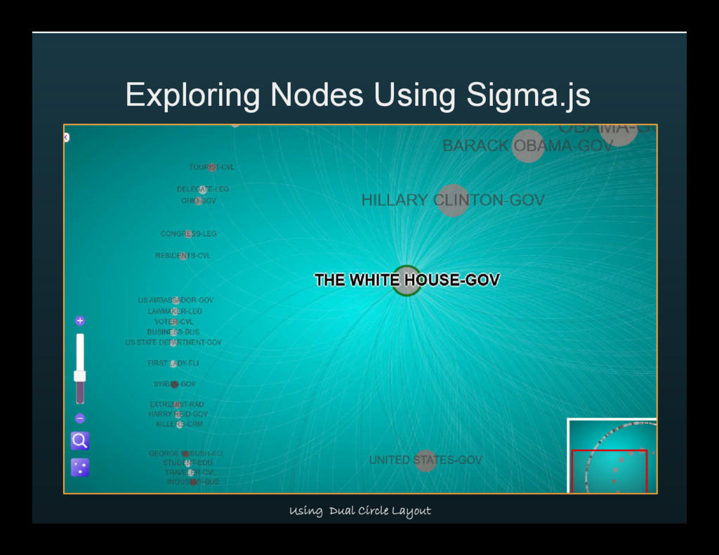
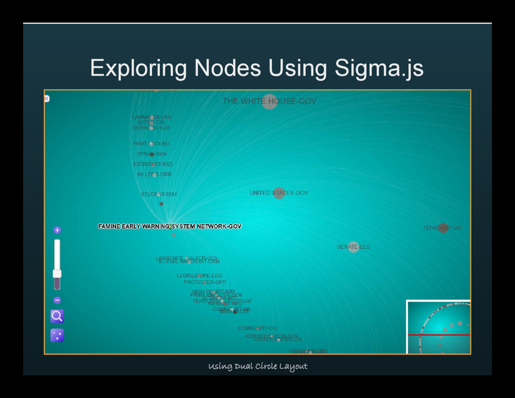
nodes are positioned in the inner circle, based on the number of articles on cumulative events (speeches, press conference, negotiations, etc.) Secondary nodes are positioned around the outer circle; these may be either primary or secondary actors in an event Node colors are again based on the GDELT GoldsteinScale variable
on news reporting, and allows us to understand which actors are directing actions against others, and what is the tone of those actions. Tracking these measures over time will enable us to spot trends both positive and negative.
visually and statistically assessing complex networks • Network graphs are proliferating, due to the availability of multiple open source tools and increasing amounts of open data • Network graph analysis can be used to tell powerful stories wherever connected data is present
Nodes and edges created in Excel • Graph created in Gephi using the Yifan Hu Proportional algorithm • Exported to Sigma.js (json format) • 348 nodes, 596 edges
Database at seanlahman.com • Nodes and edges created using SQL code in Toad for MySQL • Graphs created in Gephi using the ARF layout algorithm • JSON file exported to Sigma.js • 1668 nodes, 51,223 edges
Media, Education, and many more • Event codes reference the type of event – riots, protests, sanctions, and so on • The GoldsteinScale runs from -10 to 10 in describing the relative destabilizing potential of the event
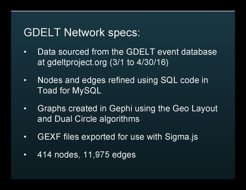
database at gdeltproject.org (3/1 to 4/30/16) • Nodes and edges refined using SQL code in Toad for MySQL • Graphs created in Gephi using the Geo Layout and Dual Circle algorithms • GEXF files exported for use with Sigma.js • 414 nodes, 11,975 edges