$30 off During Our Annual Pro Sale. View Details »

Design Hacks for the Pragmatic Minded

Kyle Neath
March 24, 2011

Design Hacks for the Pragmatic Minded

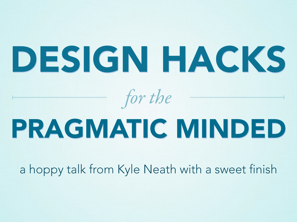
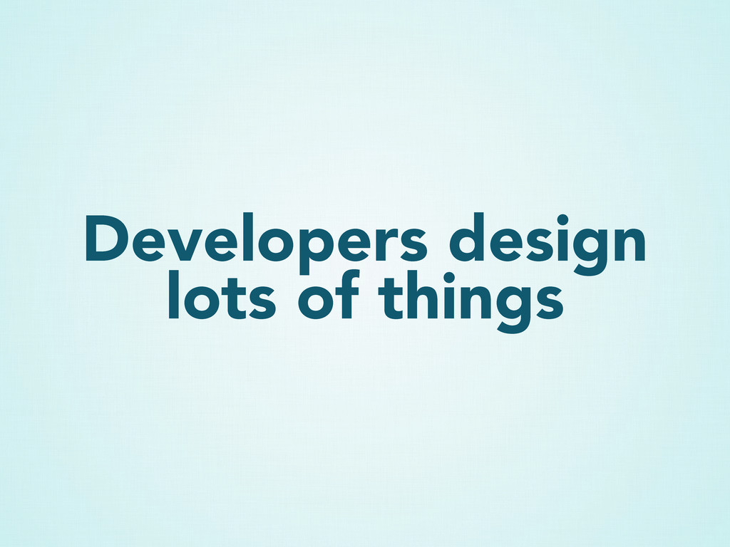
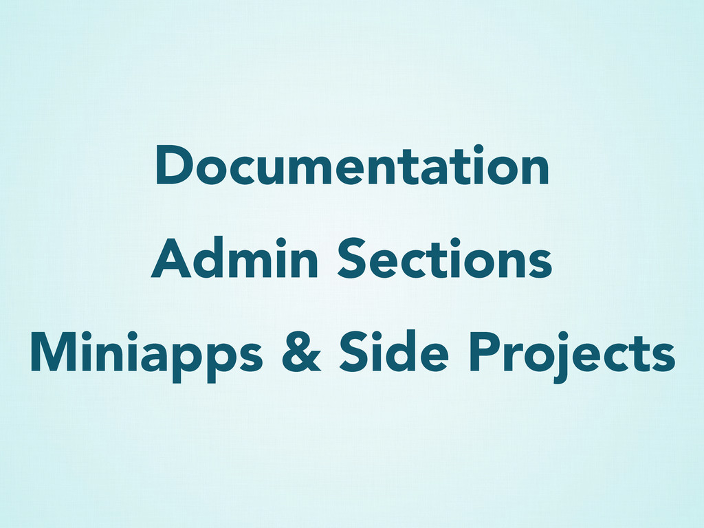
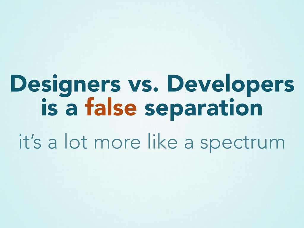
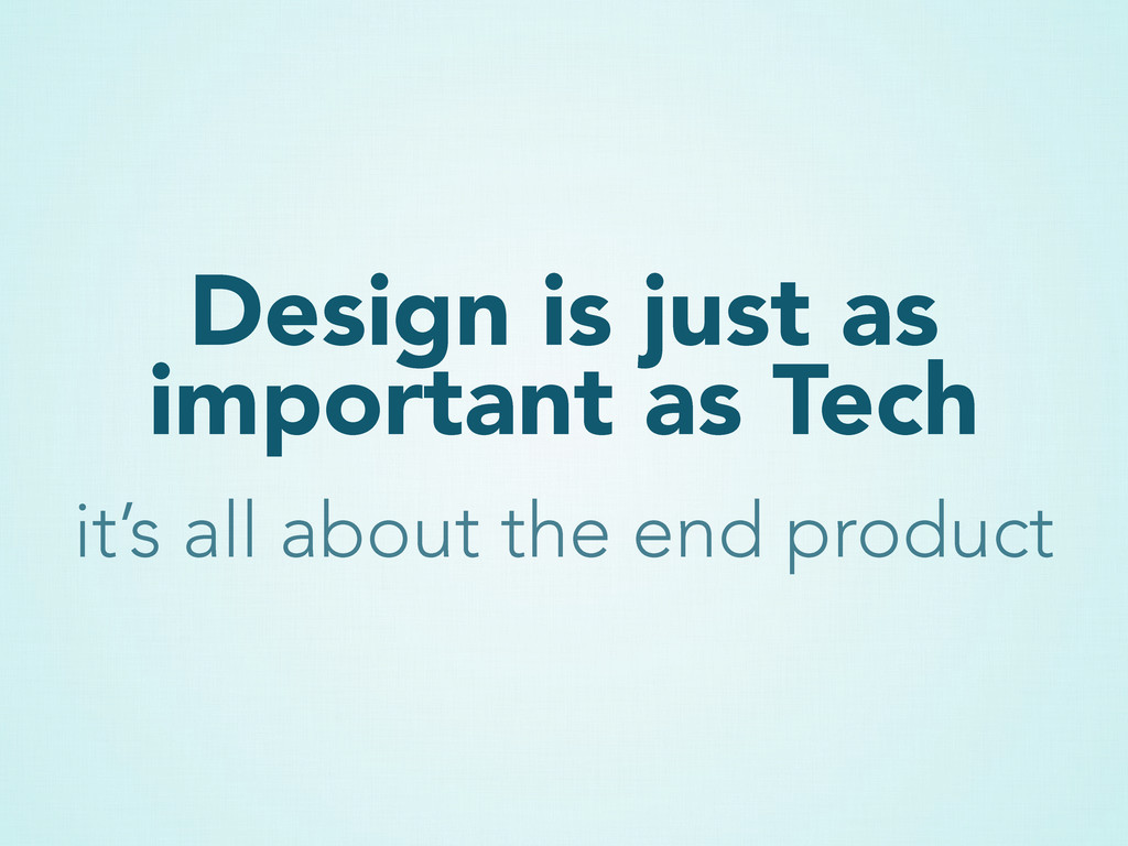
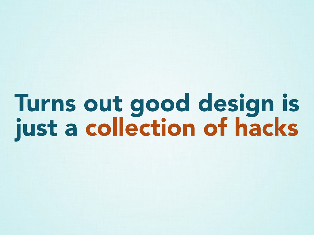
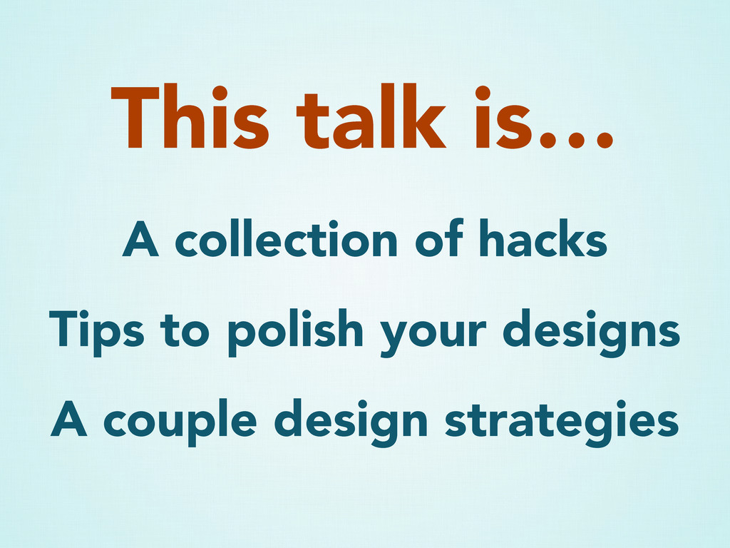
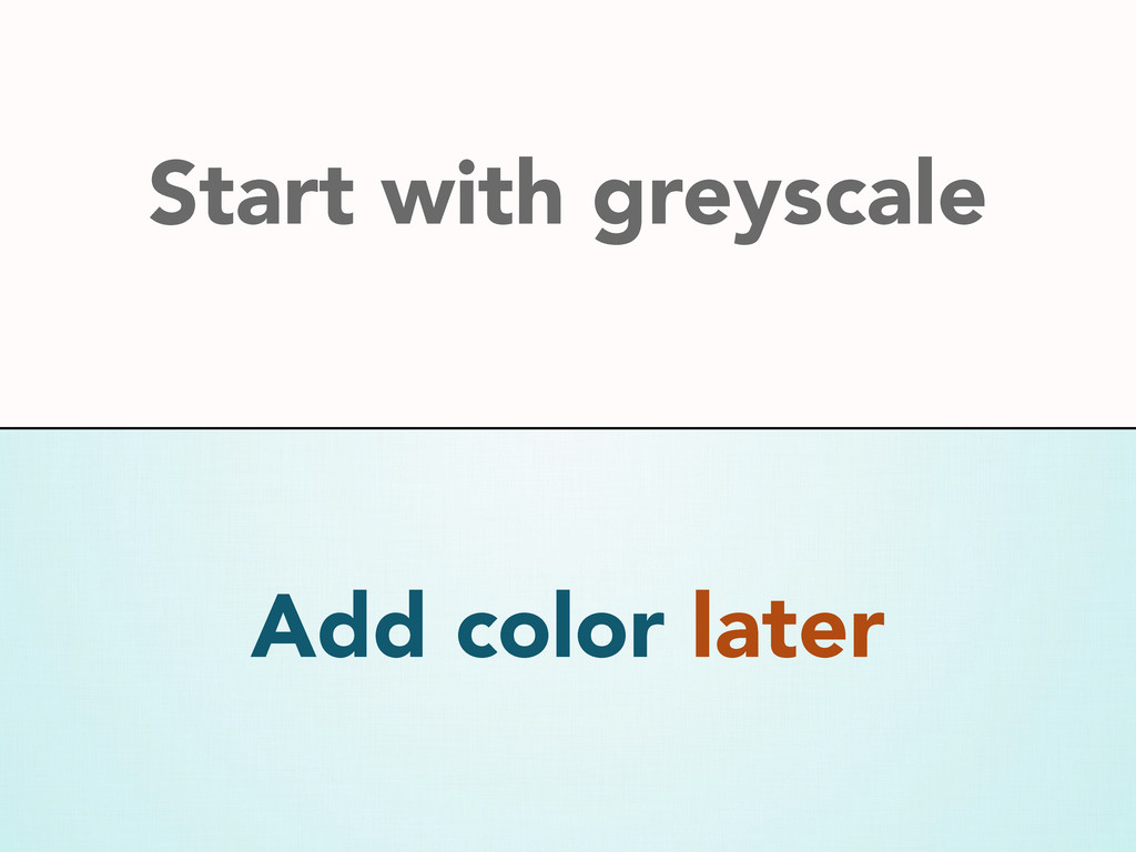
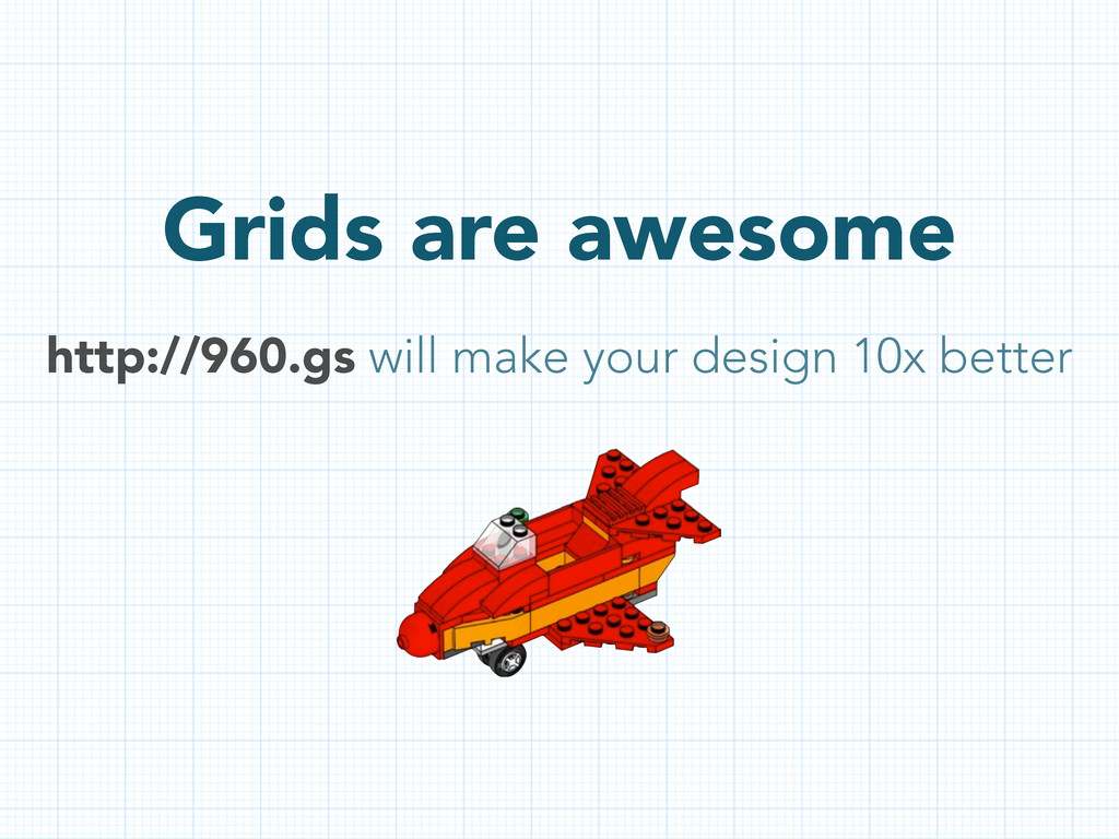
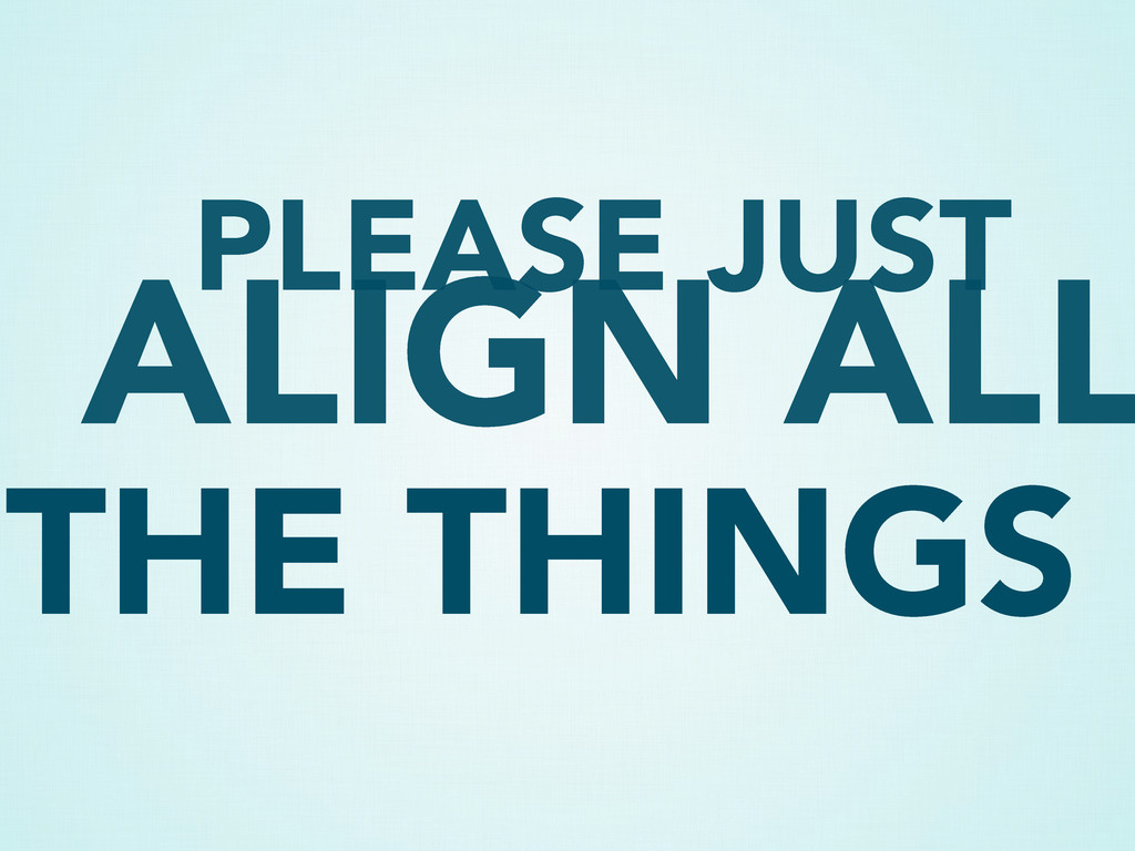
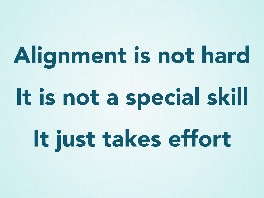
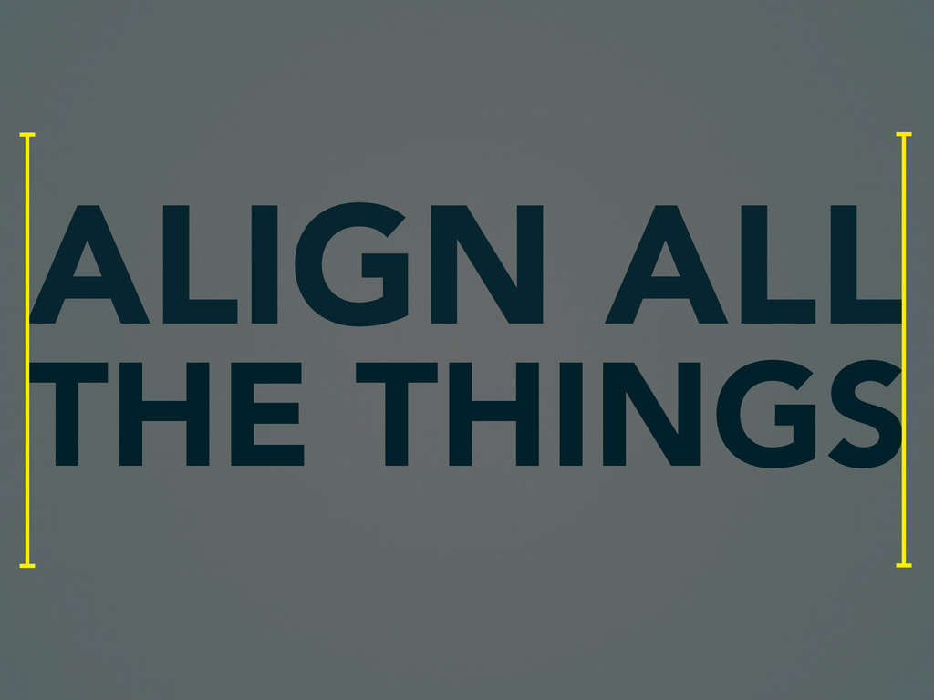
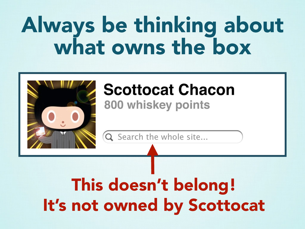
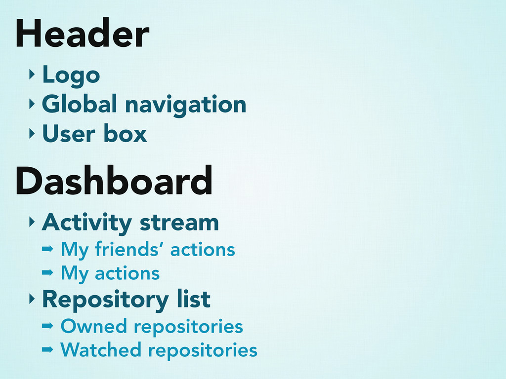
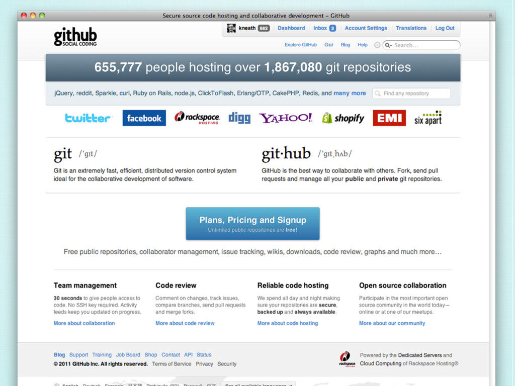
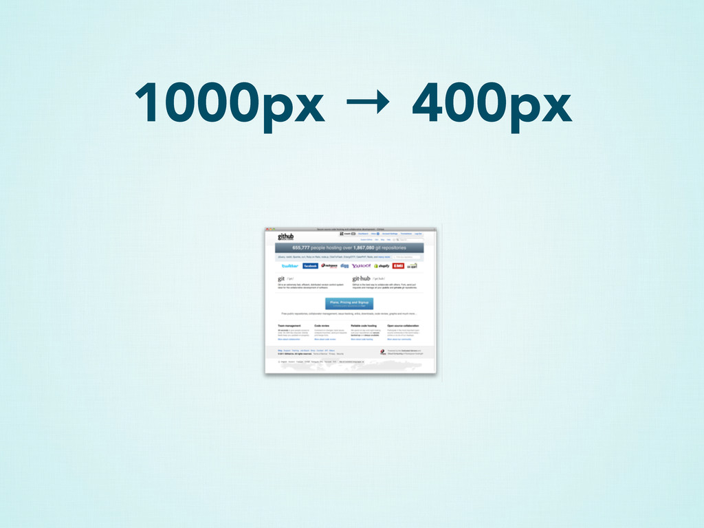
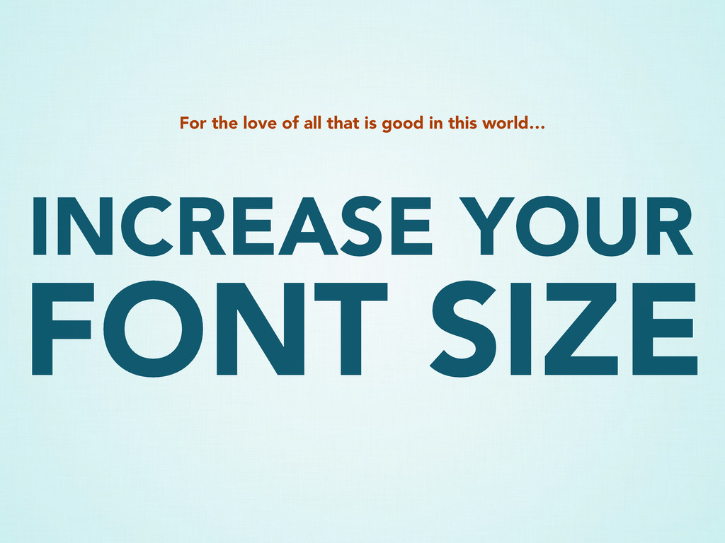
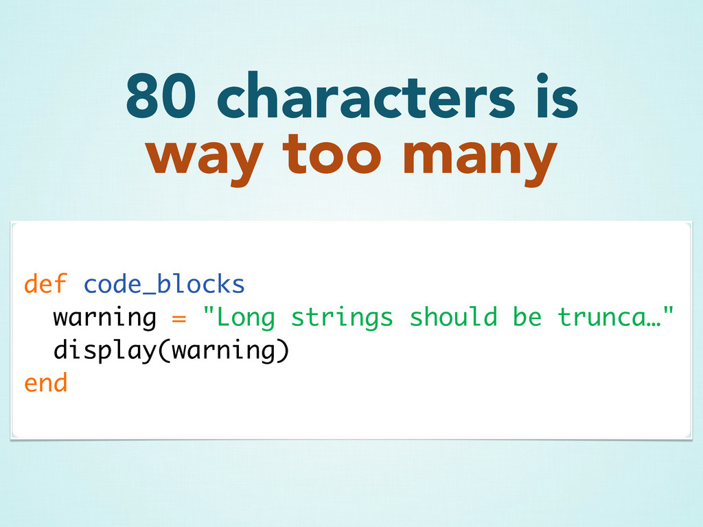
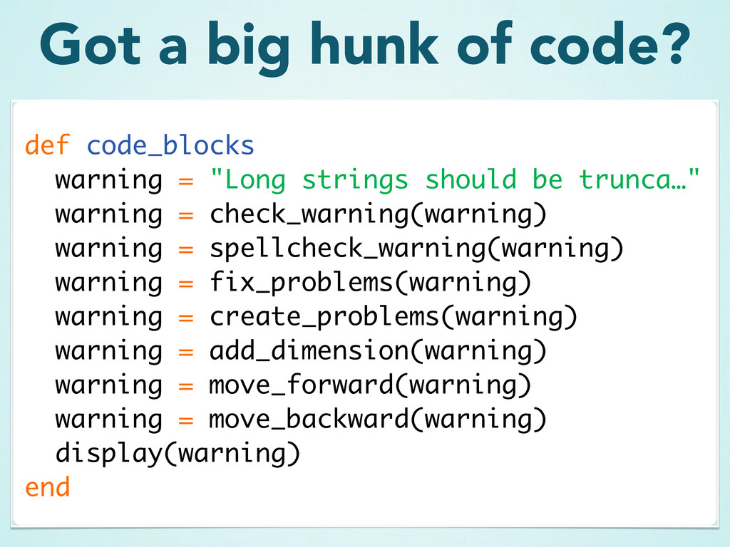
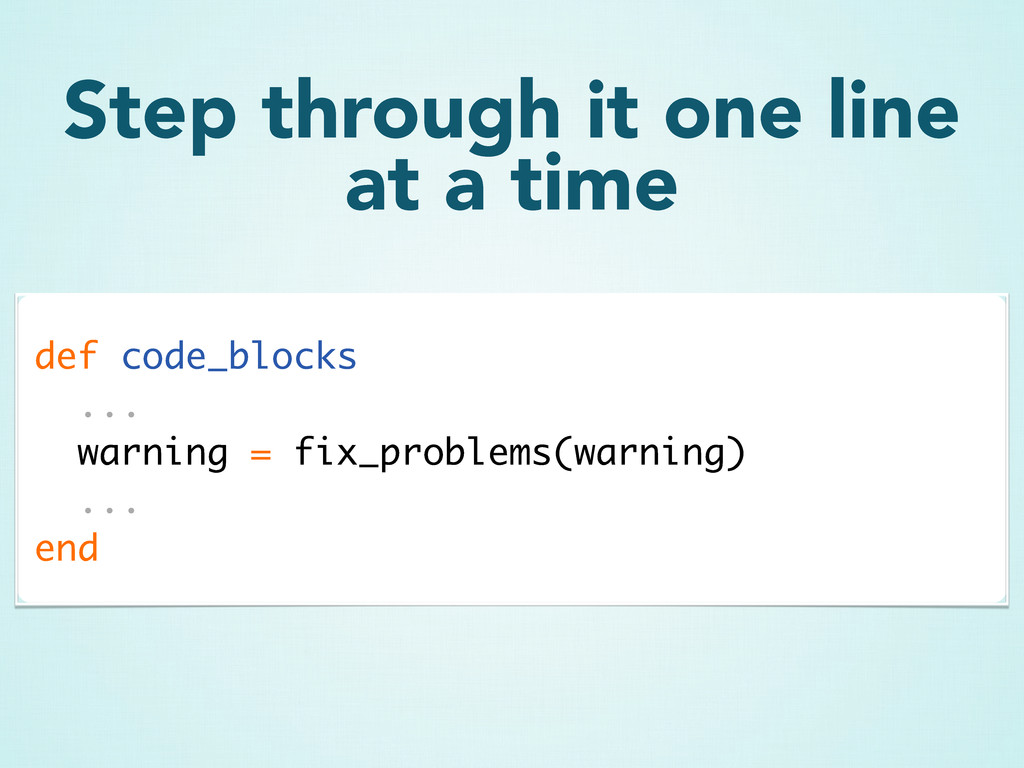
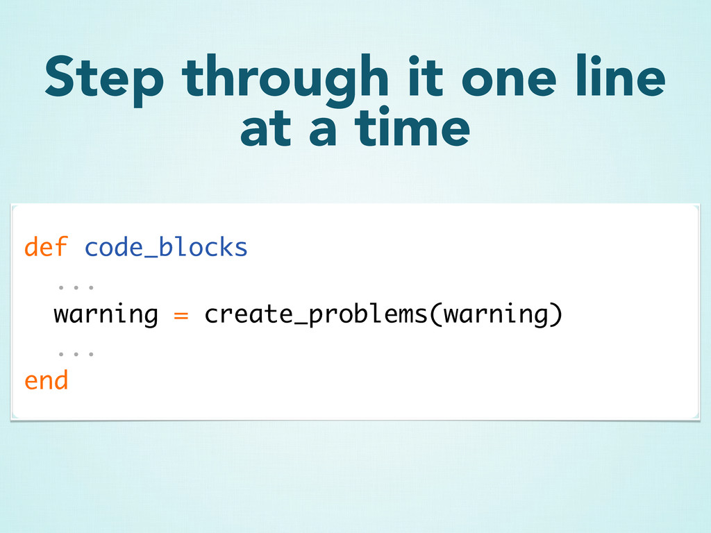
A lot of developers think they either can't or don't need to design. But that's just a myth — everyone can benefit from a few simple design concepts. Learn some simple design hacks you can apply to your documentation, presentations and products to make them just a little bit prettier.

Kyle Neath

March 24, 2011
Tweet

More Decks by Kyle Neath

Other Decks in Design

Transcript

  1. DESIGN HACKS
    PRAGMATIC MINDED
    for the
    a hoppy talk from Kyle Neath with a sweet finish

    View Slide

  2. Kyle Neath is...

    View Slide

  3. ~designer
    @

    View Slide

  4. @kneath

    View Slide

  5. warpspire.com

    View Slide

  6. My favorite beer
    What’s Important

    View Slide

  7. Dogfish Head
    90 minute IPA

    View Slide

  8. But Firestone’s DBA
    is so delicious…

    View Slide

  9. I can always go for a
    Black Butte Porter

    View Slide

  10. And Sierra Nevada has
    never let me down

    View Slide

  11. Luckily, I don’t have to choose

    View Slide

  12. Oh yeah, and I like to
    fall in the snow

    View Slide

  13. What am I doing at
    a Ruby Conference?
    If I’m a designer…

    View Slide

  14. Developers design
    lots of things

    View Slide

  15. Documentation
    Admin Sections
    Miniapps & Side Projects

    View Slide

  16. But more importantly..

    View Slide

  17. Designers vs. Developers
    is a false separation
    it’s a lot more like a spectrum

    View Slide

  18. Design is just as
    important as Tech
    it’s all about the end product

    View Slide

  19. You should want to be
    a better designer

    View Slide

  20. My design background
    A little bit about

    View Slide

  21. I just wanted to build
    websites

    View Slide

  22. Steal Everything

    View Slide

  23. Turns out good design is
    just a collection of hacks

    View Slide

  24. Design theory
    Anything I learned in school
    Organized or coherent
    This talk is not…

    View Slide

  25. A collection of hacks
    Tips to polish your designs
    A couple design strategies
    This talk is…

    View Slide

  26. Type
    A little bit about

    View Slide

  27. Good typography is 90%
    what you aren’t doing
    you don’t have to be fancy

    View Slide

  28. Helvetica, Arial, sans-serif
    Times New Roman, Georgia, serif
    Monaco, Courier New, monospace
    Classic fonts go a long ways

    View Slide

  29. Playing with font weights
    and styles is easy & less risky

    View Slide

  30. Playing with font weights
    and styles is easy & less risky
    font-weight:300
    font-weight:bold
    font-weight:normal

    View Slide

  31. We're GitHub! If you're ordering a tshirt,
    you probably know that this isn't the main
    gig. Please enjoy one of our cheeky grey
    shirts and be sure to check back
    periodically for new designs. Exercise
    patience while waiting for your crisp new
    attire - we are busy every day doing
    things…
    Increase line height to
    improve readability

    View Slide

  32. We're GitHub! If you're ordering a tshirt,
    you probably know that this isn't the main
    gig. Please enjoy one of our cheeky grey
    shirts and be sure to check back
    periodically for new designs. Exercise
    patience while waiting for your crisp new…
    Increase line height to
    improve readability

    View Slide

  33. A baseline grid can be
    a great tool
    but don’t be too obsessive about it

    View Slide

  34. A baseline grid can be
    a great tool
    but don’t be too obsessive about it
    font-size:100px
    font-size:50px
    Vertical Grid = 50px

    View Slide

  35. Color
    A little bit about

    View Slide

  36. Color can be a great way
    to highlight content

    View Slide

  37. Hey guys! We just restocked the
    GitHub mugs today. Head on over to
    the GitHub Shop to pick one up today!
    It can also serve to set
    expectations

    View Slide

  38. But using color for the
    sake of color can be
    distracting & harmful

    View Slide

  39. Start with greyscale
    Add color later

    View Slide

  40. A lot of people use grey
    on colored backgrounds

    View Slide

  41. Add some of the
    background hue instead

    View Slide

  42. Wondering why your
    gradients look so... drab?

    View Slide

  43. Blend Mode Superpower
    Overlay Gradient

    View Slide

  44. Blend Mode Superpower
    Color Burn Gradient

    View Slide

  45. Adding black or white
    desaturates colors
    Lesson Learned

    View Slide

  46. Stock Icons & Images
    Cheating with

    View Slide

  47. Salads are hilarious and
    spice up boring pages

    View Slide

  48. But seriously

    View Slide

  49. Icon sets are crazy helpful
    Insanely cheap

    View Slide

  50. 648 Icons
    PNG & Vector & Fonts
    $240
    Pictos

    View Slide

  51. Your time is better
    spent elsewhere

    View Slide

  52. Spacing & Alignment
    It’s all about

    View Slide

  53. Your text is crying for
    padding
    We're GitHub! If you're ordering a tshirt, you
    probably know that this isn't the main gig.
    Please enjoy one of our cheeky grey shirts
    and be sure to check back periodically for
    new designs.

    View Slide

  54. We're GitHub! If you're ordering a tshirt,
    you probably know that this isn't the
    main gig. Please enjoy one of our
    cheeky grey shirts and be sure to check
    back periodically for new designs.

    View Slide

  55. We're GitHub! If you're ordering a tshirt,
    you probably know that this isn't the
    main gig. Please enjoy one of our
    cheeky grey shirts and be sure to check
    back periodically for new designs.
    When in doubt...
    padding = margin = font size

    View Slide

  56. Grids are awesome
    http://960.gs will make your design 10x better

    View Slide

  57. ALIGN ALL
    PLEASE JUST
    THE THINGS

    View Slide

  58. Alignment is not hard
    It is not a special skill
    It just takes effort

    View Slide

  59. ALIGN ALL
    THE THINGS

    View Slide

  60. Visual Hierarchy
    Bring it together with

    View Slide

  61. Visual hierarchy is all
    about boxes within boxes

    View Slide

  62. Related elements should
    be grouped together
    Scottocat Chacon
    Dashboard Your Profile Log Out
    800 whiskey points

    View Slide

  63. Scottocat Chacon
    Dashboard Your Profile Log Out
    800 whiskey points
    Scottocat’s links (and no one else’s)
    The avatar (Scottocat) owns this
    box: everything descends from it

    View Slide

  64. Scottocat Chacon
    800 whiskey points
    This doesn’t belong!
    It’s not owned by Scottocat
    Search the whole site...
    Always be thinking about
    what owns the box

    View Slide

  65. UI design is just a series
    of boxes within boxes

    View Slide

  66. View Slide

  67. Owned by the
    logo (site)
    Global Actions

    View Slide

  68. Owned by the activity stream

    View Slide

  69. Owned by pie0

    View Slide

  70. These are post-specific
    actions
    …because the post owns
    this box

    View Slide

  71. Write out an outline of
    your UI elements

    View Slide

  72. Header
    ‣ Logo
    ‣ Global navigation
    ‣ User box
    Dashboard
    ‣ Activity stream
    ➡ My friends’ actions
    ➡ My actions
    ‣ Repository list
    ➡ Owned repositories
    ➡ Watched repositories

    View Slide

  73. Try the squish test

    View Slide

  74. 1000px → 400px

    View Slide

  75. 1000px → 400px

    View Slide

  76. Presentations
    Improve your

    View Slide

  77. For the love of all that is good in this world…
    FONT SIZE
    INCREASE YOUR

    View Slide

  78. def code_blocks
    warning = "Long strings should be trunca…"
    display(warning)
    end
    80 characters is
    way too many

    View Slide

  79. def code_blocks
    warning = "Long strings should be trunca…"
    warning = check_warning(warning)
    warning = spellcheck_warning(warning)
    warning = fix_problems(warning)
    warning = create_problems(warning)
    warning = add_dimension(warning)
    warning = move_forward(warning)
    warning = move_backward(warning)
    display(warning)
    end
    Got a big hunk of code?

    View Slide

  80. def code_blocks
    ...
    warning = fix_problems(warning)
    ...
    end
    Step through it one line
    at a time

    View Slide

  81. def code_blocks
    ...
    warning = create_problems(warning)
    ...
    end
    Step through it one line
    at a time

    View Slide

  82. 40 characters wide
    4 lines of code
    Font size as big as will fit
    Brevity over correctness

    View Slide

  83. Contrast is awesome

    View Slide

  84. Contrast is awesome

    View Slide

  85. Does it look sleek?
    Increase the contrast

    View Slide

  86. Add 75% white overlay
    Add 75% black overlay

    View Slide

  87. Add 75% white overlay
    Add 75% black overlay

    View Slide

  88. Be a better designer
    How to

    View Slide

  89. Steal Everything

    View Slide

  90. Side Projects

    View Slide

  91. Practice

    View Slide

  92. FIN

    View Slide