By and large we (scientists) treat data well. . . • . . . and we visualise it poorly. Why? • Colour maps • Data is of some field f : Ω ⊂ R2 → [0, 1] • A colour is assigned to the output of f (a scalar). Seems reasonable. • Colour map is a function g : [0, 1] → Ω ⊂ R3 • Mismatch in dimensions: R3 versus R • The point? Colour maps can be misleading. 3/19
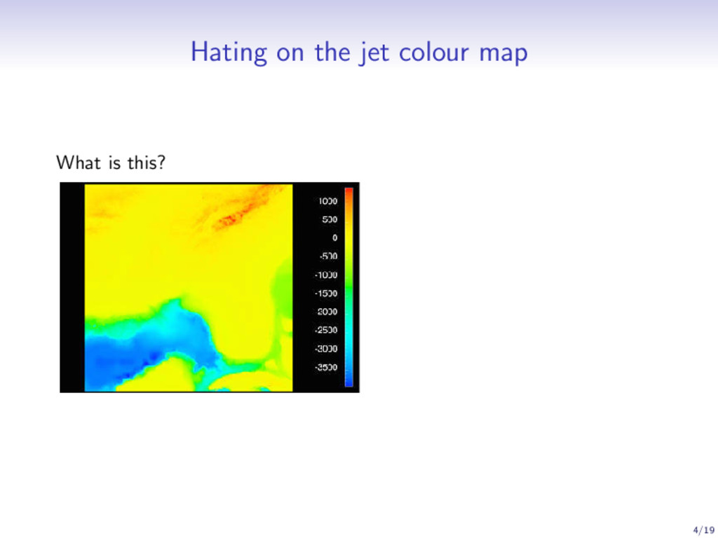
• Left: Linear interpolation in RGB space between red and blue. • Right: Changes in data are perceived as proportional changes in colour (subjective) • Right: Domain specific knowledge used to reveal important features 5/19
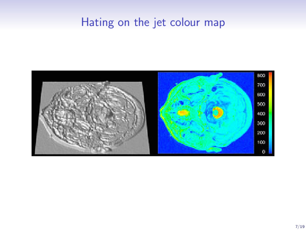
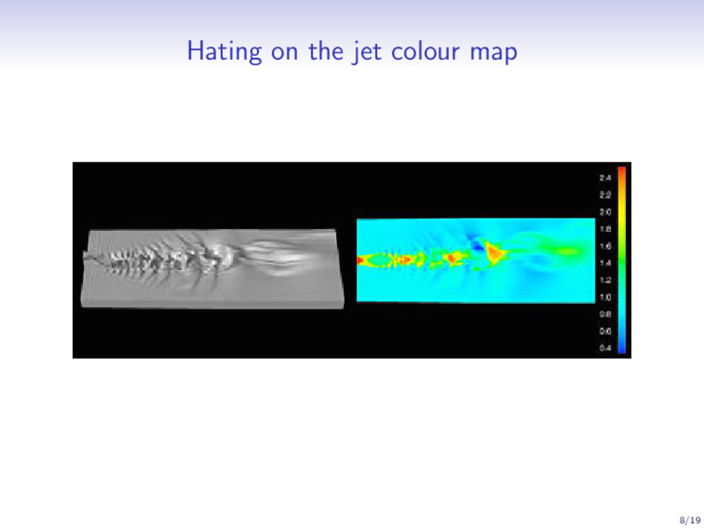
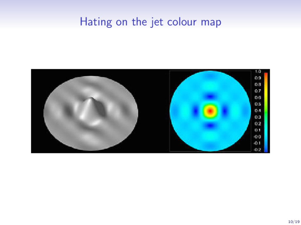
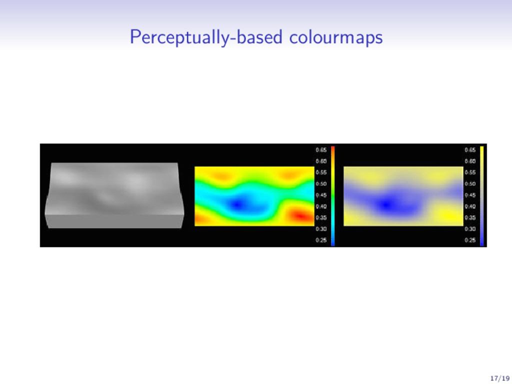
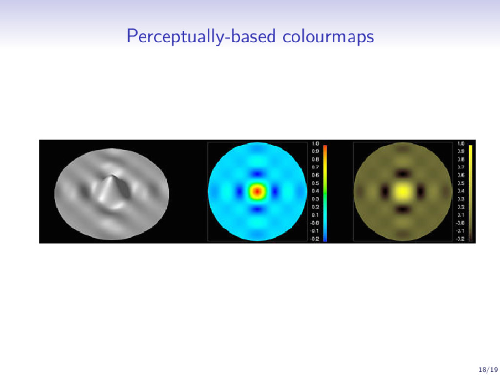
colourmap (or is it?) • Two types of information one can glean from a colourmap1 • ‘Value’ or ‘metric’ information • ‘Form’ or ‘structure’ information • Jet is not bad for value information (but not everywhere) • Jet is awful for form information • Jet is not alone—but it is very commonly used • How to pick a good colour map? It depends! 1C. Ware, Color sequences for univariate maps: theory, experiments, and principles, IEEE Computer Graphics and Appliations, 1998. 11/19
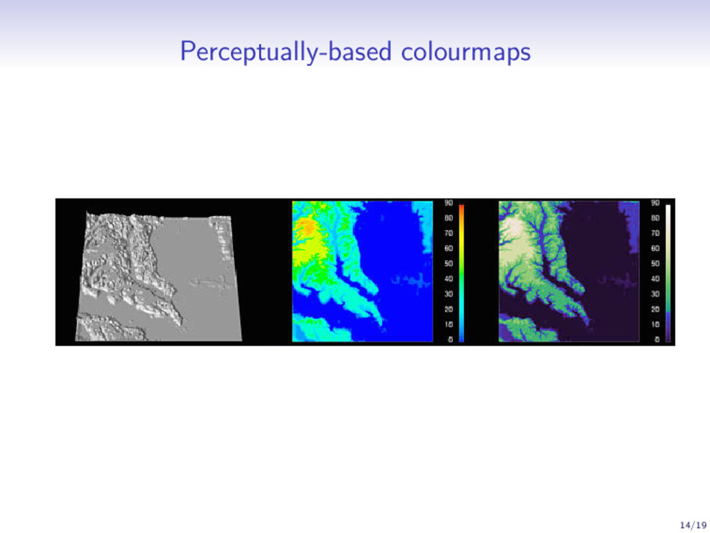
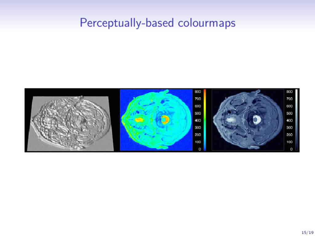
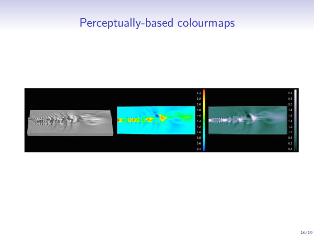
dimensions: hue, saturation, and luminance • Saturation-varying colourmaps are good for low-frequency data • Luminance-varying colourmaps are good for high-frequency data • The human brain is very bad at interpolating hue2 • Perceptually-based colourmaps • Equal steps in data are perceived as equal steps in the colour space 2Conclusion from psychophysical experiments by S. S. Stevens (formerly at Harvard) 12/19